In David Fincher’s Panic Room, home is the battleground, the safe spaces all upturned and infiltrated. When the home invasion thriller was released in 2002, American audiences were still reeling from the September 11th terror attacks in New York City. Similar to the home invasion flicks of the ’60s – like genre classics Lady in a Cage (1964) and Wait Until Dark (1967) – Panic Room emerged in a time and place that was tense and tightly coiled.
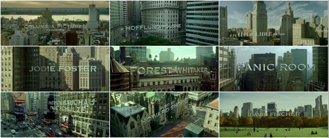
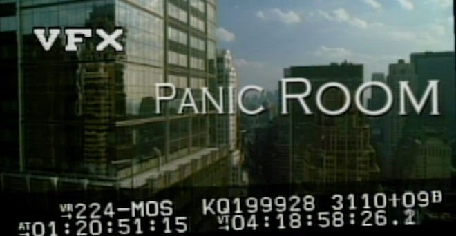
David Koepp, the writer of the screenplay, originally described the film’s opening as a series of one-second shots of the city which lead to a scene of the characters on their way to view a brownstone. Of course, Director David Fincher had something else in mind: some “graphic fun.” The film was Fincher’s fifth feature, following Fight Club, which notoriously opens with one of the most expensive title sequences ever made. Here, Fincher wanted to ask: “When you see the credits for a movie, what is that type? Is it supposed to be a projection over the scene or is it supposed to be there?” In the opening to Panic Room, the type is there and it’s spectacular.
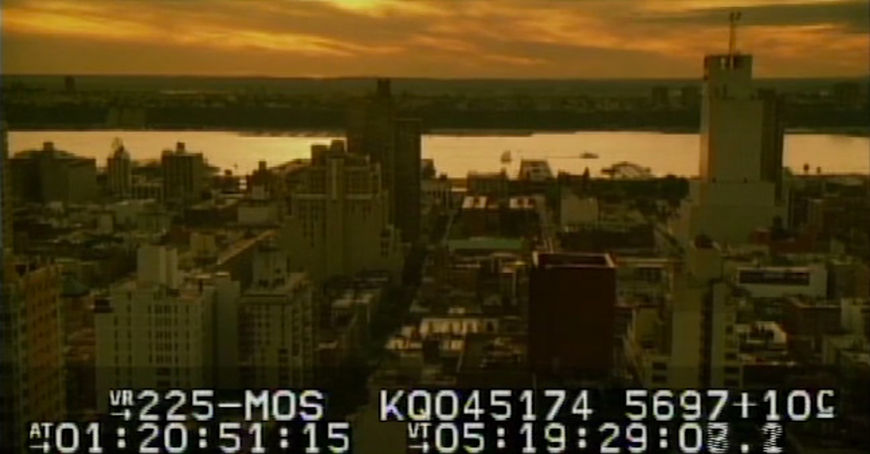
But this title sequence is much more than a physical iteration of typography in a film. Work on the sequence began in spring of 2001 and took the teams at ComputerCafe, a visual effects house, and The Picture Mill, a seasoned title design studio, over a year to complete. The titles, flawless and white, float in the midst of the city, looming large. They are incredibly realistic, casting shadows and reflections on their surroundings. On their own they are monumental, towering names exuding power and wealth, unreal and unattainable. Paired with Howard Shore’s imposing score, they become something else entirely: a foreboding presence. The effect is one of low-grade anxiety, turning the city into a place haunted by grandeur, by the spectre of the American Dream, always just around the corner but dangling out of reach.
In 2002, film reviewer Caroline Westbrook wrote, “Style is evident right from Panic Room's superb opening credits, which are laid out like signs and billboards across the rooftops of New York.” One of the real electronic billboards in the sequence actually flashes the phrase “Face your Fears”.
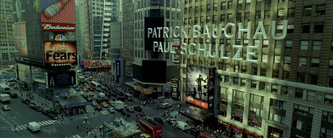
In Panic Room's opening title sequence, an electronic billboard flashes the phrase "Face your Fears"
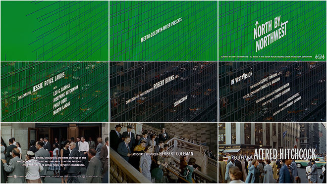
The sequence takes inspiration from the opening titles of Hitchcock’s North by Northwest and The Trouble with Harry. Also, much like the opening to West Side Story, the sequence presents a guided tour through Manhattan from above, starting in The Battery and moving up into Central Park. The tour grounds the film in the milieu of New York City, which is important because other than the opening and closing scenes, the entire film takes place inside one house.
Altogether, Panic Room’s opening title sequence combines Fincher’s sense of typographic play with a number of important narrative functions. It establishes the setting and the subtle notion that space is fluid and easily manipulated, it introduces the computer-generated sleight of hand that weaves the film together, and – primarily through Howard Shore’s substantial score – it taps into the overriding emotion of the day: anxiety.
A discussion with Executive Producer JEFF BARNES of ComputerCafe and Creative Director WILLIAM LEBEDA of Picture Mill.
Jeff, can you give us a little background on yourself, and Computer Cafe/CafeFX?
Jeff: Sure, myself and David Ebner were the founding partners of the ComputerCafe Group. Our companies consisted of CafeFX – feature film VFX, The Syndicate – commercial and music video post, and Sententia Entertainment – feature film development and production.
I acted as the company’s CEO and senior executive producer. We started the group in 1993 and were in business for over 17 years. Our companies contributed VFX work to over 90 studio-released feature films and hundreds of commercials, music videos, motion design work, and special venue projects.
William, can you tell us about your background, and where you are now with Picture Mill?
William: I am a classically trained graphic designer, during the transitional period of the rapidograph and onto the computer. I didn’t really get involved with film until graduate school at CalArts where I earned an MFA in Experimental Animation. We learned almost everything by hand on optical printers and Oxberry cameras. I joined Picture Mill in 1995, after a few years working at ABC, designing on-air graphics for shows like Home Improvement and Roseanne and The Wonder Years. I was the first designer hired. Over the years I became art director and in 2000 became creative director. As creative director at Picture Mill, I lead our team of 11 designers, animators and producers.
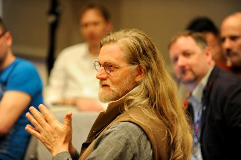
Panic Room Visual Effects Supervisor Kevin Tod Haug
How did you become involved with the titles for Panic Room?
Jeff: We were pitching Visual Effects Supervisor Kevin Haug on being involved in the effects for the film. We were also very interested in working on the titles. We had a heavy broadcast design history at that time and were huge fans of what Fincher and Kyle Cooper created on the opening of Se7en. I expressed to Kevin that in addition to the visual effects, we were extremely interested in producing the title work and were hoping Panic Room would be our first project. He loved our enthusiasm and aesthetic but had concerns that we had not yet been involved in a major film title sequence and suggested we collaborate with a more established title studio and re-pitch.
William: Kevin initially contacted us. He needed title experts to consult on the idea as well as deal with whatever legal issues might arise, like type size and equitability. He was looking to get a title concept and exploration for “half an idea” for the titles that Fincher had started to imagine.
—William LebedaFincher described a loose idea about floating letters hanging above the city. It was a little vague. Were they paper-thin? Big as buildings?
David Fincher discusses his idea for the opening sequence in this excerpt from the Panic Room DVD director's commentary
I went with Kevin and the guys from CafeFX to meet David Fincher on set. They had built the brownstone on a massive stage with flyaway walls and all sorts of trick practical stuff… just amazing. Anyway, Fincher described a loose idea about floating letters hanging above the city. It was a little vague. Were they paper-thin? Big as buildings? What were they made of? What colour? How high up? These were the kind of questions that needed to be answered.
Jeff: After our first pitch meeting with Fincher, my partner David Ebner, Bill and myself all stepped into the elevator after leaving the meeting very cool, calm and collected. When the doors closed, we all looked at each other and started shouting with excitement, “How cool was that, we just met David Fincher!” High fives all around... it was a fun day.
William: After that meeting, we all agreed that Picture Mill would put the creative treatment together. CafeFX was working on the technical side, dealing with how it could be done with photogrammetry, tracking and other techniques. I led a team of about three or four putting together the initial presentation book. The presentation was mostly concept images of modeled 3D typography rendered from Maya then painted into location stills. Plus a bunch of support materials: examples of typography in the city, a map with a proposed path from the south of Manhattan to Central Park. It’s a cool book.
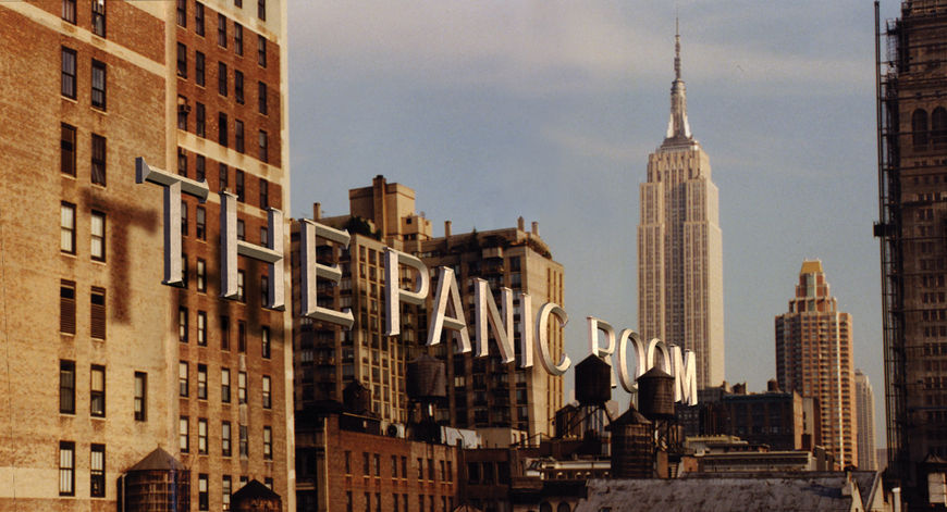
Initial rendering of the title card of The Panic Room, as it was then called, in the Copperplate typeface.
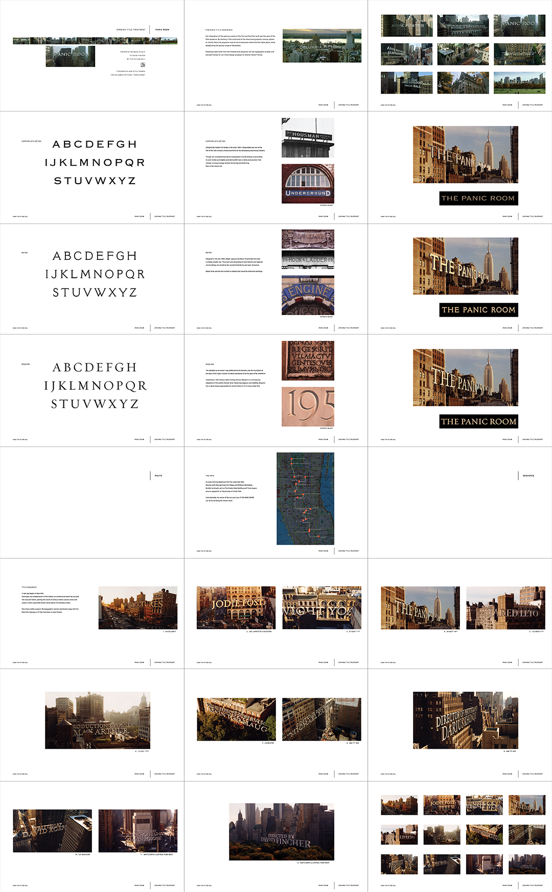
Picture Mill's presentation book for the opening of The Panic Room – as it was then called – featuring concept images of modeled 3D typography painted into location stills, examples of typography in New York City, and a map with a proposed path from the south of Manhattan to Central Park.
William: When we started, they were still in principal photography… There was no movie to see, which is unusual for a title sequence, especially in the current post-production environment, and David was quite busy, you know, directing the rest of the film. Also unusual.
Once David saw and approved the treatment, we had strong support for our process. He wanted us to interject what was needed to make it as strong and compelling as possible.
When we spoke to Fincher, he said the idea for the title sequence was kind of a running joke between him and Angus Wall, the editor. "What is that type? Is it supposed to be a projection that the audience is having over the scene they're seeing or is it supposed to be there? Let's ask that question." Was that always the concept for the title sequence or were other ideas pitched?
William: Ha! I hadn’t heard that… that’s hilarious. This was it, really. We did talk about some other wackier ideas, like the type doing animation in the air. It was ridiculous, in retrospect. I think it is what it was meant to be, the most literal version of words in a movie. It’s a weird thing in a way… half a VFX sequence and half credits. And all awesome, to this day.
Some people have mentioned a connection between Panic Room and North by Northwest, though it was only after the fact.
North by Northwest (1959) main title sequence, designed by Saul Bass
The Manhattan cityscape is obviously a hell of a canvas to work with. Did you have to scout locations in advance or did you already have what you needed thanks to storyboards or previz?
William: Since most of the movie takes place inside, in the dead of night, Fincher really wanted to bookend the film with short sequences outside, during the day, to give the movie a touch of lightness and some New York City flavour.
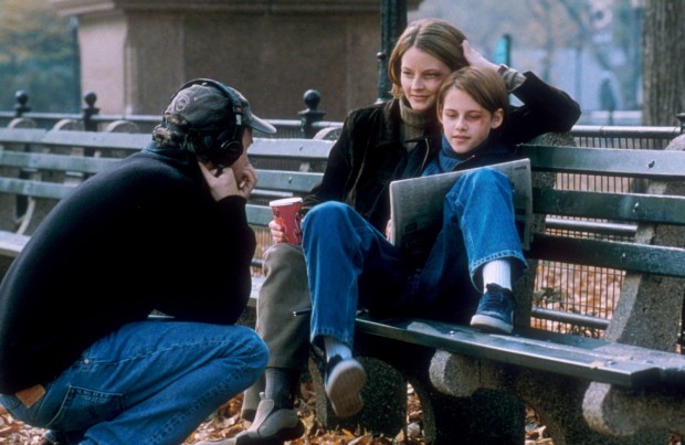
David Fincher (left) directs Jodie Foster and Kristen Stewart for an outdoor scene of Panic Room.
He wanted to clearly set that location, so there was some initial location stuff around, just through the course of scouting the entire film. That’s what we based some of our concept frames on.
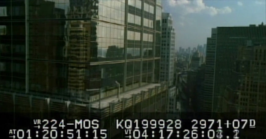
Once it was clear how it was going to work, Kevin took a VFX splinter crew to NYC to shoot the plates. He rolled 35mm running footage and 65mm VistaVision for stills. Kevin at one point had shot a series of materials that would have let us build a long, one-take section in the middle of the sequence, moving down and around St. Patrick’s Cathedral and back up. A giant fly-through, like we were pigeons. But in the overall tone of the piece, the cuts were so much more effective. If it had some slick virtual camera work in it, your brain would have said, “Oh, right, visual effect. I know what this is.” But the cut shots didn’t feel that way – they never distract you.
Reference photography shot for the main title sequence, part 1
Reference photography shot for the main title sequence, part 2
Jeff: Our main role was executing Fincher’s vision in a photo-realistic and believable manner. As always, it was imperative that our work was seamlessly integrated with the plates. It was obviously an effect, but the goal was to present the titles so the viewer accepted them as a part of the landscape, not an additional element to the space.
—Jeff BarnesThe goal was to present the titles so the viewer accepted them as a part of the landscape, not an additional element to the space.
Panic Room main title typography tests created in May 2001 featuring various levels of extrusion and placement within scenes
Can you talk about the typography a bit? It has to compete with some of the most recognizable architecture in the world.
William: This was one of the things we worked on the most before we presented our concepts to David and Kevin. We really dug into what type on buildings in NYC looked like. We looked at classical, modern, postmodern, everything.
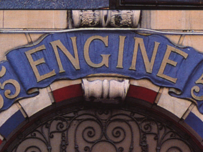
Image Set: Reference imagery of typography in the city collected by Picture Mill for their initial title treatment presentation book
Jeff: They would send us different concepts and we would render test frames to show David. I believe he wanted something traditional in terms of the weight and style but nothing overly modern or what could be perceived as distracting.
William: We looked at straight sans serifs like Helvetica and Univers and they were terrible. Just too cold and too clever. A slickness that was just counter to the idea. In the end we selected three to present: Copperplate, Requiem, and Meyer. Requiem because it felt so classic. It’s a modern Trajan, dramatic and important. Serious. We really felt like it had gravitas.
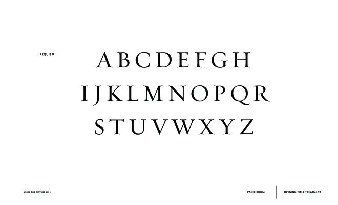
The typeface Requiem (designed by Jonathan Hoefler), as featured in Picture Mill's initial presentation book

"The Panic Room" early title treatment typeset in Requiem
“The Panic Room” early title treatment set in Requiem and rendered into the scene
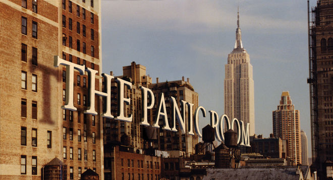
William: Meyer is a recut of an early 1900s face that feels distinctly New York to me. Feels like Ellis Island and the Big Apple. An American typeface. And we found some great reference of it in the city.
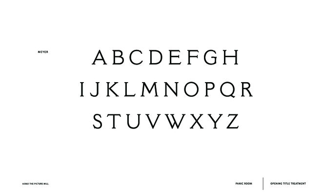
The typeface Meyer (digitized by David Berlow from a Linotype typeface designed for Louis B. Meyer for silent film titles), as featured in Picture Mill's initial presentation book

“The Panic Room” early title treatment typeset in Meyer
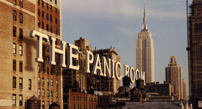
“The Panic Room” early title treatment set in Meyer and rendered into the scene
William: Coincidentally, I went on to use Requiem later the same year for Signs, which was a far better choice there than here.
Copperplate, which David Fincher chose on the spot, was ideal for so many reasons. Technically, it bevels well and is really legible off-angle. And aesthetically, it doesn’t fight the architecture. It has enough refined detail that it didn’t feel too modern either, especially with the chiseled front face. It has its own presence without being showy or too unusual. Floating in space is unusual enough, I think.
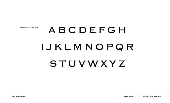
The typeface Copperplate (designed by Frederic W. Goudy), as featured in Picture Mill's initial presentation book

“The Panic Room” early title treatment typeset in Copperplate
Main title sequence iteration 1, featuring the final title "Panic Room" in the Copperplate typeface in capitals and small caps, September 2001
Can you talk about the technical side of the project, and that “half-VFX sequence and half-credits” aspect that William mentioned?
Jeff: Some of the title shots had subtle VFX work and others were more involved. For instance, on the “Forest Whitaker” card we replaced the water tank with a CG version and added some steam.
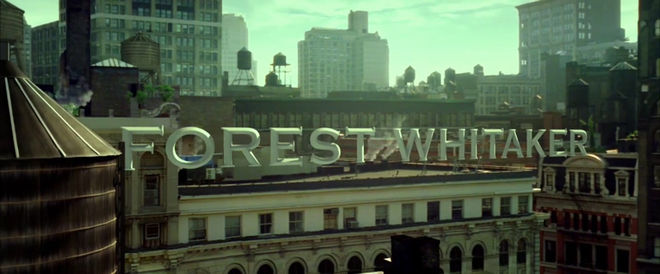
Jeff: A few of the shots were built using the reference imagery directly as elements and a process called photogrammetry. Photogrammetry allowed us to map high-resolution photography accurately onto modeling points with slight camera moves to cause a subtle perspective shift.
Main title sequence iteration 2, featuring a heavier weight of Copperplate in all caps, October 2001
—William LebedaOne thing that people forget is that movie credits are actually legal documents, and follow certain agreements determined by lawyers and guilds and agents.
On the “Panic Room”, “Film Editors” and “Produced By” title cards, we broke up the background into various layers to add the 2D perspective shift.
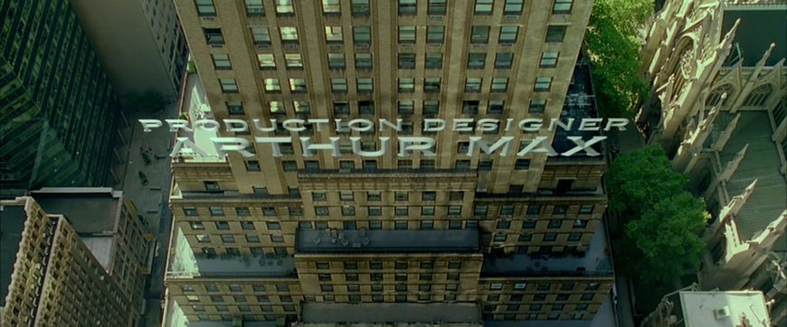
William: My favourite shot in the sequence is for production designer Arthur Max. When we went through the very first edit of all the plates that Kevin shot it was rhythmically a little flat. A lot of left-right moves or forward pushes out into the open air. We needed some additional variety and I wanted to have that sense of looking and moving down, since we were clearly so high up at that point in the sequence. So the team at CafeFX made a virtual camera that let us move downward toward that building.
And they added the birds for me too… Even though it’s Mr. Max’s credit, I will always think of that as my shot.
Main title sequence iteration 3, November 2001
What was the most challenging part of this project? Anything unexpected you encountered?
Jeff: I guess the only thing I can think of in terms of a big challenge was maybe the timeframe. We were hoping it would be complete in a few months and it ended up taking over a year, so we had to be smart with our resource allocation. Usually you don’t have enough time, this time we had too much!
William: I don’t think any of us expected it to go on as long as it did. And there were other hurdles because of the length of post-production. CafeFX had to go into footage and recolour leaves and make spring green into autumn for the ground-level shots at the end due to reshoots during the post-production. The falling leaves on David Koepp’s card are so beautiful.
Main title sequence iteration 4, February 2002
William: One thing that people forget is that movie credits are actually legal documents, and follow certain agreements determined by lawyers and guilds and agents. So there was some fiddling of the order of names, which meant that a name set for one plate had to move to another, and that causes big ripple effects since these weren’t just burn-ins over footage. Names had to be reanimated and rendered in 3D. We had to add a name unexpectedly later in the process. I think the plate with the Chrysler Building, that now has James and Angus’s names, was added when a new credit was added into the sequence. I think it’s a fully digital shot too, like Arthur’s.
—William LebedaI think anytime an opportunity comes along that you really want, it’s good to feel the butterflies.
Howard Shore's imposing score matches both the imagery in the title sequence and sets the tone for the film. Was it composed after the fact or did you have it to work with?
Jeff: I do not remember having the score beforehand. I believe the project was post-scored after our work was mostly complete.
William: I think it was scored after we locked the edit. It may have been composed after we started but before we finished. I do recall that we cut the first passes without audio, so it was a purely visual rhythm driving the editorial at the beginning.
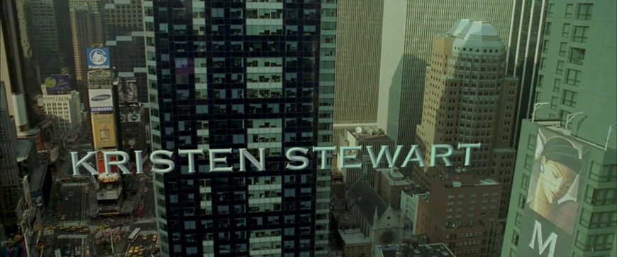
The score is really imposing but also sinisterly playful. I love the sound of the ticking clock when Kristen Stewart’s credit appears… such great foreshadowing that her character would be the ticking clock for the last act of the film. I am grateful for his distinctive theme… it makes the sequence even more memorable.
Almost all of David Fincher's films feature interesting title sequences that add to the overall film experience. Having seen what he did on previous films, was it daunting to take on a Fincher title sequence?
Jeff: This is a great question. We knew the stakes were higher than normal and there was no option for even the slightest hiccup. So yes, there was some intense pressure there but it was also exhilarating. Up to this point we had never teamed up with another design firm for a feature and were a bit concerned about working with someone new. However, looking back now, Kevin definitely made the right call in having us collaborate with Picture Mill as they were invaluable in the process.
William: It was a little daunting, since the bar was set pretty high after the attention of Se7en and that crazy opening of Fight Club. He had pegged the needle of cool, especially in the title design community. But there was a little relief from that because he was already committed to the idea of the sequence. He wanted it to succeed as much as we did.
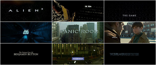
Read more about David Fincher's filmmaking and title sequences in our feature article David Fincher: A Film Title Retrospective.
William: I think anytime an opportunity comes along that you really want, it’s good to feel the butterflies. It’s good to have that little bit of fear and anxiety. It means that you are reaching just a little beyond your comfort zone. It’s what you want, those chances.
What was the collaborative process like between yourself and the director?
William: Fincher was involved throughout, but more for approvals at production milestones rather than day-to-day involvement. There was actually more face-to-face interaction with Kevin, since it was such a VFX-heavy project.
Things did shift from the initial plans though. The pacing of the sequence was something that developed during production. Initially I recall the idea being a little brisker, going along with the pulse of life in New York. Faster cuts, buzzier. But as we got into the sequence, it was clear that the less the camera moved, the longer the shots were, the more frightening and threatening the suspended titles became. And David was all for it.
How big was the team?
Jeff: Since the project went on so long, we were able to use a pretty small crew. I believe we averaged about four artists. A big part of our success [is due to] our CG lead at the time, Akira Orikasa. We had a fantastic team assigned to the project but Akira especially did standout work and really knocked it out of the park.
William: We were four or five in design. Not a huge team, and certainly spread out over time and space.
Breakdown of Panic Room's main title effects, with Visual Effects Supervisor Kevin Haug and Visual Effects Coordinator Leslie McMinn
What technology did you use to make this sequence?
Jeff: Lightwave for 3D, Digital Fusion for compositing and Photoshop for everything else. We also used various in-house software plugins as well.
William: And a whole lot of smart people. Mostly the smart people.
Finally, what role do you think a title sequence should play in a film?
Jeff: I personally love title sequences for a myriad of reasons. I like the artfulness, the expressionism and that they have traditionally provided a foreshadowing of sorts for the story. It is like a great cover of a book, or the outside art of a cool CD or album. It helps to brand the content and get you excited about the potential.
Cast members Jodie Foster and Dwight Yoakam discuss the opening sequence in this excerpt from the Panic Room DVD cast commentary
William: Every sequence is a little different. Some movies need heavy storytelling to help set up the story. And some need something simple and stylish over the opening shots. Most of the time it’s somewhere in-between. For me, the goal of any title sequence is to be true to the film and the world that is established. Tone, style, story – all of that comes from the film first. We are adding to it, supporting it, interpreting it. Going too far from the source is really denying the film itself. It would be like composing and performing a score for a film without knowing anything about it. The music could be lovely and beautiful all on its own, but it may not connect with the film [so it] becomes discordant and jarring for the viewer. It’s nice to be noticed. But we strive to be sure that we are making something fantastic and appropriate for the story being told. That is when we are at our best, I think.
I try to remember that I stand on the shoulders of giants: Paul Rand, Saul Bass, Milton Glaser, Jules Engel, Charles and Ray Eames, Pablo Ferro, Maurice Binder, Robert Brownjohn, Wayne Fitzgerald… Without them, Art of the Title wouldn’t exist. And I would be working in an advertising agency in Dallas, Texas.


