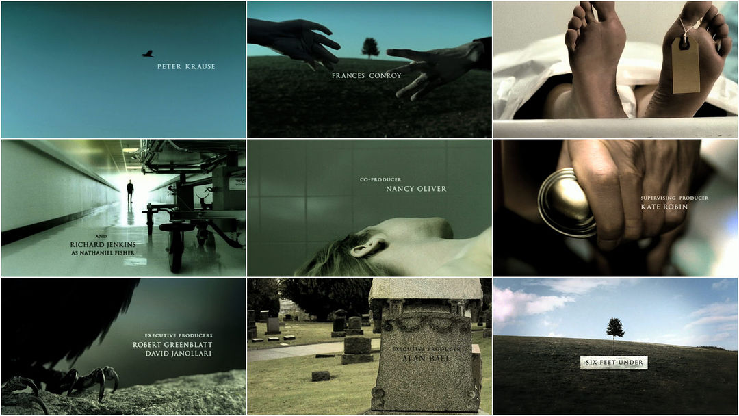
The season finale of Six Feet Under laid to rest the story of the Fisher family in the most moving six-and-a-half minute finale in television history (spoilers); but for those who followed the series from its debut in 2001, the title sequence carried with it as much significance as the final fade to white.
We begin, as Danny Yount and his team at Digital Kitchen began, with the theme music by Thomas Newman. That shuffling of horns and percussion – that mellifluous breeze of a song that was almost ambient, oddly pleasant – combined with a lilting clarinet, inspired an intriguing sense of the familiar.
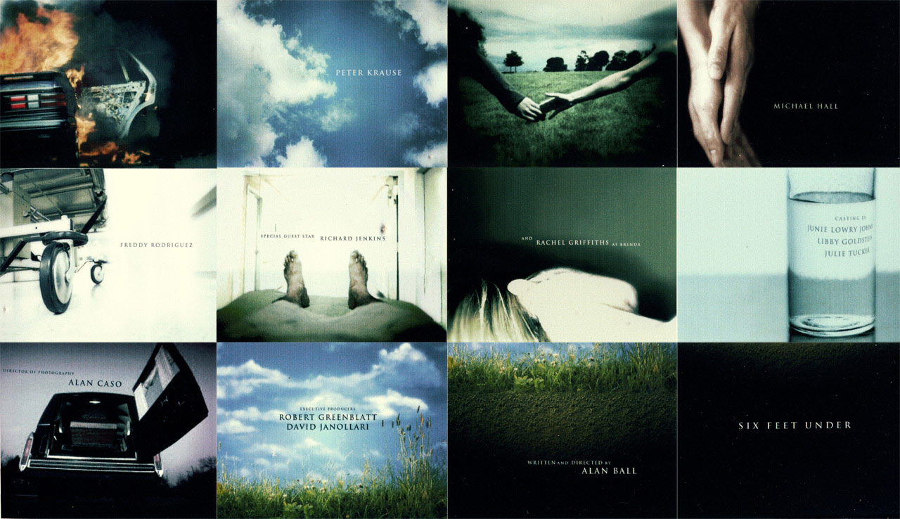
Taking this cue, Danny Yount and his team created a complementary uneasy pairing of reverence and fascination while guiding the viewer through the theme of inevitable loss. Closeup vignettes of bodies – gruesome and fantastic landscapes – mingle with parting hands and familiar metaphors of death and passage as the camera hovers with a gentle curiosity... pausing at times to search the sky for answers. A cold and muted color palette hangs over the sequence and muffles the warm imagery of clasped hands, framed memories, and the living. And yet, despite the presence of death in nearly every frame, beauty and wonder emerge.
With Yount's deliberate manipulation of frame rates, an arrangement of lilies wilts and withers, on its own an obvious nod to the passing of time, but also eerily beautiful when presented with the carefully underexposed scenes of long corridors and cemeteries. Maybe one of the greatest achievements of this sequence is that, for six seasons, the floor-level closeup of a gurney wheel somehow matched the emotional potency of images of withered hands and crows on tombstones. The final image, the lone tree on a hill, initially a glaring reminder of the cycle of life and death, has now also become one of the most iconic images in television history.
Primetime Emmy Award for Outstanding Main Title Design
A discussion with Director/Designer DANNY YOUNT.
So, Danny, how did you start out in design? What brought you to this point?
My first paying art job was in 1989 at a sign company in Oakland, California called The Art Sign Company. I made really bad real estate signs with a vinyl cutting machine. It was frustrating to work with but I learned a lot about type. I also started using one of the first Macs – a MacPlus – and that’s what gave me an interest in graphic design.
*The Macintosh IIsi was a compact three-box desktop unit which was introduced as a low-cost alternative to the professional desktop models for home use.
Then I wanted to go to design school but couldn’t afford it, so I bought a Mac and started learning. It was 1990 and the first color Macs had come out – mine was an IIsi*. Super exciting stuff back then! Multimedia was taking shape with apps like Macromind Director, which became Macromedia Director and was eventually trumped by Flash before Adobe bought it. I absorbed everything I could and made a digital portfolio, which I sent to design companies in Seattle, where my wife Vicki and I had planned to raise a family.
I was taught that design is a type of visual communication and storytelling where a single image needs to say something profound immediately, in the simplest form possible.
A few years and several odd jobs later, my “big break” came when I started as a freelancer for an established graphic designer named John Van Dyke. He was one of the top annual report designers during the ’80s and ’90s. I had made an interactive portfolio that caught his eye because he wanted to do interactive things himself. I was very green when it came to design; I had no sense of strong visual communication. He took me on as a full-time staff designer in 1994 and we made a very successful CD-ROM, but then the internet started gaining momentum. So we made a couple of award-winning websites, but I started to get frustrated with my lack of programming skills as things became more sophisticated technically.
During that time, digital video became possible on Macs and I started learning editing and animation with Adobe Premiere 2.0 and CoSa AfterEffects 2.0. I absolutely loved it – so much so that I started over! In 1998, I started learned everything I could about video post production and I took a job at a local news station, KOMO 4 Seattle. It was a hilarious and terrible place to work, but I learned a lot about broadcast production. From there, in 1999, I went to work at a post house called Rocket Pictures. After being heavily influenced by the Se7en titles Kyle Cooper made, I started to build a reel that I sent to studios in LA like Imaginary Forces, Fuel, yU+Co, Pittard-Sullivan, Novocom, Belief, and Blind. Imaginary Forces invited me to freelance with them and I jumped at the chance, leaving my family for about a month. It quickly got hard on them so I decided to head back home. I sent a reel from LA to Digital Kitchen in Seattle, founded by Paul Matthaeus. At the time, they were the only good motion studio in that area. It was there that I was able to really excel as a motion designer and eventually be able to direct live action.

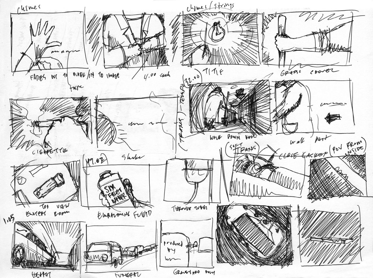
Rough storyboard
Right, and that brings us up to your current role. How did you become involved with Six Feet Under?
I had been on staff at DK as a senior designer for a year in the original office in Bellevue, WA. HBO asked us to pitch on the original series and gave us a CD with the theme by Thomas Newman. Paul asked everyone to come up with ideas and there were a lot of good illustrated and graphic ones from designers like Mason Nicoll. He was behind the idea of the logo. Another designer was doing a board that involved a crow and some spooky imagery. I went with a live-action concept and built an idea based on a day in the life of a mortician, which was what I pictured when I first heard the music. It sounded to me like someone working.
So how did you move forward?
Well, I was taught that design is a type of visual communication and storytelling where a single image needs to say something profound immediately, in the simplest form possible. To exercise this type of restraint without being boring is a challenge, but I learned to differentiate smart design from cheap communication – trends that lack substance. And that was my goal for this piece. It's about death but it doesn’t need to be gross or spooky or horror-driven. Those things have their place but I thought it was more about the bigger picture – that there is a life after death and it is not ugly or morbid but beautiful.

First storyboard
So I chose to use elegant type over iconic scenes driven by conceptual images and metaphors woven within the framework of a story – the daily routine of the mortician. I found some nice stock photography that supported this and built the look based on that. But I also wanted to add an underlying thread of metaphors like the hands parting, which represent someone leaving this earth into eternity but also loved ones letting go. To test it, I started sketching frames and made an animatic. Editor Eric Anderson added the music and made a few tweaks to the edit and we were very happy to see that it was working. The client loved the idea and chose the concept. They also wanted a few things from other ideas like the crow and Mason's logo idea. For the type animation I wanted it to feel like the words turned into ashes and floated away. All we had was AfterEffects but a clever designer named Scott Hudziak figured out a way to use the new particle system in AE to do it. Remember: this was 2002, so effects like that were new. He also did an amazing trick to make the type turn to smoke.
Storyboard animatic
What would you say were your stylistic influences?
My vocabulary was a little shallow back then but I would’ve probably said Saul Bass and Paul Rand for design in general. I also liked the typographic work of David Carson, Josef Müller-Brockmann, and Neville Brody, and the editorial work of Alexey Brodovitch. I didn't know very much about photographers back then but I knew what I wanted.
Detail the live-action shoot for us.

Location scouting
Producer Lane Jensen did some research and found a local DP, Christian Loubek, who had shot a nice piece involving beautiful tombstones at a cemetery in Seattle. We did two days of shooting in Seattle in the winter of 2002 at two locations on Capitol Hill: one at a park in Magnolia and one at a cemetery on Queen Anne Hill.
Christian shot everything on Super 16mm. We tried very hard to find a tree in Washington that had leaves on it in the winter. There was a type of holly tree that had leaves but they were usually no larger than a big bush, so we searched for people in the area that needed one removed that was at least 10-12' tall. After a few failed attempts we found one tree that was large enough to be used, so we transported it to the location and propped it up with ropes for the shoot.
For the coffin scene, we had bought a skull ring but someone stole it the night before the shoot! So we had to rush to find a replacement for that which was a huge challenge. And then unfortunately the client didn’t want it in the final cut so our Flame artist, Janice Harryman, had to remove it in post, which was very difficult.

Production shoot with DP Christian Loubek
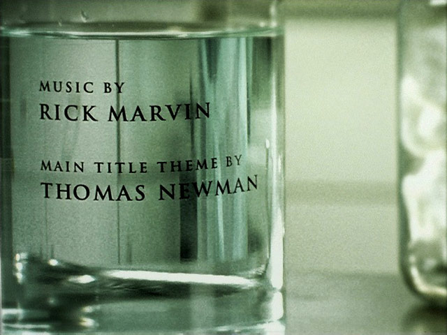
Another difficult shot was the type in the fluid jar. The cut I show has my practical type element in it but the names changed for additional shows and seasons so that had to be done in post as well.
Fluid jar with practical type
The crow was the most difficult item. We weren’t legally allowed to film a crow – weird, but true – so we had to get a raven on a leash! The trainer would let it fly a short distance and then bring it back. In a limited situation like that you only get a few takes, so we had to use what we had, but it worked out. The bird that flies in the first scene was stock film. The color correction was a challenge, too – I did it in AfterEffects, which was unheard of back then. But aside from those hiccups everything seemed to go beautifully.
There are two different cuts of this sequence, right?
Right, the "director cut" and then the network approved cut, which has no type animation. I was featured in both out of necessity – at the end of the hall for the network cut and then I was pushing the gurney in the other one. Funny thing about that shot was that the cart handles were a little low so I had to hunch over and waddle a bit to push it, which made me look like an old man.
"Director's Cut" sequence with animated type
It's astounding that this was your first live-action project.
Yeah, it was my first live-action project and I had no clue how to do it! Fortunately, it was simple enough as an idea and I was lucky enough to work with great people who all contributed amazing things to make it happen. We had no idea how special what we were making would become.
How big was the creative team for this project?
There were four of us: Eric Anderson, Scott Hudziak, Janice Harryman, and myself.
What was the schedule like – how long did it take from the first meeting to the finished product?
About four weeks total, if I remember correctly.
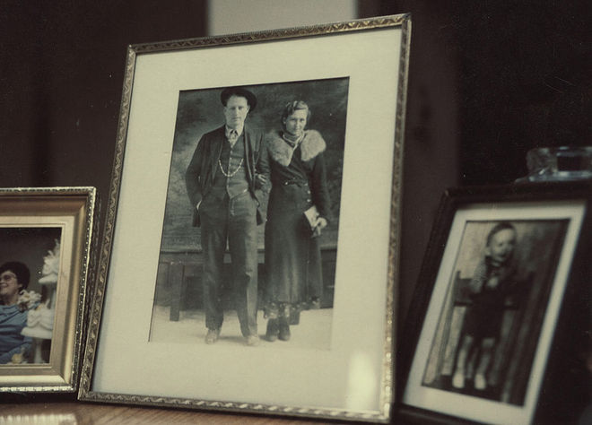
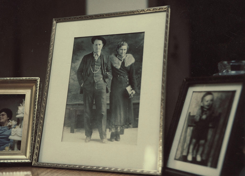
Family portrait - Danny Yount's grandmother and brother as seen in the final sequence
Can you talk a little about the state of TV title design in 2002?
It was not great; most shows had a title that just featured the stars. I think the ER title was the one to watch back then. HBO wanted something different.
What role do you think a title sequence should play in a television series?
The same role as in a film: the title should always set the tone and be inventive. It should be the opening design statement that gets the audience or loyal following excited.
What are some of your personal favorite title sequences, from television or film?
Grand Prix, It’s a Mad Mad Mad Mad World, To Kill a Mockingbird, Dr. Strangelove and Delicatessen.
And lastly, did the Six Feet Under titles change anything for you?
Yes. After I got an Emmy I had less trouble finding work! [laughs]

Tree prop
LIKE THIS FEATURE?


