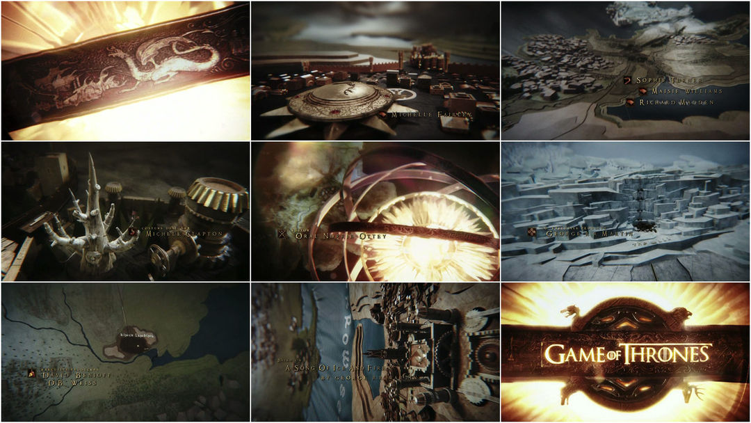
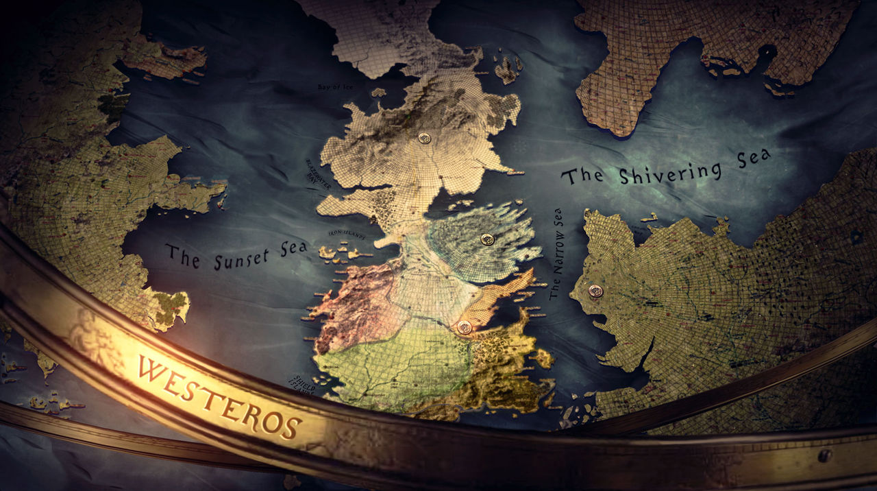
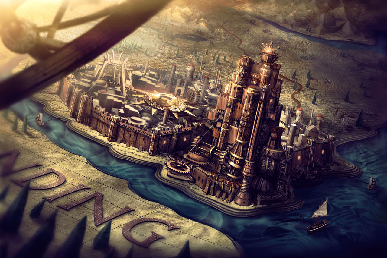
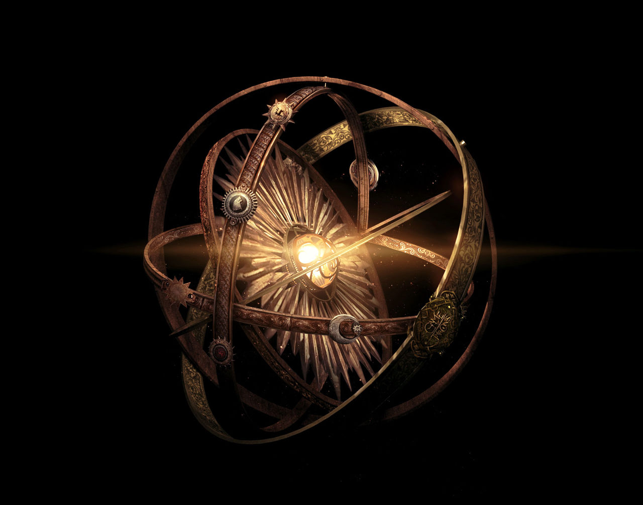
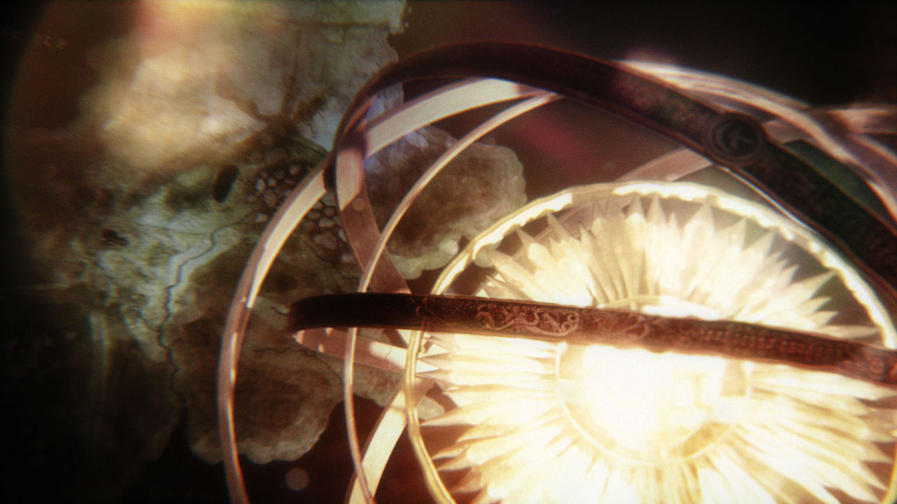
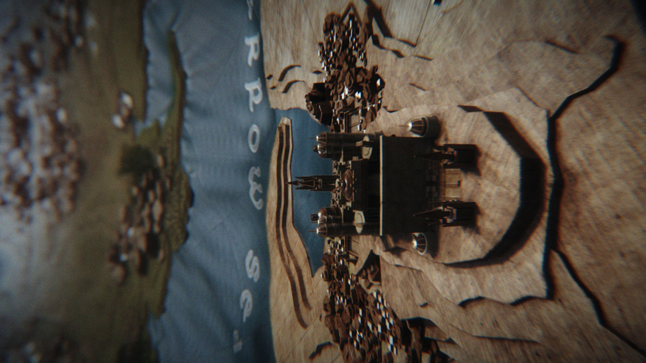
A fiery astrolabe orbits high above a world not our own; its massive Cardanic structure sinuously coursing around a burning center, vividly recounting an unfamiliar history through a series of heraldic tableaus emblazoned upon it. An intricate map is brought into focus, as if viewed through some colossal looking glass by an unseen custodian. Cities and towns rise from the terrain, their mechanical growth driven by the gears of politics and the cogs of war.
From the spires of King's Landing and the godswood of Winterfell, to the frozen heights of The Wall and windy plains across the Narrow Sea, Elastic's thunderous cartographic flight through the Seven Kingdoms offers the uninitiated a sweeping education in all things Game of Thrones.
Primetime Emmy Award for Outstanding Main Title Design
A discussion with Creative Director ANGUS WALL at Elastic.
Detail how Elastic became involved with the show.
AW: I got a call two years ago from Carolyn Strauss who we had worked with on Carnivàle, Rome and several other main titles for HBO. She is a friend and a co-executive producer on this show. We discussed a concern which is that [Game of Thrones] doesn’t take place on the Earth that we know. It takes place in a world that exists only in the books. So similar to how the legend or map at the front of fantasy book works, she felt like there was a need for a map to the show.
Now in the original pilot script, Dan Weiss and Dave Benioff had written a title sequence in which a raven flies from King’s Landing to Winterfell. We did some concept sketches around that idea but when the pilot was shot, they called us in and said, “People are confused about where they are. Can you guys create little map pieces? Not a title sequence per se, but something that shows us exactly where we are when we go from place to place.”
*Previsualization (also known as previz, pre-rendering, preview, or wireframe windows) is a function to visualise complex scenes before filming
We created five previs* map shots that were cut in every time the show went from one place to the next. It worked really well in terms of telling you where you were, but it interrupted the narrative flow of the show. We looked at the synopsis for season one and identified what it would take to make these little interstitial shots for all ten episodes, but due to the fact they somewhat disrupted the narrative, the whole map idea got pushed back into the title sequence.

World map concept art
At this point, we made a list of the locations we needed to build. Then we figured out how many different versions of the sequence we would need to create, the idea being that the opening title would show you all the places you would visit in each episode. And we boiled it down to four different sequences, each a subtle variation.
Title sequences can do a lot of different things, and besides taking you on a journey, this one offers a lot of information about the world you’re going to see. It allowed us to really create our own little world. HBO and the creators of the show really let us run with this idea and we wanted to do something distinctive with it. We didn’t want to create something that’s been done before like what you’ve seen in Harry Potter or Lord of the Rings. Those things are wonderful, but we wanted to do something different.

House sigil examples
During the pilot stage, when you’re dealing with the maps that are throughout the show, had you gotten into the style that we see now in the final piece?
No. In the beginning, it was very simple, nothing animating and everything very flat. One of the things we realized early on was that you couldn’t really tilt the camera up very far because it raised the question, what’s beyond the map? I kept thinking that if you had all the money and craftsmen in the world, and you could do whatever you wanted, what would you do? In my mind, you’d build the most intricate, beautiful map you could possibly imagine. You’d get the best craftsmen in the world, give them the materials they’d need and give them five years to make this crazy, working, super-detailed miniature.
So about the same amount of time that it takes Martin to write one of the books?
[laughter] Exactly. Our goal was to try to replicate something that looks and acts like a physical object. Art Director Rob Feng referenced Leonardo’s machines which have a timeless sense of design. We wanted the title sequence to be rooted in world of the show, which is a technically unsophisticated place, but to also have a complexity that gives it life. It’s definitely not contemporary! Everything is made of wood, metal, leather, fabric, all natural materials... stuff you could see human hands hammering out and molding.
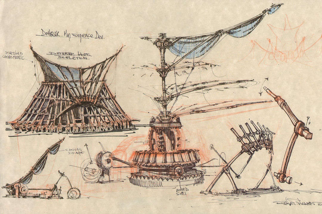
Concept sketches
So who’s involved at this point?
It was Hameed Shaukat (Producer), Rob Feng (Art Director), Kirk Shintani (CG Supervisor) and I just talking about what the different things should look like. A lot of the solutions were just pragmatic ones. The fact that I wanted to be able to move the camera anywhere led us to the fact that this whole world had to exist on the inside of a sphere, which took us a while to figure out.

Castle Black sketches to concept art
I had initially thought, okay, the shape of this thing... imagine it’s in a medieval tower and monks are watching over it and it’s a living map and it’s shaped like a bowl that’s 30 feet in diameter and these guys watch over it, kind of like they would the Book of Kells or something... they’re the caretakers of this map.
The Book of Kells is an illuminated manuscript Gospel book in Latin, containing the four Gospels of the New Testament together with various prefatory texts and tables.
I quickly realized we were still going to shoot off the map. So the next thought was, what happens when you put two bowls together? You have a sphere. Next question was “how is it lit?” And obviously, If you have a whole world inside a sphere, what would be in the middle of that sphere? The sun! Or whatever the light source of this world is.
It’s interesting that you were trying to answer these practical problems even though it would eventually be created all in the computer. You're still asking questions like, "Well what's beyond the horizon, is it a room? Oh, so let's make it a sphere" or "How do you light it?" as opposed to just saying "Well it's lit."
One thing that was really important was to make it feel like it was a physical thing and not to use CG as a kind of “magic camera.” I thought about it in terms of shooting practically with a motion controlled camera. I think you’d have to shoot everything with motion control due to the narrow depth of field and size of the camera moves, but the whole idea was to make it feel real. Early on, we did a test render of the Red Keep, which is the main structure at King's Landing. We placed the fully rendered model on a CG board skinned with a sample of beautifully damaged plywood, and showed it to the executives. Somebody said, "We didn't know that you guys had a workshop." And at that point we knew we were on to something... that the artists working on the sequence had really started making something extraordinary.

King's Landing concept art
A Dyson sphere is a hypothetical megastructure originally described by Freeman Dyson.
So you've got the idea; you know that it's going to be a Dyson type sphere and you know it's going to light it. Where do you go from there?
With the shape of the world determined, we started doing concept art, detailing what these places would look like given the fact that the world is round and they're made of wood and stone and they're of a certain size. We had several very talented concept artists working on this. At the same time we set up the world in previs and started blocking out the sequence. It seemed fruitless to do storyboards because they don't move and in my mind this whole sequence had to be really dynamic. The camera had to be moving the whole time, taking you on a journey. So we blocked the big moves, the moves from place to place, then focused on how we were revealing the different locations and how they were emerging from the surface of the map.

Godswood sketches
As soon as we had final concept art, we pushed it to the model makers working in Maya. These guys were amazing, taking sketches and turning them into working objects, adding tons of their own inventive details in the process. These models in turn, got incorporated back into the previs. It's really too bad the sequence is only 90 seconds long, because there's so much detail we were not able to show. If you're going to create a world, in order for it to feel legit, you have to have this fractal sense of detail. There are dust motes in the air when you're passing through, and all the cogs have a logic to them. There are cogs actually under the surface of the map that you can barely see in the gaps between the model and the surfaces of the world itself. There's such an amazing amount of detail in the models.
It was a very organic process. It's basically going back and forth and whenever we had a new model we'd add it to the world and refine the previs accordingly. Kirk and his team worked incredibly hard to keep us on schedule. And eventually that previs became the blueprint for what was finally rendered out.

The Eyrie sketches to concept art
There was feedback from fans almost immediately regarding certain inaccuracies within the sequence. Were you prepared for that level of scrutiny?
You know, I honestly haven't read any of the backlash. I knew there was going to be some. Basically, we had an existing map of Westeros and a xeroxed hand drawn map of Essos — both done by George R. R. Martin — and I took those into Photoshop and played with their scale until they lined up perfectly. The actual dimensions, the locations and their placement, and the different terrains are all based strictly on George R. R. Martin's maps. It was really important that we stay as absolutely true to the books as possible because of the ardent fans out there.
Was Martin himself involved in any way? Did he see any of the work that you guys were doing?
He created the foundation of what we did by writing the books and drawing the maps. He didn’t see the sequence until the premiere though... and he was very happy with it, which meant a huge amount to us.
So how long were you involved with this?
We probably worked on it for five or six months with varying scales of crew, but the first conversation we had with Carolyn Strauss was probably two years ago.
You said "scales of crew." How big to how small?
I think in total there were about twenty to twenty-five people who worked on it. There was an amazing level craftsmanship, which is a testament to Rob and Kirk and everyone who worked on their teams.

Winterfell and The Wall final renders
How large is Elastic?
It depends. We have several people on staff, and we bring in freelancers for their specific skills. Between "Rock Paper Scissors," "a52" and "Elastic" it's well over a hundred people.
A fair amount then!
Yeah, that’s why I wake up at 2:15am some mornings with morning terror...
How was the collaboration with HBO?
It was great. They are an amazing company to work with because they’re always about trying to make the idea better. I think in any situation where you're trying to do something creative, you want all of the energy going into the work, and with HBO, everyone really wanted to do what was right for the show, and subsequently for the title sequence.
Are you working with the same people that you worked with before, or is it different for every production?
It was by in large the same people that I've worked with before, which is nice. They were very, very supportive of what we were doing. One of the things that came out of our conversations were the bands on the astrolabe — they’re the bands that surround the sun. We show three close-ups of those bands that tell the pre-history of the world in relief-sculpture form. They tell about dragons attacking Westeros. They tell about how the different houses on Westeros got together and defeated those dragons, and how those houses, represented by their respective animals, bowed in allegiance to the Baretheon stag.

Astrolabe concept art
We initially had five of these depictions, but found that even with three, we were right on the edge of being able to understand what's happening in the sequence... which is a place I like. I like the fact that you think, "I'm not sure that I got everything that I was supposed to be getting out of that." You're going to see this ten times during the first season and we wanted to make sure that there was room for people to see new things with each viewing.
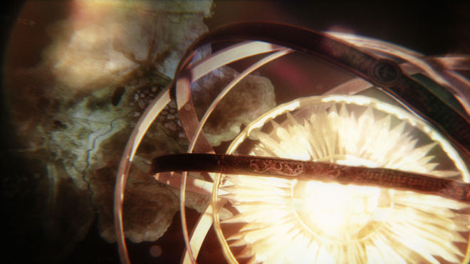
Astrolabe final render
Was there ever any talk about the characters being the focal point of the title sequence?
I think it’s the job of the show to do that. You have 90 seconds with the title sequence... so why not do something that the show can’t do? If the production is done well, which this one is, you get all the character development from watching the show.
There seem to be a lot of interesting, almost non-standard, edits in the piece. It doesn’t look like the usual choices were made in terms of what to cut to next.
Well I didn’t want it to be predictable. I suppose I wanted to push it without being completely disorienting. Although there’s a cut in one of the versions where we do a 180 degree reverse cut... we had many conversations about that cut because it is a little disorienting. But I like that kind of stuff. I like things that throw you off just for a moment. Not to confuse you permanently, but where you go “Whoa, where am I right now?” Then you reorient yourself. I like films that do that, stay ahead of the viewer. You can be a little bit more adventurous about your shot construction, blocking and staging in a title sequence. I just didn’t want it to feel too pre-programmed. There were limitations on how the shots were constructed and yes, they were designed as a sequence, but they were also designed to be good standalone shots as well.

Pentos final render
So how does that way of thinking inform the different job titles you have? On one hand, you’re an Oscar winning editor, but you also do title design.
I think people like to put you in a box and for better or for worse, if you win an award at something, that’s what people think of you as. For me, I’m a filmmaker. I’ve directed stuff, I’ve DP’ed stuff, I’ve PA’ed, I’ve edited, I’ve done design work, I’ve done animation work, I’ve done live action. I like doing title work. It’s all part of the same thing. if you’re coming out of film school you’ve probably worn several of these different hats already.
We interviewed Eric Anderson for our Dexter article and his answer to a ‘design process’ question was “I say creative process because I’m not a designer, I’m a filmmaker.” It sounds like that’s the same thing with you as well.
Yeah, I mean they all play into one another. For instance, I started doing final color correction for some of the commercials I was doing. That made me much more aware of choices that you can make on set.
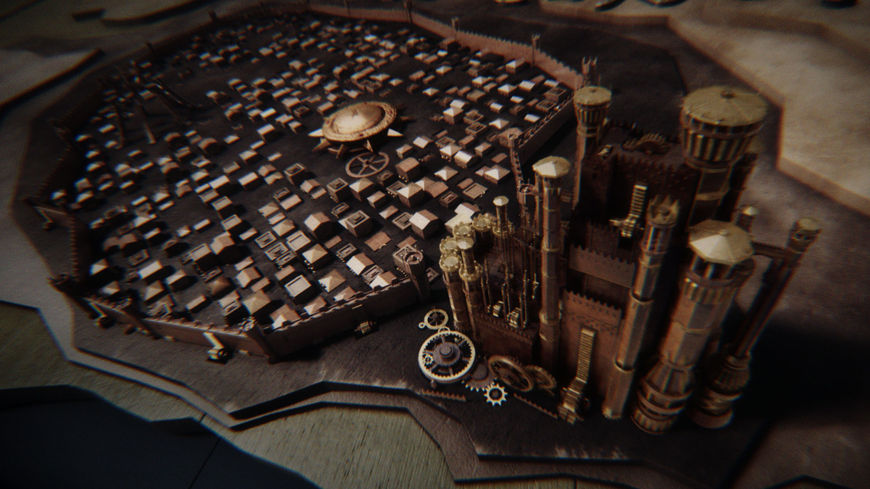
King's Landing final renders
So do you feel pressure then? Given that you’re sort of wearing multiple hats in your jobs and you now have Oscars and Emmys sitting on your mantle for different types of work that you do. Do you feel the pressure, and if you do how do you stay focused on what you’re trying to do?
The pressure is in people trying to categorize you. They kind of go, “...well, that’s what that person does.” I suppose that’s what we do as human beings. We identify things and classify things because that makes us feel more comfortable and it gives us a sense of control over the world. But I think it’s a very 20th Century notion to go, “that’s what that person does.” But in terms of pressure, I think you have to tell yourself that you might fail and you might fail publicly. But you can’t be afraid. You can’t be afraid to start over if you have to start over. At the beginning of every job you’re starting over. You’re facing failure every time you go out. But you can’t live in the place where you’re saying, I better not try this because I might fail. Because then you’re not going to succeed either.
How do you decide what you’re going to work on next?
You just have to take the opportunities as they’re presented to you and keep as many irons in the fire as possible. One thing that I’ve learned from my wife (and partner for 18 years) is that if there’s somebody you want to work with or if there’s a job that you want to do, you have to call whomever that person is or call the people who are going to award those jobs and tell them how passionate you are about what they’re doing. It’s scary to call people, but at the same time you think to yourself, “What’s better than somebody calling you up and saying, “Hey, I really love the stuff that you do. If there’s any chance I could work with you on something in the future, let me know.”

Logo final render
LIKE THIS FEATURE?


