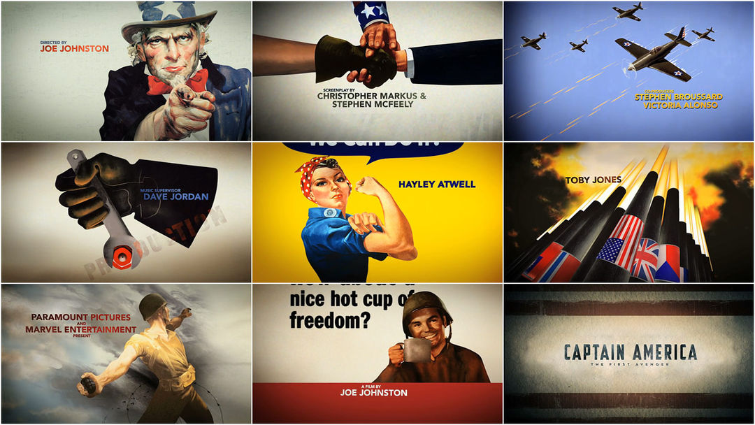
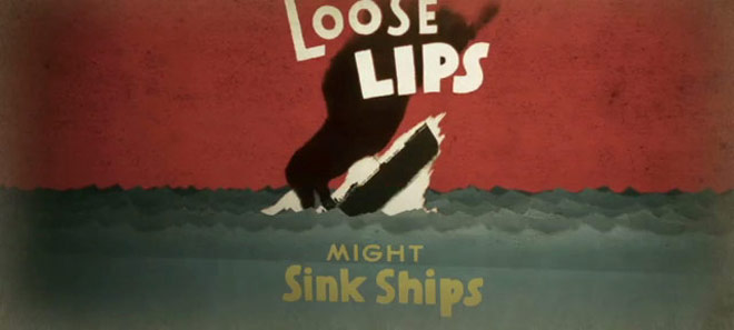
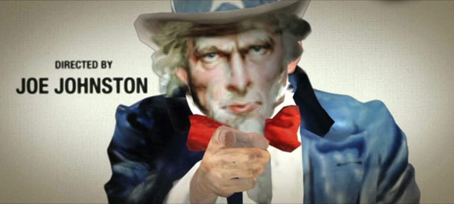
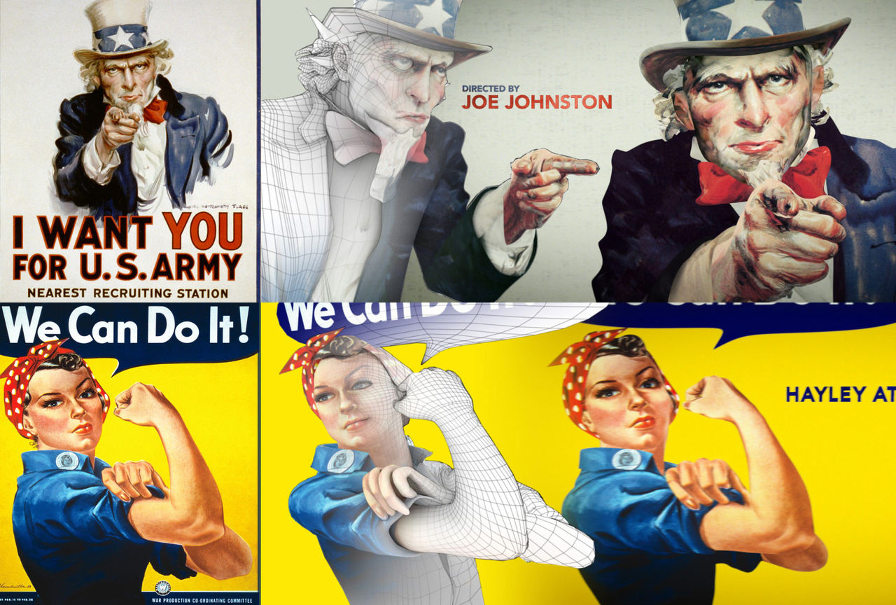
As James Montgomery Flagg’s iconic Uncle Sam orders viewers to join him on a final tour of American war propaganda, the line between two- and three-dimensional art is blurred. Painted images of smiling pin-up girls, parachutes, and fighter planes warp and shift, invigorated with a depth beyond their original form. Even ol’ Rosie the Riveter makes an appearance among the flags and artillery as the closing credits for Captain America: The First Avenger roll out.
A discussion with Creative Director STEVE VIOLA of Method Design (formerly Rok!t Studio.)
Give us a little background on Rok!t Studio.
SV: Rok!t was created in 2009 by Executive Producer David Garber and Joe Matza, President of Efilm/CIS, as a division of Deluxe Entertainment Group. The objective was to build a boutique design studio, creating motion graphics for main title sequences, trailer graphics, visual effects, and commercial and environmental graphics. In its two years of existence, Rok!t has designed and produced 16 main titles, graphics for three major studio marketing campaigns, graphics for over 20 commercial spots, a handful of TV show opens and a few production company logos.
How did the concept for the sequence evolve?
The original concept began about five to six months before we pitched to Marvel. Since Rok!t’s EP, David Garber, had worked with the director, Joe Johnston, on The Wolfman, we wanted to get an early start on conceptualizing the main titles for Captain America. While we were brainstorming, we talked about some of Joe’s previous films, namely The Rocketeer. The art deco look and feel of that film, mixed with the WWII theme, gave us a great launchpad for discussion.
I pitched the idea of doing something similar to the black and white Nazi propaganda film Joe had used in The Rocketeer but with an American theme. The idea was well-received, and we started coming up with different ways the propaganda art could be used in the film. Originally it started out as an opening sequence, and our Art Director Kaya Thomas was developing some cool ideas based on propaganda that involved seamless transitions in and out of footage and artwork.
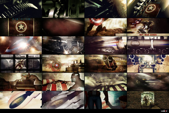
Kaya Thomas' original propaganda art pitch boards
In April, we were invited to pitch on the titles and we found out that it was going to be a self-contained main on end, rather than opening titles, so we needed to rework the idea to remove footage from the film. That’s when we decided to design original propaganda art based around Captain America, which we would build into environments and seamlessly string together. Kaya produced a set of beautiful concept boards that we were immediately confident would make a great presentation to Joe and Marvel.
They loved the concept, as well as the look, but slowly over several iterations of the designs, Joe started to push us towards using authentic, existing artwork rather than creating our own. These iconic posters tied better to Joe’s vision for the film, referencing the look and feel of the WWII era.
Director Joe Johnston began his career as a concept designer and art director. How involved in the sequence was he?
Joe was heavily involved in various aspects of the sequence. His most influential decisions were in the overall concept and the selection of the actual posters that would be used. He was more concerned with the facts, mood, and story of the piece rather than the technical execution. Once the concept changed from creating original propaganda art to existing period posters we had a great amount of autonomy in building and animating the sequence. It was a fantastic process, and an excellent relationship.
How was the order and selection of images decided upon? Did you know right away that you wanted certain recognizable images in the sequence?
The selection and order of posters was a great collaborative process we went through with Marvel and Joe. We started with some of Joe’s recommendations and assembled a collection of posters we felt were pretty iconic, clear in subject matter, and dynamic in composition. We then went back and forth multiple times with both teams adding and removing images. The Marvel team of Victoria Alonso, Kevin Feige, and Stephen Broussard were great to work with and extremely helpful.

Propaganda poster examples
Each time we had a new selection, I worked with our team on the order, which was based on subject matter, composition, and how we could creatively and dynamically transition from one to another. When the posters were set, Joe and Victoria made a few final revisions and we were ready to go.
Can you discuss the process of turning propaganda posters from WWII into dynamic three-dimensional objects for the sequence?
When the decision was made to use existing posters, we needed to figure out how to go about building the sequence. There were a lot of ideas from posters on a wall, to a 2.5D animation style similar to Thank You For Smoking. But in the end, I wanted to keep some of the original idea of turning the propaganda art into environments… especially when we knew it would ultimately end up in stereoscopic.
2D motion test
There are a few techniques out there for dimensionalizing 2D imagery, but we wanted to make this sequence more dynamic and bring the iconic works to life. Kaya and our designers worked with our 3D team to break down the posters into elements that could be mapped onto fully modeled geometry in Maya. We did three posters initially as a motion test. When we presented the animated 3D Uncle Sam and Handshake posters to Marvel, it was an easy sell.
3D motion test
Once we had approval to move forward, we had our work cut out for us. We needed to scan, roto, paint, lay out, model, map, clean up, animate, and composite 19 different posters for 29 titles in stereoscopic—and we had less than four weeks to do it!
What are the differences/challenges in producing the sequence in 3D vs 2D?
As with most stereoscopic work, you find yourself unable to use typical design and compositing tricks because the sequence needs to be seamless in depth as well as in motion. Thus, the transitions and camera animation really need to be carefully constructed to make the depth work correctly. In order to make the final stereoscopic delivery look identical to the 2D, we worked in a 3D/Stereoscopic workflow throughout the entire pipeline. Then to make the depth and transitions work as smoothly as possible, we broke the sequence into about four shorter sequences/shots that were then combined in compositing.

2D mapped image examples
How large was the team and how did it function?
The team was a moderate size during the bulk of production: about 12-13 people including production staff. We all had a great working relationship, a lot of which was spawned, I think, from the excitement everyone had for the project itself.
We set up a rough pipeline and broke the team into four parts: 2D design, 3D design, animation, compositing. Since the whole piece was rendered in the original artwork and utilized only camera animation, we didn’t need a 3D animation or lighting team. Instead we created a camera animation team with dedicated camera animators. The rest of the artists were doing all the painting, modeling, and texturizing.
Describe the technology (software and hardware) used.
We used Adobe Photoshop and Illustrator to paint the textures and typeset the titles. All the 3D work was done in Autodesk Maya. Most of the animated textures/elements were created in Adobe After Effects, and all the final 2D/3D compositing was done in Nuke.
Who inspired you on this project?
As a team we took a lot of inspiration from Joe himself. From a concept perspective, we tried to take inspiration from the WWII period and abstract/environment-based titles like the Bond title sequences and Thank You for Smoking.

Maya project setup
What do you have on the horizon?
We’re currently designing teaser trailers for a couple of major releases next summer, working on another main title sequence, creating an all CG stereo 60-second commercial and, one of our more unusual projects, the graphics and environmental design for a new game show.
LIKE THIS ARTICLE?


