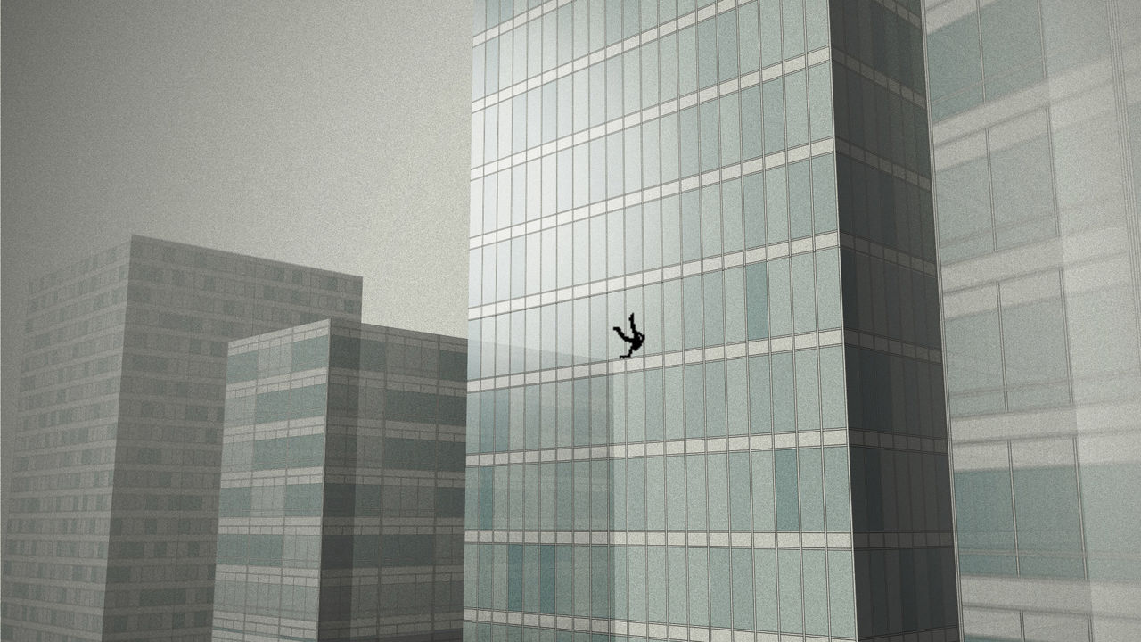
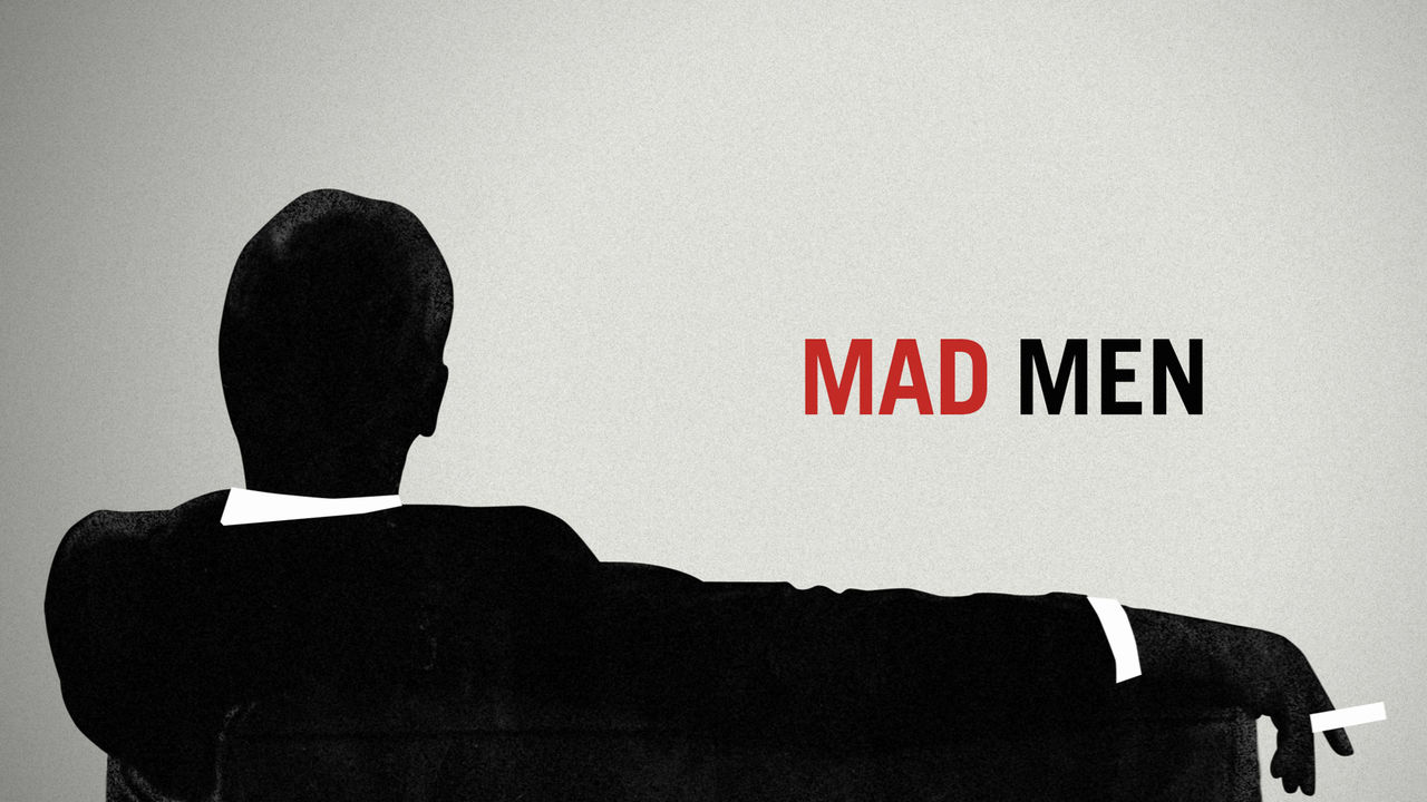
A shadowed figure enters his office, sets down his briefcase, and the room collapses around him. As he tumbles through a chasm of diamond rings, happy families, and women in pantyhose, the glossy veneer of advertising gives way, revealing the rough humanity of a man lost. RJD2’s jazzy “A Beautiful Mine” conducts the viewer through the parallel worlds of the philandering, chain-smoking Madison Avenue boys' club and the idyllic nuclear family, introducing us to some of the themes underpinning the Emmy award-winning show, Mad Men.
Primetime Emmy Award for Outstanding Main Title Design
A discussion with Producer CARA MCKENNEY, and Creative Directors STEVE FULLER and MARK GARDNER about the brainstorms and battles that went into this refined and cryptic opening title sequence, produced by Imaginary Forces.
Tell us about the initial development of this project.
CM: This was a new show, and a period drama at that, with no-name actors, on a network with no success in developing original content – wow, it’s so crazy to think that I am talking about AMC, right? But remember, this was in 2007! Mad Men wasn’t on billboards in Times Square and doing multi-million dollar cross-promotions with Banana Republic....
There were tons of red flags in terms of the first information I received about this project and I was wary until, of course, I saw the pilot and read up about Matthew Weiner. The show was gripping and emotional, complex and funny – it took my breath away. By the closing I knew there wasn’t a creative instinct in me that could have turned it down.
Matthew had a distinct point of view and came to us with a compelling brief: A man walks into an office building, enters his office, places his suitcase down and jumps out the window. But that never makes it simple to push through.
My two leads to work out the pitch were Mark Gardner and Steve Fuller, both creative directors. Mark and Steve have different sensibilities, but I knew they would both bring something meaningful. And they came back to me as amped about the pilot as I was. Then it was a matter of making it work with their schedules, working with them to strategize, to create an open dialogue between Matthew and them about the design.

Mad Men logo
SF: Mark and I had collaborated before on other projects and when we heard about the show – that it was being created by one of the head writers of The Sopranos – we were both really interested. During our first call with Matthew Weiner, Mark and I both felt like, “This guy really knows what he’s doing.”
MG: This was the script that got him hired on The Sopranos, so he’d been living this thing for years and years, before The Sopranos ever came around. He lived and breathed it. For him, those years around the end of the ’50s and the beginning of the ’60s were the most important in 20th century American history and that enthusiasm is infectious. We also saw the pilot. We see a lot of pilots and usually they’re pretty bad, but this is one of the few where we thought, “This is really good.”
SF: Yeah. Matthew said, “You know, it’s not just a show about advertising in the ’50s and ’60s, it’s about American life and culture.” He loved the idea of this main character selling the American Dream, but also being totally confused by it. He’s trying to find himself throughout the show – to define himself. Matthew wanted to touch on that and he wanted something that was going to catch people’s attention.
MG: He wanted the sequence to sum up the ideas of the show. We managed to find something that combined both, making it look cool and sophisticated while still showing that there are actually two stories: the one that you see, but also the real story that you only get glimpses of.
SF: Yeah, one thing that Matthew said kept echoing in my head. He said, “This is an era of guys wanting to be the head of the PTA but also drink, smoke, and get laid as much as possible.” That was the kind of dual life these guys were leading and that’s what was interesting.

Initial Fuller concept
How did it progress after that?
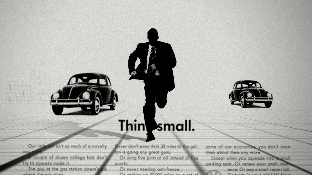
MG: There were a few people here at Imaginary Forces that had already worked on it, each with different directions, but Steve really started getting the look down. The first few frames of a semi-silhouetted guy running and being chased – those were frames that Steve was playing with and they had a great look to them. They had pared-down color so that it was almost a monochrome world...
SF: I was hovering around these ideas and I saw this nice, precise calendar in one of my books with a horse jumping over numbers, and it had this great 3D thing and that led me to the idea of skyscrapers made out of graph paper. I was also thinking that the character could be trapped in the ads, being chased by a small VW Beetle for example, but I couldn't figure out how to bring it all together.

VW Beetle chase
Then, I had to go to the hospital because my son was being born! While my wife was in labor, I was talking to Mark and Cara about this idea. Mark took that initial mood and some of the ideas and simplified it to have it all happen in one fall... a fall through a skyscraper canyon... that was when it all started making sense.
MG: Yeah, AMC had all kinds of issues with having someone falling from a skyscraper. I have seen some blog posts written about this, arguing whether or not it’s exploitative for the show to use a figure falling. Some people saw references to 9/11 and all of that, and in the beginning AMC were totally against the idea. So Matthew had to do a lot of selling to them. I think where we got away with it was because we ended up with a question that is, “Is this a dream? Which part of it is actually real? Is the pose at the end real, or is the helpless fall real?”
SF: Yeah, Mark put in the moment at the end when the “falling guy” snaps out of it and is totally composed. That made it all come together so that we could get away with having a guy falling out of a skyscraper.
Also, there were issues with the cigarette being in the shot. The characters smoke throughout the whole first show and the first conversation that Don Draper has is about cigarettes. I think Apple and iTunes took the cigarette out or something.
MG: Yeah, they took it out for the first season, but then I think it came back. It was interesting.

Storyboard
Where did everything go after the boards?
SF: After we were awarded the job, we started gathering our favorite scenes from films of guys falling past skyscrapers... so many movies climaxed with a guy falling. We wanted it to be the way a real DP would shoot it for a film. We wanted the fall not to have the continuous CGI camera move that you often see nowadays, so we decided to put cameras – all different kinds of cameras – on the surrounding buildings... just like if we were to really shoot it. We’ve got super wide shots, medium shots, and telephoto lens shots. That made it more sophisticated.
MG: Yeah, the camera hardly moves which is not what usually happens when you have something entirely built in CG. Like Steve said, normally people think, “We can do anything with the camera” and so they do... but it’s not always best.
Wireframe skyscrapers
SF: If you’re going to do something with illustration and a black silhouetted figure, you need to counteract that in order to keep it looking like a cartoon. We’ve seen stuff go badly because people misuse the camera in 3D. I’m a huge Saul Bass fan, but Matthew Weiner said, “I don’t want it to look like the ’60s.” I like to think that it’s kind of an update of Saul Bass.
The styling, the production design of the show... it works on its own. The graph paper skyscraper idea, and the ’60s architecture inside the agency, it all feels very geometric... very right angle. The skyscrapers were ultimately done in After Effects 3D. The falling guy was done using Softimage, but I think everything else is After Effects.

Mad Men – The Fall
CM: A key part of this was the animatic – it was the step where we realized that the pacing and the tone were working with the shots Mark and Steve wanted to use. We decided we wanted Caleb Woods to work with us on getting the timing – he is really talented, with a great ear and a pared down sensibility – I knew he would get the tone and he was an asset to this part of the process.
One of my favorite moments was pretty far down the road when we had a solid animatic and the iconic RJD2 song that Matthew had chosen. Mark and I were on the phone with Matthew getting notes from the network. We played the sequence and there was a bit of silence and then came a comment from the network conference room far, far away saying, “I don’t know Matthew, this whole thing is kinda off – it’s weird. It reminds me of the opening to The Twilight Zone.” It was priceless! One of those instances where things become totally clear – to us, this comment, though negative, was actually a positive. The title sequence had created a tone that was unique, enigmatic and maybe a touch peculiar. To someone else, it was just weird and creepy – something that made them uncomfortable. Needless to say, we moved forward.
The adverts that we see in the finished opening, did you consider fabricating them completely or had you always wanted them to be real ads from that time period?
MG: We wanted to use real ads, but we assumed that we couldn’t, so we did start fabricating some. That was really, really hard (particularly when you've got to fabricate ads with images that you have licensed).
CM: We had to be building these ads at the same time as we were developing the landscape since the geometry the guys were putting in place was very specific – the only way you could tell if an image was going to work was to try it out in the environment. Building these proved really challenging – it was very time-consuming and tricky to build ads that looked genuine to that time period. We had to be resourceful by both working directly with the show and sourcing family photographs.

Ad examples
MG: We wanted them to be those gray, early ’60s photographs that almost looked like illustrations. It saved us in the end when they were able to do some deals and get rights to the ads.
CM: Once we got our hands on images I got them to the design team who would work with them and the geometry we had going for the buildings – it was important to get them as many options as possible. Mark and Steve are incredible designers—they could have made that environment look beautiful with very few images—but what they managed to do was create a space that was both visually beautiful and thematically meaningful for the show. My role was to supply them with the ammunition and freedom to do so.
MG: We had some great ones in there that we had to get rid of too, which was heartbreaking. We had a Sophia Loren image, where our guy was literally falling through her cleavage, and it was just brilliant. Sophia Loren’s agent said that there was “absolutely no way that we could have that in a TV title sequence."
What was your time-frame for this?
MG: We were on it for quite a while and we had a lot of people working with us. We had a couple of people purely working on the falling figure. Then we had three people working on the rest of the environment. The music changed and then Matthew found this track that he really liked, so that changed things as well. I can’t remember exactly how long the project was, but I get the feeling it was a couple of months of work.
CM: We had about four months from pitch to delivery.

Office comparison
When did the idea of the office falling apart come in?
MG: It was something that Matthew wanted. In the original storyboards, we start on the guy’s back as he falls away from the camera. The fall went all the way through until the very end. For a while, I was really pushing to keep that. I wanted it to be purely about the fall... so you don’t know where it begins and where it ends. It took me a while to come around. Obviously, we didn’t have any choice because Matthew didn’t want that and he was the client.
He wanted to have some sense of the office, but he didn’t really know what he wanted so we had to come up with the idea where the guy puts his briefcase down. We needed a trigger. In some ways, that was the toughest bit of the whole project. “How do you make the office fall apart? Do you really feel like it’s falling apart?” There’s no ground plane or sky... The room is just defined by a few lines. Getting it so that you really knew what was going on and felt a sense of the guy and his room crumbling around him.... that was the most complicated bit of the process to get right.

Logo explorations
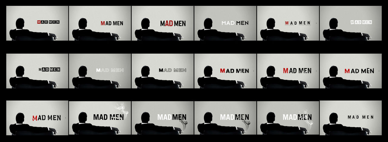
Another thing that was a very practical problem was that AMC had done this deal where everyone in the show got a name card, which is unusual. It was a real issue trying to fit them all into the amount of time because, at one point, the title sequence was going to be a minute long. AMC was like, “There’s no way... it’s going to be 20 seconds.” We felt like it couldn't be done in less than thirty. In the end, it was maybe thirty-eight or forty seconds, but even then if you watch it, the title cards are on for barely long enough to be legible and then on top of that, they had to be placed so they weren't being affected by camera movement. There are all kinds of rules about how long credits should be on, and how they all have to be equal in size and everything, but when Saul Bass was doing titles, he'd put the whole list up! Another part of the titles was the typeface and I think what we went with was probably the first typeface that I was playing with.
It was, and they made us do a lot of changes to try a lot of different things. In the end, they just came back to the one that Steve had done first, which was better than everything else.
SF: Yeah, we messed around with some sort of art deco styles at one point.
MG: ...and they looked terrible! Some of them were just awful. I mean some were not too bad, but most of them were awful. I just couldn't imagine them in there now.

Logo explorations
When did it start to solidify in terms of the final piece?
MG: Pretty quickly. Matthew was very hands-on. He is very visually literate and he understands it all which is crazy considering that he's a writer. Virtually all of his comments and suggestions were good. We talked him out of a couple of things, but there were other things that he wouldn't budge on.
One thing that became a big deal was animating the falling guy and how much he moved. At one point we had somebody rigging just the clothing alone. The animation was very realistic, as if someone really was flying past skyscrapers with his clothing billowing. We initially thought that was what we wanted. We even had his hair moving and we had to take all that out – it was too much. It just wasn't working with the background and it needed to feel dreamier. It needed to feel surreal... much more dreamlike.
That seems to tie in more with some of the earlier treatments where you have VW Beetles chasing the guy, and in the completion of the fall where he actually hits the ground and shatters.
SF: That’s me starting, but not reining in an idea. I was going everywhere with it: “Is he running? Is he falling? Is he going through these ads somehow?” I had a vision in my head but sometimes you don't have all the puzzle pieces in the right place yet. The fact that my wife was about to give birth was also a bit of a distraction!

Fuller initial concepts
The initial boards are kind of stream of consciousness... just throwing things down, establishing a look and style because I didn't really have the idea formed yet. We needed to get going, so sometimes when forming ideas you go wide, then edit and narrow down. Normally we have tons of sketches, but on this project it came together pretty cleanly and once it went into production it stayed true to our boards. The experience goes such a long way.
Are jobs usually started by one person and then continued by another?
CM: No, it was an unusual situation and one that ended up working out really well. It is not ideal to have a project started by one creative lead and then continued and finished by another, for many, many reasons. My concern was that the creative dialogue we had established with Matthew from the beginning be uninterrupted and that nobody lose confidence in the process. I was happy to be a consistent reference point and to ensure that the transition went as smoothly as possible. I like to be both Joan and Peggy.
SF: Yeah, this was just a case of me having to run to the hospital right when I was starting. I was on other jobs, but I also oversaw Mad Men. This is common in any design company. I do think that ideas get better when they have two brains and with Mark and I, we've become friends. It's nice working like that because when you get stuck, the other person can help you.

Gardner alternate storyboard
MG: Particularly when it comes to ideas. it gets better when you have to argue it and defend it. Style can be an individual thing and sometimes it's better when it's one person's vision, but I definitely think for working on concepts and ideas, collaboration is better.
It works with us because we're friends and respect each other's work. You've got to respect the opinion of the person who's critiquing your work otherwise there's nothing there. The simpler and the purer the concept, the better... but it doesn't usually start out like that. It gets there by talking about it and rationalizing it and getting rid of the bits that aren't necessary and don't work, and then you’re left with the core concepts.
SF: I think overall the reason that people really responded to the sequence was that it's ballsy to just have a guy falling. It's ballsy of Matthew Weiner to even accept that approach and it's ballsy for us to take him seriously.

End frame title card
MG: It's a sign of somebody who has a huge amount of drive and belief in his own opinion. There are so many things in that show that are only there because of him, and everyone who works on the show that we've met says that it’s all his vision and he had to fight battles on the title sequence with AMC and Lionsgate. I'm sure that he battled every day until that show became what it is now. I don't think a sequence like this would have happened if we'd been dealing with marketing people (which we all too often are). Not dealing with the creators and writers leads to everything getting washed out and watered down. These opportunities don’t come along very often.
CM: And one of the great things AMC did was let us create the network packaging for the show. I’m not sure if this was out of necessity as at that point their in-house design resources were most likely not as robust as they are now. This is always something I have to sniff out and try to push through – it helps create a strong brand for the show and assures that the graphic language is pushed through to other platforms – that it’s not interpreted and watered down. It was fun to take what we established in the title to a graphic framework for on-air promotions and packaging. It’s less and less common that title design work can be parlayed into network branding, but this was an example of how that was hugely successful and helped make the show so iconic. It’s nice to see the title work live on in other mediums.
SF: And a lot of other companies had the opportunity to pitch on the sequence – the kind of companies that do a lot of this work – but they all passed on the job because it was for a pilot and a lot of people thought it wasn’t going to be successful at all. Now it’s a cult thing.

Steve Fuller, director; Cara McKenney, producer; and Mark Gardner, director.
LIKE THIS ARTICLE?


