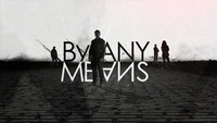
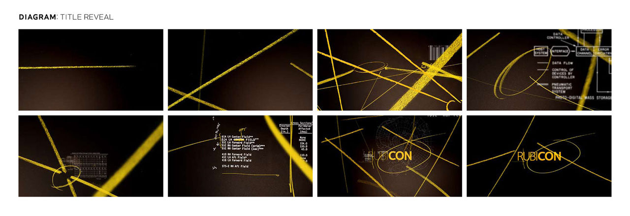
An unseen agent trails the truth, circling mysteries and raising questions with every paranoid swipe of the highlighter. Newspapers, bar codes, maps, documents, and photos – otherwise mundane minutiae is checked and rechecked for evidence, a pattern of some kind, or perhaps nothing at all. Every whir and click of the microfilm reader widens the web, as the line between conspiracy theorist and intelligence analyst is blurred in Imaginary Forces’ title sequence for AMC’s Rubicon.
A discussion with Creative Director KARIN FONG at Imaginary Forces.
How did you begin this project?
KF: The initial meeting was in Los Angeles with Rubicon’s EPs, Henry Bromell and Jason Horwitch. Then when they actually shot it, they finished shooting in New York. After the initial meeting, I met mostly with Henry. I'd go visit him in his office when they set up shop here, and then later we would meet at AMC.
From the very beginning, there was the idea of this government, this agency basically, and a main character whose life revolves around pattern recognition. In the pilot, he finds a clue in a crossword puzzle and it becomes very indicative to him of a wider theme. So, one could imagine that people all throughout our environment are embedding messages or signs in want ads or something which would seem mundane to the rest of us – like hiding in plain sight. The idea that if you could just recognize the right pattern you would see signs of a secret organization.
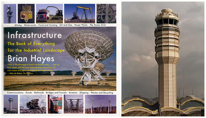
Infrastructure by Brian Hayes
At the first meeting, they showed me a reference book called Infrastructure by Brian Hayes. It was a beautiful book of photographs of everything from crop circles and agricultural testing to the dam across the Sacramento River. Jason talked about planting the idea that a secret society or oligarchy controlled the world through infrastructures like power, transport, and communications. He liked doing something with these documentary style images.
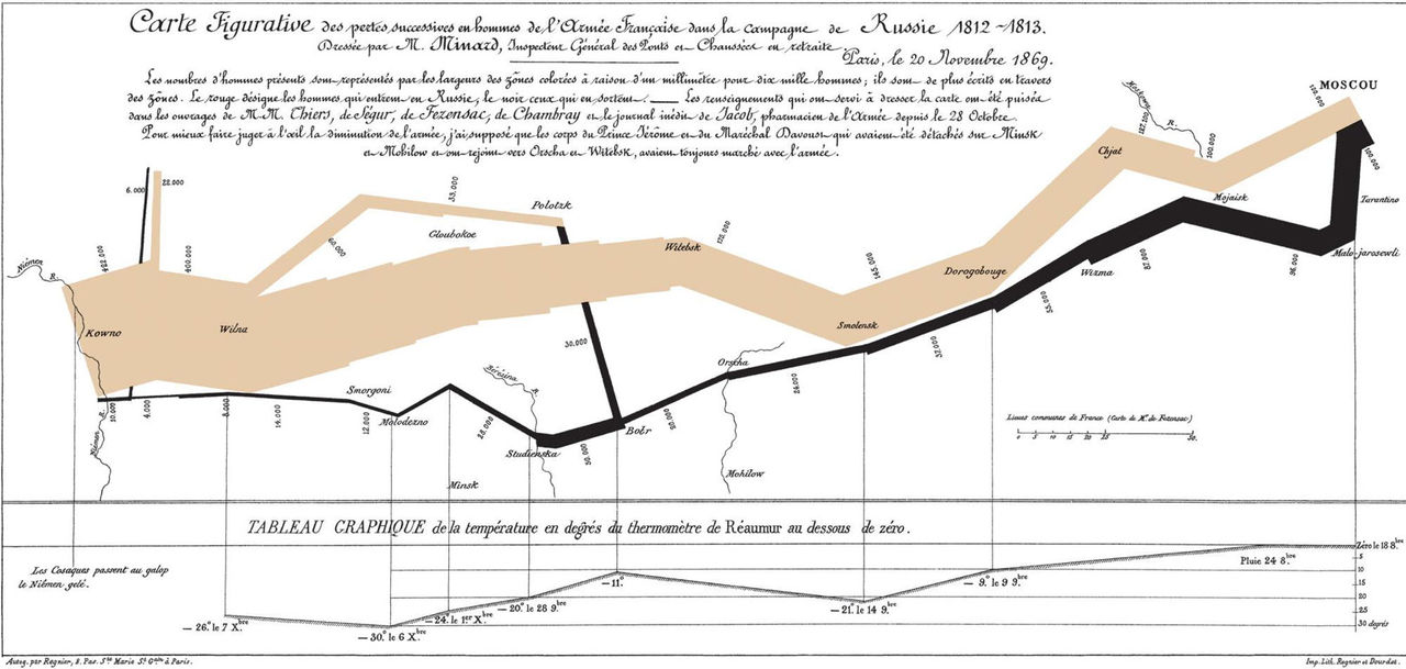
Though it takes place in the present day, there are several sequences in the pilot where the characters post up handwritten notes. You get the sense of being surrounded by bits of paper on bulletin boards or stuffed into manila folders. The main character even has a famous infographic by Charles Joseph Minard in his office that shows how Napoleon attacked Russia. In his book Envisioning Information, the famous statistician Edward Tufte called this 'the best statistical graphic ever drawn'. Being in the character’s head in that way and entering the story through the physicality of information became a central aesthetic. The idea that things are physically moved around into diagrams was immediate. In the first boards you can see there's always an idea of microfiche or slides – something that would speak to keeping files or looking at things in a very analog way.

Napoleon's attack on Russia infographic by Charles Joseph Minard
Talk about the first exploration of ideas for the titles.
The series has the flavor of those ‘60s and ‘70s psycho dramas like The Manchurian Candidate or The Parallax View, so that was very influential in the tone and atmosphere of the show. Immediately after meeting with the creator and show runner, I went to look at the brainwashing part ofThe Parallax View which allows your mind to make all these associations... it’s basically different clips of provocative scenes and then provocative words.
At one point I thought it would even be fun to take off from that and do an homage where we have words like “God,” “money,” “state,” and then “Miranda Richardson” – using the credits as subliminal information. Then, we’d cycle that and have some more images and have an image of a nuclear power plant and then display, “power,” “conspiracy,” “Jessica Collins” in some sort of way – like you’re being brainwashed with the names. Of course, the function of that sequence in The Parallax View is much, much different than this one – it was actually some kind of psychological test – but just using that kind of language hearkened to the thriller sensibility we were aiming for.
The Parallax View - testing room scene
What’s really important in a sequence like this is that the audience think they see connections, but also question if they’re really there. You want things to be juxtaposed in such a way that the audience is led into seeing things even though it’s not quite clear what is being suggested. We wanted to create a general feeling of unease and anxiety.
In the first pass, we explored ideas of “man against the system” because this really becomes the story of a man who gets wind of something big. But we didn’t want to do a montage of conspiracies, that’s for sure! We were very careful not to do things like the lunar landing or a 20th Century history montage of conspiracy theories. The creators wanted to reference the struggle between the individual and the institutional. Even a subliminal glimpse of Tiananmen Square was something that we played with. However, as the show evolved, we moved away from that theme as those things became less of a focus for the show.
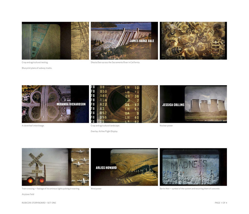
Storyboards, Set One
Talk about the three different storyboard sets you produced in the first process treatment – one is more photography-based and then there are the second and third sets which are more diagram-based.
With the first set, we liked the feeling we got with a lot of Taryn Simon's books. She does a lot of “back office” sort of photography. For instance, she photographs things that get confiscated at the airport or a vial of live HIV or a Playboy for the blind... an interesting response to the idea of infrastructure. She gets the feeling of something that's mundane, but with just a little twist it becomes a bit sinister or curious. That is an emotion that she captures very well. We looked at a lot of her photography.
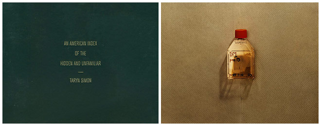
Taryn Simon - An American Index of the Hidden and Unfamiliar
With the second set, we’re taking off a little bit from Napoleon's map, but also from information mapping and pattern recognition. We asked, ‘How do you graph things in a way that isn’t visible in one visualization, but then if you tweak it and look at it in a different way, an answer becomes obvious?’ There's a famous analysis from Edward Tufte’s book, Visual Explanations, where he posits that if you had only diagrammed what went on with the space shuttle, specifically O-ring damage, you could have figured out when it would blow up. So with this board, we worked in a lot of diagrammatic things and played upon the idea of overlaying microfiche, layers of information, using transparency – still going with a very analog feel.
Do you have a given number of concepts that you will present to a client?
It’s a job-by-job basis. There are times when I come in with only one idea because I'm so sure [laughs] and sometimes that works and sometimes it doesn't... It's kind of a gut thing. There are times when I've had access to more material, like the opportunity to shoot, so that might suggest more ideas. It's also a function of time and budget.
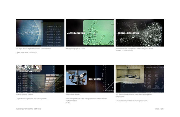
Storyboards, Set Two
There's a definite value to editing, and I think when I first started designing, I'd have more instances of boards that could probably have been combined. There is some editing that goes on to make sure that each idea can stand on its own or be interesting in its own way. You have to have a point of view.
Sometimes a client requests something specific because they're dead-set on it. Other times it’s up in the air and they don't know... maybe they even have a place in the script where they've outlined what the titles are, so your exploration is more limited.
That’s not necessarily a bad thing – sometimes the best ideas come with some constraints!
How long did it take you to do the first set of February process boards?
I believe it took us around two weeks. With the nature of this project, the photography and diagrams lend themselves very well to a Photoshop frame. But there’s a little bit of danger in doing photorealistic boards. There is something so seductive about images in that people immediately grab onto them as finished pieces. It's hard to remember that sometimes these things are just sketches, so when you do a detailed board, it's good if you really believe in the aesthetic it's representing.
How did you put the process boards together?
At first, Joey Salim and I did a lot of photo research, looking for the types of images we’d be using. We used this time to develop the mood and the style, avoiding a hi-tech language in favor of a more tactile approach.

Storyboards, Set Three
After presenting to Henry and AMC, it became apparent that we had to inject a more emotional quality into the sequence. While Henry really responded to the stark black and white boards, they needed something that tapped into fear. Something that would make the viewer link the data with disasters or a sense of doom. There was a concern that the current feel was a bit brainy, too cerebral.
So for the next round, I worked with Jeremy Cox and Theo Daley to develop a more visceral approach, starting with words and visuals that might suggest a conspiracy plot more directly. By now we were deliberately pushing the incarnation into a much more graphic form – bar codes, want ads – still thinking about encoding messages. The drained color was about making it more minimal and that ended up being the one that he responded to the best. I also think that writing, even if it's just doing it for yourself, helps make the narrative more clear.
What surprised me when looking at your treatments was the amount of written material versus the storyboard imagery. Do you find that you’re always writing and having to explain the concept?
Good writing can make a treatment come alive. It frees you up to conjure up all kinds of ideas, not just ones that are limited to the visuals you can produce at that moment.
I love doing storyboards along with the writing too. I think this is one of the most fun parts of the process – it’s a blank slate. This is the closest you can come to just thinking of concept, thinking of metaphor, thinking of the best way to distill a story. A designer likes to think conceptually and that’s a really fun part of the job.

Storyboard written example
So it's for both you and the client?
Yeah. Doing boards for a client is obviously a useful tool to show a filmmaker the aesthetic of the finished piece, to show the work in stages. You want to get everybody behind it and you want to be able to sell the idea, so the storyboards are immensely valuable. But it's not only for the client, it is part of the job – to work out ideas, like your sketchpad where you can play around and see if things work visually before you commit to them through shooting or animating (both of which are terribly time-consuming and expensive processes). Even if you don't end up showing them to your client, it's a great tool for yourself or to share with a team or an editor or anybody you’re shooting with. It's just a great creative tool.
When you meet with a client, how many people normally attend?
For the initial meeting, I’ll usually attend with a producer and we’ll get the creative brief. For television, this is usually a meeting with the creator / show runner and often executive producers. On a film, the meeting is with the director who might have the editor there as well. Sometimes there’s also key producers or the post production supervisor... that group varies. As we progress, different people get involved… there are times when it’s necessary to meet with the VFX supervisor, or have our editor talk to the film’s editor, or have a conversation with the composer.
With your next set of treatments, “Redacted” and “Diagram,” we’re starting to get closer to what is seen in the final sequence.
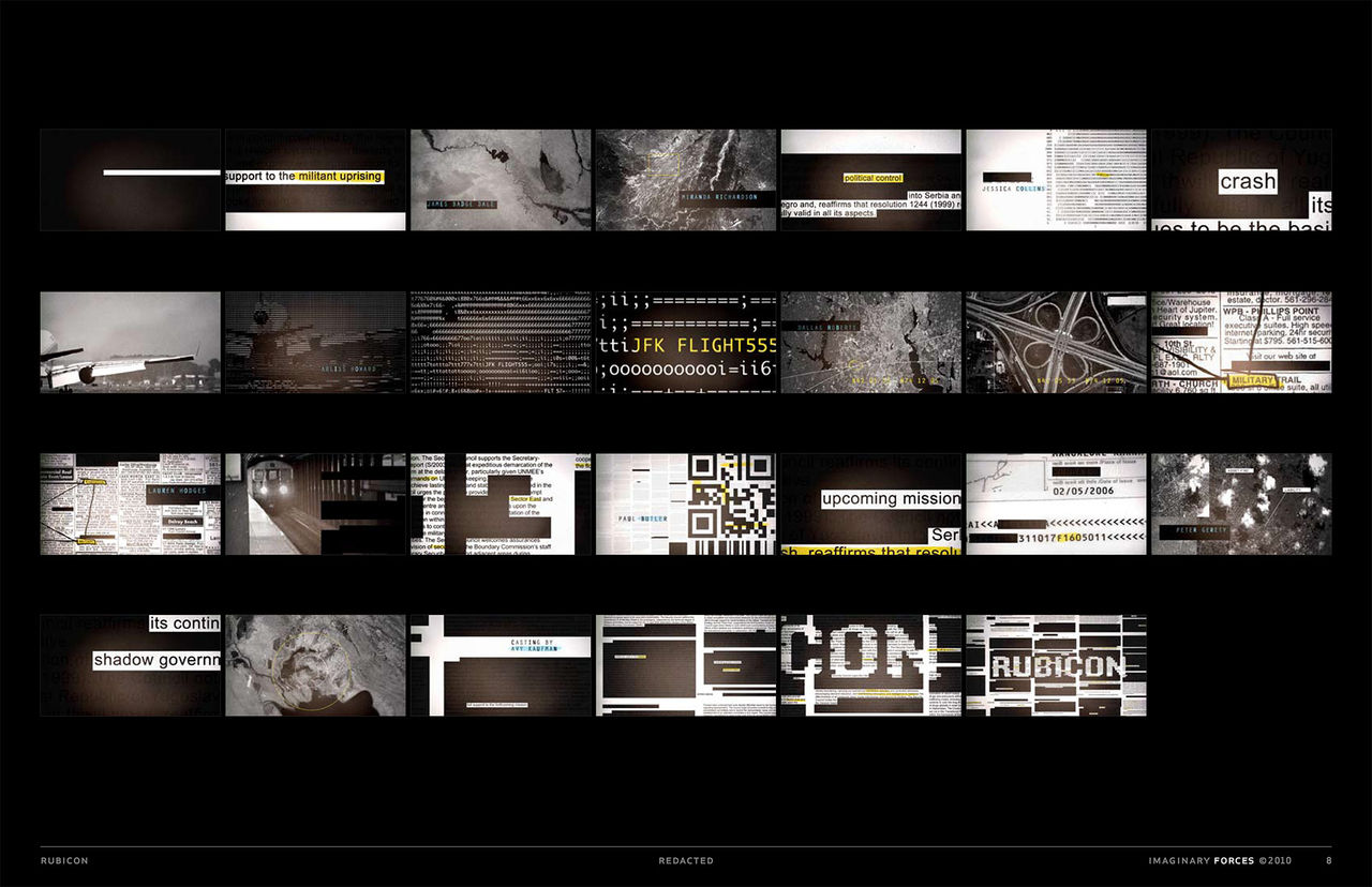
For the next round, I worked with Jeremy Cox and Theo Daley to develop a more visceral approach, starting with words and visuals that might suggest a conspiracy plot more directly. We came back with two revised versions, and one is about redacted text. An artist whose work I’ve always liked is Jenny Holzer and I remember seeing something like a bunch of big, redacted government document silkscreens that she did at The Whitney. The language and the rhythm of it made me think, ‘Let’s use that language to make the audience wonder what’s being hidden.’ I wanted to harness that feeling of paranoia and anxiety induced by messages that can’t be decoded.
ASCII video tests
Jeremy worked up some graphic frames that really plays with little snippets of suggestive text. At the same time, he worked up some short animation tests that showed how ASCII code could suggest footage as we were thinking of ways of moving back and forth between text and specific images. It ended up being more of an experiment – I’m not sure we even presented these – but there are bits of this movement sprinkled in the final piece.
Henry really liked the monochrome palette that we’d done on the earlier boards. At the same time, AMC was working on a gold, black, and white scheme for a signature look for Rubicon, for some things in the marketing department. I picked up on that because I wanted to keep the palette really limited. They wanted us to develop the feeling of something not too retro, not too mathematical or too clinical. Paranoia is a real human feeling and it had to be accessible.

Storyboards, Set Four 'Redacted'
The solution was using a hand-drawn line, so you could see a mind at work. The fact that it was hand-drawn was in contrast to all the infographics and data. And this line would be a jolt of yellow, the only color. I worked with Theo on these boards and we started playing more with the idea of hiding messages. So you’ve got the Yorkie puppies with “York” circled and then it goes to JFK and here we took some things from the show and embedded them. Also the line is a great device because it gives the animation a dynamic element to follow as it frenetically draws and makes connections.
In talking with Henry about these concepts, he said, ‘Oh, I think I’m leaning toward the redacted one.’ But by the next day, we met with AMC and he was pushing the one with the line. Henry really went to bat for this idea. There were conversations where people would say, 'You should show the lead actors’ faces,’ or ‘You should edit in a plane crash,' but he and I were always on the same page. Sometimes the show creator or director has to be really firm about their point of view. And sometimes somebody really has to go to bat for your ideas. I think everybody felt viewers would relate to the line and understand it. It transformed the disconnected visuals into following a character’s increasingly frenetic thoughts.
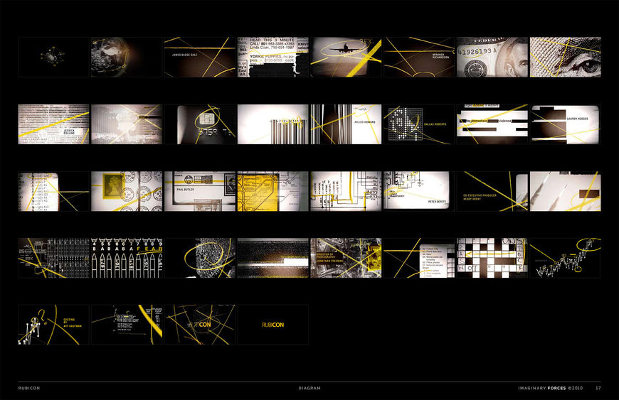
Storyboards, Set Five 'Diagram' full board and selects
The second set of treatments is from April. What happened with the production between the first boards in February and this one?
Well, film-making is an organic process. It’s worth noting to the general public that most films don’t shoot in order, chronologically. Editorial puts the narrative together and it’s always sort of wet clay. Same with a television series. Plots and characters evolve. In this instance, they were probably continuing to shoot and I think they were getting more network notes for the pilot. When the new version was ready to go, the title idea switched a little in focus. Originally, it was the infrastructure and the idea of man versus institution, but later it was much more about finding messages and instilling a sense of paranoia.
Talk about the animatics.
We did animatics to explore different things along the way. These are like motion sketches – they play with audio and pacing. Editor Adam Spreng strung together our first set of stills to music and sound effects as we were developing the initial round of boards. These tests were never supposed to represent the sequence in its entirety but were just to give a taste of how these bordered “slides” could transition from one to another.
'Transition' internal test reference animatic
Then we worked on one based on the subliminal credit idea.
'Subliminal Credit' internal test reference animatic
Later on, once we have an approved storyboard, we create an animatic to time out each scene and credit, so that we can make decisions about how the sequence starts, builds, and resolves. This becomes the road map for the animators.
So in April you came back with revised concepts. What happened from then until your final output?
When I presented in April it was to Henry and also to AMC. They were excited with the new ‘line’ approach. It was much more human, which was one of their concerns, and they were excited by the possibility of being able to include a lot of the themes like the money, the plane crash, the institution bar codes and crossword puzzles and so forth, all in one board. Internally we also decided that we could incorporate some of the ideas from the redacted frames since they would fit right in.
So that's when we headed into production. It was very quick for this – it might have been three or four weeks. And maybe it took about a week for them to get back to us, though at the meeting I sensed right away that this line idea was going to go through.
'Diagram' Animatic from Storyboard, Set Five
Then, I worked with editor Jordan Podos to pace the storyboard frames out. We picked some temporary music so we could get a rhythm going. Ultimately, the show’s composer made us custom music but just to get started we picked a track and used it to start cutting and lining up frames, figuring out how long each name is on-screen and the sequence of items. With the edit as a blueprint, we worked with animator JJ Johnstone to figure out how the line moved us through the sequence. We also had interns recreating some of the art and scans from books. Plus, we re-did a lot of original art and bought some stock images.
And what tools did you use to put it together?
For most projects Adobe Photoshop is immensely important. We used After Effects for the animation and compositing, Final Cut Pro for the edits, and Adobe Illustrator for the diagrams and typography.
Do you find that you get more satisfaction working on television or film titles?
The satisfaction actually depends more on the challenge itself and the collaboration with the client than the medium, though it is always a thrill to see the film work projected in a big theater. It's so immersive. But I love television because you have to work with themes that have to live beyond just one point in the narrative – the show would hopefully last for years or dozens of episodes. Those credits have to have a life of their own where they make sense and are broad enough to encompass the whole potential time span.
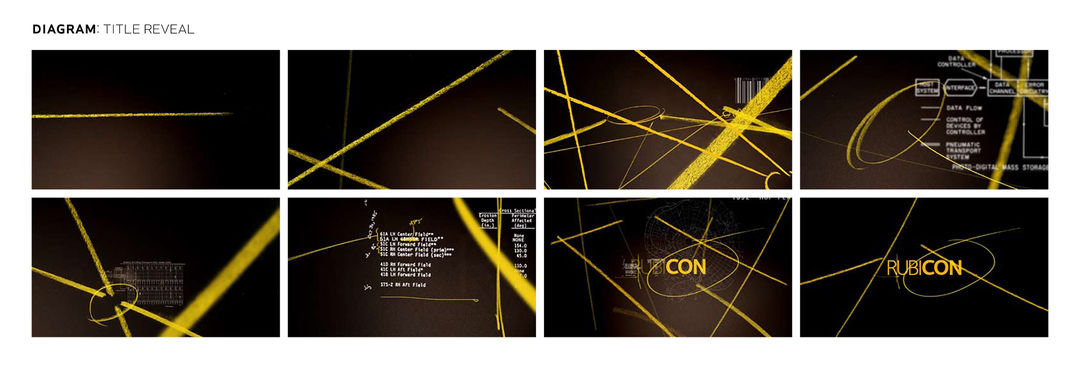
Storyboards, Set Five 'Diagram' Title Reveal
How often do you feel that creative decisions are out of your hands?
I'd say most of the time there is a good collaboration with the director or the show creator, which is a fortunate thing, or I'd probably go crazy! And ultimately the client has to be happy with the sequence. But to be honest, so much of how the final cut plays out depends on a level of trust between the filmmakers and the studio, which as the title designer, I have little influence over. I just have to concentrate on making something that both the director or show creator and I feel is right, and know that as it goes through the twists and turns of the process – the screenings, the notes, the re-shoots – that it may change.
It seems like you've been lucky in terms of the people you've worked with.
Oh yeah, I think I've been lucky in general. The people that work with us do come from a certain level and expectation of title design, so we aren’t boxed into doing one particular thing. For example, I did some really subtle titles for Alan Coulter last year for Remember Me. I think people who seek out this process and want to work this way are up for the ride.
They recognize that design is an important part of what they are trying to create as a television show or as a film.
Yeah, it's a very conscious decision to do a title sequence. What I don't like to see is television shows that have just the five-second card or titles that feel like a missed opportunity to create a distinctive opening. There are some filmmakers and show runners that want to just get right into the show. They don't want fanfare. To them, I say a designed main title doesn't have to be loud or take away from your show! In fact a good one will extend its emotional power – become that bridge between the viewer and your created world. That passageway from everyday life into the unreality of a film – the title sequence – can help create that. It can be subtle and elegant or it can be something that's a real statement. But personally I don't like it when they just skip over that whole idea in the first place. Every show does have a title and credits, so why not use them in service of the story?
Rubicon - final sequence

