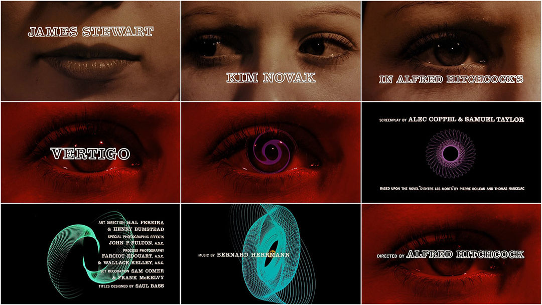
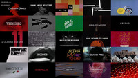
There is a threshold in art and design where a work can become so iconic as to transcend its own scope and become a symbol for its medium. Consider Warhol’s soup cans or Mondrian’s color fields, or – to bring it closer to home – Saul Bass’ iconic AT&T or United Airlines logos. And just as it would be difficult to find an American unfamiliar with these works, so too would it be difficult to find a moviegoer unfamiliar with the title sequence to Vertigo. Credit Bernard Herrmann’s haunting score or Bass’ odd synthesis of sensual Kim Novak closeups and spirographic imagery, but it’s likely an alchemy of the three that makes the Vertigo titles an enduring classic.
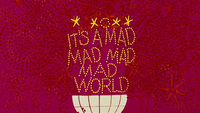
The spirographic images (called Lissajous waves, technically) were contributed by artist John Whitney, a pioneer of computer arts and a long-time animator at UPA, a commercial animation studio well-known for their modern aesthetic and experimental techniques. (In fact, Bass would again use a UPA alum, Bill Melendez – best known as the Peanuts sole animator – three years later in his sequence for It’s a Mad, Mad, Mad, Mad World.)
While seemingly unrelated to the story and perhaps even too modern for their own good, Whitney’s contributions to Vertigo were validated by Bass’ graphic direction and Hermann’s score, folding his designs into their tried-and-true audio-visual template. The resulting sequence is a landmark work both for Bass and the title industry, framing the film’s premise through evocative-yet-unlikely imagery and Hitchcock’s unique branding eye.
Title Designer: Saul Bass
Discover more Saul Bass
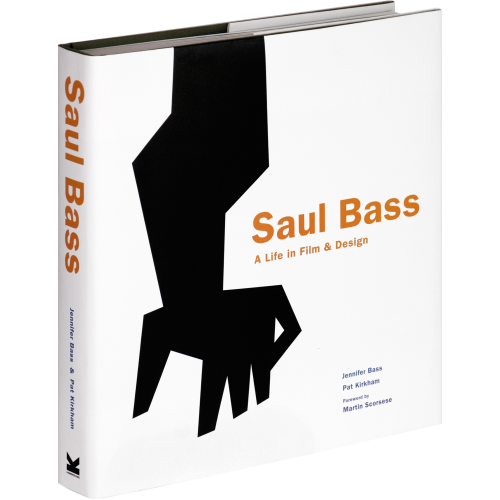
SAUL BASS: A LIFE IN FILM AND DESIGN
By Jennifer Bass and Pat Kirkham

