When Pablo Ferro was a boy in Cuba, his grandfather gave him advice on how to avoid getting stung by a scorpion. Since then, his life and career have been in constant motion. The ambitious young man who started out by drawing lewd comics for Stan Lee in the late 1950s and became the “darling of Madison Avenue” by the mid-60s would go on to create some of the most innovative and important film title designs and commercial work of the last 60 years.
Over the course of his career, Pablo developed great friendships with Hollywood directors like Stanley Kubrick, Hal Ashby, and Jonathan Demme, actor Steve McQueen, musician Harry Nilsson, and calligrapher Harold Adler. He would migrate from Cuba to New York, to London, back to New York, and finally settle in Los Angeles, the beating heart of the American movie machine.
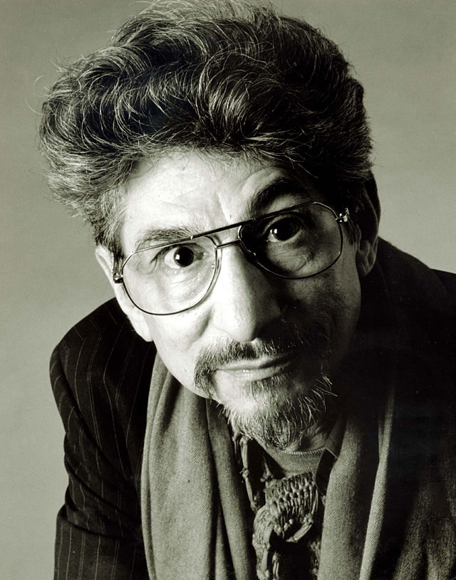
Pablo Ferro
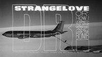
For Kubrick, he designed the opening titles to the masterful Cold War comedy Dr. Strangelove and the hypnotic trailer for A Clockwork Orange. His hand-drawn typography for the former quickly became his calling card, an iconic and much sought-after aesthetic in both film and graphic design. Likewise, the quick-cut trailer for A Clockwork Orange remains exceptional to this day – spellbinding and forceful in its technique, compelling in its intensity. Few pieces of film since have managed to replicate its power and its effect. This intensity would permeate much of his work, injecting it with an urgent and frenetic rhythm.
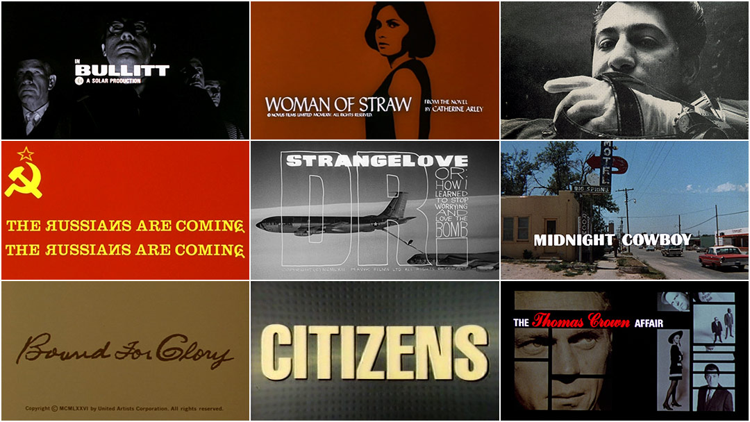
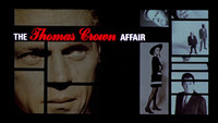
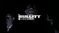
Often draped in jewelry and vibrant scarves, Pablo and his reputation as a wild-card artist were alluring to clients constantly on the lookout for the next big thing. His visceral approach to advertising inspired his Madison Avenue and Hollywood clients to take risks with color, with editing, and with bold imagery. Some of his more notable projects include the opening titles to Dr. Strangelove, The Thomas Crown Affair, and Bullitt, the lettering and type design for Stop Making Sense, Beetlejuice, The Addams Family, and Men In Black, as well as the original animated NBC peacock logo and the Burlington Mills “stitching” logo. He was a pioneer in split-screen editing, multiple screen imagery, and became a master of the quick-cut technique. His titles and montage sequences have appeared in twelve Academy Award-winning films.
In part one of our three-part feature interview with Pablo Ferro and his son Allen, we discuss Pablo’s beginnings as an illustrator and animator in New York, his first agency, and his move into film through his friendship and collaboration with Stanley Kubrick.
Part One
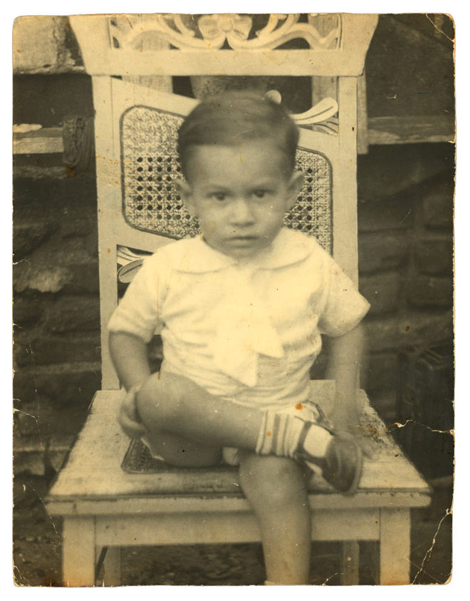
Pablo in Cuba, 5 years old
Let’s start at the beginning. You were born in Antilla, Cuba in 1935 and later you moved to New York. What was Cuba like for you?
Pablo: In Cuba, my grandfather had a big farm and I worked for him there. That was a great experience, doing all kinds of work and it helped me a lot, physically. I remember one time we were taking the corn off cobs we’d just picked. All of a sudden, I felt something. I put my foot up and there was a scorpion attached to my toe! The part with the poison was in my nail. So I just slapped it off. My grandfather looked at me and said, "See, I told you, you gotta keep moving. If you kept moving, that wouldn't have happened.”
Ever since then, I've taken that advice and every part of me, whether it’s my work or personal, I keep it moving. If you keep it moving, you keep it more interesting and you won't get stung.
And then you moved to New York City in your teens?
Pablo: Right. Now, I started drawing when I was around five years old or something like that. I realized that I could see a tree and I could draw it and it would look like a tree. That fascinated me – that I could do something on paper, besides working on the farm. When I was 12 years old, that’s when we moved to New York. I tell people my Spanish only goes up to 12 years old. I was trying to get experience there. I look at it like this – like coming from a small island to a bigger island. [laughing] I'd never seen snow or one house on top of another! When it started to snow, I couldn't believe this white that came down. It was interesting seeing snow for the first time. I would get bundled up. I enjoyed that.
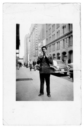
Pablo on the streets of NYC
How did your drawing develop? How did you get into animation?
Pablo: Well, later on, I was very fortunate that I got a job as an usher in a theater on 42nd Street. They would only show foreign films so I was able to see all the European master films. It inspired me. I know I'm still using that inspiration. I also got the Preston Blair book Animation: Learn How To Draw Animated Cartoons. That book is perfect. It really does work.
Me and my friend, we got in a studio, we built a table and did some animation. This was in high school and my friends would tell me, “You only know how to draw cartoons, you don’t know how to draw real people.” So I studied. They were into DC Comics and I studied DC Comics and copied their style and I created drawings to make it look real. I wrote a comic and it was terrific because, of course, I put a shocking ending on it.
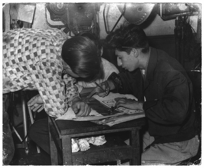
Pablo in high school, 1951
Now, it worked out pretty well. I brought it to a publisher, Atlas Comics, and showed [editor] Stan Lee and he was very good to me. He went through it and he almost fell off his chair. He said, “Pablo, you know I can’t print this last page, it's too shocking!” He told me to illustrate some stories for them and I did three stories for him. I took that money and bought a Bell & Howell, you know, single frames. That’s what we used in the studio to do pencil tests and things like that. I was looking to be an animator, so I stopped doing that after ’53, when I got out of high school.
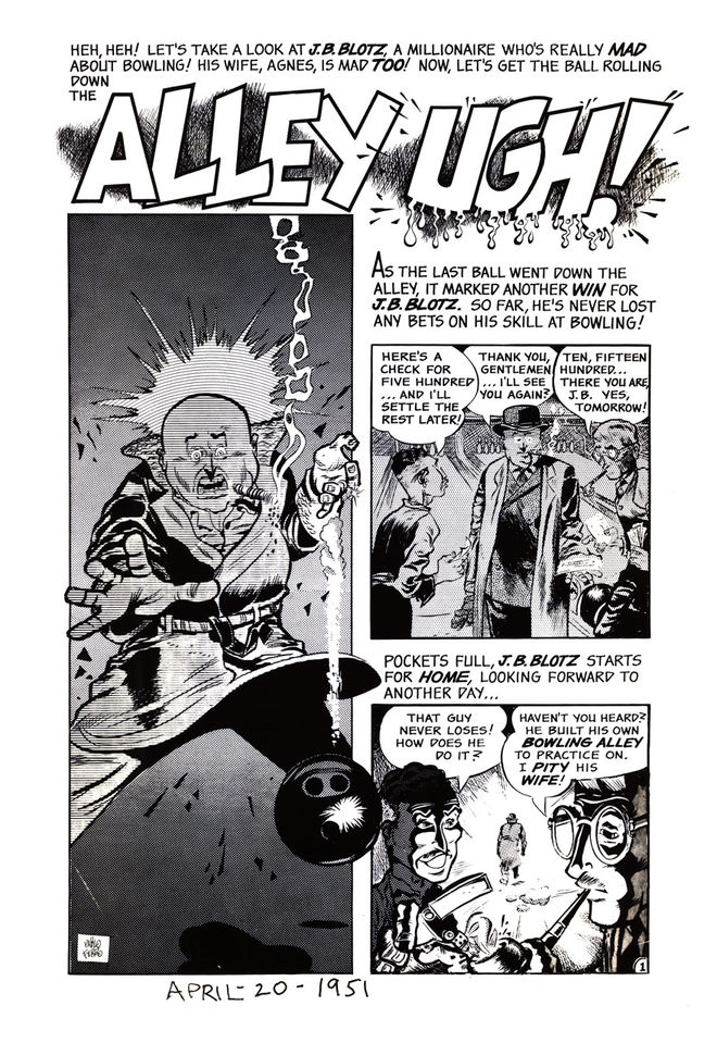
Alley Ugh! comic, page 1 and final panel
So, Atlas was where you first started doing illustration work and then you moved on to Academy Pictures where you started to do animation work?
Pablo: Well, it was Tempo Productions, and then it closed and re-opened as Academy Pictures. That comic I did in high school is what I used when I went to the animation studio to ask for a job. I had films that I'd done earlier with animation but there was no opening for that. There was an opening for ink and paint, though. I showed them the comic and the supervisor said, “Did you ink that?” I said I penciled it and I inked it. He hired me. That’s how I got into the industry.
From there, I asked a lot of questions about how to do everything, and little by little I became an assistant and in-betweener and an assistant and then an animator. I was lucky enough that I worked with Bill Tytla who did Fantasia – when the mountain comes to life, that’s what he did. I had this feeling my whole life where I keep meeting people who are great, they are amazing, and so I was able to learn from them and make a living.
Ferro, Mogubgub and Schwartz
After that came your agency, Ferro, Mogubgub, and Schwartz. How did that start?
Pablo: When I became an animator and worked for Academy Pictures, I met Vince Cafarelli and he introduced me to Fred Mogub. I loved his drawings so I made him my assistant. I got to know him and I got to know his family. Then I found out from his family that the name he told me was not his real name. I said, “Really? What is his real name?” They said “Mogubgub.” I said, “You’re kidding?” They said no! I loved it. That’s a great name.
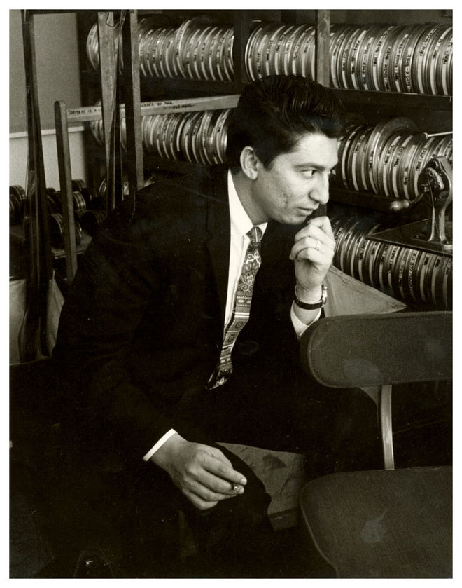
Pablo at Ferro, Mogubgub and Schwartz, 1961
So later, Fred and I were working for Abe Liss at Elektra Films, at the time the top production company in New York, doing very sophisticated commercials. I learned a lot from Abe Liss. But Abe really... I have to thank him for my career because he did teach me a lot. He was great. He worked at UPA (United Productions of America) at one time. We got good projects and images to work with. In fact, that’s where I learned to do quick cuts with stills, where they looked like they were moving.
Eventually, Fred and I got along so well and one night we were working – all night long I wanted to have that name, Mogubgub – finally around three o’clock in the morning his wife says, “Give him the name, it's okay!” His concern was that people were going to laugh. I said, “Yeah, that’s great, and after they laugh, they will remember.”
So that’s when I came up with the combination “Ferro and Mogubgub.” First it was just FM. Then, we realized that we needed a salesman because we couldn’t do that ourselves. We had a good sample reel from working at Elektra, where I animated the first NBC peacock logo as it opens up into colors. Somebody there gave me the name of someone, Lew Schwartz, who was also a cartoonist and a producer, at an advertising agency.

NBC Peacock logo, animated by Pablo Ferro (1957)
I interviewed him and I said, “Oh, okay.” We were working on a poster for our company at the time. I said, “Listen, we’ve got a partner.” They thought they’d have to change everything on the poster. I said just add an S to it, so it’s FMS. And everything worked fine. Of course, people laughed at first. I made a whole bunch of ads – because nobody knew Fred’s work at all – and would do something with the name Mogubgub as a joke, like a sailor drowning. That got everybody to know Fred and then he was happy. All of a sudden, he became Mr. Mogubgub.
How big did Ferro, Mogubgub, and Schwartz get?
Pablo: We had three floors of this building at 46th Street and 1st. We were doing so well. The combination [of Ferro, Mogubgub, and Schwartz] worked pretty well.
Allen: The company was constantly exploding into another room. It was just expanding exponentially. Whenever I would visit there would be another room where there would be some staging going on.
Pablo: There was too much work coming in for commercials! I had a lot of people to oversee everything; there was a lot of physical work to be done.
Pablo Ferro - Select Commercials (1960s)
Dr. Strangelove (1964)
Dr. Strangelove was FMS right?
Pablo: Right. I was doing commercials and I created a new way to cut and that’s why I got popular. That’s how Stanley [Kubrick] saw my work. He saw my reel and he loved it. He said, “I would like you to do the trailer for Strangelove because I like your commercials.” He said we could sell the movie as a product. I said that would be great.
Dr Strangelove trailer (1964)
So the trailer came first. How did the titles come about?
Pablo: So we had the whole campaign and he talked me into staying [in the UK] for six or seven months. I said to him, “I have a company and I have to do commercials,” and he said, “You can do commercials here.” He made it very pleasant; I had a beautiful house in London and he gave me a telephone number if I ever needed a car. No matter what time I called I would get one! He didn't need me all the time, so I did several commercials while I was there.
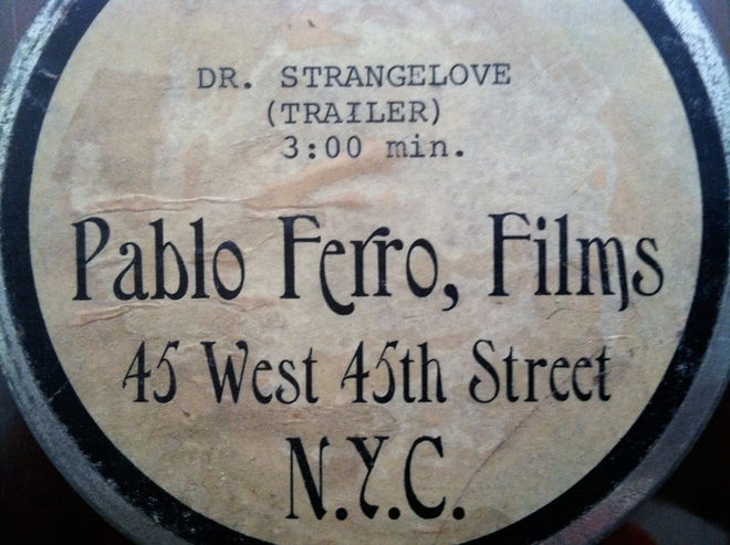
Dr. Strangelove trailer canister
The titles for Strangelove were last-minute; I didn’t have much time to produce it. It came up because of a conversation between Stanley and I. Two weeks after I finished with everything, he and I were talking. He asked me what I thought about human beings. I said one thing about human beings is that everything that is mechanical, that is invented, is very sexual. We looked at each other and realized – the B-52, refueling in mid-air, of course, how much more sexual can you get?! He loved the idea. He wanted to shoot it with models we had, but I said let me take a look at the stock footage, I am sure that [the makers of those planes] are very proud of what they did and, sure enough, they had shot the plane from every possible angle.
There’s one particular angle where the planes were attached to each other and they were swaying up and down, up and down. I asked him if we could shoot something like that and he said no, use the stock footage. I got the stock and started putting it together and when I was about finished cutting it into more pieces he came in with a piece of music. An instrumental of “Try a Little Tenderness.” I agreed and to our amazement the music was doing the same thing! It was swaying up and down. “Try a Little Tenderness”... I didn’t have to adjust anything in the cut.
Dr. Strangelove main titles (1964)
And how did you develop the lettering?
I tried to do the lettering like it’s usually done in films, but he said, “Pablo, I don’t know whether to look at the lettering or look at the plane. We have to see both at the same time.” I said to myself, oh boy, how could you do that? I remembered that I do my own lettering, just doodling around, thin and tall and things like that, and I thought I’d try that. We did a test and it worked! Stanley filled the screen with my lettering. It was perfect! You could see the plane and you could see the lettering at the same time.
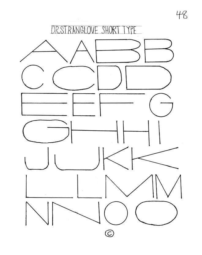
Dr. Strangelove short type example
The challenge was that I had to do everything, all the layout, and then when I had just done the last layout, he asked me: “Where’s your name?” I didn’t know I was supposed to put my name! The only open space was between two parts so I did it there, very little. You have to look for it. From then on, it was amazing working with him. I never thought that lettering I did was anything special – the only person there that liked it was Stanley.
Well it’s very iconic now, and has become the particular style that you are known for.
Pablo: Right, it’s almost a stock now that’s being used by everybody. I just finished a font book, part one, and it has lettering that I created that’s never been shown before. The Strangelove lettering is in there also and I am working now on part two. It’s amazing what you can do with lettering, what kinds of shapes it could take to make an A or B and each would be different. I took a look at a bunch of graffiti books. There was some great lettering in there but you couldn’t read it, so I took that and made it my own style. I am going to continue to do some more of that.
Company Changes and the Mid-1960s
So Dr. Strangelove came out in 1964, but you came back to New York in ’63 after finishing your work with Kubrick. How was FMS doing at this point?
Pablo: The company in New York wasn’t doing very well. I had sent Fred $80,000 and the guy was still in trouble. I said, “What are you doing?” We're trying to direct and produce and sell but they weren't getting work and were going over budget. They didn't know what to do.
So Fred Mogubgub left. A lot of people told him in his ear that he should go it alone, saying, “You're really better than Pablo.” So, I said, “Fred, if you want to go, it’s okay but be careful because they are going to take your money. They're going to 'yes' you to death.” He didn’t believe me until after he experienced it. That is what happened to him. They took advantage of him. He was interested in art more than anything so, financially, I knew someone was going to do it. The last time I saw him he was doing these two-storey-high paintings of floating vegetables.
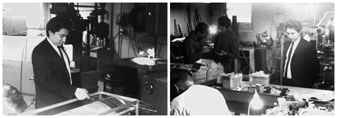
Pablo at Ferro, Mogubgub and Schwartz, 1960s
Allen: He was doing murals.
Pablo: Before he died he took me aside and said, “My father said to me that you are the one who made me.” I said, “Yeah, that’s okay. You got talent and that’s what I was interested in.”
Right. So, after Fred left, you had a little period where the company name included Mohammed, right?
Pablo: Right, Schwartz was still there and I don’t know who – one of the assistants who stayed – had to do the work. So when I came back, there was no company at all. I ran a contest to win naming the company’s middle name and the winner would get a vacation somewhere and 'Mohammed' was chosen and nobody outside even realized it was a change.
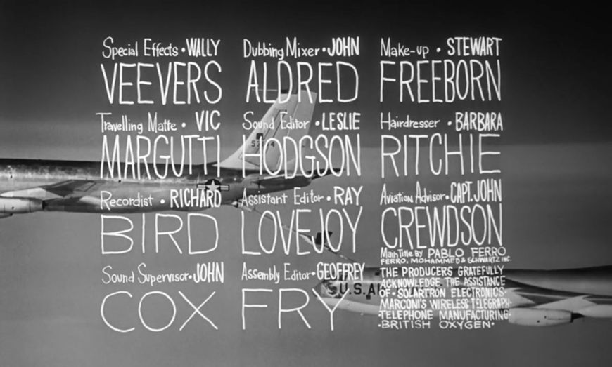
Still from the Dr. Strangelove title sequence featuring Pablo Ferro's credit
Schwartz ran out and left me soon after! I had to pay everything and I was left with only $1,000. I asked everyone that I worked with and knew at the labs and the studios if they would give me credit and I would pay them back as soon as I got work. They all said, “You got it.” It was beautiful that everybody was able to help me put a new company together. That was how Pablo Ferro, Films started.
Allen: That was late 1963.
How quickly did Pablo Ferro, Films grow? You had a thousand dollars but it grew to be a pretty large company.
Pablo: It did – it was very fast. People would only come to me with special projects or special commercials – none of the dull ones – even though sometimes I wanted to do some! There was a market to outdo your competition in commercials.
Allen: They were constantly looking for the newest thing.
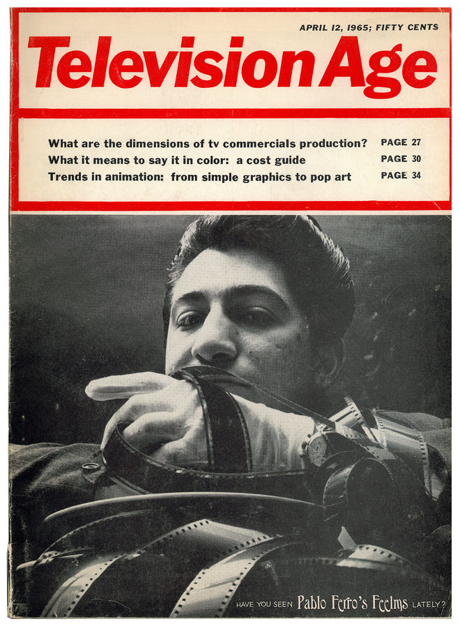
Television Age magazine
Pablo: Yeah, and I seemed to have it. It worked and it continued, unlike FMS. Because I was good to people they helped me financially and helped me get a place. I didn't even have to pay rent. That's why the flow kept going.
Allen: I mean, when you look at the whole culture, the "mad men" industry, they were very tight, cigarette-smoking, liquor-drinking, womanising executives and they didn't know anything avant garde except for poets and artists. Pablo was not only an artist but an artist with a work ethic who wasn't afraid of learning and getting things done in the middle of their club and Madison Avenue. So I think it just became very relevant – it was working because it was visceral to them. They didn't understand why they were responding to it.
People like my father, or Saul Bass and Maurice Binder, were on the cutting edge of bringing the graphic industry across language barriers. I think most people didn’t understand that because propaganda was so ensconced in audio and visual communications then – people thought TV was new and film was new. It came out of the Army Corps-type mentality. Everything was very propaganda-ish.
Pablo: Somehow, doing all these commercials that people love because of the quick cuts and the things I came up with, they said I was the “darling of Madison Avenue.”
Allen: That was one of the headlines they used to describe him.
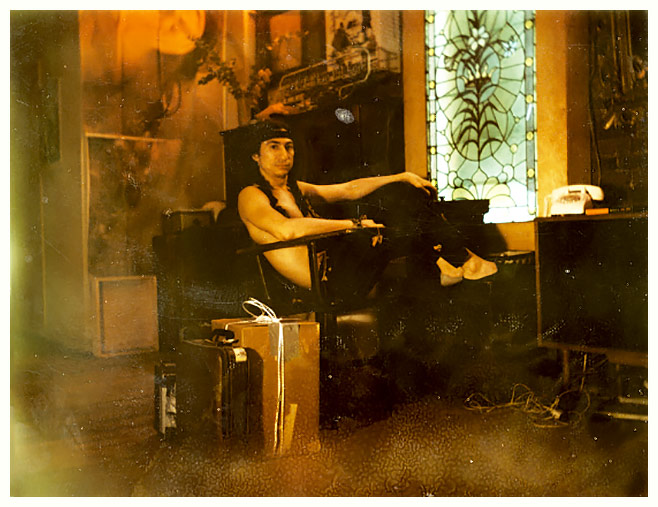
Pablo at his 2nd Ave. apartment, 1969
Pablo: Later, when I had the braids and the headband and looked like a Indian, I would show up in meetings and no one would say anything.
Allen: It’s really a sight to behold! As a child he used to tote me around every now and then to some of these gatherings or meetings and you could tell just how uncomfortable they were dealing with someone so honest about their products and then hitting it on the mark. It was so disarming that if he had been able to bottle it Coca-Cola would probably have purchased it. It was so disarming and seductive.
Did you change direction with Pablo Ferro, Films?
Pablo: Yeah, I would still do animation a little but I was getting into more live action. I created the logo for Burlington Mills. It ran from the ’60s to the ’80s. They tacked it to the end of their commercials. That was interesting. I start very close and I have lines coming in from all different directions and it starts to look like they are reeling together and I would change colors to the beat of the music.
Burlington Mills commercial (1964)
They didn’t have money to do these – it was just something that I was experimenting with, with music from film. It was two or three pieces put together where it is slow so I make the drums faster and it worked out great. It gave you an interesting feeling. That’s what people like.
Allen: What’s amazing about this – especially when you look at what it is insinuating – is that it was done on film on an Oxberry animation camera, a down-shooter.
Pablo: Yeah, also I shot this backwards because it’s a scratch-off. The way that you see the lettering, you know, the line coming in was actually coming out. I shot a long shot where everything is together and as the camera moved in, I was chipping pieces out. It was two shots: one horizontal and one vertical – they were two different pieces of film. I went to the optical bed and put them together and added the color because you could do anything on the black background. I added the color, and then I changed the background after the composite. I still like it. You can watch it over and over again.
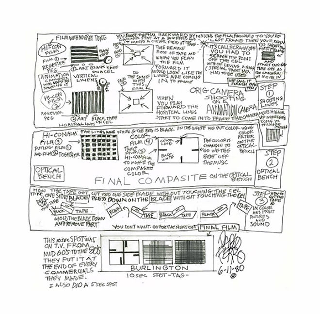
Burlington Mills commercial process breakdown
And this was all during the mid-1960s?
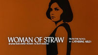
Pablo: Right. Then I was called in to do The Russians Are Coming, the Russians Are Coming. Oh, of course I forgot to mention. When I was doing Strangelove I also did a title for another movie. A production designer asked me to work on Woman of Straw with Gina Lollobrigida.
Woman of Straw main titles (1964)
With that, I did a whole storyboard, showing high contrast photographs of her, the wheelchair, Sean Connery, and a few other things. I shot that just like I shot Burlington Mills but this moving was slower. We changed color according to the music – Beethoven’s Ninth. They didn't like the colors so their version is all brown. My version is the only way that you could see it with the color changing and the high contrast. I realized that it looked like Andy Warhol’s portrait. I said maybe he saw this, but he couldn’t have seen it because it’s not even a movie.
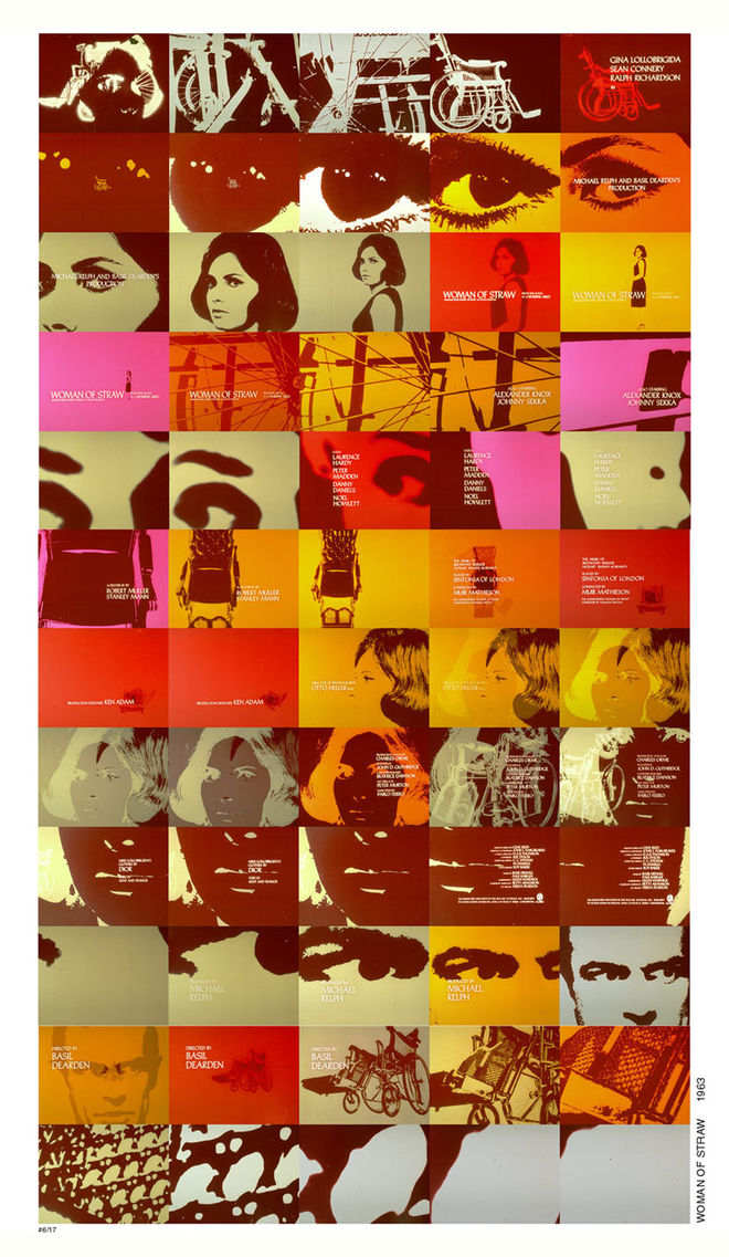
Woman of Straw original color version storyboard (1964)
Allen: No, but it had been at your apartment!
Pablo: I had a loft, and everyone came in there and that was an amazing thing. It was happening because of the work.
Who were some of the people that visited?
Allen: The list is too long! Honestly. It was very strange back then. All manner of celebrity, all manner of business people.
Pablo: Everyone from Sal Mineo, Norman Jewison, Jon Voight.
Allen: A lot of artists; Peter Max.
Pablo: Warhol came over. Yoko Ono would come over and show her films, and they'd crack me up, they were very funny. It was very exciting.
Did you prefer one to the other – commercial advertising or film?
Pablo: Both were great. Doing commercials was great because the client left me alone. They would tell me what they’d like to see, as far as the product and what they were trying to say, and I’d take that and try to come up with something. Like, they would come to me with a cough drop, you know, “Here’s our new product.” They’d say, we need something different because this is new, we have never done it.
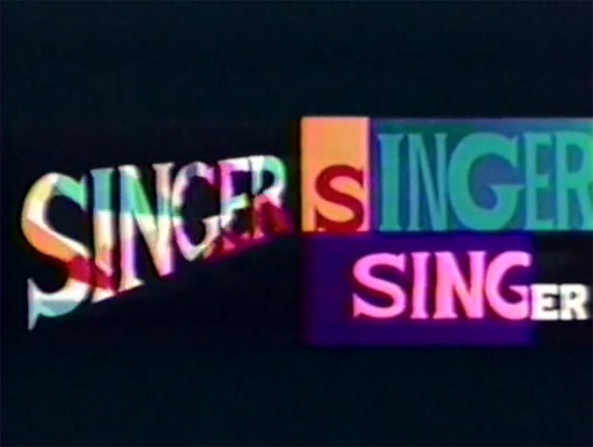
I thought of looking at a magazine – these nice pictures all together, it makes an interesting layout. So that's what I did, I did a multiple screen. In the middle of the screen I had a piano tune going off by the old piano. And I have a shot on the right and two on the left. Five different images, actually. And I would have, for example, a guy coming in with a bicycle that has a big wheel. I would go across the screen, the top, and then on the bottom I will have a horse taking over the wheels. I took the Muybridge book of horses, and that's what I shot, single frame, and it does work – it looked like a horse moving. It was amazing.
Singer Industries 1964 New York World's Fair video created by Pablo Ferro
So, this was your multi-screen technique, something you came to be known for in film, like in The Thomas Crown Affair. That came out of doing commercials?
Pablo: Yes, it did. And it happened because of Hal Ashby, ’cause Hal and I became good friends when we did The Russians are Coming. He was the editor. I showed him the stuff that I did, the multiples and all. So when the time came, the film's producers saw the Singer Pavilion at [the 1964 New York World's Fair], using multiple screens, and they wanted that. Hal said, "Well, Pablo’s already done that so we should give him the job."
[The Thomas Crown Affair] was another experience where it was a challenge to make it both simple to watch and understand, and fitting for the film. I was lucky that the costumes and the cinematography had the look of, like, a bizarre magazine. The whole film felt like a theatrical show.
A Moviola is a device that allows a film editor to view film while editing. It was the first machine for motion picture editing when it was invented by Iwan Serrurier in 1924.
I had a sketch artist and I drew a layout indicating where the multiples should be. Then I would check it and work with the Moviola. I got everything laid out perfect and then went to the optical house to show them exactly where I wanted the images to appear. Since it wasn't created for multiples we had to follow the image, and then we did the frame-by-frame. I would say, okay, a little to the left, a little to the right, yeah, that's it.
The Thomas Crown Affair main titles (1968)
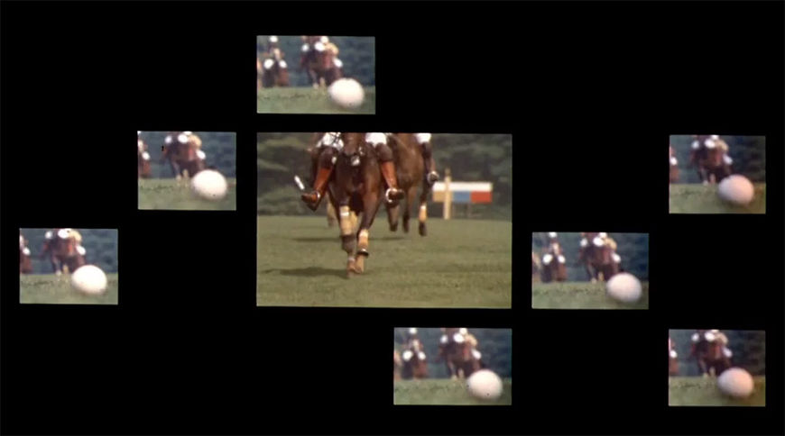
Now, I had 66 images on a 35mm film. And that's when Steve McQueen swings and hits the ball, and you see the whole thing. It was just so interesting seeing the whole swing. Harold Adler had done the mattes for me.
Allen: Harold Adler was a master calligrapher. And later on he worked at Pacific Title, but at the time he was a calligrapher that did glass drawing. He's deceased now.
Pablo: Yeah, I would give him a rough letter and then he’d clean it up and it came out great.
If it wasn't for Hal Ashby, maybe the multiples technique wouldn't have happened at all. I did the multiples for them and their purpose was to make the film shorter. Norman Jewison told me I wasn’t making it short enough, so I’d probably have to cut it altogether – not do it. Hal said wait a minute, and “Pablo, why don’t you treat the multiples as rushes?” I said, “Of course!” I could cut it up and since I had it in the multiple screen, I could cut to fullscreen and then back to the multiples.
Polo scene multi-screen montage from The Thomas Crown Affair (1968)
I told them to give me two days and I went back and cut the whole sequence. I showed it to them and they flipped. They said, “Oh man, this is terrific! But can you make it a little longer?” I said I can make it any length they want! They were very pleased and the editing, like Hal suggested, made it work very well.
CONTINUE on to Part Two, featuring Pablo’s work on Bullitt, his friendship with Steve McQueen, a harrowing encounter with a hitman, and so much more!
Special thanks to Allen Ferro for his assistance in researching this article.
Support for Art of the Title comes from


