SHOCKING! THRILLING! TOTALLY NUDE!
The Golden Age of the American B-Movie Title Sequence
B films are the wild west of the American movie landscape. While mainstream and even independent films are often beholden to censors, critics, and the public, the B industry blazes its own trail, as far to the left of its siblings as possible without losing direct sight.
Earning its title from the long-abandoned practice of attaching risky low-budget films to first-run – or “A” – features on a double bill, B films favor no particular genre or era; any Hollywood production is subject to its own B treatment, provided that its profit potential has been established. Yet the relationship between mainstream and B production has always been dynamic and symbiotic; historically, B films have been a proving grounds for box office buoyancy, testing out new talent and techniques while pushing censorship boundaries at every turn. For what they lack in production value they make up for in gusto and exposition – a tradition born out of necessity and public curiosity more than creative ambition, though certainly not exclusively.
Unable to rely on substance alone, B productions have mastered the art of marketplace recognition through bold slogans and type design, shocking imagery and loud colors. These graphic conceits are often mirrored in the films' opening title sequences, which vary wildly in technique and creative ambition but almost always work overtime to make up for the films themselves. As such, by default, B titles are often even more integral to the film than their A-list counterparts, which are more likely to deliver on their campaign promises.
While following a similar trajectory to mainstream title design, B-movie titles' nonexistent budgets often invited novice designers and craftsmen from other trades. They relied heavily on innovation and creative improvisation, leading to offbeat and unexpected results that would eventually come to define their respective genres. Many of these tropes would make their way into the mainstream title design vernacular, and even influence its dialect entirely.
It's equally true that many B titles borrow liberally from their big brothers. And then there are those that simply don't try, which are legion; but it is because the bar is set so uncommonly low that more creative entries are all the more curious, simply because they have no reason to exist, save for the artists behind them.

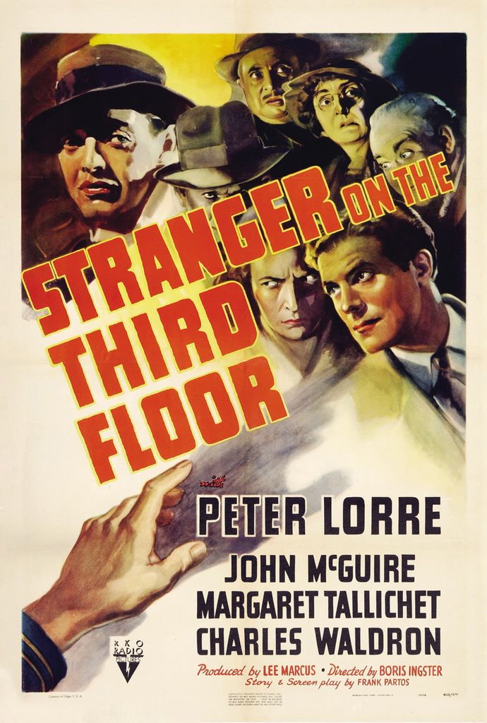
Stranger on the Third Floor (1940)
Strangers on a Train: The 1940s and Film Noir
At the beginning of the 1940s, Hollywood was reworking its marketing formula; the end of the recession meant a larger potential audience with a wider range of interests, and so the Big Studios* began exploring new genres and revisiting old ones. European cinema had come into its own a decade before, offering a trove of new techniques and concepts to a plateaued US industry. German Expressionism in particular, with its crooked angles and heavy shadows, proved a perfect match to US crime thrillers, which had previously been shot with the detachment of a soap opera. This new breed of crime film became known as film noir: the first American genre to wear its modesty on its sleeve.
*Major studios at the time were:
Fox Film Corp.
MGM
Paramount Pictures
RKO Radio Pictures
Warner Bros.
Universal Studios
More than any other genre, film noir is responsible for the emergence of the B film, as it appealed to a younger generation of filmgoers whose buying power was of increased interest to the studios. It was through noir that studios experimented with and refined their A-to-B film calculus, extracting maximum profit from minimum investment. The relative cost of producing a noir was nominal: the urban locales and minimal lighting made for easy shoots. In fact, it was not uncommon for cinematographers to turn their cameras around between takes to film another production at the other end the street.
The Pay Off (1942)
Title sequences for noir B films largely borrowed credibility from their A counterparts, which rarely colored outside the lines. There was little incentive for them to do so, as most theaters didn't even open their curtains until the credits had ended. The notion that a title sequence could be used as more than a decorative front for legal copy was simply unconventional. It would be another decade, and then some, before the worlds of art, design, and storytelling would intersect in the modern title sequence; in the meantime, on the fringes, experiments were underway.
Arthur Dreifuss' The Pay Off (1942) is one of the first crime thrillers to feature a novel, self-aware title sequence, in which the credits are printed alongside headlines in the fictitious Courier newspaper, linking the narrative to the production itself. Tactile, situational type solutions would become a hallmark of noir title design, grounding their films at street level.
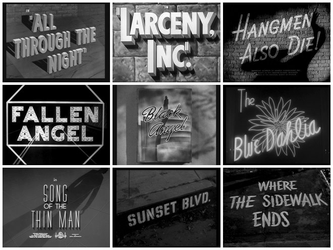
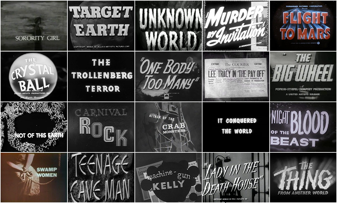
Title card art from the 1940s
Mystery and suspense films, which had always been more attuned to the potential of film packaging, were among the first to exploit their title real estate. The Topper trilogy (1937-41) features a trio of inventive sequences which, while not technically groundbreaking, creatively blend the theme of the film into their design. Further down the spectrum, Phil Rosen's Murder by Invitation (1941) features a sequence in which practical fire consumes its cellophane title cards in succession; few sequences before it had thought to physically manipulate the cards themselves.
Murder by Invitation (1941)
Optical type distortion – achieved by photographing the title plates through water, gels, or warped glass – would become a hallmark of many B genre titles in the '40s and on. Its effort-to-impact ratio and dreamlike quality appealed overwhelmingly to fantasy films, who most required a viewer's suspension of disbelief. Steve Sekely's Lady in the Death House (1944) and Frank McDonald's One Body Too Many (1944) both showcase its potential in this context, warping type to create hypnotic, layered transitions between cards.
Lady in the Death House (1944)
Similar techniques had previously been used in '30s horror films, and even more so in their trailers, which were full of catchphrases and credits – but had remained largely dormant in the interim.
Compound optical effects would later be achieved in post production, with strips of pre-exposed film sandwiched together to create composite images and layered transitions. The technique had been a favorite of the avant garde for decades, with filmmakers like Hans Richter and Walter Ruttmann creating visceral, pre-modernist graphic animations in a format wholly compatible with film title design. Early commercial adaptations include Elliot Nugent's The Crystal Ball (1943), in which the titles are scried from a glowing orb by a pair of silhouetted hands. In Edward Ludwig's racing film The Big Wheel (1949), the cards are wiped away by a checkered flag, both superimposed over a continuous live-action backdrop.
The Crystal Ball (1943)
The Big Wheel is also emblematic of B movies' expansion into new territory at the end of the decade, arcing to meet the rise of drive-in culture and the demands of its mostly-teenage audience. With staple B genres continuing to thrive, such excursions would only carve out new, even lower-budget alternatives, further dependent on shock promotion and marketing.
The Big Wheel (1949)
If not a beehive of creative title design, the 1940s are a critical moment in B-movie production, building the foundation for a robust and uniquely American industry in the coming years. Within that, techniques and concepts pioneered by craftsmen and title designers would equip a new generation with the tools and grammar to create ever-complex and meaningful works – and just in time for a captive audience.
The 1950s: Creatures, Ghouls, the Atom Bomb, and Things From Space
By the end of the War, American audiences had grown weary of the bleak realism of noir, turning instead to science fiction and horror as a means of escape. Both genres had been around as long as film itself, but neither would fully catch on until the '50s, when the atomic age and the upcoming space race would fuel a curiosity for all things From Another World! Invisible! With Two Heads! ...and so on.
The Big Studios would lose their right to bully movie theaters into showing only their films, opening the field for a wave of new low-budget production companies whose profit model was – among other things, but mostly – to milk proven A genres. With ambitious, if unimaginative, titles like American International, Global Pictures, and Box Office Spectaculars Inc., a cottage industry was born, its survival dependent on getting its product to market before going stale. B films would no longer be the backwater of the studio system, but an independent reaction to it.
If B titles of the 1940s largely followed in the footsteps of their A equivalents, in the '50s the inverse is true: B films, and their titles, began to set the tone and direction for their genres. Truncated budgets and schedules limited many sequences to a glorified “art card” followed by simplified title cards, but even within those boundaries, title designers were beginning to devise transitions, optical effects, and crude animation techniques to strengthen their delivery.
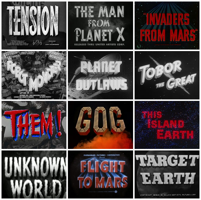
Title card art from the 1950s
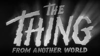
Films like Unknown World (1951), Flight to Mars (1951), and Target Earth (1954) are among the first sci-fi’s to feature integrated title sequences with immersive, genre-specific themes and typography. The Thing from Another World (1951) features a dramatic sequence in which the title is eroded from darkness – an effect co-opted by its two A-budget remakes, most recently in 2011.
The Thing from Another World (1951)
While creative innovations like these permeated early '50s B titles, it wouldn't be until the latter half of the decade that title sequences would emerge as self-contained, thematic units, inspired in part by the success of mainstream title design pioneers like Saul Bass (Around the World in Eighty Days, 1956) and Maurice Binder (Damn Yankees, 1958). Both with design and film marketing backgrounds, they elevated the profile of the title sequence by merging artistry with narrative and conceptual threads from the film, distilling its essence into a singular, potent visual statement. This format became the new standard for creative title design, fueled in equal part by industry and audience demand.
In parallel, the animation boom of the 1940s through Disney and Warner Bros. begat an entire commercial animation industry in the '50s. Studios like UPA and DFE Films – both founded and staffed by Disney and Warner alum – validated the medium beyond its association with fairy tales and cartoons, fusing modernist sensibilities with experimental techniques, developing an animation language unique unto itself. Saul Bass in particular embraced this new art form, often working with UPA artists on his own sequences*.
*Around the World in Eighty Days (1956), Vertigo (1958), Anatomy of a Murder (1959), Ocean's Eleven (1960), Psycho (1960), It's a Mad, Mad, Mad, Mad World (1963)
Swamp Women (1956)
Paul Julian (1921-1995), a Warner Bros. veteran who had worked mainly on Looney Tunes properties and is perhaps best known as the voice of Roadrunner (Meep! Meep!), migrated into title design in the late '50s before later joining the ranks of UPA. Working exclusively with notorious B producer–director Roger Corman*, Julian's narrative background and unique mixed-media animation style lent his sequences a tonal depth and complexity not previously seen in B title design.
*Roger William Corman (born April 5, 1926) is an American film producer, director and actor. He has mostly worked on low-budget B movies. Corman mentored and gave a start to many young film directors such as Ron Howard, Martin Scorsese and Peter Bogdanovich. He helped launch the career of actor Peter Fonda.
Julian's first sequence, Swamp Women (1956) combines practical camera moves with multi-plane illustrations and cross-dissolve animation. His experience as a background artist is evident in its design, with the titles themselves passive to the immersive, abstract backdrops leading the viewer into the world of the film. He continues to explore similar themes and techniques in his sequence for Corman's Attack of the Crab Monsters the following year, combining even more layers of optical animation and motivated camera moves to create a sense of urgency and mystery throughout.
Attack of the Crab Monsters (1957)
In Not of This Earth (1957), Julian uses details of human peril: blood, clawing hands, a crumbling skeleton, to contrast with a disembodied set of watchful alien eyes, establishing the tone of the film through allegory and abstraction.
Not of this Earth (1957) main titles, designed by Paul Julian
Its pacing and presentation are progressive and self-aware, mixing graceful camera moves and cross-dissolve animation with hard edits and shock-zooms, effectively inventing its own visual language to best describe the film.
While Julian's use of type remains largely inert throughout his short-lived titling career, his contemporary Bill Martin – also a frequent Corman collaborator – more actively uses typography as a component of his sequences, often factoring the credits into his designs.
Martin’s title sequence for Corman's Carnival Rock (1957) aptly uses a carnival theme to showcase the credits, placing them into the environment as features of the carnival itself. Using a combination of optical and stop-frame animation in conjunction with timed camera moves, he builds a sequence as engaging as it is complex, straddled between the worlds of animation and modern design: a novel concept in the '50s, but one that would become more common in the years to follow, as evidenced in Saul Bass' title design for It's A Mad, Mad, Mad, Mad, World (1963), and the Pink Panther series (1963-), originated at DFE Films.
Carnival Rock (1957)
In Sorority Girl (1957), Martin uses a series of expressive charcoal drawings to illustrate the struggles of the film's protagonist. Its tone is dark and foreboding, with timed cross-dissolves between the drawings alternately depicting her as an outsider and as a monster. Secondary animation and graphic overlays further reinforce the premise, complemented by a haunting score from composer Ronald Stein – often referred to as "Corman's Bernard Hermann*".
*Bernard Herrmann (June 29, 1911 – December 24, 1975) was an American composer known for his work in motion pictures. He is particularly known for his collaborations with director Alfred Hitchcock, most famously Psycho, North by Northwest, The Man Who Knew Too Much, and Vertigo.
Teenage Cave Man (1958)
Martin's affection for experimental techniques is on full display in his titles for Corman's Teenage Cave Man (1958), which features illustrated backdrops, cross-dissolve animation, op-art effects, split-screen compositing, and live-action graphic elements, all working in concert with B-veteran Al Glasser’s imposing score.
Elsewhere, B films were beginning to use title sequence real estate for backstory, placing title cards over plot-relevant vignettes. This became particularly useful for sci-fi films, which often couldn't afford extended visual effects sequences. In a prime example, Martin's sequence for Night of the Blood Beast (1958) -- which features an accurate shuttle separation sequence years prior to the actual Shuttle Program -- summarizes the entirety of a space-bound crew's mission, leaving the rest of the film to unfold on claustrophobic studio sets.
It Conquered the World (1956)
*Also known as The Crawling Eye, Creature from Another World, The Creeping Eye, and The Flying Eye.
It Conquered the World was released in 1956, featuring a minimalist, black and white graphic title sequence reminiscent of early experimental works by Hans Richter, namely his seminal Rhythmus trilogy (1921-25). A relatively unique format in feature film, its design is also similar to that of Saul Bass' first all-graphic sequence, The Man with the Golden Arm (1955), as well as Quentin Lawrence's The Trollenberg Terror* (1958). All three would soon be overshadowed by another all-graphic Bass entry, this perhaps his best known: Psycho (1960).
Mystery Science Theater 3000 takes on The Crawling Eye (aka The Trollenberg Terror) (1958)
And so many B title entries of the '50s would be counted as well-intentioned misfires: localized experiments against the current, without a greater cultural context. Their efforts, however, would not be in vain, as the coming decade would claim itself home to all things progressive. The ever-converging lenses of art, film, and advertising would soon focus on title design as a gauge for their own inter-compatibility, endowing the medium a creative autonomy previously unseen in film or commercial design.
Special thanks to Greg Dedrick and Gary Huggins for their assistance in researching this article.
CONTINUE on to Part Two:
Belted, Booted and Buckled: B-Movie Title Design of the 1960s
Support for Art of the Title comes from


