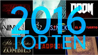
It’s the end of the year, and you know what that means: end of year lists!
2014 was an incredible year for title design and for the first time ever, Art of the Title is publishing a list of the top 10 title sequences of the year. After all, who better to cover an entire year’s worth of title design?
A few weeks ago, another publication published its list of the 10 best TV opening credits of 2014. While it was fantastic to see a year-end list celebrating title design, the top 10 neglected to credit any designers and studios behind the work. They are remiss in so doing. Title sequences do not exist in a vacuum. They are not conjured out of thin air. There is no excuse to leave the creators of these sequences uncredited.
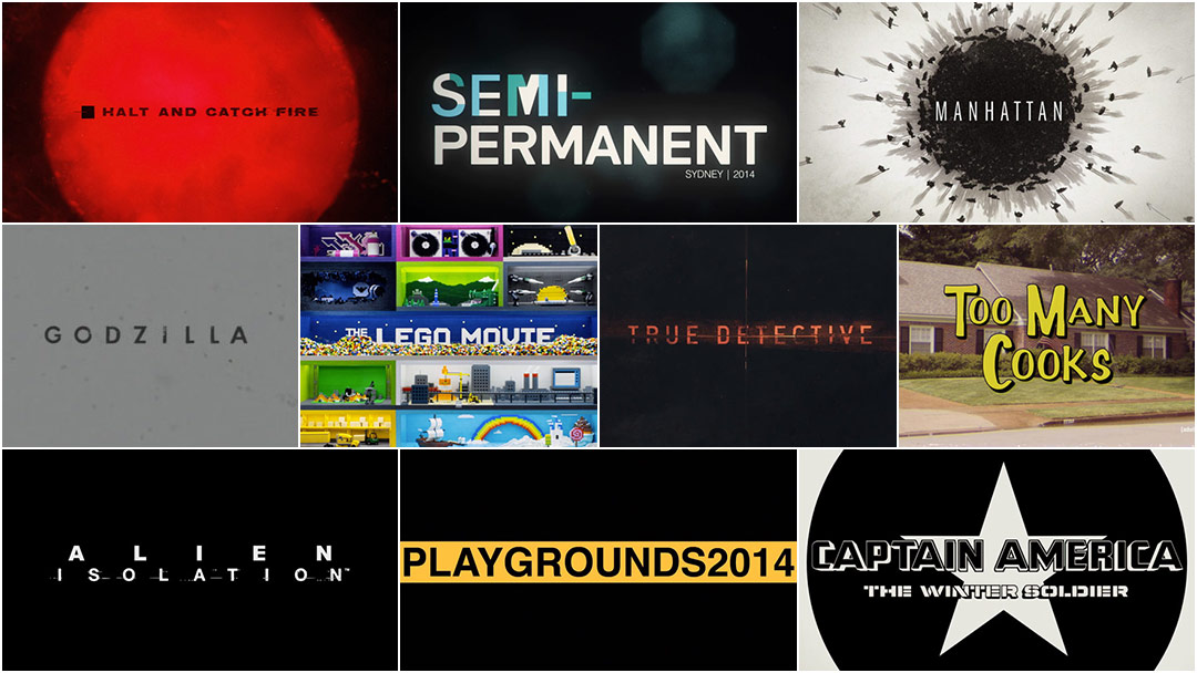
So it’s high time we set the record straight. For our list of the top 10 title sequences released in 2014, Art of the Title’s editors chose from among film, television, video games, conferences, and whatever category Too Many Cooks fits into. The top 10 were chosen based on criteria such as originality and innovation, impact, atmosphere, relevance to subject matter, and technique. Paring the list down to just 10 was a surprisingly difficult task, but we believe these sequences represent some of the most interesting and innovative work to hit screens this year.
Art of the Title's Top 10 Title Sequences of 2014
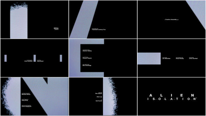
10. Alien: Isolation
CATEGORY: VIDEO GAME
Created by Creative Assembly
A pale column of light sears the darkness, fuzzy and pixelated, ascending with a creaking, ominous rumble before fading away. As other beams angle in and out of frame in quick succession, the visible strokes of some larger form, a message begins to play. One of cinema’s most enduring heroines cautiously invites us back to the place where we left her in 1979 — back to the cold and terrifying world of Ridley Scott’s Alien.
Invoking Ripley’s memorable sign off in the opening moments of Alien: Isolation – a new survival horror game from Creative Assembly and direct sequel to the original Alien – is both a bold statement of intent from its creators and one great hook.
Read our in-depth discussion with Jon McKellan of Creative Assembly
9. Godzilla
CATEGORY: FILM
Created by Prologue
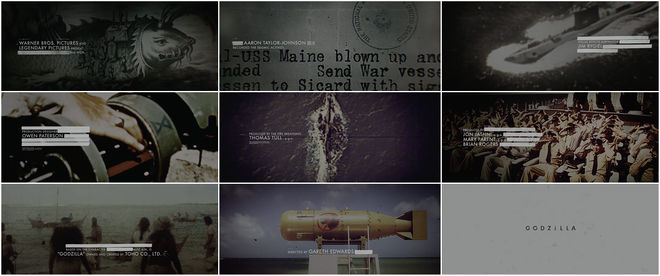
Rebooting six decades of monster movie canon and laying bare a secret history of its own, Prologue's opening to Gareth Edwards’ Godzilla exposes a government cover-up of kaiju-sized proportions.
Cave paintings and cartographic illustrations explore humanity’s age old fascination with sea beasties and other legendary creatures, giving way to a grim montage of classified documents, newspaper headlines, and wartime footage that reveal the gargantuan truth: Monsters aren’t a myth and we built the bomb not to win the war, but to destroy them. Credits appear amongst top secret reports and dreadful plans, the relevant text redacted quicker than it can be read (reminiscent of Karin Fong's work on Rubicon and PIC Agency's work on Push).
As the bomb engulfs the atoll, the titular King of the Monsters is finally glimpsed and one of the year’s most haunting cinematic images comes into view — the title card floating in a cloud of atomic fallout.
8. Semi-Permanent Sydney 2014
CATEGORY: CONFERENCE
Created by MK12
When form and shape are broken down into their most basic parts, do they lose meaning? Does the purpose or intent of an object change in the breaking?
In MK12’s pulverulent titles for Semi-Permanent Sydney 2014, a letter is still a letter, even as an explosion of particles, a billion tiny pieces expanding into the void. Out of that disintegration comes potential, the possibility for something new, something different, assembled from something else. Accompanied by a tune that could power a mad scientist’s work, the sequence is both a fitting allegory for the creative process and a stunning testbed in which to explore it.
Read our in-depth discussion with Ben Radatz of MK12
7. Manhattan
CATEGORY: TV
Created by Imaginary Forces
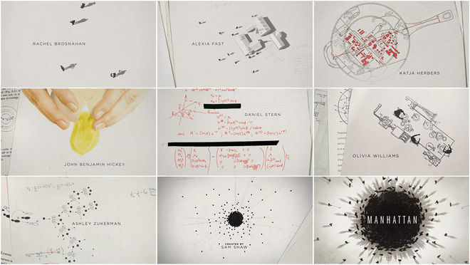
The diagrammatic titles for the WGN America wartime drama Manhattan draw a picture of daily life for the men and women involved in one of history’s greatest R&D projects: The Manhattan Project.
Designed by Imaginary Forces, the sequence brings new meaning to the term “nuclear family,” cleverly juxtaposing the humdrum realities of suburban living with the theoretical physics and hard math that ushered in the Atomic Age. Match cuts turn the grim science behind the construction of the bomb into innocuous objects and occasions — a frying egg and dinner time. With oblique references to other famous intros, the Manhattan opening stands firmly amidst the framework of the history of title design.
Read our in-depth discussion with Dan Gregoras, Jeremy Cox, and Jon Hassell from Imaginary Forces
6. Playgrounds Festival 2014
CATEGORY: CONFERENCE
Created by Bif for The Mill
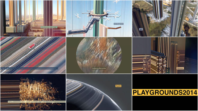
In Bif’s magnificent title sequence for Playgrounds Festival 2014, glitch is elevated to craft. A cityscape is stretched and shorn, the subject torn loose, like someone placing a thumb and forefinger on a .jpg and pulling at its seams. Blocks of colour demarcate the space, moving from light to dark. Shapes stream in all directions, planes, trains, and automobiles gliding through vibrant Koosh ball landscapes of fluttering filaments.
As buildings pour into each other, the sequence drifts further away from the intimacy of the urban world. Distance and dimension meld together. The lines are pulled taut, foreshadowing the tesseract scene in Christopher Nolan’s Interstellar, and then the title, cold and sober, shuts it down. This surreal journey, meticulously designed, is an exploration of form and technique and a joy to behold.
5. Captain America: The Winter Soldier
CATEGORY: FILM
Created by Sarofsky Corp.
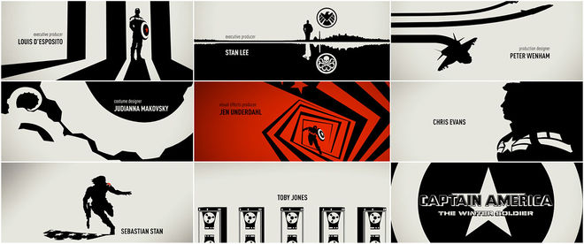
Sarofsky’s minimalist main-on-end titles for Captain America: The Winter Soldier exemplify the newfound function of the end credits for Marvel Studios. Perfectly distilling the essence of the Russo brothers’ action-packed potboiler, the sequence plays up familiar superhero iconography and pares down the themes and characters to their most basic elements. Stars and stripes, shields and skulls, gears and tentacles, a grand conspiracy unfolding as heroes and villains battle it out in silhouette.
With nods to both the graphic stylings of title designer Saul Bass and the innovative work of Silver Age comic book artist Jim Steranko, the Winter Soldier title sequence is one of Marvel’s boldest efforts to date.
Read our in-depth discussion with Erin Sarofsky of Sarofsky Corp
4. The Lego Movie
CATEGORY: FILM
Created by Alma Mater
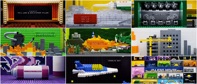
Take a stop-motion animated journey into the world of The Lego Movie, a side-scrolling flight through a series of brick-built dioramas recreating scenes and settings from the film. It seems a crime that the deceptively simple building blocks at the center of this adventure had not been used in a title sequence until now, but Alma Mater does the Danish plaything justice here, cleverly exploring its full potential as the credits roll. Everything is awesome!
Read our in-depth discussion with Brian Mah, James Anderson, and Kathy Kelehan of Alma Mater
3. True Detective
CATEGORY: TV
Created by Elastic
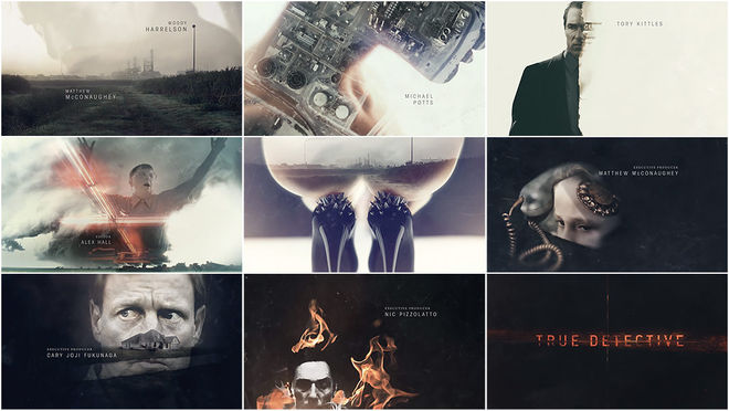
Travel to the underbelly of America. Louisiana. The Gulf Coast. Purgatory, USA. A sopping, poisoned wasteland where industry and old time religion meet somewhere in the sugarcane. This is a place haunted by people — good and bad and everything in between — fractured souls who cling to the edges of society and themselves, walking contradictions struggling to get by and simply be. It’s here that two detectives — a broken stranger and a slightly bent local — get wind of something sinister. Among the roach motels and refineries, a serial killer plies his terrible trade against the put-upon: Murder as ritual sacrifice. The cane is burning in the field. The fire eats it all away.
Beautiful, tonally perfect, and combining design techniques in a way that TV titles haven't done before, Elastic’s affecting titles for HBO’s True Detective make one hell of a case.
Read our in-depth discussion with Patrick Clair of Elastic
2. Too Many Cooks
CATEGORY: TV
Created by Casper Kelly for Adult Swim
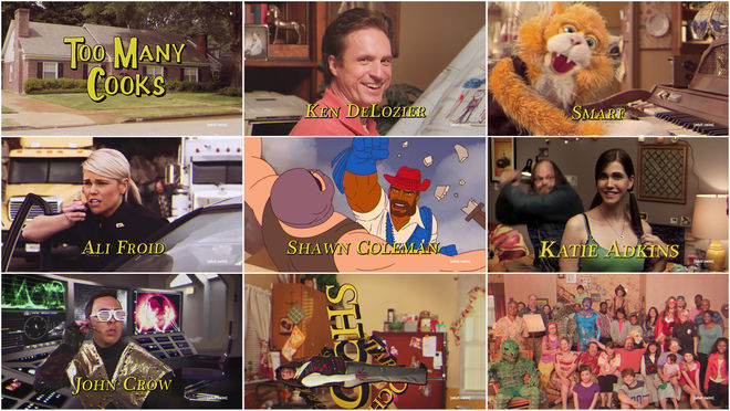
How many cooks is too many cooks? The answer to that question and so much more are contained within Casper Kelly’s Too Many Cooks, an unremitting and increasingly nightmarish 11-minute onslaught of 1980s-style television title sequences, complete with puppet cat, anthropomorphic typography, and, of course, a cannibal machete murderer.
Created as a stand-alone title sequence for a show that doesn't exist, Too Many Cooks is at once a bizarre love letter to a bygone era of American TV title design and a hilarious deconstruction of our shared pop culture heritage.
Read our in-depth discussion with Casper Kelly of Adult Swim
1. Halt and Catch Fire
CATEGORY: TV
Created by Elastic
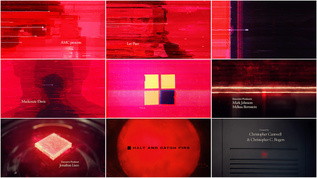
In the opening to AMC’s 1980s tech drama Halt and Catch Fire, a spark blazes a trail through sheer red, scorching an idea into existence. Zeroes become ones. Input becomes output. The characters’ faces, nothing more than glitchy approximations, are barely recognizable in the vermillion void.
Elastic’s title sequence is our gateway into this system, the interface through which we enter a simpler age of bytes and bauds, when fear, uncertainty, and doubt ruled and code was king. Propelled by the pulsating synths of Trentemøller, the idea is executed. It cannot be stopped.
Read our in-depth discussion with Patrick Clair and Raoul Marks of Elastic
—
Honourable Mention
There are so many amazing title sequences we weren’t able to include on the list, but a special mention must be made of the wonderfully bizarre couch gag from The Simpsons, Season 26, Episode 1 by filmmaker Don Hertzfeldt. It’s delightful. We believe there’s room for more of that kind of weirdness on television.
Love our choices? Disagree with our picks? Did your favourite title sequence not make the cut? What were your favourites? Be sure to tweet us at @ArtoftheTitle and have your say.
Thanks for joining us for another incredible year in title design.
Here’s to an exciting 2015!
—Art of the Title

