
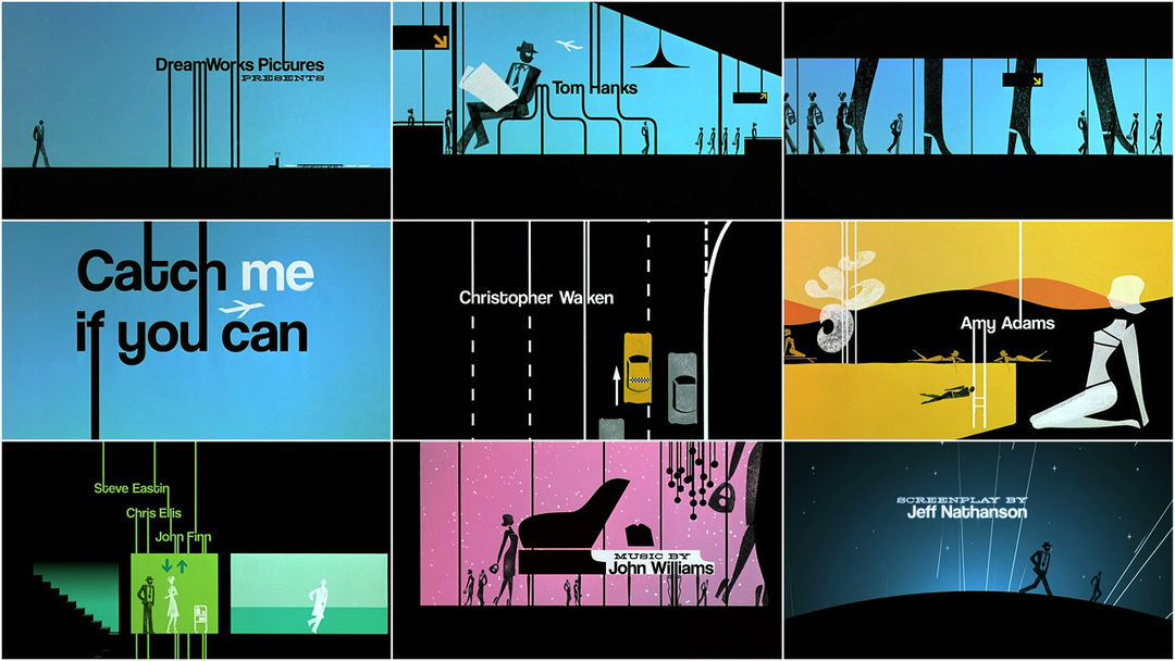


A gifted young grifter scamps and stamps across the screen, his fugitive flights aided by doctored documents and lying lawyers. The scurrying swindler dares viewers to keep up with his caper, but this race is now a chase with a “top man” on his case. Flowing type, smooth lines and cool jazz are a playground for this pursuit, snaking and sneaking across the colorful jet-set world of our confidence man’s creation, slowly fading to reveal the darkened truth.
Kuntzel + Deygas stylistically transpose the handmade design of Saul Bass using decidedly modern means. Accompanied by John Williams’ unexpectedly unctuous score, the duo’s title sequence for Steven Spielberg’s Catch Me If You Can is simply outta sight.
A discussion with the Paris-based FLORENCE DEYGAS and OLIVIER KUNTZEL.
Tell us a little bit about Kuntzel + Deygas.
FD: Olivier graduated from Olivier de Serres Ecole Nationale Supérieure des Arts Appliqués et des Métiers d’Art (ENSAAMA), in visual communication. Then he started to work for advertising agencies as an art director, but was soon attracted to making creations for himself, and in a more independent way. I graduated from Gobelins L’Ecole de L’image, studying film animation. My school was not at all theoretical, which suited me perfectly. After studying theatre and being a self-taught illustrator, I needed to learn real skills, to learn how to use some tools. The theory side, I preferred to study on my own.
About the conception of the sequence: The Saul Bass aesthetic clearly served as a jumping off point of some kind… Was “Bass- inspired” how the filmmakers pitched the sequence to you, or did you pitch it to the filmmakers? Were there other concepts for the sequence?
It’s very interesting to see how many people talk about a possible Saul Bass influence in the title sequence we created for Catch Me If You Can. In a way we are very proud to be judged at that level. If you open any Graphis magazine from 1960 to 1970, you’ll be amazed to see how many graphic designers have created works that could have been judged “Saul Bass-esque”.

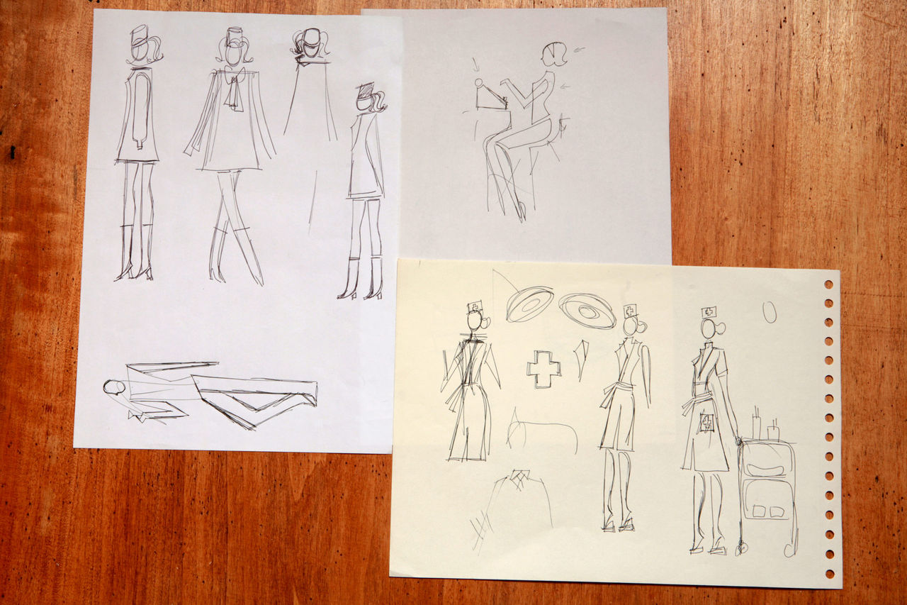
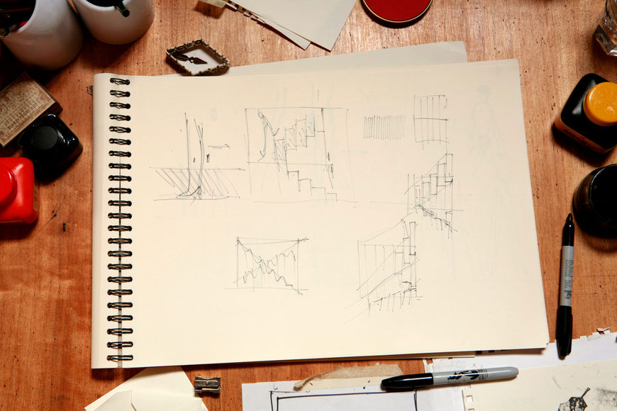
Initial sketches
Look at the work of Paul Rand for example. It was part of the spirit of that time. A time when designers had no computers, and the hand of the artist was delivering a strong message. As far as I know, Paul Rand have never created for the movies. Saul Bass did, and his name stayed as THE reference point for that kind of graphic design sequence.
We feel the genius of Saul Bass was to find an idea linked with the music. For example, the Carmen Jones title sequence is great because it’s simply a burning rose for one minute, with a musical score that delivers just the right emotion.
In Catch Me If You Can, the action takes place between 1963 and 1969. We designed the characters with sixties haircuts, clothes, and postures, but the music by John Williams brings a lot more of that sixties feeling! Try another piece of music and you’ll see it does not fit.
But we feel that it’s no coincidence that the Saul Bass feeling is there. We had the chance to work in the very same conditions that an artist in the sixties would have: Total respect and confidence from the “client”, no marketing tests, no advertising agency trying to exert control. We worked in our atelier, in our own atmosphere. We feel Spielberg wanted to have a sequence made by an artist, not by a studio, in order to keep the charm of a “human hand”. It’s a very rare opportunity nowadays. The result is not perfect, but this imperfection imbues the sequence with a strong feeling of an authentic and personal work. It directly transmits the pleasure we experienced while creating it.

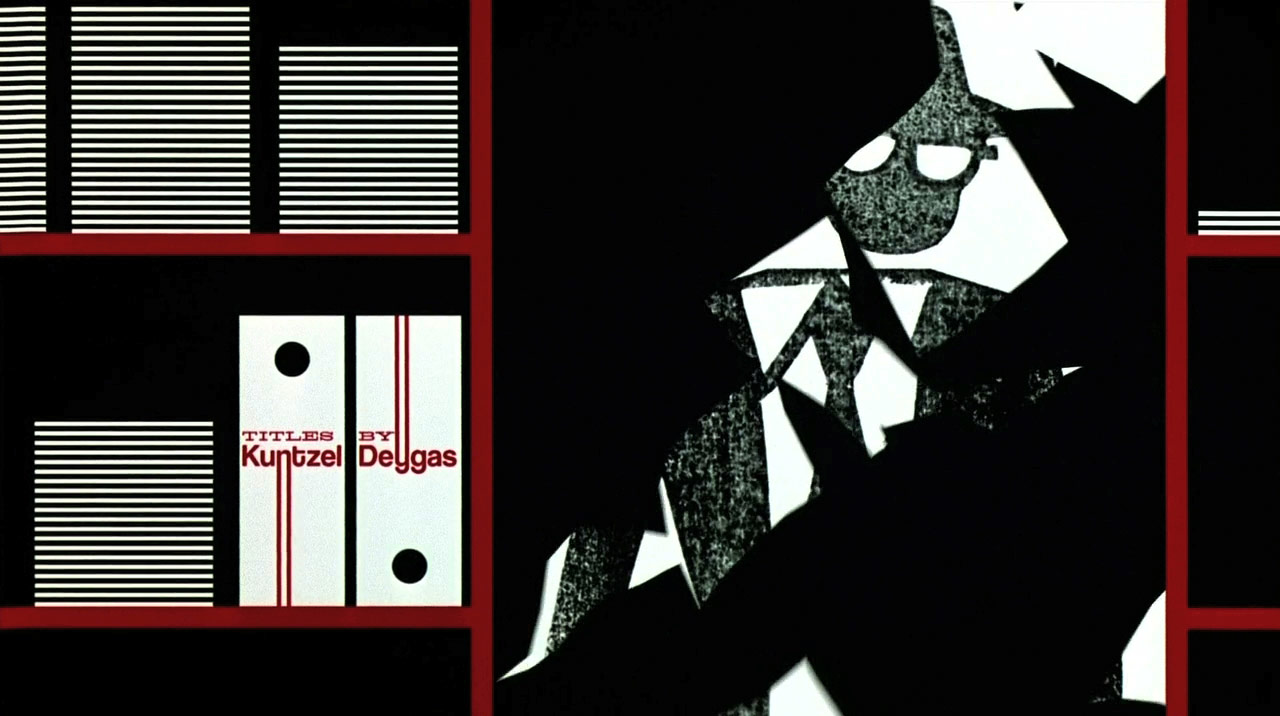
Kuntzel + Deygas sequence credit
Saul Bass’s lasting legacy also enabled us to leave our mark on the title sequence as its creators. Today, many designers forget that they have the right to sign their creations. In the sixties, signing the main title (See Maurice Binder, Fritz Frileng) was proof of authenticity, as with a painting.
Audiences knew who created a sequence because they saw people’s names credited, not an agency. Thanks to all that great artists from the past, we were authorized to sign our name to our sequence. We really hope this will help artists win the battle against marketers! As an aside, we’d also like to say that Saul Bass is a very important person, an artist who should not be reduced to just title sequence design.
What was your approach to directing the opening credit sequence and how did you go about developing the “stamp style” animation?
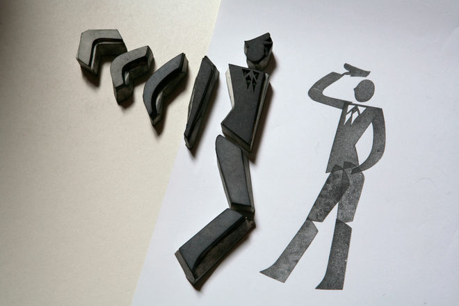
In order to capture the spirit of Leonardo DiCaprio’s character, we chose to employ a creative process that did not resort to the use of high technology. We used the same techniques as the film’s protagonist, by imagining the characters in stamp form, made from the same cutters as those used in the film by Frank Abagnale Jr. We wanted to preserve that crudeness.
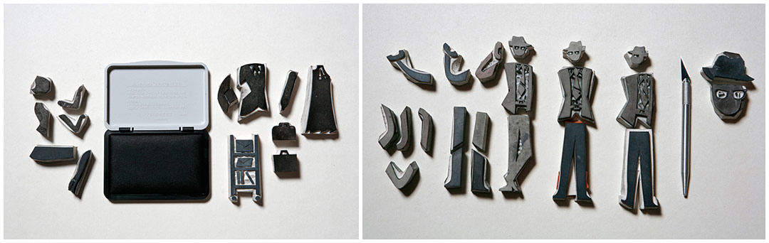
Rubber stamps
Even though Spielberg has made significant use of modern technology in recent times, we realized that high tech did not mesh with this film. Beneath his powerful style and incredible technique, we understood that we had to surprise him by heading towards something that reclaims the “artist’s” work. What mattered was not our know-how but the emotion that we could transmit to a simple thing.
The original stamps, that we created in a few hours, are those that exist in the final product. The magic of the first try was not altered. The force of the sketch remained. That seemed to cohere with the Spielberg spirit. When it was time to sync our title sequence with his film, we asked him to send us some images from his Avid or via the Internet, but we also received an actual piece of film because he edits his films the old-fashioned way, on a Moviola.
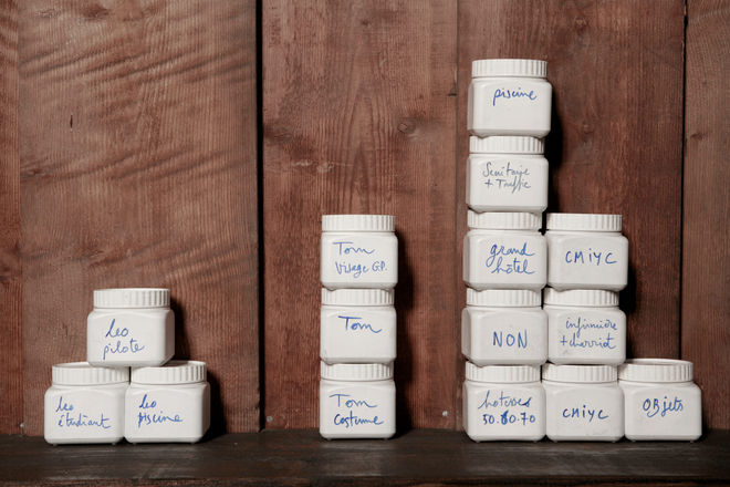
Stamp containers
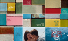
The color palette does so much to set the feel of the jet setting era in which the film takes place. Was there an intentionality to the colors that you selected and if so, what materials did you reference?
The film takes place in the 1960s and Spielberg desired for us to transplant the audience into a varied universe, with a bit of chic and a sense of drama (certainly not a humorous cartoon). We decided to take on the same approach as those who created title sequences during that era: as if we were in that era, working amongst colleagues. Not in terms of technological means, but in terms of philosophy. We wanted to deliver a personal creation that has our mark, that works in contrast to studio title sequences in which the artist’s hand is less visible. We wish to have the audience of this film rediscover a paradise lost.
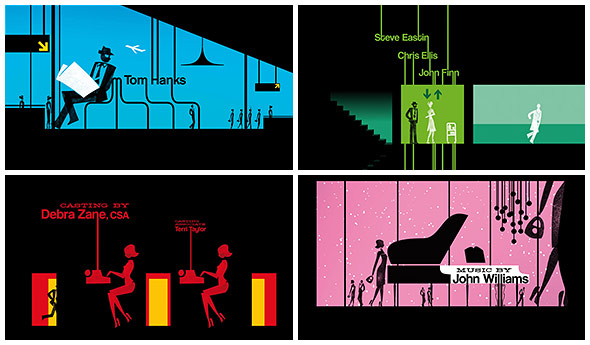
Color palette examples from final sequence
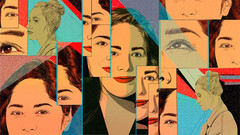
The colours signal geographical and temporal transitions. The silhouettes stem from our own graphic vocabulary with a sixties twist so it adheres to the subject matter. We decided to employ them here for their symbolic force. The silhouette evokes a character we all ignore – the hero is a trickster. Those are in fact hand-carved stamps, animated in a traditional manner on paper by hand. That “handmade” aspect belongs to title sequences of that era.
Embedding such lovely handmade animations into a precise, down-to-the-millimetre décor on a computer served as a bridge between the past and the present. The audience was able to taste a remnant of that past through the visual comfort of which they are used to today.
What is your collaborative process like? Who does what on a project like this?
When we develop a project, we don’t both do the same thing; each one of us has their own specialities. For instance on a shoot, we’re not both behind the camera. When we draw, we’re not both holding the pencil even though we both can draw. Our field of action is not still, it’s always on the move, and its limits are always floating.
We can switch parts depending on how much affinity we have for the project. If a project requires Olivier’s graphic design skills, then I will do all the things around the graphic design, taking on direction for instance. This role sharing has no defined rules, but is necessary so that each one of us can express ourselves 100% on one point and not 50% on each detail.
Original storyboard sketches
There were many notable title sequences to come out of the 1960s, do you have a favorite from the era?
OK: Florence Deygas and I are fascinated and motivated by the attitude of artists and designers in the 60s (Bass certainly, but also Paul Rand, Binder, etc.) who knew how to face and deal with an art: Hollywood Cinema, something that can very easily become very commercial. That’s what we also try to claim for in our work.
I remember Carmen Jones, the rose that is burning over and over again, like a fire without an end.
I remember Seconds, a close-up on a distorted face, very experimental. Saul Bass explaining that it was actually the result of a deformed projection on a wall that was re-recorded.
I remember Nine Hours To Rama, a close-up, very captivating, needles, pendulums, something about time, very rhythmical underlined by Indian music.
I remember Grand Prix, with the stopwatch, faces, racing cars, a division of the screen (symbolizing the idea of a competition), something very stylish and very dynamic.
I remember Walk On The Wild Side, the famous opening title sequence set in an urban environment with a black cat that is chasing away a white cat, filmed in black and white. Very jazzy, very nightlife.
I remember having been even more impressed by In Harm’s Way, the movie is about passion on a Naval base. The opening titles are a series of close-ups of a beach, small waves, waves getting bigger and bigger, a thunderstorm at its height and then back to stillness.
Stamp tests
Special thanks to Anita Abbasi for the translantion in this article.
LIKE THIS ARTICLE?

HELP ART OF THE TITLE KEEP GOING. BECOME A PATRON THROUGH PATREON.
Related
-
The Title Design of Saul and Elaine Bass
feature
-
Down with Love
title only
-
The Pink Panther
title only
-
Not With My Wife, You Don't!
title only
-
Around the World in Eighty Days
summary
-
It’s a Mad Mad Mad Mad World
summary