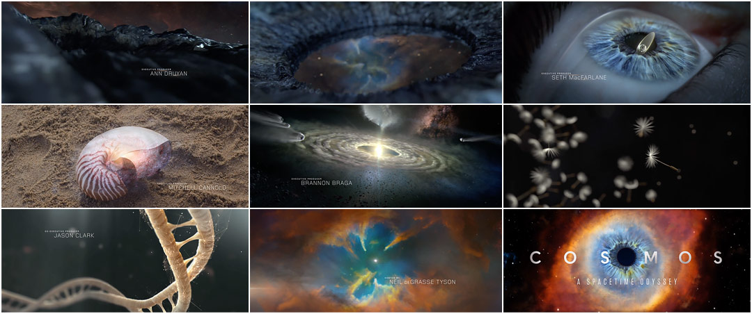
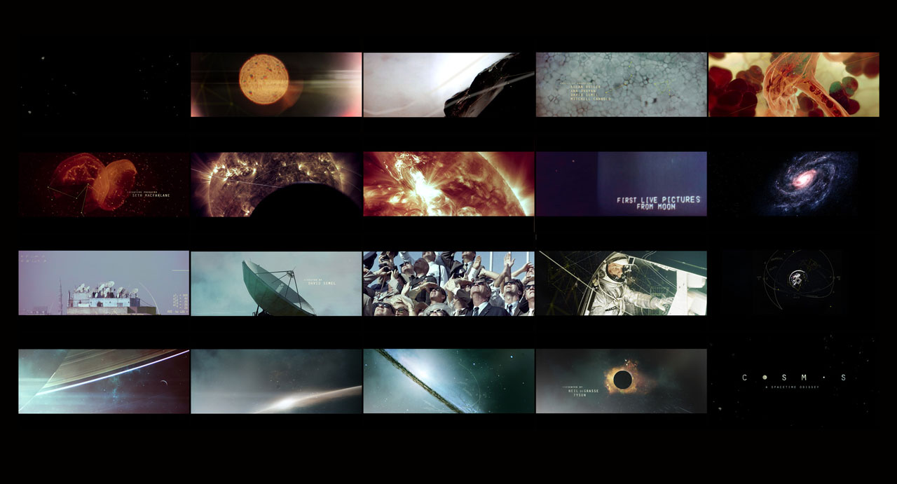
Big Block Design Group take us on the grandest journey imaginable with their beautifully designed opening sequence for Cosmos: A Spacetime Odyssey, the sequel to Carl Sagan’s landmark 1980 documentary series Cosmos: A Personal Voyage.
With the incredible advances in science and technology over the last 34 years, the "ship of the imagination" (this time piloted by astrophysicist Neil deGrasse Tyson) can now travel through time and space. From the microscopic building blocks of life all the way to a distant galaxy in the furthest reaches of outer space, this fantastic main title journey is only made possible thanks to seamless VFX transitions so perfect that they rival the best Hollywood films.
A discussion with Creative Director CURTIS DOSS of Big Block Design Group.
Give us a little background on Big Block Design Group.
We are a part of Big Block, most known for finishing, VFX, and car commercial work.
Executive Director Pete King brought us aboard with the intent of developing a design-focused division for the company, and Shaun Collings and I have been part of that for the past two years. Shaun and I have worked together many times in the past, first cutting our teeth at Shilo in San Diego. We have always worked well together and when Pete suggested we head up the design arm of Big Block we jumped at the opportunity.
What was the first client meeting about this sequence like?
Initially, they approached us with an idea of a split-screen type of thing, to show what the eye would see as it evolved, but we decided to go with more of a graphic, abstract approach. The video was going to show an eye actually being formed. We had worked on some storyboards for some of the show content, based on a script about the importance of photosensitivity and how it was responsible for much of our evolution.

Eye evolution concept board
During that initial phase we developed some images that would ultimately become the eye-nebula, which became the main branding image for the show. We weren't able to complete that content portion of the show due to budgetary reasons, but they came back to us and had kind of fallen in love with the image of the eye-nebula. We were then invited to discuss how we might work together on developing a logo reveal for the show.

Main title concept pitch
Originally that opening sequence was only supposed to be like 15 seconds. So it was just going to be some sort of reveal – a logo reveal with the eye. Fox haven't done a long, 1 minute 30 second open in many, many years.
We were so excited to be involved. We sat down with Ann Druyan and some others from the team but little did we know we would be given the most daunting creative outline that we had ever heard – “The universe is your palette.”
*Ann Druyan is an American author and producer specializing in productions about cosmology and popular science. She was a co-writer of the 1980 PBS documentary series Cosmos, hosted by the late Carl Sagan, whom she married in 1981. She was also the creator/producer/writer of the follow-up, Cosmos: A Spacetime Odyssey.
We discussed some general concepts that would be covered in the show, but were given almost zero directives as to what concepts we should explore. We were really on our own to figure out how to weave these concepts together into something that would reveal the logo, and pay homage to the Cosmos legacy.
So what were some of your concepts?
With everything in the cosmos being a potential concept, we went through many variations! We had some great brainstorming discussions and research sessions. Some of the general concepts that we looked at were knowledge of self, exploration of all types, time perception, inner space, outer space, supernovas, biology, evolution, human development of tools to allow exploration, and on and on.
We explored linear approaches dealing with historical feats of human nature and discovery, leading to what we know now to be cutting edge space-time concepts. Bringing the viewer through a history lesson of sorts to current time and then try to inspire the current youth to continue exploring. We explored montage or collage-like approaches to build mood and excitement in a more abstract way.
Original “mood edit” for the open title sequence
Let's talk about the first set of boards and the direction you went.
Absolutely. There were so many concepts that we had to figure out how to tone it down into something tangible. We worked with designer Filipe Carvalho. Felipe is an artist that we work with quite a bit and his frames really started to help us.
Parts of the boards were very well received by the client, while other ones were not. We kept brainstorming and it kept growing and changing. Once we had those frames together and were able to get the temperature test from the client based on those, we were able to kind of start to get to a place that actually made sense.

Mood and concept storyboard by designer Filipe Carvalho
After researching the original show, which aired when I was too young to care about, we found a quote from Carl Sagan that really resonated with us: “We are a way for the universe to know itself.” This quote became our guiding thread and ultimately led to the final concept.
We landed on a circular approach starting from within the eye – loosely representing a knowledge of self – and ending on a supernova in the shape of an eye, representing the great unknown. Between the bookends of the eye and the nebula we wanted to bring back some of the themes we had been exploring.

Main title development storyboard, including unused time-lapse concepts
How did you conduct your research? What was your process like to find all of the interconnected imagery?
We had a few people researching and collecting many sources from concept art to scientific models and renderings, to archival footage. Cosmos Studios already had a ton of images and access to libraries from around the world. Sorting through it all and creating a cohesive story that was poetic, poignant, and not too abstract took many variations of arrangements. Using the quote from above as our guide, the sequence began to take shape organically.
Was there anything that took you by surprise when working on this sequence?
Most of the surprises came during our research phase. It was more educational going through all those references. I found myself going on tangents, on strange space and science websites and research channels that I’d never dove into before. It was so inspiring to just go through that exercise. And that really helped us create something that actually started to feel like what Carl would have wanted. This is exactly the reason he did this: to inspire new generations and other people to explore, and that's exactly what was happening for us during the process!

Research images
That's where the organic process started to come from. We would find an element and start to develop what that would look like and then we would search for something to match it. So it was like all of that research that we did before and all the images that we combed through and all of the scientific models and illustrations and everything, they started to fit together in a visual pattern. Then we started to derive concepts from those visual patterns.

A mind map breakdown of the concepts and connections used in the main title sequence
Without that research it would have been a much more difficult process, wouldn’t it?
Absolutely. At first we felt like we had no idea where to go. We were looking for anything. We were searching, a lot of searching. And then it was like osmosis – we just kind of soaked in so many different visuals and thoughts and ideas that we started to be able to piece certain things together that became valid and weed out other ones that weren't.
How did you decide to use the 2.39:1 widescreen ratio?
We wanted to present a very cinematic experience and began designing and developing with the wide aspect ratio. There were points along the way in which the studio would express concerns about the logistics of getting it approved for broadcast, but they ultimately loved the cinematic feel.
We had been working in and composing to that ratio but there is a full frame version of that too, just to make sure that if it were to not be approved you would have something there. And it looks quite a bit different if you watch the full frame version of it. I'm not... I don't like it very much. I don't like what happens at the end with the eye. It changes it dramatically.

A visual explanation of image aspect ratios for film and television.
What about the feedback process? Did the producers have comments about which things to connect, how to arrange the visuals?
A lot of that we did internally. They would give us feedback like, "I don't want to see a human." Ann is really interesting to work with. She was driving the entire thing. She was captain of the ship at Cosmos Studios. She had a lot of stuff on her plate, and her feedback was never very specific as far as our direction or concept. She would ask us to explore other things, saying, "Well, I don't think we've found it yet. Let's keep looking into X, Y, and Z."
Eye-nebula previz, DNA render test, and nova simulations
Our original approach had a lot of human achievement. You can see it in the mood edit and Ann didn't want it to be historical. She didn't want it to be representative of human history very much. She wanted it to live as something that would not be tied to anything specific as far as time and human achievement. Keep it inspirational.
What do you like most about this sequence?
The beginning shot of traversing through a landscape which then resolves out to a human eye came out quite wonderfully. It was a beast of a technical hurdle and took almost one full month to get it where we wanted it. The dandelion to Voyager shot is also one of my favorites. I also love the DNA strand and of course the resolve to the eye at the end.

The dandelion to Voyager transition from the Cosmos main title sequence
At what point were you able to work with Alan Silvestri's music?
We never got to see the title with Alan Silvestri’s music until a couple of days before it aired. We had already delivered the project. We had been working with an M83 song from the Oblivion soundtrack called “StarWaves.”
So what was it like hearing it with the final music for the first time?
To be completely candid, I felt like there was an opportunity missed there. It was a beautiful score but it was not what I expected. I think it paid homage to the original, but to me it felt a little bit like the next generation that you're presenting this show to wouldn't necessarily appreciate it. Does that make sense? Like a younger generation wouldn't really care about that score.
It was interesting because when we watched it in the theater it was a totally different piece than it was before. It felt totally different to me. Much more nostalgic than propelling.
A special “Director's Cut” of the Cosmos: A SpaceTime Odyssey titles, set to the M83 song “StarWaves” from the Oblivion soundtrack.
How big was your production team and which tools and software did you use?
We worked with a very small internal team, when all was said and done. We had two CG supervisors, four compositors, two animators, one ZBrush artist, and two VFX and dynamics people.
As for tools, 3ds Max, FumeFX, Maya, ZBrush, Cinema 4D, Adobe After Effects, Nuke, and Adobe Premiere. It was definitely a very interesting process as we needed many different suites to work together to get the level of complexity and elegance that we wanted.
That's a long list of software! It seems a little unusual.
Yeah. And usually that's our process. We want to make sure that the artist was in control rather than the software dictating what artist we had to work on it. We wanted to choose the people best suited for the task and then figure out how to shoehorn them together to work rather than the other way.
What are some of your personal favorite title sequences, either classic or contemporary?
Carnivàle, True Blood, True Detective, and of course I need to include Se7en as it's the original title sequence that grabbed my attention and opened my eyes to the art of the main title.
How would you feel about a possible Best Title Design category at the Oscars?
I think it’s a great idea. There are so many amazing examples of feature title design which have been responsible for setting the stage for the movie and sometimes establishing a feeling or mood which leaves a lasting impression with the viewer.
What excites you outside of design?
I am a huge fan of my 17-year-old son Collin. He has and continues to inspire me on many levels.
Support for Art of the Title comes from


