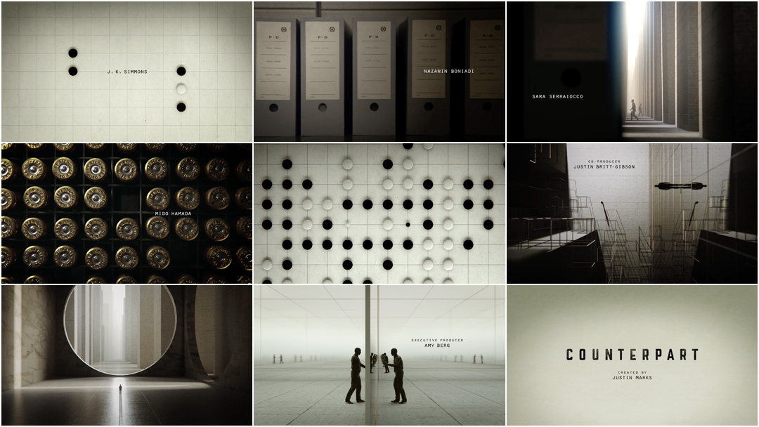
What if you could live your life differently? How many different ways could you live? These are the questions at the heart of Counterpart, Starz’s new show, as well as the prompts used by Creative Director Karin Fong to produce its Emmy Award-winning title sequence.
In the Cold War-espionage series headed by showrunner Justin Marks, actor J.K. Simmons plays Howard Silk, a man with an interesting job. Howard discovers that the agency he has laboured within for years hides a grave secret: a passage to another, parallel world, featuring another, parallel Howard. Think: the slow-burn pacing of the 1979 BBC miniseries Tinker Tailor Soldier Spy meets the 1998 parallel-Gwyneths film Sliding Doors with a dash of science fiction.
For its opener, Fong and the team at studio Imaginary Forces create a smooth and stark sequence that looks forward while looking back. Full of images shot on the show’s retro-futuristic set, a brilliant feat of production design by Knut Loewe and Dan Bishop and with decoration by Dianna Freas and Ingeborg Heinemann, the sequence presents a fascinating world of vintage machinery alongside modern tech. Watching these interior images glide effortlessly into giant, abstract landscapes peppered by small, lonely figures is a treat. As Fong says, this is very much an editor’s piece and it’s thanks to editor Zach Kilroy's keen eye and clever match cuts that the sequence flows so fluidly, macro shots slipping gracefully into grand landscapes. We caught up with Karin Fong to discuss the making of the sequence, winning her second title design Emmy, and the key to building great teams.
A discussion with Counterpart title sequence director KARIN FONG of Imaginary Forces.
The last time that we chatted for Art of the Title was in 2014, about your work on Black Sails (2014). So that was a while ago!
Karin: Oh wow! Yeah. [laughs] I’ve been doing more work at Imaginary Forces, continuing always to do title design but also a ton of other work. We’re doing a lot of things for the tech industry and still continuing to shoot.
Black Sails (2014) main titles, directed by Karin Fong and Michelle Dougherty at Imaginary Forces
Congratulations on your Emmy win! The award for Counterpart is your second title design Emmy win, right?
Karin: Yeah, it’s my second one! As my friend David Yee said, “Now you have bookends!” [laughs] Exactly. Seventeen years later.
Your first Emmy win was for your work on the title sequence to Masterpiece Theatre in 2001.
Karin: Yes, a long time ago! And a strange year to win an Emmy, right before September 11th. I won it for my rookie time and then, since, I’ve been nominated a few times and haven’t struck it until now, which is totally thrilling. It’s the satisfaction of having the respect of your peers. It’s lovely to see that title design is so visible in pop culture and the public sphere. All of us work so hard on this and all these details and to have someone notice, to have our peers recognize that work is great.
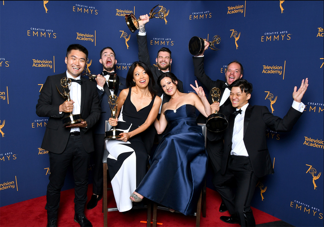
Members of the Counterpart title design team from Imaginary Forces, from left to right: Kiyoon Nam, Zach Kilroy, Karin Fong, Jake Ferguson, Maggie Robinson, Filipe Carvalho, Nathan Lee
You were an original founding member of Imaginary Forces back in 1996. You left IF for a couple of years to be chief creative officer for McG, the director. Tell me a little about that.
Karin: Almost two years, yeah! It was great. McG and I have always worked very closely together – ever since I did the titles for Charlie’s Angels. I did a lot of his shows subsequently, including Chuck. He invited me to hop aboard to see what we could make. It was an interesting twist to be on the content side. It was a great lens and experience, seeing the craft of directing on pilots, what goes into selling a show. Reading a ton of scripts and seeing that side of the business was really informative for me. Now he’s back with a studio deal and I’m back here [at Imaginary Forces].
Charlie's Angels (2000) main title reveal, created by Imaginary Forces
Let’s talk about your latest high-profile project, Counterpart. How did that conversation begin?
Karin: The conversation started with the showrunner, Justin Marks. I had just gotten the script an hour before our call and I was reading it and trying to digest it. I had read up to page 30 or something like that but I did notice that the main character, played by J.K. Simmons, plays a daily game of Go. I asked Justin about it, thinking there must be significance in this and sure enough he got right into how Go was more of a metaphor, that the interesting thing about Go is that it has fewer ways to move than, say, a game like chess but because of that there are many more permutations.
—Karin FongHow many ways can you live your life? It became a metaphor for the moves you make and how that controls your destiny.

The front page of the script for the first episode of Counterpart featuring notes by Karin Fong
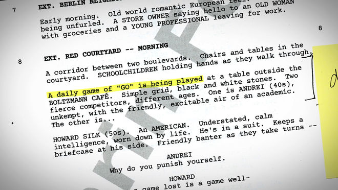
The section of the Counterpart script which mentions the game of Go
Had you ever played Go before encountering it here?
Karin: No! [laughs] I remember when I was little, there was an ad for Othello, this game, and it said it was “easy to learn but hard to master.” I think that was derivative of Go. We looked at the basic premise of that.
TV ad for the game Othello (1988)
It made me think, how many ways could you play this game? How many ways can you live your life? It became a metaphor for the moves you make and how that controls your destiny.
At the base of it, it’s a spy-espionage show and it was very clear what it shouldn’t be: It’s not a James-Bond shoot-em-up. While there’s a lot of action in the show, it’s more like those quiet, British espionage films like Tinker Tailor Soldier Spy where, we joked, nothing really happens!
Right, it’s more of a slow boil.
Karin: Exactly. There’s a sci-fi premise behind it and that’s the idea that the world, in the ’80s, has split into two. There’s a parallel world where another you is living your life in a different way. The protagonist in the show, J.K. Simmons, works at the Office of Interchange, a government agency that manages the passageway between the two worlds and kind of hides it. They control the crossing between the two worlds. So right away there’s this idea of a psychological break and paranoia. This is more of a Sliding Doors premise. “Was there a different way I could have lived?”
—Karin FongVisually, what does the template of your destiny look like?
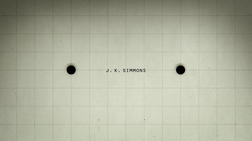
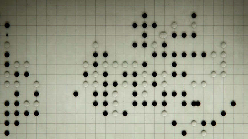
Stills from the Counterpart main title sequence
Karin: So it was about the question of if you can escape the template of your destiny. Visually, what does the template of your destiny look like? Is that a maze you can’t escape, is it cubicles that you get locked in? Are there structures or obstacles that are blocking you or is it like a pachinko machine where a ball just falls down into a slot? There’s all different ways of imagining that. That was a phrase I would go back to for ideas. On the script, I scrawled, “What if you could play the same Go game but make different choices in two simultaneous games? What if the game split?”
So, with the team of designers we explored the black-and-white opposite circles but also a gridded gameboard and that gave us a lot of graphic motifs to play with.
Go motion test
Did you storyboard those ideas? Tell me about your process there.
Karin: Yeah. The process for this was great because they shoot the show here in downtown Los Angeles. I went on set with Justin and Amy Berg, the other executive producer, and they showed me around. Diving into the period detail was incredible. The binders they use are very particular, the government agency has a handbook. It doesn’t take place in the past – it’s a present-day story but there is technology from the past. So there’s this retro-techno-futurism happening, a really interesting blend. They had these old IBM Selectrics and other typewriters with German keyboards, which made them ever-so-slightly strange to an English-speaking audience.

Image Set: Photos taken for reference on the set of Counterpart
Karin: They also go to Berlin, so I was also researching Cold War design. That’s the way I love to begin any project, a complete immersion on the show, and it was great when I could physically do that and go back and shoot things. When I was on set I had it in my head to pursue the Go game idea so whenever I would see circles or grids or dots, I would immediately pick that up. It’s like they say, If you’re a hammer, everything looks like a nail. [laughs]

Image Set: Early thumbnail sketches for the Counterpart main titles
Karin: Then doing storyboards was the next step. For that I worked with Filipe Carvalho. He does beautiful work and he has a cinematic sensibility but one that is very graphic. Another key person on the storyboards was Nathan Lee. Nathan’s strength is more in 3D. Filipe worked a lot with the photos and the Go game aesthetic and he worked them beautifully into frames. I knew I wanted something that references the architecture of Berlin and Brutalism... We put in two figures that were searching for each other…
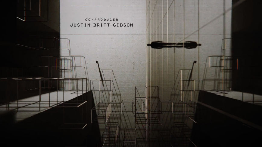
—Karin FongWe were trying to find a way to move between the macro of this office and these bigger, Berlin landscapes
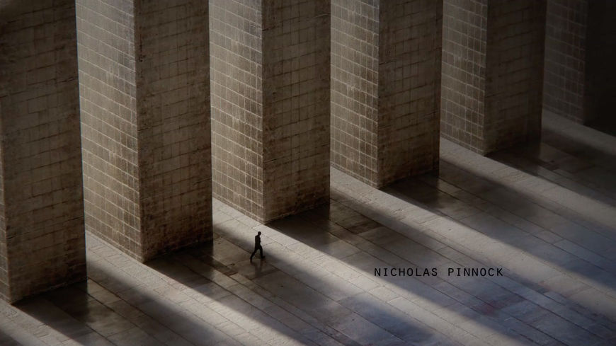
Stills from the Counterpart main title sequence
Karin: We had these two small figures in the space, in what became abstracted landscapes of Berlin. They represented this psychological break of seeing yourself or searching for yourself, your destiny. Taking all these motifs and making them almost dream-like. We were trying to find a way to move between the macro of this office and these bigger, Berlin landscapes, where these figures feel like they’re seeking each other out.
Transition test
In the very first call Justin said, “Let’s not do mirrors!” We were joking that the bad version of this sequence would be just, like, the main character looking in the mirror and seeing this alternate version of himself with a gun! [laughs] So we wouldn’t default to mirrors. But one thing that Kiyoon Nam did in one of the shots near the end so nicely is that he put a grid of mirrors. When the two figures come together they start to multiply so you have a feeling where you don’t know what’s illusion and what’s not.
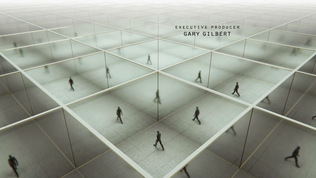
—Karin FongThe editing in this is what makes it into the piece that it is. It’s more of an editor’s piece, so to speak.
Early edit of the Counterpart main title sequence
Speaking of moving between spaces, the sequence does some interesting things in terms of its editing and match cuts. Images that mirror each other or reference each other. Can you talk about that?
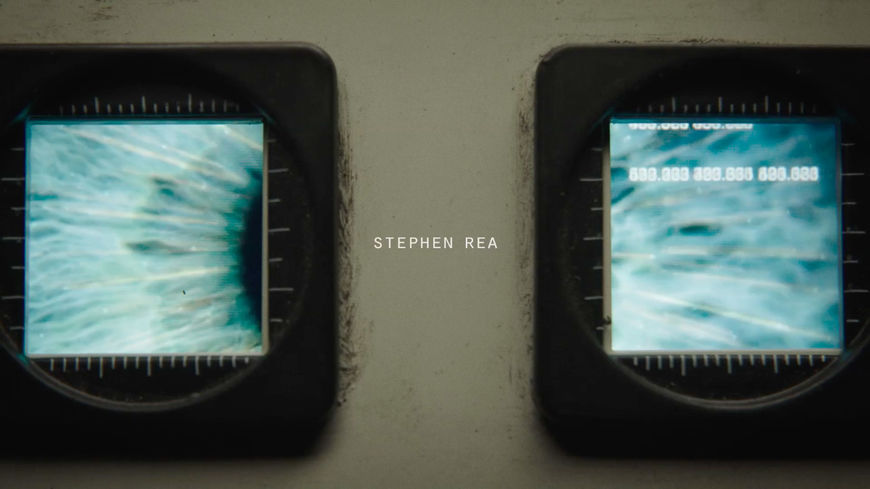
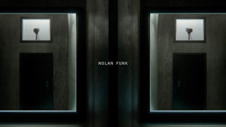
Karin: Yeah! One of my favourite collaborators is Zach Kilroy and I really feel like the editing in this is what makes it into the piece that it is. It’s more of an editor’s piece, so to speak. The minute we heard the music by Jeff Russo, we were really excited because it has a lot of layers. One of the best things to have when you’re editing title sequences is music that has changes and layers and a build. Our editor Zach could find all the similarities and he could see how one scene could go to another with a match cut. He and Jake Ferguson, our lead animator, would work back and forth with the animation to massage that and make it all work together.
Stills from the Counterpart main title sequence
Karin: I’ve always been a fan of optical illusions. Like, “Is this a vase or two faces?” [laughs] Or being able to pull out from something and be surprised. Because a title sequence often has a very impressionistic or surrealistic, almost dream-like place within the narrative so it’s fun to take advantage of that. You can’t always do that without being confusing in other parts [of the show] but a title sequence is the perfect place.
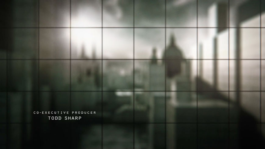
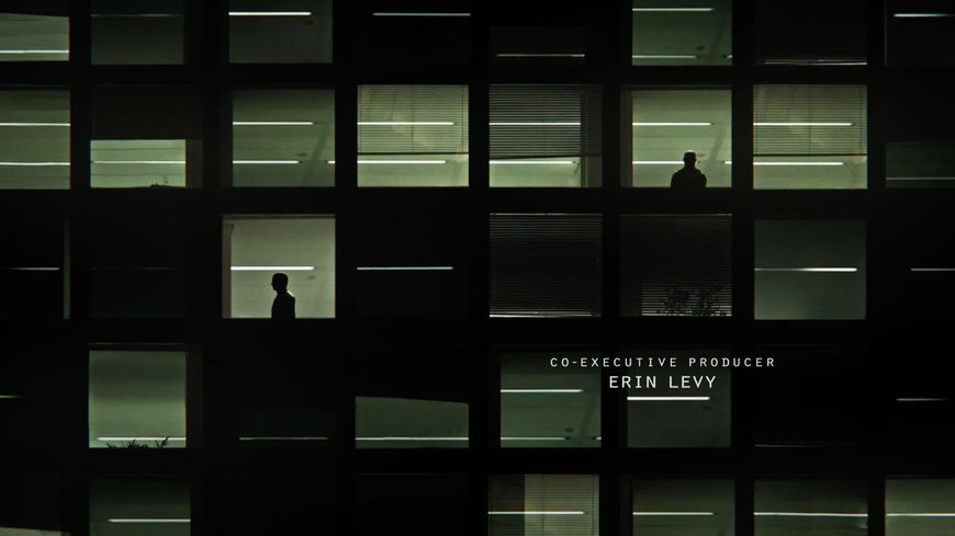
Stills from the Counterpart main title sequence
Which tools and software did you use throughout your process?
Karin: We worked a lot in Octane for this one. Maxon Cinema 4D. X-Particles, Flame. Adobe After Effects, Photoshop, Illustrator and Premiere, of course. I think we shot on an ARRI Alexa Mini.
VIDEO: Behind the scenes of the Counterpart main title sequence with Series Creator Justin Marks and Creative Director Karin Fong, produced by Imaginary Forces
And lastly, as a creative director, how do you view strategy and building teams?
Karin: I mean, the number one thing of course is to work with people better than you are. That’s the way your work is going to get better. I always like to work with people I admire, try to learn from them. A long time ago I used to animate. My mentor, Kyle Cooper, said, “Don’t. You can work with people better than you on that,” and it’s true. I was fine at it when I did it but when I see the beautiful work that Jake and Kiyoon and Nathan can do with CG, I could never match that. Working with people that will elevate ideas and that you can have a dialogue with is really important to me. Every project needs a leader but that means taking ideas from wherever the best ones come from. That’s a real way forward.

