“This is the place,” the general declared. Los Alamos. A small, otherwise unremarkable town in the New Mexico desert hiding a very big secret: the atomic bomb. Out of the wasteland the people flocked, their families in tow. The best and brightest, the extraordinary and the ordinary, a critical mass of talent coming together for a terrible purpose. Soldiers and scientists, teachers and engineers, all hiding the truth of “the Project” from their loved ones.
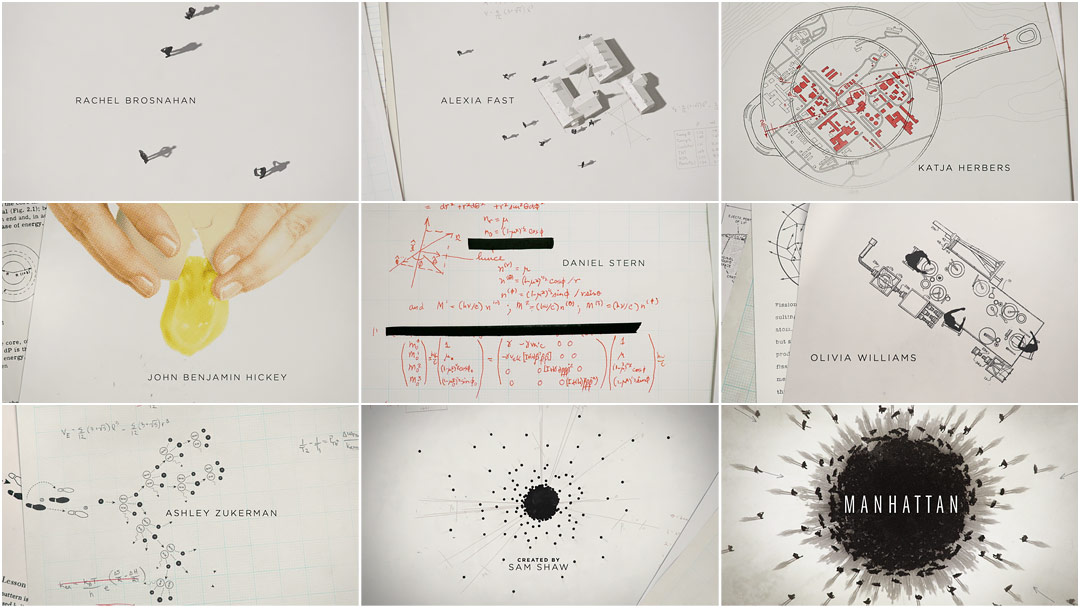
The diagrammatic titles for the WGN America wartime drama Manhattan draw a picture of daily life for the men and women involved in one of history’s greatest R&D projects. Designed by Imaginary Forces, the sequence brings new meaning to the term “nuclear family,” cleverly juxtaposing the humdrum realities of suburban living with the theoretical physics and hard math that ushered in the Atomic Age. Match cuts turn the grim science behind the construction of the bomb into innocuous objects and occasions – a frying egg and dinner time.
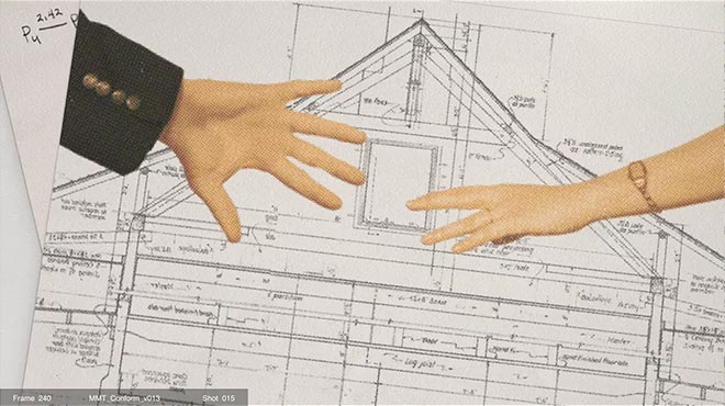
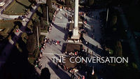
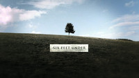
With oblique references to other famous intros, the Manhattan opening stands firmly amidst the framework of the history of title design. The tiny figures and long shadows evoke the opening of The Conversation, the parting hands eerily similar to those in Six Feet Under, the redacted information reminiscent of Karin Fong’s work for Rubicon, and even the egg, a possible nod to Dexter.
Winner of the 2015 Emmy in Outstanding Main Title Design.
A discussion with Creative Director DAN GREGORAS, Art Director JEREMY COX, and Producer JON HASSELL from Imaginary Forces.
Give us a little background on yourselves.
Dan Gregoras: I received my BFA from Maryland Institute College of Art 2002. My degree was in General Fine Art since I couldn’t pin down what I wanted to focus on. They had a fledgling CG program with a few 3D courses and from there I was hooked. I moved back to the New York area after graduating and dove into the VFX and 3D animation community here. I started out at 1stavemachine as an art director and tech/project lead which then led me to Psyop and Buck. In 2012, Imaginary Forces contacted me about an opportunity for a creative director position which I jumped at.
Jeremy Cox: I studied graphic design at the Ringling College of Art and Design, and was quickly drawn towards motion design. As a student, the work of Imaginary Forces was a huge inspiration, so I couldn’t have been more excited when they offered me a position as a designer. That was in 2006, and since then I’ve worked on many amazing projects in a variety of different roles, and even had a couple Emmy nominations!
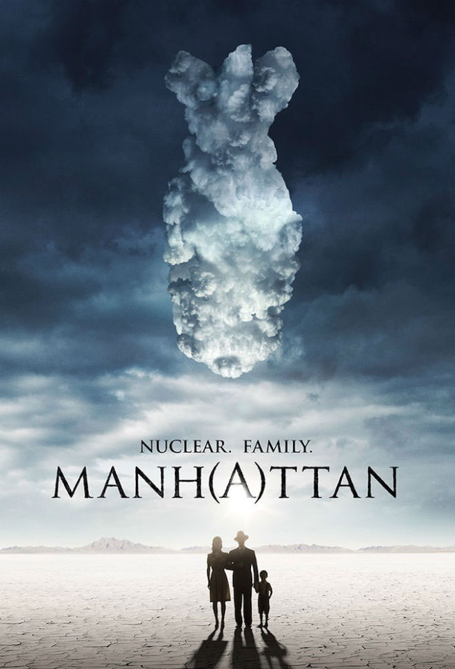
Marketing poster for Manhattan
Jon Hassell: I graduated from Emerson College in 2003. I spent a number of years writing and playing music all over the country, before transitioning into the New York production scene. I've worn a lot of hats, and produced a wide variety of work, from live action to animation and everything in between. I came to Imaginary Forces' New York office in 2011 as senior producer.
So, how did this project – the title sequence for Manhattan – come to you?
Dan: Sam Shaw [Manhattan's creator] and Peter Frankfurt [Imaginary Forces co-founder and executive creative director] go back a ways, but for whatever reason we hadn’t been able to line up on a project before this came in.
Jon: We were initially approached to pitch on the titles almost a year ago, but for logistical reasons we had to pass on the opportunity. As it turns out, Sam and the production team were having a hard time finding the right tone in the creative directions that had been presented. Sam reached out to us again, and thankfully we were able to make it work.
What was the first client meeting like?
Dan: Sam Shaw had two initial points for us to think about. One being that Los Alamos, NM was a place of significant scientific discovery, but also a place full of secrets. The individuals that were there could not share what they were doing even though they were in such close proximity to one another. The second point was that these secrets put a lot of pressure on the everyone’s relationships. Sam was very careful not to describe what it was specifically that he was looking for, nor did he share what he’d already seen.
Jeremy: It was clear that everyone involved was very passionate about this show. They had a very particular vision that was not what immediately comes to mind when you think of The Manhattan Project*. They gave us some major themes, but specifically didn’t get into their own ideas of what it should be. They wanted us to come at it with fresh eyes and no preconceived notions about the titles.
*The Manhattan Project was a research and development project that produced the first atomic bombs during World War II. It was led by the United States with the support of the United Kingdom and Canada.
Detail your initial pitches for the sequence.
Dan: We had three initial concepts, and a fourth, more broad idea. I wanted to make sure that we were well-rounded in our approach.
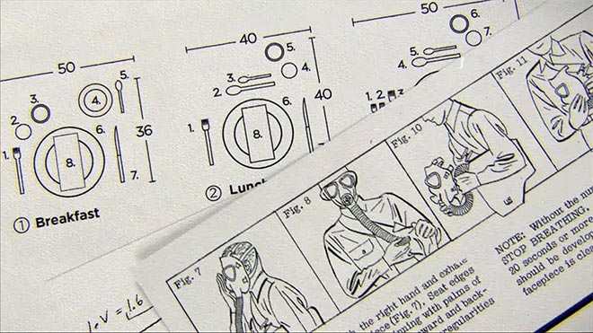
We discussed the idea of planning and the colossal amount of work which went into not only creating the atom bomb, but Los Alamos as a town itself. The town plan for Los Alamos actually inspired future suburban town plans that popped up all over the country, and many other patents were also created. While this was happening people were trying to live their lives – have dinner with their families, do chores, have get-togethers. There’s a certain irony these individuals experienced trying to live out their lives and simultaneously, fervently try to create one of the most powerful weapons in the history of mankind.
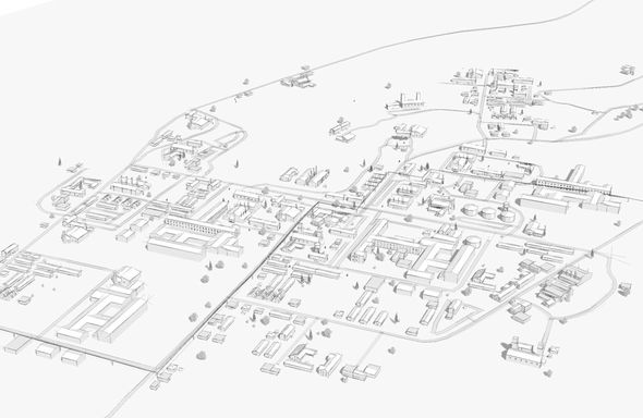
Diagrammatic visual style by designer Griffin Frazen
Jeremy: The concept came out of the idea of diagrammatically showing the juxtapositions between home and science that in Los Alamos. Hundreds of the smartest scientists in the country and their families were all suddenly living together in a city that was built for this sole purpose. We kept on referring to this as a sort of colonization of Mars. In many ways they were creating something out of nothing.
Dan: Our designer Griffin Frazen ran with that idea and came up with a visual style that I knew right of the bat had legs. It was minimal, elegant, and sophisticated. After that, it came down to conceptualizing other moments of irony and boarding out the rest of the sequence.
Jeremy: Griffin was an intern at the time. He has a master's in architecture, but was interested in getting into the motion industry. We’ve since hired him as staff designer, so he’s off to a pretty good start!
And the second board?
Dan: Surrealism and irony was the focus of our second board, with people going about their daily lives during a nuclear fallout. It was also a metaphor for those people being drawn to Los Alamos for the task of engineering the bomb – like moths to a light bulb. We liked how these everyday, seemingly idyllic moments of jump rope, laundry wires and white picket fences were set against this desert wasteland, like an alien landscape. And of course the impending detonation was sort of teased throughout the board.
The third idea was more photographic, but focused on the veneer of secrecy that shrouded Los Alamos. The sequence starts out with a car approaching the town. We travel with the car through the town, discovering propaganda painted on the sides of buildings, mysterious people in partial shadow, finding suggestive moments in this town of secrets.
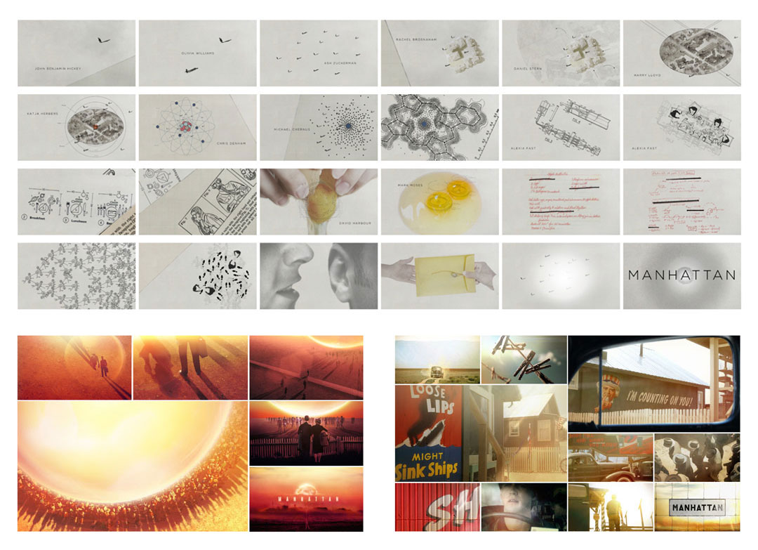
"Order and Chaos", "Moths to a Flame" and "Propaganda" pitches
Jon: There was a fourth concept as well, which was still a fairly broad idea by the time we presented, but we thought there was potential there. We wanted to re-create the town using tin toys of the era: brightly colored people, places, vehicles, all mounted on these directional tracks set into the floor. It was fun, kind of cheeky, but also a little creepy.
There was so much to run with, one of our first challenges was paring back which angles we wanted to tackle. But those early sessions were basically lengthy discussions about life in this bubble, about this city built from scratch in the middle of nowhere, the normalcy that in hindsight seems kind of crazy… not to mention the impact that this period had on society and the post-war world.
Jeremy: The schedule, also, was compressed. We only had about a week between the first client meeting and the pitch. We presented those three fleshed-out directions and the rough idea.

“Tin Track” pitch idea
What kind of research did you do on the time period of the show?
Jeremy: This is my favorite part of the process! I love really delving into a fascinating period like this and learning everything I can. I was already well aware of the Manhattan Project and what they did there, but there is so much of it I had no idea about.
Jon: Our ECD, Peter Frankfurt, gave us a ton of insight right off the bat – he's a bit of a history buff on the subject, so that was great.
Dan: We did lot of research into the planning and layout of Los Alamos. There is quite a bit of archival photography of the town and its buildings. Even though most of it was black and white you could still get a sense of how dusty and sun-beaten they were. We received scans of prop scientific notes from set, too.
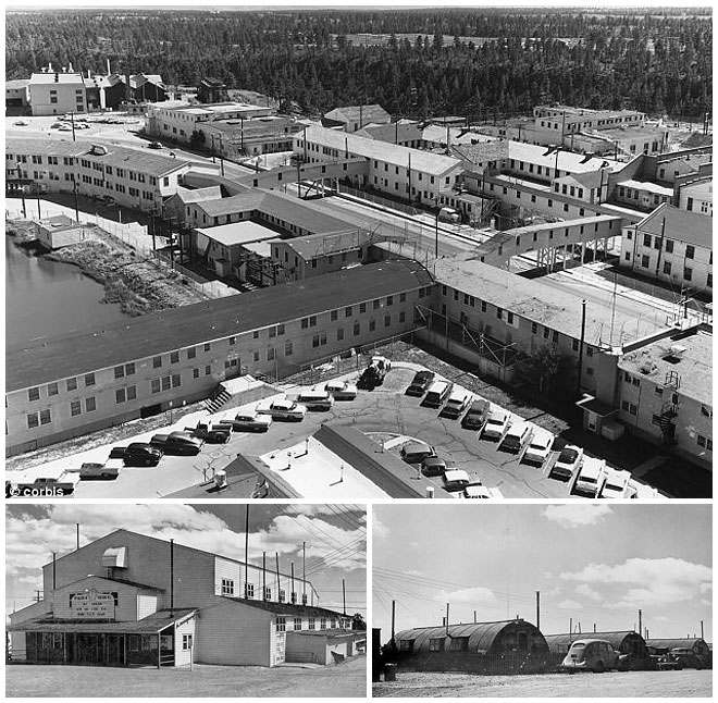
The town of Los Alamos, built by Sundt Construction, Inc., in 1942
Jeremy: I found seemingly endless PDFs of declassified documents about the US nuclear program in the late ’40s and early ’50s. These were a great source of additional imagery to flesh out the sequence and lend authenticity. Amazing what you can find on the internet! I’m probably on various government watchlists now.
Tell us about the different iterations you went through. What kind of client feedback did you get?
Dan: The initial rounds were a bit slow-going. We spent a lot of time in the boardomatic stage while also we were developing the animation style internally. Naturally, it was a bit tough for the client to wrap their heads around how these scenes would eventually move and transition into one another.
Jon: We had a number of different thoughts on animation, but it was important that the motion was cohesive throughout. We had to be careful to not get too attached to one element, in case it didn’t make sense anywhere else. That just took a lot of experimentation on our end before we were able to present something we felt would work for the duration of the title.
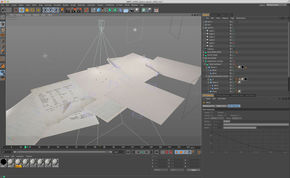
Cinema 4D screenshot
Initial C4D motion test
Dan: We used two key scenes as the basis of our motion tests: the dance sequence and the reactor/table schematic. Once we illustrated how the sliding and falling pages of plans would be used as a formula for a transitional device we were set, and Sam and Tom Schlamme [Director/Executive Producer] were comfortable. From there, we were all on the same page and we flowed through the rest of the piece without a lot of back and forth.
Jeremy: The client had nothing but smart and productive notes for us. Every time they pointed out a transition that wasn’t quite right or a beat that wasn’t working, they were absolutely correct and the final piece is better for it. The ending was the area with the most back and forth, both in initial design and final execution. After a couple rounds of ideas for the title reveal that weren’t clicking, Dan came up with the image of all the people from the beginning coming back together at the end, and everyone loved it.
How did you work with the music? When did that come in?
Dan: Sam initially provided us with about 20 different tracks from the era and about “The Bomb.” Some were campy or too country, but there was one that stuck out to us that worked well called "The Mushroom Cloud” by Sammy Salvo. It helped emphasize the sense of irony and brought a subtle dark humor to it.
Ultimately, Jónsi of Sigur Rós and his partner Alex, who will be scoring the show itself, were brought in for the final title music. They developed something that was more in line with the show’s score, much darker and more mysterious. Now I couldn't see it being anything else.
A work-in-progress cut of the sequence, featuring “The Mushroom Cloud” by Sammy Salvo
Jeremy: It’s interesting to look back at the process and how much impact the music can have on the tone. Both options worked in their own way, but the scored track we ended up with is much more in sync with the show. We’d been animating very specifically to the beat of the original track, so I was pleasantly surprised how easily we were able to transition our animation to work with the new music from Jónsi and Alex.
Who else did you work with on this title sequence and how big was the production team?
Dan: This was a relatively small team from start to finish, with myself directing, Jeremy art directing, and Jon producing. The concept was primarily designed by Griffin Frazen, with input from myself and Jeremy. The initial boardomatic was cut by Karl Amdal. Jeremy then animated, along with Sekani Solomon.
Jon: With a team this size, it really opens up the opportunity for collaboration – everyone has a seat at the table, and it's a constant exchange of ideas.
Live-action figure shooting and animation
Which tools and software did you use to put it all together?
Jeremy: Most of the animation was done in After Effects, but we also ended up doing quite a bit in Cinema 4D. All the paper movement was animated, lit, and rendered in C4D, and some of the diagrammatic elements were created in 3D and rendered using C4D’s Sketch and Toon renderer.
The piece was edited in Final Cut Pro and conformed in After Effects. We also shot various elements in the office, including the egg break, the hands being pulled apart, and the overhead figures.
What element(s) of this sequence are you most happy with?
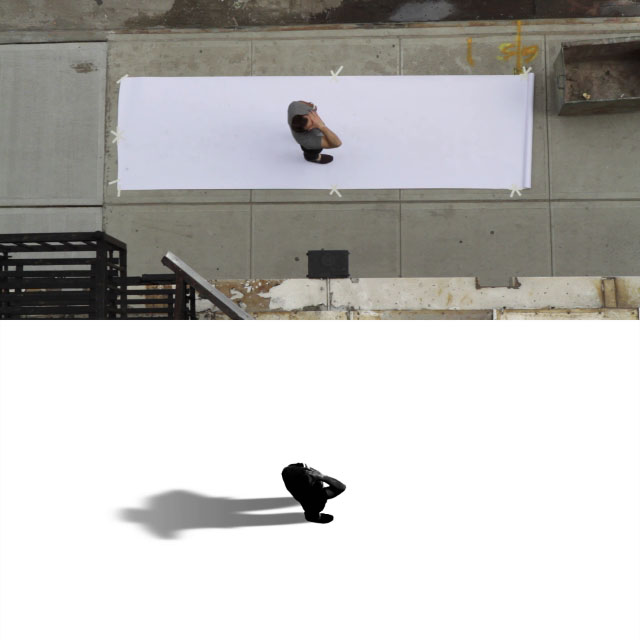
Jeremy: Early on I was a little dubious of the little figures walking around, but I’m really pleased with how they came out. We took advantage of our office's location on the 5th floor and used our 7D to shoot IF staff members walking on the sidewalk below.
Dan: That was actually a ton of fun! I was on the ground and we layed down a 4x16 piece of white paper for people to walk on so it would be easier for roto. I had Jeremy on speaker while I was directing people. He was five flights up, hanging out the window with the 7D.
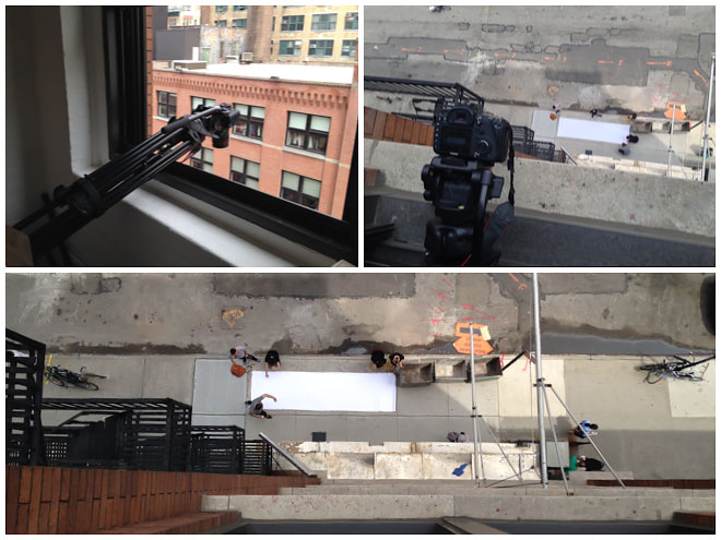
Stills from the live-action figure shoot
The apple butter pie recipe shot was also tricky one. I needed someone with brilliant cursive to write up the ingredients list. A few of us tried with little success. We were awful and most of us have an illegible chicken scratch. So my mother came to the rescue! She owned it. She came to visit so I brought out the pad and pen. The best part is that she is just as much the perfectionist as I am. If any letter was off, I wouldn’t have to ask. “That B did not turn out well,” she would say, and start over. We went through almost 12 iterations and she nailed it.
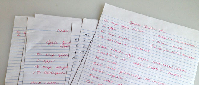
Dan's mother's pie recipe
What are some of your personal favorite title sequences, whether classic or contemporary?
Dan: Rubicon is definitely up there. Considering that Jeremy was part of the brain trust that conceptualized and created it, I feel pretty lucky to have had him on my team. Hard to look past Game of Thrones, too.
Jeremy: Dr. Strangelove has always been a favorite of mine. More recently, Enter The Void felt like I was seeing something entirely new and exciting.
Jon: I'll always love Deadwood's opening; that piece really owns the tone of the show. I'm a fan of a good live action sequence – well-shot, simple narrative, but also able to stand on its own as a sequence and not just a rehash of the show itself. Pieces like Vikings, Dexter, and The Killing are all great examples of that.
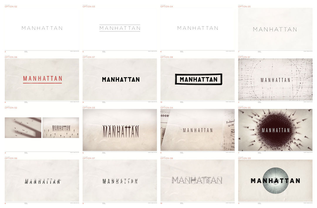
Manhattan title card treatment options
What do you think a title sequence gives to a TV show?
Jeremy: In the simplest sense, it prepares the audience.
Dan: They get me pumped up to watch the show! Especially if it’s one that inspires me and is something that I could watch over and over again. There is something special about a piece of conceptual art in motion at the beginning of a show that sets up the audience for what they are about to experience.
The good ones are iconic and hard to forget. Show fans may not remember every scene from every episode, but they’ll have a lasting memory of a good title sequence. It creates a sense of permanence.
Learn more about the Manhattan Project in Richard Rhodes’ book The Making of the Atomic Bomb.
Jeremy: It may have been a week since they last saw the show, so the title reintroduces the viewer to this other world. A TV title sequence is a very unique beast when compared to film. A film title is viewed once, whereas a show’s sequence is on every single episode. This changes the approach. For example, if you’re using a twist ending, it’s only going to be a surprise the first time the audience sees it. The best TV title sequences feel like they evolve over the run of the show, even if they didn’t actually change. The audience imparts meaning on the imagery that changes along with the show and its characters.
Jon: There's something to be said for setting a mood, a tone – in the case of this sequence, we're using a visual language that you wouldn't necessarily think of when it comes to the show itself. But together, it adds a subtext to the material – it gives you a lens to look through.

