Destroy. Create. Destroy. Create. Destroy. Create. Human nature in a nutshell.
Our two most base impulses may seem like opposing ends of some primeval spectrum, but they are intrinsically linked. When form and shape are broken down into their most basic parts, do they lose meaning? Does the purpose or intent of an object change in the breaking?
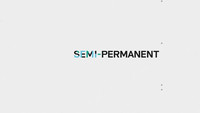
In MK12’s pulverulent titles for Semi-Permanent Sydney 2014, a letter is still a letter, even as an explosion of particles, a billion tiny pieces expanding into the void. Out of that disintegration comes potential, the possibility for something new, something different, assembled from something else. Accompanied by a tune that could power a mad scientist’s work, the sequence is both a fitting allegory for the creative process and a stunning testbed in which to explore it.
Full disclosure: Ben Radatz is a regular contributor to Art of the Title
A discussion with Creative Director BEN RADATZ of MK12.
What has MK12 been up to since we last spoke for Quantum of Solace?
Oh, it's been a bit of everything – some game and festival promos, some commercials. Kansas City, where we’re based, was chosen as the first city to get Google Fiber internet, for whatever reason, so we worked with them on some local promotion. Last year we collaborated with artist Brian Alfred on an experimental film, Beauty in Danger. We've also been working on a short film for the past two years, which has been a slow-moving labor of love.
Why Speed Matters Google Fiber promotion by MK12
And how did this project, the title design for Semi-Permanent Sydney 2014, come to you?
We've known Andrew Johnstone and Murray Bell, the festival founders, for a while now. We've spoken at some of the Semi-Permanent events and have made a couple of festival promos for them, in '03 and '05. It had been a while since we'd talked with them, so the invitation was a bit of a surprise!
How is designing a title sequence for a conference or festival different than designing for film or television?
The process and motive are much different. Architects say that cathedrals and libraries are dream projects because they offer so much creative license and encourage innovation by their nature; the same can be said for motion designers and festival titles. TV and film also promote the same things, but there are still a lot of layers to consider: the arc of the show, the producers, the director, the legal requirements. Festival titles are more casual and direct; they are a commission from the promoters, so the boundaries are looser.
How did you start? How many concepts did you have?
Exactly one! We didn't have much time to second guess ourselves; we just had to pick an idea and hit the ground running.
Did you develop mood boards or inspiration boards?
We developed some rough boards to communicate the idea to the Semi guys, then a rough animatic to work out our timings for the live action shoot, then the real deal. It was a fairly organic process and came quite naturally. I wish I could say the same for all projects – a lot of the time it's a struggle to pair the right idea with the right visuals and music. But this one came together pretty easily.
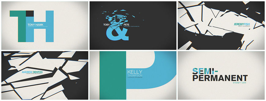
Storyboard
How did you construct the letterforms?
We worked with Dragon Dronet and Renegade Effects Group, who have done props and miniatures for classic films like Star Trek, Terminator 2, Starship Troopers, the White House explosion in Independence Day. He was basically the mastermind behind how to do it on a tight budget. He bought a whole alphabet of wooden block letters and then took vacuform molds of them in styrene, which gave us little letter-shaped trays that we could fill with powder. The idea was to blast a good amount of air from underneath up through the trays towards camera. We ended up using high pressure compressed air instead of explosives. We had to hand-drill hundreds of little holes in the bottoms of each tray, and we ran the air through custom-designed air turbulence creation boxes that would cause the chalk to move in a more interesting and organic way.
Letter assembly by Dragon Dronet
What was the chalk like to work with?
Chalk is messy. Every time we'd blow up a letter, there would be a 10-minute clean up afterwards!
People are surprised when we tell them that the letters were only about 6-inches tall. We were really pleased with how difficult it was to judge the scale of the explosions due to the powder's particulates being so small.

Letter construction design
How did you handle the live-action shoot?
The shoot happened out in LA; with specialized gear like this sometimes it's just easier to go to it instead of bringing it to you, especially on a budget. We were introduced to director Brendan Bellomo through a mutual friend – he has a background in visual FX and picked up a Student Academy Award in '09 for a hybrid live action / digital short called Bohemibot, and since then he's basically been specializing in shooting things in ways that don't occur to other people – underwater, on fire, in extreme slow motion, and so on.
Right away he got what we wanted to do, and from there he took it on as his own project; he put together a team out in LA, and they worked out all the mechanics, which are deceptively complex given the end result.
Behind the scenes at the live-action shoot in LA
How did you set up the lighting? Were there any practical challenges you encountered?
We relied partially on the sun shining on a white pop-up tent which created a very soft source, along with four 2K Arris tungsten lights with light diffusion for side lighting. However, due to bulbs blowing out, we only ran three of them simultaneously – shooting high-speed requires a lot of light.
How did you decide on the music, “Mass” by Virtual Boy? When did that come into play?
There was no allowance for music, so we just came up with a wishlist and petitioned musicians directly. Fortunately Virtual Boy was at the top of our list, and they were very cool about loaning us their track. That was one of the first things we did as we had to build an animatic for the live action shoot.
Initial animatic
How did the ‘grid’ environment that you used come about?
By accident! We were using the grid as a compositional tool with intentions of turning it off eventually, but decided to leave it in. It grounds the sequence and gives it a vaguely scientific feel, like each name is under examination.
Why did you decide to use the super-widescreen ratio?
That was actually the format of the projection system at the conference, a clean 3:1 aspect ratio. I won't quarrel with the 16:9 letterboxing though – it looks quite handsome that way, I think.
Do you have a preference between practical and digital work?
It's whatever gets the job done best, which is almost always digital these days. But there are some things that just don't translate well, or at least not without more effort than it's worth: cel and stop frame animation, high speed photography and FX – almost anything dependent on idiosyncrasy and an element of surprise, really.
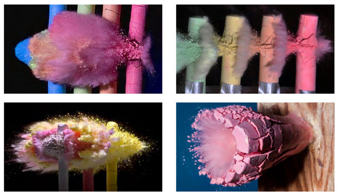
High speed photography reference images
What were some of your influences for this sequence?
We referenced a lot of high-speed bullet photography when coming up with techniques.
With high-speed photography there's just no way to predict what you'll get until you play back the takes. The full-speed effect is fairly underwhelming – it just looks like a puff of smoke. But watching it at 2600 frames per second – roughly about 100x slower than real life – is an entirely different thing. Because of the contours, each letter exploded differently, sometimes shooting out miniature comets, sometimes making miniature tornadoes. A few of the letters had ground-up glitter in the chalk, which made for some really nice subtleties.

Full speed (2600fps) vs high speed (24fps) playback
Which tools and software did you use to put it all together?
All After Effects on desktop machines, which our resident mad scientist Chad Perry builds from scratch. It's his fault our lunch breaks are shorter; now we can't use render times as an excuse.
How would you feel about a possible Best Title Design category at the Oscars?
It's high time. The days of title sequences as doormats for their films is long gone. Since the '50s and especially today, title sequences pioneer artistic and technical innovation every bit as much as visual effects and animation, both of which already receive Academy recognition.
Carnival of Souls (1962) — main titles by Dan Fitzgerald
What are some of your personal favorite title sequences, either classic or contemporary?
Carnival of Souls will probably always be my hands-down personal favorite. Maybe it's the hometown connection or just the simple effectiveness of it; either way, I enjoy it more every time I watch it.
I've also really been into the work of Paul Julian and Bill Martin lately – both B-movie title designers in the '50s and '60s on films like Attack of the Crab Monsters and Sorority Girl. Iginio Lardani's work on the Dollars Trilogy will always be high on the list, especially The Good, the Bad and the Ugly. More recently, Delicatessen, Dawn of the Dead, Tetro, and Funny Games.
What excites you outside of design?
Being on the road, tracking down ghost towns and weird pockets of Americana between the coasts. Things can get strange fast once you're off the main routes, especially in the Midwest.
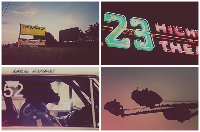
Road trip photography by Ben Radatz


