A long time ago in a warehouse somewhere in Van Nuys, California….
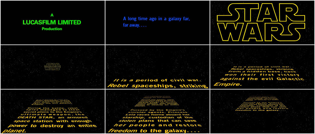
To classify the opening of 1977’s Star Wars as just a title sequence would be misleading. As a standalone piece painstakingly crafted by title designers, designed to set the tone of the film, as well as introduce audiences to the fantastic world envisioned by director George Lucas, it certainly operates as a title sequence. But the Star Wars main title and crawl – or roll-up – is so much more than that. It is simultaneously one of the most iconic pieces of film branding ever created and one of the most indelible moments in all of cinema. In 1977 it was, quite simply, unlike anything our planet had ever seen.
After a thunderous Twentieth Century Fox fanfare and Lucasfilm logo, the movie begins with a phrase suitable for any tale of knights, princesses, and evil wizards: ”A long time ago…” The text is tinted light blue in order to make the subsequent main title reveal all the more dramatic. Fade out and let the magic begin. Composer John Williams’ triumphant overture blasts the title card into frame and off to infinity as the crawl rolls into view. The familiar subtitle, Episode IV - A New Hope, would not be added until the film’s April 1981 re-release.
George Lucas describes the opening titles in his screenplay:
A vast sea of stars serves as the backdrop for the main title.
War drums echo through the heavens as a rollup slowly crawls into infinity.
Inspired by sci-fi serials like Buck Rogers and Flash Gordon, as well as a long forgotten Western, a chunk of expository text sets the scene, highlighting certain names and places in all caps to emphasize their importance to the narrative. Like the rest of the script, this text went through countless iterations before it could be put to film (though at least one alternate version of the crawl was produced for a rough cut). Fox initially opposed the idea of an opening crawl altogether, suggesting that a narrator could convey the same information more effectively, but the studio relented after Lucas’s friend, filmmaker Brian De Palma, helped the writer/director rewrite and streamline the clunky exposition.

Promotional posters for Star Wars including the original 1977 poster known as "Style A" by Tom Jung and featuring the vanishing point logotype initially designed by Dan Perri (top left), an alternate poster design painted by the Brothers Hildebrandt (top right), an updated version of the Hildebrandt poster featuring the final logotype (bottom left), and Drew Struzan's poster from the 1997 special edition release, also featuring the final logotype (bottom right).
Lucas would again draw inspiration from the swashbuckling adventure films he’d enjoyed in his youth for the film’s main title theme. Prior to John Williams’ involvement in the project, Lucas and editor Paul Hirsch added a temp soundtrack to an early cut of the movie. Work from a wide variety of composers was selected to help set the mood, including Stravinsky’s The Rite of Spring and Bernard Herrmann's Psycho score. For the opening crawl Miklós Rózsa’s main title overture from Ivanhoe (1952) was chosen, a heroic-sounding piece of music that almost certainly informed Williams’ Oscar-winning efforts.
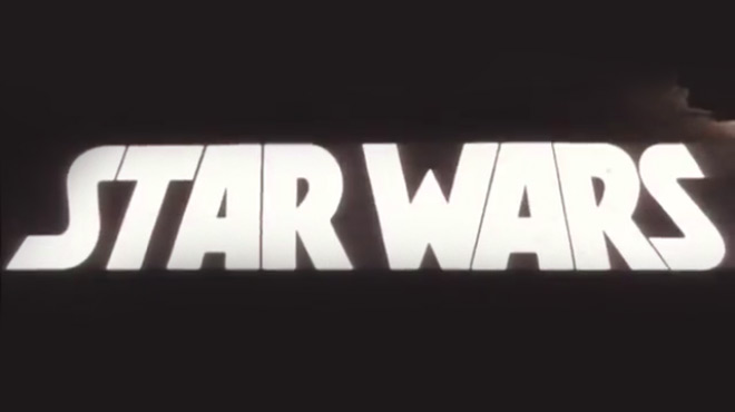
But what of that oh-so-recognizable Star Wars logo? The classic branding loomed large not just in the film’s opening titles, but on posters, t-shirts, lunchboxes, and every imaginable type of merchandise. Designed by artist Suzy Rice under the direction of Lucas, the logotype was then adapted for use in the opening by title designer Dan Perri. Rice’s logo design, originally created for the film’s bid brochure and other print materials, was ultimately chosen for the movie’s main title sequence after being revised by Industrial Light & Magic’s Joe Johnston. Perri, who had been hired to oversee and execute the film’s title treatment, also submitted designs for the Star Wars logotype, but Lucas rejected them for use in the movie. However, one of Perri’s main title designs was eventually used to brand pre-release posters and key art. After Star Wars hit theatres though, Rice’s logo design became standard on nearly all merchandise and marketing materials.
For fans of the saga, experiencing the opening moments of a Star Wars movie is like finding a key to their childhood, a hidden door to that fairytale world of Jedi Knights and an evil empire. But beyond all the nostalgia, beyond all the hype, the original Star Wars opening is simply great filmmaking. It’s a potent combination of music, typography, and sheer cinematic scale. As awesome as those screen-sized titles first appear, they are quickly dwarfed – both on-screen and in our imaginations – by the galaxy about to unfold.
A discussion with Title Designer and Filmmaker DAN PERRI.
So how did you first become involved in Star Wars?
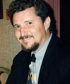
Title Designer Dan Perri, 1978
Dan: Often times, directors would recommend [title designers] to other directors. In this case, the post-production was so complex – it had never been that bad on any film – that an old friend of mine, Jim Nelson, who was a world-class sound editor and picture editor, was hired to post-produce Star Wars. He was what is now commonly known as the post-production supervisor. I'd rented space from him many years before that, so we knew each other really well, and he would often promote me for jobs that he was working on. He recommended me to George Lucas.
After they moved the production of Star Wars to Tunisia, they rented this big warehouse in Van Nuys, which is outside of LA, out in the San Fernando Valley. That’s where Industrial Light & Magic (ILM) began, in this warehouse in Van Nuys. They were shooting all the plates and all the effects and designing cameras, camera stands, and so on. John Dykstra was overseeing all of that.
An excerpt from George Lucas's third draft of "THE STAR WARS" which details the main title reveal and a very different opening crawl
What was the first meeting with George Lucas like?
Dan: I was called out to Van Nuys to meet with Lucas. We started talking about some of his ideas and he wanted me to see a lot of the old serials from the ’30s and ’40s, the Buck Rogers films and other space characters and adventures. He hired me and then I started going out there every few days whenever I had something new to show him, which he usually hated! He didn't like anything I was doing...
Really? You hear stories about how stressed he was during that time...
Dan: To say the least. He was under enormous pressure. I would bring what I was working on to George and I'd sit and wait for him for hours to show it to him. I’d sit and watch dailies with him or go to meetings with his guys. He had a lot of old films, 16mm, he had a projector in there. We'd watch Buck Rogers and Flash Gordon and glean things from that. Finally, he would have a few minutes for me, he'd look at it and wouldn't like it, then he’d get pulled away by something else and come back a few days later. This went on for two or three months until finally I hit on something he liked.
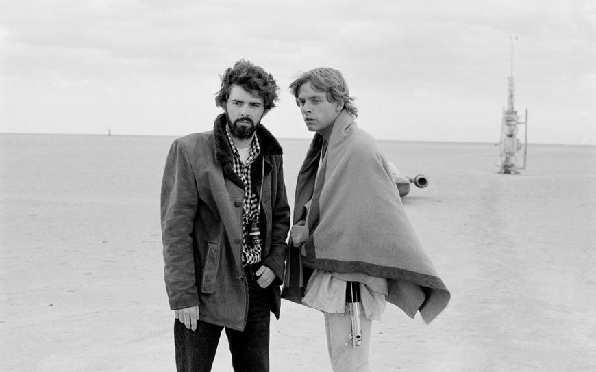
George Lucas and Mark Hamill filming Star Wars in Tunisia, 1976
What was it that he liked?
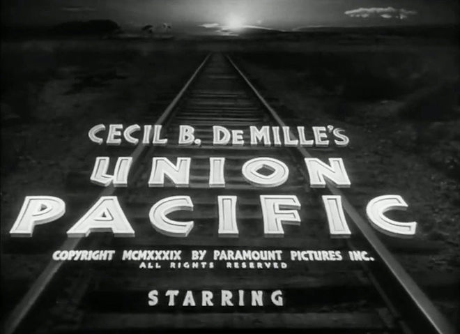
Dan: I came across this film called Union Pacific, which is just a basic film about the railway and people fighting over land and so on. A regular cowboy Western. But the main titles were looking down the tracks and these titles rolled towards you along the tracks, as if there was a train, or rolled away from you, I forget which it was. But I got an idea. I saw this motion of the titles rolling away from you into space towards a horizon line. So George liked that.
Union Pacific (1939) main titles
How did you move forward from there?
Dan: I began developing ideas and setting guides and text in different ways. I would shoot something on high contrast, just black-and-white film in motion, and shoot 30 seconds or so to show the artwork, which was on a big piece of cardboard, like three feet by six feet. It was mounted to a thicker board and on a hinge. I could tilt it different angles, shoot it in reverse – pulling away from it on this big camera stand with wheels – and make one take. It was a combination of moving the camera and moving the art.
The idea was that the titles would be in perspective and that they were being pulled in by the logo. It motivates the entrance of the crawl from the bottom of the screen, but it wasn't moving at the same speed. So, at some point, the Star Wars logo would fade out and the crawl would continue.
Then there were all the subtleties of exactly how that would look. How big would the type be? What angle would it be at? When it came in, how fast would it move? I played with the idea of it moving at different speeds, slower and faster. Since the legend was talking about things that were important to the viewers to know about the story, you had to be able to read that for as long as possible.
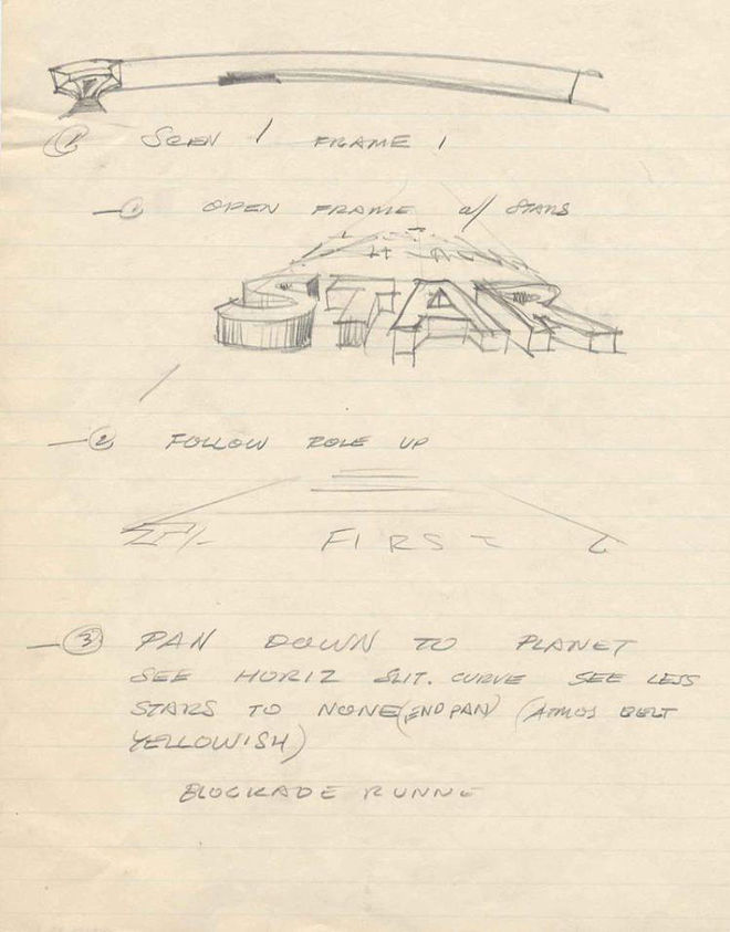
A handwritten outline of the opening sequence
So you had the concept and the camera rig, what came next?
Dan: I started shooting moves on the logo. It would blast away from you and pull out from the inside. It would fly away and keep moving into the distance and then disappear. Then the crawl would come up from the bottom screen. So, once I got the angle right and the perspective line, so it would look correct and most appropriate, I then would shoot different speed crawls. As it got back into space, the second line would obliterate the first line, then the third line would obliterate the second line and so on. So in order to maintain readability for longer I started proportionally spacing the lines. The second line was spaced farther away from the first line, and the third line farthest from the second, and the forth and the fifth and so on.
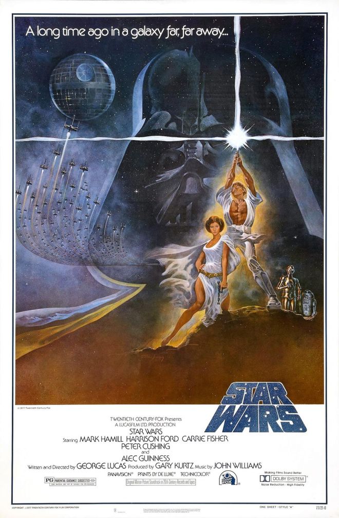
Star Wars (1977) poster featuring Dan Perri's logotype design
You designed a logotype for Star Wars that was eventually used in some of the marketing material – the one with the vanishing point and the starfield in it, right?
Dan: I did, but after I designed them and when it went to Fox, they made some changes. I remember when I saw it on a poster, I said, “That's not quite what I did.”
When I finally decided to do my book, I started going through my archives. I was looking for artwork that I still had and I came across four rejected logo designs that I presented to Lucas. They're tissue drawings done with ink pen, hand-ruled and filled in black. Then I made a scratch of them so it was reversed, what was black on the tissue is now white and the background is black. I taped them down to a piece of cardboard and I put a flap on them and I stuck my little logo sticker on them and I brought them over to him. He rejected all of them. I still have one of the tissues actually and three others are the scratch from the tissues that disappeared. So the scratch have become the original because the tissue no longer exist except for one of them.
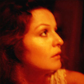
Designer Suzy Rice in 1978, Photo by Max Aguilera-Hellweg
Let’s talk about the logotype that was used in the title sequence. Who designed that?
Dan: For the titles I adapted a logo that Lucas had used for other graphic printed purposes, brochures and so on. Suzy Rice designed that one, the one with the straight "W".
Suzy worked for me when I was doing Close Encounters. After doing the titles, Spielberg said that Columbia wanted me to do the graphics for other parts, so they hired me. Suzy was on my staff. She produced the whole ad campaign with me, the posters, the billboards, all the ads. She kept trying to make design decisions and I kept discouraging her because even though she was a good designer, I didn't think it was right that I would take credit for anything she would do.
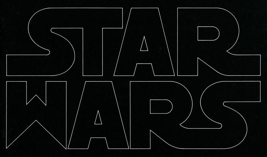
Suzy Rice's original Star Wars logo design. Read Rice’s detailed account of designing the logotype here.
Right, and then it was Joe Johnston who revised it slightly, flattening the "W" and widening the other letters. How did you work with the logotype for the title treatment?
Dan: I adapted it for the wide screen. I had to alter the logo for use on a scope picture, keeping in mind how the squeezing of the high contrast film elements would affect the sharpness and shape of the graphics. The limitations of the film resolution affected my choices in order to retain the integrity the design. I experimented with the thickness of the outlines of the logo to get just the right weight and leave a bold center inside the outline so it would hold up on film as it receded in size throughout the zoom.

Image set: Star Wars teaser posters showing the evolution of Rice's logo design
Dan: We shot many, many speed and vanishing point tests on the logo separately before pre-op compositing it with the best version of the crawl before the final optical composite on colour stock. We also shot many yellow, white, orange, blue, and gray colour density “wedge” tests before settling on just the right colour of yellow letters.
John Dykstra created the starfield. He gave me the starfield on IP – interpositive print – and I copied that and exposed the titles over it, did the drop shadows, pressed it and all that. It just went on forever.
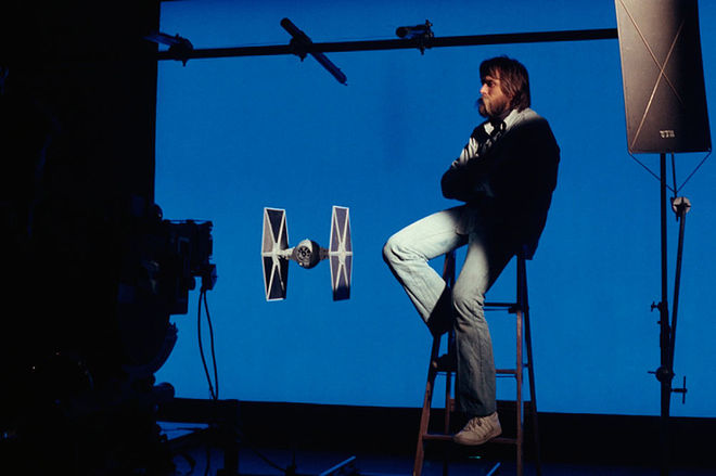
John Dykstra at ILM in 1976
So you’ve talked about the labour-intensive process, but did you encounter any serious challenges while working on the sequence?
Dan: The art was so fragile… After setting many type styles of the legend copy, the artwork was created by hand and made up of individual typeset words assembled and pasted to a large piece of black poster board measuring about 6 feet by about 3 feet. The big board wasn't stiff or anything but each word was pasted on separately, and then we'd move a whole line to make more space, and then re-line it up with a T-square. It was very hard.
But typical of shooting any artwork under a camera, you have to pump a lot of light onto it. That creates heat. The edges of each word were loose and all the words would start to curl up and catch light. You have to shoot over it and you wouldn't know how it looked until you developed it, made a print, and then you would see all these little white things following the crawl.
So you have to paint those letters down with flat black paint. Then once back under the light the letters start to curl up again, so you have to keep putting them back down, get gauges again, shoot it again, and you still might see a highlight and have to go back and do it again. It was just endless. It was just shot and shot and shot and shot. Finally we got a high-contrast element that we could superimpose over the starfield.
What tools were you using to put this together at the time?
Dan: We used the Acme animation camera at Modern Film Effects that was used to shoot all of the title elements on every film that went through that optical effects company. The camera was a 35mm single-frame camera movement that could only shoot a maximum of eight frames a second. It was not a live-action camera.

ILM Cameraman Richard Edlund, who worked primarily in opticals and miniatures, works on an early version of the opening crawl used as a placeholder
Dan: It was mounted to an elevated horizontal lathe bed track set in cement that allowed us to roll along onto the stationary artwork. We tested forward and reverse action to get the best speed and smoothness of motion. We used lots and lots of high-contrast film.
We used a standard anamorphic CinemaScope lens to effect the 2.35:1 aspect ratio of the film. We would shoot speed, framing and perspective tests for hours and hours and days and days. I would continually adjust and readjust the type word and line spacing trying to get the best combination of composition and readability. After several weeks of testing I finally got approval to composite the logo and the type crawl elements using a starfield to superimpose that ILM provided.
There was much experimenting and guesswork along the road to the final result. My production team was just myself and cameraman Mike Minkow. I produced the job at Modern Film Effects. Mike operated the camera and I developed the concepts, prepared the artwork and directed the entire project.
Ultimately, we had lots of fun and we're very happy with the final product. Mr. Lucas was very pleased.
An early version of the main title and opening crawl created by ILM for a rough cut of the film
Were there any surprises while you were working on this?
Dan: Somewhere in the middle of all this, while I was still putting it together, Jimmy Nelson called me up and said, George wants me to ask you: Would you be willing to take a half a point of the movie instead of your fee? And I said, “Are you crazy, no way in hell! No way!"
Oh, no.
Dan: So I turned down that half a point to get my seven thousand dollars ’cause I was being paid to do the design. [laughs]
Years later I learned from Jimmy that George rescinded his offer to a number of people who had accepted it. So he might have done that to me, too. But initially, if I’d said “Yes, okay, I'll take it,” and he let me have it, I would have made God knows…
A year before, I had done Days of Heaven and I was given a point on the film, which I've never seen a dollar on. So I was stung by that, and then I’d done a movie called Flesh Gordon – not Flash Gordon, but Flesh Gordon – and I had taken points instead of any fee at all. So, with those two things, when someone said will you take points instead of a fee, I just said instantly said no.

Image set: Artist Alex Tavoularis' storyboards based on George Lucas' third draft of "THE STAR WARS" feature one of the earliest iterations of the main title crawl.
How could you have known that it would do well at all?
Dan: Well, you couldn't! While I was working on it I used to talk, saying I was doing this stupid movie Star Wars. People said, what the hell is that? Some stupid space movie, some dumb things, explosions and spaceships, you know, just shooting all over the place.
What’s your opinion of the film now?
Dan: I continue to be amazed at its popularity and success. I'm certainly pleased at the passionate appreciation I've received for my work on Star Wars.
Around the same time I was working on Star Wars I was also working on a number of other eventually successful films. I had experienced a high level of appreciation for my contribution to those films. In contrast, Mr. Lucas was under such pressure and preoccupied with problems that it made him not only difficult to please but even to reach creatively to present and describe my ideas. Of course, in the end it all worked out but it wasn't one of my most enjoyable projects.
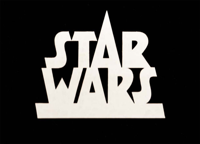
Unused Star Wars main title logo design by Dan Perri
Do you have any advice for designers working on the openings of future Star Wars films?
Dan: Due to the rabid popularity of the original logo from the first film I see no reason to change the logo in any way. Retaining its perfect integrity without updating or “improving” the original design is important.
While signing autographs at recent Star Wars Celebration and ComicCon conventions fans often asked me if the logo on the new film would be different from the original. Most became downright angry at the thought that their beloved logo would be changed. I would not recommend it.
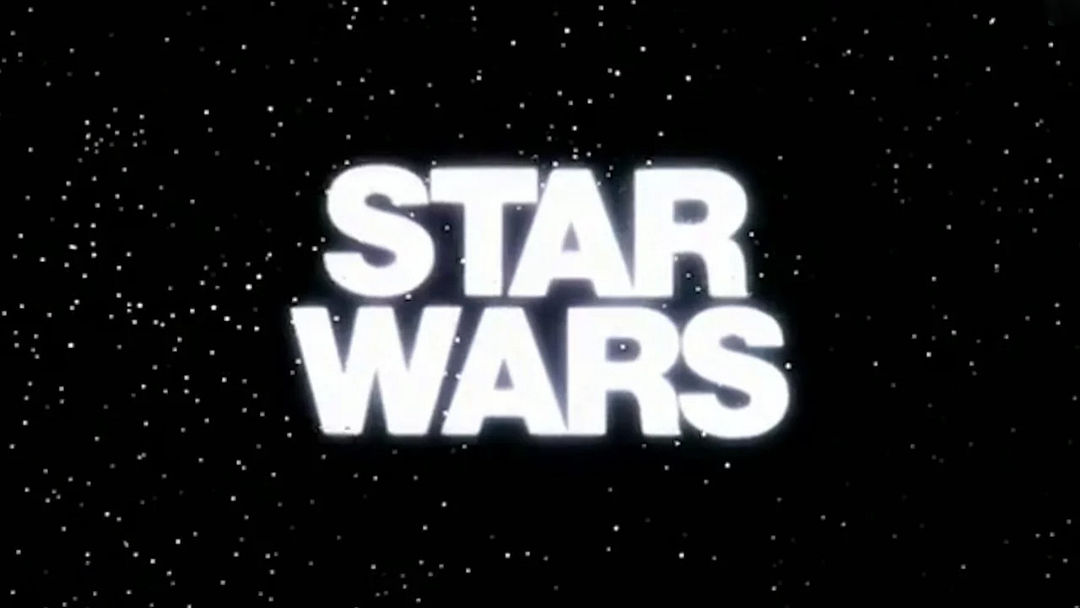
Star Wars (1977) theatrical trailer
For more insight into the making of the Star Wars opening crawl be sure to check out Dan Perri's upcoming book on his career in title design.
For more info on Suzy Rice's work on Star Wars read her in-depth blog THE “STAR WARS” LOGO DESIGN.
And for the complete behind-the-scenes story of Star Wars read J.W. Rinzler's amazing book The Making of Star Wars: The Definitive Story Behind the Original Film.

