November 1983. Hawkins, Indiana. Will Byers is missing.
Where the young man has gone and exactly who – or what – is responsible for his disappearance is a mystery to his friends and family, but answers may lie in the secretive government lab just outside of town – or perhaps somewhere in-between. It’s up to Will’s intrepid friends, his dogged mother and brother, a washed up cop, and a strange girl to discover the truth of what’s lurking below the surface of their seemingly normal town.
Netflix’s Stranger Things is a series loaded with subtle nods and not-so-subtle homages to some of the most beloved films of the 1980s. Showrunners Matt and Ross Duffer channel Steven Spielberg, John Carpenter, David Cronenberg, John Hughes, and everyone in between, delivering a shot of pure nostalgia, a dose of something both familiar to viewers and altogether distinct. Think Tarantino by way of Amblin Entertainment!
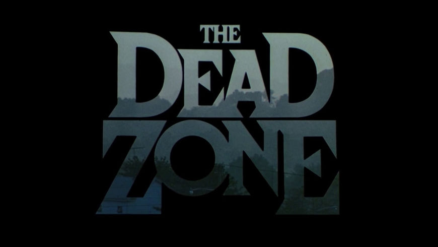
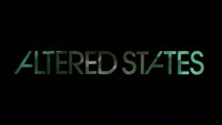
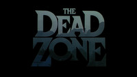
Similarly, the show's main titles function as a tribute to some of the era’s most iconic book covers and title sequences, a pastiche of first impressions. Paired with a synthy title track straight out of a Carpenter flick, the Stranger Things sequence echoes the openings of genre classics like Altered States and The Dead Zone both in form and tone. Large, hollow type drifts through a void, slowly assembling, its glowing red edges cutting through the darkness as smaller credits fade in and out. The primary typeface is Benguiat, carefully chosen for its deep associations with early '80s Stephen King paperbacks, the Choose Your Own Adventure series, and other dusty, musty touchstones.
The Stranger Things opening is not only a fitting successor to a revered title design tradition, but a testament to the power of type in motion and the enormous potency of nostalgia.
Winner of the 2017 Emmy in Outstanding Main Title Design.
A discussion with Creative Director MICHELLE DOUGHERTY of Imaginary Forces.
So, congratulations on Stranger Things! It’s gotten an incredible response. What was the first meeting about this sequence like?
Michelle: The first meeting was set up by Shawn Levy, one of the executive producers and a director on the show. He told us we’d be working with these amazing creators, the Duffer Brothers, and got us on the phone. After talking with them I could see what he was talking about. They had this incredible vision!
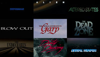
The initial call was them talking to us about some of the film titles that they liked. They referenced Richard Greenberg and all the greats that he’d created – The Goonies, Altered States, Alien, The Untouchables, The Dead Zone, just to name a few. That was great to hear because we understood where they were coming from. That was really refreshing – and pretty surprising – that these creators knew so much about title design.
After that call they sent over some book covers that they liked, from books that they’d either read or seen as children. Most of them were by Stephen King, so we knew they were looking for something that felt ’80s and tapped into this nostalgia by using that typography.

Examples of book covers that inspired the Stranger Things title sequence.
Michelle: They really loved the simplicity of those covers, but also those Richard Greenberg titles. To get that kind of brief – to let the typeface set the mood for a show – is a designer’s dream!
What was the mood or feeling that the showrunners were hoping to evoke with this title sequence?
Michelle: They sent us the script of the first episode early on to give us an idea about the tone they were going for, but they hadn’t shot anything yet. They described the series in great detail to us, but just by referencing some of the titles that they liked, we really understood that they wanted this creepy feel to it. The disjointed type getting set along with the music imbues it with this real sense of unease, which I really think they liked.
Stranger Things (2016) trailer
You were working on the titles before they’d even shot the show? That’s fairly unusual, isn’t it?
Michelle: Yes, it’s fairly unusual but it’s also really great! We started the process, they started to shoot, then we stopped working on the title for about a month during the shoot, and went back to it when they were really immersed in it all.
The company you’re with, Imaginary Forces, began as R/GA LA, the Greenberg brothers’ company, which essentially makes the Stranger Things titles a direct descendant of those iconic Greenberg openings. Did carrying on that design pedigree weigh on your mind while you were working on this?
Michelle: I don’t know that I thought that much about it, but I did think like, “Wow! OK, they’re referencing Richard Greenberg so this has got to be good because he’s one of the best.” When I first worked here – when I first freelanced – it was R/GA. So I remember hearing him and his brother’s names a lot and seeing Robert Greenberg in the offices. I definitely looked up to them, you know?
Aside from R/Greenberg’s title sequences, were there any other titles from that era that inspired the project?
Michelle: There were! Obviously we looked at all of R/Greenberg’s sequences – Altered States and The Dead Zone specifically. I know we looked at Bullitt by Pablo Ferro because it’s one of my favourite title sequences, but what we were really doing was looking for the optical quality they had rather than the motion design.
It’s so simple, but simple is sometimes the hardest.
Altered States (1980) main titles, designed by Richard Greenberg
The Dead Zone (1983) main titles, designed by Richard Greenberg
Michelle: Initially we started with this “locking in” motion where the different letterforms lock into place. It felt very rigid and snappy, but the Duffers weren’t really responding to that. I think the reason for that is because that wasn’t a really familiar motion in the 1980s. We wanted it to feel like it was from 1983 so we wanted to mimic the visual language of that time, which wasn’t a locking or snapping motion. So it was pretty great that they directed us in that way.
I came from a time when film titles were still done optically – at the beginning of my career I saw that – but my brain had to be refreshed about the process. When we were looking at opticals from that era, we were basically looking for the mistakes. You’re watching light pass through film so there’s this beauty to it, but there’s also mistakes that happen along the way. Our animator, Eric Demeusy, and I just went down this rabbit hole together, looking to find those mistakes.
Early version of the Stranger Things main title featuring the "locking in" motion
You also got some advice from a title designer who’d worked during that era, right?
Michelle: Yeah! We had a chance to pick Dan Perri’s brain when he came to visit Imaginary Forces earlier this year. He said, “If the opticals were done in the 1980s they’d pretty much perfected the technology by then. You wanted the smooth transitions, you wanted the type to move fluidly across the screen, you didn’t want jitters or anything like that.” If you look at stuff from the 1980s it looks pretty good! He was saying that we shouldn’t go too over the top. [laughs]
Perri would do the titles over and over to get them perfect. If the film shifted or there was a scratch or blemish, they'd do it again. So they actually looked clean. We had to push the style a bit, imagining a title designer who did them out of their garage without the proper equipment trying to make them as clean as possible. Or maybe someone that had made a mistake.
I remember one time I did a title optically at the beginning of my career that ended up pretty bad. I didn't see the mistake when I checked the print so it ended up in the final. It was really bad and it still sends shivers up my spine. So maybe I was just channeling some of those mistakes I made early on!
Early version of the Stranger Things main title featuring the "sliding" motion
Michelle: Things that we saw that we adopted were the fade-downs of the type that change colour in the fade. If you look super closely we added some of that, red in the fades. The jitter in the light was another. Also the way the type moved. If this was a real title done in the ’80s the designer probably would’ve been fired! We have maybe a few too many inconsistencies, but I think that’s what makes it beautiful and gives it that organic quality.
But what you ended up with wasn’t your only idea, right? Could you walk us through some of the other concepts for the sequence?
Michelle: We had three initial ideas that we presented. One was called “Missing” because the character of Will Byers goes missing in the first episode. We thought: What would the world look like without Will there? He was probably playing with his toys and then just left them there, or there’s a basketball in his backyard that he’s put away for the night because he’s going to come back and get it the next morning. The idea was that we would go shoot these very eerie scenes, but I think they might have felt a little too apocalyptic. [laughs]
The other one we played with was “Shadows” – type creating shadows or objects creating shadows with type. Those are the two other directions that we looked at.

Image set: Stranger Things "Shadow" concept boards
Michelle: There’s something about having a purely typographic sequence that’s a dream to any designer. We’ve tried to sell a similar idea many times, so for somebody to actually appreciate typography and the power of type on screen is refreshing. It’s so simple, but simple is sometimes the hardest. It really is the best of all possible worlds. The music is amazing and the show is great. All the ingredients really work together.
How did you develop the design of the typography in the sequence?
Michelle: Initially we tried some other typefaces – Cortez and a few others. We were actually working with another typeface for some time and then it got changed to Benguiat, which changed our process a bit. The logotype for the series had been finalized on the production side and we had to adapt. We’d been animating with a typeface for a while and then we changed it. A typeface is like an actor. Once you change the actor it’s a different thing.
A typeface is like an actor. Once you change the actor it’s a different thing.

Stranger Things logotype explorations
You recast your typeface!
Michelle: [laughs] Yeah, we recast! So then we had to find the most beautiful pieces of Benguiat. The other typeface maybe had nicer counters or serifs, but we had to switch things around to find the most beautiful parts of Benguiat.
What about the episode title cards at the end of the sequence? Was that an idea you pitched?
Michelle: We initially designed some different episode title cards for them, but they were actually the ones who came up with that flythrough that you see in the final version. Katherine Lang animated those. It’s a lot like Bullitt, so I was happy to see that.
Stranger Things episode title card example
So the sequence is entirely digital, but you did end up shooting a few practical elements for reference, right?
Michelle: Initially we wanted to film this out to see what kind of happy mistakes we could get. Then we talked to Dan Perri and he was like, “Ah, you don’t really have to do that!” We thought we’d make a Kodalith – which is basically a black piece of film with a transparent area where the letters would be – and shoot light through that. You’re basically mimicking what film does with the light passing through the film.
Kodalith reference videos
Michelle: Eric used that as reference, so we could look at what sort of quality that would have and find things that we wouldn’t have thought of. For example, the tiny bits of grain on the letters themselves or the imperfect edges or the different colour values that came through the red film because the light was hitting it a certain way. While we didn’t actually use that as the final, it was part of our process. All those little things helped inform our animation.
The music is such a huge part of this sequence. Did you work with the composers Kyle Dixon and Michael Stein at all?
Michelle: They gave us the music early on and as you can imagine we were thrilled when we got that email. It was a rough cut of the track, but we started pretty much right away using a version of the final track and then they recomposed it later.
Stranger Things actors Gaten Matarazzo and Caleb McLaughlin sing the title track
Michelle: I wish there was a bigger story than that, but they just kept giving us these gifts. Again, I think that has a lot to do with the Duffer’s love for title sequences; they knew the importance of having a great track so that started that process up front.
So how big was the production team on this project?
Michelle: This was a small team. I initially came up with the three different concepts and worked with Arisu Kashiwagi and My Tran to figure out the type. Arisu also worked on some initial boards of the three different ideas. But once the direction was decided Eric and I animated the entire thing. We used a little bit of Cinema 4D, but most of it was done in After Effects. Obviously we had production helping us – Dunja Vitolic helped us with production – but it was a pretty small team.


Stranger Things “Red” concept boards
Michelle: Eric created some of his own grain in After Effects and ultimately it was tonnes and tonnes of layering. He used some elements of Lens Distortion 4K which is real shot optical lens flares, but only for like one or two shots, and he used Gorilla Grain which is real scanned 35mm film grain. The Duffer Brothers also used scanned 35mm film grain in the grade of the actual show.
We feel really lucky to be part of this show. It’s like all the stars aligned. A great show, with super talented creators and people across the board.
Do you have a favourite spooky show or movie from that era, the ‘80s, that enthralled you as a kid?
Michelle: That was my era! [laughs] I love The Goonies, E.T., Star Wars – Aliens was amazing – all those films. They stay with you.
What have you seen or watched lately that’s been exciting to you?
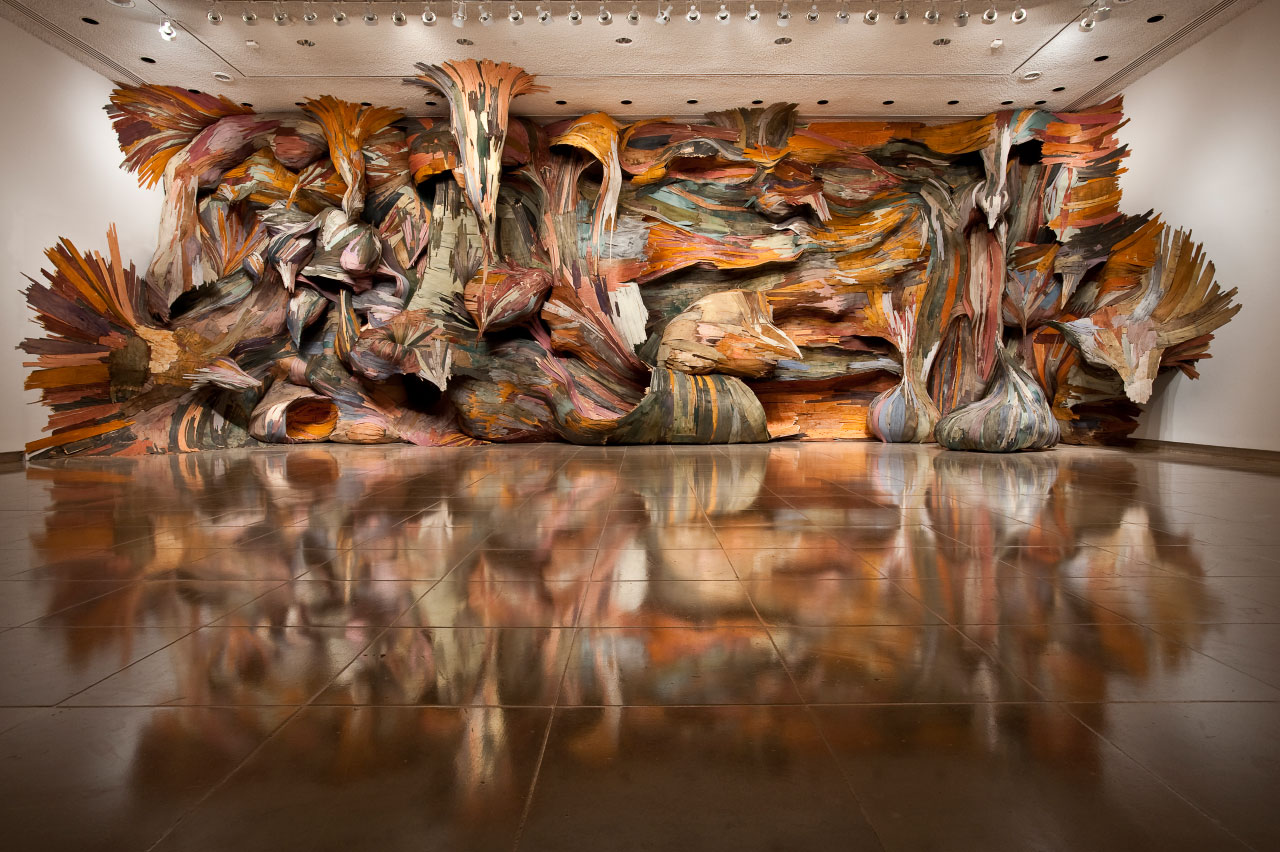
Michelle: A friend of mine who works here recently showed me this amazing artist named Henrique Oliveira. He’s a Brazilian artist who does all of these things with what looks like wood. I just saw that yesterday and was like wow!

Henrique Oliveira "Tapumes" art installation
Michelle: I should also mention that I just came back from Portland and saw such incredibly beautiful nature in the International Rose Test Garden, Japanese Garden and Forest Park. Those probably have been my biggest recent influences.
Moving forward, what do you hope to see more of in title design or in the media that uses it?
Michelle: There are so many great titles right now and so many different outlets at the moment, so it’s kind of a beautiful time because there’s so many types of content. I couldn’t believe how many submissions there were to the Emmys last year! But what do I want to see more of in title design? I like a longer title sequence because you get to put a little more story in there. I think 45 seconds is a sweet spot for a lot of a people now. That’s a nice length, obviously longer is better for us as designers, but that still works. It’s really rare for short sequences to make an impression. So if I could ask for one thing it would be: at least give us 45 seconds, please! [laughs]
Have you noticed a pushback at all in this era of binge-watching? Are producers looking for shorter sequences?
Michelle: Yeah, and I understand that. There’s even been some titles that I’ve worked on and I’ve been like, “Oh, that’s too long!” so I get that. There’s a lot of places now that have metrics, so I’m sure they’re figuring out with their algorithms that certain titles don’t fare well when they’re long. The audience has spoken!
Stranger Things (2016) textless main titles

