In huddled flight a flicker-inducing moth hotly flits between the filament and Vincent Gallo’s gaze. The spatial elegance of Stephen Faustina’s title design for Francis Ford Coppola’s Tetro is to the eyes what wine is to the blood.
Seeding light fractals arrange the type. “Wind sweeps the road, you can not go back.”
Going home will never be the same again.
A discussion with STEPHEN FAUSTINA of SFAUSTINA Design.
How did you first become involved with Tetro?
SF: I have had the honor and privilege to work for Mr. Coppola as a senior graphic designer through his company, Francis Ford Coppola Presents for five years now.
To me Mr. Coppola reminds me of a colorful painting of a Hindu deity with 6 hands, and each hand is holding something delightfully different. I say this because as a designer I am fortunate to design for so many of Mr. Coppola’s different interests and passions such as his resorts, wineries, food products, Zoetrope ALL-Story magazine and now his film.
I first became involved with Tetro when I received an email from Mr. Coppola that informed me I would receive the credit list and the rough footage for the opening credits. He wanted to see what I could do with them. Suddenly I had to switch gears from wine label design to movie titles…things rapidly progressed from here.
Describe the development process of the sequence.
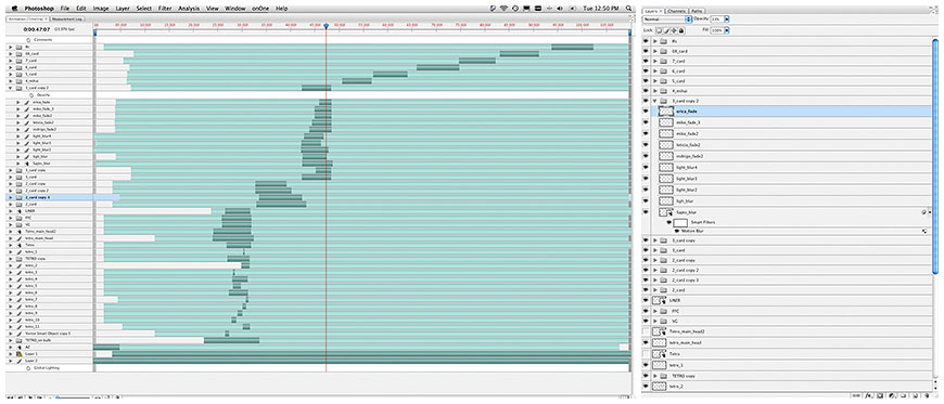
Well when I first started to work with the title sequence, the sequence had no sound and the final title sequence time had not yet been determined. A little/BIG side note; this was my first time designing title sequences or anything dealing with film/video, so I really did not know where to start or what software I should use. I’ve never used After Effects or Final Cut Pro and did not have time to teach myself these programs; however a program I did know is Photoshop. I quickly started to utilize Photoshop CS3 video capabilities (I was really impressed with it). This allowed me the freedom to begin showing Mr. Coppola a variety of different title sequences. I was relieved to know I did not need to execute the final polished title sequence; I just needed to develop a direction that appealed to Mr. Coppola.

Photoshop CS3 windows
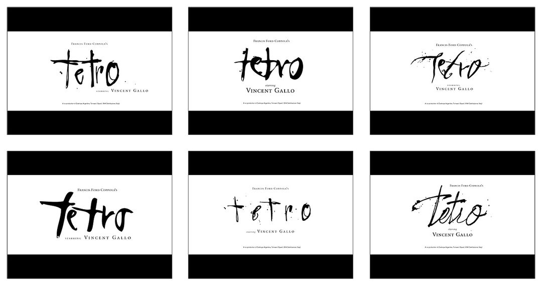
The two visual components that made a profound impact on me creatively for the development of the opening titles was when the character Tetro (played by Vincent Gallo) stares contemplatively at the light bulb/moths and the shots of the blurred light cells. These images acted as my guide to determine what font and size to use for the titles. It is through the study of the light cells and the moths’ relationship to the light bulb was how the letters TETRO, with the wavering R found its form.
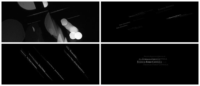
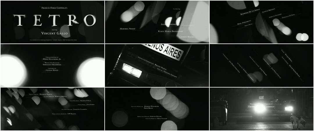
Roman Coppola shot the blurred light cell sequences for the opening and closing titles. I had many ideas, the best solution I thought was for the titles to have them interact and at times mimic the light cells Roman shot, while playing off the angle and the light fractals. I wanted to still have the sequence look relatively clean and elegant. Most of my favorite sequences are movies from the 1970s with simple type treatments that interacts with the sequence frames to form a beautiful composition. I really liked watching Sisters and The Changeling opening credits, which you have on your site.
The font I selected was Sabon. Designed by typography master Jan Tschichold, Sabon has a classic appeal, which flowed nicely with the titles and accompanied the music.

You mentioned working together (I assume with Mr. Coppola), so detail that for us.
I am fortunate because I not only worked with Mr. Coppola, I also had guidance from Walter Murch the legendary film editor. I did meet with Mr. Coppola a few times in person to discuss the project but the majority of the communication was via email. I would send Mr. Coppola my different design solutions for the titles and he would then tell me what he thought worked and what did not and then provided me with his vision and direction. Mr. Murch was also wonderful with directing me on which cards to hold longer and with the timing.
After the opening and closing titles were almost approved, I was vacationing in Amsterdam and ended up going over to Prague to work with the visual effects company, Universal Production Partners. We were able to execute the things I could not achieve technically and to polish it up. I literally sat in a room for two days with one of UPP’s Flame masters, Vincent Badia. It was great to be able to communicate and see executed all the little fine detail I was not able to technically apply myself to the title sequence. UPP also did the visual effects for Mr. Coppola’s last film Youth Without Youth.

Blur experiments
Was there anything that took you by surprise when working on this sequence?
Working on this project reminded me of collaborations I have done in the past with various artists. When I had more time on my hands to make art, my artist friends would mail me a painting or collage and then leave space for me to paint on it resulting in a wonderful collaborative piece. The spirit of collaborating with past artist seeped into the approach I took with creating the title sequence for Tetro. I felt like I was laying type on a visual moving canvas. I was surprised too how I never grew tired of working on or hearing the music of the title sequence of Tetro. Osvaldo Golijov composed the dynamic score.
In the end I am grateful for the opportunity to be apart of this beautiful independent film.


