Art of the Title

  • Title Sequences
  • Designers + Studios
  • Titles
  • Features
  • Designers
  • Studios

Recent

  • Bonjour Tristesse

    Bonjour Tristesse

    The opening tile sequence to Durga Chew-Bose's Bonjour Tristesse is just enough and very much the mood

    View article

  • An Update from the Editor in Chief

    An Update from the Editor in Chief

    An update from Art of the Title's Editor in Chief

    View article

  • Top Five: Chloe Okuno

    Top Five: Chloe Okuno

    Director and screenwriter Chloe Okuno discusses her favorite title sequences including horror from the '70s  and '90s and how important sound design is for setting tone

    View article

Recommended

  • Shōgun
  • Silo
  • The Beekeeper
  • Beetlejuice
  • Zardoz
  • Batman
  • Enemy
  • He Got Game

Classic

  • Casino
  • It’s a Mad Mad Mad Mad World
  • The Good, the Bad and the Ugly
  • Medium Cool
View all features View all titles

The Dunwich Horror (1970)

The Dunwich Horror
Come back, Old Ones... Princes of Darkness... and repossess the earth.
—Wilbur Whateley
  • Share
  • Tweet
  • Post
  • More

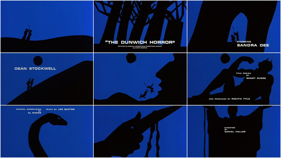
The Dunwich Horror is a tale of birth and death and terrible creatures. Based on the short story of the same name by H. P. Lovecraft, the minimalist graphic title sequence was designed by artist and graphic designer Sandy Dvore.

Dvore cut his teeth working with legendary B-movie producer and director Roger Corman, who first courted him after seeing Otto Preminger’s Skidoo (1968) and Dvore’s titles work therein. Skidoo was a light and saucy affair: comedic bickering, singing, boats, sunshine. The Dunwich Horror, on the other hand, takes its cues from the graphic minimalism of the 1960s, Lovecraft, and the terror of the unknowable. 

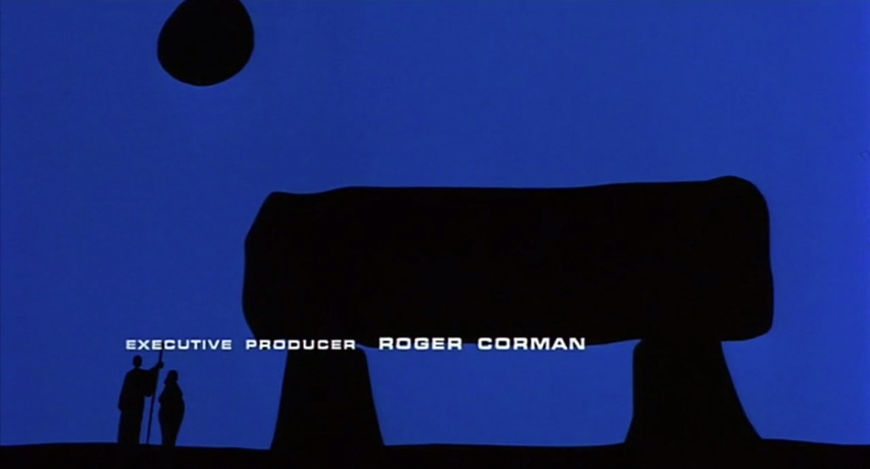
His first excursion into graphic animation, the titles to The Dunwich Horror cleverly blend themes from the film through scale and image morphing, each silhouetted form growing and shifting into another. The title sequence acts as prologue and as summary, explaining the cold open of a woman in labour and foreshadowing events to come. The style is reminiscent of leading graphic title designers of the 1960s like Saul and Elaine Bass and Maurice Binder, with hints of Matisse and his Blue Nudes cut-outs.

View 2 images

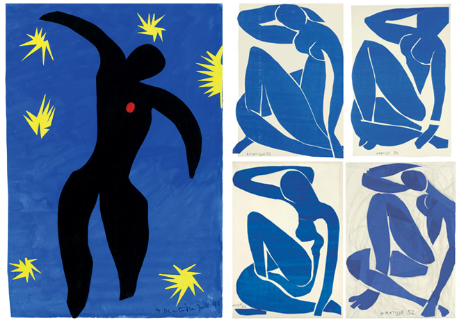
Image Set: Icarus (1946) and Blue Nudes (1952) by Henri Matisse

The deep blue and black palette establishes a sombre sense of darkness, like a summer sky just before night sets in, while Les Baxter’s theme adds melancholy and grandeur.

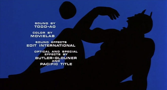
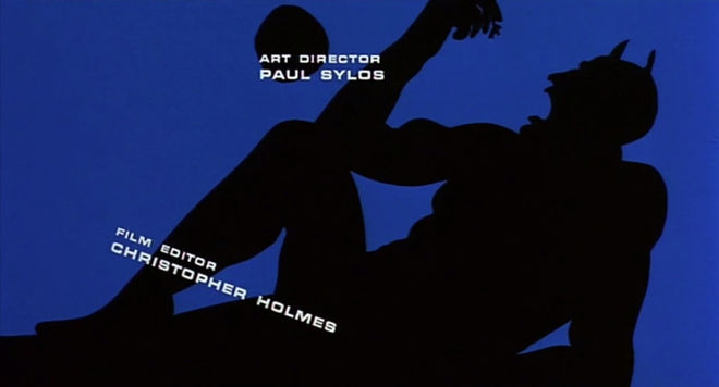
Also notable here, and in Dvore’s other sequences (Blacula, for example), is the use of type: an asymmetrical sort of placement, oblique and askew. Credits are placed atop subjects and on the edges of shapes, throwing balance to the wind in favour of graphic tension.

IMAGE: Dunwich Horror type example 1

IMAGE: Dunwich Horror type example 2

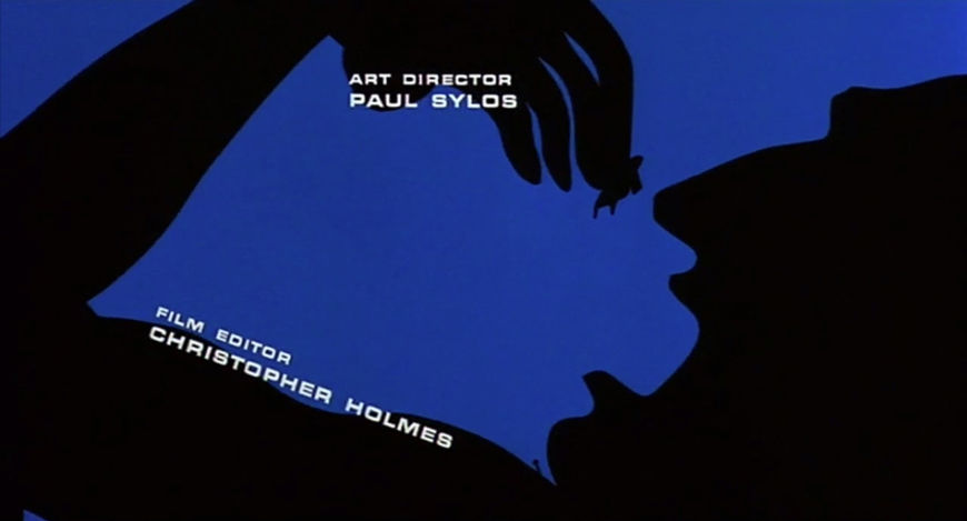
Credits are also placed in positions that seem to indicate a phallic visual metaphor, hinting at events within the film.

IMAGE: Dunwich Horror phallic type 1

IMAGE: Dunwich Horror phallic type 1

Altogether, the title sequence is a powerful animated piece that bestows the film with a graphic elegance above its B-movie station, gracefully teeing up the audience for a gruesome picture.

  • Credits

Title Designer: Sandy Dvore

Titles Produced by: Pacific Title
Opticals: Butler-Glouner

Music: Les Baxter

LIKE THIS FEATURE?

Sponsor Logo

HELP US KEEP SHOWCASING GREAT TITLE DESIGN. BECOME A PATRON TODAY.

Related

  • Vigilantes, Psychopaths, and Road Warriors: B-Movie Title Design of the 1970s & 1980s

    Vigilantes, Psychopaths, and Road Warriors: B-Movie Title Design of the 1970s & 1980s

    feature

  • Bonjour Tristesse

    Bonjour Tristesse

    summary

  • The Little Shop of Horrors

    The Little Shop of Horrors

    summary

  • Terrified

    Terrified

    summary

  • Attack of the Crab Monsters

    Attack of the Crab Monsters

    summary

  • Psycho

    Psycho

    interview

Title sequence

  • Production Studio

    Pacific Title and Art Studio
  • Title Designer

    Sandy Dvore
  • Category

    Film
  • Styles

    1970s, copyright line, graphic, illustration, main title
The Dunwich Horror
  • Film Director

    Daniel Haller
  • Release Date

    January 14, 1970
  • Aspect Ratio

    1.85:1
  • Studio

    American International Pictures (AIP)
  • Country

    USA
  • Language

    English
  • Reviews

    Reviews on Letterboxd
  • IMDb has full details

Article

  • Writer

    Lola Landekic
  • Published

    August 14, 2015

Subscribe to Art of the Title

  • Twitter
  • Facebook
  • Instagram
  • RSS
  • View full size
  • View full size
×
  • About
  • News
  • Titles
  • Features
  • Designers
  • Studios
  • Sponsorship

Art of the Title is made with ❤ in Toronto and is supported by readers like you.

© 2007–2025 Art of the Title, LLC. All rights reserved.
Works appearing on Art of the Title are the property of their respective owners.

  • Gold Sponsor

    NOW OPEN! LET’S TALK

  • Silver Sponsor

    NOW OPEN! LET’S TALK