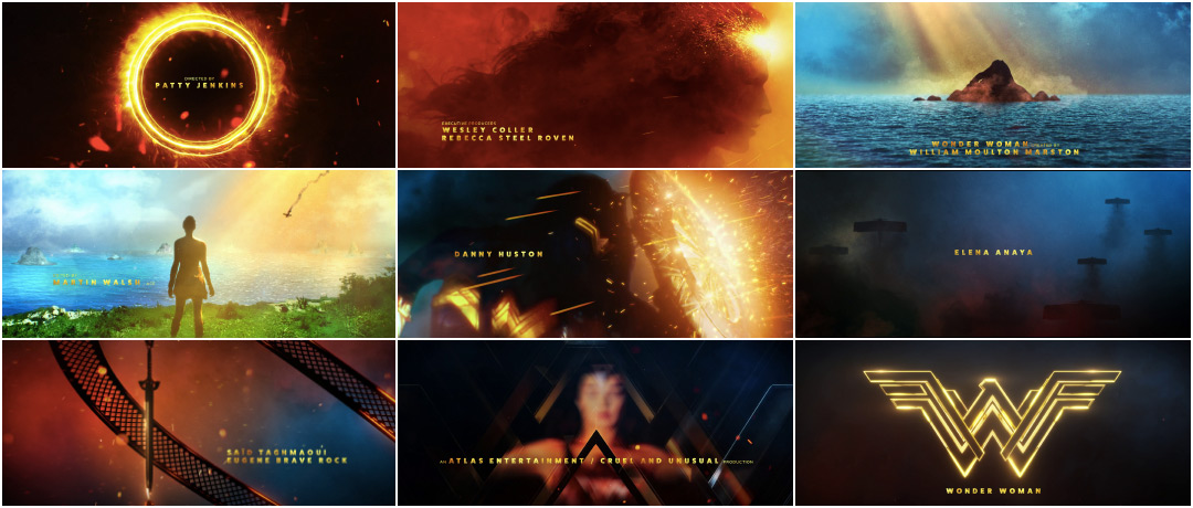
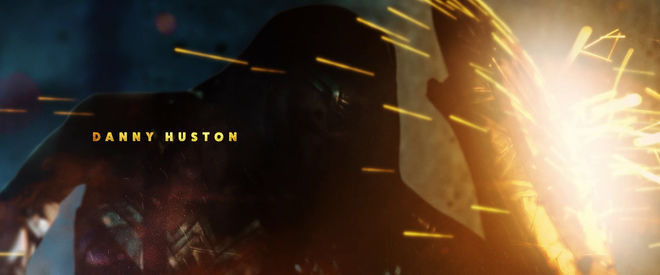
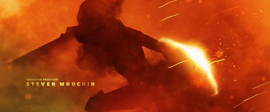
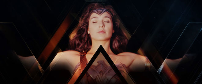
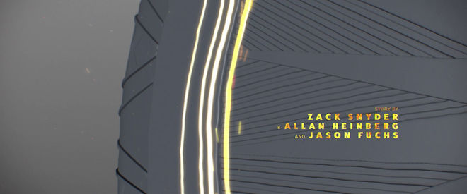
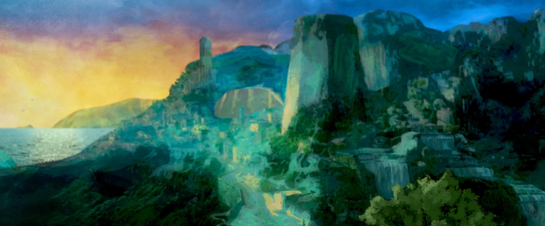
The end titles of Wonder Woman see an avatar of hope and love confront one of mankind’s greatest follies: The Great War – the war to end all wars. Fires burn, sparks fly. She is a shield against the darkness, a beacon for justice, an immovable force for good in a world gone very bad. She is Diana, Princess of Themyscira, Daughter of Hippolyta – and, by the time the credits roll, the superhero known as Wonder Woman.
Produced by the team at Greenhaus GFX under the direction of filmmaker Patty Jenkins, the Wonder Woman main-on-end titles are a mythic retelling of Diana’s journey from warrior to hero. Following her from the hidden shores of Themyscira to the muddy trenches of the Western Front and beyond, the title sequence functions both as a reprise of the film that preceded it and reminder of who this unyielding fighter and future Justice Leaguer is as she takes her place among a pantheon of heroes. She is a woman out of time, a champion forged not just by battle but by her deep understanding of the world around her. Supercharged by composer Rupert Gregson-Williams’ powerful score – a highlight of the otherwise dreary DC Comics movie musicscape – the end titles become a perfect capstone to Diana’s origin story and a springboard to a larger world.
A discussion with Wonder Woman Director PATTY JENKINS and Greenhaus GFX Creative Director JASON DOHERTY, Art Director AMANDA KOH, and Executive Producer MEGAN HAMILTON.
Hi Patty! Congratulations on the film! It's a lot of fun.
Patty: Thank you!
So I think we should start by talking about title sequences in general. How do you feel about titles, both as a filmmaker and a viewer?
Patty: It depends, you know? I feel like for a certain kind of movie it can really bring something to the party and elevate it. I don’t think that they’re always necessary, but when they’re good, when they’re well made, and when they’re in the right place I think they’re an amazing part of the movie.
The Wonder Woman main-on-end titles are an amazing part of this movie. They act as a sort of reprise of the story, a recap of what the audience has just seen. Is that how you initially approached it?
Patty: In our case the title sequence almost became the end of the movie in a beautiful way. You’re right at a moment when you wish you had more and it becomes more. It carries forward the story in a way. What the final moment of the film is best at is saying “Now there’s Wonder Woman, now Wonder Woman is born.”
Wonder Woman (2017) theatrical trailer
Patty: The movie is the journey all the way to Wonder Woman and it’s only at that final moment that she steps into the world and becomes our Wonder Woman. And so having that kind of comic book-style recap of the myth of Wonder Woman – you just saw the story but this is the myth of who she is – it felt like a really great way to be like “now she’s this and this is her backstory!”
It's very effective and a really positive note to end the movie on. It seems like more and more films – particularly in the superhero genre – are using the real estate at the end of the movie for exactly that purpose.
Jason: Yeah, this has become a popular approach for main-on-end titles. We did it with both Teenage Mutant Ninja Turtles films. It is nice because sometimes you get into your car after watching a movie and you start reflecting back to all your favourite parts, but now it’s like they’re doing that for you in the movie to a degree. “Alright, before you leave, let’s reflect on all this great stuff that just happened!”
Amanda: Yeah, I think it helps the audience to kind of wrap up how they’re feeling about the movie. The last cut we saw ended on a slightly sombre note, so it’s just good to help the audience package everything they’re feeling before they head out.
Patty, on a huge film like this – with all of the pre-production, planning, shooting, and post-production – at what point do conversations about the titles begin? Is it the sort of thing that’s mandated by the studio or did you know right from the start that you needed this sort of capstone for the movie?
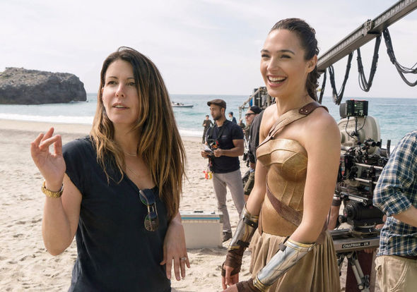
Wonder Woman director Patty Jenkins and star Gal Gadot on location.
Patty: I knew that I needed it and wanted it. I didn’t want to do any opening titles, but I wanted to do something better than just title cards at the end. I really didn’t have time to focus on it or do much about it until post – not only post but until I’d cut the whole movie into a director’s cut – which was actually wonderful. You really don’t know where you’re going to have arrived at in that final emotional moment until you see the whole movie cut together. It was amazing because what that allowed me to get there and then say “now I know what we need!” I met with a bunch of different companies, but was super excited by my meeting with Greenhaus, their ideas, and their initial pitch. So that was it!
So how exactly did Greenhaus become involved?
Jason: We were fortunate enough to go in for an early screening in late January. It was a rough cut, but it wasn’t too rough – there was a lot of visual effects that still needed work, but ultimately the story was in place. After watching the film and developing our first presentation, we were able to get on a call with Patty and David E. Hall, her post-production supervisor – who’s a good friend who we worked with on Warcraft. We had a really great Skype meeting with them for like an hour.
Megan: Helen Greene, our Creative Director, is a very big fan of Wonder Woman, so we had sent them something that we’d come up with internally before we’d even spoken or seen the movie.
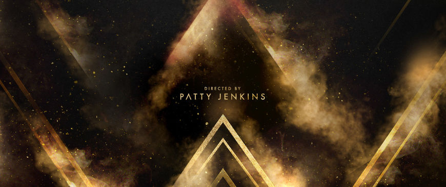
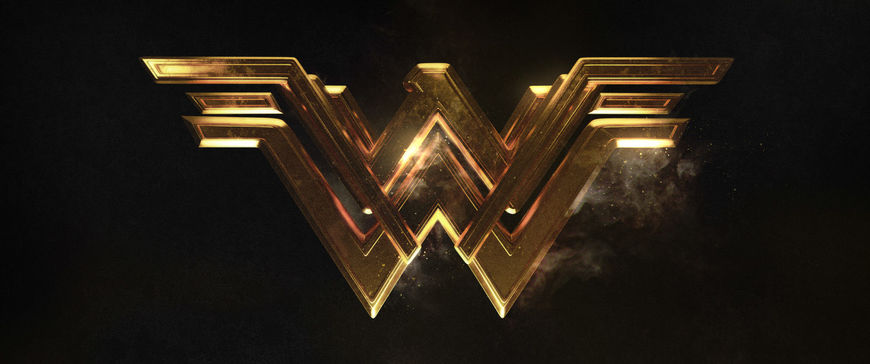
Selected frames from Greenhaus GFX's initial Wonder Woman main title design proposal
Megan: Then once we got on the phone we just kind of spitballed about what Patty was looking for, the feel she wanted, the colour palette, and any inspirations she had. She was very involved in what she wanted creatively and was very clear about what she wanted. Then we were able to go see the movie and had about six to seven great Skype calls as well as number of emails and phone calls. It was a very collaborative effort.
Amanda: She was really clear about how she wanted this title sequence to be about Wonder Woman’s journey. It wasn’t just a normal superhero movie, it was about Wonder Woman finding herself and becoming Wonder Woman. She really wanted us to come up with some ideas of vignettes that would really work with capturing her strength and femininity, and just her journey to becoming this superhero that we know and love.
Patty, you mentioned that a number of other studios pitched on the project as well. What was it about the team at Greenhaus and their pitch that convinced you they were right for the job?
Patty: They put together a lookbook and it was literally that. They had found a way to incorporate colour, brightness, and doable animation that made it exciting but possible to do.
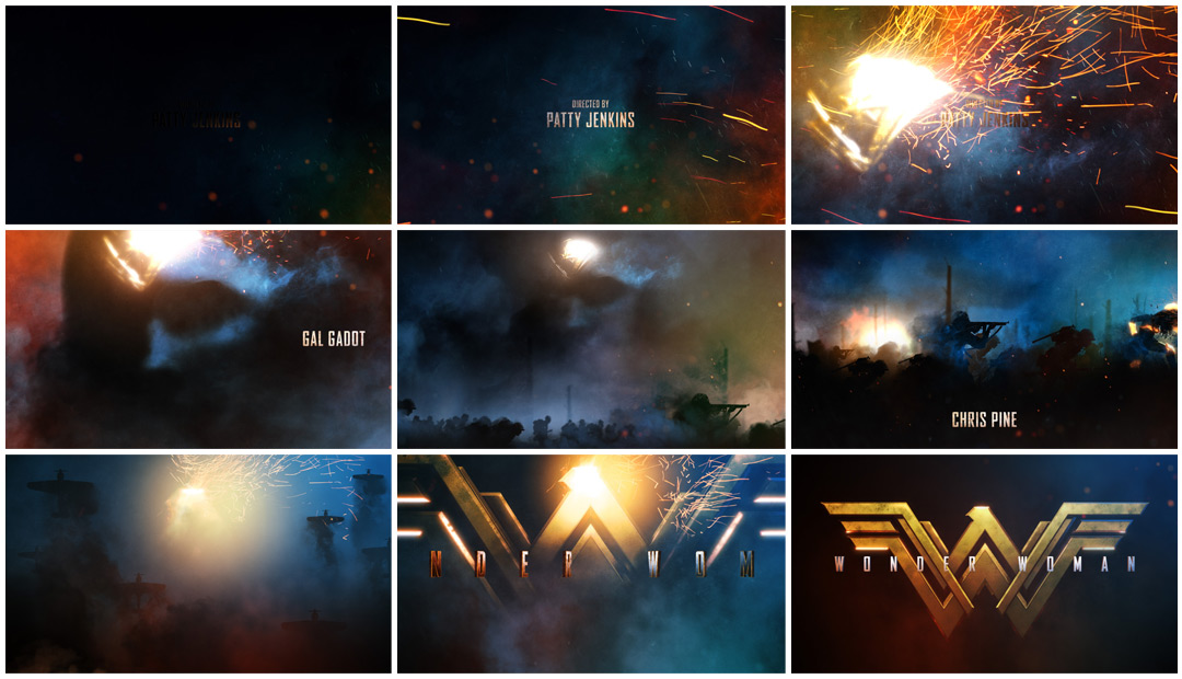
Image set: Wonder Woman (2017) “Beacon” concept boards
Patty: Movement and animation can be very time consuming. I loved what they came up with! I loved the way they showed scenes from the film but not literally scenes from the film. It was the quality of the work and the great ideas. And, by the way, their body of work being excellent.
Could we talk about some of the initial directions Greenhaus took with this project?
Amanda: There were definitely a few different ideas and variations that we tried, but Patty seemed to have a really clear vision when she saw two of our concepts at the very early stages. They were more of the illustrative style that we have in the final. It was all about taking from those initial styles and churning out different ideas and vignettes to really tell the story.
One of the boards that we sent was of Wonder Woman standing on the precipice of the “W”, which had this moody feeling of her heroicness as well as isolation and loneliness. We built off some of the different boards from there.
Wonder Woman (2017) main title shot progression
Jason: Patty was definitely adhering to the yellow, red, and blue colour palette, as well as everything involving the smoke and atmosphere. Also, the sparks, which were very prominent in the film. So it was really riffing off of what she was already liking about the film and just kind of redeveloping those things.
Amanda: It really brought a lot of mystery and energy into the characters in the vignettes, which was nice.
Jason: But then it came to a situation where she was feeling like it was too dark and too moody. We didn’t want to end on too much of a sombre note or too much of a war fighting note, which is easy to do with a superhero film.
Amanda: Especially one that was taking place in World War One. [laughs]
There’s an abstract, James Bond-like quality to parts of the title sequence, but as we've discussed it also functions as a sort of recap of Diana’s story. Patty, can you talk about the decision to not go one direction over the other, but instead sort of combine several ideas?
Patty: They had these great war vignettes, but I was missing some of the positivity. I didn’t want the entire sequence to be the war and her fighting in the war. So then I was craving the island, which then led us more in that direction. We only saw so much on the island, so it’s not like the island will go on forever in the sequence. That sort of started to make things a more literal and the conversation then became “Well, how do we show moments from the island without it being shots from the actual film?” I think that was sort of how we arrived there.
Amanda: We tried to capture certain elements from the film, like for example the watch being representative of Chris Pine’s character. We were looking for more poetic ways of positioning the concepts or certain moods that she was feeling in the movie.
Jason: Yeah, there was one concept – the Unbreakable concept – that I thought for sure they were going to respond to. It was a rough, loose sketch, but conceptually I thought it was really nice. “True power comes from within,” with this kind of Greek statue resting gently and carefully in the cave. Basically everything evolves from this statue breaking apart. We were going to do these high frame rate macro shots…
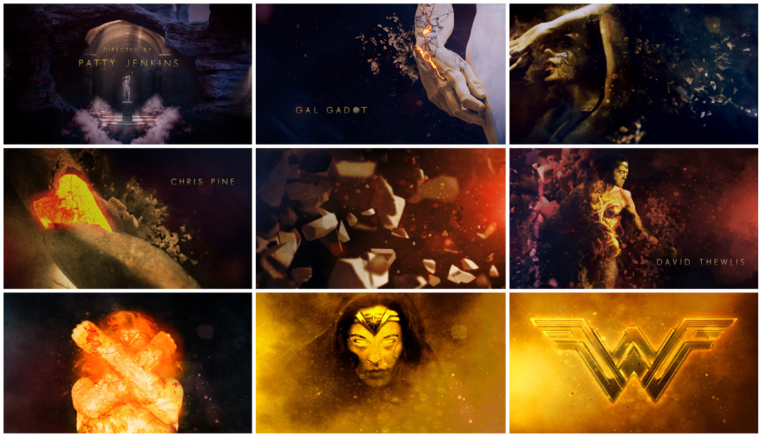
Image set: Wonder Woman (2017) "Unbreakable" concept boards
Amanda: Just crushing the damsel in distress stereotype having her break out of this mold. That was a really cool concept, but we went a whole different direction ultimately.
Jason: And a lot of times we want to go with a cohesive concept, but the world doesn’t necessarily work like that. What works for act one isn’t necessarily going to work for acts two, three, or four. I feel like we have about five acts in our piece. So it’s more like a James Bond-esque title sequence.
Amanda: It was all tied together by the colour palette.
Cool! I want to ask you about the logo reveal at the end. It’s really stunning and looks like it was complex to execute. Could you tell us about the development of that and how it was produced?
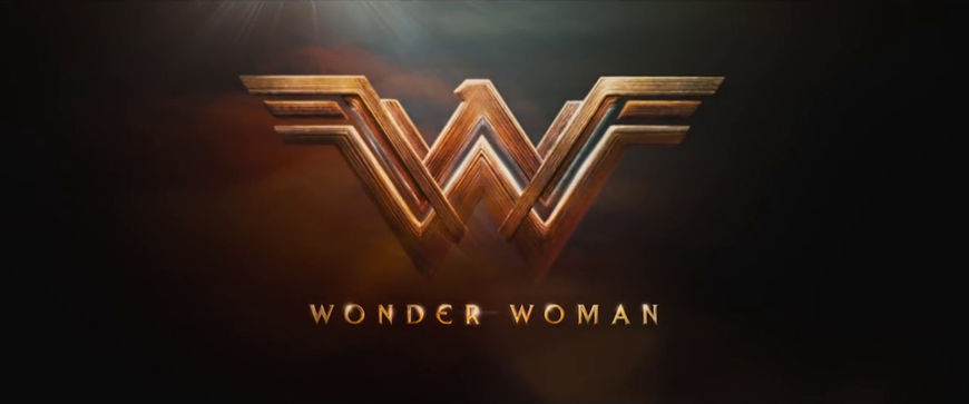
Amanda: Patty was married to this idea of the layers with the Ws intersecting with the footage in the background. We were trying to interpret that idea she had with something that would be cohesive with the film and wrap up the whole title sequence that we had built before.
Jason: It was all about trying to sew up and find a way to bring all this footage together.
Patty: Yeah, that actually took the most work. I had inherited this sort of dusted, worn metal W from Wonder Woman in Batman v Superman. It makes sense for that Wonder Woman because that’s current day, but it didn’t feel right for our movie where it’s a much cleaner, newer, shinier thing. So trying to work on how that W would be formed was a lot of work.
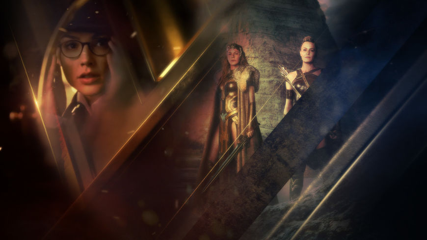
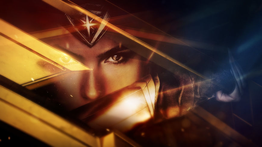
Selected frames from the "Courageous" concept that informed the final logo reveal
Patty: I loved what they came up with. This glass translucence and then the lights coming from it at the very end. It was something that I just loved. She brings light into the world and ends up using light to defeat the enemy at the end. It just felt like the right thing for the character.
Jason: We do specialize in main title reveals, especially from the trailer side of things. I’ve always liked that process a lot. Patty had us go through a number of different renditions and styles of how we get to the main title. This is a very slow and dramatic way of getting to an actual main title reveal. As I’m watching it right now, it’s a perfect execution of what the storyboards were! My layered PSD files are actually pretty gnarly.
Tell us about the music. They’d already developed a theme for Wonder Woman for Batman v Superman. Did you have that track to work with the whole time on the project?
Megan: No, actually Paul Holtzhausen, one of our creative directors and our audiovisual head, he had scored something very similar to what we ended up going with in our cut. So we actually had not received any sort of audio or music from them. We took things from the trailer that kind of inspired it. He took frames that we had put some audio to, an animatic basically, and sent that over to them. I think within five days they sent something back to us that was very, very similar. I remember Amanda listened to it and was like “Oh, it has our music!” and I said “No, that’s their music that they supplied!” So it was very, very similar.
Wonder Woman (2017) animatic featuring a temporary music track
Amanda: I think that was because they were incorporating the Wonder Woman themes they had already set up in Batman v Superman and the trailers. So it was sort of riffing off the theme they had already set up.
Jason: It also helps if you know the composer. They were very forthcoming with who was composing it, and usually Paul is like “Oh, it’s that composer!” He’s in charge of AV and he has a very musical ear. “I’m just going to pull some of this composer’s previous work and just kind of reappropriate that.” It kind of worked out! [laughs] We don’t often get a lot of say in the musical aspects, but we make suggestions.
There’s a fair bit of footage from the film in that section of the titles. In terms of the production pipeline, if Greenhaus needed reference material or assets from Warner Bros. how was that stuff made available to you?
Jason: Over the course of time! It wasn’t always readily available and we would literally have to pull from the trailers – and I think there were only one or two trailers to pull from at the time. But we would request assets or they would send us footage that would have stamps on it.
Amanda: Which we would then have to clean up…
Jason: Ultimately on the backend we were able to get clean footage from them, particularly that shot of her riding the horse when she’s little... The visual effects team often doesn’t even have these shots done, so they’re reluctant to pass off that stuff. But we would even say “Look, we’re going to stylize this anyway.” We don’t need the actual final, just get us something close and we’ll kind of riff off of that.
Wonder Woman (2017) main title shot progression
Amanda: For example, the last shot of her crossing her arms was actually shot over green screen. We just stylized it and stabilized the shot because they weren’t even done with the shot at that point.
Jason: So yeah there was a lot going back and forth with VFX and the film finishers. Honestly really pleasant people, but they were stressed. If we had it tough for two minutes of the film, I’m assuming they had it really rough for two hours of the film. They’d been working on it for a long time and it’s a very visual effects driven film for sure.
This sounds like it was a pretty lengthy process from start to finish for everyone involved.
Jason: Yeah, the studio oftentimes doesn’t want to pull the trigger on these things until you’re about eight to six weeks in front of the delivery date. The delivery date is often about a month before the release date, but it often cuts it pretty close. You can be on this pitch for two months – not a solid two months – you have a few artists on a couple of concepts, you lock in a presentation date, and then the presentation goes well and the production has to go off and shoot in Zimbabwe. [laughs] They might have to go shoot on location and they’re basically off the grid for six weeks. You just don’t know if it’s going to happen or not, and they keep asking for iterations or develop certain ideas more. Or maybe they ask you to make a baby, you know? A hybrids of different concepts.
Wonder Woman (2017) main title shot progression
Jason: Here we had a situation where we were designing all the way through production. We never had approved or locked storyboards, but we did know that the clock was ticking. The studio and Patty were giving notes and suggestions all the way up to the delivery date! [laughs]
Megan: Until like two days before!
Jason: “Wait! We just gotta wrap this thing up!” [laughs] There was also a timezone barrier since they were doing most of their work in London. There’s a Company 3 here in Santa Monica and a Company 3 in London doing colour conforms and whatnot, but trying to schedule times for phone calls or even just emails was tricky.
Amanda: But sometimes that worked to our benefit. We could send in something at night and then right in the morning because of the time difference we could get fresh notes from them and be able to start working immediately on all the changes.
Which tools and software did you use to put it all together?
Jason: Photoshop and Illustrator are always the best place to start when designing and creating assets for animation. Compositing was in After Effects. Trapcode plugins play a huge role with explosions, atmosphere, and particles. Video Copilot’s Optical Flares and Element 3D were used throughout the entire piece.
Wonder Woman (2017) main title visual effects reel
Jason: Much of our 3D modeling begins in Blender and is often refined in Maya. Krakatoa is responsible for most of the smoke simulations and Houdini was used for many of the scenes involving water. We love using Maya for realism, the watch for example, but Cinema 4D was used just as much and was just as effective.
Patty, this was just a small part of a much, much larger project, but did anything take you by surprise about the process of creating a title sequence like this?
Patty: Yeah, I’d never done such an extensive one before. I wish I had been able to work on it earlier, although really we ended up in such a fantastic place. I don’t feel like it suffered for that. But I definitely feel like it was a great process to go through something so comprehensive with such great artists. I can’t wait to do it again! I see how one would get baited into doing it even more extensively in the future, like “Oh, I know what I’m going to do this time!” [laughs]
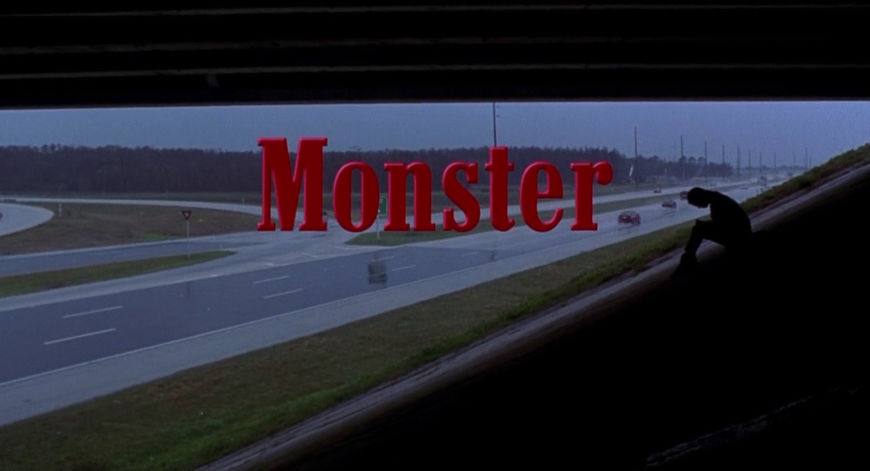
[laughs] But you’d done a bit of this before. Monster has that great opening sequence with the 16mm film, but obviously this is a completely different ball game in terms of scale and mood.
Patty: Totally! Yeah, also we did that ourselves. I wish I’d had someone like Greenhaus who could have helped me on that.
Monster (2003) opening sequence and main title, directed by Patty Jenkins
Patty: Now I understand how helpful bringing in a company to only focus on that one thing can be.
What about you guys? Was there anything that took you by surprise when working on this project?
Jason: That there wasn’t a definitive date when the job was awarded. We can always approximate, but there was a lot of uncertainty and never an official creative lock. I think the game has changed. Everybody’s used to real-time changes, so you don’t have those definitive pitch lock, design lock, animatic lock phases that you’d normally like to adhere to with a normal production schedule. This was much more of a moving target!
Amanda: And the deadline never changed, so that was interesting as well.
Jason: Also, introducing some of these scenes in a very literal fashion, especially when we go into Themyscira, her looking over the sea, the plane crash, and her diving into the sea. I don’t think any of us anticipated such a literal rendition of some of these key moments in the film. We were definitely hoping to stay in a more mysterious, silhouette mode.
Amanda: Yeah, a more abstract, conceptual manner. But it was fun trying to stylize all the footage into the sequence, and making it vibrant, slow motion, and dramatic.
Jason: Introducing the variety of colour palettes does actually make for a more well rounded sequence. If we were to stay within the one colour palette for two minutes it may have gotten a little bland. And I do feel like although from shot to shot there are a strange variety of moments, but you’re kind of intrigued. What am I going to see next? Especially once you see this fantastic film, you’ll be happy that we pay tribute to some of these moments. And some of the elements too, like the Godkiller, which is that sword that comes in. It plays such an important role, so it’s nice that it comes back towards the end and helps us wrap up the piece a bit.
Absolutely! Patty, do you have a favourite moment or particular shot that you love from the end titles?
Patty: Yeah, I love… Well, there are so many actually! I love when she is standing on the battlefield and all the soldiers are in cutouts – I think that’s a pretty incredible one. And then when she dives off the cliff. It was cool. I loved how they did it.
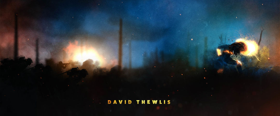
Image set: Wonder Woman (2017) final design frames
Patty: I think the whole thing is just a wonderful marriage between design and film, which is fun. A filmmaker doesn’t always get to control every poster or thing that goes out into the world, but this is really a chance to put a stamp on where design meets film. It’s wonderful. Greenhaus did a great job.
What about the Greenhaus team? What are some of your favourite moments from the sequence?
Amanda: I really like some of the war scenes and how we addressed them. The whole sequence with the airplanes and the arrows kind of bridge the modernity of World War One with Themyscira. It was kind of interesting having them together in the same frame.
Jason: Yeah, it was something when we saw that moment come to life. We knew in the designs it was a pleasant, highly stylized kind of Saul Bass moment, but when we actually started putting it into motion and have those arrows destroy those planes in a 3D sense we were just like “Yes! Let’s do more of that!” [laughs]
Amanda: It’s really simple and impactful and graceful.
Megan: There’s a real beauty to it.
Jason: It’s very beautiful and there’s just the right amount of contrast. It’s a very poetic moment. We all were really aspiring to achieve more of that throughout the piece. I think we did with the soldier battlefield segment for sure. Using Krakatoa for the smoke simulations with Wonder Woman’s silhouettes, I think those were pretty nice.
Megan: Yeah, I would have to agree. My favourite is definitely the silhouette with her on the cliff. When we first started she was on the edge of the W and have her transition into that.
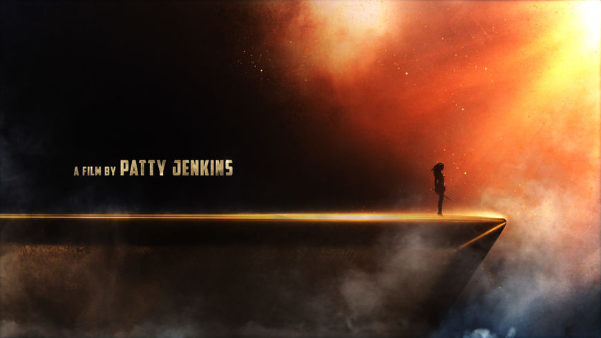
Selected frame from the "Vast Perception" Wonder Woman main title concept.
Megan: I kind of fell into love with that shot back then and then when it got into motion with the smoke coming off of it, the realism of it and the beauty and the elegance. I personally just love the colour palette and the look of that section, with her on the cliff, the close up of her and the headband with the sparks. I find it really beautiful.
Jason: I think those two sections really show where we’re probably wanted to take the whole piece initially. And then it changed and fragmented in a pleasant way I think. Honestly, I can’t wait to work on the second one – and I think we will because things went really well with David and Patty.
What are some of your own personal favourite title sequences, whether classic or contemporary?
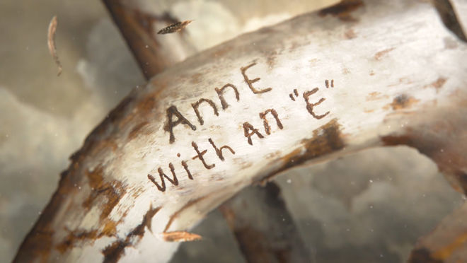
Jason: Anne with an E main title is visually poetic. 22 Jump Street is brilliant – humour and design rarely find harmony.
Anne with an E (2017) main titles, designed by Imaginary Forces
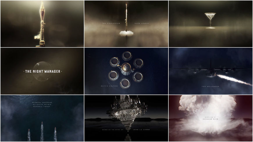
Amanda: For the classic I love Se7en, the iconic Saul Bass and James Bond sequences. Some of the more contemporary title sequences I've been drawn to are the The Night Manager and the main-on-end from Captain America: Civil War. The Night Manager was just so incredibly well done with each of the synesthetic shifts seamlessly from one iconic moment to the next and they all harken to something in the show.
The Night Manager (2016) main titles, designed by Elastic
Amanda: As for Civil War I love how they used shadow play to represent each character and how the ground kept getting more and more fractured as the piece went along which reflected well with the overall story arc of the Avengers breaking apart and taking sides in the movie. I love pieces that I can find little tidbits and representations in the clips. Concept and story wins me over every time.
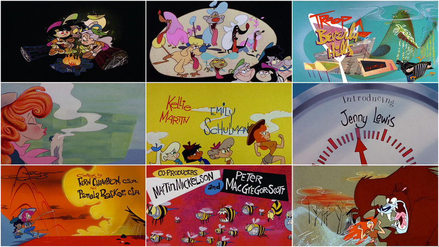
Megan: By far one of my favorite title sequences, from my youth and still to this day, is Troop Beverly Hills. I remember when I was younger I loved how it felt like a mini-movie as well as how visually vibrant and humorous it was. Now looking back I am still impressed with the multitude of fonts, scenes and continuity of the entire sequence.
Troop Beverly Hills (1989) main titles, designed by Bill Kroyer
Megan: A more recent film that truly impressed me was Pride and Prejudice and Zombies. Personally, I find that title sequences that act as a prologue can be tricky to execute without being reminiscent of what has already been done in prior films. This opening gave homage to its foundation, a Jane Austen novel, while feeling fresh and new. A difficult task to accomplish.
What about you, Patty? Is there a particular title sequence you remember that sort of opened your eyes to the possibilities of this aspect of filmmaking?
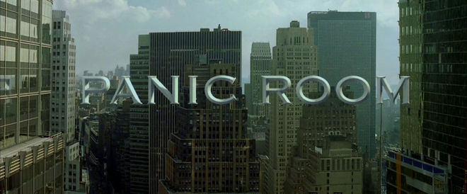
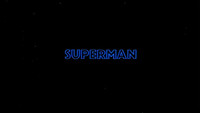
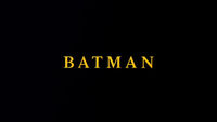
Patty: Yes, there are quite a few. It’s funny, I think that the opening of the original Superman, the font pulling you into the grandiosity of that movie, was a great one. And this wasn’t one I saw growing up, but Panic Room with the big letters against the buildings.
Panic Room (2002) main titles, designed by Picture Mill
That’s a fantastic sequence.
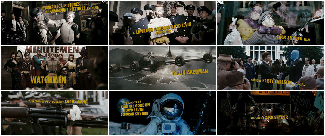
Patty: I was thinking that was sort of an obscure one to come up with, but it’s one of the only times that I have been like “WHOA!” I never would have thought of that. I’ve seen everybody copy it ever since. That blew my mind. It was such good design. Fincher always. Fight Club and Se7en are both incredible. Watchmen, that whole Minutemen sequence. The Watchmen title sequence was like the comic book come to life.
You've directed a lot of television. Has anything caught your eye on TV recently?
Patty: I’m trying to think of anything more recent, but I’ve barely watched anything lately…
It's seems like you’ve been a little busy!
Patty: [laughs] Yes! I’m so behind in that way, but nothing that I can think of in the past few years.

