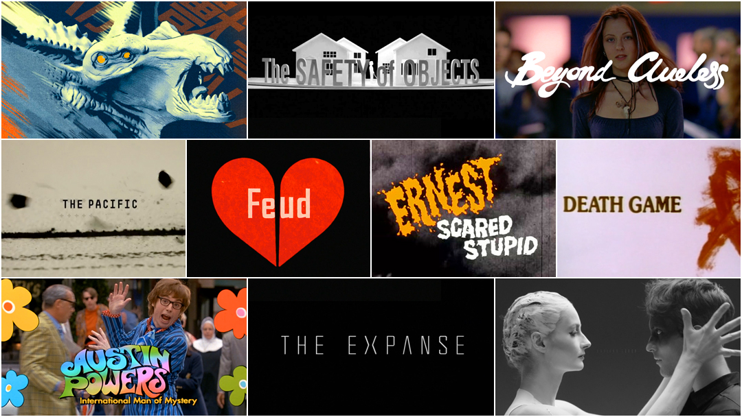
In 2015, we published our first feature article in celebration of International Women’s Day entitled 10 Women of Title Design. We have returned each year since with a new group of 10 women in the title design industry to celebrate. This year, we are ecstatic to present another 10!
Here at Art of the Title, our mission is to champion the great work of title designers and all those involved in the craft. The 10 Women of Title Design articles are one of the ways in which we strive towards more balanced representation, a priority that is vital to the work that we do. This year, the list includes creative directors, lettering artists, directors, designers, and choreographers. Join us as we celebrate another International Women's Day by shining a light on the often unsung women in this great field.
10 Women of Title Design That You Should Know – Part Four
Marlene McCarty
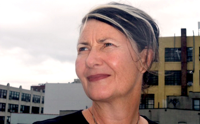
Title Designer Marlene McCarty
Marlene McCarty is a visual artist, activist, and title designer. She has worked with such film directors as Todd Haynes, Kelly Reichardt, Cindy Sherman, and Phyllis Nagy.
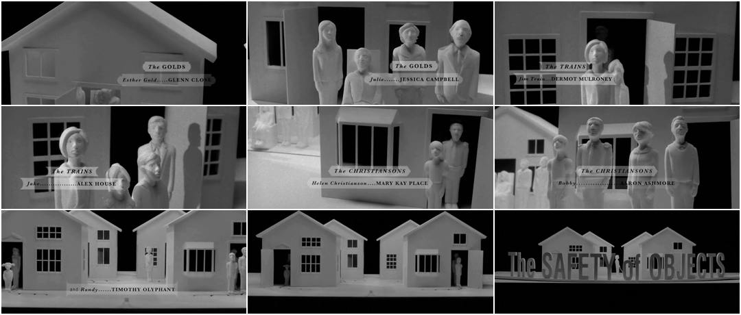
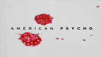
Since the 1980s, McCarty has worked in media ranging from film and motion design to print and advertising to guerilla installations and exhibitions. She was a member of the AIDS activist collective Gran Fury as well as co-founder of design studio Bureau. In film, she has designed title sequences for American Psycho, Hedwig and the Angry Inch, The Safety of Objects, and Meek’s Cutoff. For director Todd Haynes she has designed titles for Safe, Velvet Goldmine, Far From Heaven, I’m Not There, and Carol.
McCarty’s work has been featured in the New Museum, ICA London, the Royal Hibernian Academy in Dublin, MoMA in New York, MoCA in Los Angeles, and the Cooper Hewitt, among others. She has been the recipient of a Guggenheim fellowship, and, as Gran Fury, an honorary Doctorate from Massachusetts College of Art (2011).
The Safety of Objects (2001)
CATEGORY: FILM
The Safety of Objects (2001) — main titles by vBureau and Marlene McCarty
Nadia Tzuo
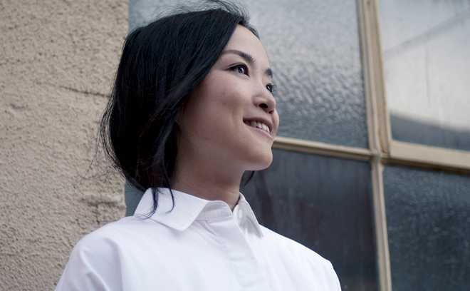
Title Designer Nadia Tzuo
Nadia Tzuo is an art director and motion graphics designer based in Los Angeles.
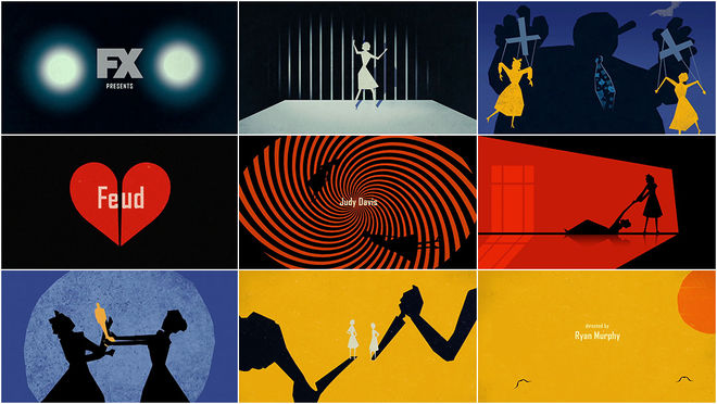
After graduating in 2003 with a degree in Advertising Design and Planning in Taiwan, Tzuo relocated to attend Art Center College of Design where she focused on motion graphics, environmental concept art, branding, and multimedia. In 2011, she joined Prologue Films. She began her career in the motion graphics industry as an art director designing and creative directing for the title sequence of TV series The New Normal (2012). Since then, she has worked on title sequences, visual effects, user interface design, and concept art for the film, TV, and gaming industries, designing for projects including title sequences for films X-Men: Apocalypse, Star Trek Beyond, and Rogue One: A Star Wars Story. In TV she has worked on title sequences including American Horror Story: Freak Show, American Horror Story: Coven, Feud: Bette and Joan, and Full Frontal with Samantha Bee. She has also designed user interface graphics for Iron Man 3 and concept art and design for the opening sequence of Bungie’s game Destiny.
Feud: Bette and Joan
CATEGORY: TV
Feud: Bette and Joan (2015) — main titles by Prologue
The first part of TV producer Ryan Murphy's latest anthology series, Feud: Bette and Joan is a dramatization of the events surrounding the production of the 1962 film What Ever Happened to Baby Jane? and the infamous behind-the-scenes rivalry of stars Bette Davis and Joan Crawford. Set in the 1960s, Feud's highly stylized animated opener—created by Kyle Cooper's studio Prologue Films and featuring design by Nadia Tzuo, animation by Margherita Premuroso, and editing by Rachel Fowler—takes cues from the era in which it is set, in particular the title design of Saul Bass and the work of director Alfred Hitchcock. The sequence, which also owes a stylistic debt to Kuntzel + Deygas’s handmade opening to Steven Spielberg’s Catch Me If You Can, features direct references to Baby Jane and several Hitchcock thrillers — most notably Rear Window and Vertigo. With multiple acts of attempted murder and mayhem, the sequence’s sinister undercurrents make it clear to viewers that the enmity between Davis and Crawford is far more than just professional or personal jealousy, it’s a true life or death struggle for these two Hollywood legends.
Marguerite Pomerhn Derricks

Choreographer Marguerite Pomerhn Derricks
Marguerite Pomerhn Derricks is a choreographer based in Los Angeles, California. Marguerite has been a choreographer in film, television, theatre, awards shows, music videos, and more. In film, her work has included cult hits like Showgirls and Striptease to blockbusters Austin Powers, Charlie’s Angels, Tropic Thunder, Mr. and Mrs. Smith, Little Miss Sunshine, No Strings Attached, and The Campaign.
She has choreographed music videos for Adele, Quincy Jones, Katy Perry, Donna Summer, and Debbie Harry. In television, her credits include Masters of Sex, The Mindy Project, 3rd Rock from the Sun, Behind the Candelabra, Dancing with the Stars, True Blood, Will and Grace, and the revival of Gilmore Girls.
She has also worked with commercial directors on spots for Clinique, Target, American Horror Story, HP, Guitar Hero, The Gap, American Express, Pepsi, and more.
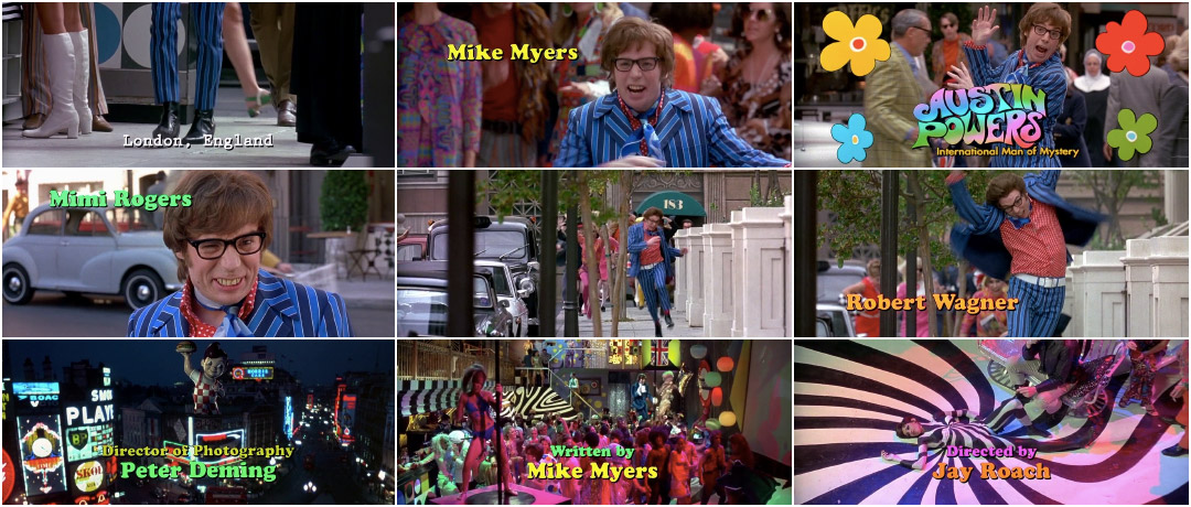
Austin Powers: International Man of Mystery (1997)
CATEGORY: FILM
Austin Powers: International Man of Mystery (1997) — main titles with choreography by Marguerite Pomerhn Derricks
The title sequence of Jay Roach’s swingin’ spy spoof Austin Powers: International Man of Mystery begins with the distinctive opening bars of Quincy Jones’ “Soul Bossa Nova” and a strut like no other. It’s Powers — Austin Danger Powers — with a spring in his step and a mission to resurrect the ’60s. Like the film proper, this opening sequence borrows heavily from figures like James Bond, Derek Flint, and TV’s Jason King, as well as films like Richard Lester’s A Hard Day’s Night (1964) and Michelangelo Antonioni’s Blow-Up (1966).
The choreography was created by Marguerite Pomerhn Derricks, who worked with star Mike Myers to create the dance sequences in the film. “She is at once a great artist and a great pragmatist,” said Myers of Derricks. “She can dream about the possibility and yet live within the reality.” When the reality of Austin Powers expanded to include not one but two sequels, Derricks was along for the ride, the ambitions and choreography of the opening titles growing with each film. Read more.
Lauren Hartstone

Title Designer Lauren Hartstone
Lauren Hartstone is a freelance director and designer based in New York.
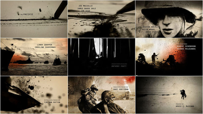
She holds a Bachelor of Fine Arts in visual communication from Washington University in St. Louis, where she concentrated in graphic design. Her work spans advertising, film, broadcast, and branding. Lauren has worked as a staff creative director at studios Gretel and Imaginary Forces, where she led projects for clients such as Google, Coach, Spike TV, HBO, BET, Pepsi, and Smirnoff. She has worked on titles for several shows and films, earning two Emmy nominations for the main titles to Boardwalk Empire (alongside Karin Fong, Michelle Dougherty, and producer Cara McKenney) and The Pacific (alongside Steve Fuller, Ahmet Ahmet, and Peter Frankfurt). She has also worked with studios Loyalkaspar, Stardust, and MTV Networks, and her work has been featured in Creative Review, Brand New, IdN, Fast Company, and PromaxBDA.
The Pacific (2010)
CATEGORY: TV
The Pacific (2010) — main titles by Imaginary Forces
In the main title sequence of The Pacific, the 2010 miniseries produced by HBO, Playtone, and Dreamworks, the faces of men are rendered rough and dark, streaked with war.
Created by studio Imaginary Forces, the opening moves back and forth between rough lines on fine textured paper and footage in black and white and red. We follow a stick of conté, shards flying off like so much shrapnel, tracing the edges of subjects and their explosive surroundings. Keeping pace during this dance between live-action and hand-drawn moments is the soaring score by Hans Zimmer, lending the components a dignity on par with the much-lauded opening for To Kill a Mockingbird. Behind the piece are art directors Steve Fuller, Ahmet Ahmet, and Peter Frankfurt, designers Lauren Hartstone and Arisu Kashiwagi, and a host of animators, producers, editors, and others. Nominated for an Outstanding Main Title Design Emmy Award, the resultant piece is a meditation on war from an artist's point of view, the dust of charcoal sweeping across page and landscape—hard lines in a hard world.
Joyce N. Ho
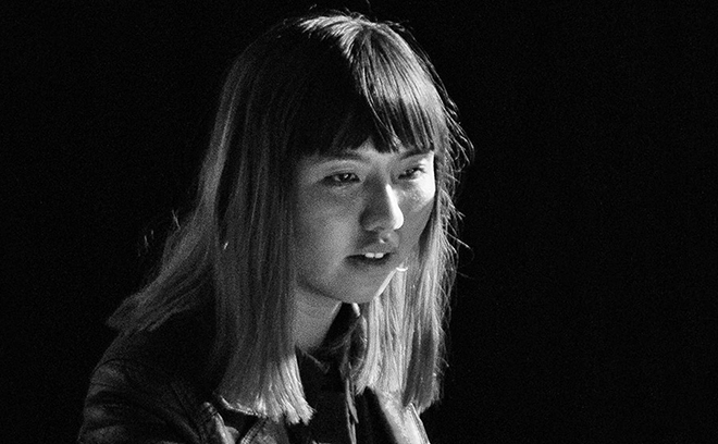
Title Designer Joyce N. Ho
Joyce N. Ho is an art director and motion designer based in Brooklyn, NY.
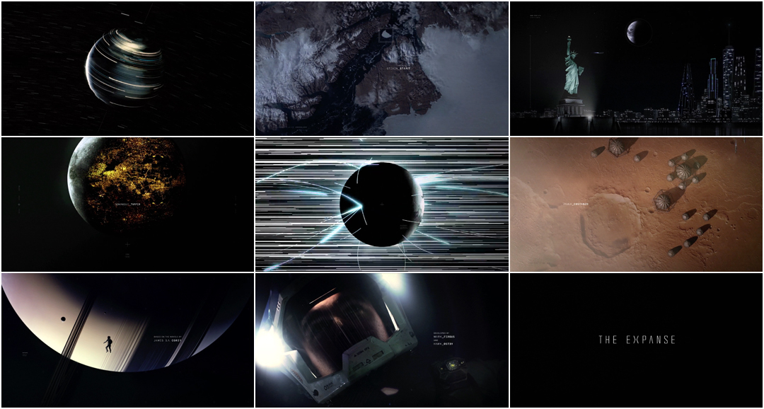
Ho grew up in Brisbane, Australia and studied at the Queensland University of Technology, earning a Bachelor of Fine Arts with a major in animation. She began her career at studio Breeder, where she worked on opening title sequences for festival Analogue/Digital, contributing to the openings for the 2013 and 2014 editions. She has worked on the opening titles to TV series True Detective (2014) and The Expanse (2015) as well as creative festival Likeminds in 2017. She has been a finalist for Young Guns 15, the SXSW Film Award in 2014 and 2016, and has been a winner of the One Screen Award, Create Design Award, and the Australian Production Design Guild Award.
The Expanse (2015)
CATEGORY: TV
The Expanse (2015) — main titles by Breeder and Joyce N. Ho
Hattie Stewart
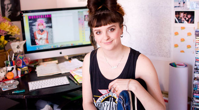
Title Designer Hattie Stewart
Hattie Stewart is a London-based illustrator and title designer.
A self-professed ‘professional doodler,’ Hattie has had work exhibited in Los Angeles, Miami, New York, Berlin, and London, and collaborated with designers such as House Of Holland, Marc By Marc Jacobs, and Adidas.
She is probably best known for her ‘Doodle-Bombing’ project, in which she draws over the covers of publications such as Interview, Vogue, i-D, and Playboy. She is also a frequent contributor to Nylon and Rookie.
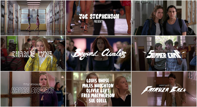
In 2014, Hattie entered the world of film title design, providing animated title cards and illustrations for Charlie Lyne’s essay film Beyond Clueless.
Beyond Clueless (2014)
CATEGORY: FILM
Beyond Clueless (2014) — main titles featuring illustration and lettering by Hattie Stewart
What if Crash Override and Cher Horowitz and Laura Palmer all went to the same high school? In the cleverly cut opening to director Charlie Lyne’s essay film Beyond Clueless, dozens of American teen movies from the ’90s and early 2000s are brought together in one long hallway of jeers and sneers, smug smiles, and adolescent longing. Shepherded by the voice of ’90s teen witch Fairuza Balk, the film is a bricolage of footage meticulously collected from over 200 films.
For the title sequence, Charlie Lyne sets the film’s tone with the help of composing team Summer Camp (Jeremy Warmsley and Elizabeth Sankey) and illustrator Hattie Stewart, making her title design debut. Summer Camp’s theme is light and dynamic, finely straddling that space between nostalgic shoegaze and modern pop, while Stewart’s small but energetic white scrawls plant the sequence firmly in its world. Read more.
My Tran
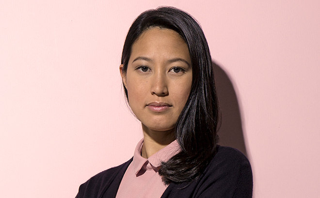
Title Designer My Tran
My Tran is a motion graphics designer based in Los Angeles.
Tran was awarded the Gates Millennium Scholarship and earned her graduate degree at Grand Valley State University. She has worked with studios Imaginary Forces and Alma Mater, among others, working on the title sequences for films The Lego Movie as well as Pacific Rim and for TV series Stranger Things. Since 2007, she has created work for clients including Toyota, Nike, ESPN, Hyundai, Sony, and Apple.
Her first short documentary film, 40 Years Young, was featured in the 2014 Asian American International Film Festival NYC. She was also a participant in the Adventure Filmmaker’s Workshop at the Banff Mountain Film Festival that same year.
Pacific Rim (2013)
CATEGORY: FILM

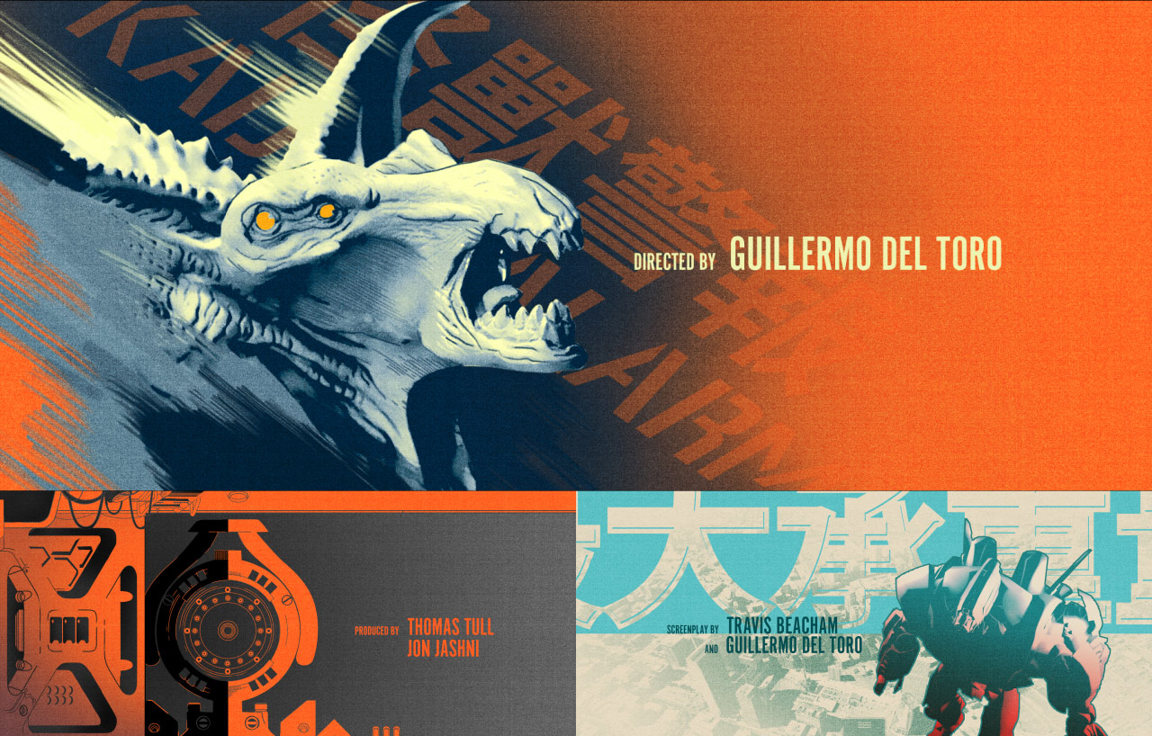
Concepts created for the end title sequence of Pacific Rim (2013) by My Tran at studio Imaginary Forces. One is based on manga art, the other is based on an imagining of Kaiju war propaganda.
Guillermo Del Toro’s 2013 summer blockbuster Pacific Rim was a two-hour battle between giant nuclear-powered robots and otherworldly creatures, featuring an Avengers-esque credits sequence. Sleek and statuesque, these credits give viewers a respite after the monsters and mayhem.
Of course, this direction was one of many that were initially presented. Two unused concepts in particular, designed and illustrated by My Tran at studio Imaginary Forces, present stunning graphic alternatives. In one, Tran presents a colourful direction inspired by manga art. In another, she imagines Kaiju war propaganda. Both directions are vibrant, energetic pieces, the compositions dynamic and full of implied motion. But as with del Toro’s 2015 directorial effort Crimson Peak, the direction chosen for the end credits functions as a visual and aural comedown. These unused concepts, however, are a treat—providing insight into the creative process and giving a rare glimpse at what could have been.
Mary Meacham Hogg
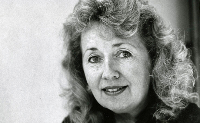
Title Designer Mary Meacham Hogg
Mary Meacham Hogg is a title designer and artist based in Los Angeles, California.
Mary studied at City College of San Francisco and then moved to Southern California in 1964 to work in MGM Studios' Title Department, where she remained until 1987. When MGM released Gone With The Wind in widescreen in 1967, Mary recreated the titles. From 1970 to 1987, the Title Department at MGM was staffed by Burke Mattsson (as head designer) and Mary Meacham Hogg. Together they worked on more than 400 titles for film and TV, including Demon Seed (1977), Fun with Dick and Jane (1977), Death Game (1977), Southern Comfort (1981), The Natural (1984), and Young Sherlock Holmes (1985).
Between 1986 and 2000, Mary worked as a wildlife artist and contributed to projects in Disney’s Title Department. In 2000 she returned to full-time work, taking a position with Disney and contributing to titles for The Wild (2006) and Meet the Robinsons (2007), and creating the English title sequences of Japanese films like The Cat Returns and Howl’s Moving Castle, and end titles and crawls for Bolt (2008), Tangled (2010), and Zootopia (2016).
Death Game (1977)
CATEGORY: FILM
Death Game (1977) — main titles by Mary Meacham Hogg
The 1977 Peter Traynor film Death Game (aka The Seducers) claims to be a real-life account of a bizarre suburban murder and blackmail scheme. To this end, the film’s opening establishes the setting of San Francisco and includes a warning, reminding audiences that “fate allows no man to insulate himself against the evil which pervades our society”.
Designed and illustrated by Mary Meacham Hogg, a titling veteran of MGM’s Title Department, the opening wholly embraces the film’s dark premise, pairing children’s drawings with the eerily upbeat “Good Old Dad” performed by The Ron Hicklin Singers, a Moog-driven jingle extolling the virtues of fatherhood. The song’s deliberate lack of irony and the uncomfortable zoom-ins to innocuous details in the drawings artfully craft an unsettling message that carries through well into the twisted narrative.
Barbara Laszewski Garner

Title Designer Barbara Laszewski Garner
Barbara Laszewski Garner is a creative director and title designer based in Nashville, Tennessee.
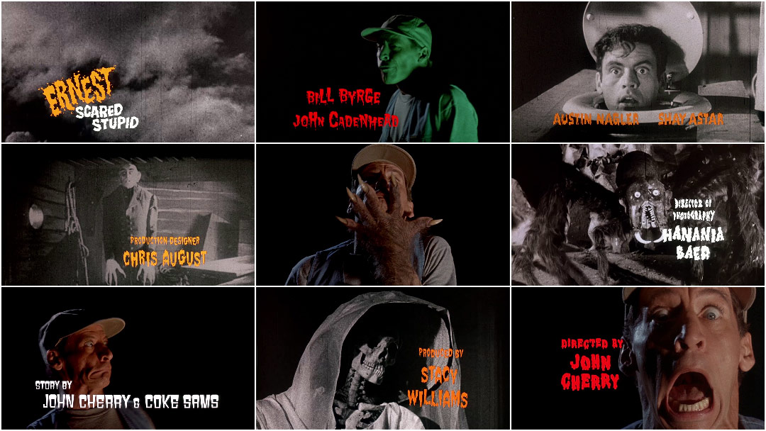
Hailing from New York City, Laszewski Garner studied at Parsons, Pratt, and School of Visual Arts, eventually earning a Bachelor of Fine Arts from School of Visual Arts, specializing in graphic design. She began her career as an assistant art director at Carden & Cherry, an advertising agency in Nashville well known in the late ’80s for its commercials featuring actor Jim Varney’s Ernest character. Soon, she moved over to startup Cascom to work in motion graphics for display and broadcast. In 1989, she created the motion graphics for the Ernest P. Worrell TV series Hey Vern, It’s Ernest!, which earned her a Daytime Emmy Award. She continued to work on the Ernest franchise, creating title sequences for Ernest Goes to Jail, Ernest Scared Stupid, Ernest Rides Again, and Ernest Goes to School. She has also created graphics packages and opening titles for CBS, TNN, PBS, and CMT, as well as graphics for music videos and TV segments.
Ernest Scared Stupid (1991)
CATEGORY: FILM
Ernest Scared Stupid (2015) — main titles by Barbara Laszewski Garner
With his denim vest and baseball cap, the rubber-faced Ernest P. Worrell regaled a generation of children and their parents from the late ’80s and into the ’90s. The fourth film to star Jim Varney’s Ernest character, Ernest Scared Stupid sees our hapless hero battle an army of monstrous trolls in order to save a small town on Halloween. Though often regarded as low-brow entertainment, the Ernest movies feature a peculiar mix of physical comedy, puns, as well as numerous references to classic films. Scared Stupid’s opening sequence, created by designer Barbara Laszewski Garner, perfectly zeroes in on that intersection of base physicality and esoteric film knowledge. Varney’s facial contortions are intercut with clips from vintage horror and science fiction films and shots featuring the limbs of various creatures, resulting in a montage that was modern in its use of typography and live-action while harking back to its campy influences. KnowhutImean? Read more.
Marga Castaño

Title Designer Marga Castaño
Margarita (Marga) Castaño is a creative director and a founder of Madrid-based studio Apéritif.
Hailing from Piedras Blancas in the north of Spain, Marga holds a Bachelor of Fine Arts from Salamanca University, specializing in graphic design and audiovisual media. She began her career as an art director at Canaldata and then moved to Wysiwyg, a pioneering digital agency in Spain. She worked at Wysiwyg (now part of Publicis Group) for 15 years as art director, as creative director, and finally as executive creative director, leading creative for brands including Diesel, Absolut, Levi’s, Mercedes, Openbank, Garnier, and Madrid’s Royal Theater. In 2014, she founded creative studio Apéritif with partner Nacho Álvarez-Borrás.
At Apéritif, she has been creative director on title sequences created for IAB’s Festival Inspirational 2015 and 2016.
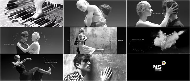
Festival Inspirational 2015 (2015)
CATEGORY: CONFERENCE
Festival Inspirational 2015 (2015) — main titles by Apéritif and Marga Castaño
Taking a fluid and purposeful step away from the gloss of visual effects, Madrid-based studio Apéritif lets inspiration manifest itself through dance.
In the opening titles for Festival Inspirational 2015, a two-day event based in Madrid that celebrates creative work, a single, dusty toe on a piano key becomes a catalyst. A male figure, draped in black, encounters the shadow of himself and a woman in white. As they spar in their stark push-and-pull tête-à-tête, the typography of the presenters’ names embraces the angles of bodies in motion. Fragile and fierce, their movements transform them and their surroundings, the space suddenly more rough, the divisions between them disintegrated.
Dance is a rare medium for an opening sequence, particularly in the 21st century, but the direction and choreography here demonstrate just how powerful and refreshing it can be. Read more.
—
To discover more fantastic title designers who happen to be women, take a look through our directory of designers. And if you know of any whose work we haven't yet featured on the site, let us know. We're dying to discover more exciting work and to keep these important conversations moving.
WANT MORE?
Check out our earlier articles:
10 Women of Title Design
10 More Women of Title Design
10 Women of Title Design — Part Three
The entry for Feud: Bette and Joan features notes from Will Perkins. The entry for Death Game features notes from Ben Radatz.

