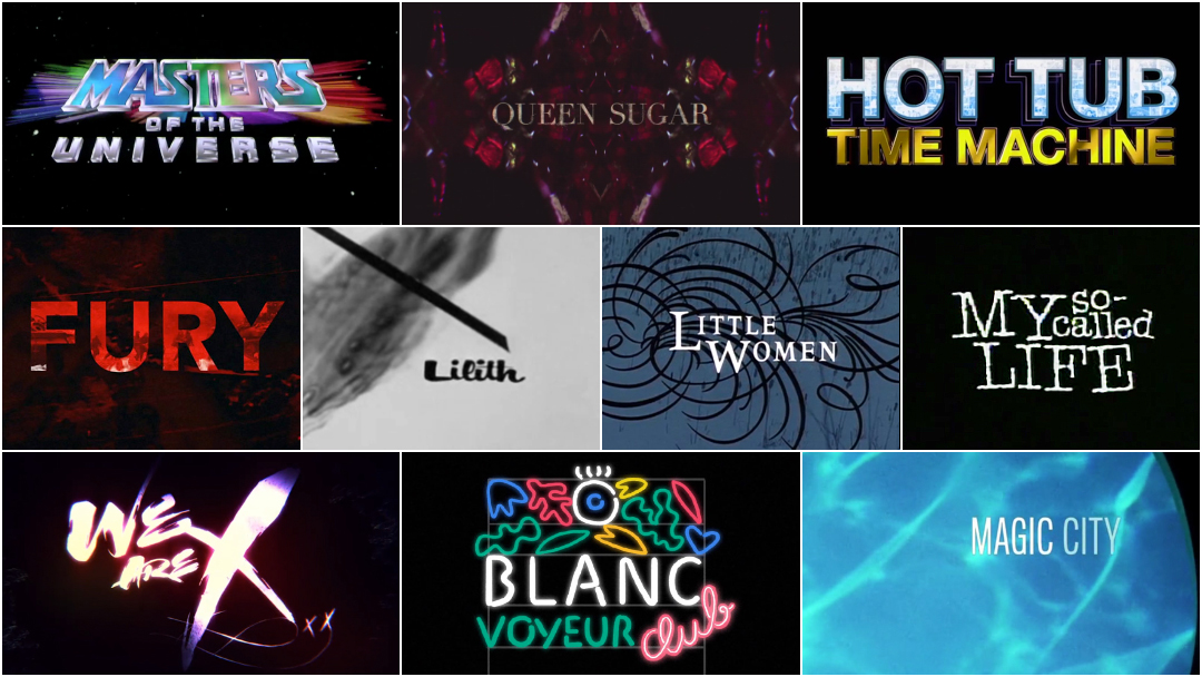
In 2015, we published our first feature article in celebration of International Women’s Day entitled 10 Women of Title Design. In 2016, we returned with 10 More Women of Title Design. This year, we bring you 10 more!
Here at Art of the Title, our mission is to champion the great work of title designers and all those involved in the craft. The 10 Women of Title Design articles are one of the ways in which we strive towards more balanced representation, a priority that is vital to the work that we do. So join us as we celebrate another International Women's Day by shining a light on the often unsung women in this great field. With hope, we’ll have another 10 to present next year!
10 Women of Title Design That You Should Know – Part Three
Synderela Peng

Title Designer Synderela Peng
Synderela Peng is a motion designer and creative director based in Los Angeles. Since 2002, she has been designing title sequences for feature films including Watchmen, Life of Pi, The Soloist, Dead Silence, and Hot Tub Time Machine. She has designed title sequences for TV series Olive Kitteridge (which was nominated for an Emmy in 2015), Key and Peele, Bernard and Doris, and The Bridge. She was a designer and art director at studio yU+co for 14 years before joining FX Networks in 2015 as creative director.
She is a member of LACE, AIGA, and the Academy of Television Arts and Sciences.
Hot Tub Time Machine (2010)
CATEGORY: FILM
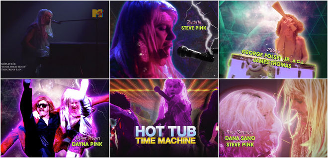
Hot Tub Time Machine (2010) — main-on-end titles by Synderela Peng and yU+co
With a title so confident and matter-of-fact as Hot Tub Time Machine, the film succeeds primarily because it does exactly what it says on the tin. What it lacks in wit, it makes up for in spades of screwball delights and sheer over-the-top lunacy. It’s coarse and honest, paying homage to and poking fun of its influences directly, as if asking: what if Back to the Future was crude, profane, wrapped in spandex and pumped full of glam metal?
The opening and closing sequences are a set of hilarious bookends that introduce the story and then finish it off with neon style. Created by Garson Yu, Synderela Peng, and a team of designers at yU+co, the opening sequence is a brief tour through hot tubs of yore, incorporating classical art history, stock photos, and original photography shot specifically for the film. “We also stayed true to the aesthetic of the time with a colour palette and a logo that has a decidedly ’80s feel to it,” says Art Director Synderela Peng. The closing is a much more elaborate affair, a main-on-end sequence that perfectly parodies the classic Mötley Crüe music video for “Home Sweet Home” with Lou (Rob Corddy) in the role of lead singer Vince Neil. To this, yU+co adds freeze-frames laced with hot pinks, greens, and blues, tiger stripes and leather, lightning and lasers, and not a little sparkle. It’s an electric and rousing end to a film that takes its joy from living in the past.
Lisa Bolan

Title Designer Lisa Bolan
Lisa Bolan is a creative director, illustrator, and title designer based in Los Angeles. She began her career designing for film, television, game marketing, and music packaging. As an art director for 1K Studios she designed motion projects for The Parent Trap, Zodiac, HBO’s Deadwood, Six Feet Under, and The Sopranos.
In 2008 Lisa began working at Prologue Films, where she has designed titles for dozens of film and television projects including Battle Creek, The Fifth Estate, Pain & Gain, The Twilight Saga: Breaking Dawn — Part One & Part Two, Sleepy Hollow, Arthur, The Apparition, ESPN 30 for 30, and The Oscars. She has also created illustrations and designs for title sequences including Tropic Thunder, Queen Sugar, Sherlock Holmes, Sherlock Holmes: A Game of Shadows, Iron Man 3, and The Secret Life of Walter Mitty.
Queen Sugar (2016)
CATEGORY: TV
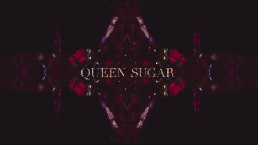
Queen Sugar (2016) — main titles by Lisa Bolan and Prologue Films
The title sequence of Queen Sugar is a kaleidoscope of fire and dark crystal, folding landscapes and glances into myriad angles. It introduces the story of Nova and Charley Bordelon, sisters who uproot themselves from New Orleans and Los Angeles, respectively, to claim their inheritance: an 800-acre sugarcane farm in the heart of Louisiana.
The drama series was created, directed, and executive produced by powerhouse director Ava DuVernay, who also helmed recent films Selma and 13th, which was nominated for Best Documentary Feature at the 2017 Oscars. For Queen Sugar’s first season, DuVernay assembled a team of female directors, making it the only show to ever have been directed entirely by women. It’s no surprise, then, that this sensibility also extended to its opening sequence, which features music by Meshell Ndegeocello and design from Creative Director Lisa Bolan and a team at Prologue Films. As the sequence rolls on, the sugarcane burns, the flames lick at the edges. The land and its people become inseparable, endless. In tones of chestnut and stone grey, scarlet red, mint green and hot magenta, hands dig and power shifts. Queen Sugar returns for its second season in 2017, with a whole new set of female directors. Dreams never die.
Elinor Bunin Munroe

Title Designer Elinor Bunin Munroe
Elinor Bunin Munroe is an Emmy award-winning title designer, director, and producer of live-action and animated films and title sequences. Elinor was senior designer at CBS Television, creative director of WNET Channel 13, a painter, and a professor. Her films have received more than 100 major awards and are included in the Paley Center for Media.
She has created title sequences for films including Lilith, Who Killed Teddy Bear, The Fat Spy, War and Peace, The Producers, The Angel Levine, Taking Off, and others, as well as titles for television including Don Rickle’s Brooklyn, The Rookies, The Great American Dream Machine, The Kraft Music Hall, ABC Stage 67, and many more.
In June of 2011, The Film Society of Lincoln Center opened its Elinor Bunin Munroe Film Center, a multi-screen theatre and cultural venue named in her honour.
Lilith (1964)
CATEGORY: FILM
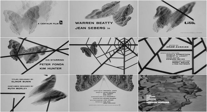
Lilith (1964) — main titles by Elinor Bunin Munroe
Upon its release in 1964, Lilith painted a confusing picture for American audiences. It was too expressive, too ambiguous, too abrupt, too raw. Jean Seberg delivers the complex and brilliant title character, a woman wholly unhinged, who “wants to leave the mark of her desire on every living creature.” In the film's opening, title designer Elinor Bunin Munroe captures the strange energy of Seberg’s Lilith with an ordinary butterfly. The butterfly becomes trapped in the stark angles of a spiderweb and then breaks free, echoing the narrative of the film.
The graphic sequence is relatively simple, but it draws attention to itself, heightening the creative presence of the film. It takes the film-before-the-film approach and addresses viewers directly with metaphor. The sequence works on a number of levels, preparing audiences tonally and narratively, but also – to take the metaphor further – by delicately positing audience as subject. For 114 minutes, if we are willing and still, we are the butterfly, temporarily ensnared by another world.
Allison Brownmoore

Title Designer Allison Brownmoore
Allison Brownmoore is a title designer and co-founder of London-based design and visual effects studio Blue Spill. She has designed titles and in-film motion sequences for over 45 films, including 13 Sundance films, five Academy Award shortlisted features, and BAFTA, Emmy, RTS and Grierson award winners. In 2016 she won the SXSW Excellence in Title Design Audience Award, was a juror for the Titles and Graphic Identity BAFTA Craft Awards, and was a Mentor for The Dots VFX/Animation Masterclass.
Working primarily in documentary, she has created title sequences for films including Sergio, Koran by Heart, 12-12-12, How to Dance in Ohio, The Tillman Story, Buck, Indian Point, We Are X, Destination Unknown, Blood of Others, and The Lure, and TV series The Traffickers, and Captive.
We Are X (2016)
CATEGORY: FILM
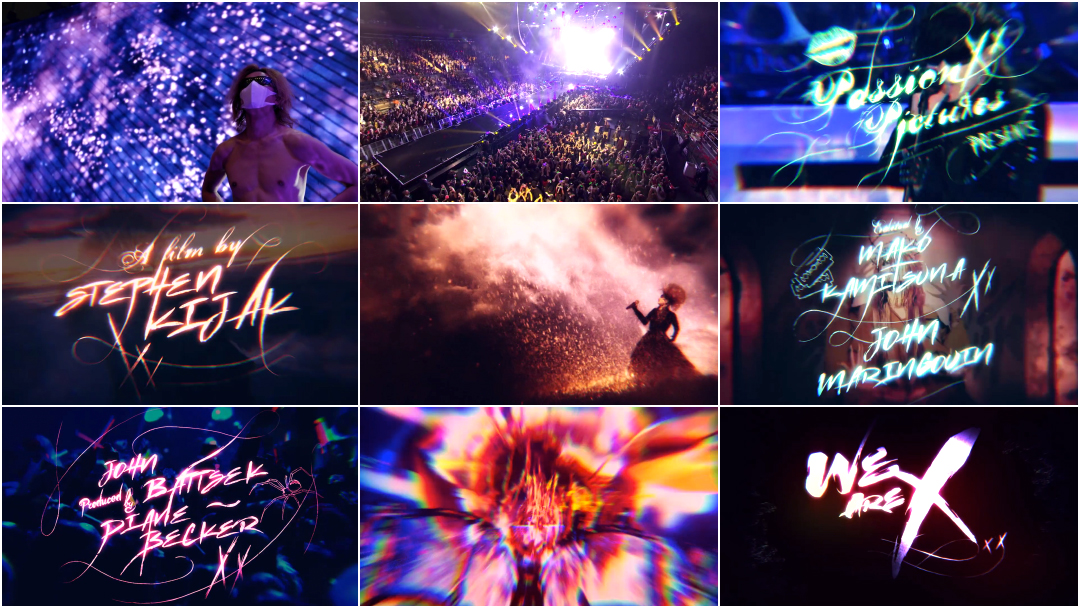
We Are X (2016) — main titles by Blue Spill
X Japan and studio Blue Spill team up to deliver an explosive opening number for We Are X, director Stephen Kijak’s documentary about the legendary Japanese heavy metal band and the physical and emotional toll of high-level musical performance.
Anchored by footage of X Japan’s much talked about 2014 show at New York’s Madison Square Garden, We Are X’s title sequence intercuts archival video and photos of the group’s wild heyday with imagery that captures the spirit of visual kei, the flamboyant musical cousin of Western glam rock pioneered by the band. As the intro of “Jade” reaches its peak, a volley of Xs blasts across the screen like an anime super attack. Luminous neon title cards pulse to the rhythm of bandleader Yoshiki’s drums – the beating heart of the group – while a series of fantastical vignettes transforms X Japan’s members into a pantheon of rock gods. It’s an electrifying introduction to the story of one of the world’s greatest musical acts. Read more.
*Winner of the 2016 SXSW Excellence in Title Design Award.
Arisu Kashiwagi

Title Designer Arisu Kashiwagi
Arisu Kashiwagi is a director and motion graphics designer based in New York City. Since 2005, she has worked with companies including 2x4, DentsuBos, VH1, Psyop, Prologue, Leroy & Clarkson, and Imaginary Forces. She has worked on the design of main titles for Marvel’s Jessica Jones, Boardwalk Empire, The Pacific, Magic City, and The Mummy: Tomb of the Dragon Emperor. In 2016, she was nominated for an Emmy Award for Outstanding Main Title Design as part of the team behind the titles to Marvel’s Jessica Jones.
She has also designed cinematics for the Sony Playstation game God of War III, and installations for clients including Prada, Mr. Porter, USA Networks, NYCxDesign, Johnny Walker, and the LA Opera.
Magic City (2012)
CATEGORY: TV
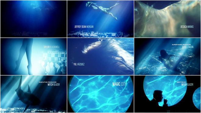
Magic City (2012) — main titles by Imaginary Forces
In the opening sequence to Starz’s short-lived series Magic City, light filters down through the still surface of the sea. A breezy and slow jazz theme composed by Daniele Luppi tinkles in and a woman, nude, swims in azure with the elegance of a creature born to water. She is temptation and desire incarnate, a lure to a glittering world where men seek their fortunes: Miami, Florida, 1959, just after the Cuban Revolution.
The sequence is a dream. It was directed by Ahmet Ahmet and Michelle Dougherty at Imaginary Forces with design support from Arisu Kashiwagi and Greg Herman, and in 2012, it was nominated for an Emmy in Outstanding Main Title Design. It’s an oasis and a mirage – a James Bond title sequence on vacation. That is, until the final moments, when a predator appears – smooth and stealthy, setting the stage for seduction and deceit.
Kathie Broyles

Title Designer Kathie Broyles
Kathie Broyles is a title designer based in Boulder, Colorado. She started her career in music, then moved into film and broadcast design. As a title designer, she has worked under her own name as well as under Kathie Broyles & Associates, and for a time as Broyles/Okun, a partnership with designer and visual effects artist Jeffrey A. Okun. She has worked with companies including LucasFilm, Touchstone, Twentieth Century Fox, Warner Bros., Disney, Sony, New Line Cinema, and many more.
Kathie’s work in feature film and television includes the title sequences for thirtysomething, Say Anything…, Courage Under Fire, Glory, Beverly Hills 90210, The People Under the Stairs, Legends of the Fall, and My So-Called Life.
My So-Called Life (1994)
CATEGORY: TV
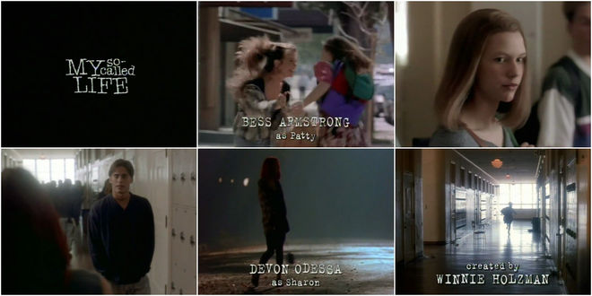
My So-Called Life (1994) — main title design by Kathie Broyles
“School is a battlefield for your heart,” says Claire Danes as Angela Chase, the central character of Winnie Holzman’s teen drama series My So-Called Life. From the whispered words at the beginning of the main titles to the final episode, the show has always had the feeling of a secret – a look into the private inner lives of teens.
The title sequence was cut together using scenes from the pilot episode by Scott Winant, who also directed it. Paired with the theme by composer W.G. Snuffy Walden, the opening captured the anguish, confusion, angst, and electricity that pulsed through the show as the characters dealt with major issues including abuse, homophobia, homelessness, and addiction. Designer Kathie Broyles chose “herky-jerky” typewriter-style typography to visualize the title, a phrase loaded with alienation and sarcasm. To underscore the instability of the characters, the lettering was set on a jagged baseline, unsure of itself. More than 20 years on, the opening is a clear crystallization of ’90s American grunge youth. It stills bear the feeling of stumbling upon a keepsake of a vulnerable time, like a long lost yearbook. Read more.
Wenden K. Baldwin

Title Designer Wenden K. Baldwin
Wenden K. Baldwin is a title designer and visual effects producer based in Los Angeles, California. She started her career working at B-movie house Cannon Films in the print advertising department. Wenden started the Title Department at Cannon with her title sequence work for Maria’s Lovers (1984), going on to collaborate with directors John Frankenheimer, John Cassavettes, and Ivan Passer. She has designed the titles to Breakin’ 2: Electric Boogalo (1984), Invaders From Mars (1986), Masters of the Universe (1987), Bloodsport (1988), and many more.
Wenden has also worked with Cinema Research Corp and Pacific Title and Art, doing title design as well as digital compositing. She designed the titles to Universal Soldier (1992), The Scarlet Letter (1995), Albino Alligator (1996), and the Toni Basil-choreographed opening to My Best Friend’s Wedding (1997). She continues to do titles and visual effects work, primarily with independent filmmakers.
Masters of the Universe (1987)
CATEGORY: FILM
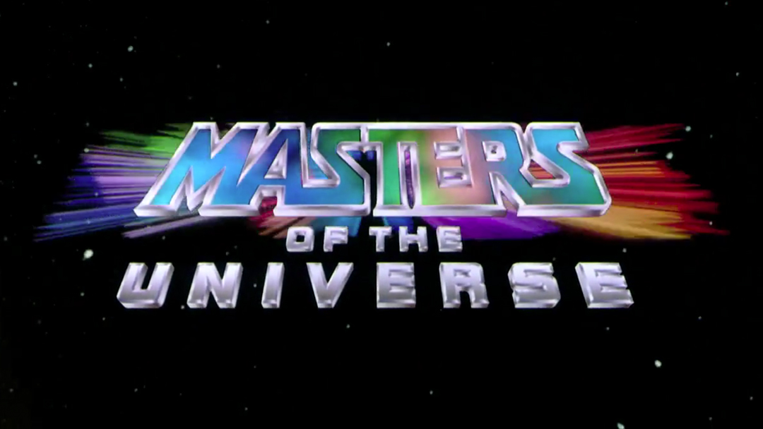
Masters of the Universe (1987) – main titles by Wenden K. Baldwin and Kyle Seidenbaum
In the center of the universe, on the planet Eternia, the evil sorcerer Skeletor and the noble barbarian He-Man duke it out in endless battles for power and possession. Originally created as a line of toys by Mattel, the Masters of the Universe made their live-action debut in 1987 with a feature film produced by B-movie house Cannon Films. Dubbed "the Star Wars of the '80s,” it came complete with a starfield opening and epic slit-screen effects in line with the title sequence to Superman. Chrome credits zoom into view and pause over vibrant nebulae of colour before moving into the deep distance of space, each element locked in its own distinct trajectory.
For this opening, Cannon Films title designer Wenden K. Baldwin and assistant Kyle Seidenbaum hand-kerned the typography and directed camera technicians at Pacific Title to achieve the slit-screen effect. “The logo was set,” says Baldwin. “But in those days you had to make everything from scratch. It was a matter of coming up with a way to animate that and to create an effect that [Gary Goddard, the director] eventually liked. You had to hire airbrushers to get the effect inside the Masters of the Universe title itself.” Paired with the grandiose score by composer Bill Conti, the sequence succeeds in gearing up audiences for a fantastically campy tale of far-off heroes.
Belinda Bennetts

Title Designer Belinda Bennetts
Belinda Bennetts is a designer based in Sydney, Australia. She is the title designer of films Black Robe (1991), Little Women (1994), Paradise Road (1997), Oscar and Lucinda (1997), and Charlotte Gray (2001), as well as TV series Wildside, The Alice, East West 101, and The Strip. She was also VFX Art Director on Moulin Rouge and Crowd TD on Happy Feet 2.
She has also taught motion graphics at the Australian Film, Television & Radio School (AFTRS), where one of her students was title designer Patrick Clair. Currently, she works in Sydney, Australia as a UX designer.
Little Women (1994)
CATEGORY: FILM
Little Women (1994) — main titles by Belinda Bennetts
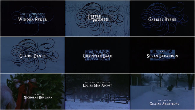
In the opening to Gillian Armstrong’s critically acclaimed adaptation of Little Women, ornament and craft lay the foundation for the story of Jo and Beth and Meg and Amy and their home in Concord, Massachusetts.
Since the two-volume book was completed by Louisa May Alcott in 1869, there has been a version of Little Women for every generation. The title sequence, created by Australian designer Belinda Bennetts, features credits typography set atop woodblock illustrations of women and their books as well as calligraphic flourishes over fields of snow, establishing the world of the March sisters.
The San Francisco Chronicle’s Edward Guthmann called Little Women“one of the rare Hollywood studio films that invites your attention, slowly and elegantly.” Thanks to the title sequence, the film is imbued with a sense of ease and familiarity from its first moments. A large part of this is also thanks to the warm and uplifting score by Thomas Newman. It’s a testament to the perfect pairing of audio and visuals when a sequence of dark shapes in blues and blacks and surrounded by snow can feel so warm.
Olga Capdevila

Title Designer Olga Capdevila
Olga Capdevila is an illustrator and designer based in Barcelona, Spain. After earning her art and design and illustration degrees from Escola Massana, Olga co-founded Tropèl Illustració, an independent collective that mixes illustration with design, motion, and performance. She has created commercial work for Spain’s TV3, Reebok, Moscou Club, and the band La Iaia.
In 2015 she directed and illustrated (alongside animator Genis Rigol) the opening titles for Blanc Festival 2015.
Blanc Festival 2015 (2015)
CATEGORY: CONFERENCE
Blanc Festival 2015 (2015) — main titles by Olga Capdevila and Genís Rigol
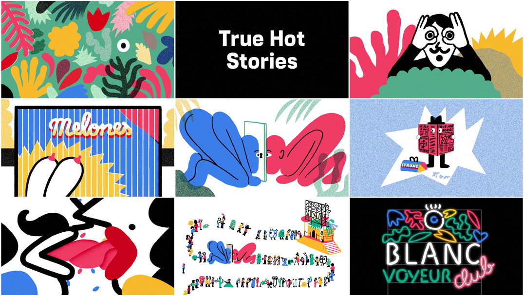
Good design has the power to both amaze and inspire, but can it also arouse or titillate?
That’s the thinking behind the bawdy opening titles for Blanc Festival 2015, an annual celebration of graphic design held in Barcelona. Conceived by BCN design studio Can Cun and consummated by illustrator Olga Capdevila and animator Genís Rigol, the sequence, titled “True Hot Stories,” is exactly as advertised: it’s a hot and heavy animated romp featuring a cavalcade of creeping cacti, poppin’ peepers, bared bosoms, and waggling tongues. The kind of work that catches your eye across the room and makes you do a double-take. Go ahead, take a good look. The line starts here.
Helen Greene

President of Greenhaus GFX and Executive Creative Director Helen Greene
Helen Greene is a motion graphics producer and the Executive Creative Director and President of production company Greenhaus GFX. Founded in 2008, Greenhaus GFX began with a handful of artists and grew to a full-scale production house with more than 20 designers producing projects across motion graphics, main title design, and editorial. The company has received Golden Trailer Awards in the Best Motion Title Graphics and Best Motion Posters categories. Their client list includes studios such as Disney, Warner Bros., Paramount, and Netflix.
Having earned two BFA degrees from Minneapolis College of Art and Design and Art Center College of Design in Pasadena, California, Greene spent nearly a decade working in the movie marketing industry before entering the field of main title design. She has produced title sequences for feature films including Fury, Teenage Mutant Ninja Turtles 1 and 2, Insidious: Chapter 3, Entourage, Warcraft, and xXx: Return of Xander Cage.
Fury (2014)
CATEGORY: FILM
Fury (2014) — main-on-end titles by Greenhaus GFX
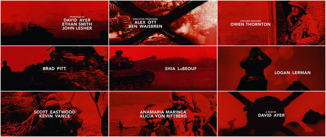
The blood-red sequence at the tail-end of Fury, David Ayer’s 2014 war potboiler, offers a brief respite from the gruesome bloodletting before plunging back into the fray. The film eschews an opening title sequence in favour of the one-two punch of a simple title card at the fore and an evocative main title sequence at the close.
Created by designers at Greenhaus GFX under Executive Creative Director Helen Greene, the end sequence is a pastiche of real World War II archival footage, film artifact and degradation effects, and fast-paced cuts. It begins on a sombre, wistful note; a soft piano piece by Composer Steven Price slowly shuffling forward. Soon the pace is a quick march, with strings and chants invading and deep distorted bass notes blaring through. The editing of the piece, cut precisely to the music, provides resonance, energy, and ultimately a strong finish.
—
To discover more fantastic title designers who happen to be women, take a look through our directory of designers. And if you know of any whose work we haven't yet featured on the site, let us know. We're dying to discover more exciting work and to keep these important conversations moving.
The entries for We Are X and Blanc Festival 2015 feature notes from Will Perkins.

