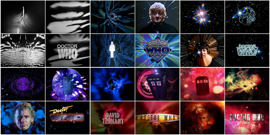
Writer Marcus Bernard from TVARK, the authoritative website on television presentation and graphics, discusses the history of the Doctor Who opening titles.
Doctor Who is the longest-running sci-fi fantasy series in the world. It was created at the BBC in 1963 by Canadian film and television producer Sydney Newman and writer and producer Donald Wilson, and launched by producer Verity Lambert, who was then 27 years old. Her team, under Director Waris Hussein, recorded the first episode, “An Unearthly Child”, by Anthony Coburn, first as a pilot in September 1963 and then again a few weeks later, for the launch transmission on 23rd November. Viewers were introduced to a mysterious elderly scientist, known only as the Doctor, who travels through time and space in a ship known as the TARDIS. He eventually turns out to be a benevolent alien from Gallifrey, the planet of the Time Lords, with the ability to transform or 'regenerate' his appearance 12 times.
Over forty years, the Doctor has been played by ten different actors on TV, with others on film, stage, radio and audio media. The TV series was quickly identified with a startling theme tune, composed by Ron Grainer – who also wrote the music for Steptoe and Son, Tales of the Unexpected and Man In A Suitcase (AKA TFI Friday) – and a spine-tingling title sequence, of which a complete history follows below...
Doctor Who (1963)
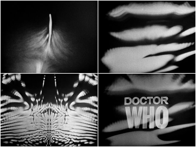
The pilot title sequence was created by Bernard Lodge, who filmed and manipulated the "howlaround" feedback of a TV camera pointing at its own monitor. A column of light rises before ripping and swirling, as if to suggest a journey through time. Delia Derbyshire's extraordinary original arrangement of the famous Ron Grainer theme music* accompanies this footage, in its day the most alien-sounding piece of music ever recorded and still prone to sending a shiver up the spine.
*For more information on the theme: “A History of the Doctor Who Theme”
In the pilot, William Hartnell's Doctor was distant and almost callous. Newman called for the episode to be remounted, with the star's performance toned down for the recording of what became Doctor Who – Episode One, first shown on BBC TV on November 23rd, 1963.
The opportunity was taken to tweak the title music too, removing the scary extra-terrestrial sound effects, but the filmed graphics stayed the same. This title sequence and music were retained well beyond Hartnell's departure in 1966.
Doctor Who (1967)
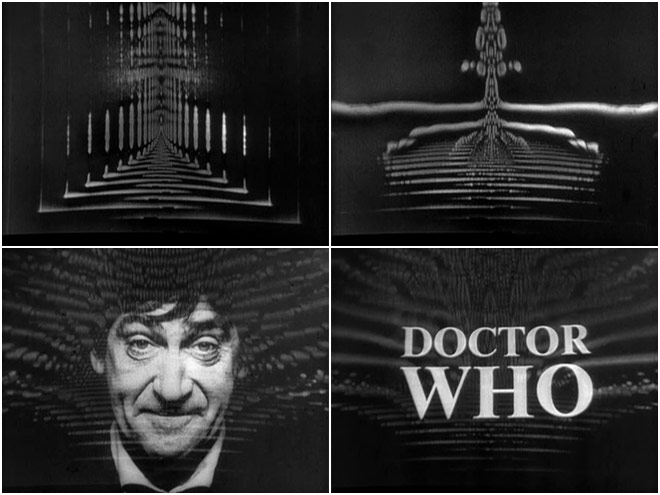
Patrick Troughton made his debut as The Doctor on November 5th, 1966, but the decision to refresh the titles and add his face was not taken until March 1967, when the series logo was reset. Delia Derbyshire tweaked her music by mixing in some spooky "spangle" sound effects over the opening bars. Both clips date from episodes in Troughton's final series: “The Krotons”, as repeated on BBC2 in November 1981, and “The Mind Robber”, shown again in 1992.
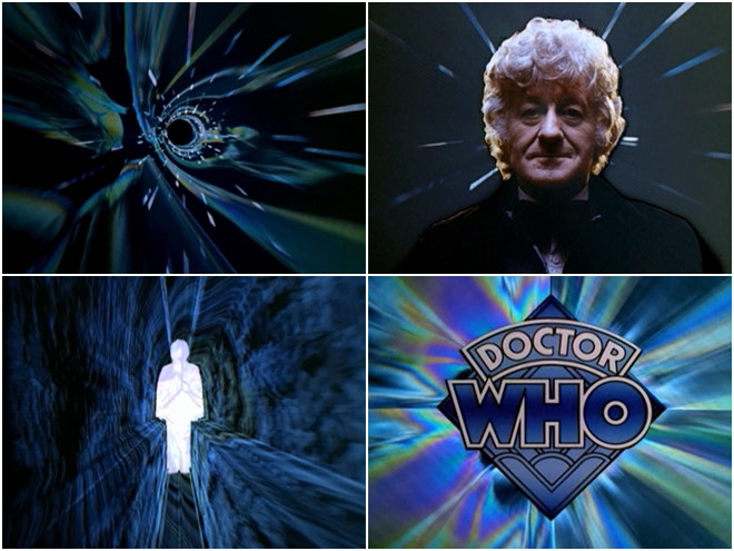
Doctor Who (1970)
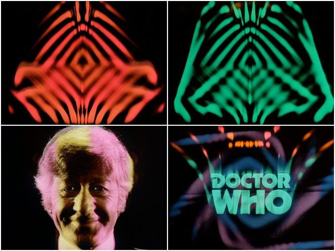
Series 7 was the first to be made in colour. Jon Pertwee's face replaced Troughton's in the titles, re-designed via "howlaround" with red and green swirling flames and climaxing with another new logo design. Delia Derbyshire's theme arrangement was given a third new edit, retaining the spangles but shortening the opening bars and, for series 7-9 adding a "stutter start". Closing music changed too, standardised at 52" and 1'12", starting with the now-famous radiophonic scream.
Doctor Who (1973)
*For other examples of the use of slit-scan technology, see the "star child" sequence in 2001: A Space Odyssey (1968) and the "stretching" of the starship Enterprise-D when it engaged warp drive in Star Trek: The Next Generation (1987–1994).
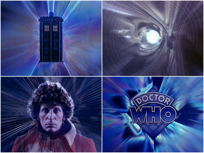
Inspired by the stunning hyperspace sequence climaxing Stanley Kubrick's movie 2001: A Space Odyssey, Bernard Lodge re-designed the Doctor Who titles again in 1973. For series 11, "howlaround" was dropped in favour of a technique known as "slit-scan", in which multiple exposures of light refracting in plastic were filmed through slots in black card on a rostrum animation stand.* Lodge also re-designed the series logo as a diamond.
Doctor Who (1974)
By 1974, with Tom Baker assuming the title role, graphics designer Bernard Lodge hit his stride with arguably the best title sequence in the series' history. He applied the slit-scan technique to images of the TARDIS and a morose-looking Baker, thereby evoking the most sensational time tunnel effects. Possibly the scariest bit is when the diamond logo dissolves out of the time tunnel, accompanied by a loud hiss of gas rushing right 'atcha!
An experimental colour change with brown and orange filters in 1975 was transmitted on episode one of Baker's second story, “The Ark in Space,” but deemed unsuccessful. The original version of this sequence was retained from series 12 right up to series 17 in 1979; the only change made was a variation in the font used to spell out the story names and writers' credits.
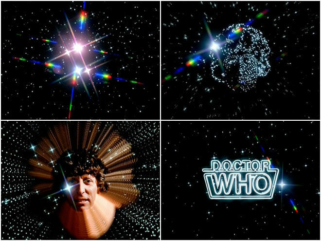
Doctor Who (1980)
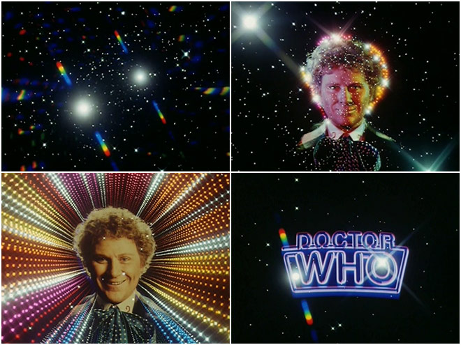
John Nathan Turner produced from series 18. He considered Lodge's work to look like a journey through a vacuum cleaner tube, and felt that the image of Tom Baker was now too young to match the actor as he looked in 1980. So graphics designer Sid Sutton was obliged to take us splendidly into space rather than time, while Peter Howell gave Ron Grainer's theme its only decent re-arrangement of the 1980s. The added whooshes and sonic booms make it all so thrilling!
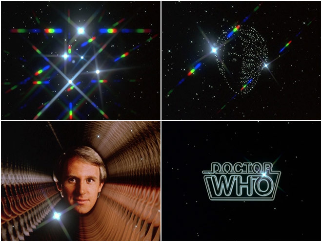
Doctor Who (1982)
Post-Tom Baker, the starfield titles had been in use for only one year. Sid Sutton refreshed them with Peter Davison's face. Rather than mixing in, the photograph wipes in using a "venetian blind" pattern. There are also some subtle variations on the opening starburst effect.
Doctor Who (1984)
Colin Baker played the Doctor from series 21 onwards as brash and colourful, so Sutton was instructed to make the titles brash and colourful. He animated the Doctor's face by dissolving from a frown photo to that of a beaming grin – possibly the friendliest that Colin Baker ever looked during his short tenure! Plus, rather than forming from stars, the neon logo now zoomed into place via Digital Video Effects (DVE), bent down at the edges and tinted purple. The old saying suggests that "if it ain't broke, don't fix it," a saying that John Nathan Turner cheerfully ignored.
For series 23 in 1986, he dropped Peter Howell's fantastic theme arrangement, in favour of Dominic Glynn's version. Glynn's incidental music was always very good, but his theme tune didn't quite do it for me...
Doctor Who (1987)
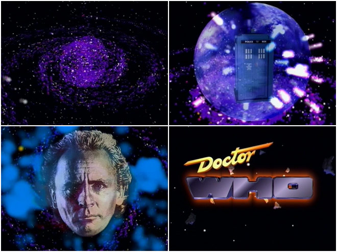
"Three years is the optimum period for an actor to play the Doctor," said the BBC, so Colin Baker was fired and Sylvester McCoy cast. Cue a new title sequence, the first to be realised with CGI. The independent company CAL Video generated the graphics, designed by Oliver Elmes. Meanwhile, Keff McCulloch was handed the commission of re-arranging the theme tune, and composing almost all of the incidental music heard within the McCoy episodes. I love the graphics, especially the TARDIS trapped in a bubble, but consider this theme music and logo to be the series' absolute worst. "Sheet music" indeed. Well... maybe the "middle eight" works, but that's all.
Doctor Who (1996)
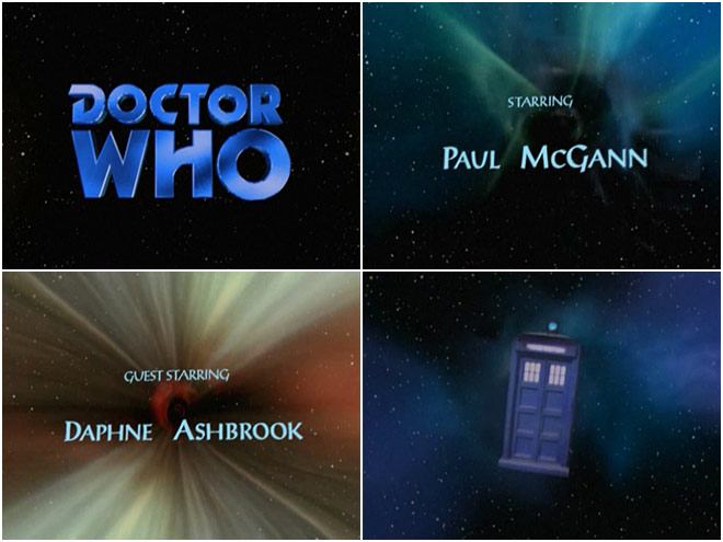
A UK-USA co-production resulted in this 1996 TV Movie, directed by Geoffrey Sax, in which Paul McGann replaced Sylvester McCoy. The theme music was re-arranged by John Debney to place Ron Grainer's famous middle eight at the start. Unfortunately the full John Williams-esque orchestral performance totally submerges the alien quality which made the original 60s/70s recordings so spooky. The graphic design is more successful, reviving Bernard Lodge's 1970 logo in 3D-CGI.
Doctor Who (2005)
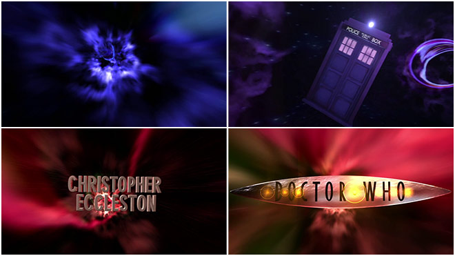
Nine years later, Doctor Who returned to BBC1 at last. Critics scoffed that this revival of a "dead series" would never work, but the 2005 version lived up to Newman and Lambert's vision and single-handedly revived the fortunes of TV drama and Saturday night family viewing. In the twinkling of an eye, the capsizing pedalo* of Doctor Who was regenerated into a gleaming flagship, thanks to the writing skills of Russell T. Davies and the industrious team assembled at BBC Wales by producer Phil Collinson. The series' logo has been re-designed in a slender font mounted on a flying lozenge, as befits an important trademark for the BBC.
*A pedalo (British English) or paddle boat (US, Canadian, and Australian English) is a small human-powered watercraft that a person drives by pedaling, which turns a paddle wheel.
Give thanks that the music and time tunnel titles are among the key elements retained from the original series. Visually, the 2005 titles (designed and assembled by post-production house The Mill) emulate 1974's classic slit-scan sequence, though the pace is a heck of a lot faster and the entire sequence is computer-generated, allowing the TARDIS to fly like thunder through the vortex!
Doctor Who (2006)
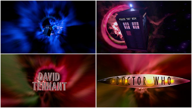
BBC’s Who revival really hit its stride with the arrival of the Tenth Doctor in 2006. David Tennant’s four year run as the Doctor was characterized by a lighter, more comedic tone than the Eccleston era, but the title sequence remained completely intact save for the change of names in the credits. Why completely revamp the titles only one year after rebooting the series? If it ain’t broke, don’t fix it.
—WP
Doctor Who (2010)
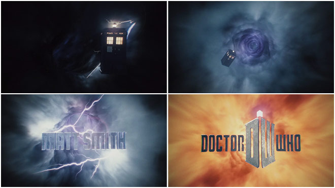
Matt Smith took control of the TARDIS as the eleventh Doctor on April 3rd, 2010. Cue new titles and another theme arrangement by Murray Gold. If the 1980s starfield titles seem bland compared to the original slit-scan/howl-around effects from series 1-17, I think the same can be said of these graphics; a column of smoke followed by a column of fire. Where's the mystery these days? Anyway, Matt Smith is brilliant as the Doctor, which is the most important thing!
Doctor Who (2012)
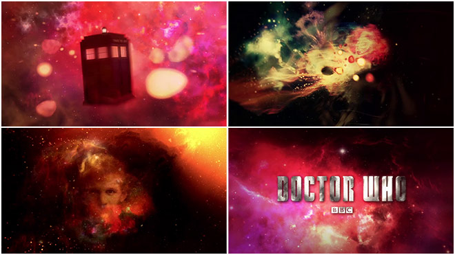
The 2012 version, produced by Peter Anderson Studio, sees the sequence shortened considerably and filled with additional elements including abstractions of nebulae and the return of the face of the Doctor. Stepping away from the tubular structure of its predecessor, this sequence ditches the lightning in lieu of a smattering of electric sparks, packing a succinct, explosive punch slightly reminiscent of the ’67 version. The TARDIS once again flies like thunder through the vortex.
—LL
With additional notes by Editors Will Perkins and Lola Landekic

