For most successful horror film franchises, the river to box-office gold runs crimson with the blood of gleefully slaughtered teens. Nowhere is this more evident than in the Final Destination series, which celebrated its 20th anniversary in 2020. Over a ten-year period and five films (with a reboot on the way), the franchise raked in over $650 million at the box office for New Line Cinema, with a total kill count of 496; pretty decent numbers for a series lacking a corporeal villain. In the Final Destination universe, there’s no Freddy Krueger, Jason Voorhees, or Ghostface – instead, the teen-murdering Big Bad is Death itself.
The standard Final Destination plot is repeated like a 12-bar blues pattern, with some variations. A stereotypical all-American teenage protagonist has a premonition of a disaster, usually involving a large-scale mechanical or infrastructural malfunction, and manages to escape with a group of bystanders only to watch, helplessly, as the disaster occurs and kills many others. The group realizes they’ve somehow cheated “death’s design” – but not for long, as the survivors get picked off one by one in increasingly complex death sequences. In the words of the mortician Bludworth, played by a scene-chewing Tony Todd in three of the films: “Disrespecting the design could initiate a horrifying fury that would terrorize even the Grim Reaper – and you don't even want to fuck with that mack daddy.”
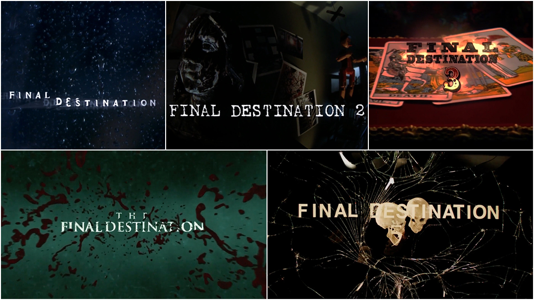
This franchise also bears another distinctive feature: its title sequences. For each Final Destination movie, the title sequence serves as a premonition and small taste of the carnage to come, using symbolism, editing and sound to create an ominous sense of doom and inevitability. As the franchise moved into its fourth and fifth films (and into 3D), the title sequences became increasingly striking and creative vehicles for fan service: high-concept mini-movies providing visual callbacks to the most gruesome deaths, designed to get the audience riled up and hungry for bloodshed. This is the title sequence at its finest: evolving meta-narrative devices that display an awareness of audience expectations, providing reverent nods to the history and possibilities of genre cinema.
Final Destination (2001)
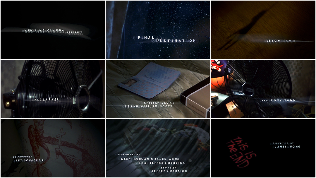
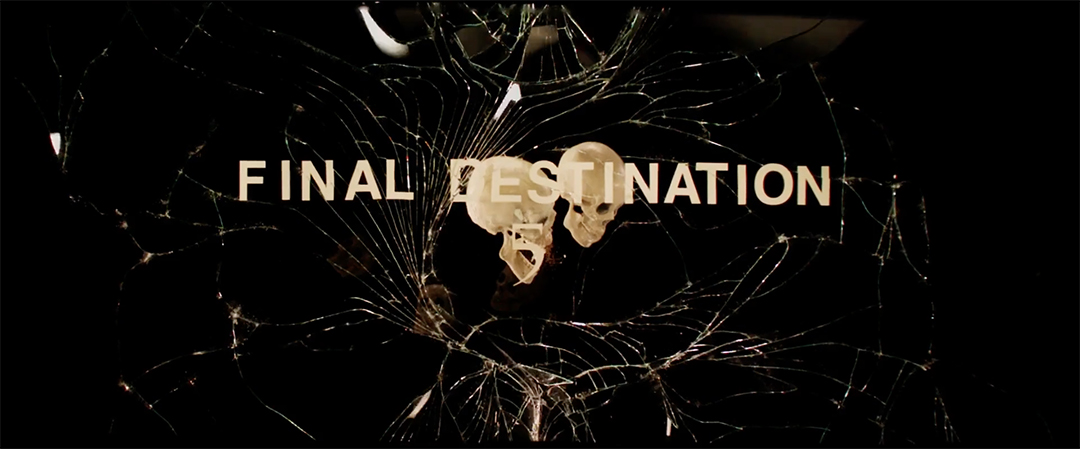
Final Destination (2000) main titles, designed and produced by Goodspot

Glen Morgan and James Wong in 2016 at the premiere of The X-Files at California Science Center in Los Angeles, California.
Photo: Angela Weiss/Getty Images
The first film in the FD franchise was conceived as an X-Files episode script by Jeffrey Reddick, featuring Dana Scully’s brother as the hapless character who has the initial premonitions of a plane crash. Reddick worked the script into a feature film and passed it on to X-Files writers Glen Morgan and James Wong, who rewrote the script with Wong attached to direct.
Alex Browning (Canadian heartthrob Devon Sawa) is seated on a plane, embarking on a class trip to Paris when he has a horrifying premonition: shortly after takeoff, Flight 180 will explode. He snaps awake and has a meltdown. He and six others are forced off the flight, which indeed explodes shortly thereafter.
When Alex’s best friend Tod (Chad Donella) is found throttled by a shower cord, it’s written off as a suicide. Alex and fellow survivor Clear Rivers suspect otherwise and visit Tod’s body in the morgue. They meet the chatty and weirdly omniscient mortician Bludworth (Tony Todd) who warns them about “death’s design”: a fatalistic plan set in motion by the Grim Reaper. Alex and Clear realize that the survivors will die in the order they were sitting on the plane unless they can thwart the design.
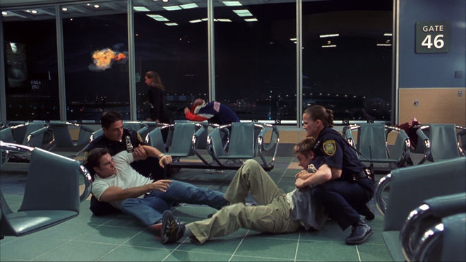
The moment of the Flight 180 plane explosion in Final Destination (2000) occurs while Carter Horton (Kerr Smith) and Alex Browning (Devon Sawa) are having a scuffle inside the airport
The title sequence
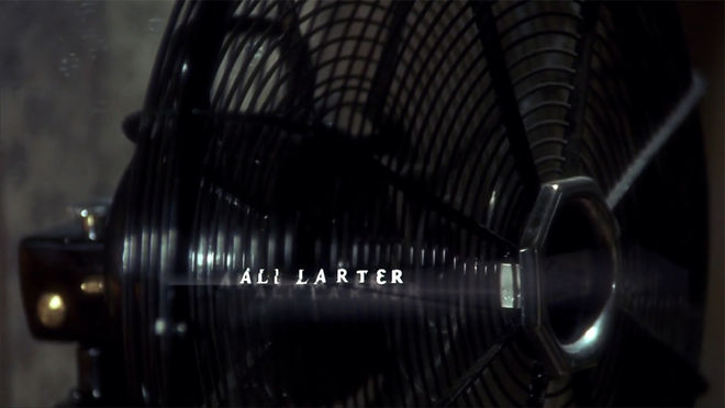
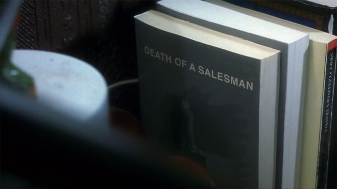
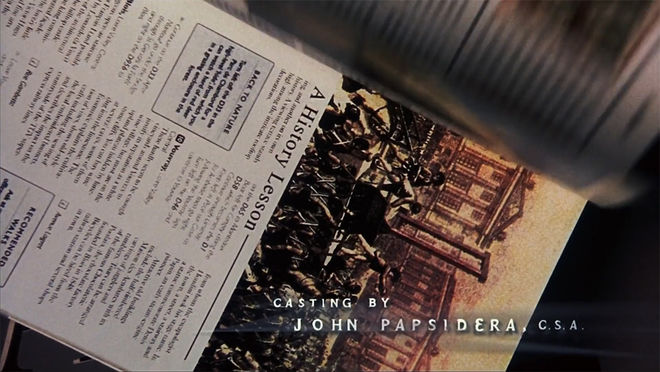
The first film’s title sequence, produced by media company Goodspot, is short but impactful. Set in Alex’s bedroom as he packs for his trip, the camera pans over a humming fan (a motif that appears in future title sequences), a set of books toppling over to reveal the cover of Arthur Miller’s Death of a Salesman (perhaps a foreshadowing of Tod’s “suicide” by hanging) and a travel guide flips open to scenes of public square torture from the French Revolution. While subsequent title sequences pay more specific homage to death scenes within the franchise, this one set the tone through general grimness and thematically heavy imagery.
Deaths of note
Aside from the harrowing and markedly pre-9/11 explosion of Flight 180, the demise of Terry Chaney (Amanda Detmer) is perhaps the series’ most iconic moment: while ranting in terror, she backs into the street and is plowed over by a bus. It’s a ghastly comedic shock that repeats itself later in the franchise and is teased in a couple of the sequels’ title sequences.
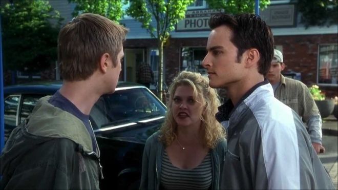
Terry Chaney (Amanda Detmer) argues with Alex Browning (Devon Sawa, left) and Carter Horton (Kerr Smith, right) in Final Destination just before being hit by a bus
It is also a loving horror homage, in a series packed with them, to producer Val Lewton’s “Lewton Bus” technique, where tension is slowly built and then abruptly broken by the appearance of a seemingly innocuous object. This was first seen in the movie Cat People, where a character runs anxiously down a deserted sidewalk in tense silence and then – ack! – a bus abruptly pulls in front of her, causing audiences at the time to leap out of their seats. Of course, in Terry’s case, the appearance of the bus doesn’t end quite as well.
The music
It’s impossible to talk about the title sequence for any Final Destination movie without mentioning the influence of legendary composer Shirley Walker, who composed and conducted the score for the first three films prior to her death in 2006.
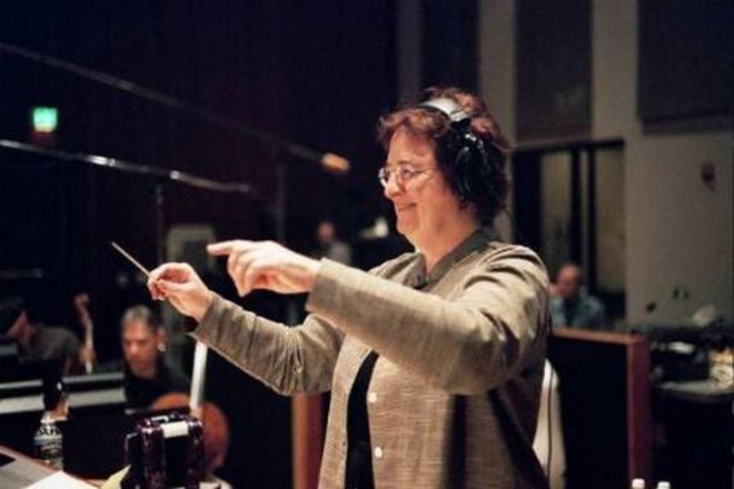
Composer Shirley Walker
Walker’s first gig was an auspicious one – she played synths on Carmine Coppola’s score for Apocalypse Now. She went on to be one of the first female composers to record a score for a major studio film with John Carpenter’s comedy Memoirs of an Invisible Man in 1992 – one of the few Carpenter films that he didn’t score himself. And she composed much of the darkly evocative score for Batman: The Animated Series, winning a Daytime Emmy award in 1996.
It was James Wong’s idea for Walker to score the title sequence for the first film, an opportunity she relished: “What a treat for me to get to write a piece that calls you into the movie and lets you know something bad is going to happen from the get-go,” she said in an undated fansite interview. While Walker preferred a “low-key” approach to the score in contrast to the intense violence, her theme casts an indelible shadow over the tone of the film. Subtle yet unsettled, with ominous humming horns and strings rising and building with the faintest dissonance, Walker’s theme recalls the creeping feeling that something is amiss. It’s the sound of death’s icy grip slowly taking its hold.
Final Destination 2 (2003)
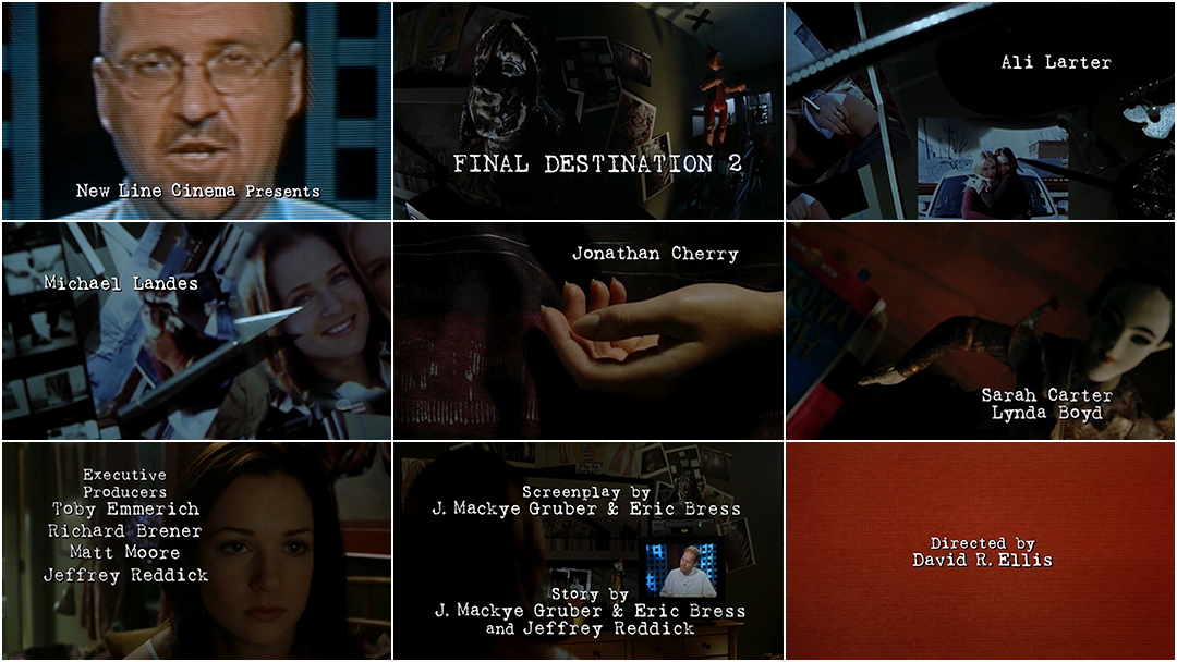
Final Destination 2 (2003) main titles, designed by Howard Anderson Company with music by Shirley Walker and cinematography by Gary Capo
One year after the crash of Flight 180, Kimmie Corman is driving a carful of pals to Florida for Spring Break. While driving, she visualizes a catastrophic car pile-up caused by a lumber truck. She swerves to block the highway entrance, earning the ire of other drivers and a cop. The semi plows into her car, killing her friends and narrowly missing Kimmie. She and her fellow survivors learn about the curse of Flight 180 and run into the creepy Bludworth, who once again warns them of death’s divine plan. They seek out one of the survivors from the first film, Clear Rivers (now confined to a psychiatric ward). Despite the ample warnings, the domino effect of death’s design is set into motion again.
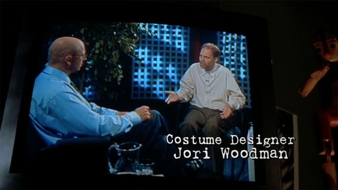
Still from the title sequence of Final Destination 2 in which Kim Corman (A. J. Cook) naps and then watches a TV news guest (David Purvis) talk about the machinations of death
The title sequence
Much like the first film’s titles (produced by the Howard Anderson Company), Final Destination 2 opens with a slow pan across Kimberly’s dark, cluttered bedroom where she’s napping. Audio comes from a TV in the corner, where a news anchor reports on the one-year anniversary of the crash of Flight 180, interviewing a conspiracy nut who outlines the idea of “death’s design.”
The camera pans through an array of objects as the titles fade in and out; a magnifying glass frames the tip of an X-Acto knife pointing at a photo of Kimberly while a travel journal is partially covered, its title reading “ROAD RIP”, a foreshadowing of the car crash. A toy airplane hangs above, calling back to Flight 180. The camera pulls back to Kimberly’s hand, which twitches in slumber like it’s seized with a cadaveric spasm.
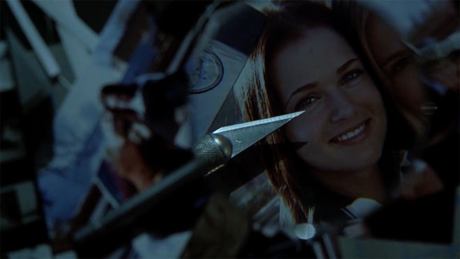
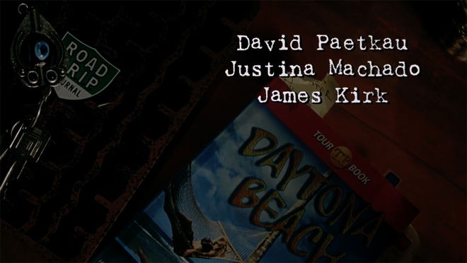
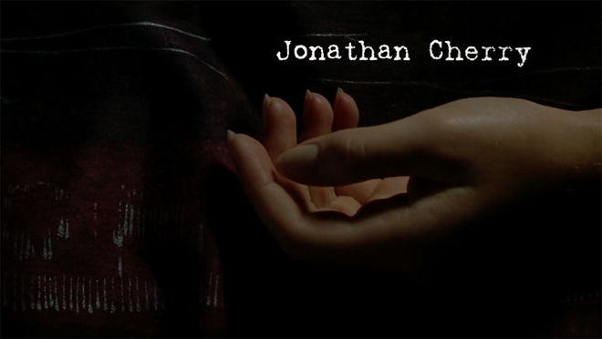
Deaths of note
Final Destination 2 features several notable deaths, including a particularly gnarly eye impalement via fire escape ladder, an elevator door decapitation and a pane of glass squashing a boy’s body into pulp. But Kimmy’s premonition of the car wreck beats them all – it’s a blood-spraying, spine-snapping, skin-boiling, metal-crunching vision of hell. It is shockingly realistic; SFX supervisor James Crosby confirmed in a 2003 interview that none of the cars used in the wreck scene were CG. Wild.

Still from the Final Destination 2 (2003) traffic crash premonition
Final Destination 3 (2006)
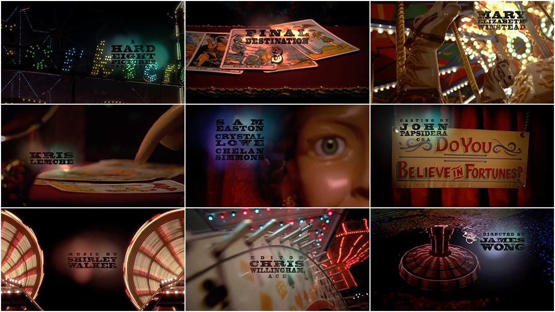
Final Destination 3 (2006) main titles, designed by Picturemill
FD 3 had been conceived as the final film of a trilogy. James Wong and Glen Morgan returned to write the screenplay, with Wong directing again. Wong also brought on a title design team he’d worked with before – Picturemill, who had worked on Wong’s 2003 remake of Willard.
In Final Destination 3, Wendy (Mary-Elizabeth Winstead) is visiting a local amusement park on a high school class trip. She wanders, taking photos for the yearbook but doom hangs heavy in the atmosphere. At the cajoling of her boyfriend Kevin (Ryan Merriman), Wendy agrees to ride the hair-raising Devil’s Flight rollercoaster. As the bar straps across her lap, she has a premonition of the coaster falling to pieces mid-ride, killing everyone aboard.
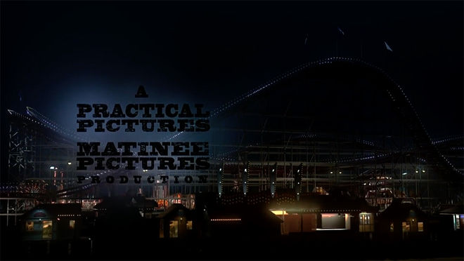
You know the drill by now: Wendy freaks, a collection of teens get off the coaster, and it continues on its ill-fated, teen-slaughtering course. Kevin tells Wendy about the Flight 180 legend, and shortly after, their surviving classmates begin to die in horrible and ironic ways. Wendy looks at her photos from the amusement park night and realizes she can predict how the survivors of the rollercoaster will die based on clues within the photos.
The title sequence
“I can’t say I was [initially] a fan of the Final Destination movies,” says William Lebeda, creative director at Picturemill. “Working with James and Glen, it’s pretty clear what kind of movie those guys are making.” When Lebeda’s team – which included art director Brad Berling and producer Christina Hwang – met with Wong to discuss the title sequence for Final Destination 3, most of the film had already been shot.
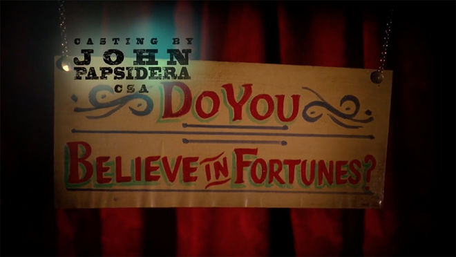
A sign from the carnival set of Final Destination 3 that asks, "Do you believe in fortunes?"
“Jim (Wong) knew exactly what he wanted,” said Berling. “We came back and pitched a bunch of ideas, too. But he knew he wanted the pinball machine and the fortune teller – visual allegories for taking chances.”
The team was presented with a variety of material to work with, including B-roll footage Wong had shot of rollercoasters, funhouses and the merry-go-round. Wong’s team also provided Picturemill with a series of 8’ x 15’ printed banners featuring vividly painted carnival figures: the bearded lady, the “Electric Twins” (twin sisters strapped into electric chairs – a visual nod to the tanning bed deaths), a sword swallower, the Amazing Metal Eater and finally, the Devil. In order to fulfill the fortune teller/tarot card imagery, Picturemill rented a fortune teller dummy and photographed it to add to the sequence.
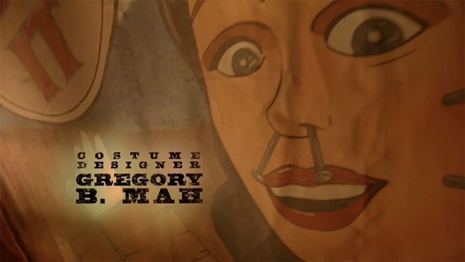
Still from the title sequence of Final Destination 3 featuring a painted banner showing a carnival performer with nails inserted into their face
The final component for the sequence was the pinball machine. Lebeda’s team had initially pitched that the entire title sequence take place inside one. After some research, 3D artist Jon Block ended up animating it in CG as a stand-alone sequence – a methodical close up of the intricate mechanisms, from the bounce of the silver ball to its journey against jutting nails (also a foreshadowing of Erin’s death by nail gun).
Given all the disparate elements, the resulting sequence feels impressively cohesive – and ominous. Merry-go-round horses grimace in close-up as screams echo from seemingly empty rollercoasters, while the camera pans over the blank eyes of the fortune teller as she sweeps her hands over the cards. Lebeda estimates the whole project took about two months to complete, with some parts – like the lurid circus-style typeface – taking a lot of time and energy.
“I think [the final product] is interesting because it’s a combination of so many things – CG and shot footage and other provided footage,” Berling says. “It helps to have a good editor and a good compositor and just overall a strong team.”
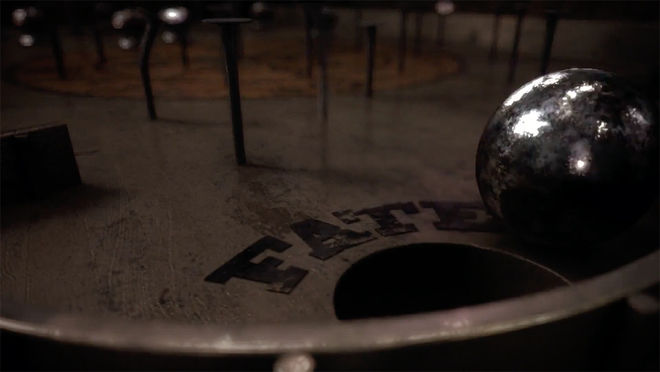
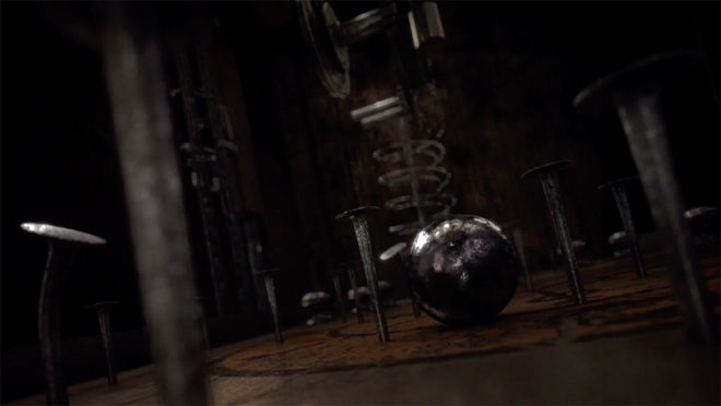
While there have been advances in CG in the years since this sequence was produced, Lebeda is still pleased with the unique final product. “In many ways it’s such a throwback – so much live action, and the banners, and so much shooting,” Lebeda says. “Many title sequences today – you see them and they’re 100 per cent CGI. There is something about this one that was pretty cool and old school.”
Deaths of note
Wong and Morgan clearly enjoyed conceiving the death sequences here, with many falling into the “ironic punishment” category. Many were so gnarly that score mixer Bobby Fernandez, working with Shirley Walker, created a “Gross-o-Meter” to measure the type of death and how violent it was (sample unit: “Dismenberment and Wiggley [sic] Guts.”)
The movie’s most wincingly effective death comes when the movie’s token goth Erin (Alexz Johnson) stumbles into a nail gun at her workplace which shoots into her skull and hands. Somebody call workplace safety!
The Final Destination (2009)
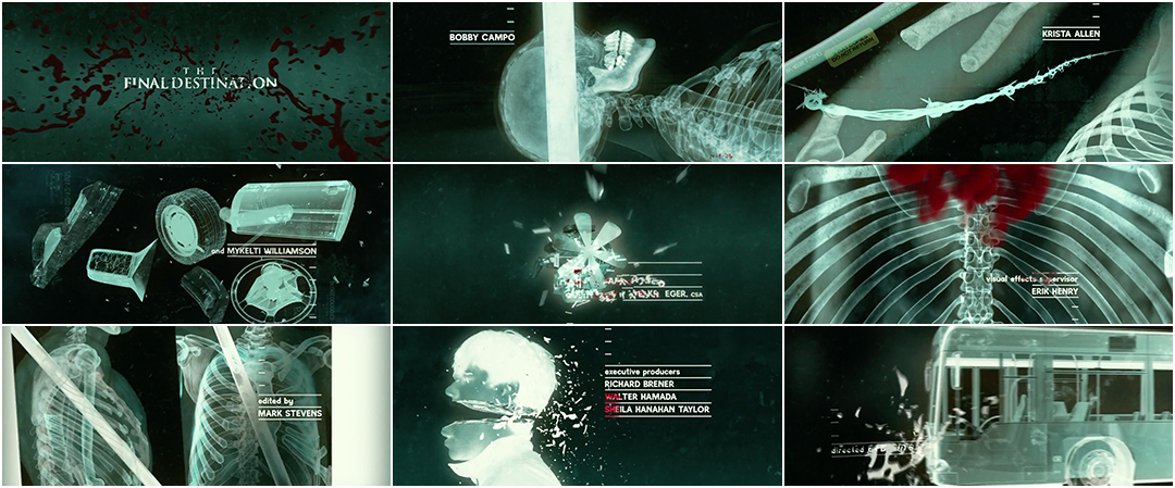
The Final Destination (2009) main titles, designed by PIC Agency
The Final Destination (not to be confused with the first film, Final Destination) is actually the fourth film in the series and the first to be shot in high-definition 3D, as part of the 3D horror revival that marked the late aughts. David R. Ellis directed and Eric Bress returned to write the screenplay.
The film opens at a speedway, where Nick O’Bannon (Bobby Campo) and his pals are enjoying the afternoon. Nick hallucinates that the foundations of the track will collapse as a racecar simultaneously flips over and into the crowd, killing nearly everyone in the stadium. He ushers most of his friends out the door just as everything falls to pieces. Nick continues to get premonitions, providing clues about how his friends and fellow survivors will die. With his girlfriend Lori (Shantel VanStanten) and George (Mykelti Williamson), a former security guard at the track, Nick races to warn his friends before time runs out.
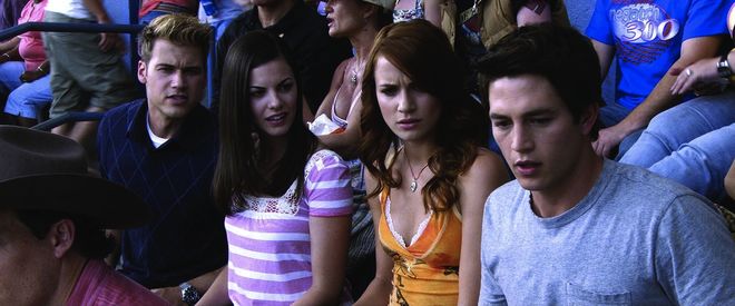
Hunt (Nick Zano), Janet (Haley Webb), and Lori (Shantel VanSanten) sit with Nick (Bobby Campo), who has just had a startling revelation at the speedway in The Final Destination (2009)
The title sequence
PIC Agency was hired to design both the title sequence and Nick’s visions of death throughout the film, in order to add more 3D elements overall – at the time, they conceived that the titles and visions would have a visual unity of sorts, though eventually the x-ray concept overshadowed that idea. “It was always intended to be 3D, as that period was 3D-stereo heavy,” says PIC co-founder Pamela Green.
PIC faced two challenges when putting the sequence together. First, they’d been instructed by director David Ellis that the sequence should pay fan service, making nods to deaths from previous films. For legal reasons, however, they were not permitted to use the actors from the previous films. And second, the sequence had to be 3D. The answer to all of this? Create x-ray footage of various death sequences and re-shoot the death scenes with PIC’s own actors, working with the filmmakers as well as cinematographer Gonzalo Amat. Finally, they animated it all stereoscopically in 3D.
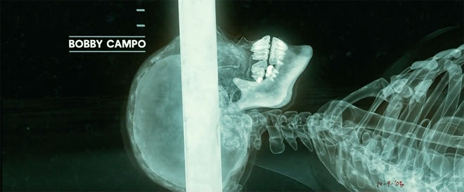
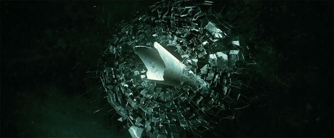
“We didn’t consult anyone on the sequences – I remember bringing in our own x-rays at one point,” Green says. “We did do a lot of research and put a lot of thought into how it would all come together. We had to plan and build up a team and divide the work so people could focus on specific areas.” Ben Bullock was the designer/animator on the sequence – it was his first project with PIC and he was still new to the industry. “I may have told people I knew some Cinema 4D, and I’d actually never opened the program,” he recalls with a laugh. “On my first day, they were like, ‘Can you do this?’ And I was like, ‘Yes, I’ll figure it out.’ Definitely a bit of a learning curve.”
First, Bullock assisted with the creation of frames – a sort of “stop-motion flip book” showing the name title cards and breaking down the action on each frame. “It’s a bunch of different still images laid out, showing the progression of the title sequence over the length it needs to be on screen,” he explains.
The next phase was creating the “x-ray” images. PIC created a shader in their 3D software along with additional processing and shading, creating a believable x-ray look. Bullock says the team even used an actual x-ray plate in one scene where a skull is being crushed, recreating the skull and removing the personal information from the plate.
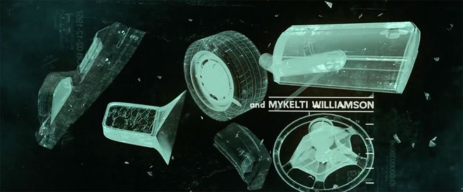
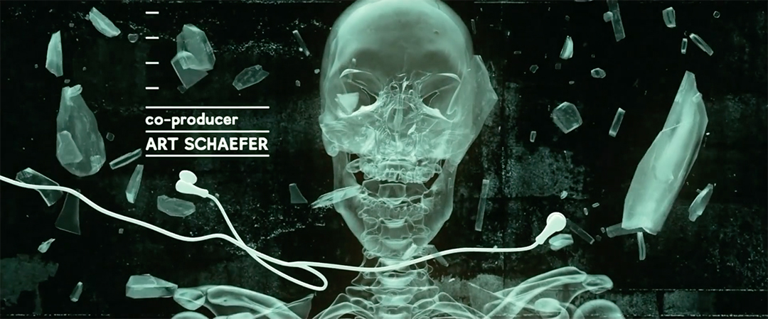
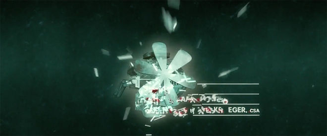
This also meant the team had to focus on deaths that could have maximum impact in 3D: shots of a knife coming straight into the camera or the pole from the pole-vaulting death shooting towards the audience. In another scene, a drill points toward the camera (a possible reference to Alex Browning, who was killed by a drill in an alternate ending for the first Final Destination film). It’s rendered with such detail that brain matter can be seen on the tip – added via CGI.
“Those (deaths) were all chosen to really push the stereoscopic 3D look,” Bullock says. “Then we went back and added dust and dirt layers to give an atmospheric feel to it and then on top of that you’ve got a bunch of splatters and brain matter coming towards you as well. We were just pushing a lot of 3D in the viewer’s face.”
“When you are doing 3D, it is like live action in some respects – you really have to plan,” Green says. “Where is the camera? How does it rotate? What is the transition? It starts with storyboarding, then creating the style frames, showcasing the textures...the movements that are all thought out ahead of time. So planning ahead and understanding how to go from A to B from the get go is very important.”
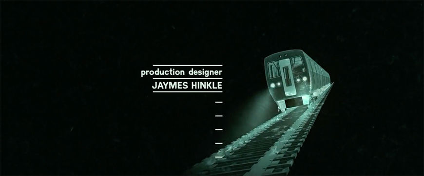
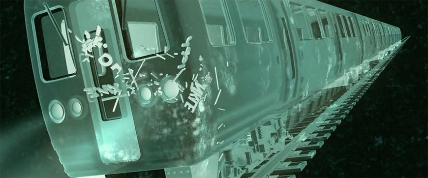
The final product is an absolute showstopper; each re-created death scene followed by the bone-crunching anatomical fallout. The nail gun scene from FD 3 is followed by a shot of nails flying loose in poor Erin’s brain. A spinal column morphs into the rollercoaster tracks from FD 3, as we see skeletal bodies fall from the sky. And so on. Bullock got a chance to witness the sequence’s impact on audiences firsthand when he saw the fourth movie in theatres.
“In the stereoscopic realm, you can only see things so far on a computer screen,” he says. “We thought we were pushing things to an eight! And when you get to a movie theatre all of a sudden it’s a ten, with knives and skulls coming straight at your face. People were groaning and cheering… it made me really proud. I think it was very successful.”
Deaths of note
The ironic deaths continue in this installment. One of the survivors from the racetrack disaster – a Klan-adjacent racist – tries to set a cross ablaze on George’s lawn only to get dragged down the street by the hooked ball and chain attached to his own tow truck. Later, a cartoonishly stupid jock gets stuck to a malfunctioning pump at the bottom of a public pool and his guts are sucked out through his butt (almost certainly a reference to Chuck Palahniuk’s hideous 2004 short story “Guts”).
Final Destination 5 (2011)
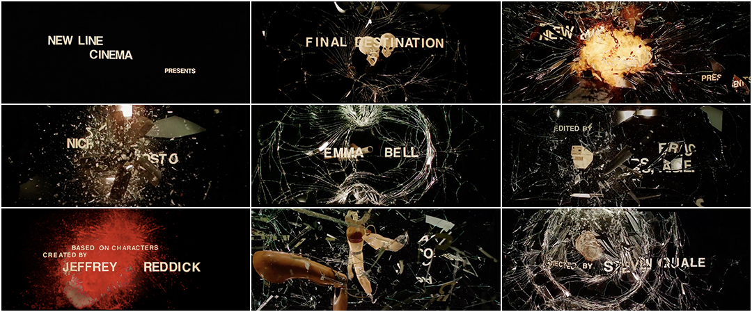
Final Destination 5 (2011) main titles, created by Prologue Films
Sam Lawton (Nicholas D’Agosto) is on a bus going to a staff retreat, headed toward a suspension bridge. He envisions the bridge collapsing in spectacular fashion, the crash mutilating himself and his co-workers, and manages to convince several people to get off the bus before the collapse actually happens. Of course, everyone begins to die in the order they were meant to in the accident.
The title sequence
Much like the title sequence for The Final Destination, director Steven Quale wanted the title sequence for FD 5 to provide visual callbacks to previous deaths in the franchise. The creative team at Prologue Films (under the creative direction of Kyle Cooper) knew they would have to come up with clever solutions in order to harken back to the previous films – and do it all in 3D. Designer Eunha Choi worked on the sequence. “Steven really wanted part five to connect to older parts of the series,” she says. “At the same time, he was open to fresh and unique ideas. We presented the first round of our ideas to him and he added comments that would help us link back to the previous films.”

Final Destination 5 (2011) main title card
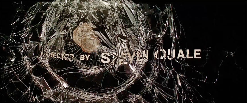
"Directed by Steve Quale" credit in the Final Destination 5 title sequence
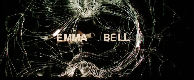
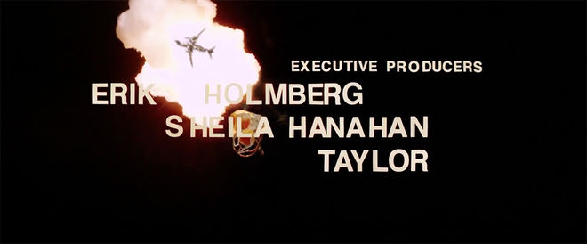
The team decided they wanted to take various menacing objects from the previous films – logs, the hooked ball and chain from FD 4, microwaves, a knife block, a tea kettle, metal piping, fan blades, and of course, tons of skulls – and depict them flying toward the audience, smashing through each title card. Shockingly, the entire sequence was shot practically.
Part of Choi’s job was to gather the scenes of objects falling through glass to prepare frames. She familiarized herself with the previous films and got to work. The Prologue crew then created panes of glass with the title cards in clear Helvetica typeface, printed out and laid on the glass. They filmed the objects breaking through the glass and shattering each title card upon impact, replete with blood and flames composited together.
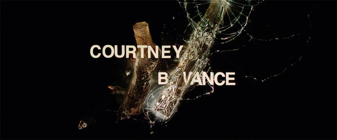
David Nietzsche was one of several editors at Prologue tasked with providing editorial options for the sequence using the footage provided, with his cut ultimately chosen for the final version. He recalls being given several takes of footage for most of the objects: “I think each object was shot falling three to five times,” he says. He then played with each “scene,” speeding up or slowing down the object’s descent, to make each scene as tense and dynamic as possible while also displaying each title card for the appropriate length of time.
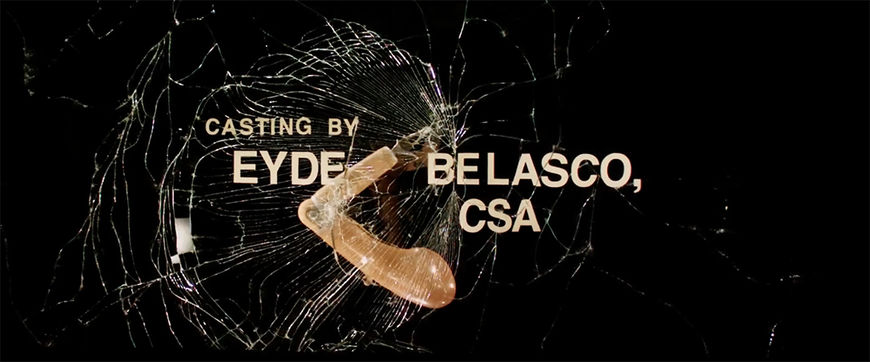
“The thinking was: What visual impact does this object have as it flies toward the screen?” he says. “I don’t know how quickly light bulbs fall in comparison to logs. I do know that a giant log smashing through glass in slow motion looks really cool.”
Nietzsche also toyed with ways to make certain items pop; for example, in the light bulb sequence, he made them flash on and off before hitting the glass. Hilariously, there’s also a microwave explosion with a box of Chinese food splattering toward the glass – “that one was comped,” Nietzsche says – and a coffee cup filled with blood that explodes upon impact.
“That coffee cup was not my favourite!” Nietzsche laughs. “It’s a little bit past the halfway point, and you’ve had these epic logs and ladders smashing the glass, and then… a coffee cup.”
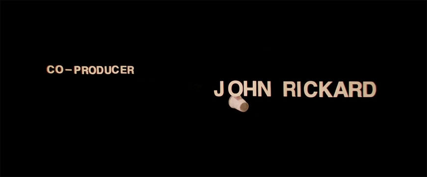
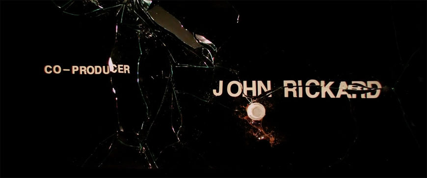
The theme music for the FD 5 sequence is so powerful that even the coffee cup explodes with an urgent thrill. Working collaboratively with composer Brian Tyler in a back-and-forth process, the creative team shared bits of the sequence with him and matched the music with the footage. The result is a heavy-metal explosion of dynamic drums and squalling guitar, building up to a staccato burst of strings as the objects explode faster and faster in bursts of blood and flames. It is, in short, one of the most heavy metal title sequences ever created.
Both Choi and Nietzsche remember the sequence as a high point in their respective careers. “You don’t always get to work on projects that are this exciting,” says Choi. “There was a real risk here and it paid off. Sometimes you work on horror projects, seeing all these dark images, blood in every frame, and for a long time it makes you unhappy,” she says. “It can really affect your mood. But when you get the chance to figure out the design in a way that’s smart, it gives people a lot of energy and we are happy to come to work every day. So it does balance out.”
A history of violence
Despite their success at the box office, the Final Destination films are not often discussed as part of the horror franchise canon. Maybe it’s the lack of a marketable villain (there are no mangled or decapitated Final Destination collectible figures to put on the mantelpiece) or maybe it’s the films’ formulaic templates, or the lack of recognizable genre stars (with the exception of Todd). But they’ve left their mark on modern horror cinema, opening the gates to the torture porn subgenre; it’s impossible to imagine the existence of the SAW franchise without Final Destination.
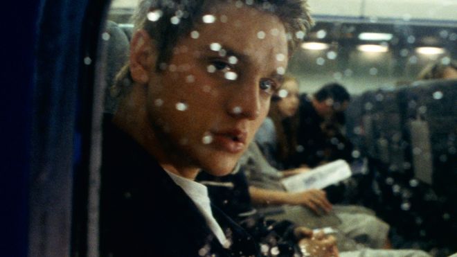
Still from Final Destination (2000) featuring Alex Browning (Devon Sawa) on doomed Flight 180
As goofy and elaborate as many of the FD death sequences became, there is also an element of sickening realism that feeds fascination and enthusiasm for the franchise. A lot of people are scared of dying in plane crashes; a lot of people have been in horrifying car accidents. By infusing the most mundane of places – a carwash, a pool, a gym – with fatalistic menace and destiny, the series digs into our culture’s perpetual anxiety over death, particularly when it’s seemingly preventable. “Those movies always felt too real to me – like these things could happen to you,” says Nietzsche. “I still don’t drive behind trucks carrying logs or steel beams because of the Final Destination movies!”
The title sequences for the Final Destination movies also stand on their own, many years later, as brilliant and evocative teasers combining practical effects, symbolism, and CGI to set the tone and whet audience appetites for blood. Like William Castle’s theatre gimmicks, the FD title sequences, particularly those in 3D, helped get adrenaline pumping and became a treat that fans could anticipate and dissect. For a goofy horror movie series, these title sequences demonstrate peak craft and creativity; they’re a high point for the art form.
“It’s so easy to dismiss these movies as cheap thrills,” says William Lebeda. “But there is a lot of care and craft that goes into them. Working with James and Glen – those guys knew what kind of movies they were making and really cared. They cared a lot! There is a lot of love that goes into these things and there’s a lot of affection for these movies. As title designers, we really like that and we want to be a part of it.”


