If there’s a pithy phrase that can be applied to title designer Nina Saxon’s career perhaps it’s Always be hustling.
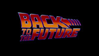
As Part One of our career retrospective discusses, Saxon started out as a visual effects artist on Star Wars (1977) and then spent the ’80s in a state of near-constant hustle, launching what was to become a 40-year career as a designer of memorable film and TV title sequences. With iconic work for box office hits Romancing the Stone (1984) and Back to the Future (1985), she helped to usher in the era of the branded blockbuster film.

Have you read Part One? Read Nina Saxon: A Career Retrospective, Part 1
She is one of very few designers to have had a multi-decade career in film and TV titles, and part of this is due to her training in psychology, her ability to read a room and navigate its dynamics. The other part, of course, is due to her creative vision and her determination.
Along with the vibrant logotypes Saxon made in the ’80s for slam-dunk hits, she also established connections with the directors, editors, and producers who would become her friends, collaborators and recurring clients. She learned Painting with Light from Robert Abel, found a mentor in editor Donn Cambern, developed relationships with Disney and directors Robert Zemeckis and Michael Douglas, and formed Saxon/Ross Film Design with designer Deborah Ross. Saxon summed up the era as a blur of “lots of different people, lots of different things and hustling a lot of people.”

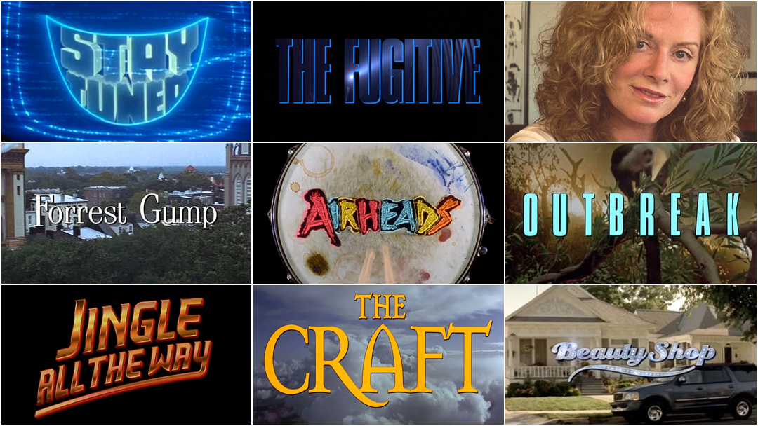
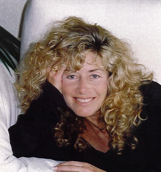
Nina Saxon, c. 1992
This ambition carried her into the ’90s, her true heyday, during which she created a grinning television for Stay Tuned (1992) and glowing blue typography for Glengarry Glen Ross (1992), collaged chaos for Airheads (1994) and a painted primer for Jade (1995). She harnessed light for the logo of Jingle All The Way (1996) and built a hamburger for Good Burger (1997). Her work transformed with the times, moving across media and through technological advances. She collaborated with title designers Bohnie Avanzino and Marcel Valcarce, cinematographer Emmanuel “Chivo” Lubezki, and filmmakers William Friedkin, Peter Hyams, and Wolfgang Petersen. Except for her partnership with Ross and a stint with New Wave Entertainment, Saxon primarily worked under her own moniker, Nina Saxon Film Design.
She and Ross began this tumultuous but fruitful period with a fitting metaphor: a gleaming pilot’s insignia.

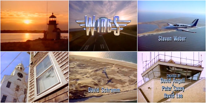
Wings (1990) season 1 title card with logotype designed by Saxon/Ross Film Design
Wings (1990-1997)
After working on films including Tin Men (1987), Worth Winning (1989), The Little Mermaid (1989), and Back to the Future II (1989), Saxon and Ross were picking up momentum. In 1990 they made the move into television with the shimmering logo for NBC’s airport sitcom Wings. For the workplace comedy nestled in a small-town airport, Saxon and Ross developed the faceted chrome logotype at the series’ head.
The gleaming typography sits atop a metal circle and wings, alluding to the insignias worn by pilots. Reflected in the metal is a soft rusty-beige expanse – the landscape of Nantucket Island. Paired with Franz Schubert’s “Piano Sonata No. 20” the title sequence sets up the cozy environs of the show, just a short flight from the coast of Cape Cod, Massachusetts.
Wings (1990) season 1 title sequence, designed by Saxon/Ross Film Design
Saxon/Ross’s work in 1990 also involved the creation of title sequences for sequels. “I always was doing sequels!” Saxon bemoans, laughing. That year, they pumped out title sequences for Back to the Future III and Teenage Mutant Ninja Turtles II: The Secret of the Ooze. Sequels would become a necessary component of Saxon’s work going forward. “Like, Teenage Mutant Ninja Turtles II: The Secret of the Ooze. Of course we made the type ooze, animated it. I was always working on sequels that did no business.” She often asked herself why she didn’t get, for example, the first Home Alone but was called in for Home Alone 2 and 3. She found these projects creatively frustrating but also knew that not every job would be fulfilling. “A gig’s a gig,” she shrugs.
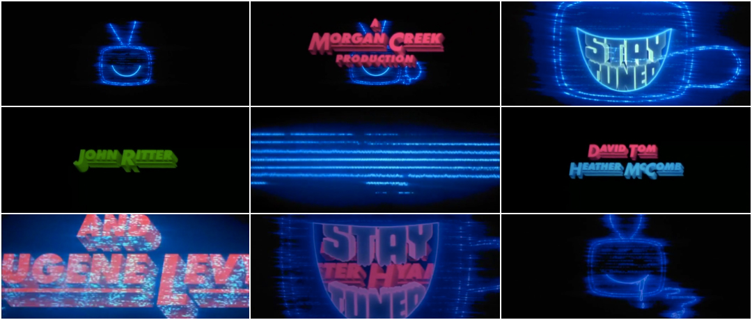
More interesting projects came along soon thereafter, including the opening to Stay Tuned, which involved animating a ravenous television set.
Stay Tuned (1992)
To achieve the memorable opening of Stay Tuned, a dark comedy directed by Peter Hyams, Saxon/Ross worked with an optical and effects company on the animation. “It was kind of a kooky movie. Everybody got sucked into a television... That was quite an undertaking!” says Saxon.
Stay Tuned (1992) main titles designed by Saxon/Ross Film Design
She describes Hyams as “tough,” recalling that he insisted on several reshoots for the animation. “Some things look great when they’re done but when you hear the history and how the director actually wanted to do it again and again…” she shrugs. “We went through a lot of budget issues and his issues. Directors oftentimes don’t want to know about budgets. They just don’t. I learned over the years to always talk to post supervisors about budgets, find out what my limits were.”

Stay Tuned (1992) title card featuring the glowing, grinning animated TV set
Saxon applied her training in psychology to navigate the situation, keenly aware of the industry’s imbalances and the possibility of scope creep. She recalls that she and Ross were the only women in the room, which was a common occurrence. “We only worked with one or two female directors. They just didn’t exist then. So, it was definitely two women in a male world. You had to kind of put a stick down your back and be pretty tough,” she says. They pulled it off, creating a mischievous, credits-gobbling TV set with a cord slapping around like a wagging tail. The large opening credits zoom toward the viewer in brilliant colours and dissolve into static.


Stills from the Stay Tuned (1992) title sequence featuring Eugene Levy's credit
Set to epic music, the motion and scale of the typography bears echoes of the openings of Superman (1978) and Masters of the Universe (1987), the letters transcending space to tee up excitement and fantasy.
She learned a valuable lesson on this project which doubles as advice she would offer to designers working today: “Never talk about money to directors. They don’t want to hear it.” Saxon went on to work with Hyams several more times – albeit in a more lowkey capacity – creating the titles to Timecop (1994) and The Relic (1997).
Glengarry Glen Ross (1992)
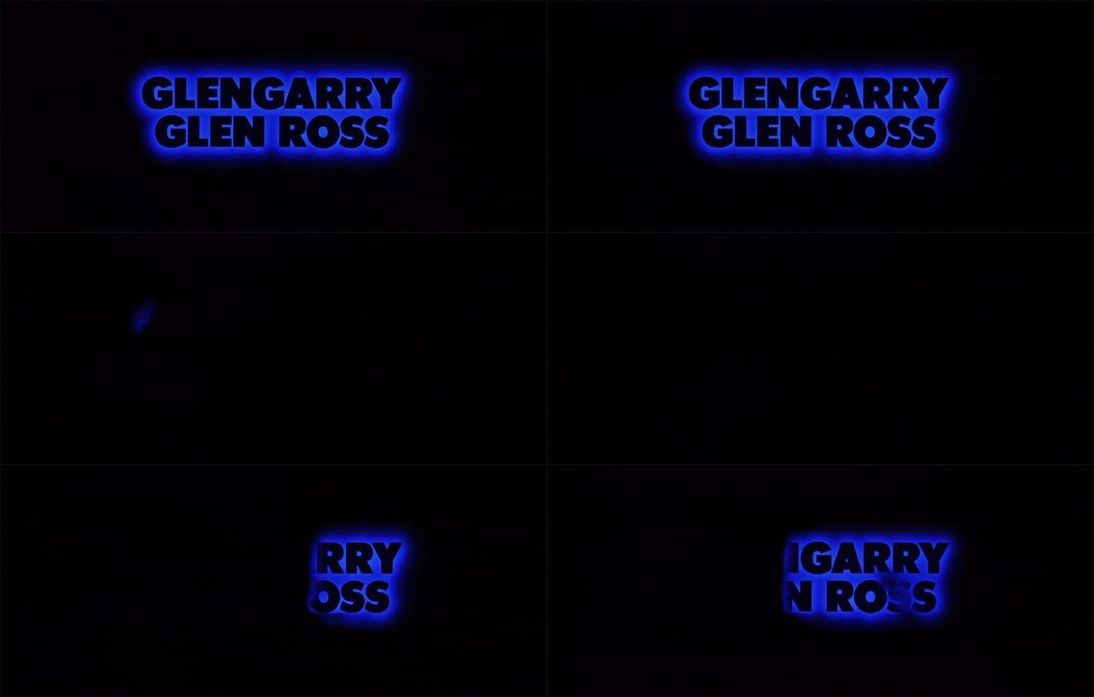
The year 1992 also saw them attached to the oft-quoted real estate sales drama Glengarry Glen Ross. The film begins with smooth jazz by composer James Newton Howard and the sounds of a train. On screen is black text with an electric blue glow, the train’s motion disappearing the letters. Saxon and title designer Laurence Starkman created this optical effect to echo the movement in the film’s first scene, pulling a matte off the existing footage.
Glengarry Glen Ross (1992) main titles designed by Saxon/Ross Film Design
“There was a train and I said, ‘What if we take the type and put a blue glow around it and run a matte?’ Pull it off of the train. You take the train that’s going by and you optically pull a matte off of it and you run it through the type with the colour. And it would – brrr! brrr! brrr! – and bring on each credit and then marry into the first shot. This was a lot of what I did, integrate the feeling of the film into the typography and into the first shot of the film.”
The result is an elegant, atmospheric overture to the film and a straightforward way to set up its pressure-cooker environment. (Twenty years later, a similar technique would appear in the opening to Bong Joon-Ho's sci-fi train film Snowpiercer.)
Aesthetic and thematic integration was important to Saxon. “If you weren’t going to reflect the movie itself, then you would try to have a main title that set up or carried out whatever that first scene of the movie was going to be, so it would integrate, you know?”
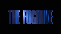
Her opening to The Fugitive, the 1993 Harrison Ford manhunt picture directed by Andy Davis, reflects the movie itself. Where the treatment of the typography in Glengarry Glen Ross set up a general mood and the motion of the first scene, The Fugitive's typography gestures at the pursuit at its core.
Saxon and Ross had met the film's lead editor Dennis Virkler back in 1990 while working on The Hunt for Red October.
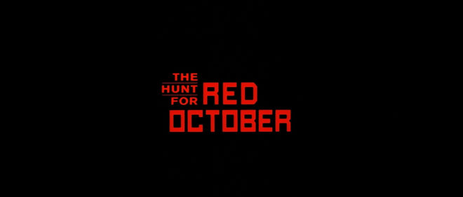
The Hunt for Red October (1990) main title card designed by Saxon/Ross Film Design
In that film’s opening, the title first appears in Russian as "КРАСНЫЙ OKTIABR" (which should be "КРАСНЫЙ ОКТЯБРЬ") in a boxy sans serif. A ripple runs through it from right to left revealing the English words “RED OCTOBER”. The smaller words “THE HUNT FOR” appear a moment later, stacked in the top-left corner. It’s a strong lock-up that efficiently sets the tone for this Cold War submarine thriller. “It’s a simple reveal and it worked. I pretty much supervised that,” says Saxon. Three years later, Virkler called on the duo again for The Fugitive.
The Fugitive (1993)
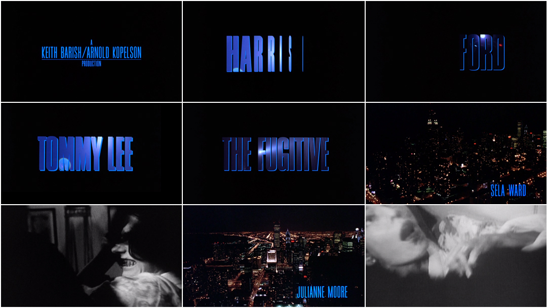
Many directors request a title sequence or simply a title card consisting of text over a black background, an opportunity Saxon relishes. "More can be done with the type without distracting from anything," she says. The opening for The Fugitive is what’s called a partial sequence. It includes a series of typographic cards with a black background before transitioning into night-time city shots and black-and-white scenes of a struggle with credits superimposed. The segment of text over black is simple but bold, featuring sudden, industrial clangs that bring on tall three-dimensional letters in blue. They are revealed by rotating in place, the shapes filled with the restless beam of a flashlight.
The Fugitive (1993) main titles excerpt with title design by Nina Saxon Film Design
“That was really fun, coming up with the concept of the light through the type,” says Saxon. “I knew The Fugitive was going to be huge. That summertime release was really crucial to a lot of people, so we had very little time on The Fugitive titles, like six weeks.” In those six weeks, she says, director Andy Davis also asked her to re-cut the opening clips of the murder. “Andy would say, ‘Just get all the footage and go into a video house and you give it a whirl.’” When she told Virkler that the director had asked her to re-cut the opening, Virkler told her to say it was all being done and to just ignore him. “There were six editors on the film,” she recalls, laughing. Virkler and the editors married the typography with the other footage, cutting the montage of the struggle and the aerial city shots. The rest of the credits appear as text over these scenes, smaller condensed typography in hot blue tucked in the bottom-right corner.
Back to One
It was around this time that the Saxon/Ross partnership began to fold. “We got a little too big for our britches,” says Saxon. The duo struggled to see eye-to-eye when it came to financial and creative decisions. “It got to the point where we were starting to bleed. You have to get in someone’s ear and really hustle in order to keep it going.” They were also competing against well-known names like Wayne Fitzgerald and Pablo Ferro and the rise of the title design studio, with companies like R/Greenberg, M&Co, and Balsmeyer & Everett snapping up many high-profile jobs. “You were competing against other people that would get in the door first. That was really the issue,” she says. They shut down the office. The next few years were tough as Saxon relaunched herself as a sole proprietor and set about making new in-roads and connections.
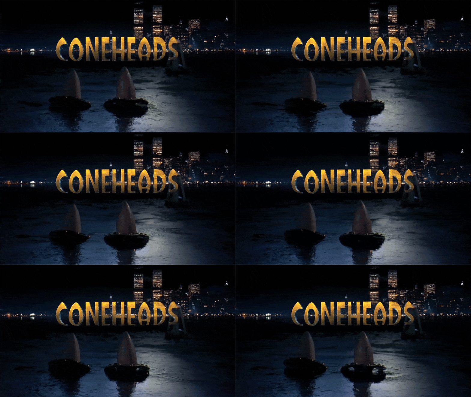
Coneheads (1993)
When I bring up Coneheads, one of her first projects after returning to her previous moniker, Nina Saxon Film Design, she laughs and then recoils. “I can’t!” she exclaims, waving her arms as if brushing the film out of the air. “That was a nightmare. That was a nightmare director. There’s nothing to say except we made the type coned. It was awful.”
Coneheads (1993) main titles designed by Nina Saxon Film Design
The typography in question is a mustard sans-serif that looks almost like a version of the typeface Hobo but elongated at the top, each letter bearing a conical head of its own. Saxon insists she has no memory of it but then continues. “I mean, I did a lot with a company called Scarlet Letters who were typesetters. It would be like, bam! It’s coned.” She laughs. “That was a terrible movie but I worked on a lot of terrible movies.”
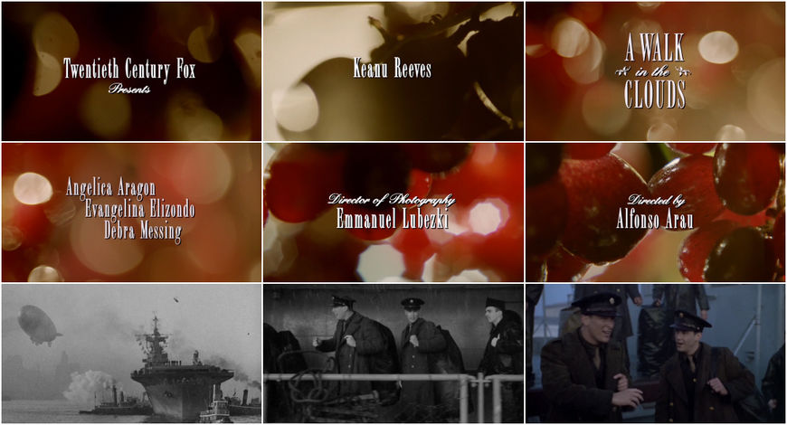
A Walk in the Clouds (1995)
She brings up A Walk in the Clouds, the 1995 Keanu Reeves romance. “I mean, A Walk in the Clouds didn’t do any business but I met Chivo [cinematographer Emmanuel Lubezki] and the director was wonderful. I worked for Alfonso Arau on that. It was a dud. I worked on a lot of duds. Everybody does if they work a lot.”
A Walk in the Clouds (1995) main titles, designed by Nina Saxon Film Design with cinematography by Emmanuel Lubezki
Saxon has fond memories of the shoot and effusive praise for Lubezki, now a multiple Oscar Award winner. “The movie was about a courtship with Keanu Reeves on a vineyard and we wanted the titles to look dreamy and out of focus. We took grapes and put them on a rack and lit them so they look like out-of-focus starbursts and Chivo shot it for me. It was like five grapes with a candle this close – [holds fingers an inch apart] – in this tiny room that we rented for the day. That was wonderful,” she says.

Nina Saxon and Cinematographer Emmanuel "Chivo" Lubezki while shooting the opening sequence to A Walk in the Clouds (1995)
Saxon’s relaunch in the mid-1990s saw her drift into more lively stop-motion animation work and more robust, complex sequences. There’s the collaged chaos of Airheads, the spinning food of Good Burger (1997), the zippy text of 200 Cigarettes (1999) and the bouncing cosmetics of Whatever It Takes (2000). “All those stop motion sequences I loved because it was more like filmmaking than just plain design and typography. Not that typography can’t be wonderful.”
Airheads (1994)
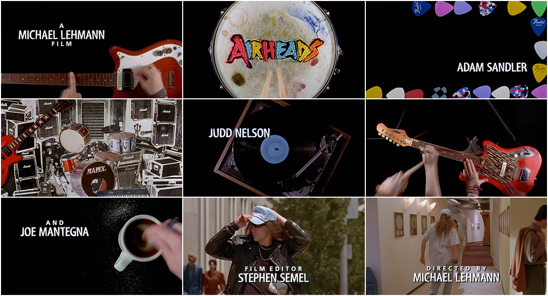
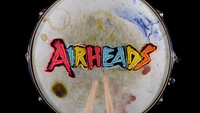
For Airheads, Saxon worked with title designer, animator and music video director Andrew Doucette (Tank Girl) to create a pumped up rock n’ roll collage that builds in intensity.
Airheads (1994) main titles designed and animated by Nina Saxon Film Design and Andrew Doucette
The title sequence needed to set up the world of the Lone Rangers, an early ’90s hard rock band featuring losers Chazz (Brendan Fraser), Rex (Steve Buscemi) and Pip (Adam Sandler), musicians desperate for their big break. Piles of compact discs, concert tickets, instruments, and torn denim abound. Guitar picks frame Sandler’s credit, a pizza spins on a turntable, an electric guitar is dismantled and sawed apart, and a cut-out Buscemi kicks as Motörhead’s “Born to Raise Hell” amps up the energy.


Stills from the Airheads (1994) main title sequence
“For Airheads, everything was piled on one thing at a time,” says Saxon. “That was stop-motion on pieces of paper moving around in real time. You’d do eight frames, move something, eight frames, move it again. Everything was cut-outs. And then you do several versions of it, and whatever fit, fit.”
The secret to achieving the multi-layered compositions was shooting in reverse. “With Airheads, I think – which I did for Good Burger, that was the making of a hamburger – we shot it in reverse. We had the whole title assembled and then we broke it apart and shot it in the other direction, going backwards, so that we’d know it’d assemble.” The sequence was shot on an animation camera operated by Doucette, who had the access and skills required to pull it off. “We didn’t have a camera,” says Saxon. “Unless we were working with [optical house] West Indigo, we had to find someone who had those capabilities.”
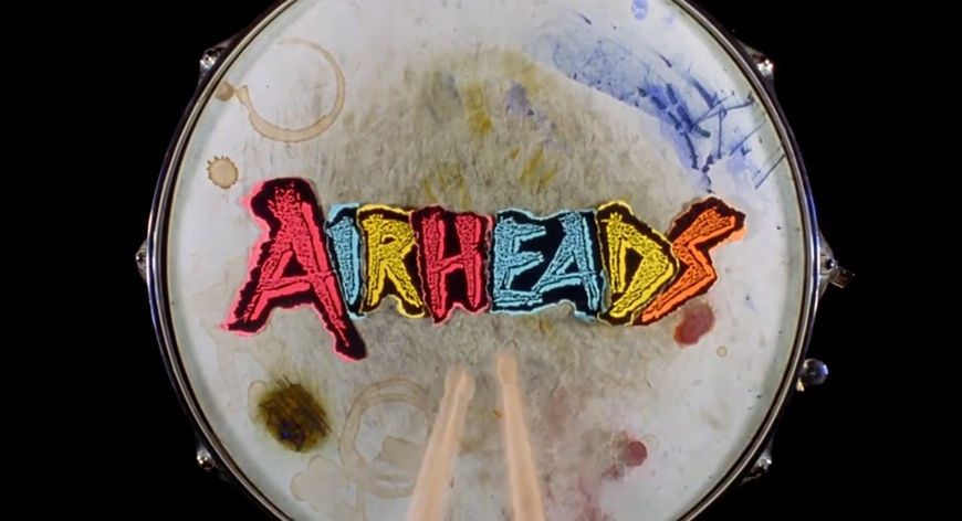
Airheads (1994) title card
The film’s title appears on a coffee- and paint-stained drumhead, the letters printed and ripped from coloured paper. A pair of drumsticks jumbles the letters and then the lot becomes a blur of colour, spinning wild. It’s an energizing opening sequence and a fantastic example of stop-motion being used to establish the texture and spirit of a film. “It was tricky but it worked. That was a really fun sequence,” she says and it remains true to this day.
The director of the film, Michael Lehmann, was also Saxon’s neighbour, making it easy for the pair to work together again in 2002 for the opening of Lehmann’s romcom 40 Days and 40 Nights.
Forrest Gump (1994)
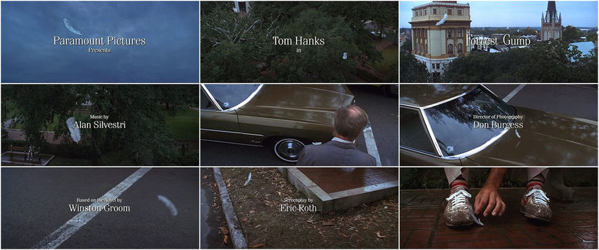
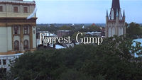
In 1994, Saxon worked on the opening titles to Best Picture Oscar winner Forrest Gump, her fifth collaboration with producer Steve Starkey (whom she had met while working on Star Wars) and Back to the Future director Robert Zemeckis. The film about the life of a kind but slow-witted man from Alabama who becomes entangled in several key events in American history became well known for its “invisible” effects and state-of-the-art digital achievements, also earning Industrial Light & Magic an Oscar for Visual Effects. Forrest Gump begins with one of these invisible effects: a shot of a white feather slowly falling from the sky and landing on Gump’s shoe.
Forrest Gump (1994) main titles designed by Nina Saxon Film Design
The feather floating through the sky isn’t real – at least, not in the way one might assume. It was digitally composited into the scene, making it one of the longest and most impressive digital effects shots created to date. The background was shot in Savannah, the camera on a crane flowing through an elaborately choreographed move that glides down among pedestrians and street traffic. The feather was filmed separately against a blue screen and attached to a monofilament line that was held from below, a fan placed underneath to make it dance in the wind. The shots were then digitally composited together. “It was clear that was going to be huge,” says Saxon. “That was really exciting and fun.”
VIDEO: VFX breakdown of the opening feather sequence from the documentary Through the Eyes of Forrest Gump: The Making of an Extraordinary Film (1994)
The feather is an apt throughline for the film and for Forrest himself, a character who drifts from place to place and whose life is largely determined by forces bigger than himself. “Our destiny is only defined by how we deal with the chance elements to our life,” says Tom Hanks. “And that’s kind of the embodiment of the feather, as it comes in, that, here is this thing that can land anywhere and it lands at your feet. It has theological implications that are really huge.”
Saxon worked with Industrial Light & Magic to supervise the opening sequence and mark where each credit would go. “I had a studio with a Moviola and I would sit there with a grease pencil to do all that,” she says. “I had to interface with [ILM] because the feather went all the way through. Wherever the type fell, I had to imagine it because it was wireframe – you couldn’t see what it looked like.” By this point, Saxon had built a rapport with Zemeckis and his frequent collaborators. “Once you have a relationship you can brainstorm together,” she says. “We must’ve done the ‘F’ in like 17 versions – cocked, with the stem a little longer than the other letters... I’ve done so many movies for Bob Zemeckis now that I know what typeface he would like. I knew after Forrest Gump.”
Jade (1995)
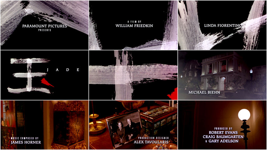
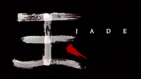
The following year, Saxon worked with Exorcist director William Friedkin, an admitted perfectionist known for working through his films frame by frame and for firing entire swaths of crew on a whim. Saxon affectionately calls him “Billy.” For his 1995 film Jade, a box office bust and critically panned erotic thriller, Saxon created an ominous overture with stark splashes of paint.
Jade (1995) main titles designed by Nina Saxon and Laurence Starkman
Like The Fugitive, Jade’s opening featured a partial sequence. “They needed something that introduced the main title. It was very common in those days to do a partial sequence,” she says. “We had paint splashes going across the screen in green, the colour of jade. Billy had the storyboards mounted in his office.” Saxon designed the sequence using the colour green which would then fade into the opening shot. This was approved down the line, she explains, through various stages of production and into scoring.

“Sitting there in scoring – which means they’re deep into the film – he looked at me and he said, ‘I have one question.’ And I said, ‘What?’ And he said, ‘Why is it green?’” Saxon was dumbfounded. Friedkin didn’t like the jade-green paint and said he would prefer white. “I had to call Paul Haggar who was the toughest post supervisor in the city. I said, ‘I need you to come over now, Billy’s having a breakdown. He’s seen the storyboards, he’s seen an animatic, he’s approved it all, and now he’s asking me to bring him books on expressionist art!’” Eventually, the graphics were changed and the splashes were made white.
“It was a good call because it dissolved into a foggy white scene,” Saxon concedes. “Once we did it in white and it was in the can, it was fine and he was fine,” she laughs. “But it’s really true. Billy does fire everyone the first week.”
She went on to create the titles for Friedkin’s Rules of Engagement (2000) and The Hunted (2003) but Saxon dismisses those with a wave of her arm, saying, “Those were just typography.”
Outbreak (1995)
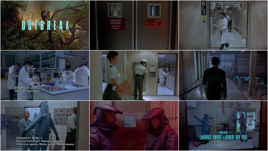
That year Saxon also lent her expertise to Outbreak, the 1995 medical disaster film directed by Wolfgang Peterson, whom she warmly describes as “a doll” and “full of life and joy.” The opening sequence is an astounding feat of filmmaking, one long shot that wanders behind personnel into areas of increasing levels of security, the Steadicam POV embodying the as-yet-unknown threat.
Outbreak (1995) main title sequence featuring cinematography by Michael Ballhaus, music by James Newton Howard, and title design by Nina Saxon
Because the shot is so complex, with actors weaving in and out of frame and lower-thirds indicating the biosafety level, Saxon’s design for the titles had to be unobtrusive while aesthetically and thematically appropriate. “That was a typography-solving problem,” says Saxon. “It was a real quick schedule. It was pouring rain for like six weeks and they were in a trailer at Warner Bros. here. I would get there just drenched. It was hard going through the mud into the trailers with type all wrapped up in plastic.”
Escape from LA (1996)
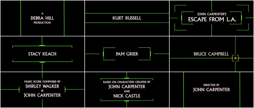
For the Kurt Russell–Goldie Hawn terrorism jaunt Escape from L.A. (1996), Saxon designed a graphically minimal opening featuring laser-like lines and crosshair graphics in green and red.
Escape from L.A. (1996) main titles designed by Nina Saxon, Ken Rudolph, Laurence Starkman
It makes liberal use of Albertus, the typeface that has come to represent John Carpenter and his oeuvre, having been previously used to introduce seven of his films, from 1981’s Escape from New York to 1988’s They Live. The director’s next four films did not feature the typeface but it reappeared in 1996 with Escape from L.A. This was also the first time a Carpenter film featured a graphic opening sequence incorporating line and colour. Though Albertus has come to be known as Carpenter’s go-to typeface, it wasn’t necessarily top of mind. Speaking with website The EFNYLA Page, Saxon said, “We showed many [typefaces] and they chose it anyway."
The Craft (1996)
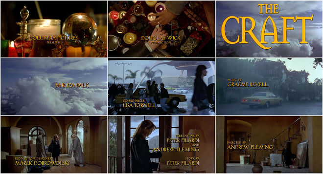
That year she also conjured the titles for witchy teen classic The Craft and the Arnold Schwarzenegger Christmas-crisis film Jingle All The Way. For The Craft, Saxon executed elegant golden typography with a rigid drop shadow. The main title, in a medieval-looking lock-up, swoops into sight after eyes, religious and occult imagery, and an explosion flash on screen in a quickcut montage by editor Jeff Freeman.
The Craft (1996) main titles designed by Nina Saxon Film Design
Jingle All The Way (1996)
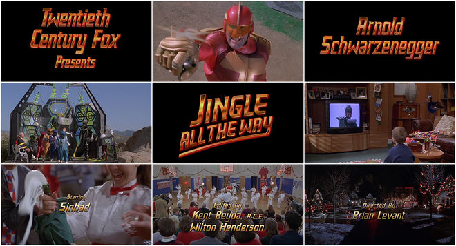
In Jingle All The Way, a film in which bumbling fathers Howard Langston (Schwarzenegger) and Myron Larabee (Sinbad) battle to buy their sons a coveted Turbo-Man action figure, the main titles appear in giant, gleaming text on black cards.
Jingle All The Way (1996) main titles
The brassy three-dimensional letters shoot in from the left and right, glowing red from beneath; a shining image of action, luxury and commodity. The design harkens back to the sequence with which Saxon first made her mark: the polished, vibrant type of Back to the Future.
Good Burger (1997)
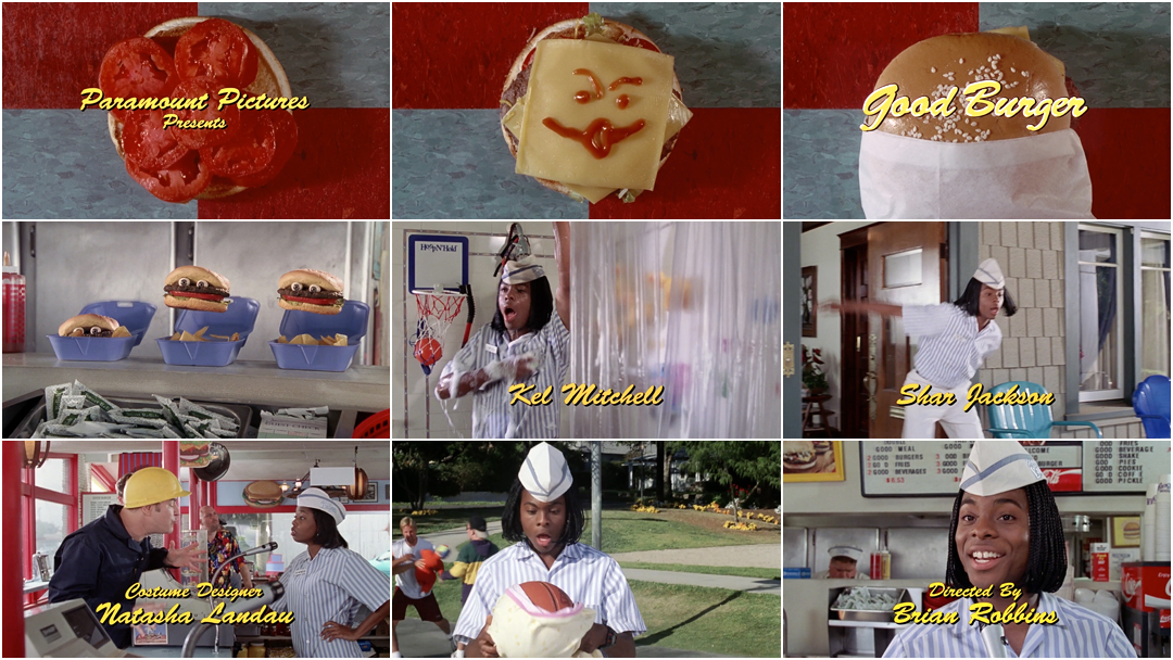
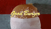
I ask her to tell me about 1997's Good Burger, which seems like it was a lot of fun. “It was a lot of fun!” she says. “I mean, it was a silly movie but the idea of making a hamburger was fun. We built the hamburger and then we took the hamburger apart in reverse. We’d just take a few frames, and then add a pickle, shoot a few frames, add a pickle, and on.”
Good Burger (1997) main titles designed by Nina Saxon Film Design
“We did it a few times but it was not shot real-time, it was shot a few frames at a time so it moved really fast. We shot it backwards. First we shot a hamburger done and we pulled it apart so when you play it forward it’s building. There were a lot of problems with the ketchup and stuff. You’d have to wipe the ketchup off going backwards. We tried it both ways. I don’t know which one was used, going forward or backward. But I was like, wiping the ketchup off one frame at a time, which was weird,” she laughs.

Still from the Good Burger (1997) main title sequence
The End of an Era
Toward the end of the ’90s Saxon linked up with New Wave Entertainment. In 1998, the marketing company announced that they had named Saxon VP and Creative Director, “leading the company’s efforts in graphics and title design.” Dividing her time between New Wave’s Burbank office and her own in Santa Monica, Saxon helmed logo projects for production companies and title designs for more than two dozen films including Rush Hour (1998), Practical Magic (1998), 200 Cigarettes (1999), Jakob the Liar (1999), Dick (1999), Chocolat (2000), and Antitrust (2001), often working with in-house designer Bohnie Avanzino. "It’s all learning," she says. "When you walk in the room and you sit with people, the job was figuring out who was the crazy person in the room. Being sensitive enough to know, Okay, I’d better run this by the editor first and then the director, otherwise I might get screamed at. There’s always this whole dynamic going on."
Jakob the Liar (1999)
For 1999’s Jakob the Liar, Saxon and Avanzino created a barbed wire motif to underscore the opening credits. “I got to work with [editor] Claire Simpson who cut Reds, so that was really great,” she says. “I did that all at the optical house. I picked the type and I came up with the barbed wire idea.”
Jakob the Liar (1999) main titles designed by Nina Saxon, Bohnie Avanzino (New Wave Entertainment)
Baby Geniuses (1999)
For 1999’s cutesy comedy Baby Geniuses, she produced a time-consuming live-action shoot that never saw the light of day. “It was a terrible movie,” she says. “It was one of the best sequences I ever produced.” Saxon pitched director Bob Clark on a tot-packed title sequence. “I said ‘Why don’t we do an opening sequence to music that’s just regular babies? We’ll put out a casting call, we’ll get social workers, we’ll get props – baby bottles, balloons, diapers – and we’ll just do a whole bunch of shots.' Kind of like [the shoot for] Tin Men."
Unused main title sequence for Baby Geniuses (1999) created by Nina Saxon
Saxon started the day at 7 a.m., and soon twins and triplets started arriving. "The babies would cry and the mothers would scream, ‘Don’t shoot that! I don’t want my baby crying!’ and I would say, ‘Let it go! We want to see real babies doing real things!’”
She cut the sequence with an editor, designed and placed the type and then brought it in. Clark loved it, says Saxon, but the studio nixed it. “They said, ‘The movie is so slow that we can’t put a sequence on the head. We have to just get into it.’ The movie sucked, basically,” she laughs. So she was paid for the work and it was never used. “It ended up on the floor,” she says. “A lot of things do!”
200 Cigarettes (1999)
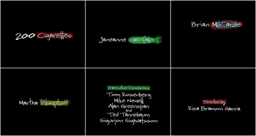
For 200 Cigarettes (1999) and Whatever it Takes (2000), Saxon jumped back into the world of stop-motion. For the former, a New Years Eve ensemble comedy, she had credits zip around a black void, each name placed atop a zebra pattern or a blob of colour, a chainsaw or wiggling box, falling or zooming across the screen. Janeane Garofalo’s credit receives a green chainsaw, emblematic of the bad-tempered, neurotic Ellie, while Courtney Love gets a swipe of red lipstick for her character Lucy.
200 Cigarettes (1999) main titles designed by Nina Saxon / New Wave Entertainment
Whatever It Takes (2000)
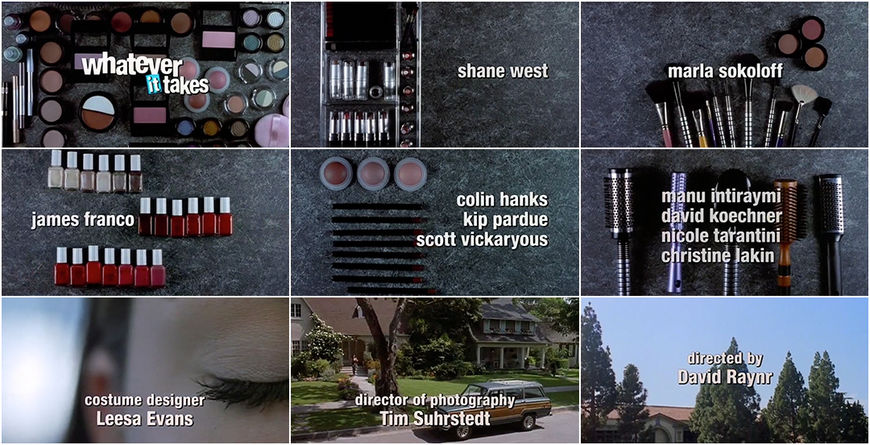
For 2000's Whatever It Takes, cosmetics, nail polish, and hair brushes frolic on a gray surface, one item from each grouping singled out to disappear. The sequence then transitions into live-action close-ups of a young woman preparing for her day and driving to school, the thick, white credits laid plainly overtop.
Whatever It Takes (2000) main titles designed by Nina Saxon
The stop-motion of the sequences injects both films with life and personality, setting up the comedic tone and offering clues relating to character, style and narrative.
Antitrust (2001)
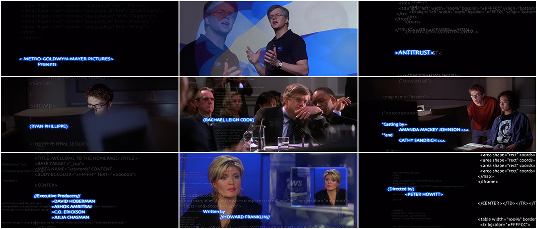
One of Saxon’s more interesting title design projects of this era is for 2001 film Antitrust, for which she was hired by editor Zach Staenberg. “It was all linear, all straightforward, with Tim Robbins narrating it,” she says. “The job was to take the opening of the movie apart and make it random with the voiceover and then animate it. I came up with animating it with code and that was really hard! It was just crazy making it, working on very expensive 3D and compositing equipment.” The film was directed by Peter Hewitt, most well known for his Gwyneth Paltrow alternate-universe romance Sliding Doors, whom Saxon describes as “wonderful but very much hands off.” She worked directly with Staenberg to create the sequence, pulling together a team, handling the compositing, and setting the type.
Antitrust (2001) main titles designed by Nina Saxon / New Wave Entertainment
She didn’t have any knowledge of HTML code but she didn’t let that slow her down. “We just animated it. It probably does not translate,” she laughs. “It was just the concept. It looks good and they were happy!”
A New Millenium
Moving into the 2000s, Saxon tackled the titles for Holes (2003), Be Cool (2005), Beauty Shop (2005), Snakes on a Plane (2006), The Yellow Handkerchief (2008), and Salt (2010). She often had help, calling on other designers, optical specialists, and animators. “There was a designer that worked for us, Robert Vega, and I wound up hiring him on every job I could. He was invaluable to me. Really good support.”
When Saxon slowed down in the mid-2000s it was done reluctantly. “My business atrophied when a lot of my clients, who are older than I am, either got really rich and didn’t care anymore. Or they died,” she says. “That’s how it goes.” Near the end of her career, she was called in to design the titles for Martin Scorsese's 2006 film The Departed and for Robert Zemeckis’s 2012 film Flight.
The Departed (2006)

The Departed (2006) title card
For The Departed, she laid out simple opening typography in stark white on black, an uncomplicated task but one done with relish. “That sequence was just type but I had to do it like two inches bigger and two inches wider and two inches thicker. It was eight minutes in and it wasn’t a big job.” She enjoyed taking calls with Scorsese’s long-time editor Thelma Schoonmaker, whom she was always sure to prioritize. “I knew that was going to get an Academy Award because there was no competition,” she says.
I ask her about the Oscars. In the U.S., the Emmys have an award for Outstanding Main Title Design in television and in the U.K., there's the BAFTA Award for Best Titles and Graphic Identity. Does she think there should be an Oscar Award for film title design? “It’s a tough one,” she says but ultimately decides that it wouldn’t work. “They give an Emmy to it but [in film] so many times it’s a collaboration or it’s something that you’re adding to; it’s not a standalone sequence like it is for a Mission: Impossible or a James Bond movie. The lines get too muddy. I don’t think you could award it to somebody.”
If there were an award for achievement in title design, she believes Saul Bass should have received it. “I think pretty much anything Saul Bass did was good,” she says. “I think Man with the Golden Arm is great because it was four pieces of artwork. That was an accomplishment.”

Flight (2012) title card
Flight (2012)
Before she retired she also set up simple typography for Zemeckis's 2012 film Flight. “When I went into Flight, which was one of the last movies I did, I probably only showed [Zemeckis] three typefaces. He only likes thin type.” She rounded off an impressively varied slate of projects with title cards featuring one colour on a black card, plain as day. This return to basics didn't bother her – sometimes that's all a job required – and she had grown up with a very practical mindset. She always saw her role as a designer in service to the picture. It's a role she happened across while learning about visual effects and one she didn't realize could sustain a career until she was in it.

Title Designer Nina Saxon
“I didn’t think I could make a living as a title designer!" she says. "I meandered into it, you know? And I ended up making a really good living as a title designer, so it just happened that way.”
Many title designers cite a particular sequence or watershed moment that ignited their interest in filmmaking or design. Saxon does not. “That didn’t happen to me,” she shakes her head. She hadn't set out to make a name for herself as a designer or artist. It hadn't even occurred to her that a career in title design was possible. “I started out in visual effects, I started out learning how to paint by light and then being asked to do a title sequence. I know a lot of people will say, ‘Oh, you must have seen The Man with the Golden Arm, Saul Bass!’” She had seen it and she had liked it but it didn’t strike sparks for her. The sparks came later, with each new skill, project, and relationship that inspired her to grow, learn and hustle.
Now retired after 40 years in the business, she’s thankful for the opportunities and the twists and turns that brought her along the way. She looks back with gratitude and attributes her success to luck, hard work, and her ability to adapt. “I’m just real fortunate that by the time I got done with college I had been working and continued to. In 1974 I was already on Star Wars. I graduated college in ’75. You have to be able to learn things so you can do it yourself.”

