The Very Best Title Sequences of 2018, as chosen by Art of the Title
For our fifth annual list of the year’s top 10 title sequences, Art of the Title's panel of experts chose from among film, television, video games, and conferences. The Top 10 of 2018 were chosen based on criteria including originality and innovation, impact, atmosphere, relevance to subject matter, and technique.
Paring the long list down from more than 200 to just 10 was a difficult task, but one done with relish. This year's title sequences were painstakingly created by teams large and small all around the world, with budgets modest and mighty, in state-of-the-art facilities and in home studios. So sit back, relax, and enjoy some of the most interesting and innovative work to hit screens this year.
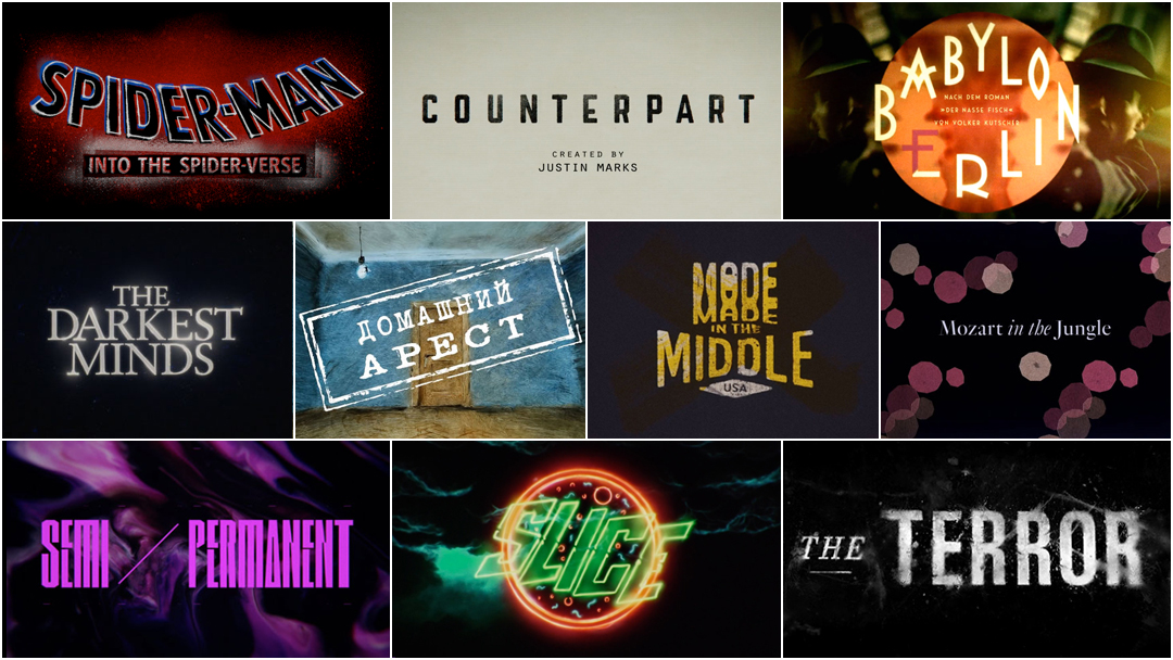
Art of the Title's Top 10 Title Sequences of 2018
10. Mozart in the Jungle (Season 4)
CATEGORY: TV
Created by CHIPS
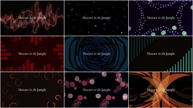
For Mozart in the Jungle’s fourth and final season, title designer Teddy Blanks moves away from the refined, geometric shapes of the series’ second season titles (also produced by CHIPS), and towards a more natural, hand-cut style reminiscent of Saul Bass’s early title design work.
With its inconstant lines and organic but ordered feeling, Mozart’s season four titles are a joyous melding of music and graphic animation. Sound waves seemingly scribbled out in marker or formed from hastily cut construction paper flow, grow, and crash; abstracted hemispheres of the human brain light up and change colour in time to the music. The colours and shapes call to mind openings like Bonjour Tristesse or The Umbrellas of Cherbourg. The theme song, a classical rendition of "Lisztomania" by Phoenix, anchors each of the ten title sequences; however, the arrangements become increasingly experimental as the season progresses. This reflects the musical progression of the show’s conductor characters as well as the show itself, leading up to its adventurous and formally challenging final season. Episode 10’s opener acts as a coda of sorts for the season – and for the series – calling back to all the previous sequences as it rises to a crescendo.
Music is composed, conducted, and played, but it’s nothing but sound and feeling until someone hears it. Mozart’s title sequences become the medium through which the music travels from the composer’s brain – or in this case that of the showrunner – into the viewer’s heart and soul. WP
9. The Darkest Minds
CATEGORY: Film
Created by Imaginary Forces
When a group of people are oppressed due to circumstances beyond their control, there’s bound to be trouble. It’s not the most subtle metaphor but within the fiction of The Darkest Minds it’s an effective way to deliver a message: Don’t fear the unknown. Based on Alexandra Bracken's novel of the same name, The Darkest Minds depicts a world where a pandemic decimates the children of the world, leaving the survivors with extraordinary powers. Those surviving children are rounded up by the government and assigned a colour based on their abilities and the dangers they pose to others. Understandably, they decide to fight back.
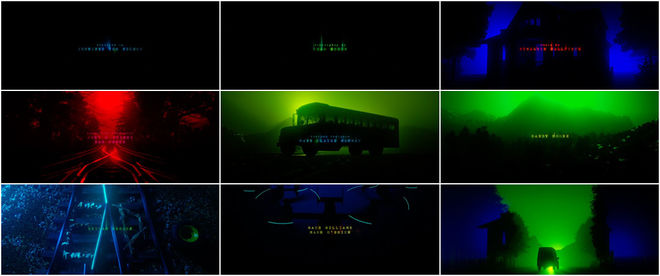
The Darkest Minds is the live-action feature debut of Jennifer Yuh Nelson (Kung Fu Panda). It’s a beautiful-looking film and it’s clear that Nelson’s experience as a storyboard artist and animation director have translated to the film’s simple but haunting end sequence. Teaming with Nelson and Stranger Things producer Shawn Levy, studio Imaginary Forces and Creative Director Michelle Dougherty create a series of monochrome vignettes. Broken up by credits type that shimmers from within, these vignettes evoke scenes and settings from the movie – a mountain, train tracks, a van, a school bus, a house, military transports – all revealed in brief flashes and backlit by the film's core colours. While this approach to main-on-end title sequences has become more common, it’s rarely done so simply and strikingly as it is here. WP
8. Slice
CATEGORY: Film
Created by I Saw John First
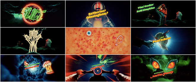
Describing Austin Vesely’s werewolf-pizza Chance-the-Rapper comedy-horror film Slice is a mouthful. But with a premise like that, it’s no surprise that it bears a fully loaded, stuffed crust, dripping hot delight of a title sequence. Created by artist and animator I Saw John First (John Christian Ferner Apalnes), Slice’s titles are a cornucopia of body parts and blades, leather and lightning, neon demons and gnarly rides, all set to a synth- and bass-heavy score by composers Ludwig Göransson (who also scored 2018’s Venom) and Nathan Matthew David.
Slice and its opening join the recent trend of 1980s nostalgia seen in the neon-lit title sequences for shows Stranger Things (2016) and GLOW (2017) and films Atomic Blonde (2017) and Guardians of the Galaxy Vol. 2 (2017). In 2018, an animated main title sequence is rare in film but Slice delivers the goods. LL
Read our in-depth discussion with Artist I Saw John First and Director Austin Vesely.
7. Semi-Permanent 2018
CATEGORY: Conference
Created by Joyce N. Ho
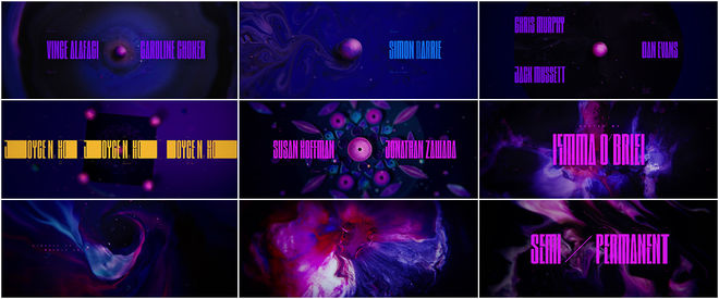
Over a few days every year Semi-Permanent Festival is a pixel-pumping, creativity-boosting, and future-making series of events taking place in Sydney, Australia, and beyond. And every year since its inception in 2003, a designer (or design team) is invited to create an opening title sequence to kick it all off. For Sydney’s 2018 edition, an electrifying magenta-and-indigo sequence launched the festivities, giving fans and attendees an eyeful of elastic typography, invigorating spirit, and colours bleeding every which way. It was directed by Joyce N. Ho, a creative director based in New York with projects including The Expanse (2015) and True Detective (2014) in her rearview.
To create the piece, Ho assembled an international murderers’ row of talent. There’s Davy Evans (Brighton) on cinematography and paint, Ambrose Yu (Los Angeles) on score, Worship (Toronto) for custom typography, Mercy Lomelin (New York) on storyboards, Alex Gee (Toronto) for the edit, and design and animation from William Arnold and Joel Watkins (both New York), Nidia Dias (Porto), and Somei Sun (Shanghai). Handling logistics in addition to creative direction and design is an enormous job, so the gorgeous finished product is a real testament to Ho’s skills. Creating the titles for a conference of this scale is also a singular honour and opportunity, and surprisingly, Ho is the first woman in Semi-Permanent’s history to get a crack at it. With this sleek piece, she's knocked it out of the park. LL
6. Spider-Man: Into the Spider-Verse
CATEGORY: Film
Created by Alma Mater
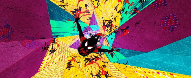
Stills from the Spider-Man: Into the Spider-Verse main-on-end title sequence
Studio Alma Mater (The Lego Movie) caps off one of 2018’s most visually striking films – animated or otherwise – with a spectacular main-on-end title sequence.
Spider-Man: Into the Spider-Verse explores the well worn comic book trope of multiple universes colliding with disastrous results, and sees Spider-Men Miles Morales and Peter Parker bring together a team of Spider-People (and pigs) from across the multiverse to stop the Kingpin of Crime, Wilson Fisk, from destroying the very fabric of reality. Into the Spider-Verse’s end titles exploit this dimension-shattering conceit to its full potential, leaning into the film’s splash-page approach with Spider-Heroes and onomatopoeia leaping out from the flat, Ben-Day dot world of Silver Age-style comics and into a full stereoscopic 3D world.
The title sequence is a dizzying vortex of action, a kaleidoscope acting as both a bed for sight gags and callbacks and an epilogue. The hip-hop aesthetic that grounds the world of newly minted Spider-Man Miles Morales provides the backing track, but a multiverse of characters means each iteration of Spider-Man brings a new art style to the table. Similarly, the credits for Spider-Verse’s cast and crew appear as graffiti tags, Noir-era title cards, comic book captions, and more. Audiences will stay for the now ubiquitous post-credits scene no matter what, but Alma Mater’s work not only makes that wait worthwhile but a genuine thrill. WP
5. Made in the Middle
CATEGORY: Conference
Created by Ben Radatz
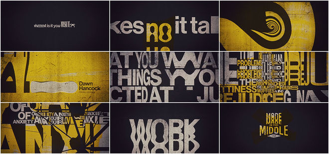
“What is it you want?” asks the voice. Strong and commanding and doling out direct questions, the voice tempts us with the strangest secret in the world. The sage advice comes from Earl Nightingale and his 1957 motivational book and audio recording, The Strangest Secret. It’s also the backbone of designer Ben Radatz’s purely typographic opening to conference Made in the Middle, a solidly engaging work that steamrolls and stretches text, alternating between steady restraint and invigorating energy.
Drawing on homegrown talent, the Midwest-based conference tapped Radatz, a partner at MK12, a studio with its roots in Kansas City and a portfolio of title design projects including Stranger Than Fiction (2006) and Bond film Quantum of Solace (2008). LL
Read our in-depth discussion with Title Designer Ben Radatz.
4. The Terror
CATEGORY: TV
Created by Elastic
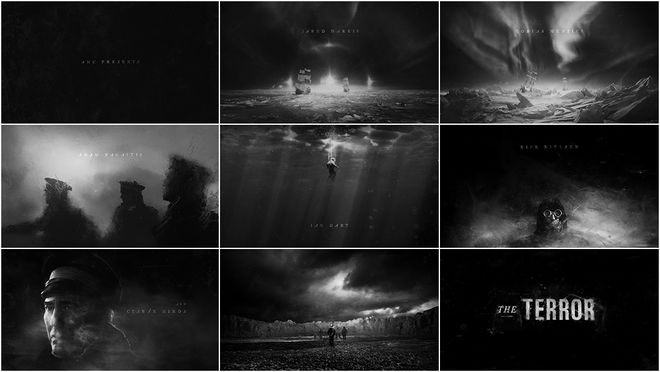
AMC’s horror anthology series The Terror puts a supernatural spin on one of the greatest maritime mysteries of all time: the disappearance of the Franklin Expedition. In 1845, Arctic explorer Sir John Franklin, two ships, and 128 crew set out to chart the fabled Northwest Passage — a sea route to connect Europe and Asia — and vanished in the Arctic, leaving scattered records and bleached bones.
Adapted from Dan Simmons’ novel of the same name, The Terror follows Franklin (Ciaran Hinds) and his men during the calamitous voyage, a period in which Inuit locals became the only witnesses to the disaster. According to this fictionalized account, the bitter cold is not the only thing to fear north of the Arctic circle. For the opening of The Terror, the showrunners and design studio Elastic hauntingly convey the story of this doomed expedition with a brisk, monochromatic main title sequence viewed through sheets of ice. As sun dogs turn to auroras, the ships — HMS Erebus and HMS Terror — are frozen in place, the crew bound in snow and darkness for the endless winter, driven to madness and worse. One by one the crew fades from view, those who remain setting off into a white wasteland and an unknown fate. WP
3. Domashniy Arest (House Arrest)
CATEGORY: TV
Created by Alexandr Petrov, Dmitri Petrov
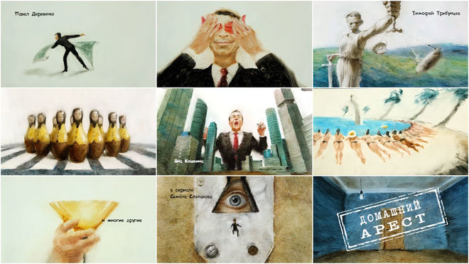
Arkady Anikeev is having a tough year. After being caught accepting bribes, Anikeev – once the mayor of the city of Sineozersk – is placed under house arrest, forced to live with the consequences of his actions and a host of zany characters. Not to be confused with Domashen Arest, the Bulgarian sitcom, Domashniy Arest is a Russian TV series that sees Anikeev help a childhood friend become the new mayor.
Telling the story of Anikeev’s fall from grace is the show’s stunning title sequence, created with brilliant oily brush strokes by father-son duo Alexandr Petrov and Dmitri Petrov. Most well known for their 22-minute film The Old Man and the Sea (1999) which was the first animated film to be released in IMAX and an Oscar Award-winner for Best Animated Short, the Petrovs revisit their paint-on-glass technique for Domashniy Arest's gorgeous one-of-a-kind opening. As Anikeev dances with an American one-dollar bill and men in suits engulf each other like morose nesting dolls, a smudgy and vibrant history unfolds. It’s a treat to watch each scene blend into the next, culminating in Anikeev’s metamorphosis into a lowly housefly, left to his fate in an empty room. Sweet justice. LL
2. Counterpart
CATEGORY: TV
Created by Imaginary Forces
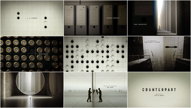
What if you could live your life differently? How many different ways could you live? These are the questions at the heart of Starz' series Counterpart as well as the prompts used by Creative Director Karin Fong to produce its Emmy Award-winning title sequence.
In the Cold War-espionage series, actor J.K. Simmons plays Howard Silk, a man who discovers that the agency he works for actually hides a grave secret: a passage to a parallel world. For the show's opener, Fong and the team at studio Imaginary Forces create a smooth and stark sequence that looks forward while looking back. Full of images from the show’s retro-futuristic set, the sequence presents a fascinating world of vintage machinery alongside modern tech. Interior images glide effortlessly into giant, abstract landscapes peppered by small, lonely figures. It's thanks to editor Zach Kilroy’s keen eye and clever match cuts that the sequence flows fluidly, macro shots slipping gracefully into grand landscapes. LL
Read our in-depth discussion with Emmy Award-winning Creative Director Karin Fong.
1. Babylon Berlin
CATEGORY: TV
Created by Saskia Marka
“Let's not be shy to say it,” says Christian Buss, Der Spiegel’s cultural critic, about Babylon Berlin. “We [Germans] are big again – as the world champions of angst."
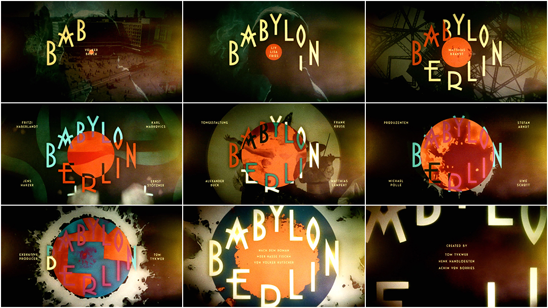
It is this angst that is front and center in the show’s hypnotic, Art Deco-infused opening created by German designer Saskia Marka. Hailed by critics as dazzling and dynamic, the 16-part series has been likened to the “German angst cinema” of the 1920s including silent films The Cabinet of Dr. Caligari (1920) and Metropolis (1927), both of which feature landmark title sequences. Taking place towards the end of the Golden Twenties of the Weimar Republic, Babylon Berlin premiered in Germany in October 2017 and was soon picked up by Netflix, debuting in the United States, Canada, and Australia in January 2018. It taps into growing international interest for depictions of German history and the rise of Nazism, deftly exploring the anxieties swirling through many cultures today.
For the show’s exhilarating opening titles, Marka created a “seething energetic fireball,” keying up tension using bold colour and typography. “The radial wipe gives you this feeling of a ticking clock,” she says. “Especially in regard to what is going to happen in Berlin and to the world after the Golden Twenties.” The theme composed by Johnny Klimek and Tom Tykwer serves the same function, the notes speeding up and climbing to a higher register like a kettle about to blow. Marka, who also designed the openings to Deutschland 83 (2015) and its successor Deutschland 86 (2018), wanted to depict a Berlin that is always in motion, always changing, and dangerous. “Nothing is ever safe,” she says, and we feel it. LL
...and that's a wrap!
There are so many amazing title sequences we weren’t able to include in this top 10, but many of the year’s most notable sequences are available in our 2018 titles list. We recommend checking out the hilarious behind-the-scenes bloopers of The Happytime Murders, the mesmerizing ending to Annihilation, the Easter egg-filled opening to Castle Rock, and our in-depth article on the atmospheric titles to Deep State.
Love our choices? Disagree with our picks? Did your favourite title sequence not make the cut? Join us on Twitter at @ArtoftheTitle and have your say.
Thanks for joining us for another incredible year in title design. Here’s to an exciting 2019! Wakanda forever!
—Art of the Title


