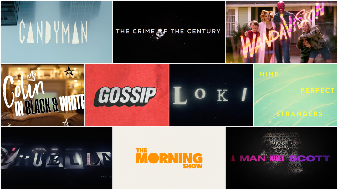
The Best Title Sequences of 2021
In a year that felt very much like a run-on of 2020, many of us found solace and joy in screen-based arts and entertainment. Art of the Title’s eighth annual list of the year’s top 10 title sequences celebrates the cream of the crop of motion-based graphic design from among film, television, festivals and conferences. This year, the panel chose its top titles from among work completed not just in 2021 but also 2019 and 2020 as many studios pushed release dates back, hoping for an ease in pandemic restrictions.
As with 2020, we reached out to our community to pull in new voices and to expand the team that calls the shots for the Top 10 Title Sequences of the Year.
Chosen by Art of the Title's panel of experts
The panel for 2021 includes: Dan Boland, art director, The Price Is Right; Briar Levit, designer and educator; Dorca Musseb, director and animator; Norman Wong, director and photographer; Aleysa Young, director; plus Art of the Title’s Editor-in-Chief Lola Landekic and founder Ian Albinson.
The list below includes title sequences that were painstakingly modeled, animated, painted, composited, illustrated, torn and pasted, shot, acted and typeset by teams large and small all around the world, with budgets modest and mighty, in state-of-the-art facilities and in home studios. So sit back, relax and enjoy some of the most interesting and innovative work to hit screens in 2021.
Art of the Title's Top 10 Title Sequences of 2021
10. Cruella
CATEGORY: Film
Created by Elastic
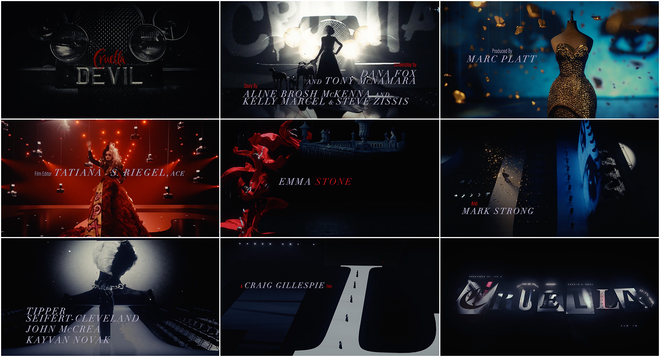
Cruella (2021) main-on-end titles
Disney’s Cruella, a film centered on the villain from the studio’s 1961 hit One Hundred and One Dalmations, boasts a cast including the Emmas (Stone and Thompson), a lavish array of costumes, a soundtrack sparkling with ’70s hits, splashes of razor-sharp graphics and a sultry closing sequence. As Cruella De Vil (Emma Stone) and her hero-turned-rival the Baroness (Emma Thompson) square off in elaborate fashion battles all over 1970s London, headlines smack on screen and frame Cruella, pronouncing her the “FUTURE OF FASHION” and asking “WHERE WILL SHE STRIKE NEXT?”
Cruella (2021) headline graphics
Behind this typographic artistry and the film’s main-on-end sequence is creative director Lisa Bolan (Queen Sugar, Yellowstone, Carnival Row) and the team at studio Elastic. Set to Florence Welch’s seductive vocals and the bespoke number “Call Me Cruella,” the closing titles are a series of CGI vignettes featuring flashes of light and folding chairs, gilded moths and mannequins, crimson crepe and catwalks. “This was as epic as the main character is,” says judge Dorca Musseb. “It told us exactly who she was and what she was about. The visuals are absolutely stunning.”
The final zoom out reveals that each set was built atop a letter, arranged to form the film’s title. All the world’s a stage.
9. Nine Perfect Strangers
CATEGORY: TV
Created by Antibody
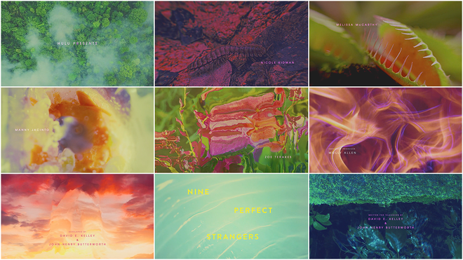
Nine Perfect Strangers (2021) main titles
“Isn't it kinda fucked up that there's an industry that traffics in telling us we're broken in the first place?” asks studio Antibody on their Instagram account. The question is central for Nine Perfect Strangers, Hulu’s eight-part miniseries starring Nicole Kidman, Regina Hall and Melissa McCarthy. The show takes place at an exclusive resort that entices wealthy urbanites with the prospect of tranquility while taking aim at the corrosive elements of the wellness industry, a domain in which exercise and meditation, gua sha and massage, juice cleanses and jade eggs reign supreme.
Opening the show is a smooth and enchanting dose of psychedelia. The tropical, shape-shifting title sequence was made by creative director Patrick Clair, motion designer Raoul Marks and studio Antibody, best known in the world of titles for their Emmy Award-winning work on True Detective (2014). Talking with Stash Media, Clair said they employed machine learning software to visualize the “sticky, insidious paradise where shimmering sunshine seduces you into a world of dark hearts and exploitation.” Using EbSynth, they melded moving imagery of figures dancing and swimming with stills of flora and stars. “The result is trippy fluid videos reminiscent of data moshing but smoother, more organic, and devoid of the characteristic glitching,” said Clair. Driving home the dreamy atmosphere is Unloved’s cover of Ray Davies’ 1965 song “This Strange Effect,” a hypnotic accompaniment for a uniquely vivid work of art.
8. The Morning Show (Season 2)
CATEGORY: TV
Created by Elastic
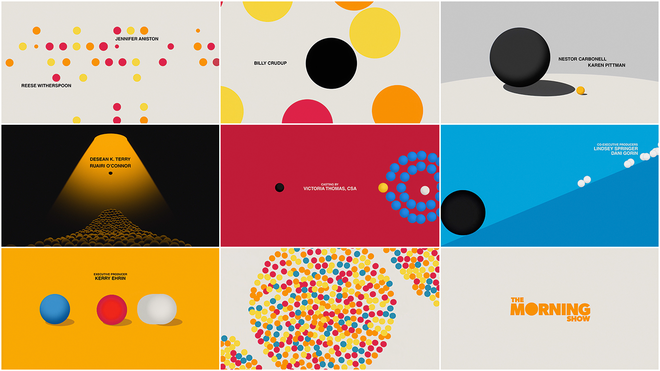
The Morning Show (Season 2) (2021) main titles
The opening sequence to season two of The Morning Show, Apple TV+’s drama starring Reece Witherspoon and Jennifer Aniston, is a bright and abstract depiction of the world of morning news. In 2019, the first season’s opening was nominated for an Emmy in Outstanding Main Title Design. The show paused production on its second season due to the covid-19 pandemic but made its return in 2021.
Produced by studio Elastic with creative directors Hazel Baird and Angus Wall at the helm, the show’s opener builds on the title design tradition of the dot, famously used in such openings as Ocean’s 11 (1960) and Dr. No (1962) – created by designers Saul Bass and Maurice Binder, respectively – and takes it into new territory with narrative complexity and three-dimensional graphics. In an interview with Deadline, Wall said, “It was meant to harken back to that sense of design and then break it – to go to this mid-century idea of a very structured world and then update it, or sort of drag that forward into now, where things are less structured.”
The musical theme, “Nemesis” by Benjamin Clementine, is an admonitory bop, warning the listener to “Treat others the way you want to be treated / Otherwise / You'll get your punishment.” The music bounces forward as a small black dot makes its way through one hurdle after another, pushing its way through a crowd, bursting with colour, ostracized and sized up, growing and shrinking and taking a beating but never defeated.
7. Colin in Black & White
CATEGORY: Film
Created by Elastic
Colin in Black & White (2021) main titles
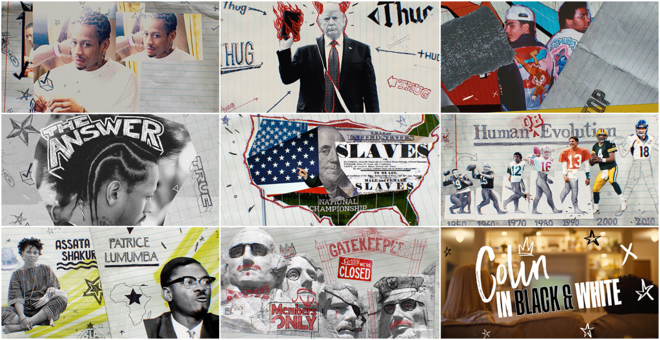
“The combination of collage work, motion graphics and imagery was both inventive and powerful,” says Top 10 judge Aleysa Young about the opening titles for Colin in Black & White, the Netflix miniseries centered on and created by athlete and activist Colin Kaepernick. “It captured an energy and scrappiness that told a complete story in an abstract but specific way.”
Perhaps most well-known as the ex-49ers player who kneeled during the national anthem at NFL games in protest of racial injustice, Kaepernick's voice flows throughout the series to ground it in his personal experience. The show’s minute-long intro montage was created by studio Elastic and is set to Kendrick Lamar’s thumping track “DNA.” It folds together elements of the former quarterback’s life as well as clips of music videos, TV series, other athletes, politicians and historical events. As NPR’s Eric Deggan notes, “Kaepernick sets the tone early, speaking ominously while visual images morph from Black professional athletes examined by white coaches and team doctors to slaves getting a once over from white men selling them at auction.” Co-created with Ava DuVernay (Queen Sugar, 13th), the series makes crystal clear what it was like for Kaepernick as a young biracial man growing up with white parents while struggling to determine his identity and how these experiences shaped the principled activist and football star he would become.
6. A Man Named Scott
CATEGORY: Film
Created by Elastic
A Man Named Scott (2021) main titles
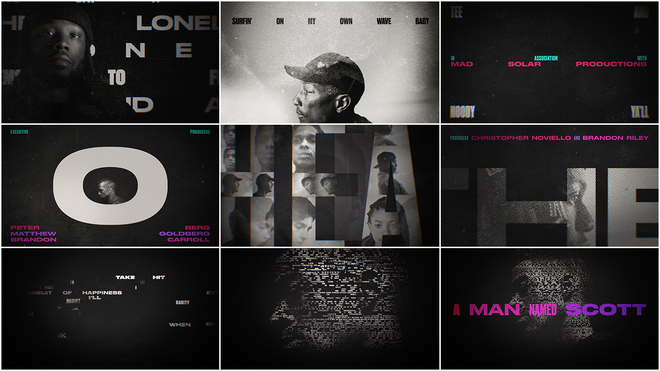
“Oh if I crash,” sings Kid Cudi over a shuffling beat and plaintive piano. “Or if I land, no matter the case / I'm all smiles, I'm all smiles.”
In the track “Speedin’ Bullet 2 Heaven,” the title theme to Amazon documentary A Man Named Scott, Cudi AKA Scott Mescudi speaks to his struggles and the performative nature of his life and work. The intimate documentary directed by Robert Alexander (HBO’s The Shop) mixes interviews and talking heads with more experimental clips and effects to paint an apt portrait of the troubled, influential rapper, songwriter and producer. For the film’s opening, creative director Clarissa Donlevy (His Dark Materials, The Last Dance) and a team at studio Elastic use the power of words and the strength of typography, differentiating the picture’s credits from Cudi’s lyrics with colour. The half-tone black and white portraits of Ye, Pharrell Williams, Willow Smith and other industry notables come together to create an enticing yet dark opener. In the end, the words coalesce to form Cudi’s sombre profile, an artist in repose but filled to the brim.
5. Loki
CATEGORY: TV
Created by Perception
Loki (Season 1) (2021) main-on-end titles
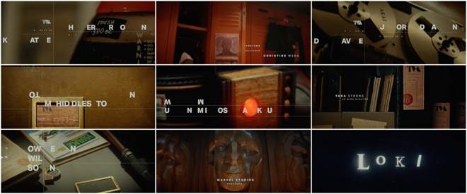
After being captured by the Time Variance Authority, Marvel supervillain Loki is powerless and trapped in a strange, bureaucratic world. The 2021 TV series on Disney+ takes place following the events of the 2019 film Avengers: Endgame, in which a new timeline is created by an alternate Loki. The show’s end credits sequence is a stand-out component featuring staccato and delineated typography shapeshifting among mid-century office equipment, paperwork and artefacts. The sequence was created by studio Perception, who approached the project as an opportunity to create “an insider look into what life is like within the offices of the TVA” and to imagine how the organization would see Loki.
“This sequence felt fresh to me for the energetic typographic treatment throughout,” says Top 10 judge Briar Levit. “The abstract and frankly more edgy motion and appearance of the type paired well with the more straightforward tone the imagery is setting with the documents, photos, and other case files. The energy of the music supports it very well, and the rotating logotype at the end has the sort of chaos and beauty that feels great for a supervillain.”
4. Gossip
CATEGORY: TV
Created by Elastic
Gossip (2021) main titles
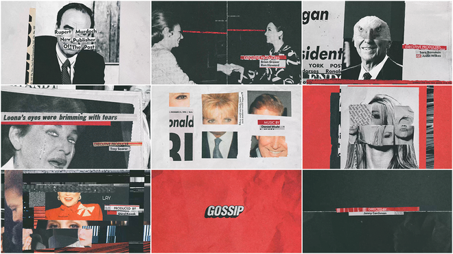
Created for Showtime, the documentary miniseries Gossip spotlights the life and career of columnist Cindy Adams, who wrote scandal pages for conservative daily rag The New York Post. Produced and directed by Jenny Carchman (The Fourth Estate, Public Speaking), the four-part show features a punchy opening title sequence created by studio Elastic. With creative director Clarissa Donlevy at the helm, the design team also included Antoni Sendra Barrachina and Lynn Cho.
“The typography and image collage are so tight and connect so well with the driving music,” says Top 10 judge Briar Levit. That music was created by composer Daniel Wohl. It’s enticing and energetic, providing a sense of largesse, power and influence and it efficiently emphasizes the striking images appearing on screen. We see Ronald Reagan’s smiling face half-obscured, the forehead and eyes replaced by that of a stern-looking eagle; the eyes of “Queen of Mean” businesswoman Leona Helmsley cut out, the holes leaking newspaper tears; and the head of popstar Britney Spears replaced by that of the Statue of Liberty and juxtaposed with the words “Bimbo Summit.”
“It’s not that newspaper referencing in design hasn’t been done or that it hasn’t even been done in titles,” says Levit. “But this was just executed so well and with all the cheekiness one would expect for this topic.”
3. The Crime of the Century
CATEGORY: TV
Created by Elastic
The Crime of the Century (2021) main titles
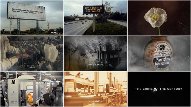
“Since 2000, more than 500,000 Americans have died of opioid overdoses,” states a billboard in the opening moments of HBO docuseries The Crime of the Century. The two-parter takes a deep dive into the opioid epidemic and its perpetrators, chief among them the pharmaceutical industry. Over the course of four hours, director Alex Gibney (We Steal Secrets: The Story of WikiLeaks, Why We Hate) highlights how Purdue Pharma and the Sacklers (the family behind the company) in conjunction with politicians, government officials, distributors and doctors contributed to the devastating sweep of opioid-related deaths across the US and beyond.
The opening titles set up this crisis and present a wide-spanning prologue narrated by Gibney which details the history of opium as a commodity from the time of King Tut to today. The sequence was made by creative director Clarissa Donlevy, lead designer Lynn Cho and a team at Elastic. Top 10 judge Norman Wong says this opener “articulates the overall backstory very well visually and reinforces the story with potent visuals. It communicates what we need to know strongly and clearly.” Likewise, judge Briar Levit says “These credits do an excellent job of setting the foundations of the story of opium and its successors in a way that helps contextualize and intrigue.”
Ultimately the show asks viewers to absorb a complicated web of crimes and their painful consequences. When the problem is so widespread and deadly and when so many profit from it, can justice ever be achieved?
2. WandaVision
CATEGORY: TV
Main Titles Created by Various
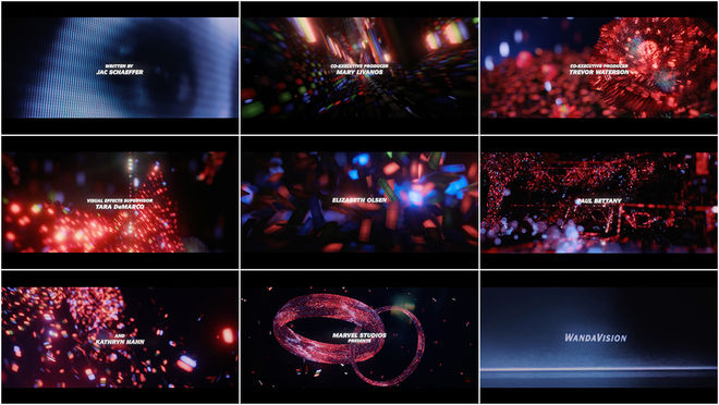
End Titles Created by Perception
WandaVision (2021) episodes 1, 2, 3, 5, 6, 7 main titles
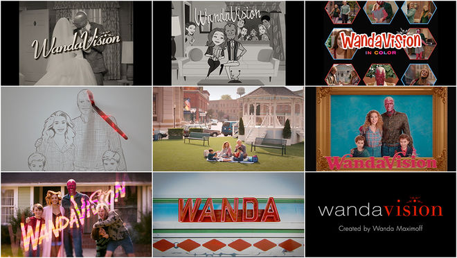
“I’m so proud of all of them,” said series director Matt Shakman of WandaVision’s varied opening titles in an interview with Vulture. “They make me so happy.” And it’s no wonder, given the obvious work Shakman and showrunner Jac Schaeffer put into the aesthetics of each episode of the Marvel series. The openings, which capture the styles of specific eras of television, were part of the process from the beginning; the show's writing team drummed up the ideas for each opener and its theme song.
WandaVision (2021) episode 1 end titles
“They are executed so well, down to the ’90s send-up of Malcolm in the Middle,” says Top 10 judge Briar Levit. “I almost find it hard to watch them because they are all parodies of fairly cringey TV.”
The second episode’s titles riff on the sassy cartoons of Bewitched and I Dream of Jeannie and were created by Vancouver animation studio Titmouse. Episode five takes its cues from Family Ties and Full House, while episode six imitates the handheld grunge aesthetic of Fox sitcom Malcolm in the Middle. The opening musical themes were all written by Oscar-winning composing duo Robert Lopez and Kristen Anderson-Lopez (Frozen, Coco).
1. Candyman
CATEGORY: Film
Created by Manual Cinema, Filmograph
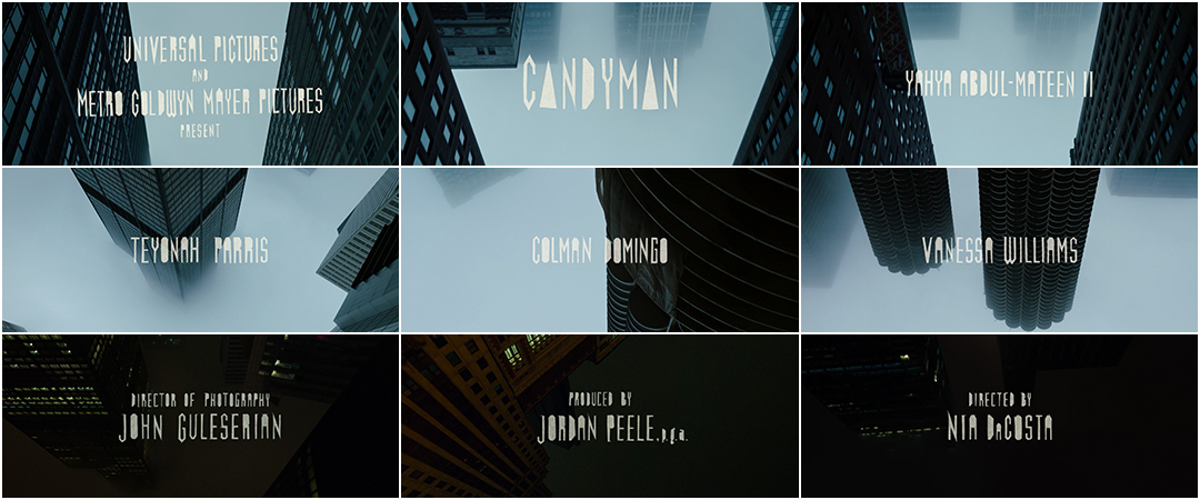
In June 2020, a teaser trailer was released for Nia DaCosta’s Candyman, a sequel to the 1992 film directed by Bernard Rose. The video is a dark and wordless puppet show and a powerful first impression for the resurrection of a horror classic. It was created by Manual Cinema, a performance collective and production company based in Chicago, and features eerie paper cut-outs of long-legged figures paired with a haunting piano score by Robert Aiki Aubrey Lowe. It combines the titular figure’s origin story and the narrative of the new film with tales of real-life acts of racial injustice and brutality in the US. This entirely practical shadow puppetry appears again in the film’s end titles, giving the Candyman experience a sense of closure.
The film’s opening title sequence is also remarkable. With foggy, ominous sweeps through Chicago’s skyscrapers as seen from below, the opening literally turns the original film’s introduction on its head. While the 1992 film begins with an aerial view of the city during daytime, this one builds fear from the ground up, creating a sense of unease by upending a familiar view and moving from light to dark. The opening also benefits from custom typography created by Manual Cinema based on the original film’s titles. The credits were hand-cut and then backlit and photographed. Studio Filmograph then combined these elements, placing the titles onto footage and creating the projection-room end credits sequence. Altogether, the combination of elements is effective and singular — stunning old-world effects for a truly modern work of art. Sweets to the sweet.
...and that's a wrap!
There are so many amazing title sequences we weren’t able to include in this top 10 but you can check out recent notable sequences in our 2020 and 2021 titles lists.
Love our choices? Disagree with our picks? Did your favourite title sequence not make the cut? Join us on Twitter at @ArtoftheTitle and have your say.
Thanks for joining us in celebrating title design. Here’s to an exciting year ahead!
—Lola Landekic
Editor-in-Chief, Art of the Title

The Art of the Title 2021 judging panel, clockwise from top-left: Norman Wong, Dorca Musseb, Dan Boland, Aleysa Young, Briar Levit; plus Art of the Title Editor-in-Chief Lola Landekic and Founder Ian Albinson

