Chloe Okuno’s Top Five
Chloe Okuno is an American director and screenwriter from Los Angeles. She has directed the feature film Watcher (2022), which premiered at the Sundance Film Festival, and the segment "Storm Drain" for the horror anthology V/H/S/94 (2021). She has also directed several short films including Slut (2014). I reached her by Zoom to chat about her top five title sequences.
—
Thank you for joining me! Did you struggle to choose your Top 5? I feel like people often struggle to pick.
Chloe Okuno: Yes, I really did! Honestly, Se7en is probably one of my favorites. But I didn't want to put it on my list because I'm like, how many times have you probably talked to people about Se7en?
[laughs] A lot.
CO: So we could just leave that one aside. But yeah, it was very difficult. There are a few that really stick out in my mind.
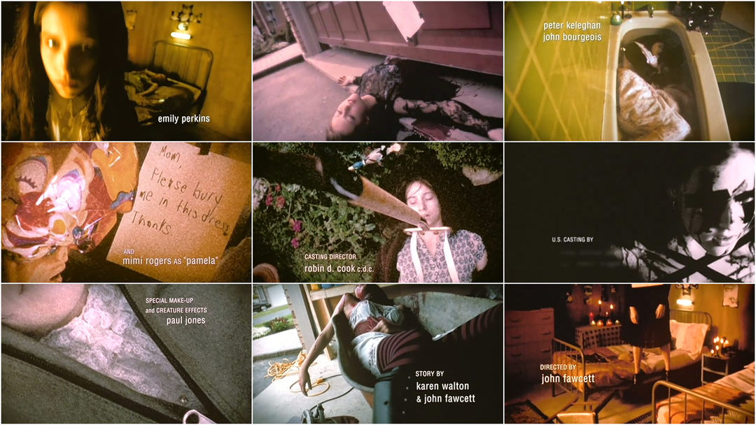
Ginger Snaps (2000)
CO: Like, Ginger Snaps is a movie I love. I've always adored that title sequence. It's one of the things that really just sticks out immediately. But there are also a lot of movies where even if the title sequence is great, it's not what you think about so you have to go back and remind yourself.
Right, it’s often that you love the movie as a whole and the title sequence is merely a part of it. What do you love about Ginger Snaps’s opening?
CO: Oh, boy. It's so interesting what people try to do with their title sequences. Obviously you want to establish the tone of your movie. Ginger Snaps uses this title sequence to truly make us understand these characters in a way that very few title sequences are able to do. You just immediately get who these two girls are. What kind of girls would stage these elaborate suicides?
Ginger Snaps (2000) main titles
Directed by: John Fawcett
Writer: Karen Walton
Cinematography: Thom Best
Opening Title Composite: Jamie Hallett
Digital Visual Effects & Opticals: Film Effects, Inc.
Music: Michael Shields
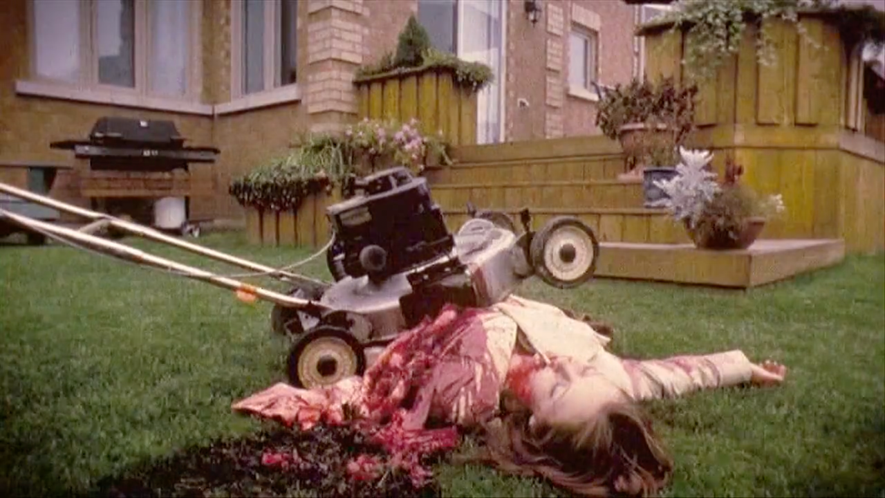
CO: Within this title sequence you see the macabre side of their personalities, their fixation on death, but also the fact that they're clearly brilliant and artistic and creative. It makes you understand them and also love them. It was unusual to see this kind of goth girl portrayed in this way – and without pulling any punches. All those tableaux in that title sequence, they're all great, but the one where she's just been run over by a lawnmower [laughs] and her guts are, like, spilling out all over the place [laughs] and she has a cigarette in her mouth?
—Chloe OkunoThis isn't a cute little hobby – this is extreme. It also prepares you for the level of gore that you're about to experience.

Still from the opening sequence of Ginger Snaps (2000) showing Brigitte (Katharine Isabelle) lying on a lawn, cigarette in her mouth and lawnmower across her middle
CO: This isn't a cute little hobby – this is extreme. It also prepares you for the level of gore that you're about to experience. And the music is fantastic. It's more serious than you'd expect.
Yeah. It's quite haunting, actually.
CO: It's very haunting. I could see a different version of that title sequence where they're being a bit more arch with it or you're doing a needle drop or something, but it actually feels much more melancholy. Yeah, it is very haunting.
It's like watching their innocence ooze away.
CO: Totally. It prepares you thematically for where we're going.
Alien (1979)
Let’s talk about your second pick – if we want to stay on the horror tip – which is Alien.
CO: Two movies that couldn't be less similar! [laughs]
Right, except for the one broad category. [laughs]
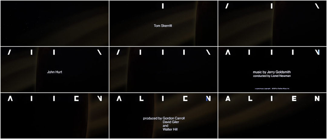
CO: [laughs] Yeah. I mean, Alien is probably my favorite horror movie of all time. Looking at those titles, every time I see it, even though I know what they're doing, I find it really unsettling.
Alien (1979) main titles
Directed by: Ridley Scott
Titles Production Company: R/Greenberg Associates (R/GA)
Title Design: Richard Greenberg, Steve Frankfurt Communications, Tony Silver Films
CO: Something about the appearance of these – like, you don't realize they're letters. These lines across the screen. It feels like a mini mystery within the title sequence, like, What's happening? This alien script that you don't understand. It's very minimalistic but it does a perfect job of setting the tone, drawing you in. Preparing you for the story about this thing that you don't initially understand. You're going into the void with these people through this title sequence.
That's a great way to put it. It makes what is normally familiar and human – language – seem completely alien.
CO: Completely. It takes so long to even see what that they're spelling out a word. It's such a fun reveal. There's something very uncomfortable about seeing these disparate markings. It puts you into the mindset of these explorers who are going into this alien world they don't understand.
Have you ever seen the original trailer for Alien?
CO: Oh, is it the one with just, like, the egg?
Yeah, there’s one where it's the egg cracking and then once it cracks, there's this wild quick-cut sequence. It's got this shrill alarm sound that's really unnerving and the cat keeps appearing.
CO: Yes. [laughs] Oh, my God. That trailer is amazing. It feels like it has a lot more creativity than usually goes into trailers these days.
Alien trailer
CO: Oh, do you want to talk about another of my favorite movies of all time?
Once Upon a Time in the West?
CO: Yeah!
Once Upon a Time in the West (1968)
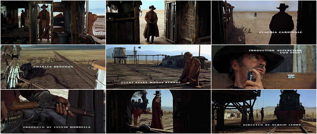
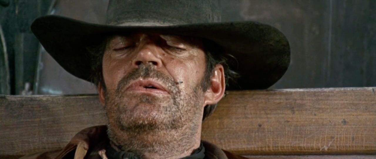
CO: I mean, what to say about that opening sequence? It's not like they created a “title sequence” – they created this incredible sequence in the movie and decided to put titles over it. It doesn't feel like a separate thing at all. Except it does feel much more deliberate.
Once Upon a Time in the West (1968) main titles
Directed by: Sergio Leone
Director of Photography: Tonino Delli Colli
Editor: Nino Baragli
Title Design: uncredited
Music: Ennio Morricone
CO: The silence – the sound design is so incredible. The fact that it's very limited on dialogue. It’s just this moment of three people settling in at a train station and doing things that are weird insights into their character, like this extended thing of that guy trying to blow the fly off his face?
—Chloe OkunoYou can spend this two-minute sequence just watching a guy trying to blow a fly off of his face and it’s really compelling.

Still from the opening sequence of Once Upon a Time in the West (1968) showing gunslinger Snakey (Jack Elam) trying to blow a fly off of his face
CO: That's where titles are great because the audience will have more patience in the beginning of a movie. They especially have more patience when you're combining a sequence with titles because it's tricking you into feeling like the movie hasn't started yet. You can spend this two-minute sequence just watching a guy trying to blow a fly off of his face and it's really compelling. It settles you in – in a very slow and deliberate way. It’s building up to the moment when they reveal Charles Bronson. So even if it feels slow, you have this undercurrent of feeling they're here for a reason. All of this is designed to build up to this reveal of our hero character, which is so brilliant.
Right. As a filmmaker, you can get away with a lot in the title sequence in terms of exposition that otherwise might be a little dreary.
CO: Completely. In that way, it is a great tool.
The Conversation (1974)
For your next pick, we have The Conversation. The long, slow zoom in.
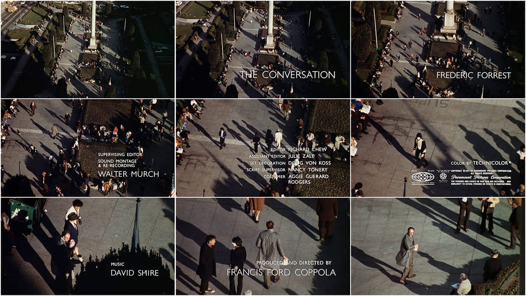
CO: Yes. It's so funny because it's a moment in time that we revisit over and over again throughout the movie. This one conversation. We see it in so many ways. The movie begins with a bird's-eye view, the widest possible shot of this area in which the conversation is happening, without you even understanding what you're looking at.
The Conversation (1974) main titles
Directed by: Francis Ford Coppola
Title Design: Francis Ford Coppola, Wayne Fitzgerald
Sound Design: Walter Murch
CO: If there's one thing that I've taken away from revisiting these sequences that I love it is how important sound and sound design becomes. The Conversation is another one where you're hearing these strange, distorted fragments. You're not even sure it's human speech. It puts you into the mindset of this character and what he's trying to accomplish, which is to overhear these people in this huge crowd. It shows you what his process is and it helps you understand why he's good at what he does – his expertise. It also puts you into this mindset of paranoia. Even in this massive crowd of people where you would think you could get lost, you know, somebody could potentially find you. It’s very unsettling.
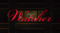
I'm sure subconsciously it influenced Watcher. It's that single take, that very slow shot. There's something about that unbroken shot that I think works really well for opening credits.
Lost Highway (1997)
Your last pick was Lost Highway. What struck you about this sequence?
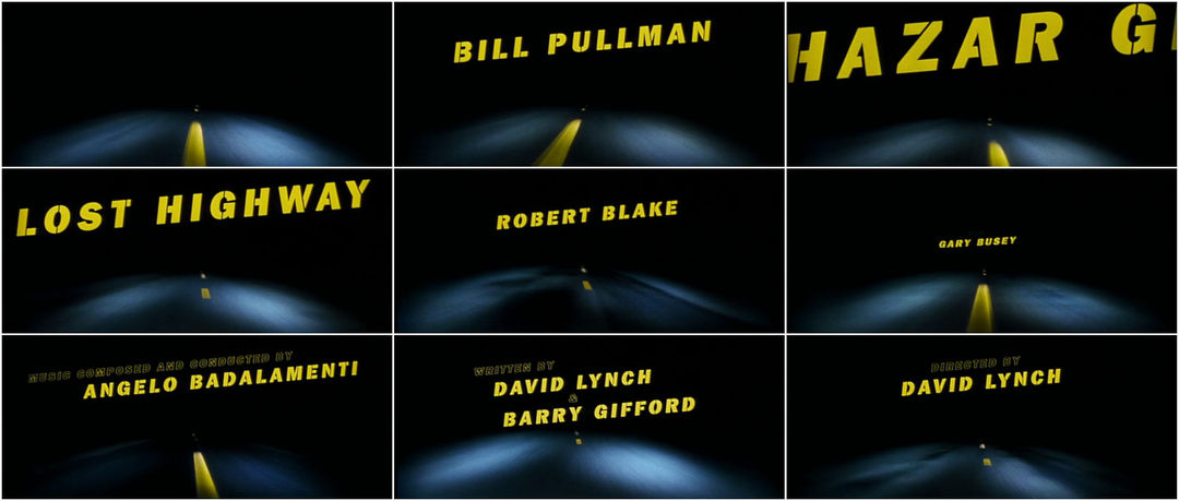
CO: I don't know. I don't. I just… there's something about the image – that image of car headlights at night zooming down a freeway… it’s really evocative. It's a little bit scary… but it's also exciting. Where are we going? I don't know.
Lost Highway (1997) main titles
Directed by: David Lynch
Title Design: Jay Johnson
Music: “I’m Deranged” by David Bowie
CO: I’m really interested to know if it was just the rattling motion of the car filming this that makes it so jittery or if they did some other kind of process on it. And also of course, like the wave kind of zoom into the frame. It feels like a nod to a movie from the ’50s or a noir. There's something retro about the font and the way that it moves into and out of frame.
It's very eerie. It always makes me think of Kiss Me Deadly’s opening.
CO: I love Kiss Me Deadly. It reminds me of – oh, I'm blanking on the name. Who was the director who did Shock Corridor? He did a great war movie. I think it opens with a woman…
Sam Fuller. The Naked Kiss?
CO: Yeah, Sam Fuller. The Naked Kiss. Thank you.
The Naked Kiss (1964) main titles
That's the one where, in the opening, she's fighting with a man and then she looks in the mirror to put on her wig.
CO: Yes, exactly! Obviously, not what Lost Highway was doing, but I like the sleazy ’50s-ness of it. David Lynch is so good at capturing that.
I often wonder about the idea of the lost highway – the highway itself. In my mind, this opening is a vision of that journey in space and time. That weird space of moving through the continuum, the metaphorical made physical.
CO: I love that. That's great. I mean, yeah, it's in a David Lynch movie in which he's not going to explain anything. It's probably very good to take metaphorical readings into the imagery. You can interpret it in a lot of different ways. That's a really cool one. That's why he's so good. It's a simple motif, very evocative, and you can really read a lot into it.
Yeah, I love that. Just giving you dreams. Well, that's our top five! Thank you for this wonderful selection. I really appreciate your time.
CO: This was fun. Thank you so much. And thank you for having this incredible website. What a good resource. The detail that you get into is really amazing.
It's a joy to get to dig in with people like you who make us these thrilling works of art.
CO: Thank you.

