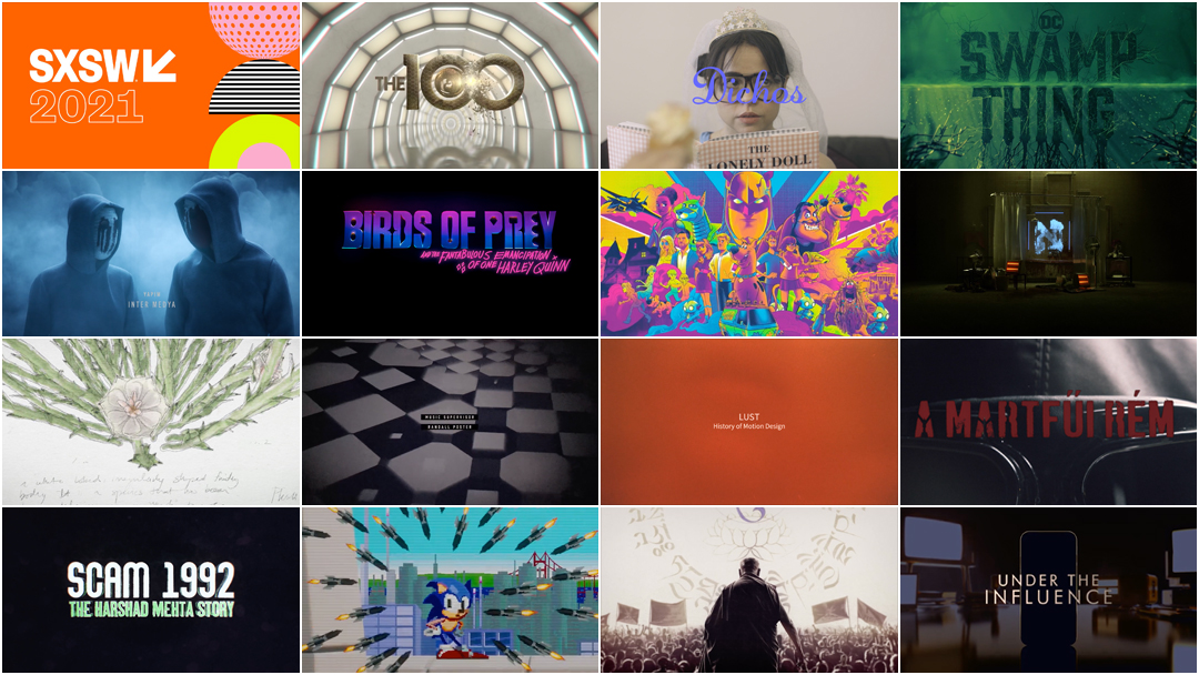
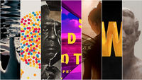
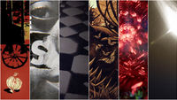
The SXSW Title Design Competition, normally showcased in front of a large audience and featuring an in-person judging process in Austin, Texas, has been shifted to an all-digital experience for 2021. We've compiled all of the finalist title sequences here.
Last year on March 6, the 2020 edition of the SXSW Conference & Festivals was called off due to the onset of the COVID-19 pandemic. For 2021, the 28th annual SXSW Film Festival has moved entirely online, taking place from March 16 to 20. Normally the annual screening of finalists for the Excellence in Title Design Awards, part of the SXSW Film Festival, is presented in Austin, Texas, in front of a large enthusiastic audience and succeeded by a brief judging process. With only 15 finalists, the number of sequences up for an award this year appears to be the lowest it's ever been – half of last year's total of 30 — and many of the more established title design studios are noticeably absent so it's good odds for an unusual year. Due to SXSW's eligibility criteria, some sequences from last year appear again in this year's list of finalists.
Update: Congratulations to title designer Saskia Marka on her Excellence in Title Design Award for her work on TV series The Queen's Gambit (2020), and to studio Shine on their Special Jury Recognition for their work on the film Birds of Prey: And the Fantabulous Emancipation of One Harley Quinn (2020).
Please join us in celebrating all of the finalist work for the Excellence in Title Design Awards below.
_
The 2021 Finalists for the SXSW Title Design Competition
The 100
Studio: Picturemill
Designers: Dustin Reno, Evan Jackson
The 100 season 7 main titles
For the final season of The CW’s popular sci-fi drama, Picturemill once again brought the creators’ visions to life in a high energy title sequence. Evolving the sequence from Season 6, entirely new environments and locations were created while Season 6 locations were updated with new UI elements crucial to the season 7 narrative.
Within hours of the sequence’s premiere on Twitter via showrunner/EP Jason Rothenberg, the show’s dedicated fanbase eagerly began searching to decipher clues and hints toward the characters’ future journeys buried deep within the on-screen graphics.
Alef
Designers: Uǧur Baltepe, Ethem Cem
Alef (2020) main titles
Alef is an engrossing detective thriller that blends the classic narrative universe of its genre with cultural elements of Eastern geography.
Designed in eight episodes, the first season appears at first to focus on the efforts to catch a killer. The visual language of the main titles has been inspired by Istanbul's Islamic and historical architectures. We combined that with the poor, run-down and uncertain face of the city and create a dark, grunge and mysterious atmosphere. When the audience watches the title they can see some hints from the episodes they haven't watch yet. By doing that we aimed to create a curiosity for the audience and prepare them for the next episodes.
Birds Of Prey and the Fantabulous Emancipation of One Harley Quinn
Studio: Shine
Creative Director: Michael Riley
Birds of Prey: And the Fantabulous Emancipation of One Harley Quinn (2020) main-on-end title sequence
Director Cathy Yan’s Birds of Prey is a jittery, glittery joyride through loss, independence, sisterhood and gory vengeance. Graphics burst forward at every opportunity, bright and multicoloured, neon and shining. Like its central figure, they cannot be contained.
After delivering one manic melee after another, the film finishes with a main-on-end title sequence doused in vast swaths of colour and looped in loose, agitated lines that blink, swing and bleed into the shapes of key setpieces. To create the end sequence, design studio Shine took inspiration from the film’s production design and turned to a tool that hasn’t historically been used for big-budget Hollywood productions: Procreate, Apple’s graphics software for iPad.
Read more in our interview with Michael Riley and Penelope Nederlander.
The Botanist
Studio: Samplistic
Designer: Michael Rosen
The Botanist (2019) main titles
As a botanist takes a solo journey into the mountains in 1979, his notes document the growth of various flowers, trees and fungi. As a psychedelic influence begins to take hold… Where will this lead?
Dichos
Designer: Gwenaëlle Gobé
Dichos (2020) main titles and phrase cards
Fancifully illustrated title graphics of Latin American expressions for each episode of the web series Dichos which attempts to translate the untranslatable while educating (and miseducating) audiences about Latin American proverbs.
Lust
Studio: Ringling College of Art & Design, Department of Motion Design
Designer: Rudy Schultz
Lust (2019) title sequence
Through the use of self-shot body imagery, warm colors, and hazy videography, “Lust” explores the idea of being consumed by the strong desire for sex. Lust, at its core, is only the body producing estrogen or hormones to fuel your sex drive. However, when you have this feeling yourself, it doesn’t feel scientific at all; it’s animalistic if anything.
Never Forget Tibet
Designer: Chris Caswell
Never Forget Tibet (2021) title sequence
The Never Forget Tibet title sequence takes the audience through the story of the Dalai Lama's remarkable journey and escape into exile in 1959.
The Queen's Gambit
Designer: Saskia Marka
The Queen's Gambit (2020) main-on-end title sequence
When the title sequence does arrive — a surprising closer capping off the show’s seventh and final episode — it’s a demonstration of skill, a celebration of Beth’s journey and a visual delight. The checkerboard abstractions are the brainchild of title designer Saskia Marka, most well known for her work on Babylon Berlin, which earned the top spot in Art of the Title’s Top 10 Title Sequences of 2018. The hypnotizing patterns used as the basis for the graphics were created by physicist-turned-animator David Whyte (aka Bees and Bombs) using the coding language Processing.
Read more in our interview with Saskia Marka and David Whyte.
Saygı
Designers: Ethem Cem, Uğur Baltepe
Saygı (2020) main titles
Seeking the solution of corruption in society by providing his own justice, Ercüment Çözer's path crosses with Helen and Savaş, two young people who are stuck in the deviance and evil in society.
While designing the title sequence for the Saygı series, our idea was to construct visual representations for the significant parts of the script. We used important places and events which affect the development of the characters such as rehab corridor, archive, burning theater, etc. and recreated them in 3D world. Our approach for the visual language of the title sequence is heavily inspired by the series itself. Director's idea was to add red color before the violent scenes as foreshadow. We continued the same visual language on the title sequence. It starts with desaturated, cold color grade, and as it progresses brighter red color appears to create a more violent, bold, and vibrant feeling.
Scam 1992: The Harshad Mehta Story
Studio: Applause Entertainment
Designer: Jishnu Chatterjee
Scam 1992: The Harshad Mehta Story (2020) main title sequence
A young stockbroker from humble beginnings quickly gains fame and fortune. But just when everything was going well, the corrupt and faulty foundations of his success start to crumble and he plummets to his eventual downfall.
Scoob!
Studio: Aspect
Creative Directors: Jon Berkowitz, Brad Colwell
Scoob! (2020) main-on-end titles
Aspect had already been working on the marketing campaign for Scoob! for several months before our design team was approached about collaborating with the filmmakers on the title sequence for the feature. The film’s director, Tony Cervone, was entirely open to unconventional ideas and in fact, expressed a desire to utilize an aesthetic distinct from the animated style of the movie itself. Overall, Tony looked to Aspect to create dynamic scenes that would portray the ongoing story of the Mystery Inc. crew after the events of the movie. We took this opportunity to reach out to Matt Taylor, a UK-based illustrator with whom we had always dreamed of collaborating. Aspect creatively developed the layout of Matt’s compositions and added dynamic animation and environmental elements to the illustrations. We also added subtle animation to the character illustrations.
Sonic the Hedgehog
Studio: Picturemill
Designers: William Lebeda, Cecilia De Jesus
Sonic the Hedgehog (2020) main-on-end titles
Mains on End sequence for the film Sonic the Hedgehog. A delightful retelling of scenes from the film, lovingly reimagined in the style of the classic Sega Genesis 16bit games.
Strangled
Studio: FilmHungary, Studio-X
Creative Director: András Derzsy
Strangled (2020) main titles
A serial killer stalks the streets of 1960s Hungary in this psychological thriller based on true events. In the town of Martfű, young women are haunted by a killer's murderous rampage. An innocent man is accused of the crimes, while a detective plots to pin the murderer at any cost. The title sequence offers a thrilling journey through the show's world visiting the town's original murder scenes. 'Strangled' is the first Hungarian series premiered in Netflix in 2020. The series is directed by Árpád Sopsits.
Swamp Thing
Studio: Filmograph
Creative Director: Aaron Becker
Swamp Thing (2019) main titles
Atomic Monster commissioned Filmograph to create an opening sequence for the television adaptation of this titular DC Universe comic book character. Because the people of Marais, Louisiana must endure the supernatural effects of Swamp Thing, we depict the town as submerged in water, a metaphor for its crumbling infrastructure and the inhabitants' struggle to coexist alongside one another.
Under the Influence
Studio: Yacht Club Films
Designer: Nicco Quiñones
Under the Influence (2019) main titles
It’s a fact: the smartphone and its social media applications are addictive. As habit-forming effects surface at an alarming rate, we seem to shift our gaze. Bite-sized warning flares lift into the public sphere, but this vital discussion rarely goes beyond clickbait headlines and trendy explorations.
Under The Influence raises a mirror to our obsessive society by building sensitive inroads to the conversation, rather than arriving at some prescriptive conclusion. True stories ripped from the headlines allow our audience to identify with specific characters and plotlines, while respecting the evolving nature of the subject matter.


