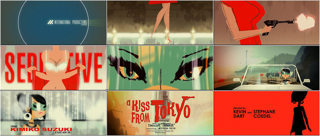
Presented in Cinescope®. Color by Chromalux®.
In viewing Kevin Dart and Stéphane Coëdel's trailer and titles for A Kiss From Tokyo we see something slightly different. The film doesn’t exist per se, but its born slippy siren certainly does in Dart’s book, “Seductive Espionage: The World of Yuki 7.“
The context of the work -both Dart’s and his crackerjack team of collaborator’s- is what we will call forwardly vintage; the faded logo, audio pops, use of depth of field, film grain, and classic edits blend into some web of go-go glam authenticity. 1964 never looked so good.
In speaking to Directors Kevin Dart and Stéphane Coëdel, and Composer Cyrille Marchesseau, the creative process rose to the surface like the bubbles in a Yuki 7 cocktail.
A discussion with Directors KEVIN DART and STÉPHANE COËDEL, and Composer CYRILLE MARCHESSEAU.
How did the trailer come from the book, The World of Yuki 7?
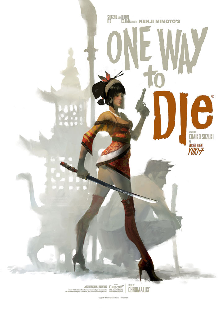
KD: I had been thinking about doing a fake movie trailer for about four years. I was talking to someone about the fake movie posters I do and we discussed cutting out the different elements [of the posters] and animating them in After Effects, and it seemed like we could create an amazing looking animation fairly easily. I thought for a long time about situations where I would be able to apply that idea. I thought it would be a neat piece to expand the story. I wasn’t thinking in terms of promotion. I was thinking I wanted to create this really believable package and the trailer would enhance that.
Conceptually, was the trailer put on hold as you started to develop the book?
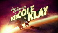
KD: The book and the trailer were developed simultaneously. I had worked with Stéphane on a project in London and the Kid Cole & Klay piece before that. The first work of his that I saw was a title card for Kid Cole & Klay using a painting I had done of a harbor. I was blown away and immediately wondered what else can this guy do? I remember thinking he was a phenomenal talent. So for the trailer I thought, ‘if this character was being introduced to audiences in the 1960′s then what would be the most eye-catching way to do that?’ I then started thumbnailing ideas for the trailer as I was figuring out the book.

Thumbnail sketches
Stéphane, take us through the first discussions with Kevin, what attracted you to the project?
SC: I worked with Kevin before on Kid Cole & Klay and BBC Olympics with Pete Candeland, and I was already a big fan of his work. I think we both really enjoyed the experience. So Kevin asked me, at the end of last summer if I’d like to do an animated trailer for him, he didn’t tell me all the details (that it was to advertise his new book). At first he said it was an experiment, like a kind of pilot. He wasn’t sure of its purpose (at least that’s what he said).
When he explained the concept, he flipped the right switch: a trailer for a James Bond-like movie, released in 1964. I didn’t need any more to say yes. My brain was already on high speed because I could see all the little things I always wanted to do in animation but never had the opportunity to include in my previous work. Kevin was giving me the perfect playground!
Cyrille, how did you become involved?
CM: I’ve known Stéphane for a long time now, we worked together on projects in France before he set up in London. I appreciate his work, he is a very talented guy and a good friend of mine.
When he told me about the job, I wasn’t aware of Kevin’s work so he showed me The Amazing Adventures of Kid Cole & Klay and the work on his website. I was very impressed by his talent. He has a very personal way of designing. It is unquestionably ‘Art’! Beautiful illustrations, amazing drawings…
Stéphane and I are both fans of vintage TV shows like The Avengers, The Twilight Zone and The Prisoner, so when he gave me the storyboard with a few of songs (for reference) my job became easier. I’ve always been interested by that music.
What films did you research?
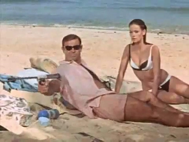
KD: When I began the project I started watching a lot of spy movies and researching them online. The early James Bond movies, especially Thunderball and You Only Live Twice. I know I sent the trailer of Thunderball to Steph quite a few times. It had a wipe I really liked as well as the way the characters were introduced, especially the women where they’d be framed ‘pretty’ but not doing much as their name would wipe across the bottom of the frame.
Thunderball theatrical trailer
And there is a great European spy film called Deadlier Than The Male. So I was watching these movies and studying the compositions, especially Danger: Diabolik which has these amazingly composed scenes. I thought about what would capture the essence of the 60′s spy genre before thinking about the flow of the trailer. I thought the scene where Yuki is driving her car against the rear projection screen could be iconic. I wanted to do a close up of her eyes; there is something about that that came across as really pulpy. At the time these were random scenes. It wasn’t until later that I had to figure out how to string them together.
So there were key elements throughout the genre that you wanted to highlight in the trailer?
KD: Exactly, and once I had those images in my head I started to get a good grasp on what the first movie, A Kiss From Tokyo was about. I started to understand how I could repurpose these already-established images [from my faux film posters] to fit the storyline.
You mentioned you did initial thumbnails. How did you flesh those out?
KD: I did a few rounds of sketches on paper, then painted these really quick black and white thumbnails on the computer so that Steph would have something to time out into an animatic, but there were a lot of problems. I didn’t have the character designs and I hadn’t finalized the story lines! I realized there were a lot of issues with how it was flowing and how it was reading but after I had the animatic I began to have a better handle on who the characters were and did a major revision to match the trailer to the direction of the book.
What was the process once you’d received the first materials from Kevin?
SC: He sent me a b&w rough storyboard. It was the very early stage, the title wasn’t yet A Kiss From Tokyo but The Secret Agent Girl of Danger Cove and Yuki 7 was named Yuriko. I first did a rough edit of the stills on a temp soundtrack to have an idea of the length and the rhythm of the whole trailer. I then did a rough animation test on the three opening shots of the trailer to show Kevin how I was going to treat the picture, and to see if we were on the same page about the overall feeling we wanted to give to the audience. He was really happy with it and then he produced a colored and layered version of the board with a slightly different cut and a new title and the finalized name of our secret agent girl. And then I started the big work.
Animatic with temp soundtrack
Kevin, you’re in Los Angeles, Stéphane is in London and Cyrille is in Paris. How did you organize your collaboration?
KD: It was done entirely with email. The process went smoothly because Steph and I had worked together before. After I had the animatic I could start painting the artwork for the different scenes. I would send those to Steph as I completed them and he would send me back finished animated scenes.
At what stage was the music brought in? Did you begin with a temp piece?
SC: The music is always the first thing I think about when I start a new job. Right after our first discussion I sent Kevin one track I took out of a 60’s music compilation (“09 La Morte Accarezza a Mezzanott” from Gianni Ferrio, from the album “Easy Tempo Vol.1”) as a reference, it was a bit too punchy and modern but it had the right vibe, then I dug into my vintage music collection and found quite quickly the right reference composer for the trailer: Laurie Johnson. He’s responsible for one of the most famous and cult British TV series soundtrack, The Avengers. I couldn’t avoid John Barry as an inspiration but Laurie has this dry and rough feeling in his sound I was looking for. Like a less sophisticated mix which makes us feel closer to the (big band) orchestra, more intimate.
So I came up with a temporary mix of two tracks from The Avengers and edited the board on it. Then I called Cyrille and briefed him about the concept and sent him the video with the ref music. He was very enthusiastic about it. I told him he was free to come up with anything but had to respect the timing and rhythm of the reference as the edit was depending on the music.
Animation and grading test
How did the music develop?
CM: I don’t really have my own method to composing but it often begins on the piano. Since jazz is my language, I improvised for many hours, working on the main title theme and many arrangement ideas. I was tempted to make a big blockbuster “Hollywood” orchestra arrangement but Stéphane told me: “You are in the sixties, in a dusty studio in London.” Thanks to him, I decided to write the score for a smaller orchestra. In the end I recorded all the instruments myself using a soundbank, but I didn’t use any samples or programming. It’s a multilayered recording approach, meaning each instrument is recorded live, one by one and there’s no programming involved. The main setup I had was a computer as well as an old revox tape recorder, so when the track is recorded you can’t change it, you have to record it again. Even though it’s a longer process it’s much more realistic than what a computer could produce.
Cyrille Marchesseau – Miss Yuki
The storyboard was very precise, and the shooting script too, so I emphasized the scene changes, first with a simple organ chord, then using the vibes, piano, and eventually the whole orchestra. It was a lot of fun to rearrange the ending four notes of the James Bond theme on the “martini” close-up at 00:00:58! We wanted the music changes to be more like glimpses of the movie and not trailer-centric, so there are five themes in one minute and forty five seconds.
How did you arrive at the beautiful finished piece?
CM: For the final mix, I made a downmix to mono, added some vinyl noise and scratches, played with the pitch and made some little tempo variations to have a “floating” feeling. Stéphane wanted it to be much more dirty, so I destroyed the mix, changed the EQ and reduced to a really short bandwidth. You should hear the music before the distorting process!
Cyrille Marchesseau – Where is Yuki?
Some of my influences were Laurie Johnson, John Barry, Henri Mancini and Lalo Shiffrin. My work here was a tribute to those brilliant composers and many others, even if done subconsciously. The trailer is an homage in a way -and not only in the music. It’s wonderful to show how creative and attractive that period was. It is such a part of our collective knowledge. I hope the audience enjoys it!
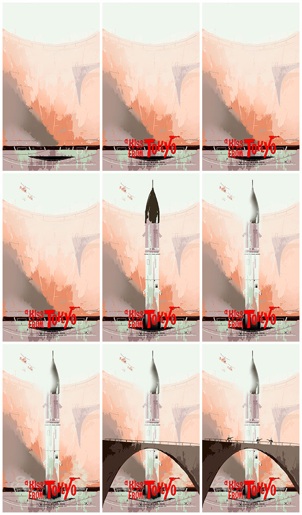
Layered Photoshop file example
How was the final artwork prepared? In your blog, Kevin, you discuss putting things on different layers; how much was layered, eg., separating your background from your foreground and your characters?
KD: What I’ve learned in working on these productions with Stéph is that my job is to give him a bunch of things to play with in After Effects. Whenever I make a scene I try to keep everything separated so that he can take any piece from the scene and do whatever he wants with it. Using Photoshop I painted as many layers as I could. Having the animatic allowed me to plow through.
Stéphane, can you breakdown the production process for us, starting with the file that Kevin sends you and ending with the final output.
SC: I asked Kevin to produce layered versions of his illustrations slightly larger than what would appear in the frame, usually the character has a specific pose and so I’d cut his body into pieces (hand, forearm, neck, calves, feet, etc…) and draw the hidden parts of the body which might become visible when animated. The same goes for the background, sometimes I’d have to create more layers than what Kevin provided, to create parallax effects or accentuate the refocusing effect.
I didn’t use a 3D camera for this. I tried to fake the 3D feeling as much as I could, because I didn’t think it was appropriate for this project; most scenes are very classically composed, it’s either front view or profile, like old time movies. After I animated the scenes, I’d play with the focusing. For some scenes I’d have to create a Z Depth* in Photoshop in order to be able to refocus during the scene. Then I added the lights, light beams, mist, and lens flares to create an atmospheric depth and produce a stronger “shot in studio” feeling.
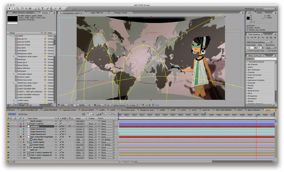
Stéphane's After Effects project window
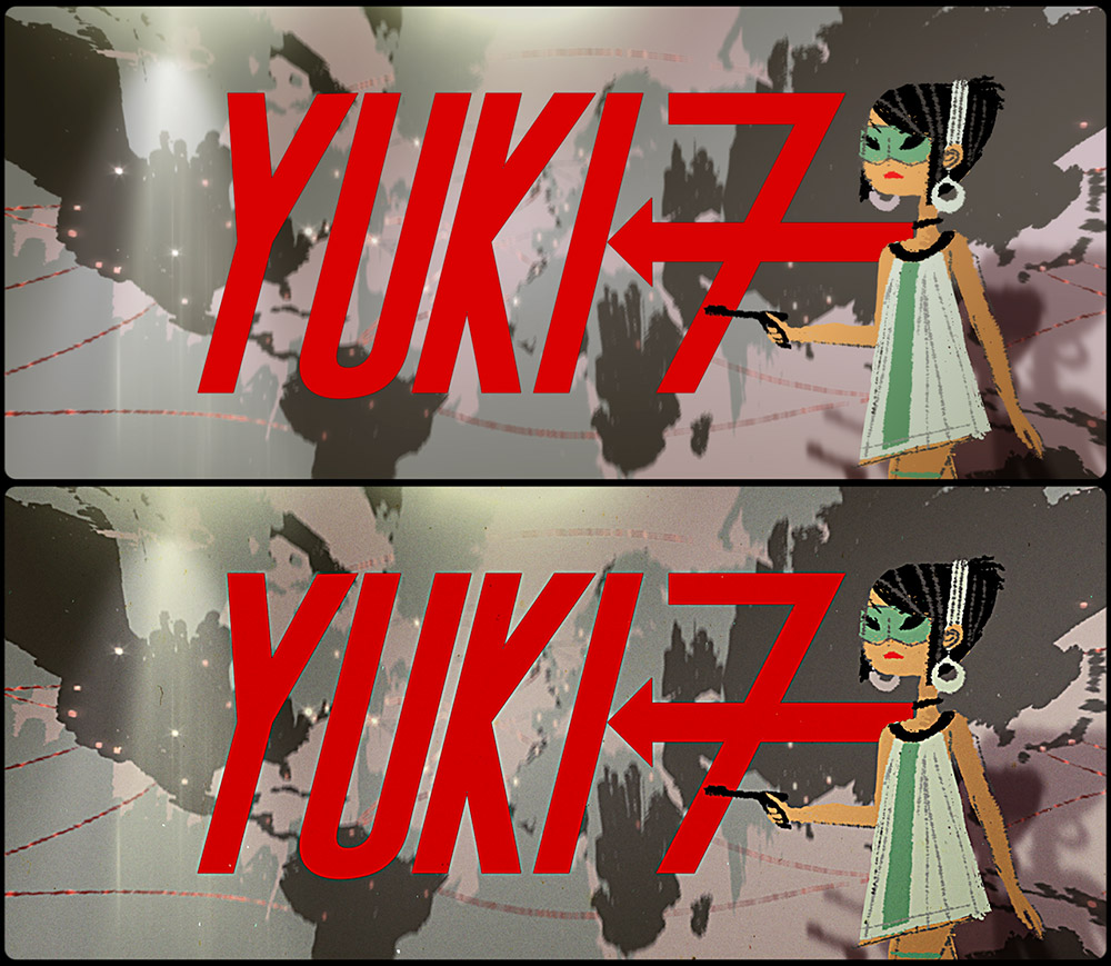
To finish, on top of everything, I put a grading layer to give the colors an old film tone. Then the film grain and the dusts and scratches. I never use the generic After Effects filters for film damage or grain, it’s too noticeable, so I usually customize it and apply it as a footage layer in overlay and set the levels the way I want. The same goes for the dirt layer. That was an SD sequence already shot that I retouched it to make an HD version.
How did you replicate the in-camera and post “imperfections” of the 70′s (60′s) spy-era films?
SC: I’m obsessed by imperfection, I like when there are little mistakes and aberrations in a film. It makes it warmer cause you can feel the people behind the magic. When I was a kid, all the movies were on film, everybody was used to the picture becoming greenish, slightly distorted by the tape one frame before and after a cut. Most special effects were hand made using either a lens trick, a chemical reaction on the film itself, on set pyrotechnics or miniature sets.
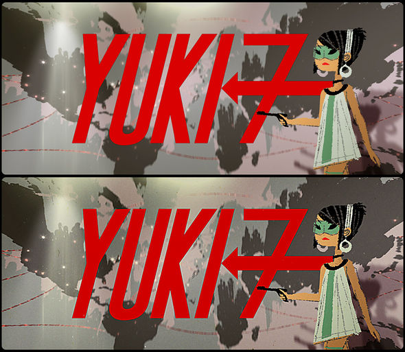
Before and after grading - color, grain and dust
For this project, I only used my memories. I often do that cause it helps me to not limit myself. If I look at some archive footage and try to imitate the imperfections I see, it’ll only be a basic copy. If I use my memory of this imperfection I saw long ago, my imagination and my background might have slightly modified and amplified some part of it, giving it more impact and personality. For example, the not perfect blurry wipe at 00.57 is a thing I remember I’ve seen in The Avengers TV series. The explosion shot is inspired by Jerry Anderson’s TV shows, and the car chase scene is something I saw so many times when I was a kid that I didn’t feel the need to look at old movies to reproduce it.
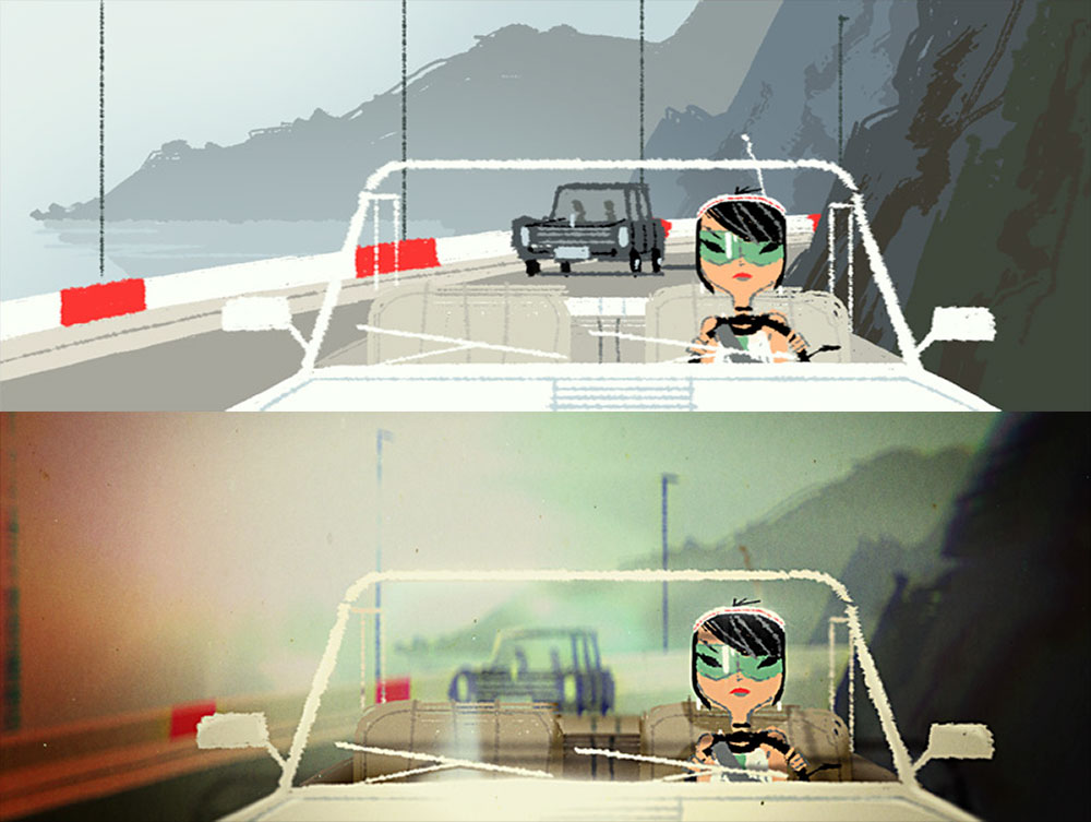
I created one first animation for the background putting the sun in the frame so it would create a lens flare. As the background is supposed to be projected on a screen behind the character in a studio with lights focused on Yuki, I assumed the background picture would be less contrasted and would have a vignette due to the projector itself. And I presume that it was hard for the technicians to avoid having any drop shadow of the foreground elements on the screen, so you can see at the bottom of the picture, on each side of the car the drop shadow of its front window’s frame. And Also, the light direction is totally wrong as the sun is in Yuki’s back but she’s lit from the front. It’s typical of those old school scenes.

Grading on the "rear screen projection" chase
While collaborating, did Stéphane ever ask for something different that what you had already provided?
KD: After we started doing the final scenes I recall Steph writing me about a building that was exploding in the background and asked me why I hadn’t put that in the final scene so we did wind up including that. There are some scene that I believe he switched around so they would flow better. There were times were Steph would ask for extra elements. All his ideas really enhanced where the trailer was going.
Was there much back and forth between the two of you?
SC: Actually not that much, Kevin was busy producing artworks for his book and I was also working on some other projects at the same time. I was using my free time working on the trailer. I would keep Kevin updated with small videos of the latest scenes I did and, quite often he was happy with it, sometimes he would suggest some clever changes or I would ask him to produce a new elements which I thought would help to tell the story. I have to say, this was one of the smoothest collaboration I’ve had.
The trailer seems to have become a really good marketing tool for the book even though it wasn’t initially envisioned this way.
KD: We wanted to include a companion piece DVD to include with the book. But that didn’t happen for a few reasons. I didn’t realize how expensive it is to make DVDs. Also, once the trailer was finished I showed it to a few friends and became obvious that this was something we had to put out there for people to see. We were confused as to what we would do with the trailer up until the point that we released it. I didn’t expect the response it got but was super excited by it all.
When was the trailer finished?
KD: Pretty much the same time as we were finishing up the book which was early March this year. Originally the trailer delivery was to coincide with the DVD. We ended up not doing that but it was amazing seeing the trailer and one of the hardest things was not showing it to people. I had a feeling that people were really going to like it and we kinda had to just sit on it for 3 or 4 months until the time was right to show it off.

Horia Dociu's Yuki 7 artwork
How do you keep your focus?
KD: Keeping focus is always a struggle. We didn’t have much money to make this trailer but both Steph and I were really passionate about this so it wasn’t hard to carve out time to work on this. I believe he had to work on this on nights and weekends.
With the Yuki stuff, it was a project with passion, I never had any problems motivating myself to keep going with it, which is kind of a new experience for me because most personal projects I work on kinda fizzle after a few month but this one, for whatever reason, kept going.
SC: It depends of the job, sometimes it can be hard to keep a clear vision of where you wanna go, but here, it was obvious from the start. I had everything in my head already, all those references I’ve had for so long were just waiting to be digested and used. It was like going home in a way, I didn’t have to think, I knew already how I would proceed for each scene, what filters I would use and what it would look like at the end.
Where do you want to take the character? You’ve done the book, which details the world. You’ve done the trailer detailing one of the films from that world. Where else do you see this going?
KD: I’m kind of hoping the character takes on a life of its own with people picking it up and talking about it. More books, a graphic novel perhaps. I’d like to involve more people with the project to help expand the universe. I’m hoping to pitch it around to studios as a feature idea or something along those lines.
Are you suggesting something more open sourced?
KD: That’s been one of the most fascinating things about this project. I was always very attached to the character but never so attached that I wouldn’t let others input their ideas. Through every step, when I contacted different artists to contribute to the book they would ask “What can I do with this character? Is it okay to do this?” I didn’t have any rules because I was interested to see what they would do. To me, this is a kind of big playground that is open to all these different ideas.
And it was the same with Stéph. I didn’t really have notes for him on the stuff he was doing because I saw it as something he would inject his own vision into. I never worried that Stephan would come back with something that was not in line with what I was trying to do. It was amazing to me to see how it all came together.
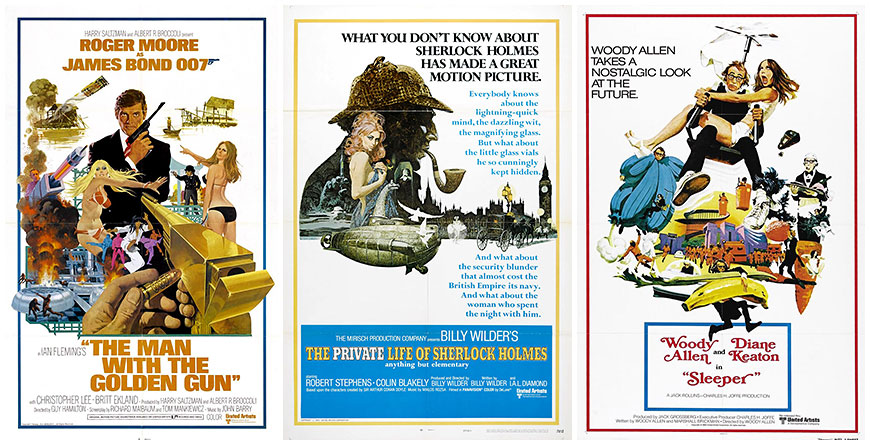
Robert McGiness film poster artwork
What inspired you on this project?
KD: I think a lot of it was the collaborative aspect of it, seeing the stuff my friends did for it and seeing how excited they got about it, kept me excited the whole time. There were a lot times I got pretty bummed out about how it was going but then something would always happen, like one of my friends would send me a piece of artwork that they’d done and it would get me excited all over again. I’d say that my friends inspire me more than anything.
As far as looking back at what makes me do what I do, it’s a lot of great movie poster illustrators, especially Bob Peak and Robert McGiness. I think there was a time in the 50s and 60s where illustration reached…I don’t want to say it peaked because that’s kind of depressing, but it was age for illustration where people were experimenting and doing things you just don’t see anymore. It’s kind of sad when you see movie posters nowadays and you compare them to the illustrated movie posters they used to do. None of the new posters really capture the scale and the sense of adventure that the older posters were able to do.

Bob Peak's film poster key artwork
So what’s next for you?
KD: The first two or three months of this year I wasn’t really taking any freelance work because I was so focused on finishing this book and the trailer. The day we sent the pdf to the printer I had to start on a new freelance job since I’d been putting this stuff off. Right now I’m working with Pete Candeland again on a new commercial at Passion, and I think Stef’s going to be working on it to.
SC: I finished a new opening title for a pilot created by Charlie Bean for Cartoon Network and I’m working as a compositor on a short film directed by Chris Garbutt also for Cartoon Network. I plan to start working on my first short in September.

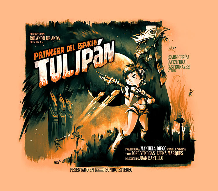
Princesa Del Espacio Tulipan poster by Kevin Dart


