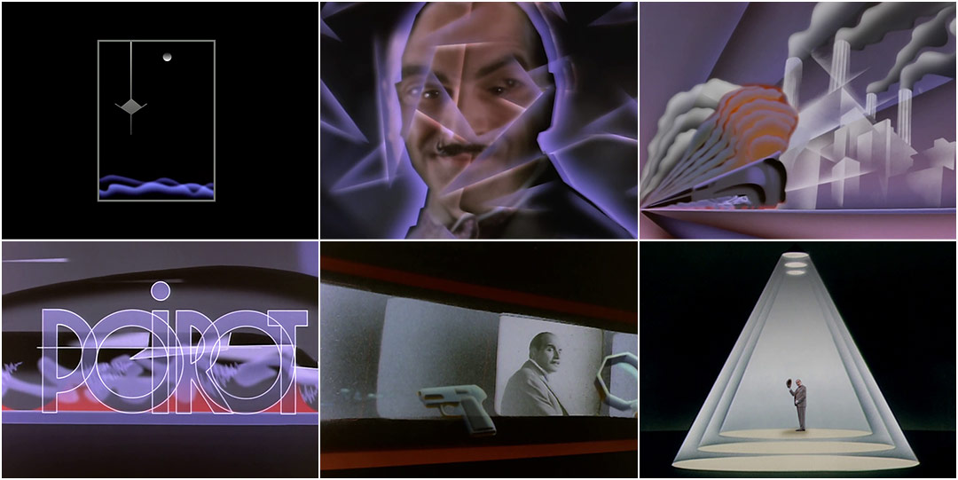
A blue fog dances underneath a curious collection of shapes. A plumb-bob and the moon framed in white? What does it mean? The distinctive profile (and moustache) of Agatha Christie’s famed detective Hercule Poirot is soon added to the mix, helping viewers to crack the case of this sparsely adorned dust jacket. The mystery is a mystery. As the book folds open, the formerly silhouetted Poirot emerges from the page, the bow-tied Belgian smiling from behind a puzzling cascade of geometry.
The showering shapes arrange themselves, replacing Poirot with signs of his interbellum times: biplanes and speeding locomotives – Art Deco iconography in flight. (In a fleeting reference to Poirot’s most famous case, Murder on the Orient Express, the smirking sleuth is glimpsed aboard the passing train that spells out his name.) Neat, tidy, and streamlined, the sequence evokes the ideals of the age and expose the fastidiously styled (and notoriously detail oriented) Poirot as very much a product of the era.
Title Designer Pat Gavin puts order and method (and his little grey cells) to work for ITV’s Agatha Christie’s Poirot.
Title Designer PAT GAVIN revisits his work on the opening titles and discusses their creation.
PG: The Poirot titles were the last ones I made for London Weekend Television, in 1988. However, they were the first titles that I conceived and designed on a Quantel Paintbox* and then put together on the system that became Animo.
*The Quantel Paintbox was a dedicated computer graphics workstation for composition of broadcast television video and graphics. Following its initial launch in 1981, it revolutionised the production of television graphics.
It was my job to set the tone for the show. The idea for the titles was a portrait of a man and his time. The late Mike Oxley – or “OXO” as we called him – was the production designer and we put our heads together and found we were both thinking about Art Deco as a stylistic theme. I had some old architectural magazines with all those wonderful buildings of the ’20s and ’30s, with architectural plans, and that was my original inspiration. I wanted to make it all look exactly like architectural photography from that time. They had a wonderful atmosphere. But I wasn't able to quite achieve that look, partly due to budget and partly to not having a clue! I had to find another way, so it became Art Deco–Cubism. I liked the idea of the fractured, multifaceted Cubist style because it reminded me of a puzzle and this is of course what Poirot does – he solves puzzles. Making Poirot himself a bit of a puzzle seemed to describe the man and what he does. Brian Eastman, the producer, and David Suchet, the actor who played Poirot – brilliantly, I might add – both agreed and gave me the green light. David was very helpful during the filming. He was a joy to direct.
Without collaboration and the support of producers and talented artists, though, technology is just that – technology.
I had the means to achieve that look because of the digital tools that became available. Up until that time, mattes on film were not accurate enough because of factors like shrinkage and sprocket weave but the invention of perfect digital matting made it possible. I had tried to do this kind of idea before on a show called Saturday Night Thriller for Michael Grade, the then-programme controller of LWT, but the technology wasn’t there. Without collaboration and the support of producers and talented artists, though, technology is just that – technology.
For the music, I spent time with the composer, Chris Gunning, who was taking his ideas from Rachmaninov and composers working in the ’20s and ’30s and I showed him my thoughts. For the Cassandre-style trains, boats, and planes with Poirot's name formed by the wheels, I gave him the storyboard plus some visuals and he worked closely to them. He was great to work with, very responsive. He gave me a track that fit like a glove but also had its own independent voice. I never like to force composers to bend to the visuals because their art is more temporal than the visuals. Like, how long does a painting last? But music has natural cadences and rhythms that can drive a visual and give it a story, bringing it to a satisfying conclusion. In effect, it is the script.
The artwork was a labour of love. I had two assistants who had worked on Roger Rabbit doing all the hand-drawn travelling mattes and we spent two months animating anything that had to move by hand. Then, everything went to the computer for digital paint and trace. This hadn't been done before and was a bit hairy, actually. This part was also where all the graduations and airbrush effects were achieved but we ran out of time and money, so I had to go back to the hand-painted artwork put together on 'Harry*' that I did in an afternoon.
*In 1985, Quantel released the "Harry" effects compositing system/non-linear editor. The Harry was designed to render special effects in non-real time to the video recorded on its built-in hard disk array (much like most computer based non-linear editing systems today).
One of the last things I did was the “Poirot” logo that appears at the start. This was never going to be in the titles, but I was asked by the producer, Brian Eastman, if I would do a bit of artwork for the wrap party invitation so I drew it up quickly. I did it in about half an hour but Brian liked it so much that he suggested we put it somewhere in the titles. So I had to adapt it a bit and in it went!
It was a lot of fun doing these titles. I had been doing title sequences and small animated films since 1967 and it took me a while to learn my trade. I was an illustrator turned designer turned animator and director, and while learning through those processes, I was responsible for some real dross! Then, I got to know what I was doing and I'm happy with the good stuff I was able to make. This includes title sequences for The South Bank Show – for which I did eleven titles in all – Hey, Good Looking!, The London Weekend Show, 20th Century Box, Clive Barker’s A - Z of Horror, Expert Witness, and music videos for Sting, Electric Light Orchestra, Led Zeppelin, The Band, and Fleetwood Mac. I have written and directed a film about the eccentric French composer Erik Satie called Erik Satie Passing Through and have been involved in countless commercials as a company director of Hibbert Ralph and as an animation director.
I'm now painting and have my first show, a set of paintings called “Welcome To Hollywood, Mr. Hitchcock,” that opens in April 2013 in Melbourne, Australia.


