In the opening moments of American Psycho (2000), Director Mary Harron presents a perfect amuse-bouche for the satirical horror to come.
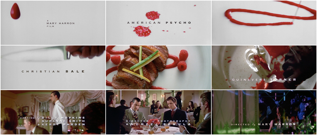
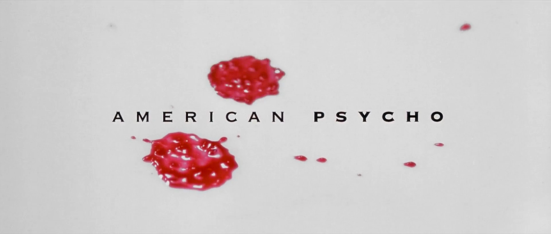
The controversial adaptation of Bret Easton Ellis’s novel of the same name opens with bloody drops falling in elegant slow motion in a stark white vacuum. An uncomfortable hum lingers while they fall, each red drop punctuated by a sharp trill of violins. The tone is elegant and sleek, the pacing slow and ominous. When Harron’s credit appears, the music quickens, the blood spattering over a pristine white surface. The title appears, the squat letters tracked wide across the space. The red keeps coming, now in rivulets, snaking itself across the void. A knife, raised high, gleams silver in the light — a nod to Hitchcock, of course — and hacks into a hunk of meat, turning notions of murder and violence into something ordinary — a culinary gesture. Plump raspberries bounce onto an exquisitely plated dish of late ’80s-era nouvelle cuisine. This ballet of blood and visual trickery is our entry into American Psycho, its sense of humour and its commentary: sharp and cutting, viciously playful, and all a matter of taste.
Look at that subtle off-white coloring
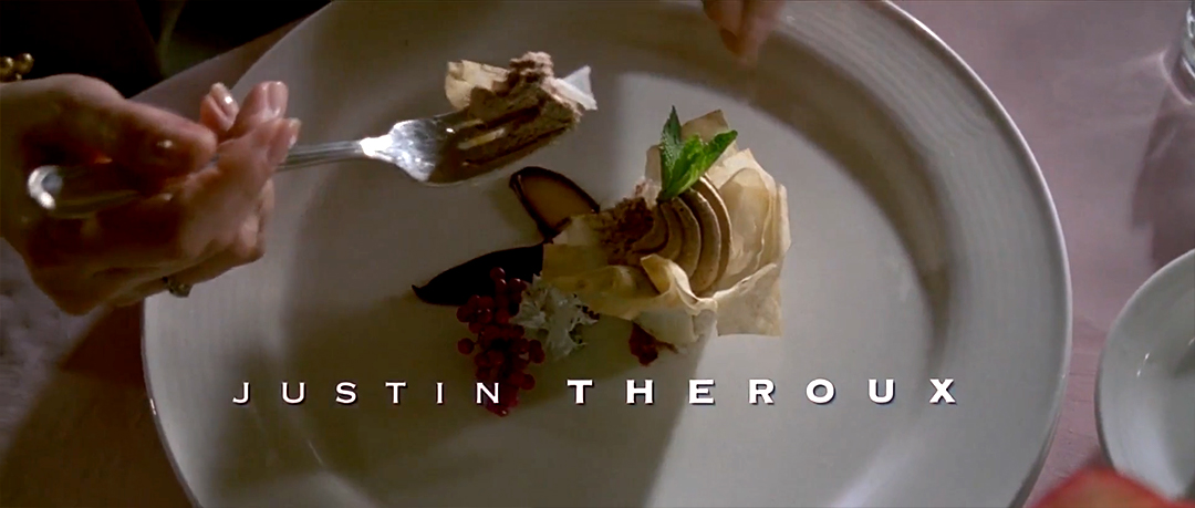
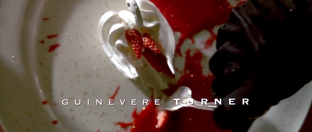
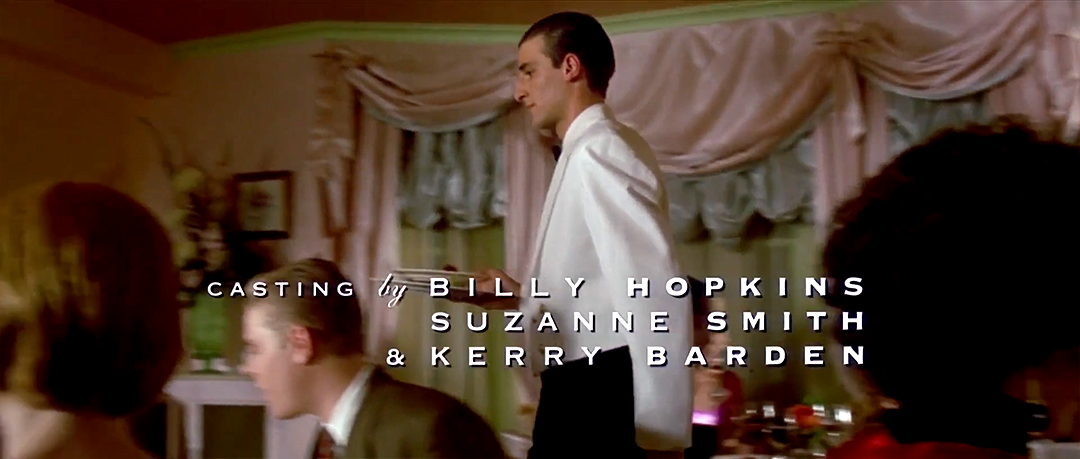
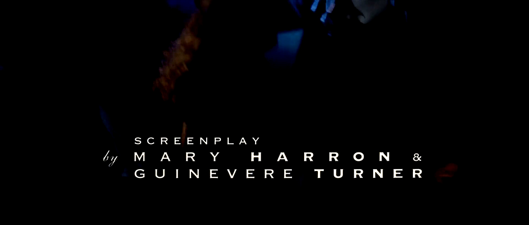
Designed by artist and activist Marlene McCarty, the credits are set in Copperplate Gothic, a typeface popular in the 1980s and often associated with authority, large institutions, banking and power. Staid and stacked, the credits are aligned to a grid and, like the plates of food, arranged in perfect balance. They appear either to the left, to the right, or just beneath the center horizontal line of the screen, not a hairspace out of place. A formal and crisp wedge serif, Copperplate Gothic was designed by typographer Frederic Goudy a century earlier in 1901. It has no lowercase characters, only small caps, and is often used by title designers because of its uniformity and barely-there-serifs which help maintain legibility at smaller sizes. The typeface appears in much the same manner – ominous, sterile, high class – in David Fincher's Panic Room.
The tasteful thickness of it
In likening the act of murder to food preparation – and therefore positing people as objects to be consumed – the opening establishes the film's themes of violence and possession, conspicuous consumption, and the perversion of the American dream. It also frames the serial killer as artful butcher and sets the precedent for television series like Dexter (2006) and Hannibal (2013).
Among the pale roses and fine plating, the flourishes of pastry and foie gras, the cigarettes and satin gloves, a set of slicked-back suits slap down platinum cards. One of them is the maniacal monster, “the voice of reason, the boy next door,” and dressed to kill.
A discussion with American Psycho Director MARY HARRON and Title Designer MARLENE McCARTY.
American Psycho has this exquisite title sequence that sets up the tone for the film. What was your process for creating that?
Mary: Originally, no title sequence was budgeted. So there was no title sequence planned; it wasn’t written into the script. It was only when I was editing that it seemed we needed it.
I had this image of 1980s nouvelle cuisine... a lot of raspberry coulis. The idea of drops of red sauce that look like blood. That was the initial thought – drops of sauce on a white plate and you’d think it was blood.
—Director Mary HarronIf you get the typography wrong, it’s like getting the hairstyles wrong.
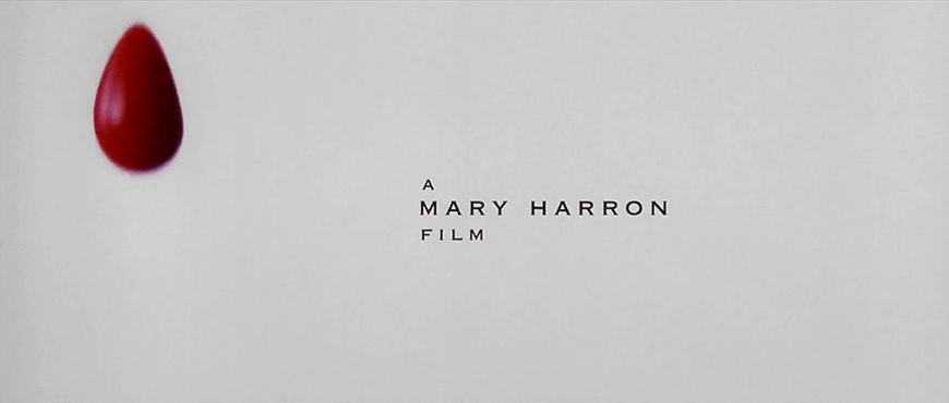
Still from the American Psycho (2000) title sequence featuring a drop of "blood" and Mary Harron's credit
Mary: One of the reasons I wanted a slightly jokey and dark title sequence was that it would set up the whole tone of the film: Nothing is what it seems. Don’t trust surfaces. It’s that idea of food and blood, that reversal. Then we got the idea of the knife coming through the air.
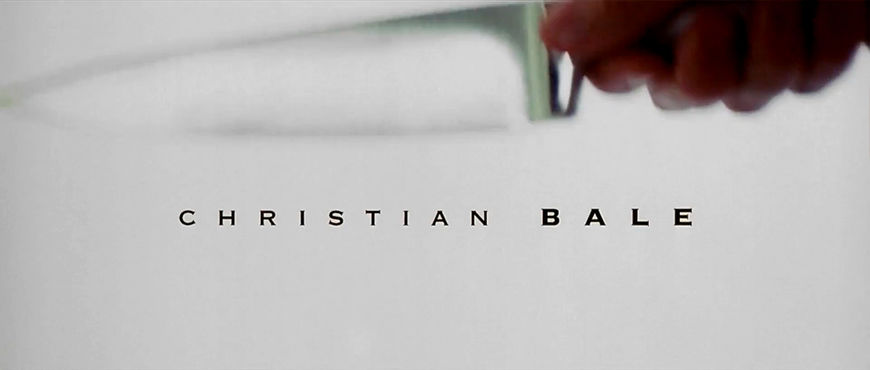
Still from the American Psycho (2000) title sequence featuring a knife and Christian Bale's credit
Mary: I must have talked to Marlene then. She had done the title sequence for my first film, I Shot Andy Warhol. She’s great. It’s nice when it’s someone who’s a visual artist because conceptually you can be on the same page.
Marlene: It was very much a back-and-forth. I work very, very closely and collaboratively with each director. Basically I would start out and I would send Mary thumbnails of ideas and she would react to those and start sending me ideas so it was a collaborative thing between us.
I Shot Andy Warhol (1996) main titles, designed by Marlene McCarty and Bureau
Did you storyboard the opening?
Marlene: Oh yeah, absolutely. I always start working with thumbnails even before getting into animation, which in those days was absolutely necessary. Do I have them? No! Because in 2012, Donald Moffett and I had our archive from Bureau, the studio that the American Psycho titles were produced within, and all of our archives were stored in Chelsea. Hurricane Sandy took care of any of that! So pretty much all of Bureau’s archive was wiped away.
That’s heartbreaking.
Marlene: Yes. So I remember doing storyboards because that’s how I always worked. But I have no artifact from that.
Mary: I remember showing a storyboard and saying, “Look, you can’t just have white lettering on black. You have to set this up properly! You have to have something that matches the look of the rest of the film.” Nobody wanted to finance it, ‘cause it was like, “You already shot the movie”, you know? We had to go and persuade Lionsgate. They understood. This was a low-budget movie. [The title sequence] was probably about $15,000, to give you an idea. The difficult thing was the budget was constrained, but the positive was that I wasn’t.

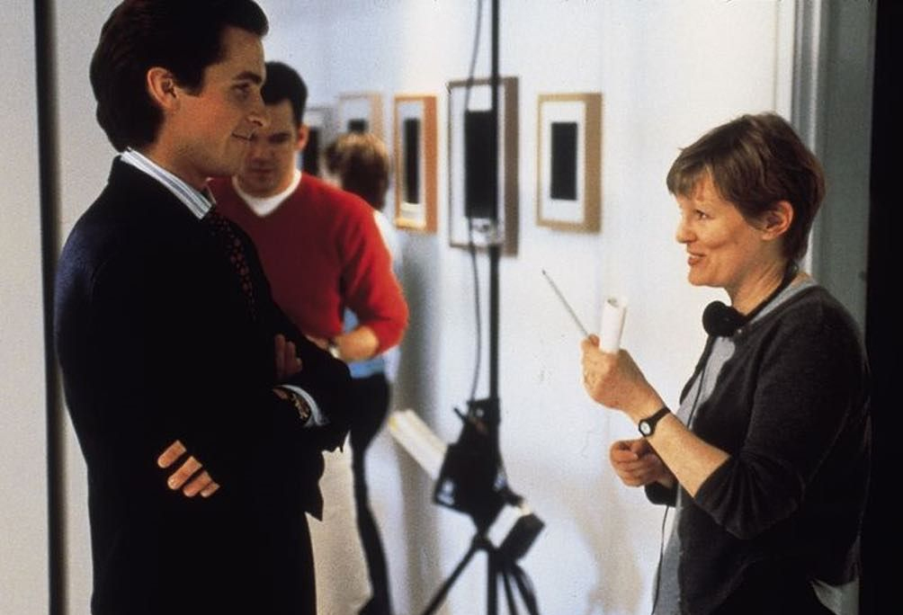
Actor Christian Bale and Director Mary Harron on the set of American Psycho (2000)
That was the good thing about Lionsgate back then – and maybe still is! Nobody was monitoring me. The fight was over getting somebody to finance [the title sequence].
Marlene: Titles happen at the end of a filmmaking process so there’s never any money left, there’s never any time left, there’s always frantic hysterical revisions because somebody’s name is spelled wrong or they gave someone the wrong credit.
Mary: We shot it towards the end when we were in the middle of editing, we just took a day and shot it in a commercial studio space. Once I was in the studio I had carte blanche to do it how I wanted as long as we ended on time. But I remember I didn’t get all the shots I wanted.
Marlene: We couldn’t just turn it around and say, I don’t like this, I didn’t like that. We didn’t have those options.
Mary: We just never had enough time to do the food properly. I wanted the food to look completely pristine and completely styled. There just wasn’t time to light it properly. We shot [the title sequence] more like a commercial so we were able to – in some of these shots – mix some of our special food shots into what we’d already shot of the plates that were being prepared.
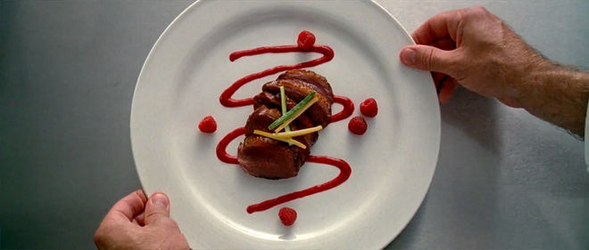
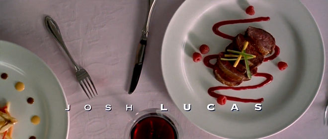
Stills from the American Psycho (2000) title sequence featuring food styling by Rick Ellis and Josh Lucas's credit
Mary: We used a high-speed camera and shot it as if we were doing a commercial for, like, Coca Cola. Beautiful perfect drops of things. That was hard to get. We had a DP . . .
Toshiaki Ozawa?
Mary: Yeah. He came in because Andrzej Sekula, who shot the movie, wasn’t available, and Toshi had done a lot of great commercials. We wanted it to look glossy and beautiful, the light to hit the red drop at the right moment. It was exciting and it allowed us to spend a lot of time getting those shots right.
Marlene: We had to use a super high-speed camera which was super expensive for our budget and it became about working with the camera operator to determine what could possibly be shot in the time we had. And then we had to find food stylists who could do it on budget… it kept growing.


Stills from the American Psycho (2000) title sequence featuring nouvelle cuisine food styling by Rick Ellis and credits for actor Justin Theroux and actor (and screenwriter) Guinevere Turner
So all of the drops of blood on the white background, that was all done in-camera?
Mary: Yeah! It’s not digital. We may have fiddled with them, coloured them, but it was done in the studio, in camera. We were shooting on film and you tried to get everything in camera. We had a top food stylist and that was great because it was all about getting that beautiful look.
That is Rick Ellis, the food stylist?
Mary: Rick Ellis, yeah. He did an amazing job. My one regret was that they pulled the plug on me before I got to shoot all the beautiful food he set up.
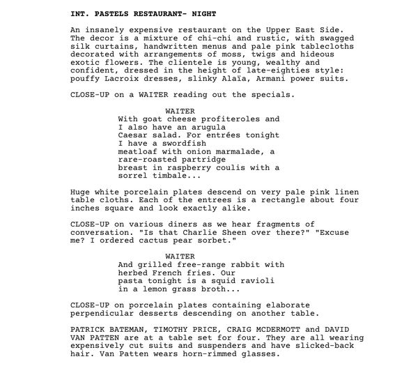
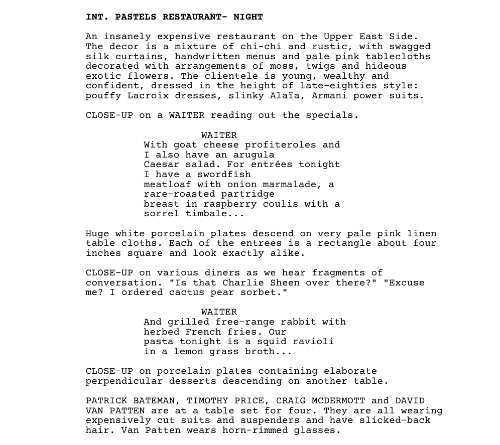
Excerpt from the opening of the script for American Psycho (2000), written by Mary Harron and Guinevere Turner
In the shooting script that you co-wrote with Guinevere Turner, you actually detail the menu and the food.
Mary: Yeah! That’s part of the scene in the restaurant. And we shot some of that when we shot that scene but we hadn’t shot it as carefully and specifically as we later did [for the title sequence], with Rick the stylist.
Did you have other concepts to open the film, besides the blood into raspberries?
Mary: No. No! This was my idea for the title sequence, and we didn’t have any others. John Cale scored it afterwards and the music obviously helps.
What were some of your influences for this opening, that tone you wanted to set up?
Mary: I think Hitchcock is an obvious inspiration. He would do things, you know, you’d think it’s something bad but then it turns out to be harmless. You’re kept off balance.
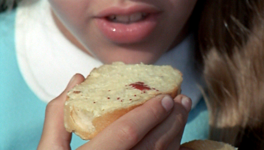
There’s one other influence. When I was a teenager, I saw this film by Claude Chabrol called Le Boucher. There’s a scene where teachers bring kids on a picnic and there’s a child with a white roll, white fresh bread, and these drops of red splashing on this white roll. It turns out that it’s blood dripping from a body that’s hidden in the hill above.

Still from a scene in Le Boucher (1970), directed by Claude Chabrol, in which a girl realizes the red spot on her bread roll is not jam but blood.
Did you have any influences in terms of title design?
Mary: I mean, there are title sequences that I love! The one that David Fincher did for Se7en…. I just remember thinking, “Oh my god, that’s an absolutely incredible title sequence!” [laughs]
Marlene: I remember seeing Se7en, which kind of blew my mind. Technically it appeared to be so put together.
Mary: I think that was the first time I thought about a title sequence, “That’s amazing.” I know it’s a famous title sequence. He’s so good at those.
Marlene: The way the imagery built a total emotional ecosystem before you even got into the film, I thought that was really masterful. It was like a beacon of change. Se7en marked a switch from analog to digital… even though it’s still very filmic. There was something extremely contemporary about it at that moment.
Mary: Recently I loved the title sequence for Westworld. I just think that’s gorgeous. I watched the whole show, and I always sat through and watched the sequence.
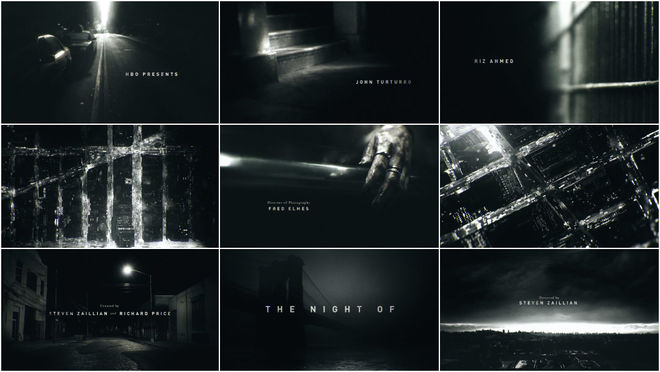
I like the title sequence of The Night Of, that other HBO show. They’re so good.
The Night Of (2016) main titles, created by Method Design
Mary: Those two are gorgeous in very different ways. What I love about them is that they unfold slowly and quite enigmatically and they also show you what it’s going to be about without telling you too much. They set the mood and the tone, and that’s what a great title sequence does.
Have you seen the opening sequence for Dexter?
Mary: You know, I never watched Dexter! Isn’t that weird? That’s so funny. Everyone mentions it and says that they ripped off my title sequence! [laughs] A number of people have said that.
—Director Mary HarronIt is that thing… of knives and food and blood. I do a lot of cooking… you’re dealing with blood in the kitchen so it’s all funny.
Dexter (2006) main titles, created by Digital Kitchen
The aesthetic and a lot of the ideas in American Psycho now appear quite regularly in horror television. This idea of food, how food relates to horror...
Mary: Oh, that’s funny! [laughs] Just like I got some of my ideas from Hitchcock. It is that thing... of knives and food and blood. I do a lot of cooking… you’re dealing with blood in the kitchen so it’s all funny.
In the opening you use a typeface called Copperplate. How did you decide on that?
Mary: Yes! Gideon Ponte, the production designer, found it. We were looking for something 1980s and minimalist. That was very important. I’m very big into typography. Love typography. It’s very important when you’re doing a period film – that all the typography has to be of the period. If you get the typography wrong, it’s like getting the hairstyles wrong.

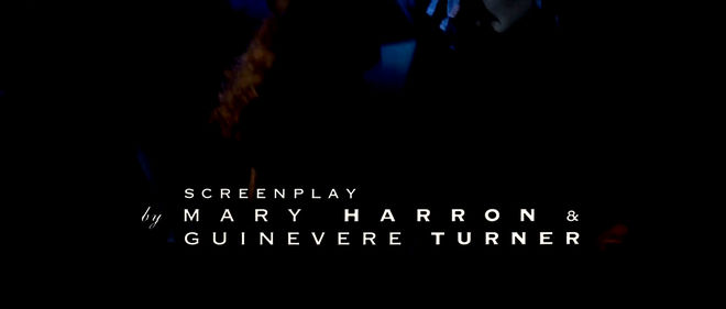
Stills from the American Psycho (2000) title sequence featuring credits set in Copperplate Gothic and stacked according to a grid
Marlene: We were referencing some of the opulence of the 1980s, those American “boom” years, and Copperplate Gothic was a typeface that was used a lot in the late ‘80s to represent money, luxury, power. Originally this typeface was used on signage for banks and law offices so it carried with it the aroma of power and wealth, significant attributes of Patrick Bateman’s character. Prior to doing American Psycho I had worked at M&Co with Tibor Kalman and we used Copperplate Gothic rather a lot then… but always with the idea that it brought that luxury and power to the project. Whether we were using that seriously or whether we were subverting that meaning… so that’s where that idea came from. The kerning was merely a carry over from the stylistic tropes of the ’80s and the grid was loosely based on vertical thirds of the film screen.

Marlene: I can’t remember if I typeset it with an old fashioned typesetter and had it output to negative film for the animator or if I set the type on a computer. American Psycho existed right on that cusp between the analog and the digital.
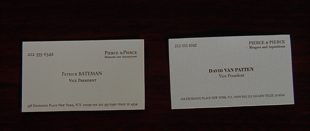
Copperplate, the same typeface, appears again later in that scene with the business cards… It’s like a little callback.
Mary: Yes, indeed. It sets the tone and it’s a bit of a joke. When you see it later, you may not know it’s the same thing. It’s quite an elegant typeface. It’s like, Oh, this is the ultimate. This is so good we used it in our title sequence! [laughs]
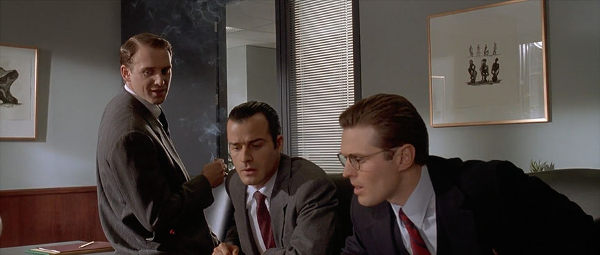
Still from a scene in American Psycho (2000) in which Patrick Bateman and his colleagues compare business cards

Still from a scene in American Psycho (2000) in which Patrick Bateman's card (with "bone" coloring and "the lettering is something called Silian Rail") is compared with David van Patten's card ("eggshell" coloring with "Romalian type")
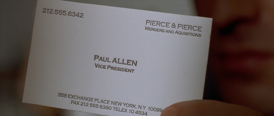
Still from American Psycho (2000) showing Paul Allen's business card featuring the typeface Copperplate Gothic
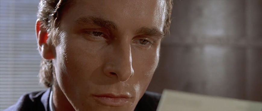
Still from American Psycho (2000) showing Patrick Bateman's reaction to Paul Allen's business card
Marlene, you’re a title designer but you’re also an activist and a graphic artist. How do you approach title design? What does it mean to you to make a title sequence?
Marlene: How do I think about film titles? I came to realize that for me film titles function very much like a really good book cover. You see a book cover, it sets you up for what you’re going to see inside. You’re in Barnes & Noble and sometimes you’re just attracted to a book cover. For me, film titles separate the viewer from the real world and the imaginary world. Typically you would go to a movie theatre and you would see a bunch of ads, a bunch of presenters, big ugly logos, and then there would be the break with the film titles, and then you’re into the movie. I am convinced that film titles function for films in a very similar way that book covers function for books. I wanted to be a part of that atmosphere. That feeling kept me involved in film titles.
Mary, recently you directed the Alias Grace mini-series. What was that like?
Mary: That was more collaborative. I worked with Sarah Polley, who was the writer, and she was originally going to direct but then she asked me to direct it. Netflix and the CBC were pretty hands off – it’s not like making a big studio movie. We had a lot of freedom. That had its own aesthetic.
Alias Grace (2017) main titles, designed by Justin Stephenson
Mary: It’s period, and there’s a lot of stuff about sewing and quilting and women’s domestic work, so it’s very rooted in that, but it’s also about murder. [laughs] Sarah Gadon who plays Grace was always joking, “More blood! More blood!” ‘Cause when we first saw the credit sequence for that I was like, This is great but I want to see more blood. [laughs] I felt it was important to say that there is murder at the heart of this.
How many times would you say you’ve directed something about a murderer now?
Mary: Well! [laughs] I Shot Andy Warhol, American Psycho, Moth Diaries, Alias Grace, The Following… I did an episode of that where we garroted somebody with barbed wire! [laughs]
It’s becoming a strong through line for your career.
Mary: Yes! I’m doing a movie now about the Manson girls. It’s not all I do, I swear!

