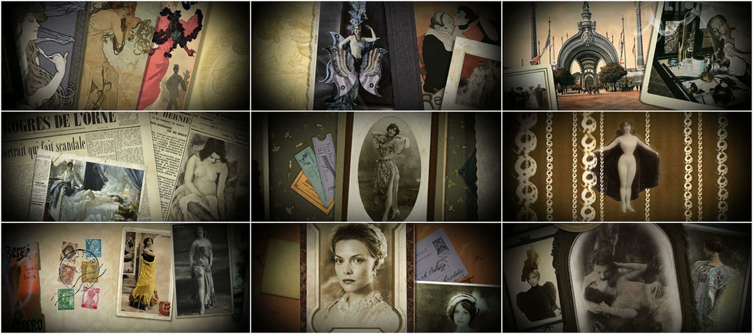
The start of Stephen Frears’ Chéri features the history of the Belle Époque through a series of vignettes comprising patterns, postcards, and images of the most famous courtesans. Narrated by the director himself our colorful journey ends with the introduction of one whose love lies alone, Léa de Lonval, “the most famous of them all…”
Art of the Title spoke with MATTEO MANZINI at Foreign Office, the design studio behind the opening to Chéri.
How did you become involved with the production?
MM: This is our third title sequence for Stephen Frears. Our working relationship with him began on Mrs Henderson Presents – a two and half minute piece of traditional animation. Our previous project with Stephen was The Queen and Chéri began in much the same way, with an elaborate creative treatment progressively being trimmed back to an elegant series of still text cards. However, months later and after initial feedback on earlier edits, Stephen asked us to explore an opening piece that would introduce his leading character (Léa de Lonval, played by Michelle Pfieffer) to the audience, in a visual history of the Belle Époque (a decadent era in France 1890-1914), ensuring that we match in texture, tone and colour, the footage to follow.
What was the time frame?
Initial discussions were in April 2008. Production began on the sequence as you see it, September 2008 and delivery of final sequence was January 2009. There were breaks for various editorial approval and screen tests in-between.
How did you develop the various artistic styles?
Every step of the title sequence was created and thought out by us, in FO. We were given a voice over to follow and the rest is our concept, design and execution. Additionally, Alan MacDonald (production designer for the film) provided support for some of the artwork and helped us to keep in continuity with the style of the film.
One linking element is a background pattern in the sequence that also appears within Léa’s apartment as a wall-paper; we designed all the wall paper patterns, save two. We were provided many old picture frames collected at markets, along with hand written notes and stamps. The newspaper was scanned in off an actual broadsheet, with some slight editorial changes and additional pictures.
Are the photographs originals?
Yes. Despite many of the photographs being of the early 1900’s permission had to be researched and granted before we were allowed to include them in our sequence. Inevitable late changes were made when agreements could not be reached between the Cheri production office and the owners. However, when it came to a particular shot of the Carlton Hotel in Cannes, the very best image we could find (both in quality and resolution) was on someone’s Flickr page. Thus it came to be that a certain Rich Ford earned a credit at the end of the feature by generously allowing us to use an image he took while on a trip. The image is still on his page to see.
How was the sequence put together?
The photo frame cards had to be created, pulling in the separate layers within Photoshop along with some aging of certain images. Background patterns were designed in-house except for two handed us from production (seen as a wallpaper in Léa’s apartment) and smoke elements which are a combination of footage alongside Maya particle effects. All elements were imported into Adobe After Effects, animated and several cameras were seamlessly linked to give the impression of one continuous move.
What was the most difficult aspect of this piece?
We had to create an opening sequence that would introduce, as well as blend organically with the film. The challenge was to avoid a sort of BBC documentary approach with a long carousel of boring pictures. The most difficult thing was to tell the story in an exciting and visually strong manner. We only had a bunch of pictures to work with…nothing else. It was very difficult to bring the piece to a dynamic level yet keeping it as an intro for people that know nothing about the Belle Époque.
One of the biggest challenges was the integration of the known face of Michelle Pfieffer with old images of the period. Careful work had to be done to make them convincing, and often we were only able to use her head or profile. Matching the right Michelle headshot with the correct image of the period, was never easy. All initial pictures, headshots and image combinations had to be cleared by Michelle before fine-tuning and final integration into the sequence. We had to change the lay out weekly due to the availability of some images. The editorial process was very long and kept the project on standby for a time.
Tell us how the decision was made to not include credits? What was the discussion?
As we started to sketch the whole opening title sequence (in an animatic form) it became apparent that the combination of the voice over narration and the many images with titles was going to be too much for the audience to digest. We had to keep the piece faithful to the original brief: to tell quite a long story and let the people know about the Parisian Courtesans and Léa during the Belle Époque. With that, it came quite natural to push the titles a bit later in the film.
What about the use of narration?
The film’s director and screenwriter took that decision. Stephen Frears’ narration was the most obvious way to tell so much in such a short time. In fact, the voice over appears here and there during the film itself and works well in keeping the film and opening titles together.
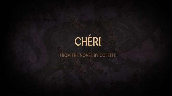
Main title card


