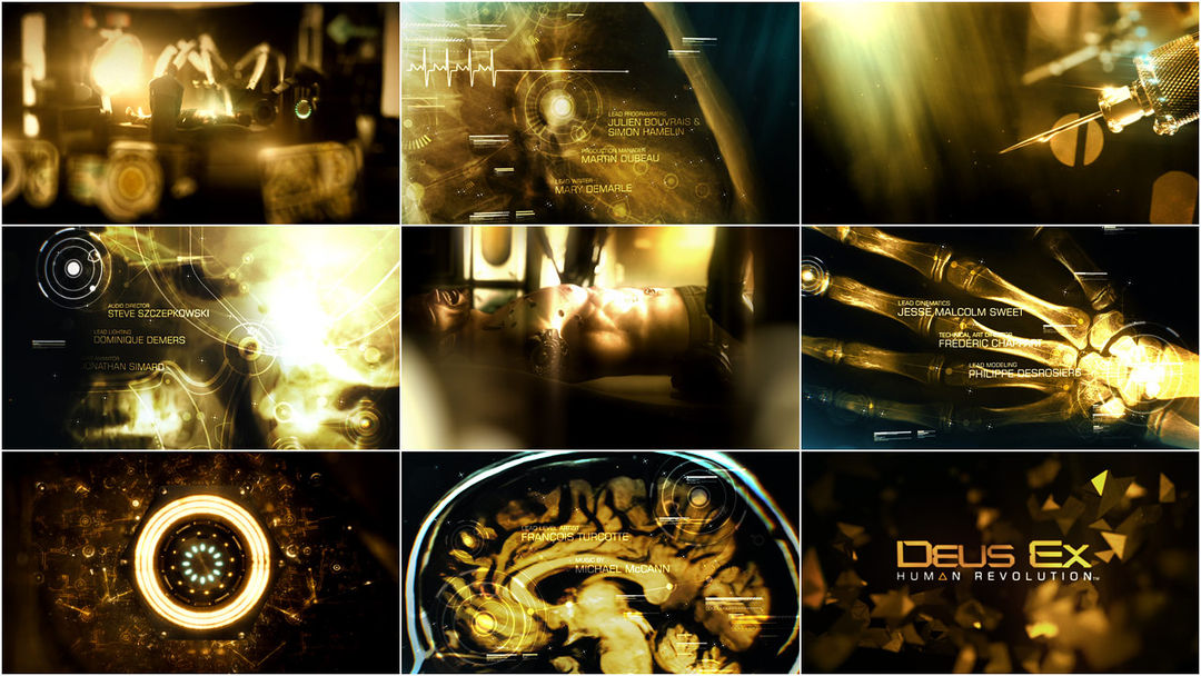
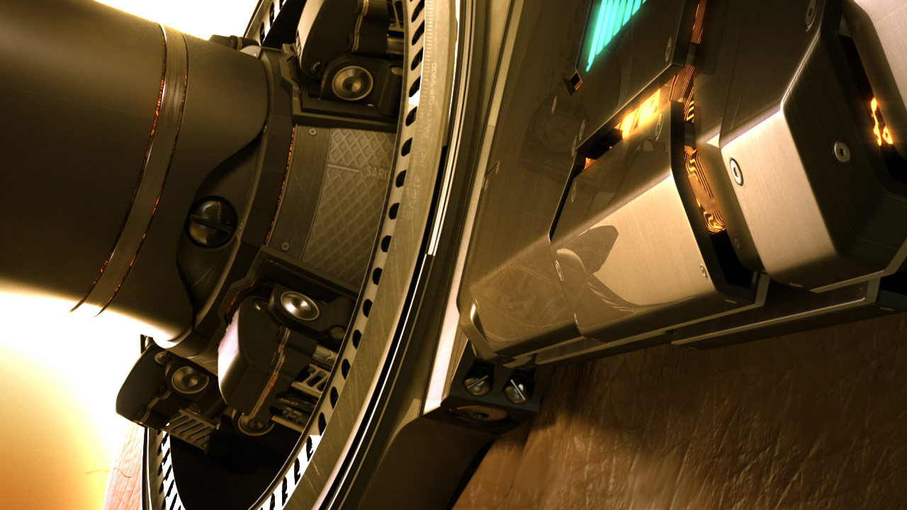
Adam Jensen is dying. The blinding lights of an operating theater melt away in a mechanical fever dream of pleading voices, surgical tools, and rent flesh. Memories of lost love flash between images of a broken and dissected form, while shattered limbs and failing organs – the embodiment of Jensen’s flawed humanity – are replaced with the cold perfection of carbon fiber and silicon. A body restored, a soul fractured – but what remains of the man? A corporate thrall bound to unseen masters or a transcendent being gifted with the power to change everything?
Echoing the central motif of Eidos-Montreal’s video game – the merging of the real and artificial – Goldtooth Creative’s stunning title sequence for Deus Ex: Human Revolution seamlessly blends both live-action and computer-generated imagery to introduce players to a world at the dawn of a cybernetic renaissance.
A discussion with JEAN-FRANÇOIS DUGAS from Eidos-Montreal (Game Director on Deus Ex: Human Revolution) and PAUL FURMINGER from Goldtooth Creative (director of the title sequence).
Could you tell us about the original concept for the title sequence and how it was developed?
JFD: It started with us at Eidos-Montreal. We knew we wanted a sequence that would tell the story of Adam Jensen’s life being saved on an operating table. The thing is, we didn’t want anything basic or expected. We wanted something more stylish and conceptual. We talked to the guys at Goldtooth Creative and explained our idea as to the direction we wanted to take and they started to pitch really creative ideas.
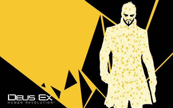
Deus Ex: Human Revolution promo art
PF: Central to the game is the exploration of the murky boundary between man and machine in a technological age. In the opening scene, Adam Jensen, the first-person protagonist, is attacked and left for dead. Without consent, his employer reconstructs his body, saving his life but changing him forever. It was this reconstruction that we needed to depict in the opening title sequence – to show machinery slowly taking over Adam's body and, more importantly, to show his body accepting the augmentations, using them to become stronger, to become something more than human.
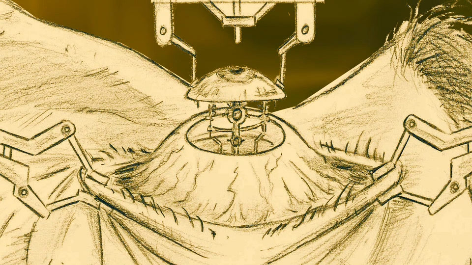
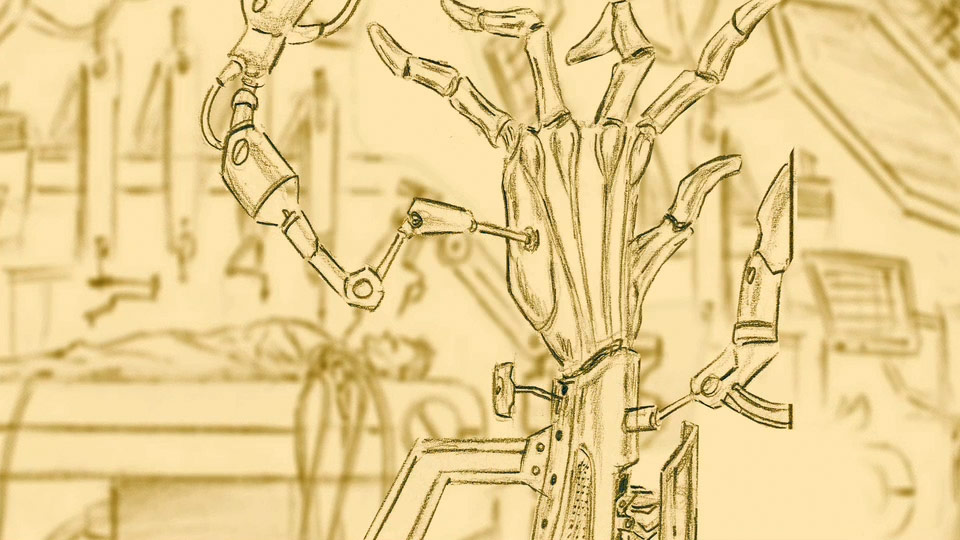
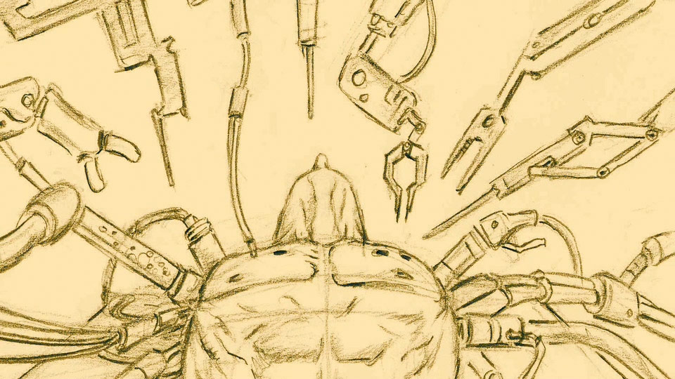
So the original concept was a descent from the macroscopic to the microscopic and from the organic to the mechanical. We started working on storyboards and animatics that began with the gruesome reality of Adam's beaten body and ended with the sublime perfection of veins and circuitry combining at a microscopic level. Though as we worked on it, we found that we weren’t conveying the pain he was enduring during the operation. So we started adding memories of Megan Reed, the ex-girlfriend he failed to protect. The thoughts of lost love and revenge brought a new level of emotion to the piece.

Original storyboards
At what point in the game’s development did work begin on the title sequence?
JFD: We started to work on it in the final year of development for about three months straight.
PF: Yeah, about a year before the ship date, around the same time that we began the pre-rendered cut scenes for the game and just after the release of the E3 CGI trailer.
Deus Ex: Human Revolution E3 Trailer
As co-writer and editor of the trailers, I was very familiar with the material and eager to re-purpose some of the masterful imagery that Visual Works/Square Enix had produced. Because the game resolution was 720p and the trailers were rendered at 1080p, I was able to blow up and reposition elements from the CGI trailers for use in the title sequence. I would’ve loved to get new CGI from the same team for the title sequence, but the timing wasn’t right – the team at Visual Works had already moved on to another project.
Heart render passes
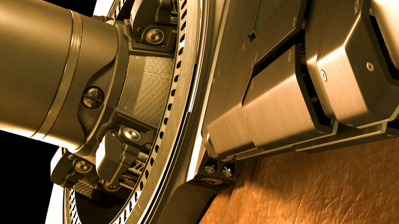
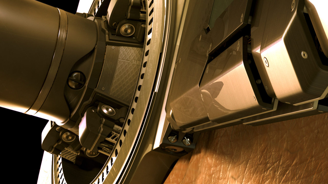
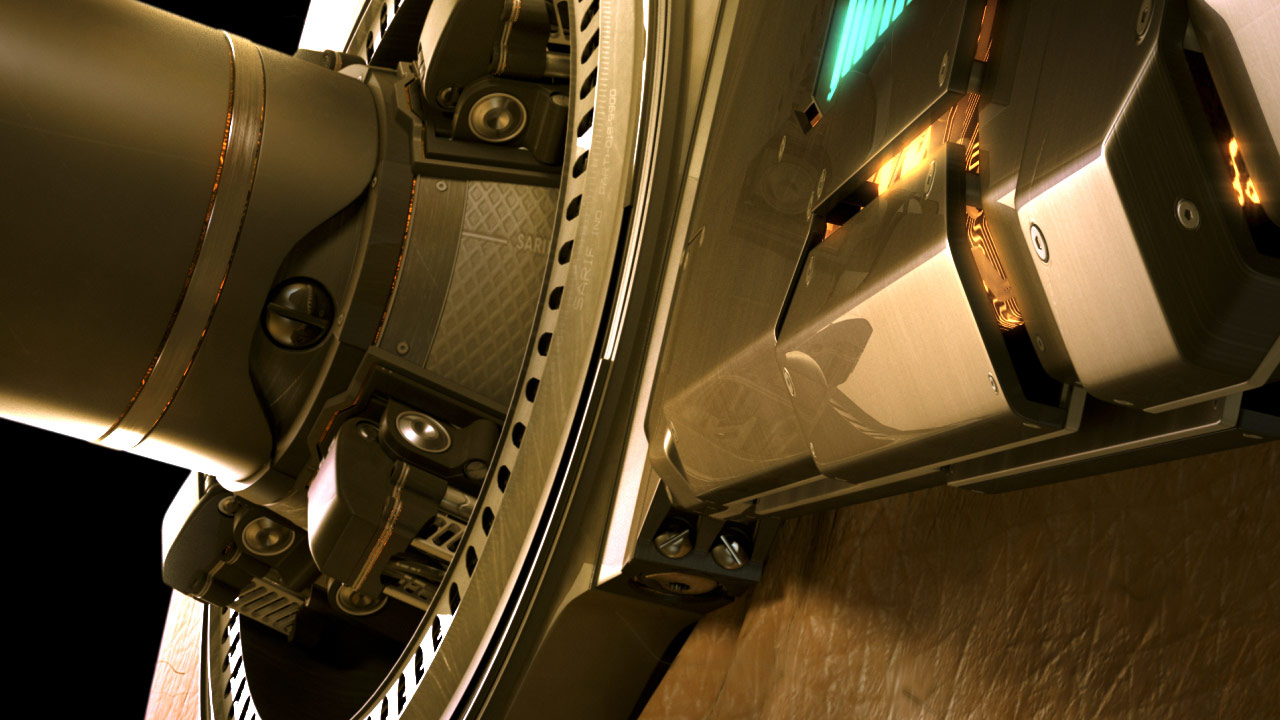
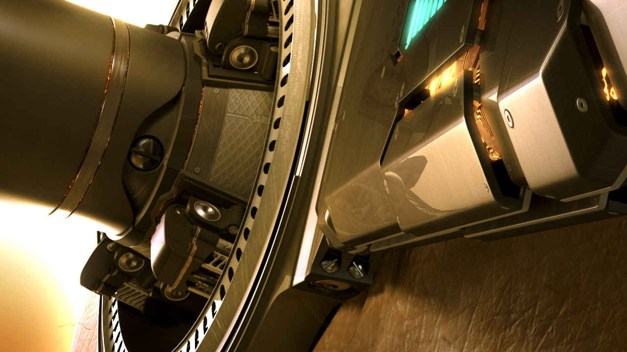
Consequently, the original computer-generated imagery seen in the title sequence had to be created in-house by a small team led by Mike Smith-Kennard. We focused all our CG production energy on key visuals: the heart covered with Sarif-owned circuitry, the gears driving augmentations deep into Jensen's body, and the robotic arm splayed out on the operating table, among others.
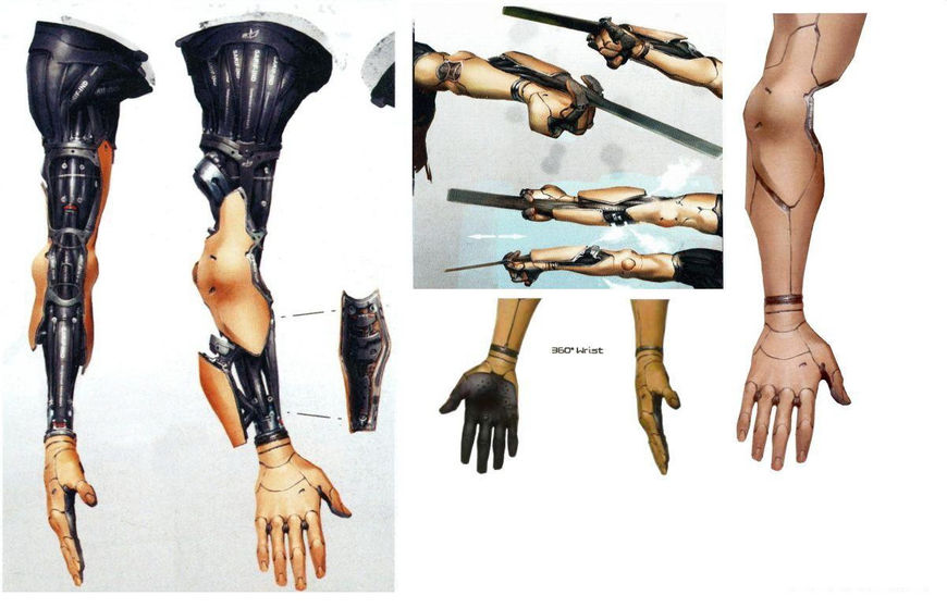
Jensen arm concepts
Arm render passes
High contrast imagery and prominent lens flares figure heavily into the look and feel of both the game and the sequence. How did the two teams achieve a consistent aesthetic?
JFD: Our game has a unique and strong visual signature. It was important to us that everything remained coherent on all fronts. Whether it was a component of the marketing or a piece of the game like the title sequence, it needed to convey the same visual identity. So, it was clear from the get-go that the title sequence would be black & gold with triangles integrated here and there.
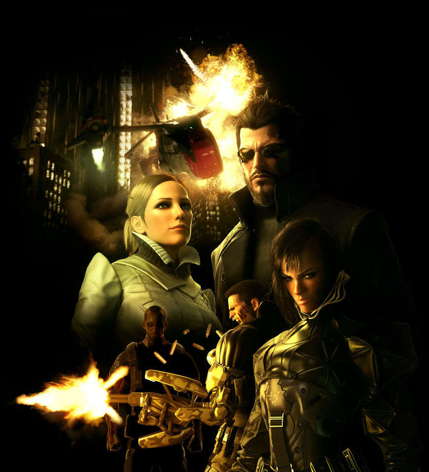
Deus Ex: Human Revolution marketing artwork
As for the lens angle, it was intended to convey a kind of dream-like quality for the sequence as if Jensen lost consciousness and then partially woke up. During this time, he would have flashes of memories or maybe dreams about his ex-girlfriend, Megan Reed.
PF: It was all very ambitious. We knew we’d never be able to create all the CG within the tight timeframe and limited budget, so we decided to shoot live elements to help us tell the story. Paal Wilhelm Nesset, our DP, and Scott Moulton, our production designer, were instrumental in creating live action images that fit in seamlessly.
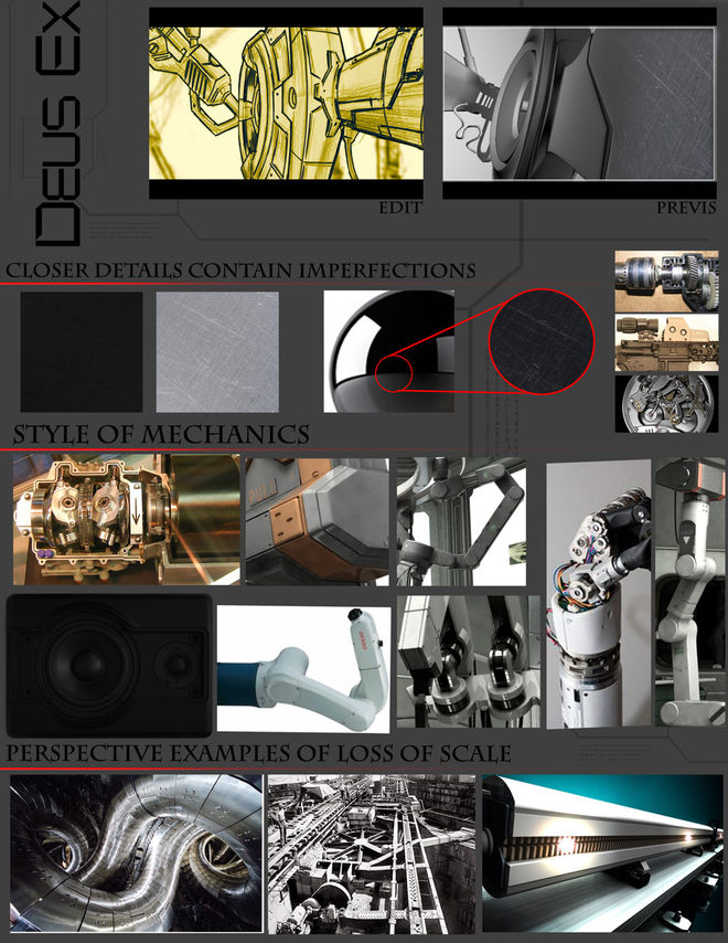
Mechanical reference images
Also, before we shot anything, Pablo Gonzalez – the art director for the sequence – created a post treatment that would allow us to combine our mixed media into a unified look to match the game's art direction. He used depth of field, particles, light rays, vignettes, high contrast, cyan accents, flares, and countless other tricks for that.
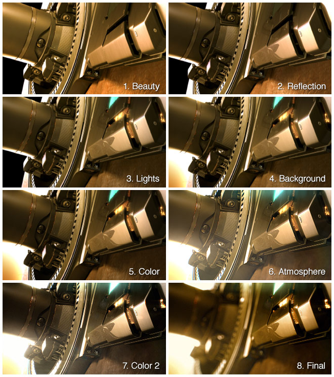
Augmentation render passes
Augmentation render passes
How did you approach the live-action portion of the sequence?
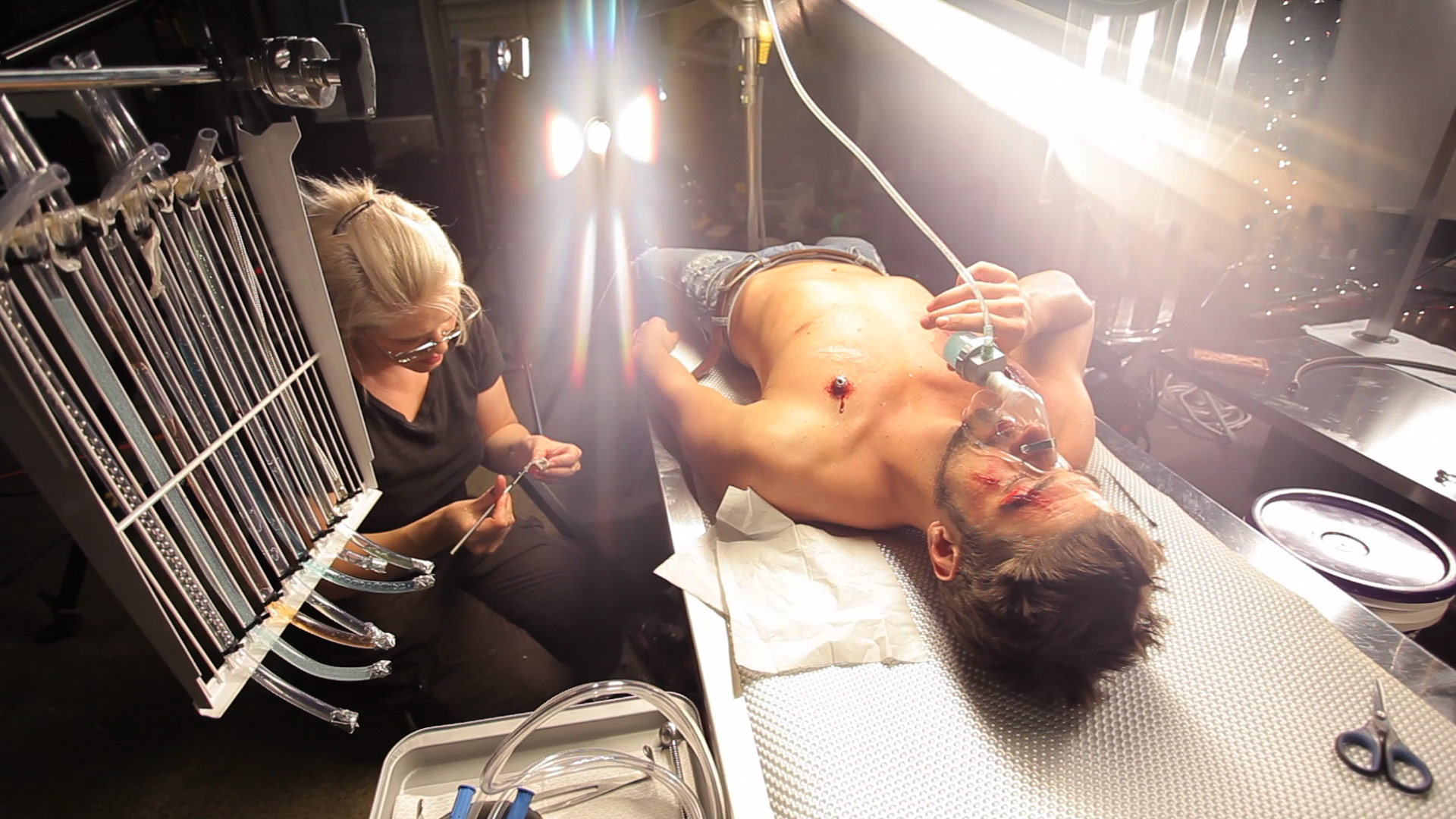
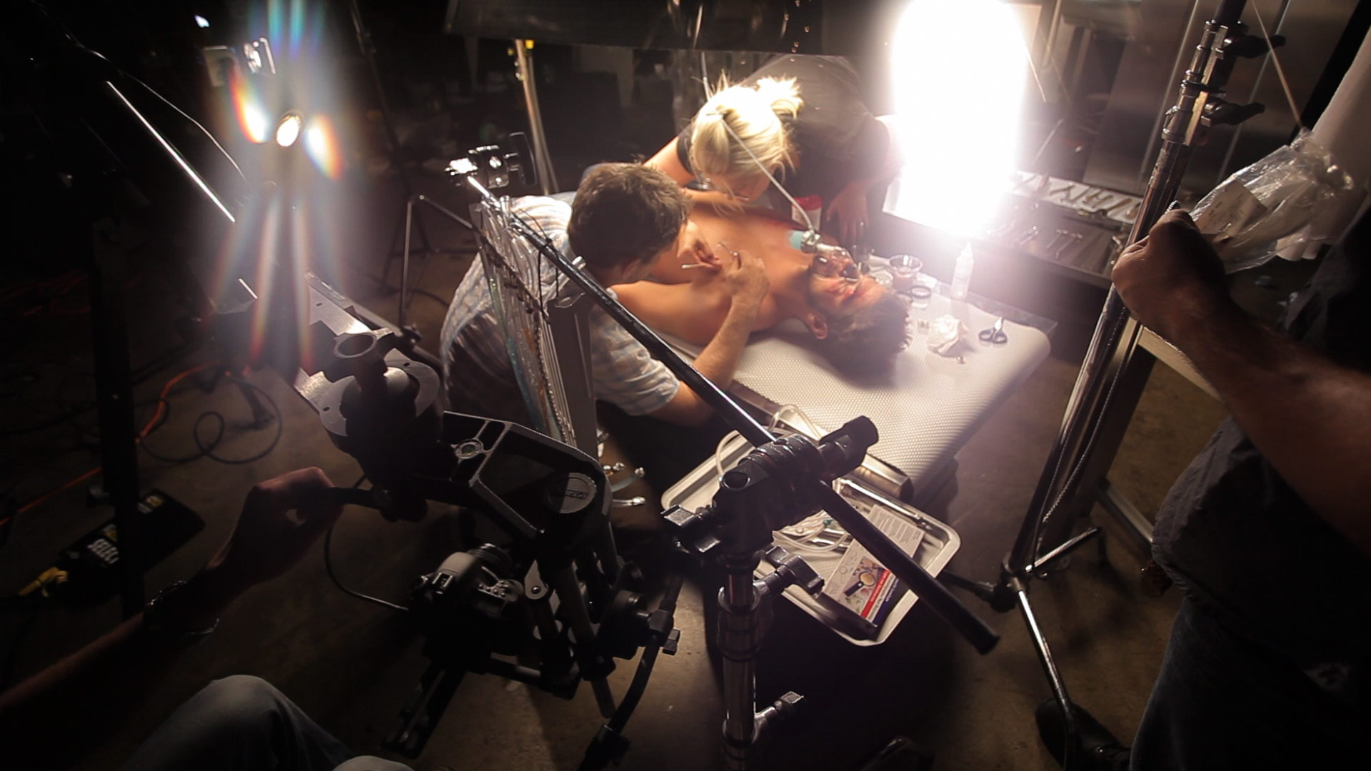
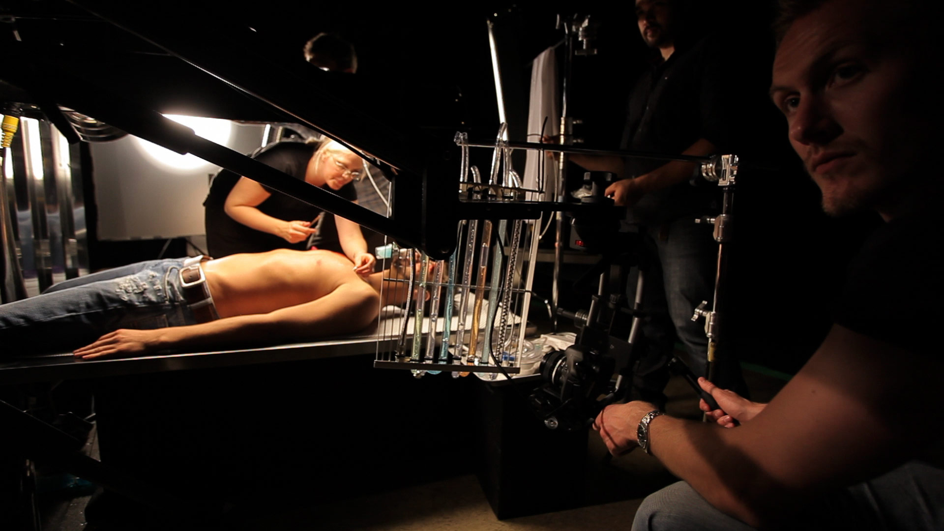
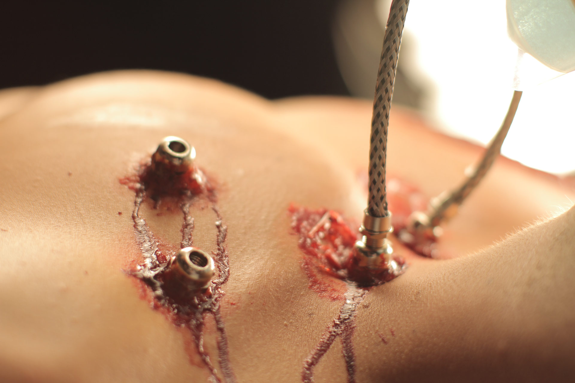
PF: Once we decided to take the mixed media approach for the opening credits, I went through the animatic and clearly defined the shots that would need live-action elements. The entire shoot was done over two easy days, each around eight hours, which is very relaxed for a live-action shoot. On the first morning, we shot all the love scenes with our Megan and Adam lookalikes. In the afternoon, we put Adam on our futuristic operating table and got all of the surgery shots. On the second day, we shot all of the still elements, the pyro/effects plates, and we did the more serious operation shots – for example, we shot the circular saw cutting into the fake human body on the second day.
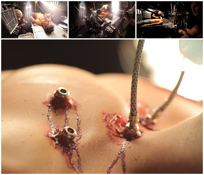
Live-action shoot
As far as putting it all together, the goal was always to seamlessly blend the CG, motion graphics, and live-action shots to create a surreal, etherized vision of the operation. I worked with Scott, our production designer, to find elements that would fit into the world already defined by the CG shots. Often, Scott created the futuristic surgical tools by taking parts from modern-day computers, household hardware, power tools, and medical supplies.
Then with Paal, our DP, we created simple rules that we would also follow when compositing the CG and motion graphics: 1) always light for the black and gold look, knowing that the blacks will be crushed in post, adding cyan accents where possible; 2) shine lights directly into the camera (there are lots of lens flares in the future!); 3) shoot with as many foreground elements as possible with very shallow depth of field in order to hide the boundary between live action and CG elements; 4) add atmosphere and particles to as many shots as possible (scenes with many layers were shot clean and the particles were added in compositing).
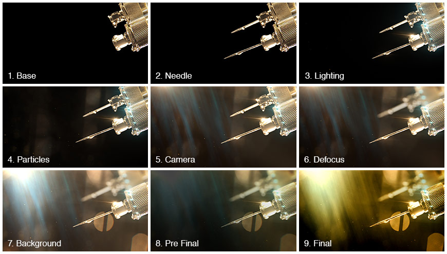
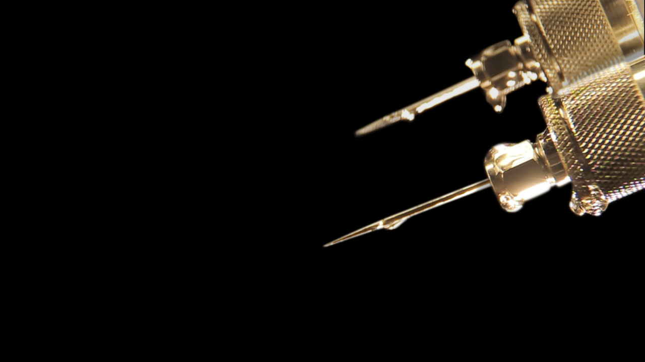
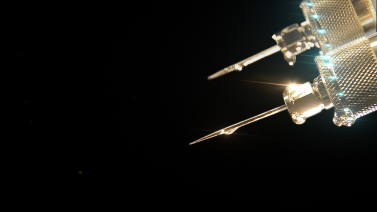
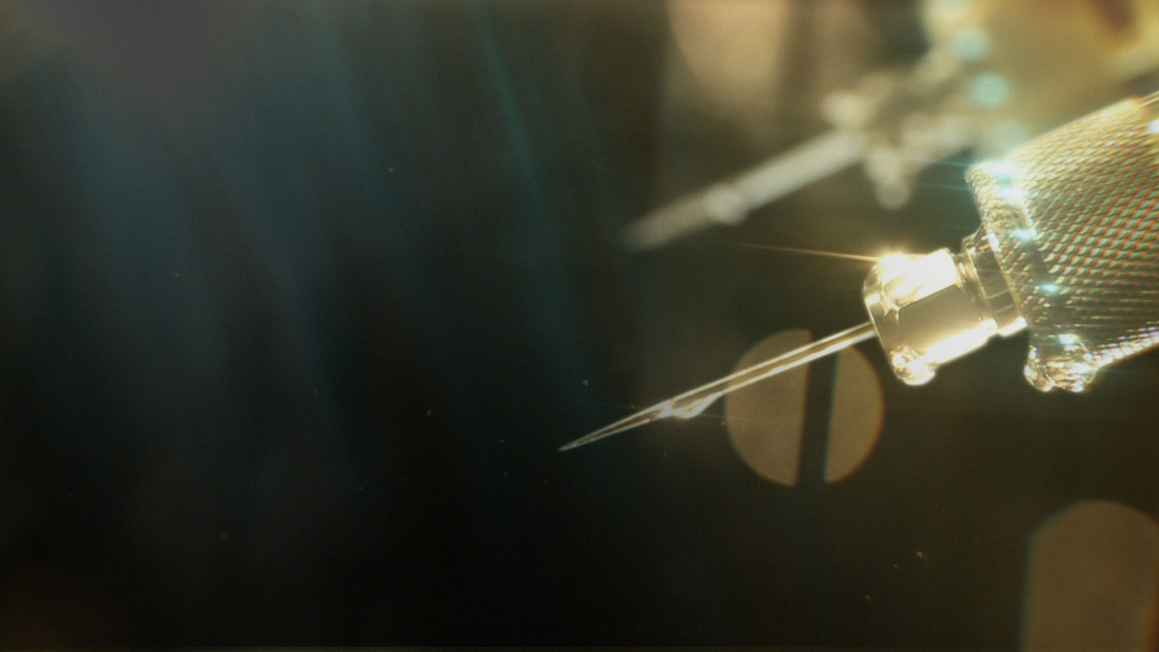
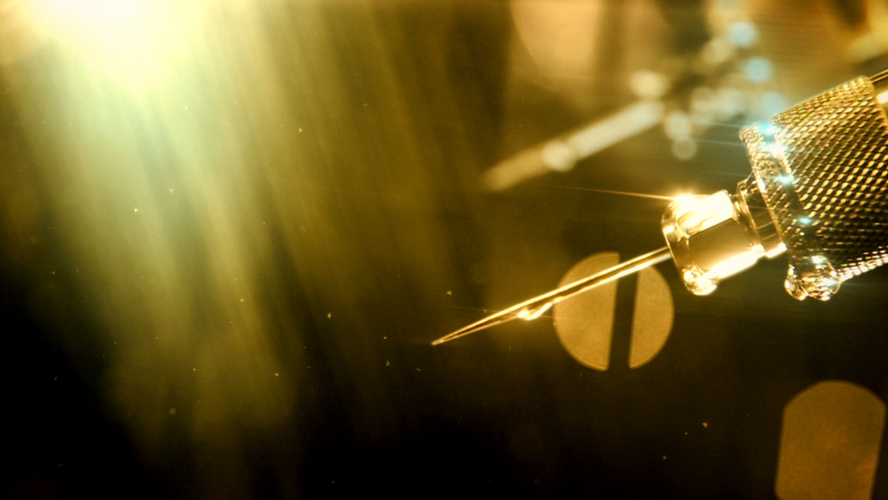
Needle render passes
In the final sequence, there are 25 shots, not counting the title cards. Of those 25 shots, 14 are live action, 9 are computer-generated, and two were created in motion graphics using 2D animation on stills and photographed elements. The laser shot, for example, was entirely created from one still of a horse tranquilizer that we shot on our second day. The still was modified in Photoshop and then animated in After Effects.
The CG was done in Maya. Most of the show was comp'd in After Effects and some shots were comped in Nuke. For plugins we used Trapcode Particular, Frischluft DOF, Optical Flares and the Sapphire plugins.
What were some of your references for the sequence?
PF: The two biggest references for this piece were the title sequences for The Six Million Dollar Man and Ghost in the Shell.
JFD: Also, various James Bond opening sequences and Bjork’s video for “All is Full of Love” by Chris Cunningham.
The Six Million Dollar Man opening title sequence
At what point in the process was Michael McCann's score introduced? Was there ever a temporary track in place or did the team have the track from the beginning? How did the music inform the process?
PF: We were given a track from Michael McCann very early. It had a similar mood and tempo to the final piece. The track was very influential in the selection of imagery in the edit. The animatic that we referenced during the live-action shoot also had the temporary Michael McCann track underneath it. We had lived with the music for quite a while before locking down the edit. Once the edit was locked, Michael did a final pass on the music, combining audio flawlessly with the visuals. It really helped that we refined the audio and visuals at the same time, instead of forcing one to mesh with the other.
What are some of the differences between producing content for games as opposed to for film and television?
PF: Our game clients seem more open to experimental and mixed media approaches than our film and TV clients. It's that pioneering spirit that attracted me to creating gaming content in the first place.
What attracted you to Goldtooth Creative?
JFD: We wanted to work with people outside of our industry who would have a fresh take on our vision, because we’re video game makers, not movie makers. In regard to the trailers they created, it was important to us that we did some things that were non-traditional and unexpected. We wanted something different – more cinematic and more emotional – to compel people to jump into our universe.
With Goldtooth, we found the right partners to achieve these goals because they were on the same page. Internally, we had one of our art guys working with them to nail the concept until completion of the sequence and it was a natural fit. They totally understood what we had in mind. It was a true collaborative effort.
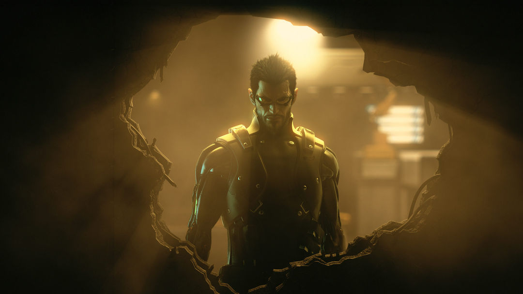
Adam Jensen still
LIKE THIS FEATURE?


