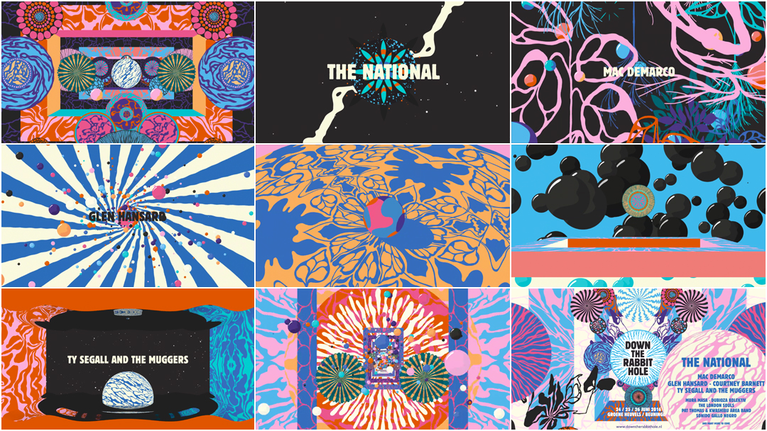
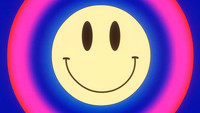
At just over a minute in length, the title sequence for Dutch festival Down The Rabbit Hole is a transcendental fall through colour and shape and the edge of madness. Created by brothers Merijn and Jurriaan Hos, the sequence is a fantasia of forms with waves of impossible movement, rotating orbs and shining spheres, skeletal flora and bursts of pattern that push at the seams, growing curiouser and curiouser.
"Did you ever see such a thing as a drawing of a muchness?" asked the Dormouse in Lewis Carroll's Alice in Wonderland, and here the Hos brothers answer, blurring the lines between two- and three-dimensional space, using music as propellant, ushering the viewer beyond the boundaries of experience, with moments of quiet purity and strange fascination. After a fall such as this, it's no wonder the festival is able to grow each year, inviting successive streams of attendees to return in search of the fantastic.
A discussion with Art Director and Illustrator MERIJN HOS and Animator JURRIAAN HOS.
So, Merijn and Jurriaan, you're brothers and you work together on projects. Can you give us a little background on yourselves?
Merijn: I’m an artist and illustrator and occasional art director from Utrecht in the Netherlands. I run my own studio since I graduated, about 12 years ago, from the Utrecht University of the Arts where I studied illustration. I focus on advertising, music, and editorial projects. My work is at first sight happy and colourful, a bit quirky, maybe psychedelic, sometimes a little bit dark and mysterious. It can be very commercial but at the same time I love making weird zines on my photocopier.
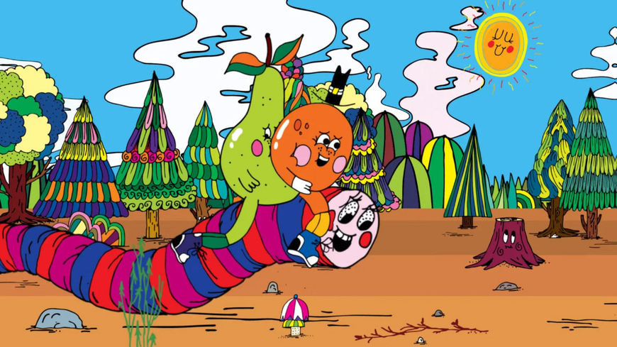
Jurriaan: I'm a generalist. I studied interaction design but during my studies I came in contact with 3D animation and that was the starting point for really finding my way. I worked for a few companies after school, making commercials with realistic rotating objects like TVs, then I did a few years of 3D character animation, five years at a motion design studio, and finally I went freelance. In 2007 Merijn was asked to make something for Yo Gabba Gabba and we did that together. After that we did more and more together. It was kind of logical that I would help him with this.
Animated sequence from Yo Gabba Gabba created by Merijn Hos and Jurriaan Hos
And how did this project come to you? You’ve been working with this festival for a while now, right?
Merijn: It was 2012 when the director of Lowlands, a big music festival in the Netherlands, got in touch with me and asked me if I would be interested in creating an identity for a new festival. The name is “Down the Rabbit Hole” which of course immediately makes you think of Alice in Wonderland. The first edition of the festival launched in 2014.
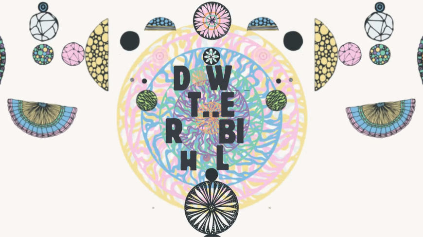
Down The Rabbit Hole (2014) teaser sequence, designed by Merijn Hos and Jurriaan Hos
Merijn: The aim is to create a place away from the real world for a couple of days, dive into another world, experience new things, be yourself. The festival area is a bit different, there is more personal space for the visitor. There is a lot of attention to detail on the festival grounds; for example, the fences are made out of grass-braided willow branches.

Down the Rabbit Hole Festival attendees do yoga in front of the fence
Merijn: For the festival I created an identity that consists of a series of circle-shaped figures, and each year I add new ones to keep it organic. The original idea for these shapes came from drawings that I made for a small exhibition for which I made drawings of trophies that were built out of organic circles.

Trophies drawing by Merijn Hos
Merijn: The circle shapes are used as visual elements throughout the festival grounds as well. The fill-in of the circles reminded me of the inside of fruits and of microbiology. I thought this was a very interesting starting point and I started researching these forms and came up with a form alphabet which forms the base of the identity.

We wanted to make something strange, weird, and wonderful, and give the viewer a positive psychedelic trip and feeling.
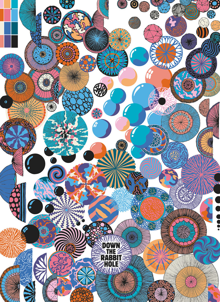
Form alphabet developed by Merijn Hos
Merijn: Early in October I met with Ide Koffeman and Bente Bollmann of Down the Rabbit Hole, the guys who are in charge of the creative direction and marketing of the festival. We talked about what people found significant at the 2015 edition and where the festival is going in 2016. During this conversation the terms “secret spots”, “hidden areas” and “discovery” came up a lot and I decided they should be key values for the 2016 art direction.
After I came up with the concept I created a series of nine poster artworks that will be used throughout the year for the promotion of the festival.

The set of 9 poster designs created for Down the Rabbit Hole Festival by Merijn Hos
Jurriaan: The title sequence is based on Merijn's design for DTRH. Every year we make one, this is the third. The style evolves and with that, the title sequences, too. The first one was very static, the second one more a trip. When this year came up we wanted to do something more crazy than the last one.
Merijn: The sequence needed to capture the feel of the posters and go deeper into the concept of “hidden spaces”. Jurriaan and I got together and started thinking of scenes and how we could connect these scenes and made a quick storyboard and luckily Ide and Bente liked it. We are blessed with the amount of creative freedom and trust that they give us.
Jurriaan: Because of the generous amount of creative freedom we actually experiment within the film to see what works. When Merijn had developed the visual style of the festival poster, I was pretty quickly able to draw the storyboard.
We wanted to have huge contrasts in the film: fast and slow, full and empty.

Image Set: Storyboards
Jurriaan: We got the go-ahead without much hesitation. We have very quick communication and both don't like to linger so Merijn drew the scenes and I started placing them roughly and trying out the timing. The 3D scenes were done backwards – I made the scenes first and then Merijn drew textures for them. Merijn draws by hand at first so adding it on the computer and then putting it in a 3D scene can be a scary process because we need to keep the feeling of his work. We wanted to have huge contrasts in the film: fast and slow, full and empty.
The actual titles came in very late as the client did not have official confirmations. We got them in the last three days! Until that time we had placeholders. This is why the film is more an overall mood of the festival and the type of music they play, rather than fit per act.
Did you have inspirations or references in terms of atmosphere?
Jurriaan: Merijn’s work, mostly. When I work with an illustrator I dive completely into his world and look for possibilities, keeping the essence and integrity of his work as the highest priority. We did look at a vertigo effect which we used in the start of the film.
The sphere with cloth falling off was inspired on a exhibition from Merijn where he made a three-meter ghost figure.

Ghost figure by Merijn Hos
Merijn: I’m personally not a big fan of 3D animation and was a bit scared when Jurriaan proposed to make the ghost scene in 3D. When I saw it for the first time I was super surprised with the outcome, we worked a bit on the colour and inside pattern and in the end it is one of my favourite parts of the sequence. The tranquility works really well in the middle of all the hectic scenes.
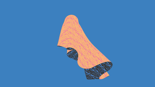
Still from the sequence during the "ghost scene"
What feeling did you want this sequence to evoke in the viewer? What did you want people to feel?
Merijn: We wanted to make something strange, weird, and wonderful, and give the viewer a positive psychedelic trip and feeling.
Tell me about the music. How did you work with that?
Merijn: We work with the same guy every year, Wilco Alkema.
Jurriaan: This year he came very late into the process due to a family situation. Until he started on it I used a random track to work on to give it some rhythm. I think when the sequence was at 75% Wilco came in and added his first version of the sound and it instantly gave everything energy.
Merijn: I think he has done an incredible job creating a significant sound for the sequence. I love that you can’t really say what it is, and that it’s custom-made for the piece.
How did you decide on the colour scheme for the sequence?
Merijn: Every year I start with selecting a new range of colours for the year’s edition. The first year I chose rather soft colours and the colours are getting a bit brighter every year as the festival comes to life and grows.

Posters from 2014 (left) and 2015 (right) featuring a more muted colour palette
Given the amount of detail in this piece, it seems like a lot of work was involved. What was your timeline like?
Merijn: I think I worked on the identity of the festival over a three- or four-week period. When the identity was finished we made a quick storyboard and took it from there. This project is a bit more organic than other projects as the thing we need to do is catch the feel of the festival rather than tell a strict story so there is a lot of room for other ideas and small changes. I started delivering frames to Jurriaan and he started building the scenes.
Jurriaan: For me, I used mostly After Effects. After the storyboard and the poster frames for the festival the production for the sequence was done within four weeks. But just the two of us. Merijn on and off when needed, supplying assets and checking colours and discussing.
Merijn: Every other day over a period of four weeks we would get in touch via Skype and talk through the progress by sharing each other’s screens. It’s funny because we live quite close to each other but somehow this works for us!
I delivered all my files to Jurriaan in Illustrator layers. Most of my part is drawn by hand and traced into vector.
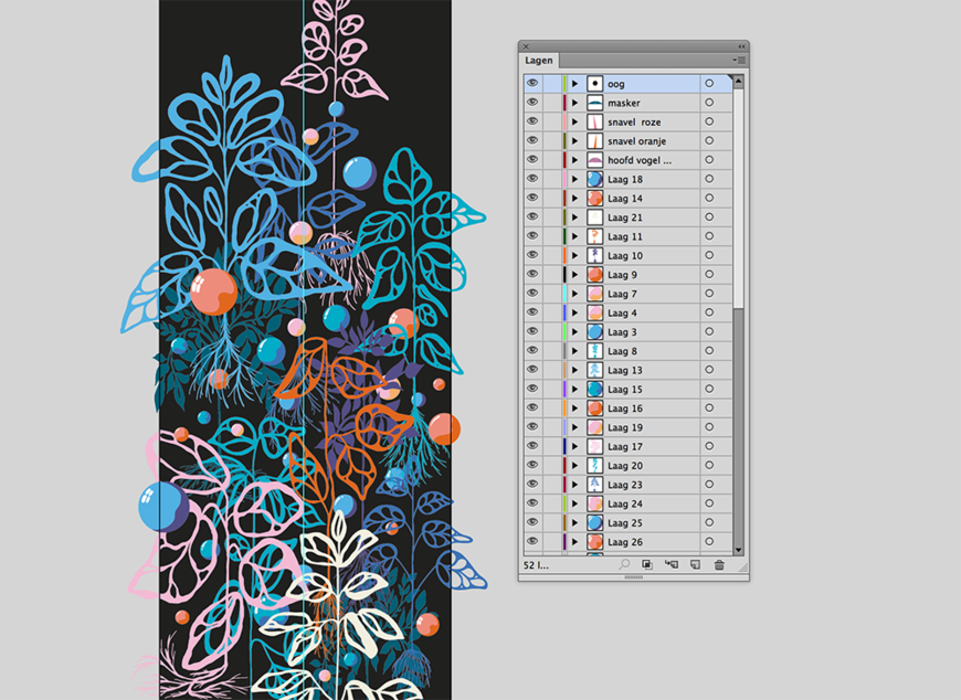

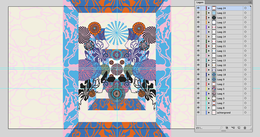
A screenshot of Merijn Hos's artwork in Adobe Illustrator
What's it like working together as brothers?
Merijn: It’s great, we can be very direct with each other, we don’t need to be careful to say things in a delicate way. I love seeing my work come to life in animation but I could never do it myself. I truly believe that everybody should stick to what he or she is good at and I’m happy I have a brother that is such a great animator who is always willing to help out with projects.
Jurriaan: I really enjoy adding to his worlds. And being my brother, I know him, and we support each other. I am really glad we both do what we love and have found each other in this.
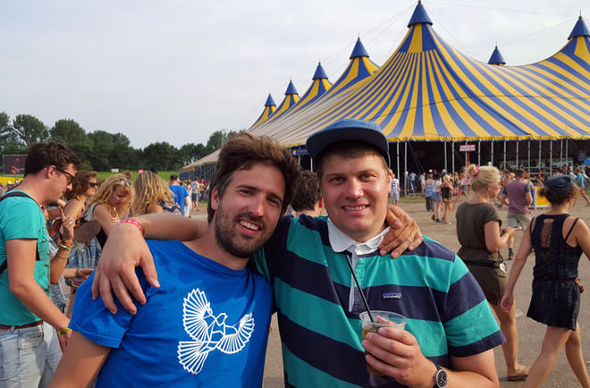
Jurriaan Hos and Merijn Hos

