Part one of an exclusive two-part feature on the opening title sequences for Hulk (2003) and The Incredible Hulk (2008). This week we feature an in-depth interview with Garson Yu, the visual designer for Ang Lee's Hulk.
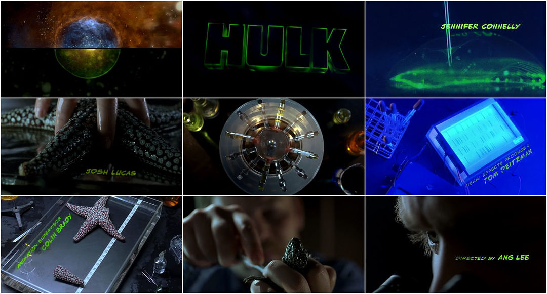
The opening title sequence to Ang Lee's Hulk begins with nothing less than a drop of water, the Big Bang and the origin story with echoes of Dr. Jekyll.
Audio commentary excerpt with Director Ang Lee:
From the 2007 Hulk Special Edition DVD
A discussion with Creative Director GARSON YU.
A graduate from Yale's graphic design program in 1987, Garson Yu began his career with R/Greenberg Associates. In 1993, he joined Imaginary Forces as co-creative director with Kyle Cooper. In 1998 Garson founded yU+Co., a design company specializing in motion graphics for film and television.
How did you become involved with the project?
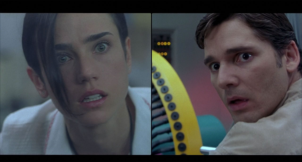
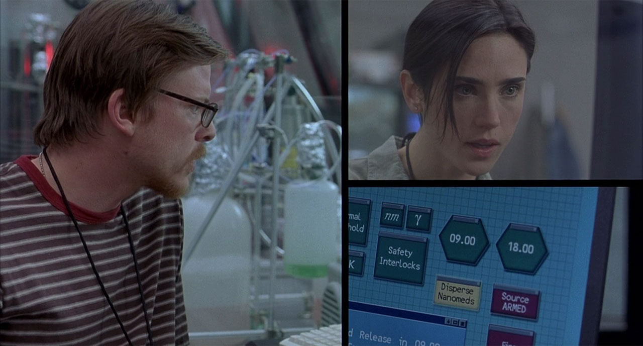
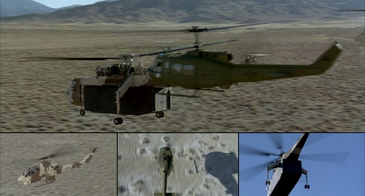
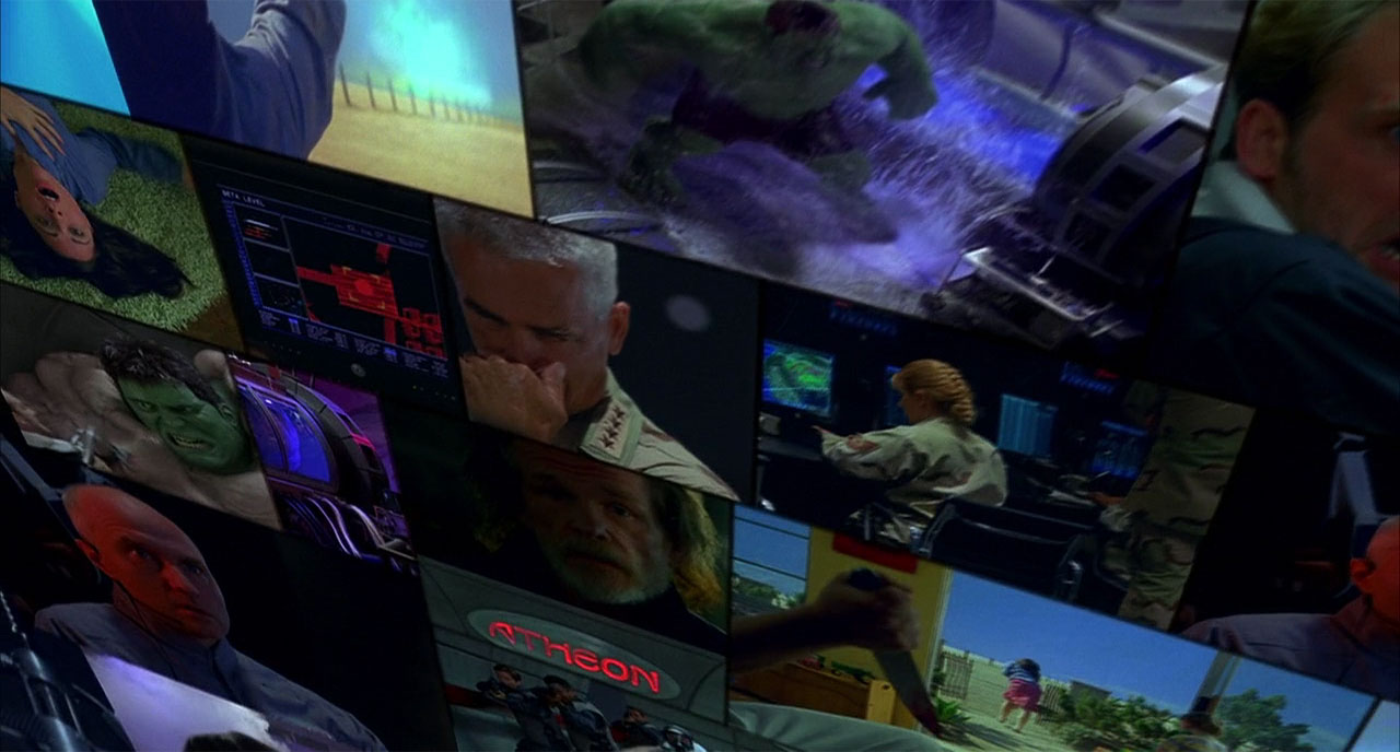
GY: It was six years ago. I had never worked with Ang Lee before Hulk. I was called to meet with Ang and producer Larry Franco. They met with me and with people from Imaginary Forces. I was picked by Ang to develop the visual look for the film. At the beginning, the project was not about the opening title sequence; Ang wanted to create a unique look for the film. He wanted me to develop a new visual language incorporating multiple cameras to tell a story.
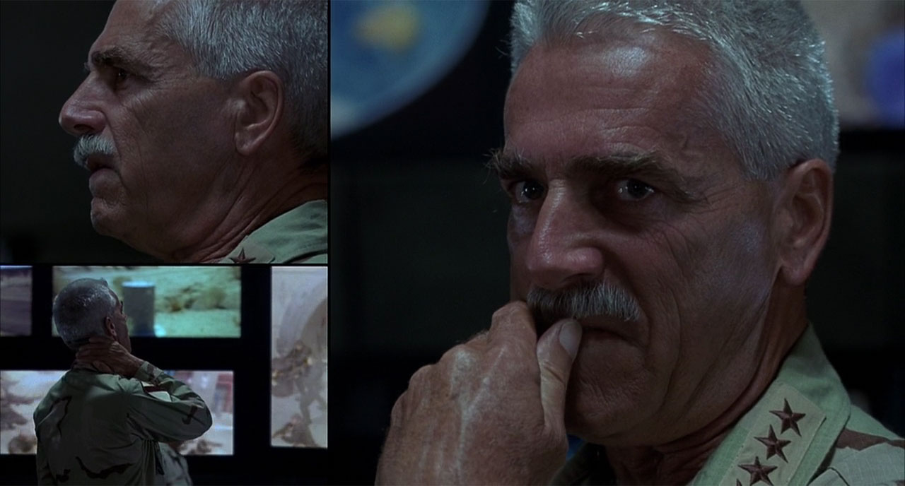
In film, it's difficult to show multiple events simultaneously on one screen. Ang wanted to develop a concept that incorporated how we normally read comic strips. He wanted to present the film in one giant comic page. I was asked to do R&D on a technique to choreograph multiple image panels on screen. As it developed, my involvement on the film expanded to design the opening sequence.
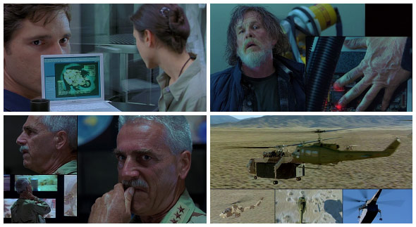
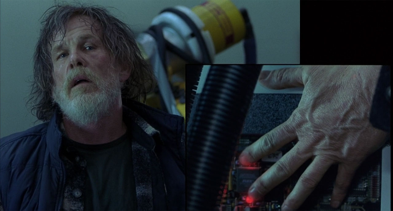
Split screen examples from the film
What kind of collaboration was involved in creating the sequence?
Ang was very busy shooting the principle photography with Fred Elmes, the DP, at the Universal Studios Lot. It was a very intense working schedule for him and his production crews. I started to develop the storyboard for the opening. It was not that easy. In the opening, he wanted to create a backstory that explains David Banner's experiments in extracting DNA from other species, which turns him into the Hulk. A week after I presented the storyboard, the production manager called and said the producer wanted to start shooting the opening in San Francisco at the ILM stage in 2 days. I sent out a shot list, they prepped the shoot in a day and we started shooting the next day.
I ended up spending 5 days shooting in San Francisco. All the major set ups were shot up in the bay area and we also did 2 days of pick up shots for all of Banner's journals at our own studio. We started editing the offline in L.A. while Ang was still working at ILM. We sent quicktimes back and forth until we locked the picture. That was a 6 minute long sequence. The studio wanted to cut it to 3 minutes. All the VFX and animation were done at yU+Co. We had a team of about 6-8 artists working on the project.
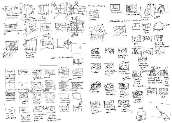
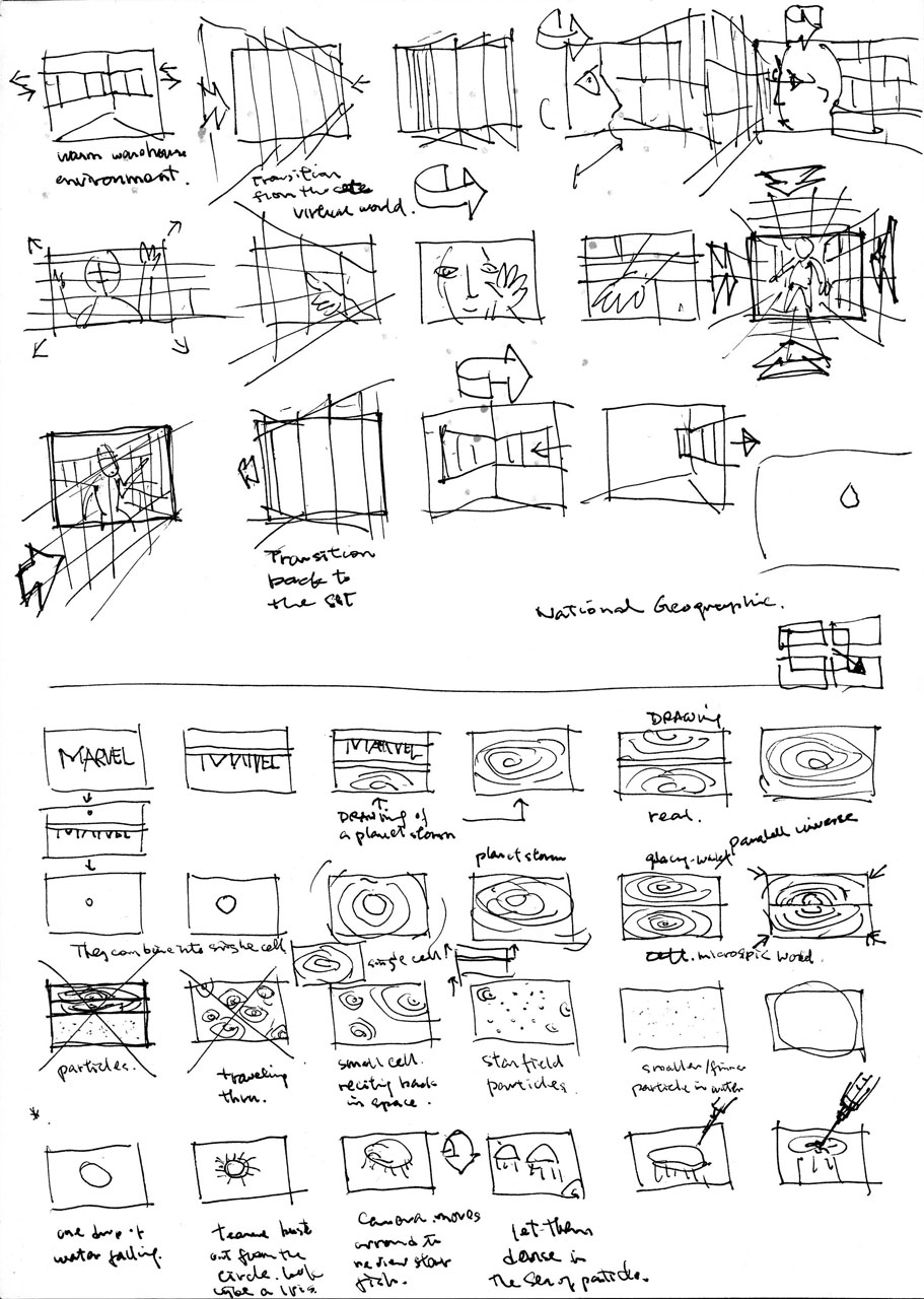
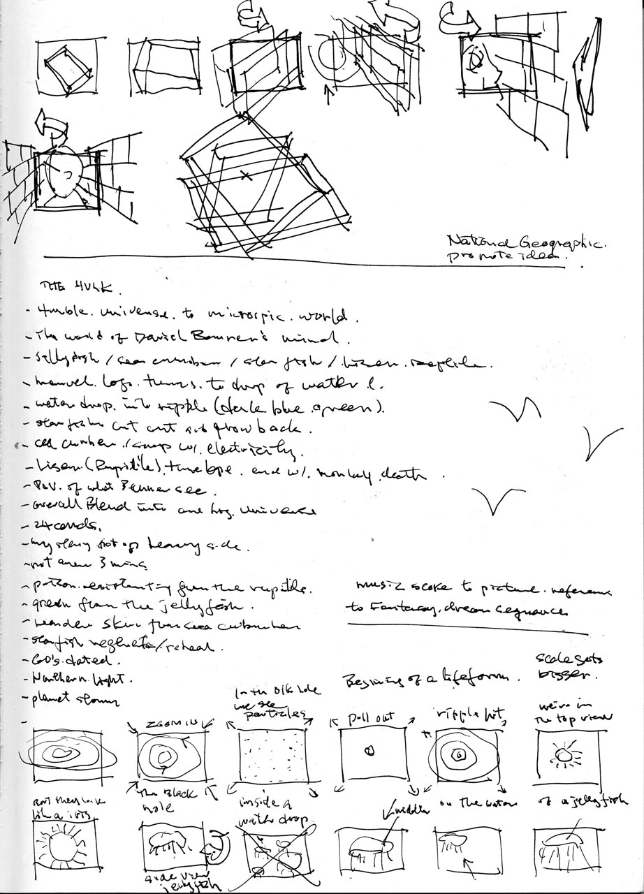
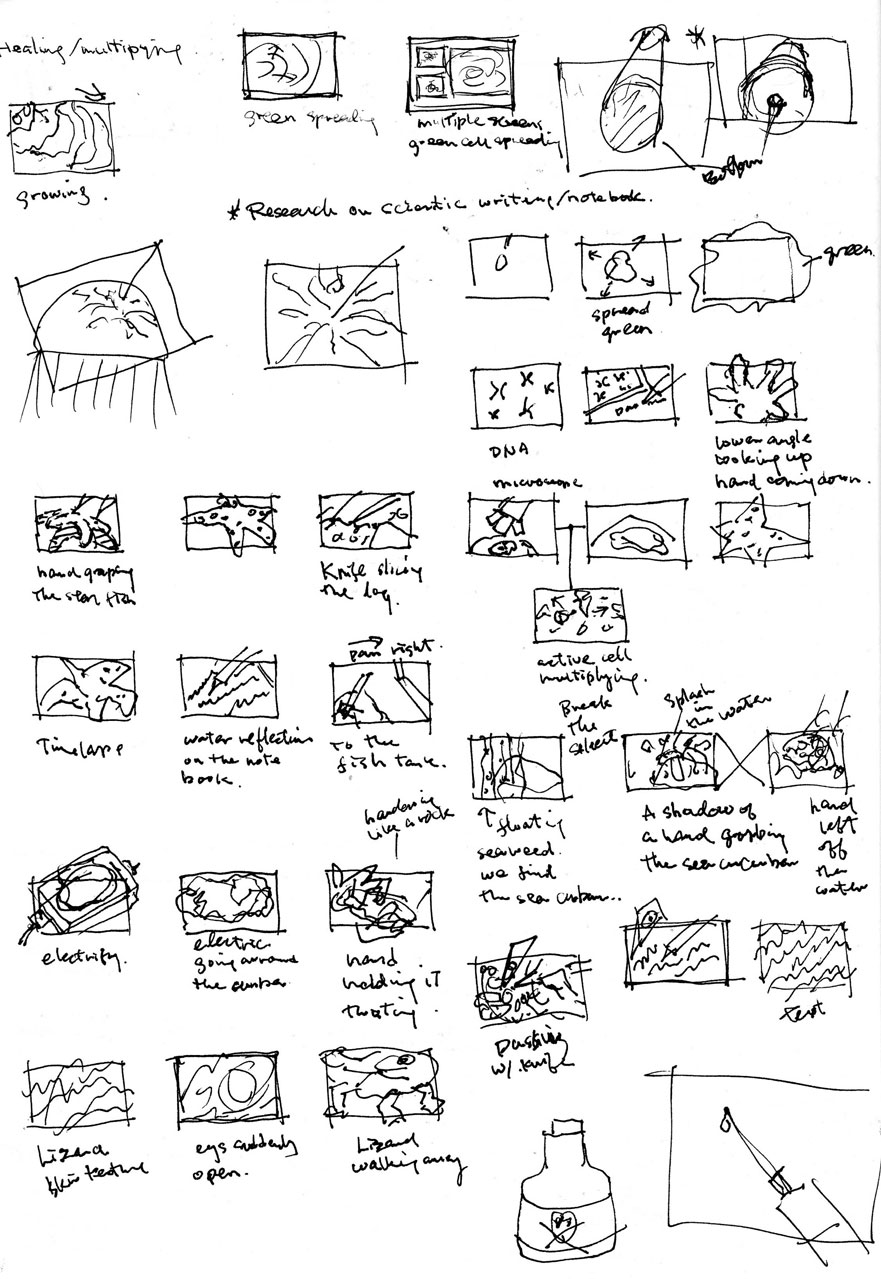
Storyboards
Can you breakdown the development of the sequence? Were there differences between this and other yU+Co. projects?
First we went through an R&D stage. We had two concerns: content, and design, meaning the look and feel. The content was defined by Ang, but it was my responsibility to determine how to tell the story. The sequence is divided into two parts. In the first, I wanted to compare a microscopic world to the larger universe in outer space. To me there is always a universe within a universe- a world within a world. There is a visual similarity between the two. I decided to start with a drop of water which represents the beginning of life.
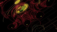
From that, the journey begins. I did research on the look of a DNA double helix. For this project, the research was very important. The studio had hired a science consultant, John Underkoffler, who helped me to make sure all the visuals I created were scientifically correct. He was also involved in developing the story with me. The animation of a cell dividing is all based on real science reference. My sequence takes us traveling down to double helix DNA level and from there we find the Hulk graphic logo at the end of the journey.
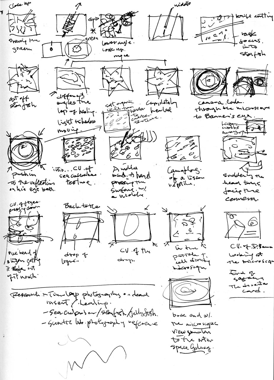
The second part of the sequence takes us on a journey through David Banner's experiments, which take place over time. His experiments involve extracting DNA from four species to harness certain characteristics from each. He uses the jellyfish for luminescence, the starfish for regeneration, sea cucumber for tough skin, and the lizard for its resistance to poison. One of the greatest challenges in the sequence was to communicate complex information without voiceover. We had to explain the whole scientific process visually. To help with this, we shot tabletop inserts of Banner's diary which were then intercut with the lab footage. Ang later decided to also use the diary shots during the movie to help tell the story.
This was no different from other yU+Co. projects. We always start with research and defining the creative direction, from there we will go through a design process defining the look and feel. Once the design and offline are approved then we go into final production.
Previz storyboards
Were you responsible for the custom Marvel logo?
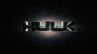
Yes I was responsible for the custom Marvel logo. Ang wanted to replace all the comic pictures with The Hulk images.
Were you able to reference Danny Elfman's theme music? If so, how did it influence the sequence?
I must say Danny's theme music was influenced by my temp music that I put together with my composer friend Walter Werzowa. The original music sketch was more fragmented. I used Walter's music to edit my picture. Danny followed our picture and music to recompose his version of the theme music. He scored to my picture.
Offline edit
Was the type design always integrated? Were the scenes shot and edited with the title placement already in mind?
Yes the scenes were shot with the placement of the titles in mind. I wanted to integrate the typography with the picture, reacting and interacting with the physical environment. I didn't have time to plan everything before I went to San Francisco so I had to improvise a lot on set. A lot of design decisions were made in the post production stage because of that. The typography is a custom font designed to recall the movie's comic book origins.
Do you have any interesting stories related to this sequence?
Shooting on a tight schedule was pretty stressful. I got to the set for an 8am call and I had all the producers behind me watching over my shoulder waiting for me to give direction to my crew. I had to make quick decisions to tell my DP and AD what to do. I think I smoked at least 10 packs of cigarettes for those 5 days in San Francisco.
Is there someone relatively new whose work has taken you by surprise?
There are so many young talents out there. Their work always surprises me. There is a Japanese saying: "The flow of the river is ceaseless and its water is never the same." There are always fresh perspectives and new talents. Design never stops evolving.
What inspires you these days?
My inspiration usually comes from everyday life observation. I think I'm like other artists. Everything around us affects our thinking: our life experience, our memories of the past, our dreams for our future, our imagination at any moment in time. I guess everything from music, literature, art, films, TV, internet, pop culture, dancing, architecture, my kids, my dogs... everything around me inspires me.
SUPPLEMENTAL: The comic-styled end credit crawl

