A mysterious figure rides into town, gun on his hip and dog in tow.
There are few better ways to start a Western. The arrival of a man with no name always signals that bad times are ahead, that blood will soon be shed. The lone figure is, of course, far more dangerous than he initially appears, a splash of blood transforming him into a one-man posse. He’s not looking for trouble, but trouble always finds him.
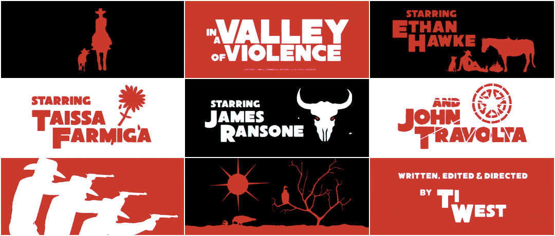
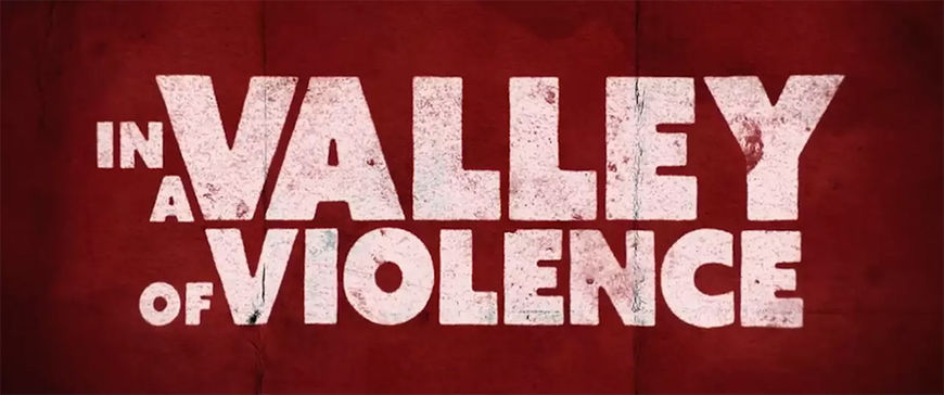
Director Ti West’s new film In A Valley of Violence embraces all the tropes and trappings that make the Western one of cinema’s most enduring genres, from the seemingly familiar set-up right down to a bold opening title sequence that would not feel out of place in a Leone or Sollima movie. Designed by Neal Jonas, the sequence employs a red, black, and white colour palette (the same palette favoured by Spaghetti Western title designers like Iginio Lardani), setting the tone with brash transitions and foreboding iconography. It’s a graphic introduction to the film’s taciturn antihero (Ethan Hawke) and the denizens of the scummy border town of Denton. Bolstered by Composer Jeff Grace’s menacing main title theme and Sound Designer Graham Reznick’s aggressive audioscape, the opening to In A Valley of Violence is a thoroughly entertaining primer for the film to follow.
A discussion with Director TI WEST and Title Designer NEAL JONAS.
Neal, you and Ti have worked together several times now, but is it true that you worked on his 2009 film The House of the Devil as a musician? What’s the story there?
Neal: Graham Reznick who does all of Ti’s sound design is a friend of mine. He uses a lot of distortion ambience from guitars and stuff in his soundscapes, so I just went over with Graham one day and recorded a bunch of guitar feedback that he used. That’s how I got that credit. I don’t know if Ti knows about that. [laughs]
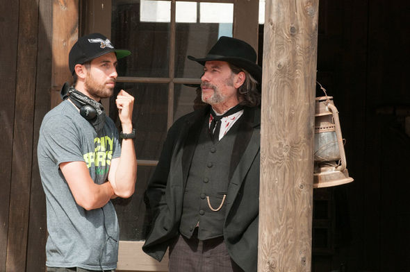
In A Valley of Violence director Ti West and star John Travolta on set.
Ti: I remember that now! There was a whole bunch of that stuff on the soundtrack of The House of the Devil. But otherwise we started working together on V/H/S and then you did the titles for The Sacrament as well. Neal is the go-to person now for titles and VFX stuff. It’s good to have somebody that you know and can communicate with easily, especially for things that have a really specific aesthetic. It’s really hard to find someone like that. Title companies always pitch on these, but they’re going to do their own thing.
Ti, as a director, what would you say is the role of a title sequence?
Ti: For me as a filmmaker, I think the title sequence is an incredibly underappreciated aspect of movies. Generally it primes everybody for the experience they’re about to see. If you see it at the theatre and you’ve got your popcorn and your phone, you’re sitting in a dark with a bunch of people and there’s a transition to get into the right mindset for the movie. Being in the right mindset can really make or break the experience. If you’re thinking about some bullshit work stuff you’ve got to deal with, then you’re not really going to get fully into the movie. It primes you with an aesthetic or a soundscape or a score that should transition you from whatever experience you were having into the experience that you’re about to have.
It’s also a time to celebrate all the people who worked on the movie – which is important because making films is a pretty incredible art or craft, whatever you want to call it. There’s something really great about reminding people that human beings made this and that it’s not to be taken for granted.
Always give credit where it's due! So what did you have in mind for the In A Valley of Violence title sequence?
Ti: On Valley the title sequence is really setting you up – you know what kind of movie you’re in for and you’re either in or out. We hopefully got you enthusiastic about the movie by making such a specific statement, and whatever follows you’re willing to accept rather than resist. When the movie starts you’re already in the right headspace, which as a director is really important.
—Ti WestYou know what kind of movie you’re in for and you’re either in or out.
In A Valley of Violence (2016) theatrical trailer
Ti: I knew that Neal would totally understand the aesthetic I was going for – the optical ‘70s quality of it all, a subtle optical shake that doesn’t look like a grindhouse effect but also doesn’t look like a modern day digital thing. Those are such idiosyncratic details. It’s a really very small bullseye to hit – where it doesn’t feel kitschy like you’re winking at people, but it also doesn’t feel modern. It’s the subtleties.
Neal: Not to be super pretentious about it, but I think the In A Valley of Violence opening works in the same way that an overture does. It can give you a taste of what you’re going to experience without giving you the whole thing. You can aesthetically get into the world with imagery and colour and sound, you can get the viewer in the mindset without revealing the plot. There’s nothing else in Valley with red frames or silhouettes like that, but with a title sequence you can make this unique piece that speaks to the themes, the feelings, the world, and the vibe you want – and have it operate in that direct, visceral way that only aesthetics can. The movie itself can build themes with dialogue and stuff over time, but with a title sequence you can shove people right into that world immediately. It’s a weird little portal, like the artery of the movie basically.
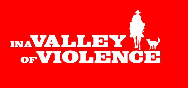
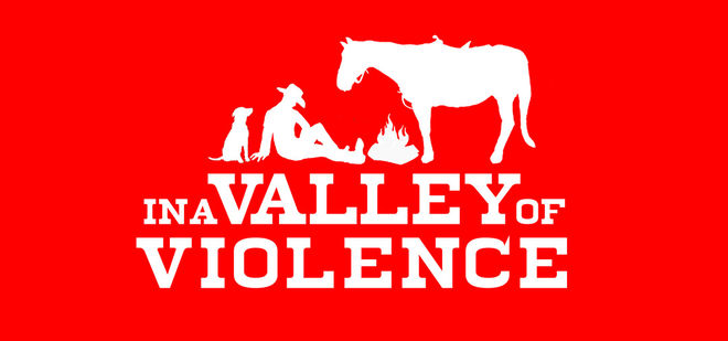
In A Valley of Violence (2016) early title card explorations
So what was the starting point for all this? Were the titles outlined in the screenplay?
Ti: I think it was in the screenplay, but I don’t remember specifically. If it was in the screenplay I always knew exactly what it was going to be. From the very first conversation with Neal I always knew it was going to be this type of title sequence. I had a couple of references in mind. I remember saying, “The goal is that all the characters should have some kind of iconography that helps identify them in the titles OR there’s a version where you watch the entire movie play out in the title sequence, but you don’t realize it because you don’t have the context for it yet.” We ended up splitting the difference: all the names have their own iconography and that iconography also related to the plot.
At what point in the production did you start having these discussions?
Ti: It was probably around the time we wrapped shooting. There was another company trying to pitch to do them, but I was shooting at the time and couldn’t quite deal with that. When I got to post I wanted to talk to Neal first before talking to anyone else. Neal did some mock-ups and his very first mock-up was so clearly like, “Oh yeah, this is going to be great!” I’m sure we went through 10 or 11 versions that weren’t very different, they were like the same thing with very minor shifts, but it just evolved into what it was.
—Neal JonasIt’s a weird little portal, like the artery of the movie basically.
In A Valley of Violence (2016) early title sequence mock-ups
Ti: It was so close from the get-go that it just became let’s talk about this card or that card, this might need a little cooler transition, or maybe this thing has movement so Graham can add a sound effect to it! It just became a question of how to keep adding to it to make it more and more fun.
Neal: I think directors like Ti are drawn to the Western genre because it has such strong iconography. That’s why it’s one of the big American genres: it’s mythic! When you have something that mythic you have a wealth of visuals to draw on.
What were some of those reference points you mentioned? Were there specific title sequences you were feeding off of for inspiration?
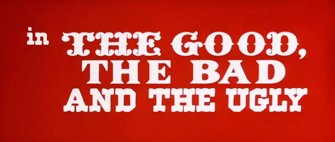
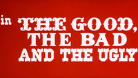
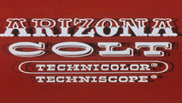
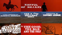
Ti: Certainly The Dollars Trilogy was a big part of it, but then there were also some more B-movie Spaghetti Westerns that were doing kind of the same thing. It wasn’t really “Hey, make it like this,” it was more “Hey, look at how this jiggles on screen or look at this type of transition and how it’s different from what they do now.” It was never like, "Let’s make the title sequence from The Good, The Bad, and The Ugly," it was more “check out the optical shake in that,” and “look how the red is a really desaturated red that’s really hard to come by on screen now” because of the way CMYK is and things like that. It became way more idiosyncratic than specific.
The Good, the Bad and the Ugly (1966) main titles, designed by Iginio Lardani
Ti: There were a bunch of title sequences we used as like an inspiration board. I knew Neal knew what I was talking about and I knew he would make his own thing. Rounded edges were a big part of it. Some of the images in there have these wonky hand drawn bits. It had to be hand drawn in a way so that it didn’t look like a Flash animation from some crappy website.
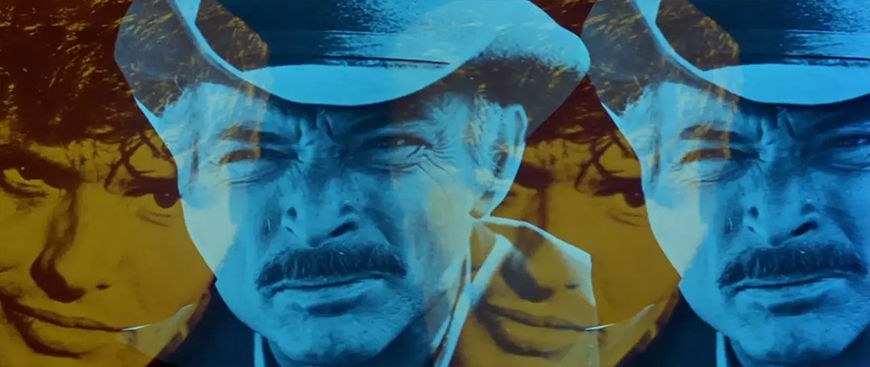
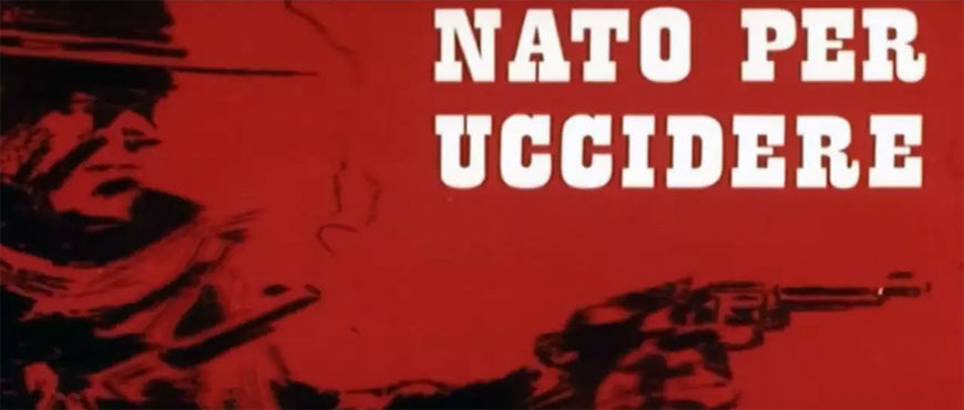
Neal: Yeah, some of the other movies Ti referenced were Day of Anger, Nato Per Uccidere (Born to Kill), and Berberian Sound Studio – that’s another black and red, high contrast title sequence.
I giorni dell'ira (1967) aka Day of Anger main titles, designed by Iginio Lardani
Nato Per Uccidere (1967) aka Born to Kill main titles
Neal: It was really about looking at all those things and figuring out what I liked about them and what would work for this project. A lot of those other title sequences are really out there and psychedelic; Valley isn’t really a psychedelic title sequence, but the big thing was looking at the limitations they had. It’s like writing code or a game: what are the rules of this sequence? What can’t I have? I can have three colours, no gradient, no clean edges. Is there anything I can age a bit? I wasn’t trying to do the ‘90s style visible grit thing, I wanted it to be handmade and look like someone touched it. It was about using digital techniques in a handmade way. It was a “clumsy clean” look we were going for.
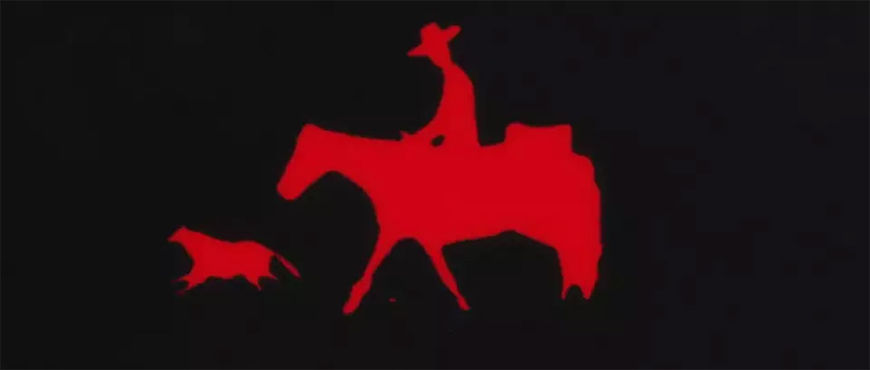
Originally it was going to be a little more lowkey. We saw these title sequences with all this amazing animation, but we had a tight window for this because I also did the visual effects on the movie. There was a window between when we started talking about this and when the footage from the movie was going to be available to start working on the visual effects, which is a big process. At first we didn’t think we’d have time, but then we added a slight animation to the dog and suddenly it felt so good, it felt like it would be a disservice to not take it all the way. It ended up being bigger than we originally thought.
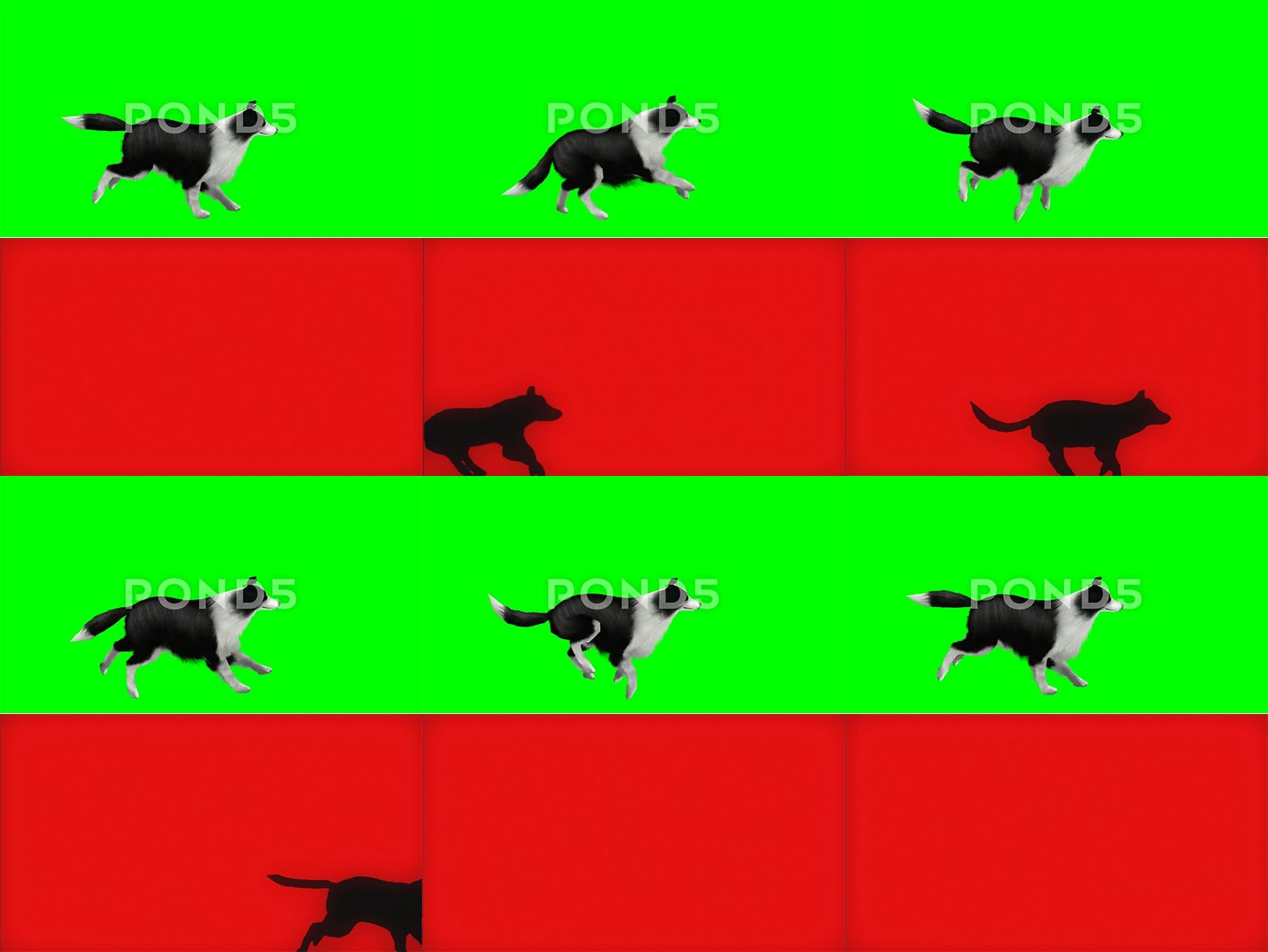
Dog stock footage (top) vs. final animation (bottom)
So the title sequence sort of grew in the making. What about the audio components? Sound is a really big part of the opening – another trope of the Spaghetti Western genre – could you talk a little bit about Jeff Grace’s score as well as Graham Reznick’s sound design?
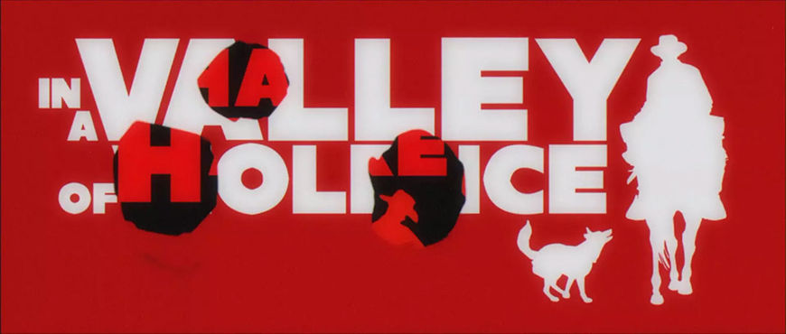
Ti: I’ve known Graham my whole life and he’s done the sound for all my films. We obviously wanted to highlight what Neal was doing in the title sequence, but by highlighting what Graham and Jeff do we can get the audience primed for it all. It was a way to tune you into being sensitive to sound design or use the main theme to tell you to listen to the music in this movie. It’s a big part of the movie and we’re making a point to tell you that. It added to the telling of the story of the movie, to the identity of the movie, to have the bullet holes or the whip or the rope hanging, foreshadowing things that play later in the film.
But again, it was also just a way to put everyone up on a pedestal. Here are these fun parts of movies that get overlooked. People underappreciate title sequences, they underappreciate music in movies, and they underappreciate sound design – here’s a minute and 45 seconds or whatever to just enjoy it and then we’ll start the movie!
Neal: I think it was a lot of fun for Graham. As a sound designer you have this whole library of sound effects but usually you have to integrate them in a very realistic manner. In the sequence he gets to use them almost musically. In the way that everything else is really stylized, it allowed Graham to be stylized with his sound design on top of that amazing score. You’re never going to hear any of those sound effects that clearly in the movie, they’re going to be mixed better, but you really get to feel the iconography of the sound in addition to the visuals.
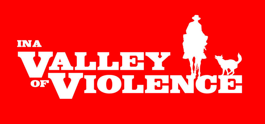
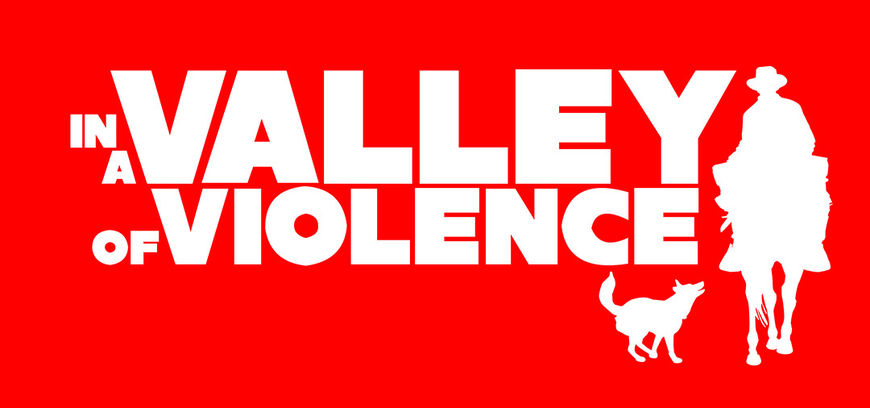
In A Valley of Violence (2016) title card explorations
Was there anything that took you by surprise when working on this sequence?
Ti: When we turned in this movie and we got the QC (Quality Control) report, we got notes back that said there were optical problems. That’s great! They didn’t even realize that it was for effect. They were like, “Oh, there’s a jitter in the title. Your optical’s messed up,” as if we’d actually done opticals! That is, I think, the highest compliment we can get.

Vulture animation featuring a subtle "optical" shake
Ti: Right down to the eleventh hour, Neal would be adding a little of this, a little of that, moving something out. We knew from the get-go that it was really special. If we’re going to make something really special, it’s those little details, those little idiosyncratic details. If they’re right then we’ll be having a conversation with a guy like you about the title sequence. It’ll be something that resonates with people. That was probably the most difficult part. Let’s make sure we don’t finish this until we’re for real done.
Neal: Yeah, not that it wasn’t a lot of work to make, but the process was really easy. We just locked in really easily and kept going in that vein. It found itself really well. It helps that Ti had a very specific vision for it, but sometimes you do things where you’re throwing things against the wall and beating your head against the table just to get something that’s okay. This was just fun, it feels good and it’s coming easily.
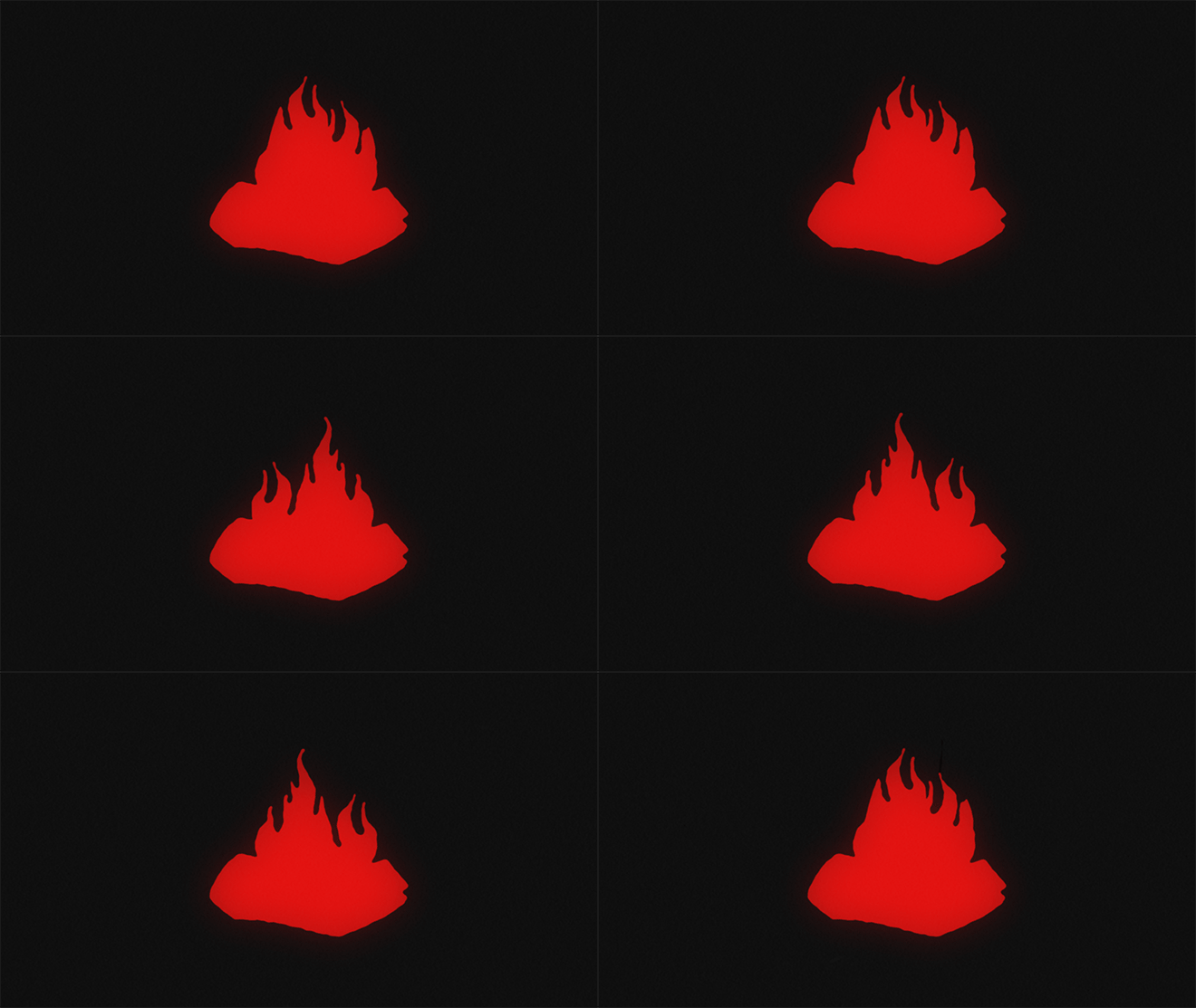
Firepit animation
Neal: Sometimes iterative process can be a real grind when there’s a disconnect between the parties about the vision of the piece. As the person creating it you can begin to lose your instinctive aesthetic compass and it can be hard to stay creatively invested. When that happens you lose the magic of the discoveries and happy accidents of the process, because you start to no longer trust your creative impulses. But with Valley, the vision was clearly communicated, so a lot of of the best parts were from those explorations and happy accidents.
What elements of this sequence are you most happy with?
Ti: I’m quite partial to the beginning with him and his dog in silhouette. I also think Travolta’s is pretty cool, too. Actually, the one with the three cowboys lined up, I think that speaks to a lot of the inspirations.

Did the film's cast give you any feedback on the opening titles?
Ti: They all liked ‘em. Everyone was like, “Whoa! Those were awesome!” That’s really satisfying thing to hear because we worked hard to make sure that everyone who worked on the movie had a cool title card. No one wants to not have a cool title card! [laughs] Not only did they have cool cards, they had really cool title cards. Everyone is happy to see their name on the screen, but then to see it animated in such a way was really fun.
What about you, Neal? Any favourite moment?
Neal: I also think the three cowboys walking out, the echo, was a favourite. The thing I like about it is that by that point you don’t really set up that something is going to come from the side of the screen, so it shifts how the animation happens. I also liked the vultures, that whole tableaux, but maybe that’s because it was a lot of work. [laughs]
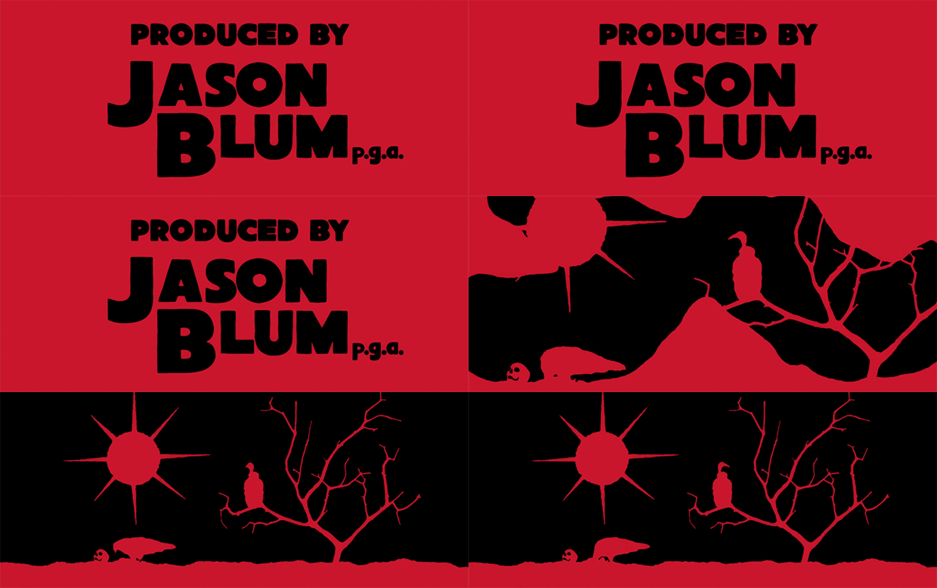
Neal: As far as cast and crew reactions, I was sitting next to the Costume Designer Malgosia [Turzanska] at SXSW and I remember her saying, “Oh, I got the dog!” since the dog wipes under her title card. That made her happy. Graham’s been my good friend for a long time and I know he likes whiskey, so I was happy I could give him the whiskey on his title card.
So how many people worked on the sequence all told?
Neal: I was the only one on the visual side, beside Graham Reznick and Jeff Grace on the sound side.
Which tools and software did you use to put all this together?
Neal: It was built with After Effects and Photoshop with different pieces of shot footage and stock elements. They were purchased elements, like the shot of the dog running... It's such a lo-fi technique.
We’ve talked a lot about Western title sequences already, but what are some of your personal favourite title sequences, Western or otherwise?
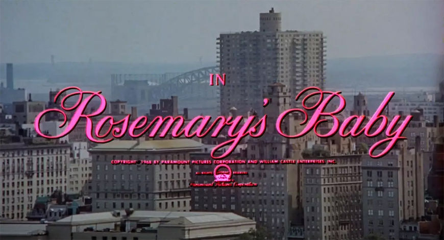
Neal: Personally, I like a lot of horror title sequences. I love the Rosemary’s Baby opening, where it’s just the pink titles, that super scary, ominous singing, and that big pan all across New York and then settling on the building.
Rosemary's Baby (1968) main titles, designed by Wayne Fitzgerald
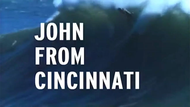
Neal: A TV one I like a lot is the John from Cincinnati opening. I actually love that title sequence. It’s just old, vintage surfing footage with Joe Strummer playing over it. It’s so well cut. It bums me out because I’m always let down by the actual show, but the title sequence is very human. 8mm surfing footage, simple type, and it cuts so well to the song. You feel that world of Southern California surfing so well.
John from Cincinnati (2007) main titles, designed by Angus Wall and David Brodie
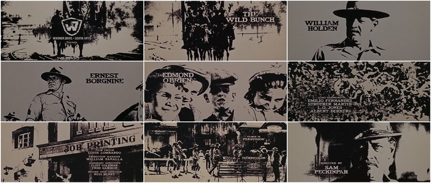
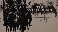
Ti: As far as other ones, I have to say Do The Right Thing is really great. It’s a really memorable one. Enter the Void is also a really excellent title sequence. The Dollars Trilogy openings are really special. Those are the most special Western titles that I can think of. The Wild Bunch is really cool too.
—Ti WestWhat are people doing? Make a cool title sequence!
The Wild Bunch (1969) main titles
Ti: It’s a shame since all of our references are like 40 years old. What are people doing? Make a cool title sequence! Hopefully this movie sticks around and people reference it as a really cool title sequence.

