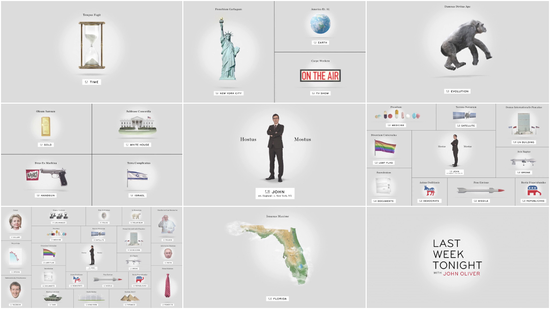
Take one absurdly catchy theme song, boil down complex world issues into simple animations with tongue-in-cheek scientific names, put it all in motion, and you’ve got the opening of Last Week Tonight with John Oliver, HBO’s weekly news satire program. It’s a brilliant way to open the show, and one that perfectly encapsulates Hostus Mostus Oliver’s acerbic and hilariously cynical approach to current affairs in a brisk 22 seconds.
More than just a “slightly more British” version of The Daily Show – the venerable nightly news satire where the host honed his approach and persona – every episode of Last Week Tonight is a deep dive on a specific subject, injustice, or outrage; a cutting, go-for-the-jugular dissection of the news of the week presented as only Oliver can. As such, the show’s opening sequence is both an encyclopedia of gags and a living document designed to reflect current events, adding new elements and recurring bits each episode. The point is that this modular approach to visual comedy, designed by Kelli Miller and Trollbäck + Company, allows the Last Week Tonight staff to keep things fresh week in and week out. That really matters when a show’s job is to both inform and entertain.
A discussion with Creative Director KELLI MILLER of And/Or.
Hi Kelli! Could you tell us a little bit about your background and how you got into motion design?
Kelli: I am a graphic designer by training. I grew up in the suburbs of Detroit and went to the College for Creative Studies for undergrad. They are more well known for transportation design, but their graphic design program is really good. I got a BFA in Interactive Design and Graphic Design. I was always really interested in the way that shit could move [laughs], but things back then – this is like 2000 – things were still very rudimentary. Everyone was obsessed with the internet and web design, so I started getting interested in that, but then I ended up working in print for a few years out of college because I didn’t really respond to the coding aspects of interactive. Then I went to Cranbrook Academy of Art for grad school to expand upon what I was into. Print was cool, but I really wanted to be doing video and music and things that were more multimedia focused.
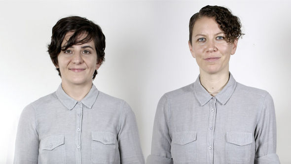
And/Or studio founders Kelli Miller (left) and Kendra Eash (right)
Cranbrook is a dreamland. It’s this beautiful campus with Eames’ everywhere – they taught there in their heyday – and Saarinen designed the whole campus. It looks like Harry Potter! Elliott Earls, who was the head of the program when I was there, was a really just cool person to be around. He’s so experimental and wacky. The way that it works is basically European style. They have an artist in residence, they don’t have classes, and you’re very self directed. Graphic designers are doing paintings, painters are doing sculptures, it’s just mayhem. Do whatever you want but do it well. It was a really great experience. That was where I really started to dive into doing video and audio work, learning After Effects and animation, and that kind of launched the whole motion design career I’ve been doing for the past ten years. I started there, moved to New York, and have been working here for ten years. I’ve almost always been working in motion design, but it definitely has more of a graphic design branding lens than a commercial advertising lens.
So it was in New York that you ended up at Trollbäck + Company, right? How did you first get involved with Last Week Tonight?
Kelli: I freelanced with Gretel and Loyalkaspar quite a bit and then I worked with Trollbäck + Company for three years – that’s where I did John Oliver. Last Week Tonight is one of my favourite jobs ever, if not the favourite so far in my career for many reasons. Basically it started when the Last Week Tonight showrunners came to Trollbäck to get some ideas to pitch for the show packaging and opening.
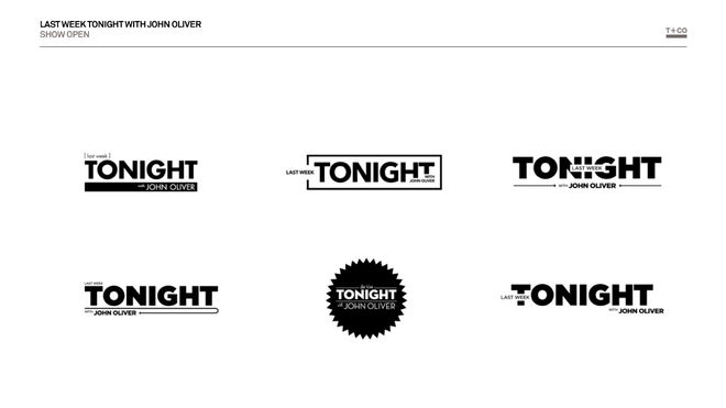
Image set: Last Week Tonight with John Oliver (2014) logotype explorations
I think we pitched maybe six ideas and the one that they chose is the one that you now see on air. If you look at the pitch and then look at what it is, not that much has changed. It’s very one-to-one. That’s incredible because usually clients get their hands in there, change everything, and it takes on a life of its own. This was not the case. They really loved the idea and fully supported us the whole time. It was a really great process.
Could you tell us about the original concept for the opening title sequence and how it was developed?
Kelli: When they came to us they were like, “Please do not create a news show parody package! That has already been done.” That is Colbert and The Daily Show. Since John Oliver comes from that world we need it to be kind of the exact opposite of that. We want this to represent him and his point of view, and not be the same old same old. Plus, being on HBO, the content is a little bit more elevated, a little bit more mature. So that was the directive from them.
They had no other vision for it other than that?
Kelli: No! They were just like, “Please don’t make a news parody!” [laughs] That was great. It was very freeing because then we didn’t have to go do something obvious and very cliché. I think those things work for those other programs, but it doesn’t make sense for him because it’s not the same type of show.
The concept that we ultimately went with was inspired by cabinets of curiosity and encyclopedic reference books. I was thinking about how all these events, people, and cultural touchstones are examined, dissected, and kind of fantastically wonderful when you look at them through the lens of humour and satire.
The concept that we ultimately went with was inspired by cabinets of curiosity and encyclopedic reference books.

Last Week Tonight with John Oliver (2014) "Curioser and Curioser" concept board
Kelli: The format of the show is really about diving deep and dissecting issues through that lens, so it felt like a really great way to open the show. I think the faux academic language and properness of the cataloging also laddered up nicely to John Oliver's style and heritage as a British, outsider comedian commenting on US and world politics.
What were some of the other concepts you had in the mix?
Kelli: We did an idea that was something that I’ve pitched to other clients since then – because I liked it so much – called “What’s Black and White and Read All Over?” kind of like the newspaper punchline. That was literally just black-and-white, super bold type, and playing with the vernacular of over-the-top news and media.
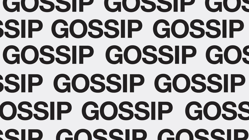
Image set: Last Week Tonight with John Oliver (2014) “What’s Black and White and Read All Over?” concept boards
Kelli: I remember we had a picture of a dude in an American flag speedo with a word over it. It was something buzz-wordy, you know? Or a big grid of the word “GOSSIP”, that was a fun one. We also did some stuff that was a little more poppy. We did one that was a Terry Gilliam style “What’s Inside John’s Head?” It was very Monty Python, very British.

Last Week Tonight with John Oliver (2014) “Inside John's Head” concept board
Kelli: Needless to say, the one that they picked was the crowd favourite though. We were like, “This is what they should do.”
The sequence elements change episode to episode. How was that handled? Did you go back and forth with the show every week or did you hand it off to them?
Kelli: We created the open, lower thirds, scrolling backgrounds, and some tools for them. This is one of my favourite parts about it: we pitched it with the idea that it was modular and that any of those little icons could be updated. For example, you could do an entire election one where every single thing could be swapped out to represent the election. If one of these hot button issues is not really relevant anymore, you could just swap that out and put in whatever is happening now. The open is meant to evolve and change as the times change.
Last Week Tonight episode opening from June 28, 2015 featuring updated elements.
Kelli: We also designed an easter egg at the end of the open that was meant to be updated each week to feature something of the moment, a fun way to make a little joke in the open and also keep things fresh and exciting with each viewing of the program. They’ve been doing that internally since the beginning. That’s really awesome because sometimes TV shows don’t have the staff to manage that sort of thing, but they did a really great job of carrying through the vision. The density of the visual language and these updatable easter eggs really makes it fun to watch every week rather than the kind of thing that you might want to skip over after several viewings.
That’s great that you were able to hand it off to them. So tell me about shooting with John Oliver – most title designers don’t get to work with the talent!
Kelli: It was very fast. [laughs] It was about half an hour with Oliver spinning on a little turntable in front of a green screen. It was kind of surreal directing him. I’m a designer so I’m still learning about directing. That was definitely the biggest talent I’d ever directed.
It was about half an hour with Oliver spinning on a little turntable in front of a green screen.
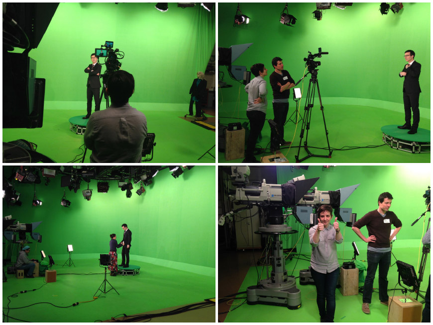
Image set: Kelli Miller and crew shooting host John Oliver for the Last Week Tonight opening sequence.
Kelli: He was just great. I was like, “Just be yourself and do some different faces for the camera.” I remember we were talking about Game of Thrones. He was just riffing. “What the hell is this show? Why do people like it? What is with the dragons?” I was like, “I know all about this. I will tell you. I will get you up to speed.” It was really great. He is one of the most honest, earnest people I’ve ever met. There’s no ego.
Did he have any input on the look and feel of the titles or the show's branding?
Kelli: Definitely! That was also surreal. We went to the original kick-off pitch meeting and he was there. I remember being like, “Oh shit, John Oliver is in the room.” He was in the pitch and on a handful of the calls. He definitely had a voice in it.
How big was the production team on this project?
Kelli: So I designed and creative directed it. We had three animators – a lead senior animator, a mid-level guy, and then a junior person helping out. It wasn’t that big. Then of course we had a producer running things with us, so I would say about five people. On the pitch we had one other designer working with me and then whoever they have on staff over at the show.
Did anything that take you by surprise when working on this?
Kelli: I think the thing that was surprising to me was how smoothly it went. They really didn’t meddle. They did have a lot of input on the copy though. We did a fake Latin labelling of all the images and because they’re all brilliant comedians they had more opinions on that than anything else. [laughs]
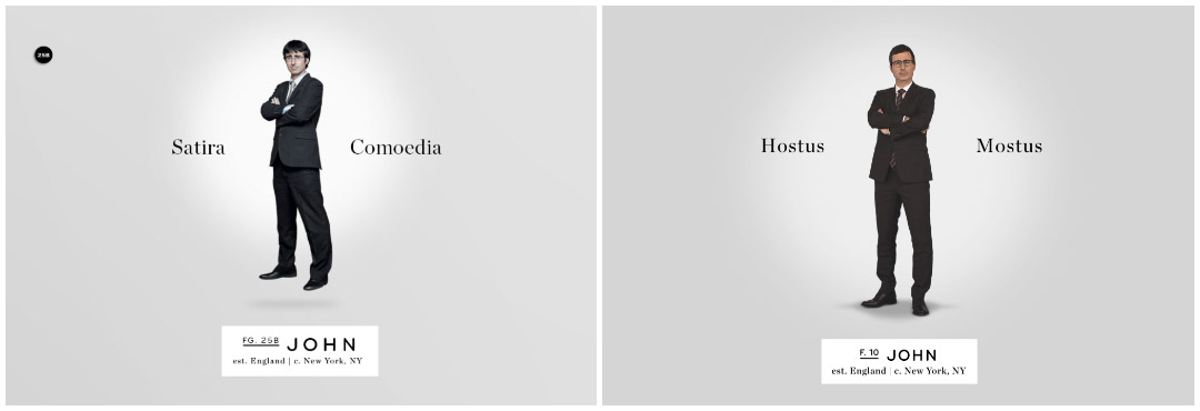
Last Week Tonight original concept versus final product
Your new studio And/Or basically spun out of this project, right?
Kelli: Yeah, I kind of popped off of Trollbäck. That sounds weird! [laughs] I was working at Trollbäck when we got the John Oliver pitch. It was such an amazing job and it was exactly what I wanted to be doing. So I partnered with my wife Kendra Eash, who’s a copywriter and comes from the agency side. We have a shared love and appreciation for humour and how it can connect people in a positive democratic manner. She writes short form humour pieces for McSweeney's Internet Tendency and The New Yorker’s Shouts & Murmurs blog in her spare time. [We] started And/Or because we felt like there was a bit of a lack of vision or personal voice in the industries that we were working in. At around the same time Last Week Tonight was in development Kendra had a bit of a viral hit with the This is a Generic Brand Video piece she wrote and we really felt there was a place for this kind of voice in popular media.
This Is a Generic Brand Video (2014) written by Kendra Eash
Kelli: Our goals as a company are really a work a progress, I think we want to continue to make really great work with clients who respect our voice and meanwhile start looking to create some content of our own. We are working towards finding a balance between commercial work and development work, i.e. short form content, scripted animations, and live action, film, TV, you name it. This is a really exciting time in creating media and content and we want to be a part of shaping that.
So those two projects convinced you both that you could be doing this sort of thing out on your own?
Kelli: Yeah! I was art directing and creative directing things with Trollbäck for the entire time I was there. I love Trollbäck – we’re friendly, they’re great and I love them – but they have a very specific aesthetic. People come to them for a very specific thing: clean, modern design solutions. That is my inclination too, but I feel that sometimes it doesn’t have quite as much personality as I want my work to have. So I think that seeing success with John Oliver made me feel justified. I can do this. I can have a bit of a voice in my work and be successful, so I’m going to try that now. We’ve been doing that for the past two years and we’re expanding like crazy. We just moved to a bigger studio, we’re hiring our first person, and we just won a big rebrand pitch. So it’s going!
Like most parts of the entertainment and advertising sphere, the motion design industry is heavily dominated by straight white men. What do you think the industry and community should be doing to make itself more open and inclusive?
Kelli: Great question. I think it's important to us as a studio to be visible as a women run studio without making a big deal about it. It's a delicate balance. We are not a WOMYN studio, we just so happen to be women who are really good at what we do. It should not be a huge deal or surprise. All that is to say we are very interested in leading by example. I think as far as the larger industry is concerned, simply giving women, people of colour, and queer folks a chance to do the amazing work they are capable of is the way to do it. Support voices that don't necessarily reflect your own male, straight perspective. Put women, people of colour, and LGBT people in positions of leadership, as directors, CDs, etc. Support women who want to have children by accommodating that lifestyle change in the workplace. It's not rocket science, it's really just about being a curious and supportive human being that respects other creators.
What are some of your personal favourite title sequences, whether classic or contemporary?
Kelli: I actually love the Night Moves sequence that Marlene McCarty did. It’s amazing. It’s so simple and bold. It just feels so different from anything I’ve seen. That one I love endlessly.
Night Moves (2013) main-on-end titles and crawl, designed by Marlene McCarty
Kelli: What else do I like? The Westworld titles that Patrick Clair did are beautiful and incredible. I usually don’t feel the 3D stuff, but that particular title sequence is done soe beautifully and elegantly. It’s undeniably great. And I mean, Jesus, Stranger Things is like the best thing I’ve ever seen. The article you guys did on it was so great to read. I think that one is drool-worthy, it’s so perfectly done.

