One dose of passionate past. A portion of political intrigue. And a shot of high-octane present. These are the ingredients for the 2023 TV series Liaison, a UK–France co-production starring Eva Green and Vincent Cassel as intelligence agents and former flames. Created by Virginie Brac (Cheyenne & Lola, Insoupçonnable) for Apple TV+, the series is a sultry thriller centering on cyberattacks, disasters and desire beyond borders.
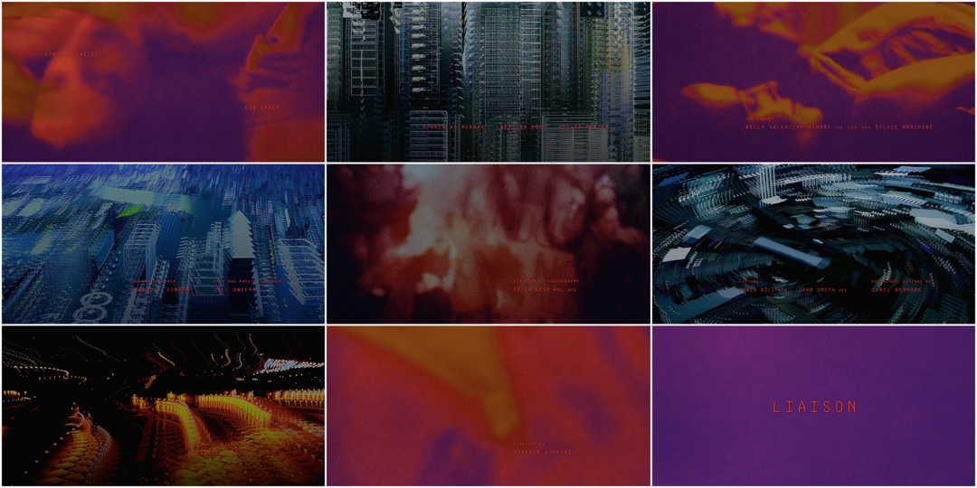
Introducing the series is an opener by Emmy-nominated designer Saskia Marka, who weaves the themes together like a tangled tech tapestry. The colourful footage of two lovers embracing is sharply cut together with cityscapes stretched past cohesion. Burning red type, sans serif and mono-spaced, sits atop each scene. Known for her work on the end titles to The Queen’s Gambit, the explosive opening to Babylon Berlin, and the colourful collage-work of Deutschlands ’83, ’86, and ’89, Marka here cements herself as a heavy hitter of title design.
I chatted with Marka about the making of the Liaison sequence, what it was like being nominated for an Emmy, and what she’s cooking up for the future.
Hi Saskia, how are you doing? The last time we talked was about your work on The Queen’s Gambit back in 2020.
Saskia Marka: Yes, it’s been a while. I’m good, thanks so much for having me again!
The Queen's Gambit (2020) end titles, created by Saskia Marka with animator David Whyte
Your work for The Queen's Gambit was nominated for an Emmy. What was that like for you?
SM: The announcement was the best day of my career for sure. It still feels surreal. I‘m still sad I couldn’t make it to the Emmy Awards in person to soak up the Hollywood feeling.
Tell me what the last few years have been like. What kinds of projects have you been doing?
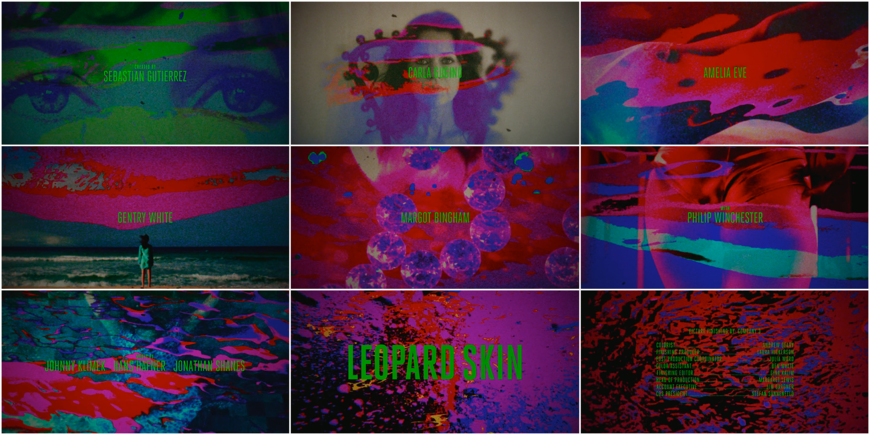
SM: The pandemic was hard but it was nice to have more time with the kids. I’m also glad that there was still enough work. I stayed true to doing titles and also started to work on some personal artwork, which is very exciting. In particular I did an end title sequence for the super-cool thriller show Leopard Skin and a new opening for Babylon Berlin season 4.
Leopard Skin (2022) main titles designed by Saskia Marka
SM: There are two more short openings coming out soon. With a 1:40 runtime Liaison is the longest opening title sequence I ever worked on. It was super fun being able to be generous with time and not rush everything up in just a few seconds.
What was the first chat about the Liaison titles like? How did this come to you?
SM: The production reached out and asked me to pitch. Liaison is a UK–France co-production, so there were many people in the first call. My point-people were director Stephen Hopkins, executive producers Sarada McDermott along with Gub Neal, Jean-Benoît Gillig and Edward Barlow.
They shared a synopsis, the DOP lookbook, and a creative brief before our first meeting. The brief was rather about suggestions than restrictions or precise directions. It pointed out the core of the show and what was of importance for the sequence: Liaison is a combination of different genres from romance, action, espionage to political thriller. It explained the dark and twisted relationship of the two main characters in the past. The love story between them is the central element of the show and should be the focus of the title sequence. The series is also about the political relationship between France, Belgium and the UK, while the UK gets hit by a series of mysterious cyberattacks. So that was my starting point.
—Saskia MarkaThe love scenes should be blurry and distorted like a memory or a dream, but at the same time show the couples’ burning love through very intense, glowing colours.

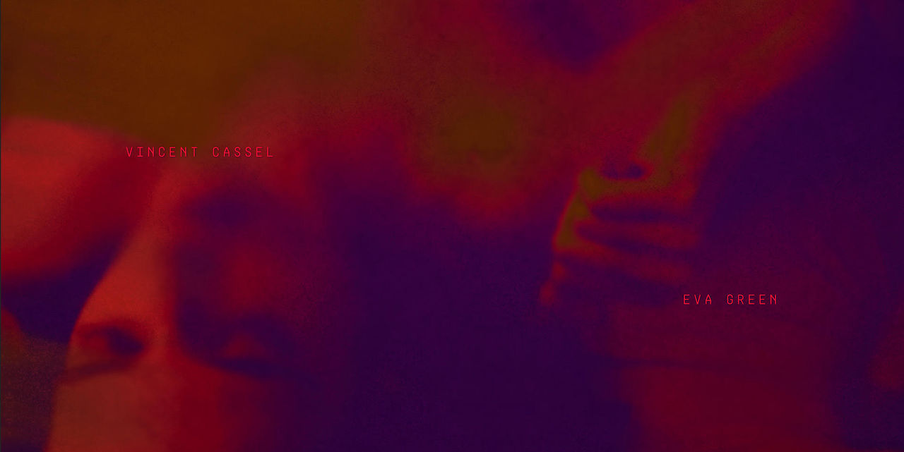
Credits for Vincent Cassel and Eva Green
Tell me about the process of creating this sequence.
SM: I came up with this concept: Three countries – three different parts or “storylines“ that are intersected. The backstory of passionate love, the political backstory of the couple and a jump to the present through drone shots of the main cities of action, distorted by glitches. They should stand out from each other visually and be high in contrast concerning colour, look and visual behaviour. Start slowly and end up in some kind of climax.

IMAGE SET: Drone footage with early glitch effect mock-ups
SM: Luckily they liked the concept and more luckily they already shot a lot of footage of what I needed for a mockup. So the production sent a great compilation of love scenes, protest scenes and drone shots for me to play around with and to show something in moving picture.
The love scenes should be blurry and distorted like a memory or a dream, but at the same time show the couples’ burning love through very intense, glowing colours.

IMAGE SET: Love scene footage shown in its original colours and, on the right, after being treated with the following effects: a scale wipe on a soft keyed light colour range on an extra layer, universe multitone, texturized motion, spot blurs and a heatwave on top.
SM: For the drone shots I experimented with glitches, but that felt too one-on-one with the cyber attacks, so it became another effect. The political backstory should also feel like remembered fractions from the past, so I zoomed into the material to an extreme. I chose scenes with speed from action or from camera movement, that would also give a hint at the story of the past. I think the restlessness of these clips is a nice contrast to the other parts.

IMAGE SET: Protest footage in its original colour and after being treated. On the right, the images are heavily zoomed in with multiple magnified spots, colour grading and a strong grain on top.
SM: Each of the three parts has its own story arc throughout the sequence. The love scene becomes more passionate, the drone shots follow the emotional state of the two lovers, and the demonstration scenes tell a story, too.
The title sequence is like another detached storyline of the show, which makes it more relevant. Patrick Clair would hopefully say that it has "a reason to exist"!
For the mockup the love scenes were very bright and the rest was low in saturation, but it pointed out the love story too much, so for the final sequence we decided to be bright all over the place. And that’s how this went down. I think we zoomed three or four times in total and everything fell into place very quickly.
—Saskia MarkaIt’s an echo effect within After Effects, which works very well with the camera movement of the drones. It repeats the past into the present and destroys it at the same time.
Video showing a selection of random pre-render tests for the motion behaviour of drone/aerial shots with the echo effect applied.
How did you create the sort of digital, multi-layer effect?
SM: It’s all set up in After Effects. From compositing to colour correction and delivery. It’s an echo effect within After Effects, which works very well with the camera movement of the drones. It repeats the past into the present and destroys it at the same time. I think that’s an interesting approach. This effect has a very different behaviour depending on object and movement. I took all the drone shots and ran the effect in different variations randomly on top of them. It’s super exciting to see the outcome.

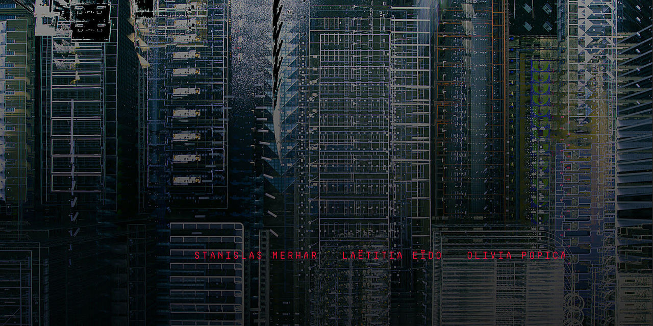
Still from the Liaison title sequence showing the glitch effect on top of drone footage with the credits for Stanislas Merhar, Laëtitia Eïdo, and Olivia Popica

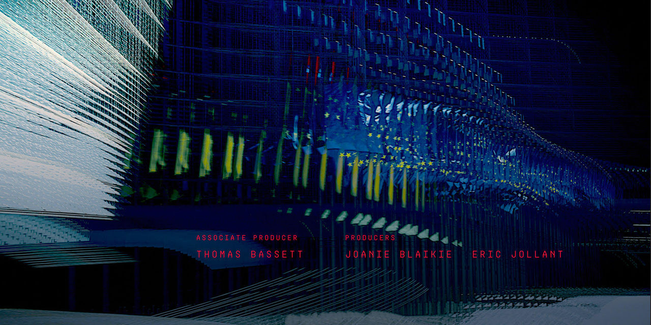
Glitch effect on top of footage with the credits for Associate Producer Thomas Bassett and Producers Joanie Blaikie and Eric Jollani
SM: There is one hour of material from which you can put 95% to trash, but that 5% often has great visual explorations that I might not have come up with myself. And this randomness is actually where I’m building from in this sequence. From this 5% there is 2% that makes sense with the story and that’s all it takes.

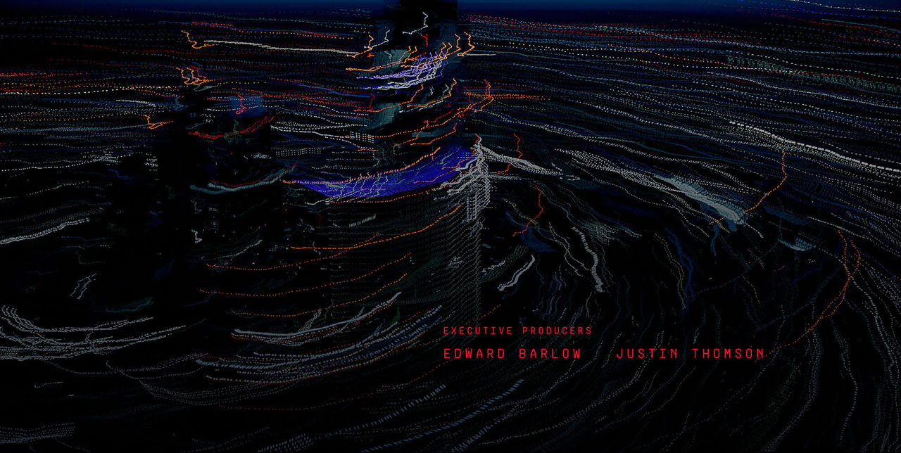
Glitch effect on top of footage with the credits Executive Producers Edward Barlow and Justin Thomson

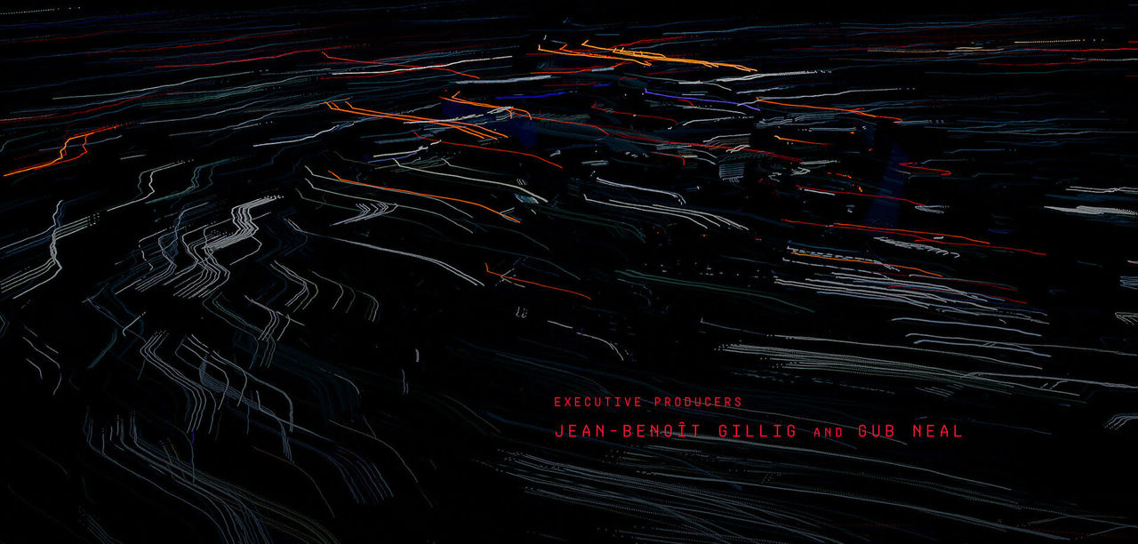
Glitch effect on top of footage with the credits Executive Producers Jean-Benoît and Gub Neal
SM: All the multi-layer scenes are very different in composition and colour but still work in unison. I like the modern feel about these “shattered landscapes“ and the way it picks up the music to support the love story.
Tell me about the typography. Did you explore a number of different options?
SM: It felt right to use a monospace font regarding the cyber theme and also as a contrast to the love scene part. Since the type is also red, I didn’t want it to feel cheesy. The credits should rather feel neutral, detached from the story. So the font Mono Spec made it right away and there were no other type variations.

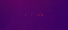
Liaison (Season 1 Episode 1) title card
SM: Concerning the placements of the credits, there was a lot of trial and error. I wanted every credit to be in a different position but the jumping around became confusing the more credits came in, so I put them all in one place. It seemed more sophisticated. The placement of the actor credits in the beginning is predetermined by the production.

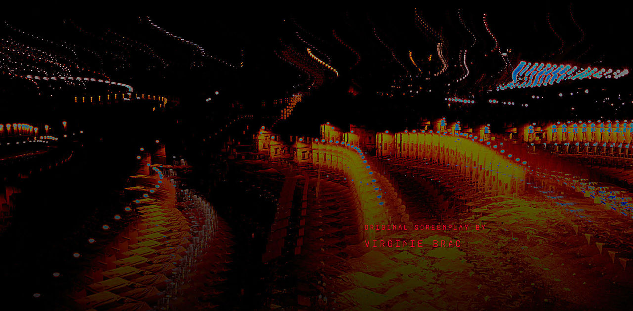
Credit for "Original Screenplay by Virginie Brac"
Did you also do the editing on this sequence, or did you collaborate with the show’s editors?
SM: I would have loved to work with the editors but in that phase of production everybody is super busy with their own tasks, so I did the editing on my own and handed in the whole piece.
How did you work with the music by Walter Mair?
SM: For the first animatic I used “Angel” from Massive Attack, because their music had a role in one of the episodes concerning the past of both main characters. I don’t know if it’s still in there. That track had something dangerous and unpredictable to it, which added another layer to the loving couple, but in the end the track from Walter Mair and PLUMM called “You Are the One” made it. Its tonality is more passionate, delicate and personal, which is a nice contrast to the destruction of the drone shots. Good thing I’m all about opposites!

Credit for "Music by Walter Mair"
What was the biggest challenge of working on this sequence?
SM: When I changed the footage from the HD mockup to 4K, my computer almost broke down on the echo effect. The high resolution material changed the outcome and the effect looked totally different from what I had already created. So that needed to be readjusted, but my iMac took about 20 seconds to preview only one frame in 4K in After Effects. I almost went crazy. Looking back, it makes me appreciate my new Mac Studio even more. Other than that it was a really great experience. I had a lot of creative freedom and I’m thankful for the trust and the opportunity.
Moving forward, what kinds of projects would you be especially excited to work on? What's a goal for you, now?
SM: Well, an Emmy would be nice! [laughs] I have always worked towards international projects with some creative freedom, so if it goes on like it is now, I would actually be very happy. Every film or show has different content, requirements and expectations on title design. That can never be boring. Other than that I’m working on some digital art that I‘m very excited about. I haven’t shown it to anyone yet but exploring the art world is my next big step.

