What is that you’re feeling? The love of another – be it a person or a god – is one of the primary drivers of creative output in this world. Poets, painters, philosophers, songwriters, and scribes have long attempted to put love into words or music or images, with varying degrees of success. In the comparatively brief history of the moving image, putting that emotion in motion has usually been the purview of filmmakers and actors. Few others get the opportunity to meaningfully weigh in on this subject on screen, least of all the title designer.
Madly is an international anthology film bringing together six stories of love – in many different forms – from six very different filmmakers: Gael García Bernal, Anurag Kashyap, Natasha Khan, Sebastián Silva, Sion Sono, and Mia Wasikowska. To introduce this multilingual, multi-part tale of love, infatuation, and romance, the global co-production turned to Canadian title designer Galen Johnson (The Forbidden Room) to create a title sequence that would capture the feeling, the idea of love – and act as the connective tissue to tie the entire piece together.
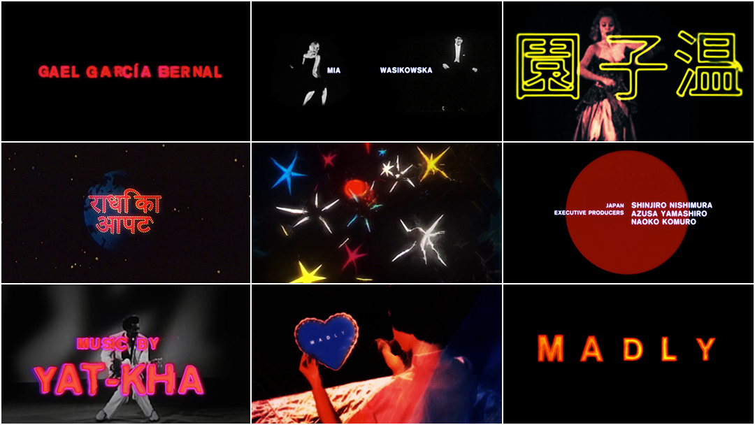
With a generous hand from the inimitable sounds of PJ Harvey, Madly’s title sequence attempts to do just that: encapsulate that explosive, unquantifiable thing. Images and type melt into one another, a pageant of quivering torsos, bright shining stars, and beating hearts all pulsing to the rhythm. It’s a messy fusion, a raucous combination of elements that feels both jarring and familiar, as it should. Like a love song or a sonnet, these titles are a welcome reminder of things that are and things that were. A fitting place to start.
When we last spoke The Forbidden Room had just bowed at the 2015 Toronto International Film Festival and the interactive project Seances was still in the works. What have you been up to creatively since then?
Galen: We finished off Seances and put it online. We also did a behind-the-scenes documentary about Hyena Road called Bring Me the Head of Tim Horton. Then a found footage remake of Vertigo called The Green Fog, and a 10 minute short called Accidence. And I helped Bill Morrison with the Dawson City: Frozen Time titles.
The Green Fog (2017) trailer
Galen: We also banded together with a few other artists to make these fake movie posters for the Contact Photography Festival. It’s my hope that we’ll eventually be able to adapt them into movies. Or even better, that someone with more talent and money will adapt them into hit movies!

Image set: "Coming Attractions" posters by The Long Weekend collective
You've been busy! So let’s talk about Madly. It’s an anthology film – six short stories from some very exciting filmmakers from all over the world. How did you first become involved in the project?
Galen: I think the producers saw The Forbidden Room at Sundance and liked the opening title sequence so they tracked me down and asked if I’d be interested. I’d heard of most of the directors – one of them was Bat for Lashes [Natasha Khan] – so I said yes.
What was your first meeting about this sequence like? Did the directors or producers have a vision for the opening?
Galen: From the beginning, they were adamant that I look at the titles as a standalone piece. So stylistically, at least, I wasn’t favouring any of the individual films. They'd seen and liked The Forbidden Room credits, their liveliness and instability, but we all agreed that we needed something more "contemporary".
Madly (2016) trailer
Galen: The two sequences they cited as references were The Forbidden Room and – of course – Enter the Void. So I took that to mean they wanted colour and energy. Given the subject matter and tone of the films, I obviously had to avoid the retroness of The Forbidden Room and the ominous aggression of Enter the Void.
Did you have any interaction with or feedback from the individual filmmakers?
Galen: No. Thank god! Directors tend to have opinions. They have to. But six wildly different directors would be a lot to deal with. Maybe there was feedback, but it never reached me. I hope they liked it! The producers seemed to like it so I assume no one found it too egregious.
So what was your process here? Obviously you’ve built a shorthand with collaborators like your brother and Guy Maddin, but this project must have been a little different. Did you pitch them ideas? Did you create storyboards? Tell us how you developed the concept for the title sequence and how you worked with the production.
Galen: Initially I thought this job might be a bit of a headache. It had many producers, and I thought that would mean 17 different people giving input. But I was given a lot of freedom. I knew they wanted something crazy and energetic, something that grabbed your attention immediately. So I needed to come up with a concept that would allow for that. I didn’t want it to just be untethered self-indulgence. Always tether your self-indulgence! So I used a really simple metaphor, based on the title ‘Madly’, a title which is more specifically referring to love: the idea of two relatively stable people coming together, and this sort of fusion reaction that occurs to make them behave in wild and irrational ways.
The idea of two relatively stable people coming together, and this sort of fusion reaction that occurs to make them behave in wild and irrational ways.

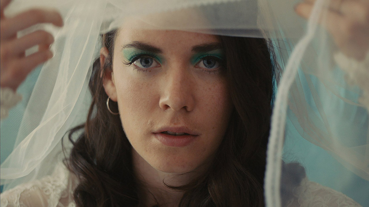
Madly still: "I Do" segment, directed by Natasha Khan
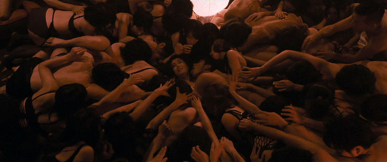
Madly still: "Love of Love" segment, directed by Sion Sono
Galen: So to translate that to a visual or typographic schema, I just had two typographic elements, say, the first and last name of a cast or crew member – come in from opposite ends of the screen and collide. Once that collision occurred – the relatively reserved Akzidenz Grotesk would sort of explode into something way bigger, more colourful and unstable with cartoon explosions and sexy dancing, etc. I sent them a rough proof-of-concept early on, and they liked the direction so we went with it.
Where did the footage of the dancers and musicians come from? More trolling the murky depths of the internet for treasure like on Forbidden Room?
Galen: Yeah – deep from the bowels of the internet! I have a collection of various public domain odds and ends that I mulch up and repurpose. I think I found most of them at archive.org.
I liked the way the little black-and-white dancers looked when they were sped up and combined with the glitchy neon text and cartoon explosions.
Nora the Quivering Torso short film sampled in the Madly title sequence
Design for Dreaming (1956) promotional film sampled in the Madly title sequence
Galen: I liked the way the little black-and-white dancers looked when they were sped up and combined with the glitchy neon text and cartoon explosions. I’d be hard-pressed to rationalize them anymore than that! It felt okay and I ran with it.
You’ve gone to some pretty extreme and interesting lengths on your previous projects to achieve that glitchy, distorted, worn look, and you go for a similar aesthetic here. In terms of methods or tools and software, how did you put it all together?
Galen: It’s mostly After Effects – no external plugins. There’s a bit of hand-drawn lettering but even that is altered in After Effects. In the initial stages I just pile on the effects, hit render, and see what happens. Most of it is usually garbage, but there are always a few moments that work. I probably only use about 2-5% of the stuff I create. I just sort of edit together all the best accidents in Adobe Premiere. There are a series of frame interpolation effects and expressions I exploit to give it that woozy morphing quality. So rather than hard cuts, in some places the frames just sort of briskly melt in to one another.
PJ Harvey’s “This Is Love” is a fantastic title track and works very well with the sequence. Who’s idea was it to use that particular song and were other songs ever considered?
Galen: I knew from early on that the producers wanted to use that track, but they hadn’t secured the rights so I wanted whatever I did to be transferable to another song if it became necessary. I’d never edited to a song with such a steady, persistent, dominating beat before. It was trickier than I thought it would be – if you make a cut on every beat, it seems sort of mechanical and predictable, but if you ignore the beats completely, it just seems out of sync with the sequence. I tried to find a sweet spot – cut on the beat 67.8% of the time, ignore the beat the other 32.2%.
One of the films is from India and another from Japan, so naturally you’ve got Japanese and Hindi typography in the mix too. Did that pose any challenges?
Galen: Honestly, I just used Google and Wikipedia to translate and confirm how to typeset those names properly. No one ever told me I did it wrong, so I assume I did it right, but who knows!
I just used Google and Wikipedia to translate and confirm how to typeset those names properly.
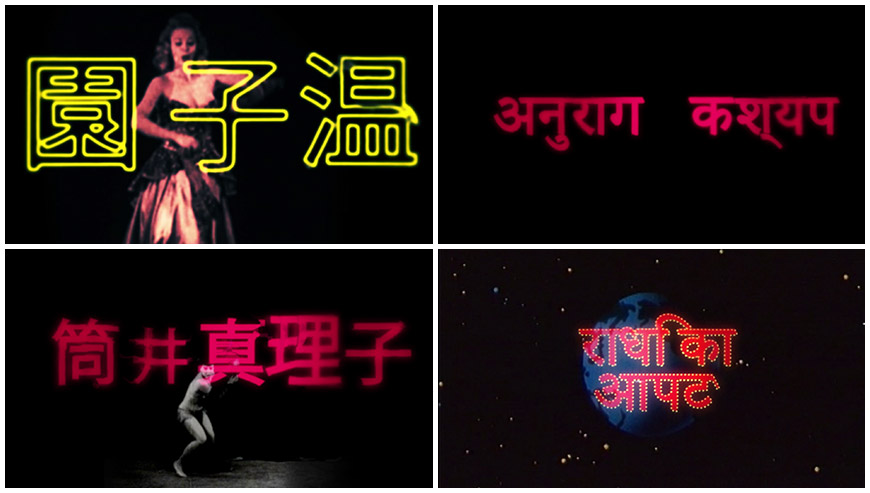
Image set: Japanese and Hindi title cards featured in the Madly title sequence
Did anything take you by surprise when working on this sequence?
Galen: I guess, since I’d been working in the Maddin bubble for so long, I expected a lot more back and forth between me and the producers. But it was really pretty painless. Either they liked it or they were too busy to push me in another direction. You never know with producers.
Is there a particular element or shot in this sequence that you’re most happy with?
Galen: The way the title appears on that card at the end, if only because it was the only moment that I actually planned, that wasn’t a complete accident. I rely so much on chance and accidents that sometime if I have an actual idea that I want to execute, it’s tricky, because I’m so used to being reactive rather than proactive. And I use so many effects that I’m rarely able to preview a sequence properly before I render it. It’s not like I have a big powerful rendering setup. It’s just me and my five year old iMac.
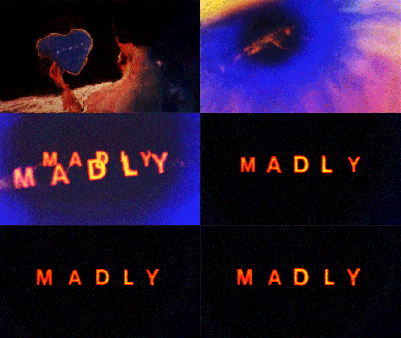
Galen: I guess I'm just happy I've been able to bluff my way through another title sequence with a rudimentary knowledge of After Effects and good-but-not-great typography skills! Also I always liked those black-and-white videos of burlesque dancers and am happy I found a home for them.
What’s caught your eye lately in terms of title design? Any new favourites or old title sequences that you’ve discovered recently?
Galen: It wasn’t all that recent but I found the opening sequence of Resident Evil: Retribution really enjoyable. It’s in reverse, slow motion, and 3D. Every trick in the bag! And Paul W.S. Anderson is a great action choreographer! So spatially coherent! There are shots in there that Antonioni would almost be proud of. I can’t wait for the next in the series.
Resident Evil: Retribution (2012) main titles
Galen: Also, I love the opening to this little Encyclopedia Britannica film: The Dirt-Witch Cleans Up! Those freeze-frames, the typography, and that dull orchid and burnt raspberry colour palette!
Those freeze-frames, the typography, and that dull orchid and burnt raspberry colour palette!
The Dirt-Witch Cleans Up! (1971) main titles
And more generally, what have you seen or watched or read or experienced lately that’s been exciting to you?
Galen: There's lots but Horse Money and The Love Witch come to mind. Also we watched a lot of the 80s primetime TV soap Hotel when we were culling footage for The Green Fog. That's a DVD box set that's worth diving into. James Brolin plays the manager of the titular hotel and he lives in the penthouse. It has automatic sliding doors, like the starship Enterprise, but they're made of wood! Or at least that's how I remember it.


