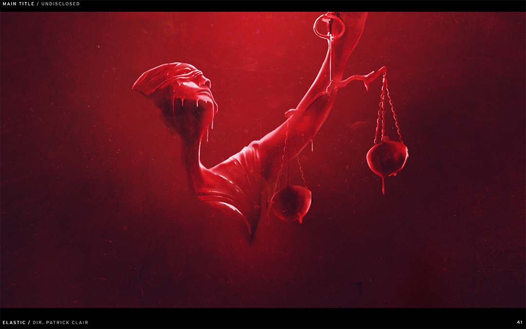
A city bleeds and a hero is born.
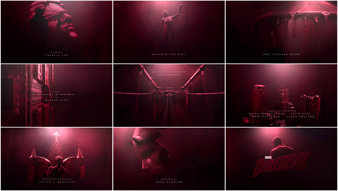
Elastic’s main titles for Daredevil — Marvel’s hardboiled foray into the world of episodic on-demand television — announce the series in grand fashion. Viewers are introduced to the violent, murky New York City that blind lawyer slash masked vigilante Matt Murdock calls home. An insidious, corrupting force is set upon the world, seeping out into the city, blood red, trickling down from the highest towers like hot wax, drowning the streets below. It’s there that a figure emerges — the Devil of Hell’s Kitchen — shaped by the city, formed by all that fear and ill intent — a part of it but compelled to oppose it.
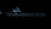
Echoing the sloshing Chianti of Hannibal’s all-too-brief main titles and the raging black ooze of The Girl with the Dragon Tattoo, Daredevil’s blood-soaked opener serves as memorable calling card for the series. John Paesano’s minimalist main title track also leaves an indelible mark, the melancholy notes of a piano – like the show’s hero – are an island in a sea of darkness. Head bowed, horns out, a great weight washing over his shoulders. Good, bad, or something in between, this place makes you what you are.
Nominated for a 2015 Emmy in Outstanding Main Title Design.
A discussion with Elastic Creative Director PATRICK CLAIR, Illustrator/Designer YI-JEN LIU, CG Lead ANDREW ROMATZ and Fluids Lead MIGUEL A. SALEK.
First of all, congrats on the Emmy nominations for Daredevil and Halt and Catch Fire! Are you rooting for one or the other?
Patrick: We love them both. They were both made in such different ways at such different times. Halt and Catch Fire was created with a really small team, and it was a very creative design process with lots of iterations between me and Eddy Herringson. Daredevil was much more epic.
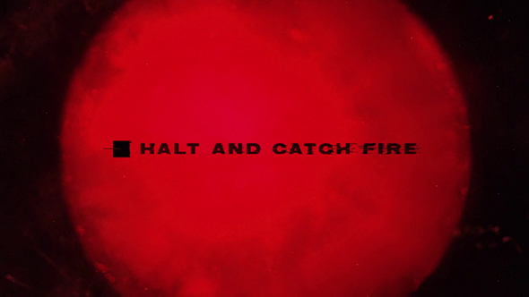
Halt and Catch Fire (2014) title sequence designed by Elastic
I directed that with the CGI team here at Elastic in Los Angeles. The technical requirements of the sequence demanded a lot of hands, and the team came together brilliantly under the leadership of Andrew Romatz. Between Andrew, Miguel Salek, Shahana Khan, and their various crews – not to mention our design and concept artists – we were able to execute a really focused creative vision across a very complex CGI pipeline.
Daredevil is one of Marvel’s oldest and most beloved characters. There’s a lot of history there. How did you familiarize yourself with the character?
Patrick: We spent a lot of time talking with Marvel and immersing ourselves in the world of the show. There’s some great themes and symbols at play with Daredevil – from the Catholic imagery, through to old school iconic New York City in the Hell’s Kitchen neighborhood, and all the parallels between blind Lady Justice and the hero’s own condition.
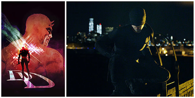
A modern comic book depiction of Daredevil by artist Bill Sienkiewicz (left) and Daredevil as played by actor Charlie Cox (right)
What was the starting point for the team? Walk us through some of the early concepts.
Patrick: I read some scripts and talked with people from the production about the show. We looked into eye scans, real life optometry stuff. They look very disturbing, like an insidious web of corruption.
We also looked into showing the city through depth maps and sonar, like Daredevil might see it.
Yi-Jen: Patrick came up with the idea of making a red world that was revealed by liquid. I started with lots of research, observed all kinds of liquid, paint, slime, and even blood.

Image Set: Daredevil title sequence reference material featuring liquid effects on black and on white, including stills from the opening titles of The Girl With the Dragon Tattoo (2011)
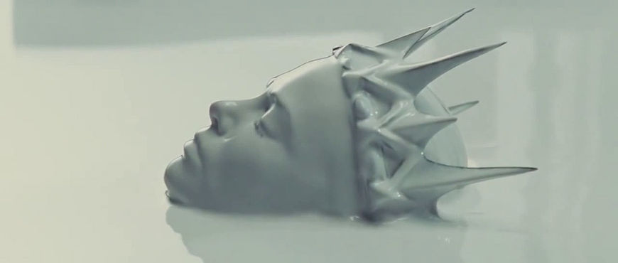
Snow White and the Huntsman (2012) milk bath scene
Patrick: We had the jumping off point of the post-Avengers world, where the city is ruined from the battle, and I was fascinated by the idea of corrupted parties vying for control through the reconstruction effort — this insidious corruption resonated with the creeping, gooey poison from Daredevil’s childhood — and that gave us a starting-off point for thinking about a liquid reveal themed sequence.
Yi-Jen: After that I sketched out a couple of compositions. Then I went ahead to illustrate and “liquify” the object using my research of liquids as reference.
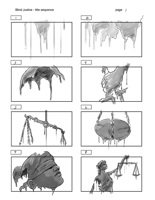
Image Set: Daredevil title sequence storyboards illustrated by Lance Slaton
Patrick: We did try a footage-based approach, hinting at a shadowy and ominous New York, full of reconstruction and a brooding danger – this was intriguing, but not as visually compelling. Ultimately, the city objects were rolled into the final execution and this really merged with the liquid concept. The liquid concept was always my favourite.
We didn’t meet with the whole creative team until after we’d developed a few of these ideas, which I think they liked, but they gravitated to the liquid concept immediately.
[Showrunner] Steven S. DeKnight zoned in on one of our images straight away. It was an early sketch of Daredevil being revealed by sticky liquid, all done in deep reds by our artists Paul Kim and Yi-Jen Liu. I think they saw their show in that image, and from there we were off and running.
Yi-Jen: We wanted to create a heroic and fearless look of Matt Murdock, so we researched different depictions of heroes for inspiration. I also had my co-worker pose for me and I sketched off of that to create a silhouette that captured what Patrick was looking for.
Patrick: That image now is the final frame of the title sequence.
Yi-Jen: Paul Kim designed the typography and tied everything together.

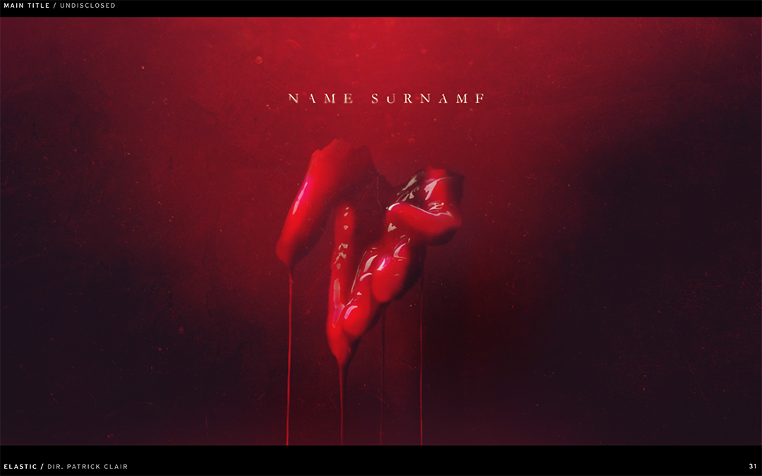
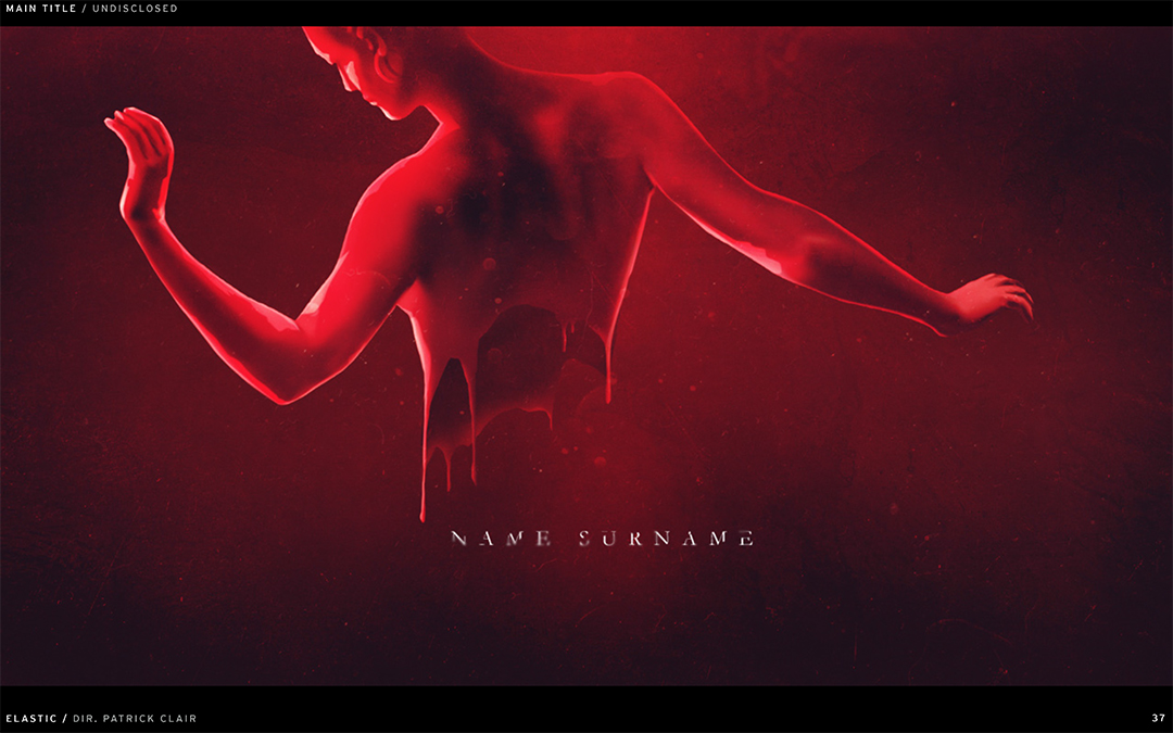
Image Set: Daredevil "Revelations" design boards
CG liquid simulation can be pretty tricky stuff. What were some of the challenges you encountered building the sequence around this concept?
Patrick: I found this to be a really exciting example of technical and creative coming together. Yi-Jen had sketched this goo, the sticky red bloody stuff revealing the objects, and there was a great feel, look, composition to the way that worked. We could give that to Andrew and Miguel, working in the very technical world of fluid sims and geometric CG models, and they were able to translate that same feel into the way the fluid moved on-screen. It’s hard to make an algorithm act “insidious” but I think they nailed it. They can explain this in more technical detail.
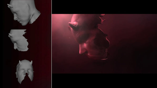
Andrew: Developing the right consistency and behavior of the fluids was definitely a tricky process. Getting the scale to feel right was something that we had to play with quite a bit in simulation and also in lighting and texturing. Patrick wanted the sculptures we were forming to feel like miniatures, so we did a lot of experimenting with scene scale and with camera settings, simulating depth of field to achieve that look.
Miguel: Each shot required custom flow maps to be painted on the sculptures, along with small attraction fields and thousands of tiny adjustments to achieve the shapes and behavior Patrick was looking for. In the end I simulated hundreds of tests and thousands of frames of fluids to achieve just the right balance for each shot.
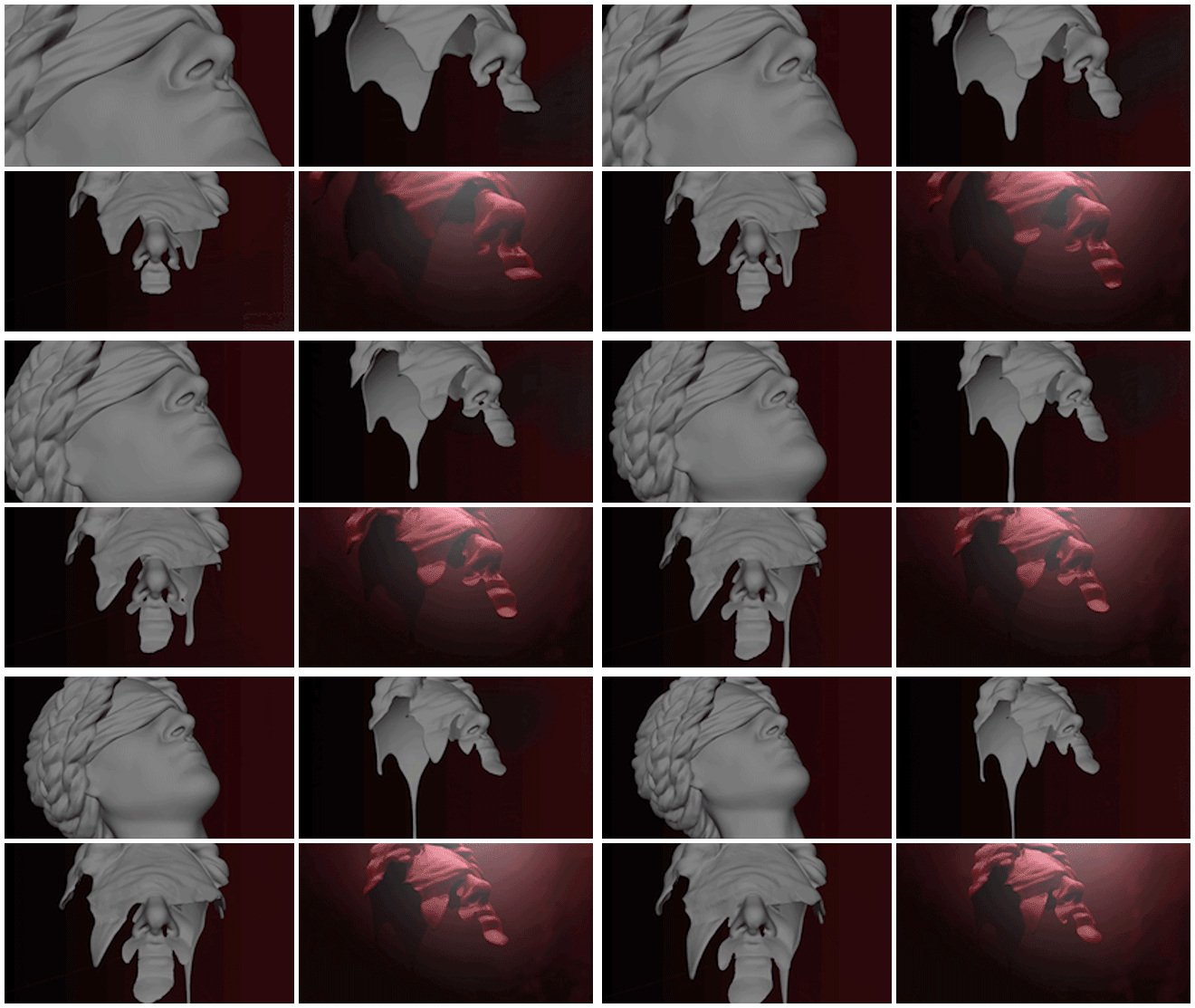
Animations of the computer-generated 3D fluids in action
Was there a particular fluid and its behaviour that you were trying to imitate? It looks a little like melted wax.
Patrick: It was important to me to keep the fluid ambiguous. It was a reference to poison, it was a reference to blood, but it was probably matching the tempo of the music that set the pace for how it should behave.
Andrew: We were looking for something that was blood-like but also maybe some kind of poisonous sludge. I translated that into liquid chocolate. From a behaviour perspective I was thinking of something in between liquid chocolate and tar. Look-wise, when [3D Artist] Katie Yoon was developing the shaders I asked her to add in as much gunk as she could while still keeping the fluid looking sickly pretty.
For an example of a title sequence that actually uses liquid chocolate, check out The Cabin in the Woods
Miguel: My main goal was to convey the idea that this was something thick and poisonous. A mix between thick goo and blood. It was definitely a very challenging task that required partial modification of existing solvers in order to gain arbitrary stickiness and viscosity controls.

Image Set: Various 3D models and environments used to create the title sequence as rendered in ZBrush and Maya
Yi-Jen, what was it like seeing your concepts put into motion?
Yi-Jen: It was extraordinary. The CG team did such a great job and made all the concept illustrations come to life. When I first saw the final open, I was so excited that I jumped up and down like a little kid.
The liquid concept illustrations included references to Murdock’s history boxing (the heavy bag, the ring). Why were these shots nixed from the sequence?
Patrick: It was simply a matter of time. It was important to make sure we got a really good sense of the location – Daredevil is a hero for the streets – and we wanted to make sure the sequence felt steeped in the icons of Hell’s Kitchen and the city. Between Lady Justice and the religious imagery, it was hard to tell the story while maintaining a creepy, suspenseful pace. So, as always, some of your favourite elements don’t make it to the screen – but that’s all part of the process.

Boxing concept illustrations by Yi-Jen Liu which were not included in the final sequence
John Paesano’s haunting theme really ties the whole sequence together. At what point in the process did you get the track to work with?
Patrick: John’s work on this is stunning. We did all our animation to a temp track – an old piece of 90s trip hop – but then John’s score really brought the piece to life. I love his music so much more than the temp track, which is actually one of my favourite songs from high school.
What elements of this sequence are you most happy with?
Patrick: Probably the colours. I love working in restricted colour spaces, and the red was awesome to explore and push to the limits.
You seem to gravitate towards scorching reds these days – it’s in Halt and Catch Fire, the new True Detective’s got it. What is it about that that's attractive to you?
Patrick: It's been really exciting to have some pieces to work on that have pushed so far into reds and pinks and really hot, warm colors. Traditionally, I've always been inclined to use very muted colours, and I love cool colour schemes of desaturated blues and greens – but now and then the right project comes along to really push out into hot bold tones that have strong hues.
The fascinating thing with red is that it's a really delicate color, by which I mean that just a few degrees of hue shift can really alter whether it feels fundamentally pink and neon or warm and cozy and bloody. Daredevil was always going to play into reds, riffing on the suit and comic book traditions, but what was cool for me was to see how we could drag some blues and purples into the blacks, and smoky tones through the mids and highlights. We wanted this world to feel sticky, dark, mysterious, and regal. It took lots of tests to find the right balance.
Which tools and software were used to put it all together?
Patrick: Modeling was done in Zbrush, fluid simulation was done in RealFlow, and texturing was done in Photoshop, Mari, and After Effects. Animation, lighting, and rendering were done with Maya and V-Ray. Compositing was done in Nuke.
Video: Daredevil title sequence making-of reel
We haven’t really seen elaborate opening titles in a Marvel universe property before. Marvel Studios is well known for their main-on-end film title sequences, but nothing like this.
Patrick: I think that a TV series is the perfect place to head in this direction. Netflix is quickly establishing a great tradition of cool title sequences, and as we see more and more content coming out of the dotcom portals, it’s exciting to see these new distributors and producers embracing our role in the process.
The sequence seems to have been very well received by Daredevil fans. Has there been any discussion yet about the other Defenders shows – Jessica Jones, Luke Cage, Iron Fist?
Patrick: It’s always stressful working with material that has such a loyal fanbase – you really don’t want to let people down, especially when you’re handling characters that they have invested so much time into. We loved it though, of course, we’d definitely work on more series in the Marvel universe.
What are some of your personal favourite title sequences, either classic or contemporary?
Andrew: For me the 1989 Batman titles were wonderful. I was obsessed with Batman at the time and this was the first title sequence that really caught my eye creatively. I also really dig the Napoleon Dynamite titles and the True Blood titles really set a great mood for the show.
Patrick: Six Feet Under, True Blood, Dexter – all amazing use of mood and tone and footage. Alien is the best type ever laid on a cinema screen. The Dawn of the Dead remake is music and montage at its finest.
Yi-Jen: Lemony Snicket's A Series of Unfortunate Events end titles, The Man In The High Castle titles, The Adventures of Tintin unofficial titles, the Sherlock Holmes end credits and more. There are so many great titles, it's hard to pick favourites.

Image Set: Daredevil title card in the design board stage (left) versus the final product (right)
Support for Art of the Title comes from

CINEMA 4D BY MAXON
Featuring an Unmatched Live 3D Pipeline with Adobe After Effects CC


