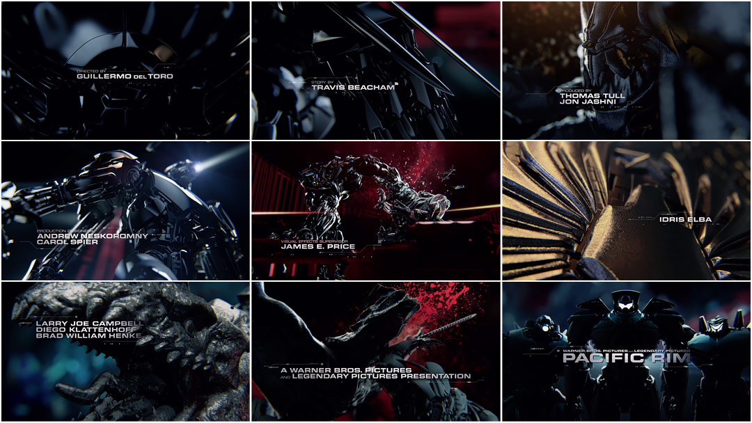
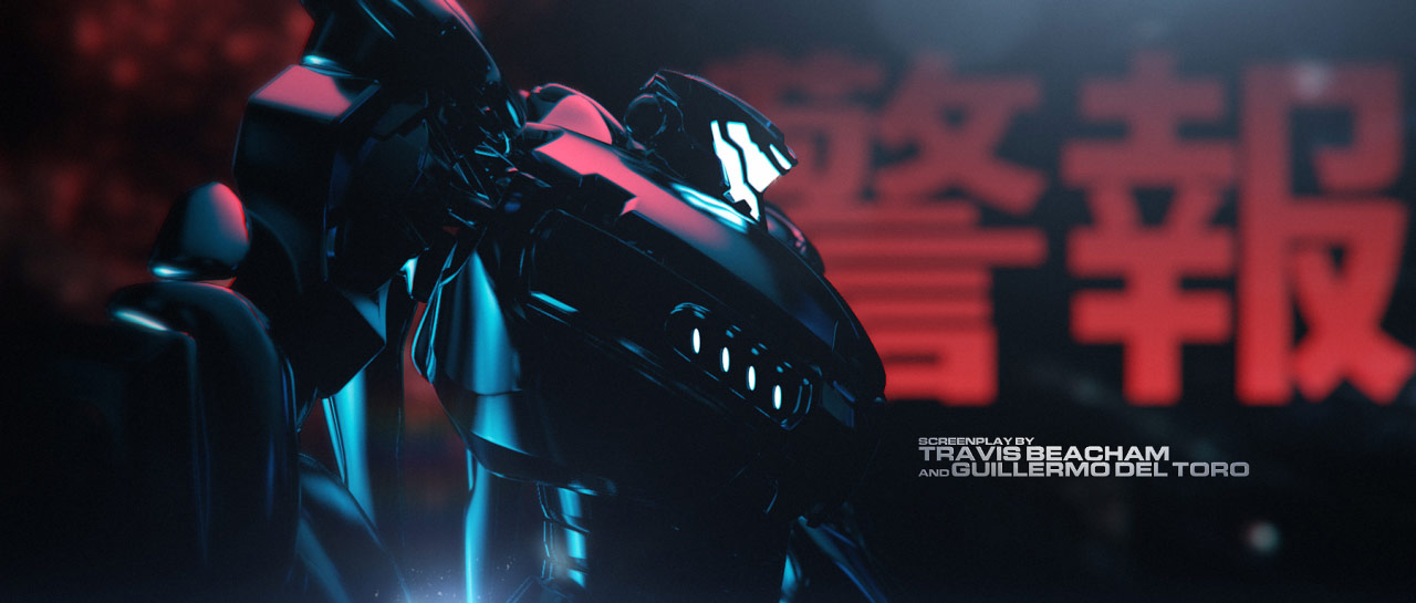
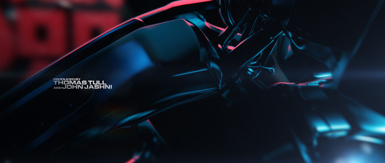
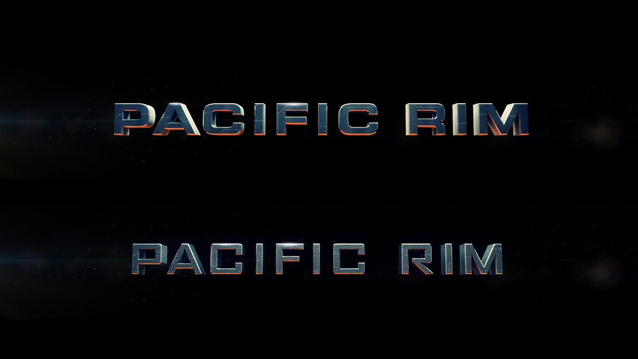
For moviegoers who survive two hours of massive, nuclear-powered robots beating the living hell out of alien monsters from the bottom of the ocean, Imaginary Forces’ sleek and statuesque main-on-end titles for director Guillermo del Toro’s Pacific Rim are the calm after the creature-punchin’, bot-stompin’ storm.
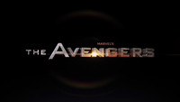
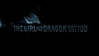
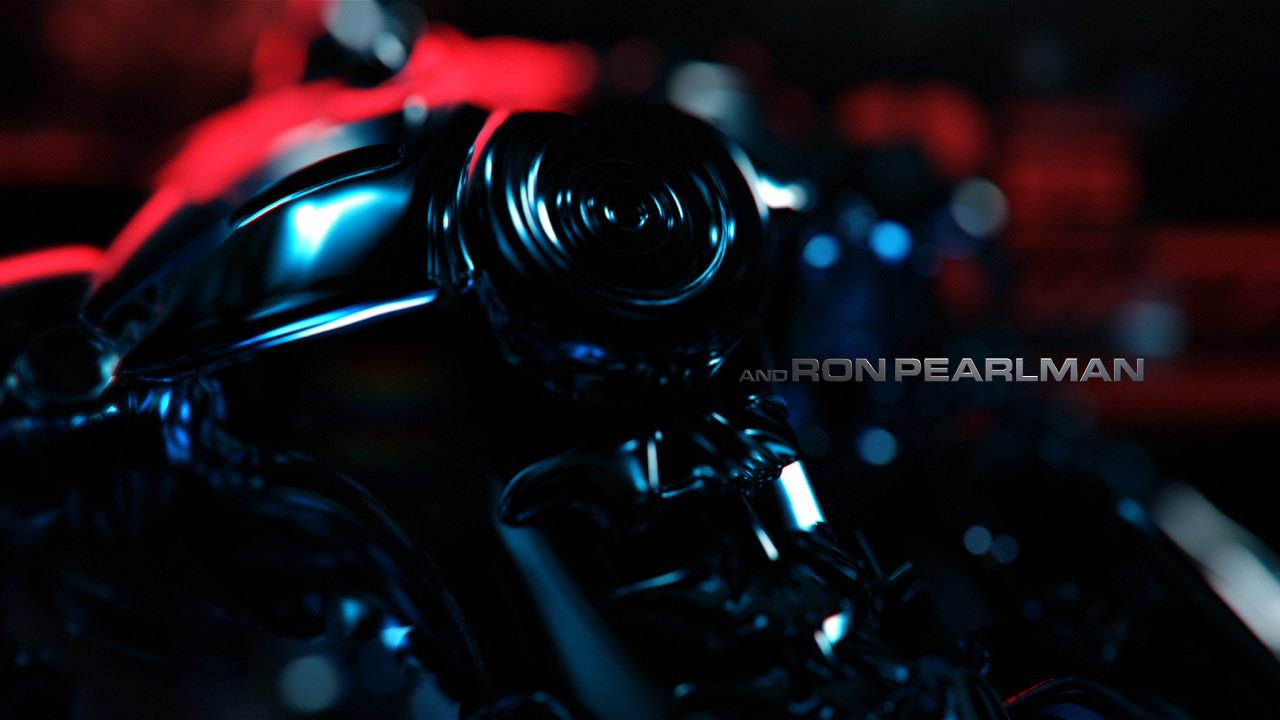
The unholy techno-organic offspring of Avengers and Dragon Tattoo, the sequence is a heart-pumping showpiece set to the sweet strings and screeching riffs of composer Ramin Djawadi and guitarist Tom Morello. Dwarfing jets, tanks, and helicopters alike, the Jaegers and Kaiju (Pacific Rim’s skyscraper-sized mecha and monster combatants, respectively) battle it out one pose at a time, like enormous obsidian action figures in the hands of an unseen child. Robot jocks throw punches, colossal fists crack gargantuan jaws, cities crumble, kaiju roar, and the screen becomes a twirling tangle of machine and monstrosity.
Director Guillermo del Toro, on producing the sequence with Imaginary Forces:
It was very quick. We gave them our models – our robot models and our kaiju models – and they came back with five different types of sequence. One that was manga and then the one that you see in the film, which was like a beautiful, very sexy machine, black with very saturated colours. We art directed it over the course of a week – I said go brighter with this, go less with this, more reflectiveness on this – and in two weeks we had the sequence. I think it is one of my favorite things about [the movie]!
A discussion with Creative Director MIGUEL LEE and Lead Animator RYAN SUMMERS at Imaginary Forces.
Give us a little bit of background on yourselves, and your current positions and responsibilities at Imaginary Forces.
ML: I started at Imaginary Forces fresh out of school in 2006 as a freelance designer and animator and spent the next few years working there. After freelancing at several other studios and running a shop for two years with my partner, I returned to IF in 2011 as a creative director. Iʼve maintained a fairly hands-on approach with all the projects I work on.
RS: I was studying to be a chemical engineer when I happened to take a 3D Studio DOS class on a lark, and the rest was history. I changed my major as quickly as possible, spent two years at an awful college, and then found a job doing direct-to-video character animation in Chicago. When that studio went under, I found a gig at a casino game development studio and then a gig shooting web documentaries. After that, I headed west and I've been working at Imaginary Forces since. Now, I work alongside Miguel as a staff artist, where I do a bit of everything motion graphics-related, from design to character animation to on-set supervision. It's pretty awesome.
—Miguel LeeIt made sense to have something a bit more “subdued” after two hours of mayhem and destruction
Describe how you first got involved with Pacific Rim and how that relationship began.
ML: IF founder Peter Frankfurt has had a long working relationship with Guillermo del Toro which began with Blade II. Word came in that we were being considered for the end title sequence for his upcoming summer release. We all knew that it was going to be a huge movie and were excited by the prospect of working directly with Guillermo.
Initially, a couple of other creative directors and I went for a meeting with Guillermo and the film producers to screen parts of the film. Even in their various stages of completion, the production design and VFX looked spectacular. Guillermo wanted the end titles to contrast the rest of the film; it made sense to have something a bit more “subdued” after two hours of mayhem and destruction.
The entire project had to be executed within a tight timeframe with a large part of the schedule dedicated to creating the stereoscopic 3D version. After our first meeting, we had less than a week to present concepts to the studio. At this point, the other CDs stepped out due to scheduling conflicts – all of us were directing multiple jobs at the time – so I was fortunate to lead the project.
Detail the first round of concepts you presented to del Toro and company.
ML: The objective at this point was to have an idea green-lit so that we could move into production. We presented as much variety as possible to see what Guillermo responded to – five directions, each including only four styleframes but covering a wide gamut of both concept and style. We also presented a couple of additional explorations, one which ultimately evolved into the opening film title.

“Sexy Robots” concept
Some assets from the production were available to us to incorporate into our designs. We had ILM’s 3D high-poly models of the Jaegers and Kaijus as well as plenty of robot schematics and concept art. My first instinct was to create an aesthetic that would resemble a graphic novel which fused 3D and 2D elements. I took the ILM models into Cinema 4D and rim-lit them with softboxes and bounce cards to create a dark, monolithic look. I wanted epic moments as well as some macro shots which would leverage the rich complexity of the geometry. Once rendered, a bit of secondary color was infused along with some graphic elements to complete the frames. This look was influenced by several references that we had pulled together, including the title sequence for The Girl with the Dragon Tattoo (2011) as well as the frozen moments of Chez Eddy’s Silent Hill: Revelation 3D end title. This direction ultimately was chosen by Guillermo for the end titles.
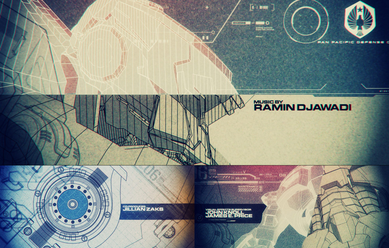
Other concepts included taking the 3D models and sketch-rendering them as if they were technical drawings. These were accompanied by line tracings of the schematics we received as well as a graphics toolkit designed by Jae Namkung, our intern. Additionally, we worked with My Tran, an illustrator who hand-crafted looks for a couple other directions; one imagined how Kaiju war propaganda posters would look while the other was an homage to manga.

Additional main-on-end title concepts
What kind of feedback did you get and how did you proceed?
ML: Guillermo and the studio producers had a very positive reaction. It was clear during the presentation that he favored the full 3D approach. He was enthusiastic about the 3D graphic novel concept, which he affectionately dubbed the “Sexy Robots.”
How did you end up creating the main titles as well?
ML: Among the concepts we presented was a wildcard idea which included a large war room map comprised of a vast array of small metallic tiles. This was created using a fairly conventional Cinema 4D technique. Admittedly, there wasn’t much consideration to the narrative of this approach aside from a rift that would form in the middle of the map signifying where the Kaiju emerge. Guillermo was really interested in this and proposed a main title reveal for the film, which was something that we hadn’t anticipated. But it was exciting and we took the challenge head-on.

"War Room Map" concept, plus revised version for the main title
Once locked, how did the final concept come together?
ML: A second round was planned to show further visual development of the selected end title concept as well as the proposal for the main title sequence. Once we got the go-ahead, we put our team together and jumped into production. Concurrently, Alejandro Lee, a visual development artist, thumbnailed out compositions and rough poses. Because the styleframes were created in Cinema 4D and composited in After Effects, we had a head start on some of the shots that eventually made it into the final.

Alejandro Lee's compositions and rough poses for main-on-end titles
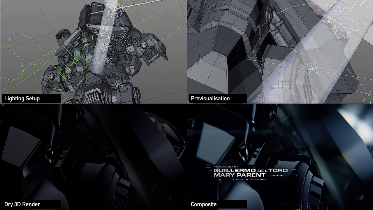
Ryan Summers and Eric Demeusy dove into cameramatics and previs*. Essentially, the camera was the only “noticeable” element that was animating through this sequence as all the characters would be frozen in action. I say “noticeable” because it turned out that we actually had to animate plenty of elements to make them look frozen!
*Previsualization (also known as previz, pre-rendering, preview, or wireframe windows) is a function to visualise complex scenes before filming
We unfortunately lost Eric to another project after a few days, but he had set up the camera rigs and laid the groundwork for the graphical animation that would house the title cards. Our intern Jae adeptly filled in and completed all the type animation. At this point, I shifted my focus to executing the main title sequence.
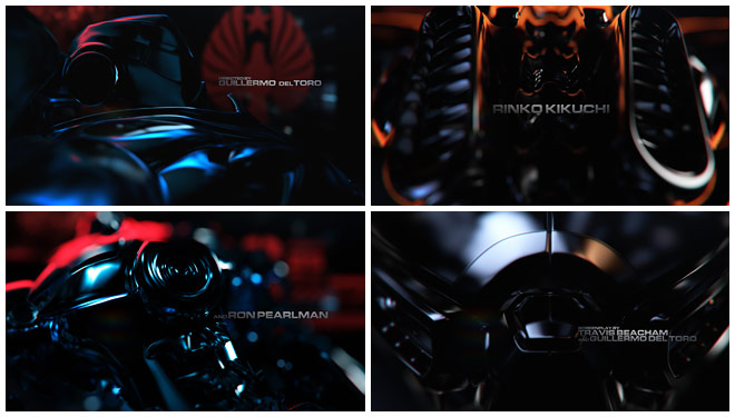
Revised “Sexy Robots” main-on-end title design
Talk about your (and IF's) first experiences with using 3D for a main and main-on-end title sequence.
RS: It was daunting! We had never taken on an entire stereoscopic 3D job as a team, let alone one as high profile as Pacific Rim. When we started, Miguel and I agreed to put the stereoscopic conversion to the side and just make something awesome, otherwise I probably wouldn't have been able to focus on any of the tasks at hand. We had boards to design, ILM assets to convert, pipelines to build. I definitely had the shivers thinking about putting 3D glasses on before we ever even showed styleframes to Guillermo.
We got lucky thanks to the Guillermo's taste – when he picked Mig's "Sexy Robots" board I breathed a sigh of relief. That board was ready to go, straight outta Cinema 4D* and onto the big screen. Miguel designs pretty intelligently that way. What wasn't smart was not rendering left eye* for our 2D version; we could have saved a boatload of render time if we’d thought ahead!

Main-on-end title render breakdown
*CINEMA 4D by MAXON is a 3D modeling, animation and rendering package well known for its ease of use, fast workflow and effortless integration with other production tools.
For other examples of CINEMA 4D in use and for more information, visit Maxon.
Thankfully, Maxon has a logically built set of stereoscopic camera tools: as long as we stayed symmetrical and parallel, we could keyframe eye separation to a point that we liked and still manipulate the volume in both After Effects and Flame. We had a tight game plan for keeping all of the Kaiju and Jaeger imagery in aquarium space, which allowed us to generate all of our titles as 2D elements that could be composited in Flame at the end. Plus, we already had textless versions!
*Rendering left eye is outputting one of two viewpoints that can be viewed on its own as 2D, or combined with a right eye render for stereo 3D (as opposed to rendering from a centered camera)
As soon as we finished up our 2D version, we headed into the stereo process. Eric Mason, our resident Flame genius, was indispensable here. We spent a week dialing in low-quality stereo stills from C4D to save time, catching several issues that needed to be addressed from the flat composites. If you watch both versions, you might see a couple little animation differences. A claw slid to the right here, a reflection buffed out over there. If you dig the 3D version, that's all down to Eric's handiwork.
What is it like creating a title sequence for a film that you haven't seen in its entirety?
RS: I wanted to avoid seeing the finished film, but I wanted to make sure we weren't missing any key moments either. I made it my mission to sneak around the production office and check in with anyone I could to see what cool new moments had come in during the week. Thankfully, Pacific Rim's awesome editor John Gilroy would always sneak me into the edit bay to show me the good stuff. That's how we got our "living sculpture" final shot into place. John asked if I knew about "the sword" and the rest is history!
Pacific Rim Main Titles
ML: As of this interview, I still haven’t seen the full movie! From what I’ve seen of previews, there are things that would have been great to explore for our title sequence. On the other hand, not knowing took the pressure off of feeling like we were copying something from the film!
Were there any major technical hurdles with this project?
RS: Besides the great unknown of the stereo process, we were also in the middle of a historic move for IF.
ML: Yeah, the studio moved to a new space across town in the middle of the project. Our IT team worked hard to get everything up to speed before and after the move, but naturally, there were a lot of mishaps which set us back a couple times.
—Ryan SummersPrecision, laughter, and the best damn cursing you could ever hope for. I’d go to war for Guillermo.
RS: Basically, we never knew how many pieces our render farm was going to be in, so Miguel and I instituted the "5 Minute Or Less" Rule. If you couldn't get a frame out in under five minutes, you had to go back to the drawing board.
Plus, there was Miguel’s pregnancy.
ML: Yes, giving birth to my first child one week into production!
This was a very complex project. Could you talk a bit about your approach to project management and organization?

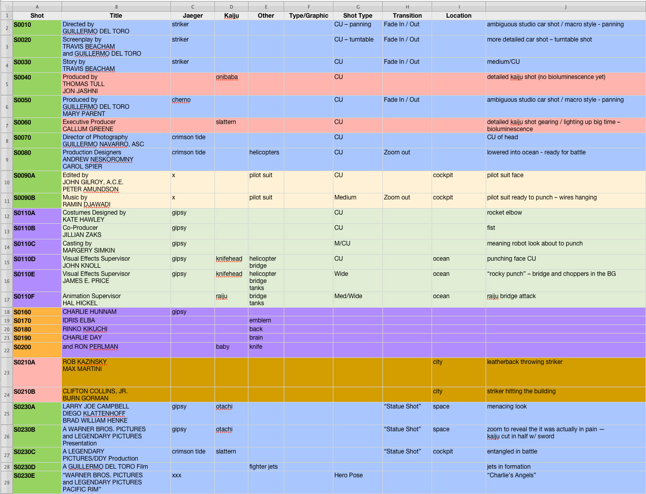
“Virtual Conform” spreadsheet
ML: Since we really didn’t have time to do an edit, we created a “virtual conform” through a spreadsheet that outlined all the shots we envisioned, where they would be physically staged, which characters or monsters would be in each shot, the title cards to feature, and what assets would be needed for each one. We outlined the moments of impact, shot types to create a narrative arc, and essentially projected the overall structure of the sequence.
We were fanatically adherent to our file-naming convention and folder structure. Every file had to be set up like a roadmap for any artist who needed to work in it.
Was there anything that took you by surprise when working on this sequence?
ML: Guillermo was an incredibly gracious director to work with. He was precise about details and knew exactly what he wanted, yet gave us an amazing amount of creative freedom and encouragement to explore throughout the project. A week before delivery, we were screening the near-final version of the end titles in the DI suite* when he – the client – coyly asked, “May I make a small comment?” His humility and genuineness are truly impressive, especially for a leader of his stature. The cursing was definitely impressive, too.
*Digital intermediate (typically abbreviated to DI) is a motion picture finishing process which classically involves digitizing a motion picture and manipulating the color and other image characteristics

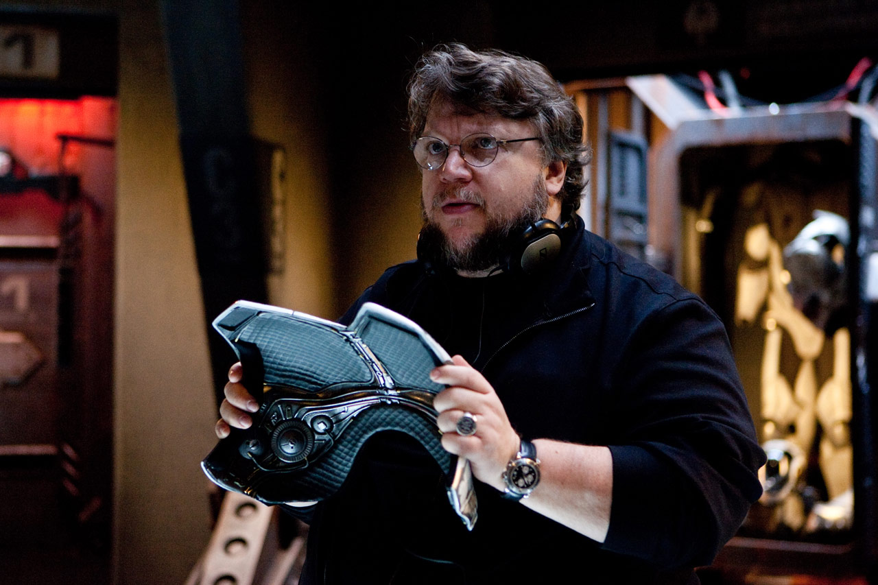
Director Guillermo del Toro on the set of Pacific Rim
RS: Working for Guillermo was like no other experience I’ve had as an artist. He's razor sharp, knows exactly what he wants, and is loud as fuck – in the best way possible. I do not know where his energy comes from! He started his days at DreamWorks, spent most of his time at Warner Bros. working on the edit and VFX for Pacific Rim, but would also be doing Cinesync sessions in Santa Monica producing on Jorge Gutierrez's feature film debut with Reel FX.
And he never stopped smiling or slapping you on the back. Precision, laughter, and the best damn cursing you could ever hope for. I'd go to war for Guillermo.
What element(s) of this sequence are you most happy with?
ML: I was surprised by how well everything worked out in stereo 3D. This really is a testament to Ryan and Eric Masonʼs development towards robust and thoughtful methodologies for stereoscopic conversion. Itʼs one of the rare times that I outrightly prefer the S3D version over the 2D. My two favorite shots in the sequence are Idris Elba and Rinko Kikuchiʼs title cards for their sheer simplicity and photography.
RS: Guillermo Navarro's title card. I still haven't gotten a chance to meet him, but I wanted to honor him by matching up his name with Crimson Typhoon's model. I can't get enough of his work, and the moment I saw the mecha with a camera lens for a head, I knew it belonged to him. We tried to match up the credits with just the right poses and characters - especially for some of our heroes like Hal Hickel and John Knoll. They both got featured in our big San Francisco shot.
Main title and main-on-end render breakdowns
How would you feel about a possible Best Title Design category at the Oscars?
ML: Wider recognition can only serve to elevate the craft. Let’s get the petition started!
What are some of your personal favorite title sequences, whether classic or contemporary?
ML: Itʼs not a full-on sequence, but Iʼd have to go with Aliens (1986) – perfect combination of ambiguity, futurism, mood, simplicity, and terror.
RS: Wreck-It Ralph's end credits were something special, especially considering they never should have happened! A true labor of love. Aeon Flux's short opening title is tone perfect for that show. I still rewatch TMS's opening titles to the original ’80s Thundercats series when I get down about the state of hand-drawn animation. I think Randy Cunningham’s 9th Grade Ninja is my most recent favorite. Kevin Dart and Stephane Coedel aren't capable of making anything other than modern classics.
All that said, I don't think anything can or ever will top the original opening for Batman: The Animated Series. Blood red skies, guns and batarangs, and that iconic Bruce Timm silhouette. The best Batman bar none!
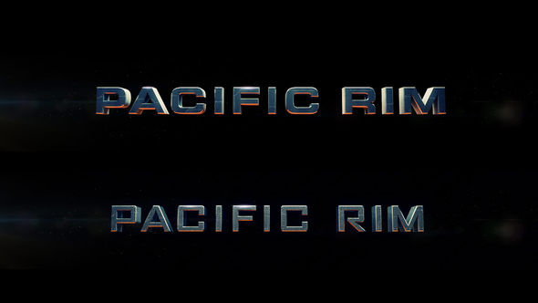
Title logo concepts
—Guillermo del ToroI think it is one of my favorite things about the movie!
What would you like to change about the way that feature films utilize designers?
ML: I'd like to think that design in the truest sense is just problem solving. I would be very interested to work on a film which asks the question “is making this film really the best solution?” Guiding large-scale filmmaking and storytelling through a rigorous design process could be revolutionary. Or disastrous. Either way, it would be epic.
RS: Tighter integration from as early on in the process as possible – guys like GMUNK and Ash Thorp are leading the way, but more of us need to follow. Design can be one of the engines that stokes the entire development process for directors, and it thrills me to see people like Guillermo or Joseph Kosinski valuing the input of some very talented artists. I love seeing these roving bands of designers and animators find homes under the wings of some of the best young directors coming up. It's what I would love to see happen within the VFX industry as well. If Spielberg can work with his editor Michael Kahn for nearly an entire career, I'd love to see directors do the same with designers.
And maybe lift them up into the director's seat occasionally as well.
Support for Art of the Title comes from

CINEWARE by Maxon
A live 3D pipeline. CINEWARE is a full-featured workflow integration between Adobe After Effects CC and CINEMA 4D.

