An OUTCAST BOY who can commune with the DEAD... A TOWN obsessed with the past, UNWILLING to accept him! BULLIES! ZOMBIES! GHOSTS! WITCHES! A FILM as SPOOKY as it is HEARTWARMING... CHILLING as it is ENDEARING! LAIKA’s 3D stop-motion TRIUMPH ParaNorman has SCARES and LAUGHS aplenty... AND a BEWITCHING main-on-end title sequence worth writing home to mother about!
The tale of young Norman Babcock comes to a close to the tune of the White Stripes’ “Little Ghost” as the slightly skewed citizens of New England’s Blithe Hollow transition from their stop-motion reality into beautifully rendered motion paintings. Each character gets a moment to shine, their goofy, freeze-frame poses and accompanying credit recalling the events of the film and a more innocent era of title design. With ghoulish typefaces and delightfully old-fashioned screen transitions, the sequence pays homage to the Saturday night horror flicks that inspired Norman’s spine-chilling adventure. Just a few of the many small touches present in ParaNorman sure to bring out the kid in anyone.
Art of the Title speaks to LAIKA/house artist and illustrator AARON SORENSON about the gleefully spooky and charmingly realized main-on-end titles of ParaNorman.
How did the first meeting about this sequence go?
Arianne Sutner, one of the co-producers, spearheaded the process. She contacted me and asked, "Are you interested in directing our title sequence?" Of course, I said yes.
We then had the initial meeting where Chris Butler and Sam Fell, the film’s co-directors, laid out their vision for the titles, which was inspired by old Hollywood horror posters – specifically old B movies artwork with slightly garish qualities. They wanted the animation to look quite painterly and loose. Designer Trevor Dalmer had already done some amazing concept art and the directors used his illustrations in a short proof of concept animatic that featured the first few characters. The challenge was to create art for the key crew titles and the credit roll for an eight-minute piece, so there was still a lot of design and layout to consider. I wasn't even sure how we were going to animate the characters and maintain the painterly quality in motion, but it was fun to just dive into the deep end.
Proof of concept animatic
How closely did you work with the rest of the film's production team?
Our production bridged the locations of the two LAIKA studios. Our immediate team consisted of a mix of artists from LAIKA/house, LAIKA's content division, and artists from the feature side. LAIKA/house Co-EP Jan Johnson produced the sequence and juggled artists back and forth with Arianne. To keep the process flowing smoothly, we regularly checked in with Chris and Sam and constantly posted work in progress as we went along.
What were the initial design stages like? How many different concepts did you go through?
This was actually the most challenging part of the process. The goal was to have every credit the camera paused on look like a classic horror poster from that late '40s to '60s. Getting the compositions to work in a wide-screen format was a challenge, but more importantly we had to integrate the stylized poster images with the characters' personalities and key scenes.

Gravestones to toenails
So for example, headstones from a graveyard poster morphed seamlessly into a painted toenail. Some character's concepts came together easily, while others were tougher to conceptualize. When in doubt we went back to the film for inspiration.
At what point did the White Stripes’ “Little Ghosts” come into play?
They had the rights to the song before I was even involved. It's a perfect choice – great energy, related to the subject matter, but not too literal. And it's the White Stripes!
Detail the creation of the sequence for us.
Right, so after the initial meeting with the film's directors, we went into an extensive storyboard design phase to work out the basic concepts, timing, and compositions. I borrowed Julian Narino and David Vandervoort from the ParaNorman crew to draw the storyboards. We also created the art cards for the main crew title and the "roll," which are all of the scrolling titles at the end of the sequence. The roll and the crew credits was more of a design and layout puzzle than anything else.

Original storyboards
Once we had a working animatic for the main credits – voice talent, directors, and producers – we tightened up each layout. To get exact key poses and character expressions from the film, we based the hand-drawn designs on the original digital models made in Maya to create the rapid-prototyped faces. We then animated the characters traditionally in 2D and composited the rough animation in an After Effects comp for approval. Once a scene was approved, we sent selected frames to the production designer to paint for a final look. After we got approval, we digitally painted the characters with many layers of highlights and shadows and additional brushstrokes, which were tracked onto the artwork. LAIKA/house Designer Jenny Kincade actually discovered new ways to paint the animation while retaining the painterly quality. She would often track in fields of loose brushstrokes to break up flat painted areas – sometimes it was painstakingly necessary just to paint in strokes by hand.
After many long hours together, we were ready to take frames from the concept and pull the different paint layers apart and track shapes to match the rough animation. Animators Dave Vandervoort and Chris Purdin streamlined the method along with Stephen Bodin, Jon David Buffam, and Eric Kilkenny. Each artist had their own way of implementing this "paint-tracking" technique, but I think it was successful because it was founded on the solid 2D animation under all of the digital trickery.
Working animatic
There was a ton of compositing work done as well, roughing up edges and choking mattes like crazy. Alphonse Swinehart and Erich Richter handled the massive After Effects projects, which were constantly being tweaked for timing, camera, and effects.
The final phase, which ended up being a lot more fun than I imagined, was the 3D layout. We broke out layers organically in terms of depth and sent the layers to the feature's 3D team – Steve Emerson and Brian Van't Hul – to work their magic. Chris and Sam would weigh in on how the depth was working and we'd implement their feedback. For example, in the beginning of the sequence when the camera is finding the different posters and the zombie hand crashes through, the directors had us separate the fingertips from the rest of the hand to add an extra bit of depth and make the action more extreme.

Color script storyboards - cutout style and painted
What were your influences or references for this sequence? Were the animations in the sequence modeled off of Illustrator Heidi Smith’s distinctive character designs and Kent Melton’s sculptures, or were you referencing the work that was being put into action by the on-set animators?
The way we represented the characters was based off the final puppets you see in the film. We went to great lengths to get every facet and asymmetrical feature just right. We actually used CG models of the heads as reference for our key positions. This is not to say the end sequence was animated in CG! Chris and Sam were very adamant that they wanted a hand-drawn aesthetic. In some cases there were no CG references. For example, the Judge Zombie was a tangible mechanical puppet – unlike puppets with CG-created removable rapid-prototyping faces – so Dave Vandervoort drew a likeness instead.
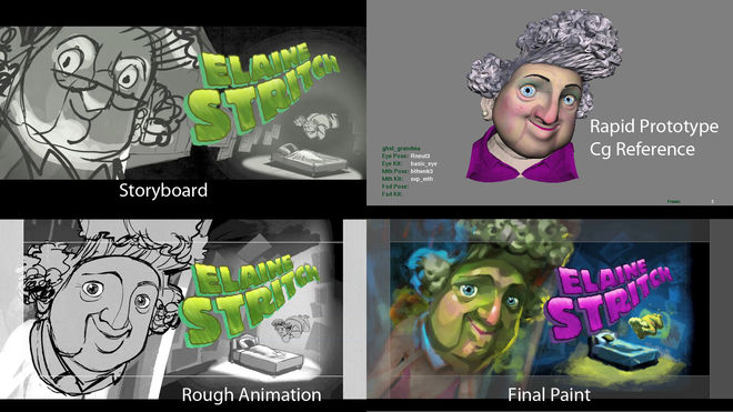
Grandma process stills
What inspired the different lettering styles for the names?
Alphonse Swinehart created all of those and did an amazing job. The directors wanted variety in the typography, so we embraced it. The biggest thing with those horror fonts is legibility, so we had to do a lot of tweaking to get them to read quickly. We also had to change the colors quite a lot to match the concept art, but the typography itself changed very little.
How did you decide to use different transitions for each name?
The transitions were always part of the plan. For a while we tried to make that a camera move to Norman, but the cut was better. Some of the transitions, such as going into the poster on Norman's wall, or the tombstone turning into the toe, were already in the proof of concept. The rest came about organically based on the imagery in the concept frames. For instance, with Grandma we had this little scene in the background of her floating over Norman's bed and it just felt natural to have the disembodied hand of the Judge come out from under the bed and then scamper across frame leading the viewer to the Judge's credits.
How long did this sequence take to complete, from the first meeting to the final cut?
We had our first conversation with Sam and Chris at the beginning of December and delivered the finished titles at the end of May. Six months, all in.
Tell us about the fun little Norman “making-of” scene after the credits.
Actually, that was created by the movie's marketing team! It's pretty amazing.
ParaNorman Behind-the-Scenes: Making Norman by Grow Film Company
Which tools and software did you use to put it all together?
Roughly half the animation was done on actual paper, which seems so old fashioned but has its advantages. One of the animators drew in Flash, frame by frame. We painted the characters in Toon Boom Harmony and finished the compositing in After Effects. Photoshop was used for all the backgrounds and a little bit of Maya for reference.
What is working at LAIKA like?
The thing I like most about the studio's Entertainment and HOUSE sides is the fearlessness of the artists. We're often asked to do some pretty crazy stuff. In the beginning, we really don't know how we're going to pull it all off. It's that sense of discovery and problem solving that I like. It's also an outsider studio, which appeals to me. It has its own identity artistically and is always breaking new visual ground, without losing sight of good storytelling and strong characters.

ParaNorman logo

