Ratatouille, Disney and Pixar’s Oscar-winning film, follows cooking prodigy Remy, a small grey rat, as he moves through the streets of Paris with only the dream of becoming a chef. Remy’s ambitions are externalised in the world around him, the rat’s smallness acting as a constant reminder of the wall separating the modest Remy from the overwhelming culinary world before him. The life-threatening obstacles Remy has to face are numerous: boiling pots of water like pools of lava, knives ten times his size, being cooked alive or squashed underfoot, and all with the ever-present threat of death-by-mousetrap.
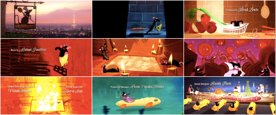
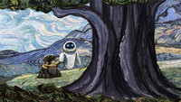
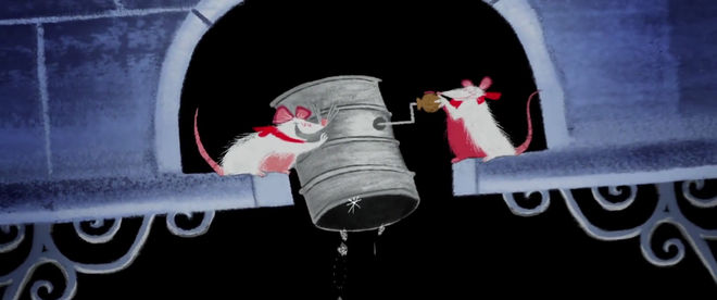
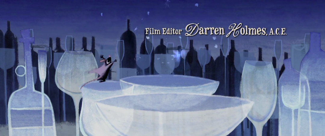
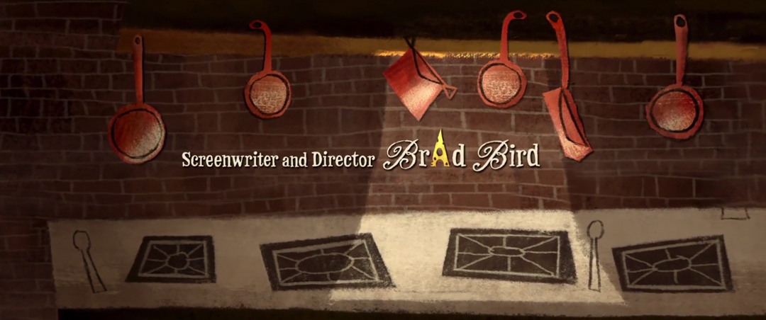
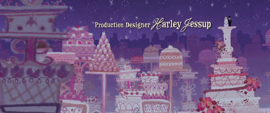
It’s no surprise that Ratatouille is directed by Brad Bird, the director of 1999’s heartbreaking and wise The Iron Giant and 2004’s family-of-superheroes film The Incredibles. Ratatouille continues Bird’s thoughtful, detailed depictions of outsiders with special talents and the film’s attention to detail carries through to the title sequence design. Created by a large design and animation team, the film’s main-on-end titles are an Impressionistic reimagining of the film. Through a single take conceptualized by Design Lead Teddy Newton and executed by Camera and Layout Lead Andrew Jimenez, audiences are taken on Remy’s journey. Art and Paint Lead Nate Wragg’s Impressionistic paintings go hand-in-hand with Jimenez’s complex, single-shot layout, the fluidity of each movement of colour visualizing the tastes and smells of Remy’s world. Title Designer Susan Bradley’s custom typeface speaks to the Parisian aesthetic of the film, with the loops and swirls of the lettering mimicking Giacchino’s luscious score.
Six years before Ratatouille, Geefwee Boedoe’s work on the Monsters, Inc. (2001) titles set the model for Pixar’s 2D animated title sequences. The sequence in Monsters, Inc. manages to capture the essence of the computer-generated comedy through hand-drawn lettering and the single theme of doors.
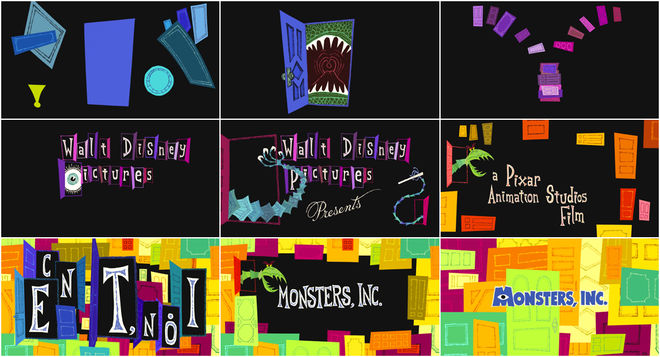
Monsters, Inc. (2001) main titles, designed by Geefwee Boedoe
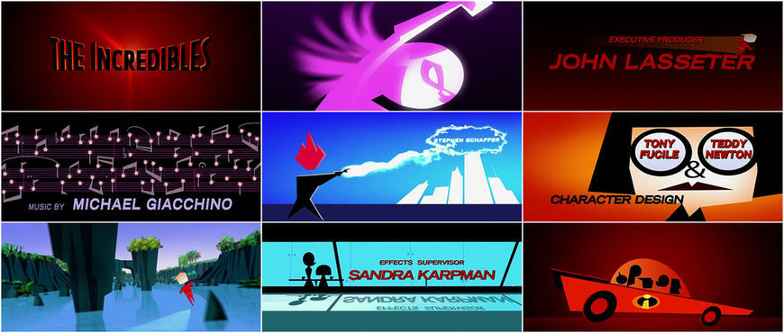
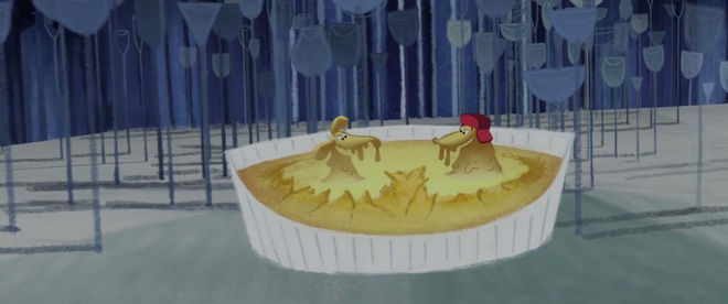
Three years later, The Incredibles did the same with its distinctively sharp and retro title sequence. These films set a precedent for Ratatouille. Paired with Bird’s encouragement to style the sequence as 2D animation, the end titles are fun, warm and inviting, and bearing what Newton calls a “flicker”. The sequence begins with rats’ overlapping footsteps on a black screen. The dark blues and blacks quickly turn into an explosion of colour, beginning with the snap of a mousetrap as a rodent tries to eat an Eiffel Tower-shaped cheese, resulting in a sequence where colour dictates emotion and taste. Onion slices are hula hoops and spatulas are diving boards, with the mix of deep reds and oranges presenting an intense visual flavour. Once Michael Giacchino’s music relaxes, the light blues and pastel colours soften the sequence, allowing space for sweeter and more subtle tastes. By the sequence’s finale, the rat that introduced us to this world is back in the drain. Nevertheless, even this rat has a happy outcome: the end of the credits crawl reveals he has got the cheese at last. This sequence provides an impression of the film rather than regurgitating its plot. It becomes something more than a metaphorical opening and closing of the book. Instead, Ratatouille’s, and indeed Pixar’s, title sequences often feel as though they could be short films.
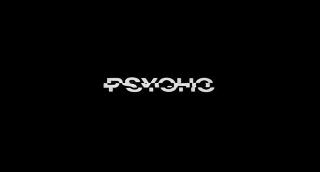
As the design lead and additional character designer on Ratatouille, Newton’s work allows viewers to see the world and characters of the film in a new light. Responsible for the character designs on other Bird-directed features such as The Incredibles, Newton’s style is instantly recognisable. Departing from Ratatouille’s CGI animation style, Newton’s design decisions are reminiscent of the stylistically innovative title sequences of Saul Bass. Newton spoke about Saul Bass’s influence on him, saying, “seeing Psycho for the first time and [the title sequence] was so strange compared to other movies I remember. I just thought that that was something that I always wanted to do.” Like Psycho’s title sequence, Ratatouille’s titles both add to the experience of the film and exist in a world of their own.
A discussion with Ratatouille’s main-on-end titles Design Lead TEDDY NEWTON.
How did you first get involved with Ratatouille? Did you pitch an idea for the end titles or did it come to you?
Teddy: I had done the titles for The Incredibles – I designed those. Brad [Bird] had asked me, “What do you think this one should look like?” I was thinking it would be very different than what was going on in The Incredibles. There was a young artist who was an intern, I believe, in the hallway, painting. And I said [to Brad], “You should really see this guy down the hall. He’s just in the hallway, painting.” I said there was something about his style that would be really great to incorporate. His name is Nate Wragg – the Art and Paint Lead of Ratatouille’s end titles. I suggested that it should take on the look of Nate’s paintings, and then we brought Nate in. After that, I was conceiving a lot of ideas about what we could do, just as a storyboard, and I presented that. I was saying we should do it like one shot, one two-minute shot for the titles. Brad always gets excited by these kind of novelties. I laid it out, and then Nate painted it. We had other artists – I think there must have been at least 15 artists on the project that were doing a variety of things under Nate’s and my supervision.
—Teddy NewtonOn The Incredibles it was all Illustrator and After Effects. On Ratatouille it was all Photoshop and After Effects.
The Incredibles (2004) main title sequence, by Pixar Animation Studios
So how did you create the paintings? Is that all digital?
Teddy: Yeah, it was Photoshop. It was all painted in Photoshop. The drawings that you see, those were hand-drawn on paper and then scanned. Then Nate Wragg painted over the drawings in Photoshop to give it this – I wanna call it like a cartoon Impressionist look.
On The Incredibles it was all Illustrator and After Effects. On Ratatouille it was all Photoshop and After Effects. I kind of lean more towards Photoshop because I feel After Effects has almost gotten beyond me at this point. Every year it gets more complicated. I use it for a few things here and there, but I only know a fraction of its full capability.
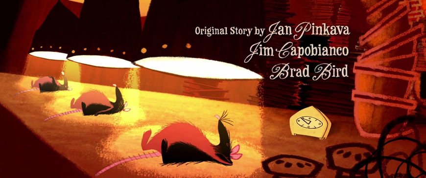
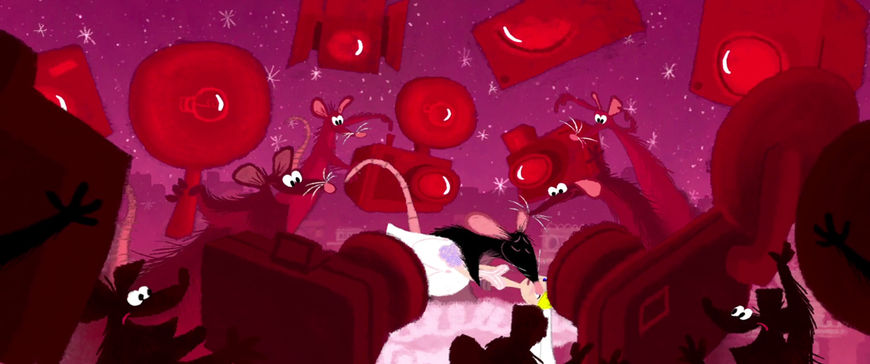
Teddy: In my case I was doing the layout and the character posing, and then I’d give that to an animator, as well as the storyboarding of the concepts. Nate styled all the colour, and the actual physical painting. Susan [Bradley], she hand-lettered everything you see in the end titles. As a whole group, we met for only 15 minutes a week. [laughs] The whole group! That’s how efficient it was. Each person had their own task. I don’t know how many names – it was like a Vietnam war memorial – it was incredible! And then Andy Jimenez, Ratatouille’s Camera/Layout Lead. He’s the cameraman, so he’d take the work and then he’d move it.
The camera moves are really interesting. As you said, it’s one shot, but it feels like there are still cuts because of how quickly it moves.
Teddy: It’s quite beautiful if you have seen the files for these layouts. They look like the world’s largest miniature golf course when you pull way back to see how many pieces are hooked together to make this painting. They were separate paintings but then they all have their bridgework painted in between.
It sounds amazing. You express a lot of interest in 2D and hand-drawn animation. Why did you decide to use 2D in Ratatouille’s end titles, and what draws you to the 2D style?
Teddy: [laughs] You know, it’s funny, I didn’t even think this deeply about it but when we were doing The Incredibles, I created a style for the end titles and it was unbeknownst to me but I started to see advertising, in a fringe way, using my artwork from the end titles. It almost became a secondary identity of the movie – this very extreme, graphic style. I thought Ratatouille could have that, too. You have what the movie itself looks like, but then the titles and the posters and the way all that stuff complement the movie – it doesn’t have to always look exactly like the movie looks. It could be a more stylised impression. When you look at old movies like Psycho, something about Saul Bass’s titles feel – even though there’s no knives in it or anything – it feels jagged or fractured. Like a mind that’s broken and it races and that’s all happening with the movement of the lettering and these lines that collide.
Teddy: You know, Saul Bass in particular, it’s almost like intellectual -- the way you’re experiencing those graphics. I feel that encapsulates the whole movie and I think that’s why we did this with 2D animation. Plus, Brad also came from a 2D background. I think he loves the idea of reviving that in any form he can. It is fun to exercise that when you get a chance, because it is quite rare. For some reason I have been one of the few people who has done a lot of very hand-drawn things at Pixar. I feel lucky to have been able to do that, because they don’t have a pipeline to do this. Every time we do one, we have to create our own little system to make one of these projects.
Michael Giacchino’s score for the end titles works so seamlessly with the visuals. Did he create the score after you’d created the titles or did you work together during production?
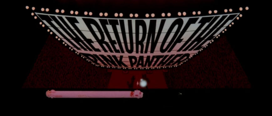
Teddy: I always laugh when someone asks me a question about that because I think of the Richard Williams titles for The Return of the Pink Panther. And I was thinking, “How did they do it?” They had to have written music first because there’s no other way! The beat of these characters has to be in sync to this beat.
—Teddy NewtonI think of the Richard Williams titles for The Return of the Pink Panther. And I was thinking, “How did they do it?”
The Return of the Pink Panther (1975) main title sequence, designed by Richard Williams Studio
Teddy: I always thought that was how we were going to be doing it, but we did not. These kinds of things nowadays are luxuries and people don’t plan for them as much as they could. A lot of what saved this is Andy Jimenez. He’s the camera guy but he’s also like an editor, so he’s taking the work we animated but he’s making adjustments to it to music that’s coming in, in the midst of us animating [laughs].
You also did character design for Ratatouille’s end titles. Can you talk about that a bit?
Teddy: Again, I was going off of Nate’s styling. All the A-to-B-to-C primary key poses, I drew. For instance, you have the rat on the diving board, it may consist of five drawings where he’s preparing, he bounces, and he leaps and then he splashes. There would be that type of drawing that I would put in, and then the animator would add the nuance to what the movement was.
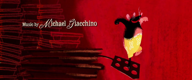
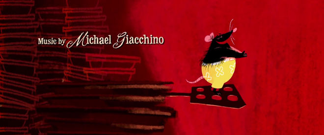
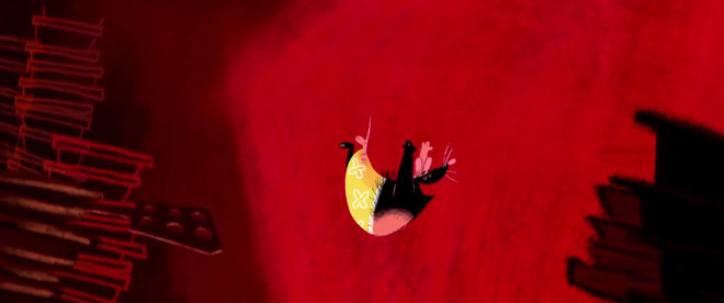
I read that you were inspired by Al Hirschfeld, and there’s a quote about how he aimed to “capture a perfect likeness using a minimum number of lines.” I think your animation does that too.
Teddy: Thanks. Yeah, I’ve always liked that. Somebody was asking me about why did I draw like that, so quickly? And I said I have no patience for drawing. A lot of people I know who are phenomenal artists spend a lot of time on one drawing and I feel like I want to get to the next one. That style sort of evolved out of that.
In Roger Ebert’s review of Ratatouille, he talks about how when Pixar films are released there’s always the same conversation around how people realise animation is not just for children, but adults too. Do you feel as though Pixar has changed audiences’ attitudes towards animation?
Teddy: Yeah, I might even go as far as saying it’s changed what you think of as a family movie. I do feel that because they’re making movies that a forty-year-old and a four-year-old can sit side-by-side throughout the whole movie and maintain interest – that’s a big deal. It’s a rare thing. Older films like Mary Poppins did it, maybe some of the early animated Disney films, but I think even those played more for younger audiences than what Pixar was trying to do. They were trying to make it contemporary yet have a visual appeal that children would salivate over. This idea of what a family movie is supposed to feel like has more and more been crossing over into the live-action movies. So The Bad News Bears – is this for kids? Who is this for? It almost goes into a racy area. If you look at Jaws, I remember seeing it as a young kid. I don’t think of those as that offensive for kids. They’re stimulating. These Pixar movies make you feel safe – you know what you’re getting into: it’s gonna be sophisticated and funny, it’s not gonna cross the line.
Did Paris inform the way you animated Ratatouille’s end titles and its short film Your Friend the Rat? Brad Bird has said that Paris has a lot of history but CGI is very clean, so it was a challenge to make Ratatouille feel as though there was history behind its animation.
Teddy: That’s always the thing with animation, especially with CG. Everything’s so controlled. Harley Jessup, the production designer, I forget what he called it – it was like a “pass” on the sets themselves where he’d kind of mess them up a little bit. The flooring of the tile in the kitchen, when you do it with a computer it’s perfect, but that’s not how it would really be in real life so you have to kind of mess it up a little bit. Even though it’s imperceptible when you watch the movie, it is buried.
—Teddy NewtonThere’s no real straight lines on that grid, and that’s deliberate so that it looks a lot more uneven and warm and natural.
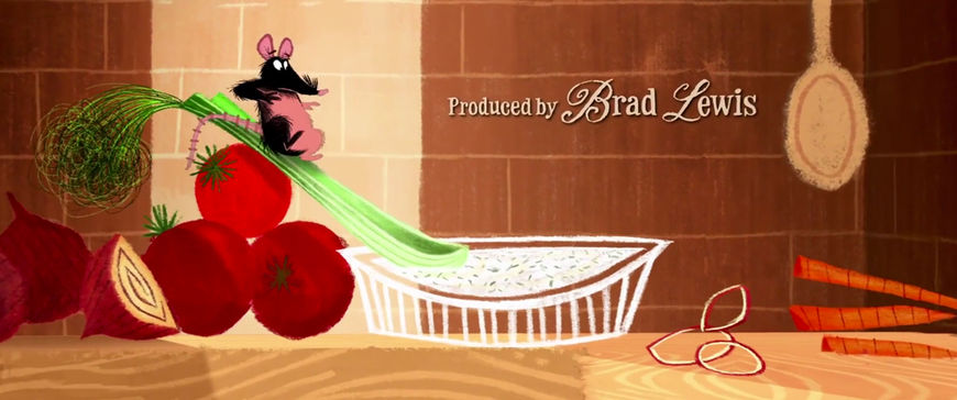
Teddy: There’s no real straight lines on that grid, and that’s deliberate so that it looks a lot more uneven and warm and natural. Again, the tools are better to plan for these sort of imperfections – you don’t get those happy accidents like you would in a painting; sometimes two colours collide in this beautiful way that you could only get with real paint. An accident in the computer is usually awful artifacts that just stand out and they remind you of the coldness of the piece. It’s kind of like overdoing it, really, to kind of get back to rough edges. It’s very time-consuming.
It reminds me of Nick Park, who did Wallace & Gromit, and how he loves doing stop-motion and claymation because sometimes you can see the animator’s thumbprint. Even though it’s a mistake, it reminds you that it’s human.
Teddy: I love that. One of my favourite animated films is The Man Who Planted Trees. It’s an excellent one. It won an Oscar. It’s about half an hour, it was all done with coloured pencil, and it has that flicker to it. Actually, it was one we looked at for Ratatouille. And I remember at Pixar, some of the technicians would try and develop a technique, an algorithm, that could take pencil lines and map them onto computer characters, then play it back and it would look like a pencil drawing, but it was all done on a computer without anyone drawing it. But it always looked false, because of the consistency of the way these textures were mapped on. And I remember them saying, “Well, it’s better because it doesn’t flicker.” And I said that’s why it looks fake. Part of where the life comes out is in the flicker because you know then that it’s made by hand.
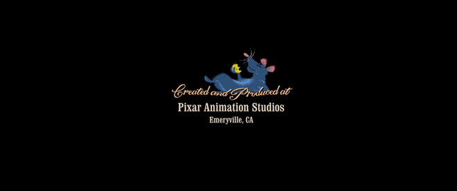
The final frames of the end credits feature a rat enjoying a piece of cheese.

