Barry Kane is a wanted man. Accused of wartime sabotage and murder, the factory worker turned fugitive is pursued across the country by police and the FBI, determined to clear his name and expose a fascist conspiracy.
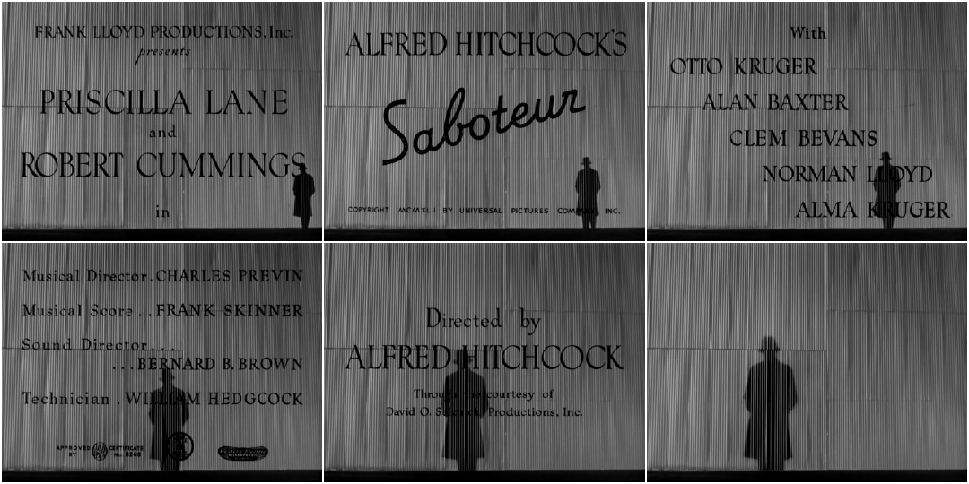
Although by no means director Alfred Hitchcock’s finest work – nor even a personal favourite of the filmmaker himself – 1942’s Saboteur has all the ingredients of a classic Hitch thriller: mistaken identity, action, romance, tension, and, of course, an arresting opening title sequence. Produced at the height of the Second World War, Saboteur’s opening titles are set against the corrugated siding of a massive aircraft manufacturing plant involved in the war effort. As the credits cycle, the shadow of the titular traitor slowly makes its way across the screen, composer Frank Skinner’s main title theme hinting at some nefarious purpose. Fire erupts moments later, a billowing cloud of black smoke replacing the silhouette on the very same wall.
Saboteur (1942) theatrical trailer
It’s a little known fact that Hitchcock began his career as a title designer, a vocation that no doubt helped inform many of the visual proclivities he would become known for as a filmmaker. Even before his now-legendary collaborations with designer Saul Bass there was a sophistication to Hitch’s opening credits sequences simply not found in the films of his contemporaries. With its evocative logotype – a winding cursive script that appears riveted to the factory wall – and slight credits type that seems to disappear into the background, the Saboteur opening is a perfect example of Hitchcock using the real estate at the head of his film to full effect. The director sets the mood and creates an immediate tension using entirely practical means: a camera, a light, a large wall (the side of a storage building on the Universal backlot), and an actor.
The Saboteur title sequence both recalls and anticipates Hitchcock’s other work in title design. The image of the villain is reminiscent of the shadowy trenchcoated figure featured in the opening of one of Hitchcock’s earliest films, The Lodger: A Story of the London Fog (1927). The intersection of type and geometry presage the bold graphic lines used in the main titles of North by Northwest (1959) – which, like Saboteur, features a climax that takes place atop a famed American landmark – and later Psycho (1960).

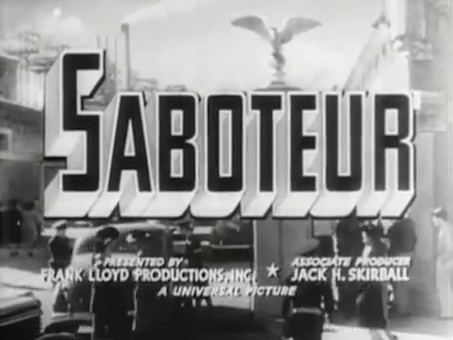
SUPPLEMENTARY: Saboteur (1942) end title card
Title Designer: uncredited
Director of Photography: Joseph A. Valentine (as Joseph Valentine)
Music: Frank Skinner

