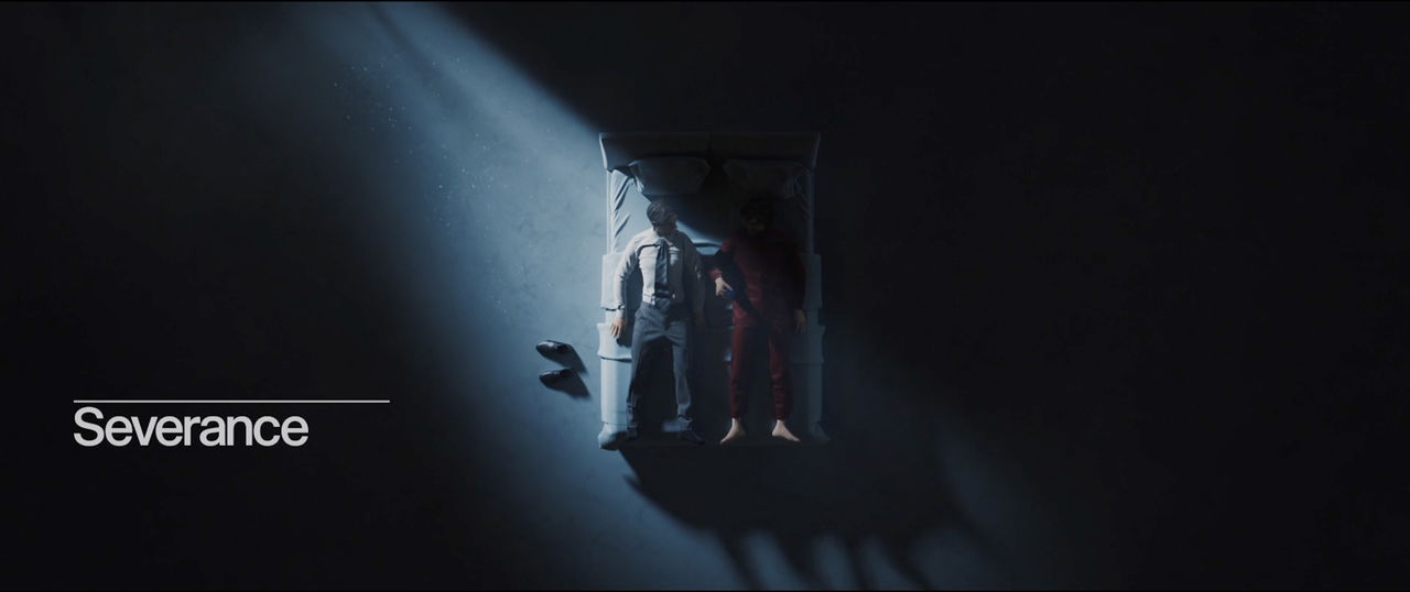
"I like to play a lot with the stories of the human mind and human anatomy," says Oliver Latta aka extraweg, the director and 3D artist behind the unnerving visuals of the Severance opening credits.
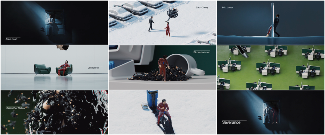
The thrilling Apple TV+ series is centered around Mark Scout (Adam Scott), a man who has surgically separated his work and home lives. Called “outies” and “innies,” these selves spend the title sequence stumbling through snowy parking lots and stark corporate hallways. They melt through walls and furniture, become trapped in versions of themselves, get sucked up through a syringe and liquify into a suffocating ooze. The uncanny animation was all created by Latta, a CGI artist based in Berlin whose work often focuses on the human body. Stretching it, dismembering it, multiplying, squishing and squeezing it. The unsettling figures are paired with minimal typography featuring a simple overline designed by Teddy Blanks (Listen Up Philip, Catherine Called Birdy) and matched with music by composer Theodore Shapiro.
The sequence has made a splash, creating not only a memorable brand for the show but also winning the Emmy Award for Outstanding Main Title Design. It was also a clear favourite among Art of the Title's 2022 jury panel, who voted it into the Top 10 Title Sequences of 2022. It was a pleasure to chat with both Latta and Blanks about the process behind these remarkable visuals.
A discussion with Art Director and 3D Artist OLIVER LATTA aka extraweg and Designer TEDDY BLANKS.

Oliver Latta (left) and Teddy Blanks hold their Emmy Awards at the Primetime Creative Arts Emmy Awards in September 2022 at the Microsoft Theater in Los Angeles, California.
First off, congratulations on your Emmy win! What has that been like for you?
Oliver Latta: It was a great honour. With the nomination, a very special and exciting time started for me. You naturally play with the idea of winning but I tried to keep my expectations low and just enjoy the journey. I would have to lie if I said that I wasn't excited, especially on the evening of the award ceremony. Especially considering that I've never worked on an intro title before!
It hasn’t changed much for me so far. I’m still sitting every day in front of the computer, working alone, but friends and other people are interested in how this happened. What changed is how people respect me, I would say.
Teddy, how did it feel for you to win an Emmy for this title sequence?
Teddy Blanks: When they handed me my statue backstage, that felt pretty great. It’s so heavy! Oliver and I met in person the night before the Emmys and got along really well. He did a great job with the speech and I was so happy he won.
My contribution [to the title sequence] was minor in comparison. I was lucky to be paired with Oliver. I could have put Comic Sans on that sequence and it still would have deserved an Emmy. I consider it a retrospective award for all the work I did that led me to be hired in the first place.
Oliver, how did you become an animator and 3D artist? Give me a little background on yourself.
OL: I’m born and raised in a small town in East Germany. After my studies at the Bauhaus University in Dessau I moved to Berlin where I spent some years working as a 3D artist in a production company.
In 2018 I started to publish the first 3D animations to my Instagram account, extraweg. A lot of videos went viral because they evoked a reaction or piqued someone's interest, compelling them to engage or pass it on.
—Oliver LattaIn my work, both for social media and what I do for clients, I want to provoke and sometimes confuse, I want to pull viewers out of their comfort zone and, most important, I want to make them feel or think about something.
Video animation by extraweg featuring small bodies making "human paste"
Who is extraweg and what does it mean for you?
OL: For me the name “extraweg” is a statement of intention and it explains how I want to be as an artist or design studio. Extraweg is the combination of the words “extra” which means being more than what is usual or expected, and “weg”, which is the German word for path or way. With the things I do I seek to draw attention to the things that concern or amuse me. But rather than showing them in an explicit way I choose to represent them in an ambiguous way, without being obvious and always playing with limits. In my work, both for social media and what I do for clients, I want to provoke and sometimes confuse, I want to pull viewers out of their comfort zone and, most important, I want to make them feel or think about something.
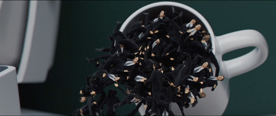
Still from the Severance title sequence showing many small bodies in suits falling out of a coffee cup
How did the Severance titles project come to you?
OL: It was early 2020 and at the time there was a big "hype" about my 3D animations on social media. I was getting a lot of messages and requests every week. One email was from Ben Stiller’s company Red Hour Productions. They asked me if I would be able to do a collaboration.
What was it like working with Ben Stiller?
OL: It was fantastic working with Ben Stiller. He gave me absolute creative freedom and his feedback was always on point. There weren’t any other creative decision-makers in between us. He was also involved in every step and gave me huge support.
VIDEO: Ben Stiller talks with Seth Meyers about using Instagram to find artist extraweg on Late Night with Seth Meyers
OL: He told me he had seen my work on social media and was impressed, partly because it was so "different," unique and impressive to look at. I received the script of the first episode with all the dialogue, about 50 pages. I started the research from scratch because I didn't get many visual references from the show. I found that there is a lot of material to work on. I started breaking down some of the main and more obvious themes and creating mood boards that could represent these. The themes were just conversation starters, points that we could agree or disagree about: Ben's vision, things that trigger my imagination in crafting the scenes. After an initial creative call, I dived deeper into the analysis and prepared a more in-depth treatment for the titles.
How did you create the story for the title sequence? Going from home into the office, the multiple identities – how did that come about?
OL: Yeah, it was a long process. I presented my first references or ideas and we started with some animation tests so they can see items moving. With soft-body stuff it’s hard to get it when you only see a still image. It was a mix of 3D tests and references, and then I put it in a row so it makes sense for me, but I didn’t have any story. We didn’t have any music so I just used placeholder music. Then I came up with the main character going to work and coming back – like a daily work life.
The daily routine.
OL: Exactly. I thought, why not have the basic story of this guy waking up, going to work, discovering weird stuff, and then coming back. Based on this, I replaced the test scenes and over time, we got where we are. I didn’t start with a storyboard, I just had this idea of going to work, two people meeting each other – the innie and the outie – and the in-between was organic.
—Oliver LattaFor me, it was important that if people know me already and they see the title sequence, they recognize it was my work.
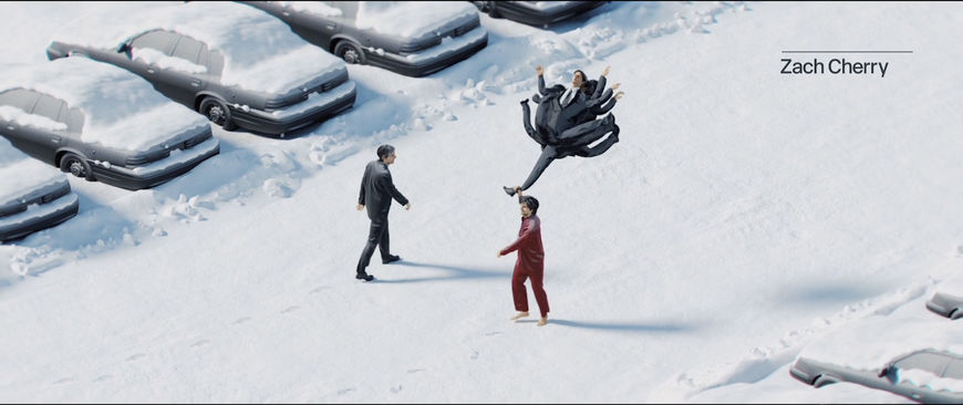
Still from the Severance title sequence showing the Mark Scout "innie" character passing by the "outie" character carrying a balloon made of bodies
OL: I sent Ben Stiller one version and he was happy with it. I had one scene which was a little too negative – I erased a face and put a clock on it – and he said to replace this with something else. It took me two weeks to replace it and then he was happy. I started the final production order, the fine-tuning of everything, which also took a lot of time. I’m doing the Severance title sequence for the second season too, and we had so many crazy ideas which didn’t make it into the final, so they might end up in that.
Video animation by extraweg featuring the "human balloon"
Several sections of the Severance title sequence are variations of your existing work, like the person dragging a balloon of bodies. How many elements were pre-existing, that you reworked, and how many are new?
OL: It was important that I have one element, this human balloon clip, which made it really clear that I did it. There are so many good titles out there and usually you don’t know who made it. For me, it was important that if people know me already and they see the title sequence, they recognize it was my work.
You wanted that to be a recognizable element, like a signature?
OL: Yes. I don’t want to do something which is completely not connected to my work. The other things are the small bodies. I’ve used that already in a music video and on my Instagram. I think of these elements as connected to extraweg. The human balloon scene has meaning for the story – it’s him dragging the past. The small humans represent the past of the self. It’s also an interesting, satisfying effect in terms of watching. The soft body stuff is really interesting to watch.
There’s also a part where the Mark character’s head is cut open. And the face squeezing between other people. Those remind me of some of your previous pieces, too.
OL: Yes! [laughs] Okay, if you see it like this, the whole intro is kind of typical for my work. I’m influenced by all my past Instagram videos somehow – you can see a connection. It comes from my way of thinking because I usually have double meanings or more meanings in each piece, not just a nice-looking image. I like to play a lot with the stories of the human mind and human anatomy.
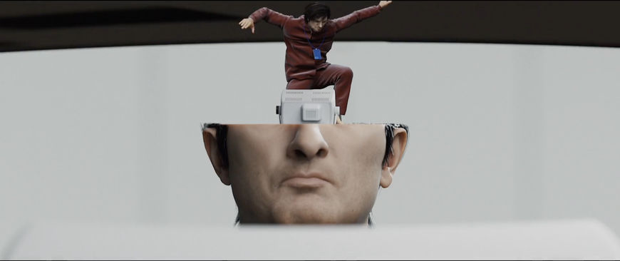
Still from the Severance title sequence showing the Mark Scout “outie” character falling into a larger-size "innie" character's head
Video animation by extraweg showing a head sliced open with another, inflated head emerging from within
Do you think you have patterns of thinking and with your art you unintentionally recreate those patterns?
OL: Definitely. I have a big library that I’ve collected over the years. Everything is over the same topic: human anatomy, human brain, soft body, human thinking. How I usually did it on Instagram is an example. I try to imagine what someone will think if they see the clip. How could you connect to this? You have to think about it. People who watch it a second time, they see the meanings, I hope.
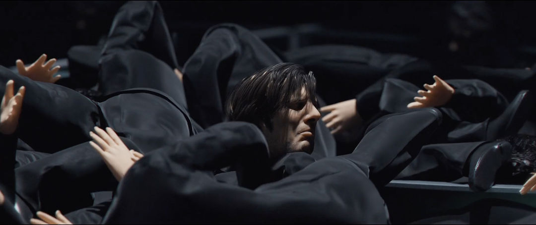
Still from the Severance title sequence showing the Mark Scout “innie” character squeezing through a mass of other bodies
Video animation by extraweg featuring a head squeezing through other soft heads
When did the music by Theodore Shapiro come into the picture?
OL: Of course, the amazing title music by Theodore Shapiro – he also won an Emmy for the music – this was a huge help to define the flow and timing. It's the kind of music I usually listen to while creating my art so it was a perfect fit and it inspired me a lot.
Before getting that, I was a little bit lost in terms of what was happening exactly and when it should happen. Theodore Shapiro and Ben sent over – I think the first email had four songs, all completely different. I said one of these could fit the most but I need something that’s slow in the beginning, then in the middle we have a high, and then in the end we’re kind of falling down again. Then I got a second email with a perfectly made one-and-a-half-minute intro title song. This is because I was working with professionals! With Theodore Shapiro’s music, I had a guide to place my scenes which was then completely easy for me.
Which tools and software did you use to put this sequence together? Tell me about the plug-ins or tutorials that were helpful to your process, too.
OL: I used Houdini for all the simulations and Cinema 4D to do the camera animations and rendering. It was all rendered with Octane. Other programs like Substance Painter, Nuke, Zbrush, all the common Adobe programs and many more were used.
For the animation of the character I used my Xsens motion capture suit. I did the whole mo-cap here in Berlin in my office. Most of the movement you see it's actually myself!

Rendering of Mark Scout (Adam Scott) walk cycle (innie)
I love that. So when the Adam Scott figure is walking, it’s really you walking?
OL: It’s a mix! For the animatic I used preset mo-caps from the internet, just as a placeholder, to get the timing. You can spend a lot of time on character animation otherwise. Since the timing wasn’t defined – the cuts – I jumped into my mo-cap suit, which I own, and I did it in my studio. In the middle when he comes out of the doors, this is me. I just mixed stuff. At the beginning it’s more dream-like.
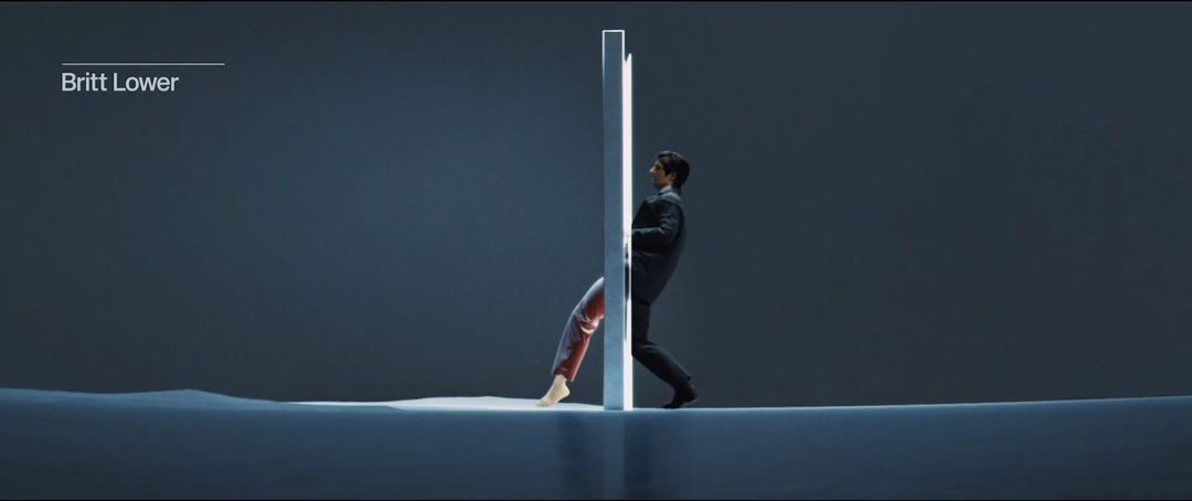
Still from the Severance title sequence showing a Mark Scout (Adam Scott) "innie" character (wearing a suit) stepping through the elevator doors and turning into the "outie" character (wearing pyjamas)
Right, he’s almost limping?
OL: Yes, and this was a mix of preset elements plus correction, getting the head down and everything. I couldn’t walk like this. Ben Stiller said he really liked that. It’s important to have that meaning and mood. Dream-like and depressed. But for other scenes, I replaced it. It’s 60% mocap and 40% presets plus animation on top, correcting stuff, adjustments. Usually the preparation takes longer than the animation itself. The mo-cap only took one day and it was done.

Rendering of Mark Scout (Adam Scott) walk cycle (outie)
Do you find when you use the mo-cap suit, you have to become kind of an actor? Is that something you feel comfortable with?
OL: I feel good about it because I would say I can move myself well. I couldn’t ask my girlfriend to do it, for example, because then you would see it’s a woman walking. Each person walks differently. I didn’t hire someone – maybe I will for season two – but time-wise it wasn’t possible.
Did you get a 3D scan of Adam Scott’s face?
OL: Yes. I said to Ben Stiller that I needed Adam Scott scans. Nowadays you can do it based on photo reference but since I had one or two detail shots, where the camera is really in front of them, I needed all the details, different facial expressions. It’s always better to have the scan.
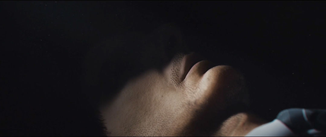
Still from the Severance title sequence showing a close-up 3D rendering of Mark Scout's (Adam Scott) face
They did it in New York. I got four or five scans with different expressions. When I got them, it was a lot of work to prepare it, cleaning the geometry, preparing the textures, making it animation-ready, grooming all the hair. Usually you get the scan without hair, you have to do it based on references. There was a back and forth with Ben Stiller to talk about the clothes, the colors. There was a suit that was more modern. He said, No, we need the more old-school suit that’s bigger, not so perfectly fitting. What should the colours be? What kind of pyjamas? Stuff like this.
Tell me about the process for the typography. How did Teddy join the project?
OL: Ben Stiller asked me if I need someone who can help with the typography and I said yes. Three days later I got an email with an introduction to Teddy Blanks.
TB: I was brought on by Gerry Byrne, the producer and post supervisor, who I had a great experience with on Bill Pohland’s Love and Mercy. I had worked on Escape at Dannemora, Ben Stiller’s miniseries for Showtime, which had a ton of on-screen type, so I got to work closely with Ben. I was – and remain – so impressed by his thoughtfulness and attention to detail. I’d imagine not a lot of directors have the clout to hire a separate “fonts person” when they’ve already engaged someone else to create an elaborate animated title sequence but I’m lucky that Ben is one of them.
What did you receive coming into it? What was your approach for the typography?
TB: When I was brought on, the sequence was already mapped out but the textures and detail-work were still in progress. There was a black-and-white animatic that gave you a rough idea of what was supposed to happen and a handful of still frames that were more fully rendered. I could extrapolate from these what the final might look like.
The typography had to be distinctive enough to stand on its own because the first episode doesn’t have Oliver’s sequence in it – it just cuts to a title card. Ben thought the sequence would reveal too much about the world of the show at that point. My job was to come up with something that could pair well with – and ultimately take a backseat to – Oliver’s incredible animation.

Severance (2022) Season 1 Episode 1 title card
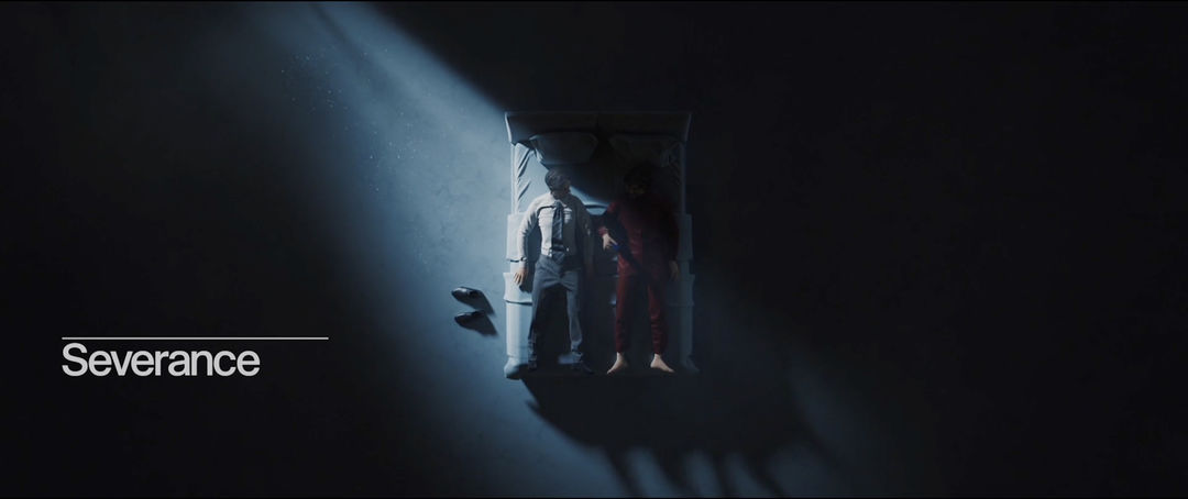
Severance (2022) Season 1 Episode 2 title card
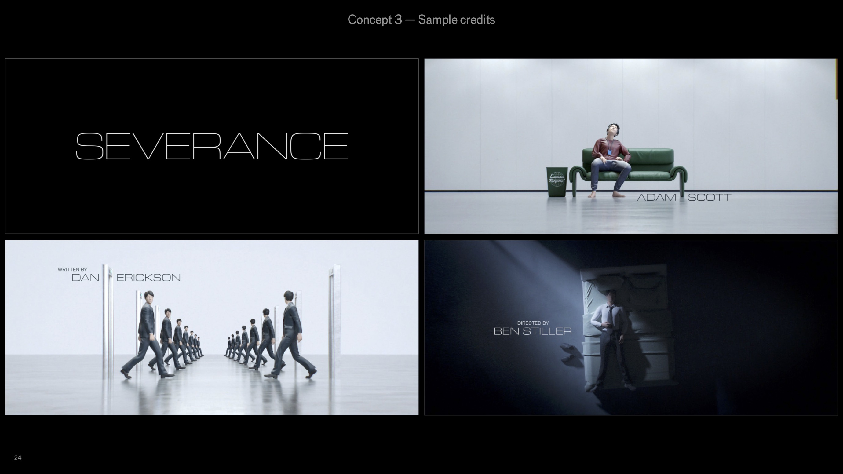
TB: I showed 12 initial directions, some extremely simple and some more stylized. We went pretty far down the road with a thin, wide sans-serif in all caps but eventually came back to an idea from my original pitch. It had a conceptual hook and dovetailed nicely with Apple’s plans for the marketing.

IMAGE SET: Concepts 1 through 5 created by Teddy Blanks for the Severance title sequence typography
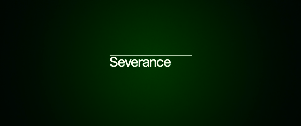
TB: The inspiration was mid-century corporate identity manuals in the Massimo Vignelli mold. Essentially, it’s left-aligned Helvetica with a thin horizontal line above it. Except it’s not Helvetica. The production design in Severance is highly indebted to that clean, modernist ’60s corporate look but there’s something “off” about it you can’t quite put your finger on. The type needed to be the same way. So I drew a custom font inspired by Helvetica and Akzidenz and the dozens – hundreds? – of neo-grotesques that have been released in the decades since they appeared, but with its own slightly odd combination of details and characteristics.


The not-quite-Helvetica concept created by Teddy Blanks for the Severance title sequence typography
TB: For 99% of viewers that know anything about fonts – already a small subset – they would just think it’s Helvetica. I hope the fact that it should be but isn’t quite seeps through to the audience somehow and adds to the weirdness of the show.
Oliver, how long was the timeline from when you first started working on the titles to when you delivered high-res files to the post house, Post Mango?
OL: One-and-a-half years, I think. There were production stops several times. Three stops with three months in between. If someone on set had Covid, the whole team had to stay home. Then there was a snowstorm, so it wasn't easy to get the face scanning done and the production timeline became a bit short. I asked Ben Stiller if he has someone that could help with the compositing. I rendered everything and then I sent it over to Post Mango. They put it together on their editing software. I built everything here in HD and I gave them the 4K render files and they rebuilt it on their end. And then they were responsible for the snow effect. It’s a small detail, when he’s walking into the door and the camera moves we have a little bit of snow there. It’s subtle. And there was also an effect where he’s going with a camera into the syringe, a distortion effect, so they did that. They also did the final color correction.
Actually, Ben Stiller came to me with a brief of – they wanted – something between 15 and 20 seconds. That was the plan at the beginning. But then there was Covid so we had a lot more time. I said if we want to make it great, we need more time. Otherwise I can’t tell any story – it would just be a small opening bumper, just a title card animation. He said, Sure, we’ll do it.
So, it was good that it was delayed. You have this great piece of art now.
OL: Yeah. Otherwise it would be 20 seconds, and it wouldn’t have turned out like this, definitely.

