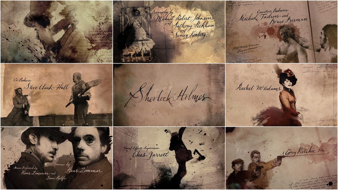
Watery cobblestone logos and longitudinal linotype layer, lace, and lash Prologue Films’ opening title and main-on-end credit work for Guy Ritchie’s Sherlock Holmes.
The sequence’s Creative Director, Danny Yount, is a self-taught Emmy-winning designer/director who produced the main titles for Six Feet Under and The Grid while at Digital Kitchen. He currently resides at Prologue Films and has created titles for Kiss Kiss Bang Bang, Iron Man and RocknRolla.
A disscussion with Creative Director DANNY YOUNT of Prologue Films.
Take us through your artistic process – how do you begin a project like Sherlock Holmes? What was your approach to the logos and the beginning and end titles?
DY: I got a call from director Guy Ritchie while he was in the middle stages of principal photography. He liked what we made for RocknRolla and asked us to consider something for Sherlock Holmes. We were sent a script and got very excited about it after seeing the more edgy and fun interpretation of the classic character. So Ilya Abulhanov and myself made a couple of ideas.
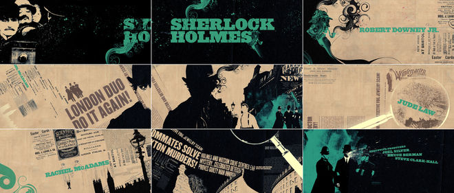
Early concept from Danny Yount
Early concept from IIya Abulhanov
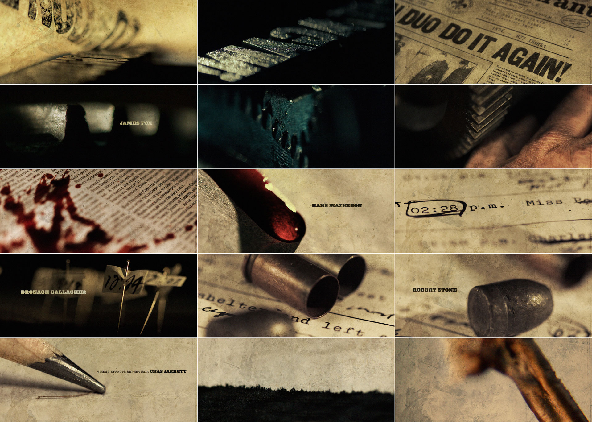
I was invited to fly out to present them at one of the sets in London and see some of the film, so I had a very strong sense after that of where they wanted to go visually. The brief I was given was to do a live action shoot that involved a lot of newspaper headlines from the late 1800s, which would give a little history to the early beginnings of Holmes and Watson and lead into the first scene of the film following the last headline on top of a stack of newspapers laid at the doorstep. We also wanted to show part of the printing process of that time period using the linotype machine and woodblock type headline compositions.
After going back and forth a bit, we concluded that it should be a macro shoot and very graphic, so we rented some time at a printing museum and set up several still shoots to get all the material we needed for storyboards. I also shot some test footage with the Canon 5D to do a couple motion style tests. They liked the presentation and told us they would get back to us.
Printing press concepts
Motion style tests
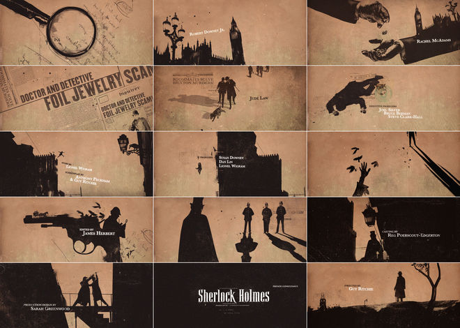
Several months went by and the film had taken shape more so they decided to lose the headlines sequence. They went from wanting a full main title to having a short main title and an end credit sequence. They also wanted the end credits to be an anthem to the film, using highlights from the movie. Designers Henry Hobson, Simon Clowes, and Lisa Bolan teamed up and made those storyboards. I decided to go into a different direction with mine. In retrospect, I think they were a little dark!
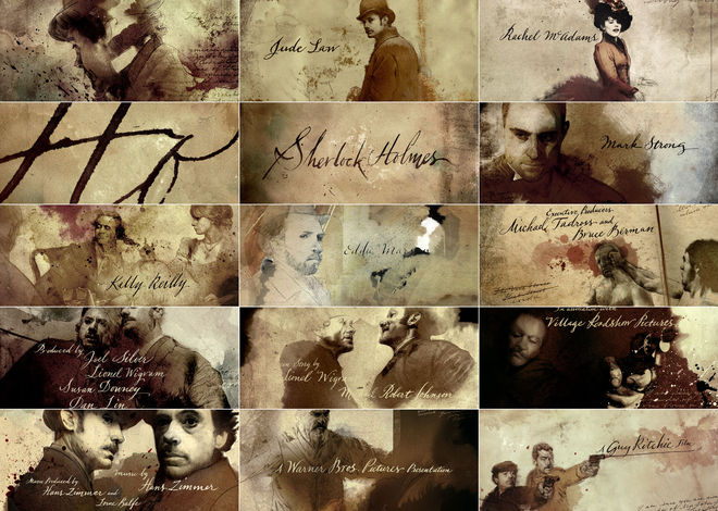
End credit storyboard from finished sequence – Henry Hobson, Simon Clowes, and Lisa Bolan
Once they approved the look, we had about four weeks from start to finish, and we were also given a special effects sequence. It was a lot of work, even for a company our size. But we have a great group of talented and dedicated people who did what it took to get it done.
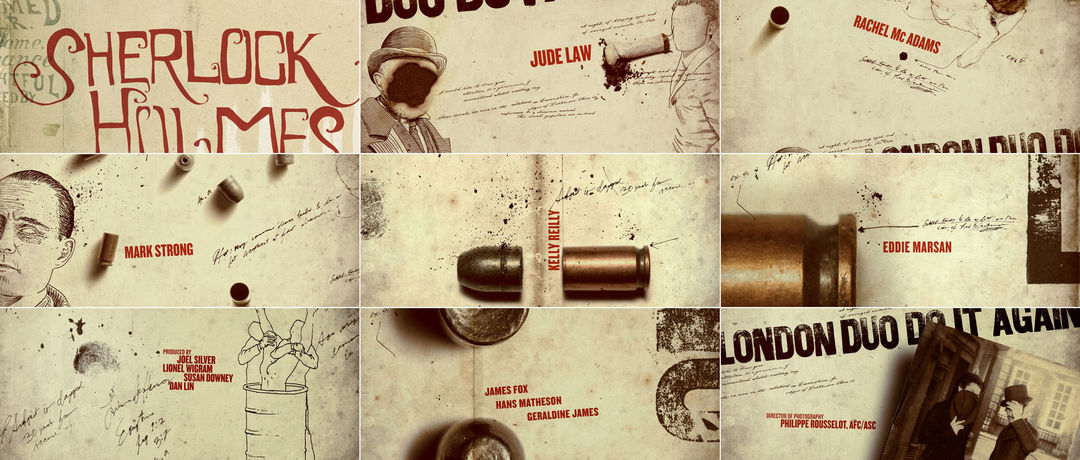
End credit storyboard by Danny Yount
How large was the production team, and how closely do you work with them?
We broke up into three separate teams with a total of about 14 people working around the clock. The end credit sequence required the most people by far, as there was so much detail in the illustration and transition work. The illustrations took a long time to make. I’m not sure if Jorge slept very much. The main title and Hallucination VFX team was myself and Brett. The opening logos José and Todd.
I work very closely with everyone and I am always part of the process. I owe that to the client and I especially owe that to the younger designers who are building their own body of work and careers. I also learn a lot from them – they always bring in new ways of doing things. And they learn from me as I help them to avoid the same mistakes I made when I was their age.
In the opening logos, is there any part of the cobblestones that are real?
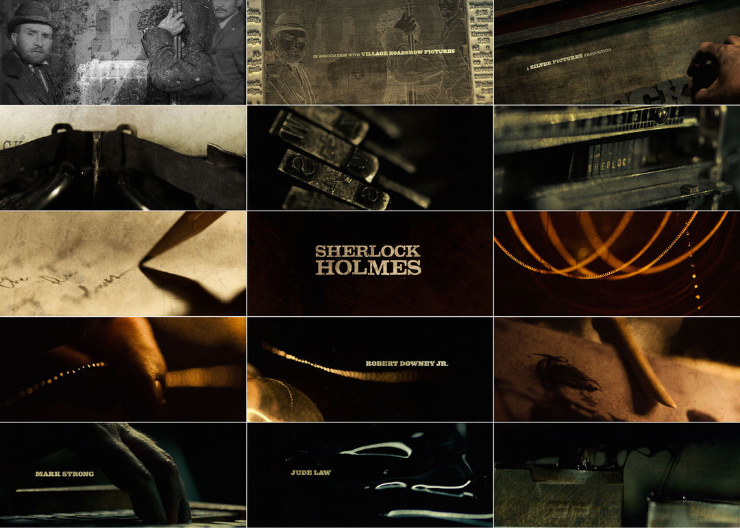
Nope! Just well-crafted 3D. José and Todd are masters. The client originally wanted the logos formed out of pools of water but Chris Sanchez came up with the idea of making them out of the cobblestones, which they loved. José made an excellent shading system that nailed the look of the wet gritty surfaces and the weathered stones, which took a lot of love to shape into very uneven bricks.
That’s the trick with making good CG – you have to spend a lot of time modeling the imperfections or it will miss the mark. It will look stiff and look like a video game. Same with the camera work – you have to make cameras that feel heavy and are hard to throw around. The more of a human touch you can bring into CG, the better it looks and feels.
They also wanted to have a carriage break frame and cut to the opening shot but I thought it would be more interesting to just whip the camera up to the first shot. Todd used camera projection techniques for it to marry properly. I also wanted leaves to blow across the surface but we just ran out of time.
Opening Studio Logos
For the Illustrated Paper and Illustrated Times motif that permeates both the opening and closing title sequences – the period sketches speckled with patterns in the clues and fine detail in the patterns – what tools did you use to accomplish this?
A lot of human hands, a photocopier, ink footage, and a few Photoshop filters.
Do you wrestle with taking creative risks? How do you balance doing something because it strikes you personally versus doing something overtly reflective of the film’s subject? When do you hold to a vision and when do you experiment?
I always experiment and I always push. That is what the client wants and it is what I am being paid to do. But if I ignore the brief, then anything I do becomes worthless to them. Or if I design something that is too abstract and self-inflated then it becomes meaningless no matter how beautiful it is. It has to communicate and it has to be interesting and stimulating – in that order. It is funny though that we call these “creative risks” – I think the only risk you take is when you ignore the client. And if you are going to do that then you better also have their version or you may get fired from the assignment. It’s a matter of trust, that’s all. And once that is established most smart clients will give you freedom.
Hallucination VFX
What are some of the lessons in title design that you’ve come across? Did you learn anything new on Sherlock Holmes?
It has to work perfectly with the film! I’m a guitarist, so I like to look at it like a solo break – I get my short time in the spotlight but I have to use it to make the song better. If I play sloppy, that makes it worse. If I play too fast and show off, it might get interesting but it is inappropriate.
What gets you thinking differently? What new technologies are you embracing?
Travel and people and nature. I’m interested in some of the newer apps like Houdini and Nuke. I would also like to buy myself a Canon 7D sometime soon.
What brings you the most satisfaction? Seeing the final piece on-screen? Or is it the process that brings you joy?
Both. I love the process – I get to learn so many things and get to sharpen my skills, but I also get very “locked in” to what I’m doing. There’s a level of commitment to the process that makes you go very deep and explore every aspect – it becomes apparent to you that you are created for that very purpose. And when you realize that, you pour yourself into every part of the process of exploration. It is only something that those who have been there can understand. We are created to create. When we realize what we are good at and pursue it with all we have, it becomes very rewarding intellectually as well as spiritually.
Main Titles
As far as seeing it on the screen – you forget all the pain you have been through. It is a cliché, I know, but it is like giving birth. You forget the hardship and long hours and stressed relationships and you walk away with a satisfaction that you did your best. And if you handled the job well, everyone you worked with is better as a result.
So what excites you outside of the design field?
My family and riding my dirt bike and photography. I also love speaking at conferences – I meet so many cool people and get to see new places.
What’s next for you?
I’m working on Iron Man 2 and things are looking good so far.
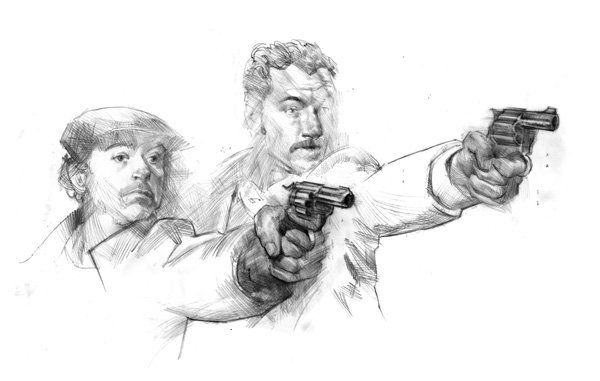
SUPPLEMENTARY: Original illustrations by Jorge Almeida
LIKE THIS ARTICLE?
