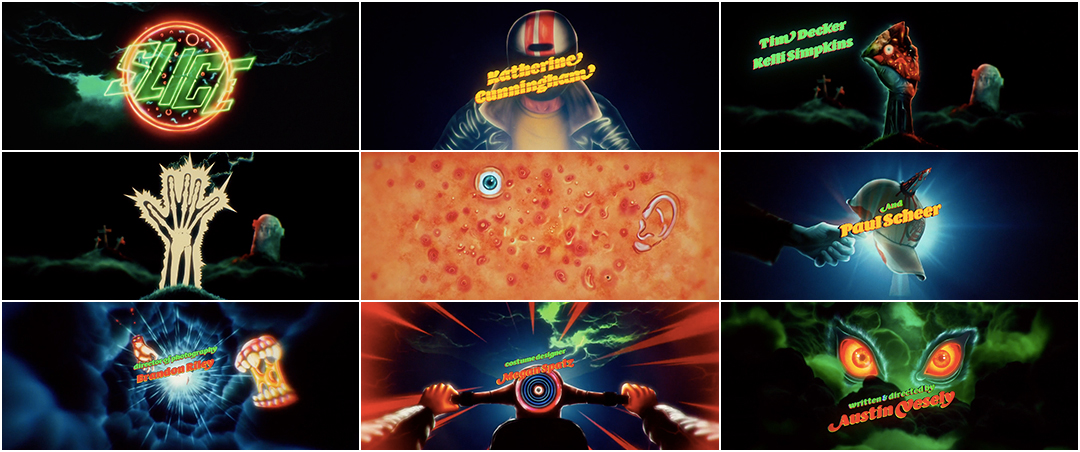
Describing Austin Vesely’s werewolf-pizza Chance-the-Rapper comedy-horror film Slice is a mouthful. But with a premise like that, it’s no surprise that it bears a fully loaded, stuffed crust, dripping hot delight of a title sequence.
Created by artist and animator John Christian Ferner Apalnes, also known as I Saw John First, Slice’s titles are a cornucopia of body parts and blades, leather and lightning, neon demons and gnarly rides, all set to a synth- and bass-heavy score by composers Ludwig Göransson (who also created the score for 2018’s Venom) and Nathan Matthew David. The theme begins and ends with a crash of thunder but in between is a medley of twisted cackles, choral voices, electric strings, knife sounds, and a smattering of howls, yells and oozing drips. When the credits appear they’re promptly slashed across their middle, the quick shink of a metal blade cutting through the music.
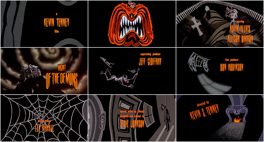
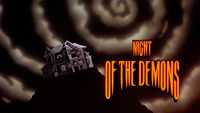
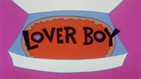
Slice and its opening join the recent trend of 1980s pop culture nostalgia, landing squarely in the wake of neon-lit title sequences for shows Stranger Things (2016) and GLOW (2017) and films Atomic Blonde (2017) and Guardians of the Galaxy Vol. 2 (2017). Not only does the sequence pull from the iconography and aesthetics of the era but it also resurrects the technique of hand-drawn animation. In the ’80s, cartoons and neon typography were commonly used to open films, especially in comedy and camp-tinged horror. Think: the glowing typography in the openings of Re-Animator (1985), The Fly (1986), Killer Klowns from Outer Space (1988), or Darkman (1990) and the animated sequences introducing Creepshow (1982), Night of the Demons (1988), Honey, I Shrunk the Kids (1989), Loverboy (1988) or Stay Tuned (1992).
In 2018, an animated main title sequence is rare in film but Slice delivers the goods as well as a feast for the senses. We talk to Artist I Saw John First about his airbrushed animation and Director Austin Vesely about why the film needed an introduction for its story and its shlock.
A discussion with Slice Director AUSTIN VESELY and Main Title Designer I SAW JOHN FIRST.
This is your first feature film. What was your journey like to getting this film made?
Austin: Yeah! It was an interesting ride. From the script stage and up to release it was about four years. It was a wild ride. It had all these twists and turns that were really unexpected but really amazing, like A24 getting involved. I had a script, my friend Brandon Riley was looking for something that could be produced in Chicago. I had been working with Chance the Rapper on music videos for a few years at that point and he was a good friend of mine. I talked to him about it, like, “If I was ever making a feature, would it be something you want to do? Act in it?” He said he was down.
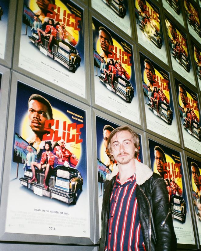
Director Austin Vesely in front of posters at the premiere for Slice (2018).
Photo by Paul Scheer
We started trying to find the money and when we kind of got to a point where we were comfortable trying to take a swing at making this movie, we announced it online with a poster, with Chance. A really graphic, visually interesting one. It was about that time that A24 reached out. Things kind of ballooned from there!
John, how did you get involved?
John: It was through Strange Beast, a production company in London that I’m represented through. It was a very loose beginning. They sent a brief saying the premise of the film about a town where ghosts live side-by-side with human beings. It sounded perfect. I got a few snippets of the film through A24 and it had a very specific, clear atmosphere that made sense to me so I was quick to jump on the project.
Austin: Ali Herting at A24 first brought the possibility to me. She works in Acquisitions and she reached out to me about it. She was sort of my guide, my champion at A24. The animation possibility came up after production.
How did you start? Did you throw ideas back and forth?
John: Yeah, it started with trying to have open communication between Strange Beast and A24. You know that process where you think you have it all figured out? So I just kept sending them reference pictures to prove that I knew what they were looking for. Little visual ideas and small sketches and I think that might’ve been the thing… I think I might’ve been such a nuisance that they were like, “Okay, let’s just run with this guy.” And I made a very quick treatment.
Animatic / motion test by ISawJohnFirst
Austin: He sent over this just incredible treatment. It was really exciting and all these new possibilities opened up. Originally I didn’t think it was possible. I didn’t know anybody who did that kind of thing. The one thing that I knew was that a lot of the lore and backstory, the universe of this movie... We thrust you into this world without fully explaining all of it and there’s a lot to be explained. I wanted to find a way to explain that in a way that was fun and visually interesting.
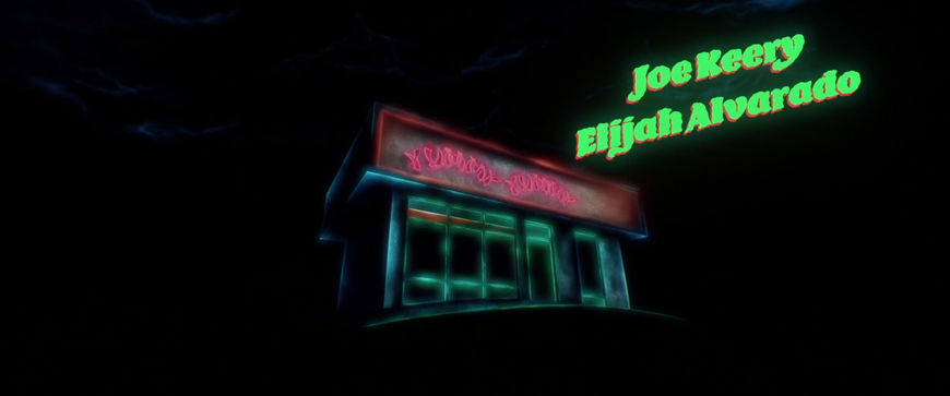
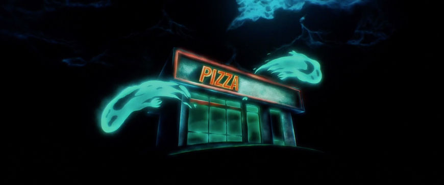
Stills from the Slice (2018) title sequence showing the previous restaurant, Yummy Yummy, and the new, haunted pizza place
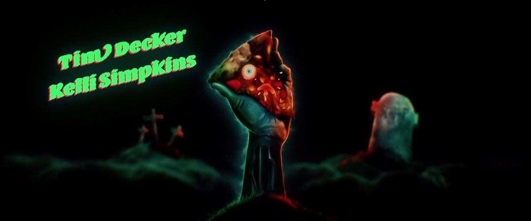
Austin: There was this past massacre called the Yummy Yummy Chinese Cuisine Massacre [laughs] and I wanted to touch on how that [restaurant] existed in this universe before and how there were ghosts in this place. Summing up the idea that there were ghosts and the undead, the culture in the town. I wanted to take some of the images from that backstory so they stick in people’s minds, maybe even on a second viewing they’ll see those things and understand them better.
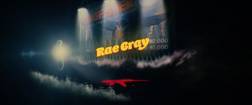
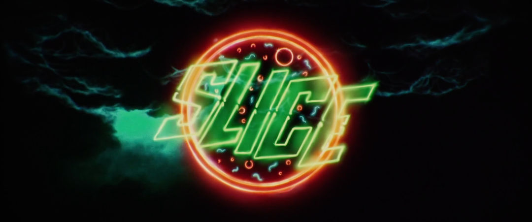
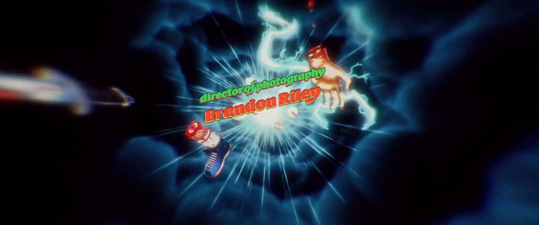
It feels like there’s a lot of influences from things like "Thriller" here, maybe Ghostbusters, Riverdale. The opening made me think of Night of the Demons. What were some of your pop culture touchstones with this?
Austin: It’s what you’re talking about, the 1980s era, those classic horror movies… I was interested in a sort of comic book vibe. Like this could be based on a graphic novel that never existed. John came up with all these visual references. He put those all in a blender and came up with all these different pieces.
Night of the Demons (1988) main titles, created by Kathy Zielinski
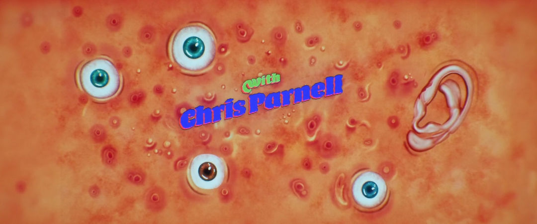
Austin: What I really liked about John’s style was that it didn’t feel derivative of anything exactly. That airbrushed look that it has, that’s really hyper-detailed and always morphing into something else, I felt like it was cool because it set up this idea of a graphic novel-type place but one that didn’t feel like Marvel.
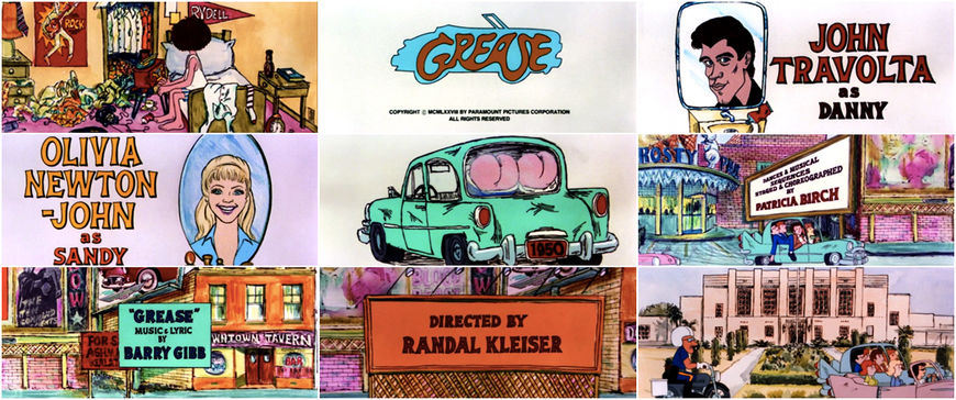
Austin: One title sequence that I think about a lot, that impacted me a lot, was the Grease opening title sequence. It’s a big animated one and it introduces you to a bunch of characters in town without telling you too much about ’em. That one sticks out to me.
Grease (1978) main titles, created by John Wilson and Fine Arts Films
The 1980s aesthetic is having a real resurgence these days, especially after Stranger Things. What is it that appeals to you about that era?
Austin: I think there was just a genuine approach to making stuff that you would consider schlock without being totally disparaging. Like a John Carpenter movie where you just like commit to the world and go hard for it. Whether it’s Big Trouble in Little China or Escape from New York or something like that where you can just go big… I really like that.
Visually, the first thing that came to me when I was coming up with this story was the pizza delivery thing. It’s nice to go back to that ’80s feel, a commitment to a uniform, because it feels hyper-stylized. When they come to your door now, they don’t usually look like that. There’s more that idea of commiting to a world… people do a lot of that in homages, doing it in an ironic way. But I just wanted to commit to that vibe.
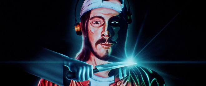
Stills from the Slice (2018) title sequence depicting Sean, Director Austin Vesely's on-screen character
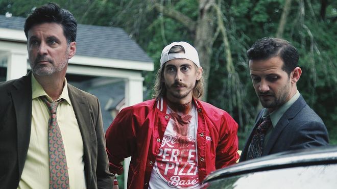
Tim Decker, Austin Vesely (who appears in the film as Sean, a pizza delivery person), and Will Brill, on the set of Slice (2018)
Did you already have key images in mind that you knew needed to be there?
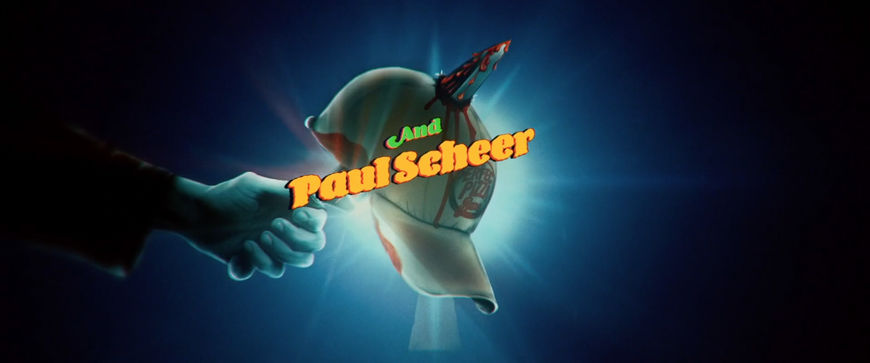
Austin: We wanted to be sure that there was this idea of the Dax character. We open the movie with this fight but then he’s not back in the movie until maybe a half hour or more, so we wanted to tee up that character and the mystery that ties everything together. John sent me some ideas, like, there’s that great one of the knife coming up through the hat, that one was one of the first ones. That was amazing.
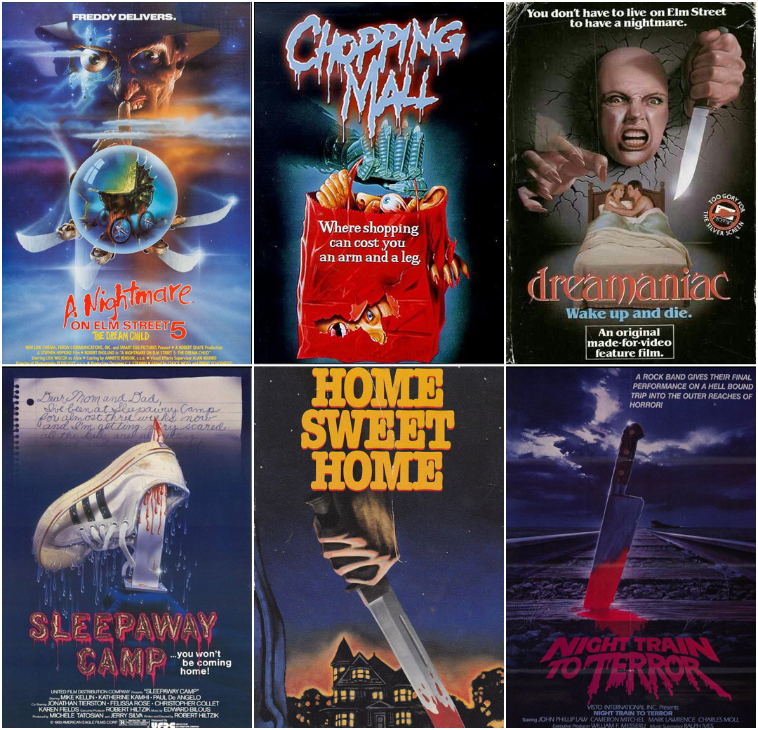
Horror movie posters and VHS covers used as reference
How did you develop the images that ended up in the sequence?
John: That was based on loose interpretations of the scenarios in the film but also borrowing elements from posters of the era that it was emulating. I mean, they have cellphones in the film but there’s the neon lights and the jackets and everything is very pastiche. It’s like a jumble of different eras so I was looking into fusing that. So it would be borrowing, like, a jacket from an ’80s horror film and then fusing it with like Weird Tales and Hardy Boys covers and Ghostly Weird Stories. And coming up with imagery that could work in those worlds.
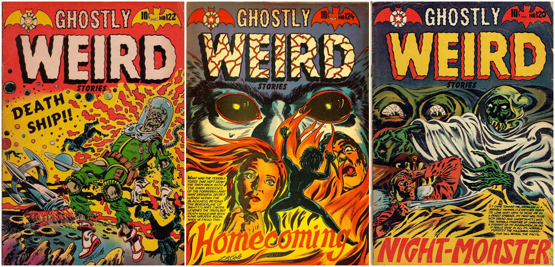
Covers of horror comics Ghostly Weird Stories, published by Star Publications, Inc.
I noticed this kind of vibrant colourful aesthetic is something that you work in a lot.
John: Yeah! [laughs] That’s true. I just really like things being translucent and the fact that neon light has so many gradients living within the same colour space. For some reason it just speaks to me on a colour scale, it’s so nice to have. Where you have more light you have more luminance and then you can add a little tint of a different colour by the edges of something… It also really helps with regards to animation because colours can blend in way more easily and make seamless transitions that way, make it more manageable. Also I’m a classic pastiche kid, growing up loving the ’80s and the ’70s.
Music video for the song "Gate 212 / Gimme That Dive" by Baya, created by I Saw John First
How did you work with the music by Nathan Matthew David and Ludwig Göransson?
Austin: Around the time we were coming up with the sequence, they were just about done the rest of the score. I presented them with the style of John’s work, what he was up to and sent them some of the key art. We wanted to set up something rhythmic and driving. It was going to be an original piece for this animation. So we wanted to make sure there was stuff in there that provided for these cool transitions that John was doing, something turning into something else. It was about setting something up that was fun but had a spooky edge to it, that would give John a lot of room to have fun and play around.
The sequence ends with a set of demonic eyes and then fades into a distortion VHS effect. Tell me a little about that.
Austin: The werewolf eyes, I thought that was a great place to go. It’s suggestive of this town and the main character of the movie. It’s about this place and what goes on there. I like the idea of this watchful eye from the sky. This threatening… overseeing… I like that being the last image. The flicker into VHS transitions into another kind of standalone piece in the movie which is this ad for the mayor’s re-election. It fit really well with the aesthetic to go from one to the other.
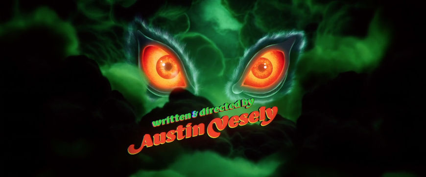
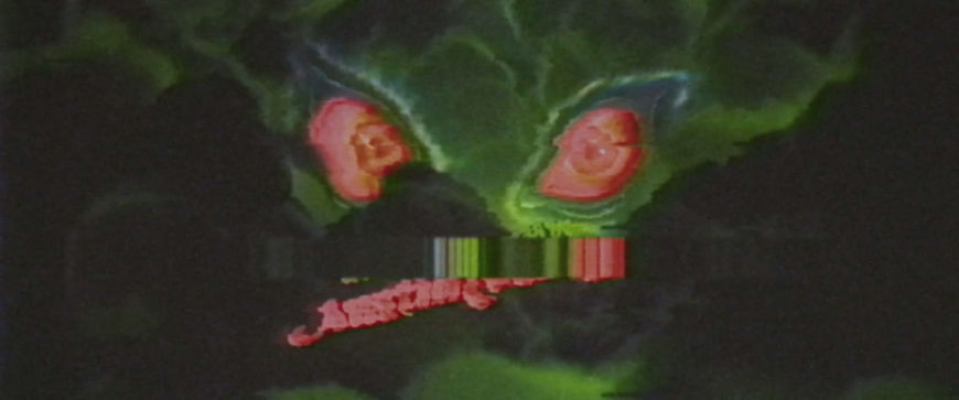
Stills from the end of the Slice (2018) title sequence featuring demonic eyes and a VHS distortion effect
John: Spiritually it also made very much sense to use that VHS effect by the end just to sort of take you in and out of the world. The reason that went into it was looking at weird VHS covers... A lot of the references obviously come from B movies that went straight to cassette and never saw the light of day.
John, this was your first title sequence, right?
John: This was the first one!
Are you a titles fan? Is this something you had specifically wanted to do?
John: Very much so! Yeah, 100%. A movie can be bad, but a title sequence if that’s good, at least that’s something! That’s usually the case, I mean, even with all those superhero movies. The films themselves are quite mundane but they usually put a lot of effort into animated title sequences and end credits… It’s insane how such good credits are made for really rubbish films!
Austin, you mentioned Grease’s opening. Do you have other favourite title sequences?
Austin: Obviously the James Bond ones. Skyfall was really stunning.
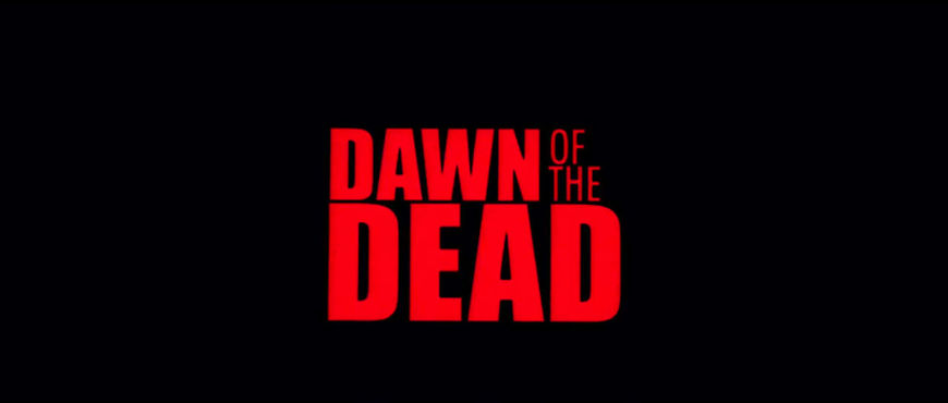
Something that was a touchstone for me when I was figuring out what to do with this title sequence was Zack Snyder’s Dawn of the Dead opening sequence. It doesn’t get much more iconic than that. It’s got all this mixed up, fake archival footage that sets up the universe. So that was what I was looking at when I was coming up with the backstory for the title sequence.
Dawn of the Dead (2004) main titles, designed by Kyle Cooper
John, what are some of your favourite title sequences?
John: I've been a longtime fan of David Daniels and his Stratacut technique so I have to mention the opening to Freaked.
I remember seeing That's Entertainment, Part II in college, when everyone was obsessed with Sagmeister and playful typography. This opening must have started that whole thing. Still like that opening a lot.
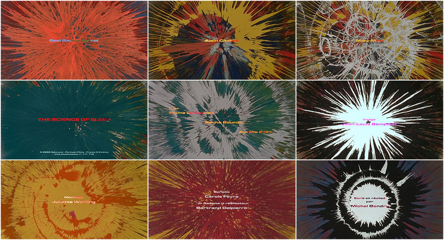
I really like the colour-paint-spiral-wheel-extravaganza opening of The Science of Sleep. So simple. Attach a camera to a spinning disk in order to keep the spinning wheel in focus, drop coloured paint on the disk and voilà! Then add some narration and clean typography over it. Clever bastard!
The Science of Sleep (2006) main titles, featuring a Spinart Camera Rig conceived by Tim McDonald
What does a title sequence give to a film?
John: It invites the viewer straight into the universe. Especially with Slice, Austin was keen on having a bit of exposition in the title sequence to put you both into the back story but also into the universe. It’s a bit like a retrospective look at the whole film, condensed into a one-minute thing. If it’s a good title sequence, you can come back to it and learn. Spot little things and details, which is cool and rewards repeated viewings.
Austin, last question. If someone was looking to make a title sequence like this, what advice would you have for them?
Austin: The great thing for me was just to have someone who was so talented in a way that was so removed from the way I work. I’d say find a collaborator who you really trust and honestly admire because… besides the initial discussions about telling a story and all those things, John was just so good at presenting these ideas that would totally blow my mind. I was really satisfied with the stuff he was delivering. Find good collaborators!

