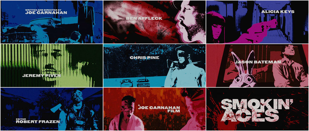
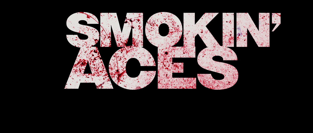
High-contrast colors and a soulful beat instantly transport the viewer back to films of the ’60s and ’70s to revisit the story they just experienced in this main-on-end title sequence. Hep assassins brandish guns and shoot pool, a cop takes a rending shot to the gut, and a femme fatale calmly looks down the sights of her iron: still images captured as if with a rostrum camera.
Taking inspiration from Butch Cassidy and the Sundance Kid and a handful of spaghetti Westerns, VooDooDog pulls the viewer into the debaucherous penthouse suites and grimy basement bars that make up the world of Smokin’ Aces.
A discussion with Creative Director PAUL DONNELLON at VooDooDog.
How do you prepare to create a title sequence?
PD: First, I read the shooting script because I think it’s always better not to have any images cluttering up my mind before putting down ideas. Sometimes it’s good not to even see the movie so the idea remains fresh and you don't replicate stuff from the film.
What were your initial concepts for Smokin’ Aces?
In the beginning, the idea was to do a 3D CG thing with bullets flying through playing cards – make it quite slick and like a pastiche of live action slow-motion, but in 3D computer graphics. I thought it would be ironic if the credits were etched onto the bullets, like in those gangster movies where they send the victim a bullet with their name on it before they are bumped off. We did a little test of that, which was as far as we got before Joe Carnahan, the director, pointed us away from that. He was looking into ’70s movies for his inspiration and pointed us toward a sort of Butch Cassidy and the Sundance Kid vibe.
3D bullet test
Is it hard to let go of the original concept and start over or does the clean slate somehow help?
It can be difficult to let go and move on if it’s not quite right. You want to see the idea through, but often the design and directing crews are trying new things out. But once you’ve made a test sequence, you sort of feel like you’ve already completed it and then you can move in another direction. So with one film project you can get to try a few different approaches. Some of them never see the light of day, but it’s good to try them out because it could be useful R&D for a later project.
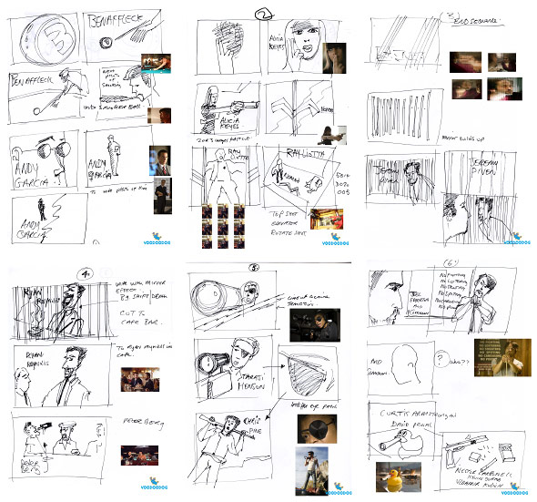
Original storyboards
So how did it progress from there?
We asked the production studio if we could have all the on-set photography from the film. I thought we could get better shots using the stills. So they sent over three thousand thumbnails in these books! Myself and Andrew White spent days marking up the photos we wanted and finally getting digital jpegs of each pic we needed.
The idea was to make jerky, pixelated actions from the stills which looked old fashioned, like old school rostrum photography from the ’60s and ’70s. We had to try to think how someone who had some stills and a rostrum camera would have made a credit sequence in the days before computers. The colours were saturated, too, to give a sort of Fuji film stock look to the final grade.
Did the director give any direction with regard to the stills?
I had a call with Joe Carnahan about those three thousand stills we got and he said he would be happy for us to use those because the angles were different than the ones from the movie shoot. He decided we should make an end title sequence as well. It would allow us to use plot elements from the movie without spoiling the storyline and then the opening title sequence could be more mysterious.
Unused opening title treatment
It's definitely bold enough to stand separate from the film. Where did that energy come from?
It had to make a big statement. It’s a brash movie so we wanted the sequence to shake up the viewer – to announce that it was a ballsy action movie. It also couldn’t give anything away plot-wise, so it demanded some punchy iconic images to entice the viewer rather than trying to set up a backstory.
You had to make quite a few adjustments throughout this project, right? You originally created both open and end titles, but only the end were used.
Yes, Joe liked the opening credits we did but after their edit they felt it slowed the momentum of the introduction. That seems to be a big concern for filmmakers now – they’re aware of the short attention span of audiences and don't want to delay the story. As a designer, I am not sure I would agree, of course. I think that if credit sequences are good and entertaining, they can hold an audience’s attention.
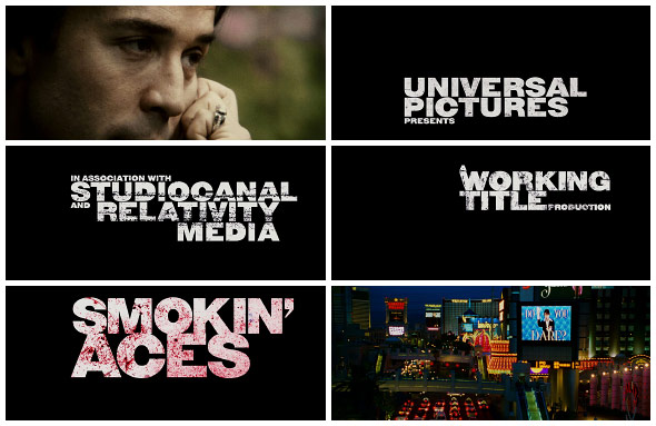
Final opening title cards
Do you think that’s why main-on-end sequences have gotten so popular these days?
Yeah, that might be one of the reasons. The opening of a movie has become sacred ground and filmmakers often want to get straight into their movie. Some filmmakers – like David Fincher with Panic Room for example – are relaxed enough to go for it and have an opening sequence. For directors who don't want to risk messing with their movie they can opt to have an end sequence, which can help provide an atmosphere for reflection or it can trigger word of mouth so it becomes a talking point in itself or make them laugh or hint at a sequel... but it’s mainly so the film is a little more memorable. I don't know, maybe it’s only designers who like end sequences and maybe no filmmakers really want them and it’s just us pushing to do some cool work, haha.
You guys are "self-professed film buffs." What are some little-known films that left an impression on you?
-
e’Lollipop, an obscure film from South Africa that I saw when I was a kid – very emotional about apartheid.
-
Mothra vs. Godzilla. I saw it when I was young and I liked the garish colours and lo-fi-ness of it.
-
The Chuck Jones-directed The Phantom Tollbooth. I loved the mixing of live action and animation.
-
Richard Williams’ version of A Christmas Carol, for which he won an Oscar in 1971.
-
Enter the Void by Gaspar Noé has brilliant opening credits and the movie blew me away – it was so esoteric and nuts, but very emotive too.
-
Last Year at Marienbad. This Alain Resnais film has stayed with me too for some odd reason... .
VooDooDog has an uncanny knack for tapping into the essence of another era's magic and remixing it into something punchy, like your Emmy-nominated title sequence for The Life and Death of Peter Sellers. Following suit, what would be a dream project for you?
It would have been nice to have done the opening titles for the Tintin movie! We could have referenced the 2D Hergé drawings and done something that linked it with the motion capture style of the film, but we didn't get anywhere chasing those up.
It would also be great to do a Tex Avery-style animation someday – maybe a crazy comedy would work. I loved doing the Sellers film as it referenced the Pink Panther opening titles, which inspired me when I was a kid. Something like that would be brilliant.


