When Kristine Belson, president of Sony Pictures Animation, confirmed the title for Spider-Man: Homecoming at CinemaCon in 2016, she briefly talked about the as-yet-unnamed animated Spider-Man film. She declared that it would “break new ground for the superhero genre,” which, it turns out, was not simply run-of-the-mill hype. Spider-Man: Into the Spider-Verse is a film like no other. Nothing looks like it and nothing feels like it. Written by Phil Lord (co-writer on The Lego Movie, 21 Jump Street) and Rodney Rothman (22 Jump Street), Spider-Man: Into the Spider-Verse is a wild, glitchy, exhilarating and most of all laugh-out-loud fun reworking of your friendly neighbourhood wall-crawler. Directed by Rothman, Bob Persichetti and Peter Ramsey, it’s the most innovative take on Spider-Man since 2002 when Columbia Pictures (now part of Sony) first brought the web-slinging hero to the big screen.
For stylistic inspiration, the filmmakers looked to the hand-drawn techniques of comics artist and Miles Morales co-creator Sara Pichelli. Combining Sony’s computer animation with Pichelli’s vibrant traditional style proved to be key to Spider-Verse’s vivacious, one-of-a-kind aesthetic. To achieve it, the film required 140 animators – at one point ballooning to reach 177 members – the largest crew that Sony Pictures Imageworks had ever used in film.
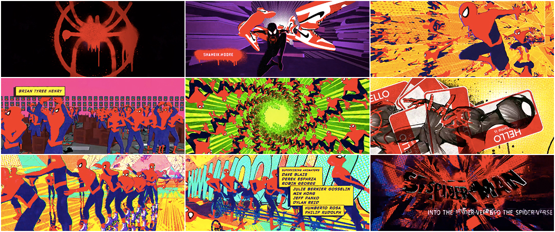
Its slam-dunk closing title sequence, which won the 2019 Excellence in Title Design Award at SXSW, required a team of about a dozen people. The main-on-end sequence is a zipline through a kaleidoscopic vortex of blazing colour, invigorating energy, industry in-jokes, and meta-Spideys, all doused in Kirby dots and halftones, graffiti and street slaps. Like the psychedelic Dondi White–Roy Lichtenstein team-up we never knew we were missing. It was created by Alma Mater, the studio behind the titles of 21 Jump Street and The Lego Movie. Tackling the “inspirational and intimidating” brief required heavy lifting from creative directors Brian Mah and James Ramirez, VFX specialists, an editor, an illustrator, and a gaggle of animators and compositors. Below, Mah and Ramirez reveal the directions that didn’t make it, their 3D explorations and techniques, the Easter eggs and barely-visible custom art, and the plug-ins that helped them along the way.
A discussion with Title Sequence Directors and Designers BRIAN MAH and JAMES RAMIREZ of studio ALMA MATER.
It’s been a big few years for Alma Mater! The last time we talked was in 2015 about your work for 22 Jump Street.
Brian: The truth is we don’t take on titles that often! This past fall and winter has been the exception. We created two very ambitious title sequences, one for Spider-Verse and the other for The Lego Movie 2: The Second Part. This was the first time we did two titles of this scale and magnitude simultaneously. It was quite an adventure.
How did it feel to see Spider-Verse win Best Animated Feature at The Oscars?
Brian: We were so thrilled to see it win. It was such a well deserved achievement. It was an unbelievable honour to be part of a film that is so inspiring on every level.
James: I loved watching the Annies and hearing the thunderous cheers every time the film came up but the Academy Awards was the culmination. Seeing it win felt like the final acknowledgment of what we all knew: it's an amazing film and it touched all of our hearts.

Bob Persichetti, Peter Ramsey, Rodney Rothman, Phil Lord and Christopher Miller pose with their Oscar statuettes for best animated feature film for Spider-Man: Into the Spider-Verse
So how do you add the finishing touches to that? What was the first meeting like?
Brian: Inspirational and intimidating. We met at Sony Animation and entered one of their conference rooms. An army of people started to pour in: Phil Lord, Christopher Miller, Peter Ramsey, Rodney Rothman, Bob Persichetti, Christina Steinberg, Will Allegra, and a collection of producers and collaborators. They walked us through the background and the basic plot. We looked at concept art, character designs and a few preliminary animated scenes. The brief was open and there were a lot of themes to leverage: an aesthetic inspired by comics, the infinite range of Spider-centric characters, the multiple dimensions... We were blown away and left with a high level of enthusiasm but we were bewildered as to how we could make something that could follow such an amazing film. They gave us a draft of a script, which was missing an ending but would give us a jumping-off point.
So you saw concept art and a few animated scenes. Did you see a cut of the film? Anything by the other VFX companies?
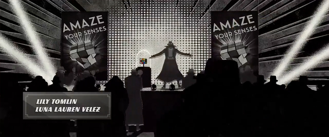
Brian: No other VFX companies had been brought in at this stage. We were able to watch many versions, starting with board-o-matics. Seeing the various cuts of the film was honestly the most amazing part. It was incredible to see the amazing artistry and attention to detail. They wanted to make sure there was a consistency to the stylistic treatment of the main-on-end titles and the theatrical logos at the head of the film. Once we aligned on the direction of the titles, that informed the logos up front [created by Devastudios].
Spider-Man: Into the Spider-Verse opening studio logos with glitches, created by Devastudios
How many initial directions did you develop?
Brian: We went through two rounds of presentations before landing on the final concept. We started off with a couple of directions. One direction celebrated the halftone comic book vernacular, following Miles through various vignettes in the city.
Frame from concept #1
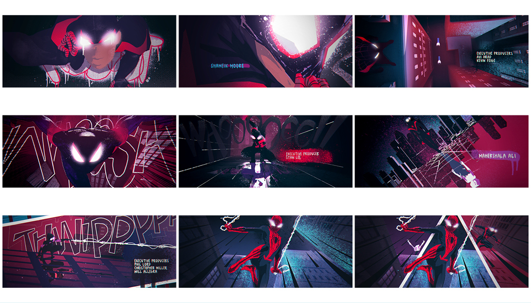
Concept #1 – celebrating the halftone comic book vernacular, following Miles through various vignettes in the city
Concept #1 motion test
Brian: The other played with the idea of creating one continuous camera move through a variety of scenes, revealing various characters from the film along the way.
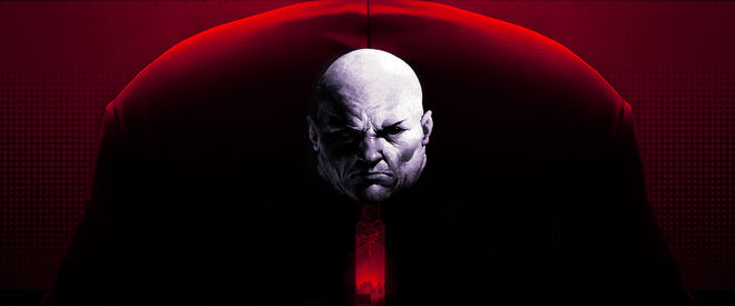
Frame from concept #2
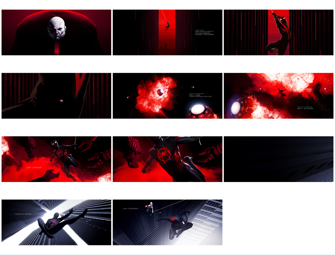
Concept #2 – one continuous camera move through a variety of scenes and characters from the film
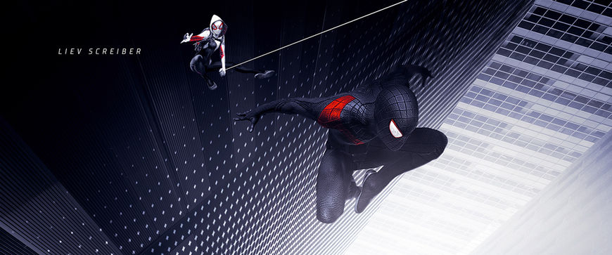
Frame from concept #2
Brian: The filmmakers were drawn to the graphic nature of the first concept but felt like there was room to simplify. They pointed us towards what they called “Burst Cards” in the film. These were a series of quick, flashing moments – only a couple of frames in duration – where a scene would become illustrative to punctuate an action or a sound. They liked the simple, graphic quality of those and asked us to consider pushing the aesthetic in that direction.
—Creative Director Brian MahWe kept going back to the film for inspiration, trying to break down the visual cues that resonated with us
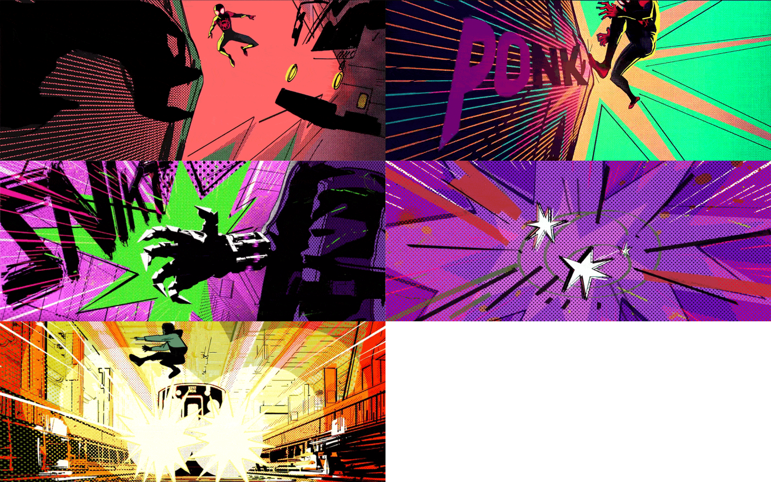
“Burst Card" examples from Spider-Man: Into the Spider-Verse
Brian: They also pointed out that this end sequence would be coming right after a climactic action scene and that a sequence of Miles swinging through the city might seem redundant. They wanted this to be completely fresh content rather than reminiscent of anything the audience had just seen. They wanted to focus more on the multiple characters of the Spider-Verse and the dimensions they inhabit.
We began brainstorming new ideas. We kept going back to the film for inspiration, trying to break down the visual cues that resonated with us. The film is such a celebration of various artistic styles and comic languages, whether it’s the cel-animated qualities of Spider-Ham, or the anime aesthetic of Peni and SP//dr, or the halftone patterns and painterly rendering of every object and environment. We realized that the sequence needed to reflect this aggregation, both in the visual diversity of the characters and the artistic execution as well.
For the second round, we presented a new concept centered around a series of vignettes. They would begin with Miles and progress into worlds populated by more and more Spider-characters. We showed styleframes which incorporated 3D renderings with analog drawings and illustrations, spray-painted textures, color offsetting and overprinting, and hand-drawn typography. We simplified the details into blocks of colour and halftone patterns, as though each scene were screenprinted.
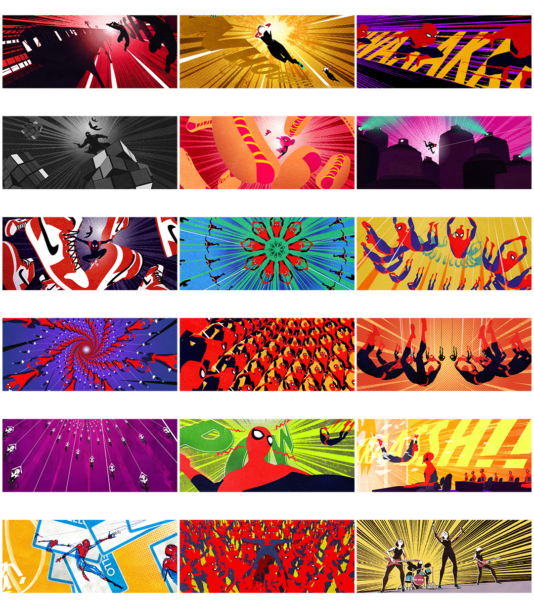
Final presentation styleframes which incorporate 3D renderings with analog drawings and illustrations, spray-painted textures, color offsetting and overprinting, and hand-drawn typography.
Brian: We also included two rough motion tests. One showcased how we could use camera moves past static 3D models of echoed action poses to create a zoetrope-like effect to each character’s movement.
Echoed action motion test
Brian: The other motion test showed how we could use a reflective environment to create a kaleidoscopic look. This device would speak to the multiple dimensions of each character while demonstrating how we could increase the density of each scene as the shot progressed.
Kaleidoscope motion test
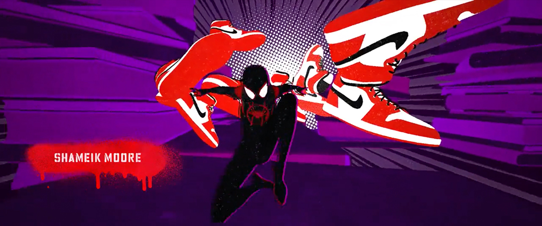
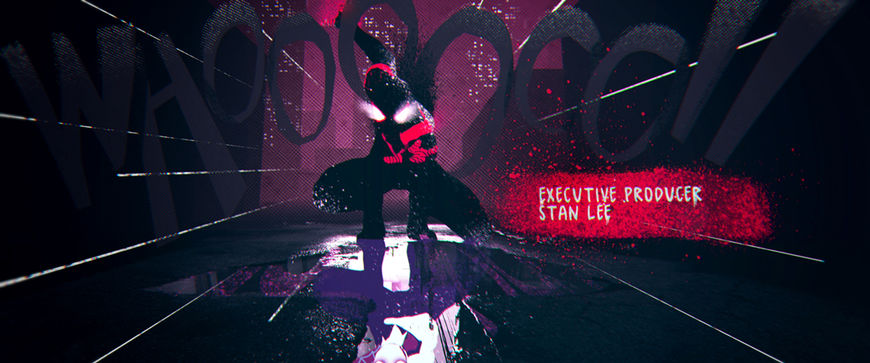
Brian: We also designed custom cards to tailor the typographic style of each credit to its corresponding scene, so for example Spider-Noir’s scenes would have a black-and-white 1930s look while scenes with Miles would use spray-painted stencils. The filmmakers loved it and told us to move full-speed ahead.
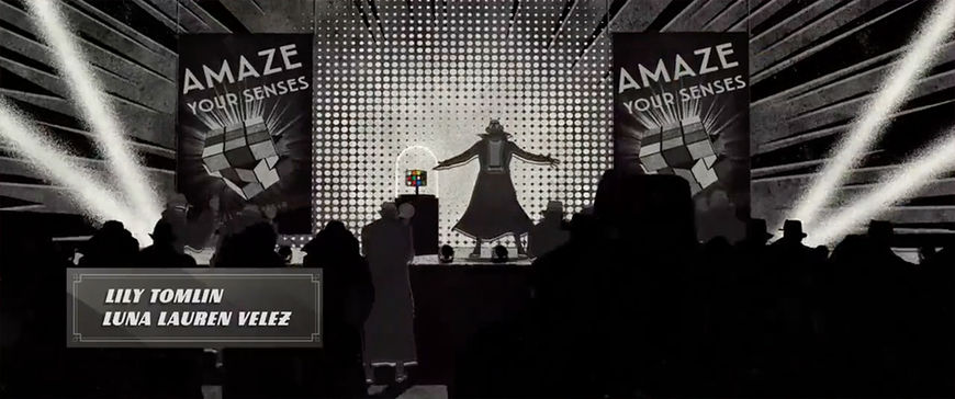
A still from the end titles featuring the "Spider-Noir" aesthetic

Various credits styles

A still from the end titles featuring the "Miles Morales" aesthetic
How did you sequence it all out?
Brian: We would create lists and simple storyboard frames to express each concept and share them with the filmmakers. They would send back notes with the ones they thought were funny and add new ones to the mix. It was truly a collaborative process. Once we felt like we had enough scenes to fill the sequence, we edited the thumbnail sketches together for timing purposes, blocking out the credits and determining which scenes flowed smoothly into the next.

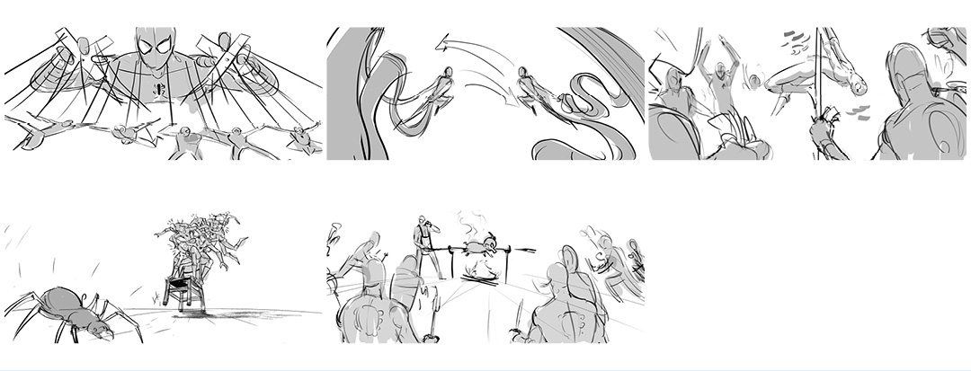
Vignette storyboard frames
Brian: Keith Roberts was instrumental in helping us organize these various storylines into a sequence that felt cohesive. He’s an editor that we’ve collaborated with on countless projects.
James: The team ended up being a cross-section of artists that Brian had worked with and others I recommended. The key person that I knew we would want was Renzo Reyes. I worked closely with him for three years and we have a great shorthand. I knew we needed someone with a great eye who was able to jump between software packages.
I also suggested an illustrator, Eric Hibbeler. I knew Eric’s style would be perfect for Miles Morales’ “HELLO” sticker tags. I’ve been following his Instagram account for a while now and his daily sketches were indicative of both his talent and his speed, which was crucial.
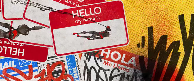
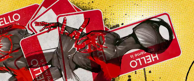
Stills from Spider-Verse end sequence featuring the "HELLO" sticker tags and Eric Hibbeler's drawings
What did you have to do to meet the requirements of a stereoscopic, 3D film? Was the studio already equipped for this or did you have to develop a new pipeline?
James: Luckily, James Anderson, Alma Mater’s VFX supervisor, had experience working in stereo so he was a huge help. Our aesthetic was made up of a lot of layered textures, spray-paint splatters and halftone patterns. This posed a unique challenge from a stereo perspective. We needed to take these 2D patterns and animate them in a way that would allow us to move around them in 3D space without having the textures moiré. They also needed to appear at the right screen depth, so we weren’t able to use some of the common motion graphic “cheats” when compositing them in the scene. James and I spent a while collaborating on a variety of motion tests to determine a methodology which would achieve the best sense of stereoscopic depth. We played around with everything from the scale of the halftone patterns to where each layer should appear in screen depth. After we found the right balance, we built all the textures in Cinema 4D to create a layered approach that worked in stereo and 2D. We set up a pipeline where we created stereo cameras in C4D and used the renders in conjunction with an AE plugin called Evil Twin, an amazing tool that helps automate the otherwise labour-intensive process of creating left- and right-eye compositions.

How were the illustrations developed? Which parts of the sequence are analog?
James: All of our texture sources were pulled from photographs or scans. Everything from a series of halftone patterns to spray-paint splatters and textures. Most of the title sequence is 3D, but treated to have a more illustrative feeling. The process involved coming up with a concept for a scene, then working with Sony Animation to either leverage an existing model of a character, or, in a lot of cases, they would create custom poses for us based on our storyboard drawings. We would then import the models, compose them in our scenes and design how the cameras would be choreographed. After rendering the shots, we used texture passes, sketch and toon lines, and compositing tricks to blend the layers together into an aesthetic that nodded to a printed comic book. Spray paint is such an important part of Miles’ character that we also wanted it to be ingrained in our aesthetic. Every character and object used a spray-paint layer amongst other textures to help make everything feel more handmade.
Some specific moments, however, did incorporate truly analog illustrations. There is a section about two-thirds into the sequence that uses a series of “HELLO, MY NAME IS…” stickers to create a cel-animated effect of Miles swinging through the scene. We wanted it to look like Miles had drawn a sequence of an animation on these stickers and they would appear to animate as he threw up each subsequent tag. This was where we collaborated with Eric Hibbeler. Eric showed us a variety of stylistic test drawings.

Illustration options by Eric Hibbeler
James: Once we aligned on the illustration style which felt most appropriate for Miles, we took an animated sequence from the film, broke it out into 2s and had Eric work on recreating each frame. These were physical illustrations, scanned in and then composited onto the stickers. Everyone loved how Eric’s final drawings added to the analog feel.
3D model sequence used as the basis for the "HELLO" sticker tag illustrations
"HELLO" sticker tag illustrations created by Eric Hibbeler
Which tools and software did you use to put it all together?
James: We primarily used your standard off-the-shelf Adobe software packages: Photoshop, Illustrator, InDesign, After Effects and Premiere, as well as Maxon Cinema 4D. The bedrock software of the sequence was definitely After Effects. Once we had the locked edit, we kept a master conform in AE that would allow us to stitch and adjust each shot as they were finalized. We also played around with a few additional plug-ins to give certain digital sequences a more analog look. I love playing with a Photoshop plug-in called Mister Retro. It allows you to create custom presets that emulate printmaking techniques. Incorporating this extra step did, however, make the process more tedious. We rendered out sequences from C4D, batched them through Photoshop, and then composited them back together. I feel like the quality we achieved was well worth it.
Are there any Easter eggs or special moments in this sequence? Something special that folks might not initially notice?
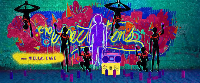
James: One personal thing that I added to the sequence are some tags on the graffiti wall. I got into art through graffiti thanks to my good friend Carlos and my cousin JR. Carlos has been such an instrumental person in my life. He taught me all about hip-hop and pushed me to develop a voice through my artwork. Including some of our old tags – that no one would ever see! – was my way of holding his hand up and saying “We did it!”
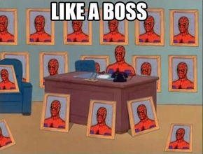
"Like A Boss" Spider-Man meme
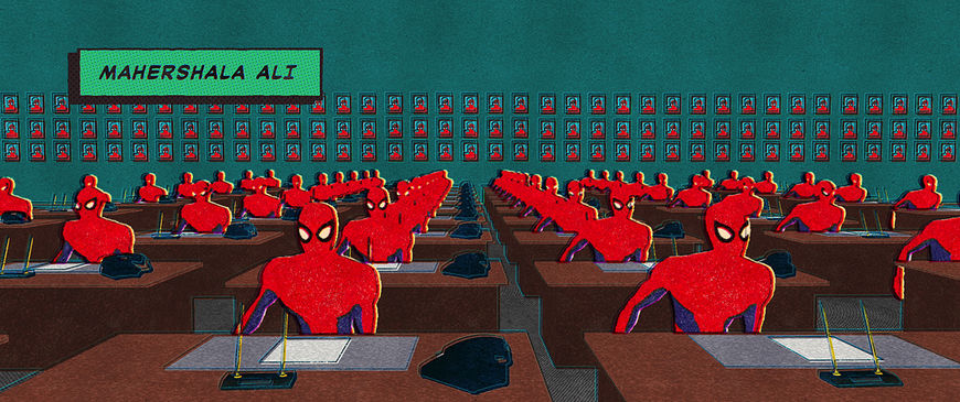
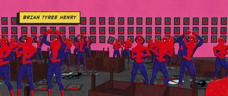
Brian: Two sections in the sequence come to mind. The first is a reference to the Spider-Man “Like a Boss” Meme. We thought it would be fun to create our own version of this classic image, but we wanted to increase the density of the figures ten-fold. We thought it would be a fun nod to a piece of pop culture, so we created a sequence where the camera passes through multiple office scenes, each one getting progressively more chaotic.
The second example is in the wallet section. There’s a moment where the camera travels past a wallet that Spider-Man’s holding and an accordion-style sleeve of photos falls out, as though they’re funny memories that he carries around. We were inspired by awkward family photos and created a series of funny moments with multiple Spider-Men posing together.
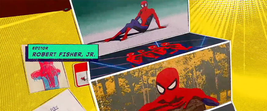
Still from the Spider-Verse end sequence from the "wallet" section
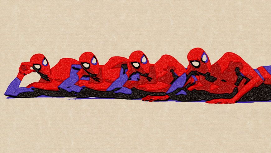
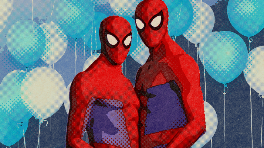
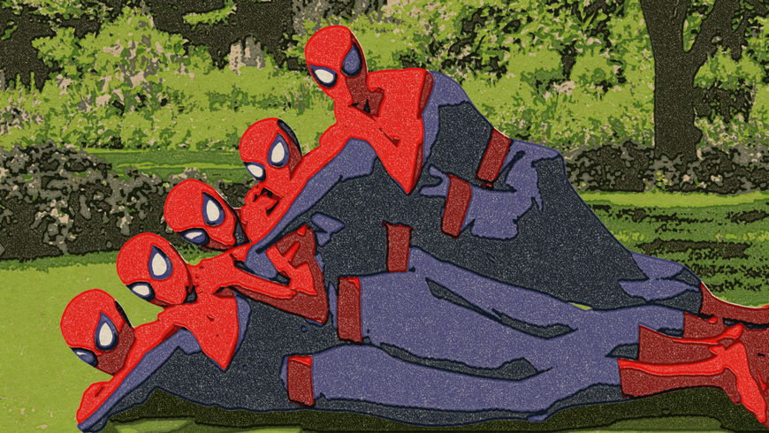
Art created for the "wallet" sequence of the Spider-Verse end sequence inspired by awkward family photos
Tell me about the childrens' drawings in the back of the wallet. I love those especially.
Brian: We thought it would be fun to incorporate some kids’ drawings. Ben Apley, our EP, had his daughter Clara, and Brinton Jaecks, a compositor, had his son Ozzie create a couple of amazing Spider-Man drawings that we used in the background.
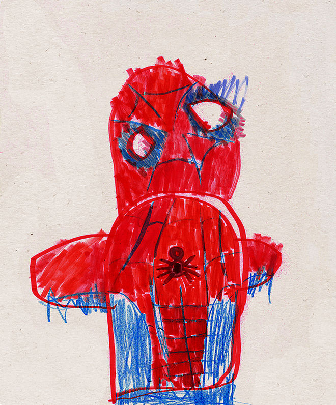
Drawing of Spider-Man by compositor Brinton Jaecks's son Ozzie
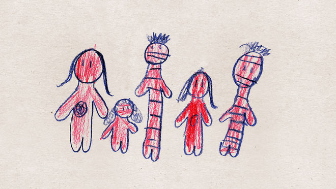
Drawing by Executive Producer Ben Apley's daughter Clara
Looking back now, what parts of this sequence are you most happy with?
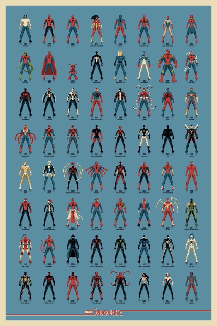
Brian: I'm particularly fond of the last 30 seconds. Early on, the filmmakers showed us two Mondo Spider-Verse posters.

"Spider-Verse" posters by DKNG produced by Mondo. More info.
Brian: We wanted to create a narrative structure which begins with Miles and populates the screen with more and more Spider-characters. By the time we reach this last section, the density gets pretty ridiculous. Between the infinite number of Spider-Men, the kaleidoscopic reflections, and the contrasting scales and colors, this last chapter feels like a surreal Spider-Man landscape; almost like a Spider-centric version of a “Where’s Waldo?” book spread.
James: The last shot of the sequence with Miles is my absolute favourite. During the entire project, Brian kept referencing one of my design frames featuring Miles leaping at the camera. He loved that frame and would always ask for that to be included somewhere. The end shot seemed to become the appropriate place for it, as a way to bookend the narrative with Miles as the hero character.

James: It's one thing to have designed a shot in your mind, but it's another when it finally comes together in a way you never imagined. When Renzo showed me his first pass at the shot, I smiled from ear to ear. Speed lines, halftone patterns, spray paint splatters, Kirby dots, reflections of additional characters and spider-web lines all combined into a beautiful kaleidoscopic aesthetic.


